Are you lost? This is my digital journal, man. For my graphics course at Brighton Uni. CONTACT: [email protected]
Don't wanna be here? Send us removal request.
Statistics
We looked inside some of the posts by brightontothemax and here's what we found interesting.
Average Info
Notes Per Post
0
Likes Per Post
0
Reblog Per Post
0
Reply Per Post
0
Time Between Posts
2 days
Number of Posts By Type
Photo
5
Video
1
Text
11
Last Seen Tumblr Blogs


Fun Fact
There were a total of 171.5 billion posts on Tumblr in 2019.


Video
tumblr
Film experiments. P shit video - shd take another.
0 notes
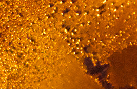
Photo


Some more brain food. I’m finding myself drawn to vibrant colours against dark backgrounds. I also love the grungy feel that all of these share.
NTS: add artists when ya get a sec.
0 notes
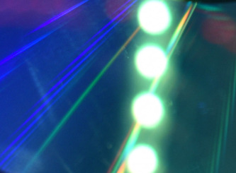
Photo


Playing with light reflecting on the surface of a CD. Taken on my iPhone, hence the poor quality.
0 notes
Photo


Playing with light reflecting on the surface of a CD. Taken on my iPhone, hence the poor quality.
0 notes


Text
Hallucinogenic Edits
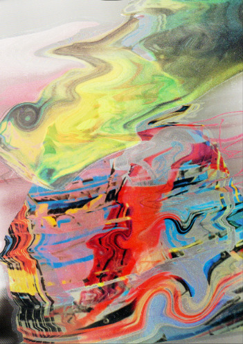
Back to the eyes and mouth. To blend the images with my new background layer, I played around with the Advanced Blending options, unchecking different channels to see what effects I could achieve. I kept experimenting with this method until each of the eyes were a different colour, and until the piece looked (relatively) balanced:


Next, I began duplicating the different eyes and unchecking different channels again, moving the layers around a little to create this motion blur-esque effect:

Lastly, I softened the edges of the eye images by using a soft round brush and erasing parts of the photos. This ensured that everything blended nicely together.

This image would serve as the base of some more graphic experiments that I did. The vibrancy of the colours and the cluttered nature of the image mimic the visuals experienced when taking acid.
0 notes
Text
Hallucinogenic Edits
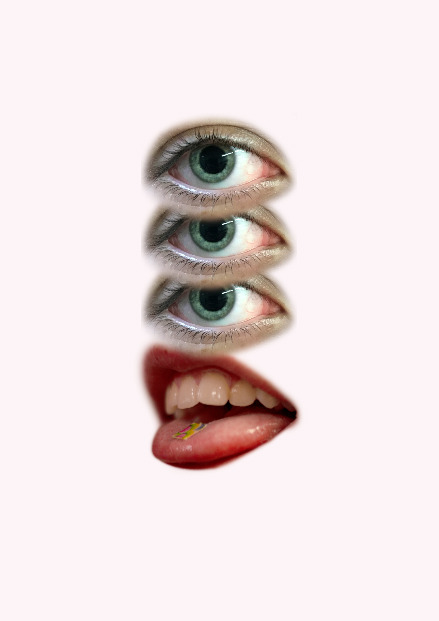
A few of my friends got their hands on some LSD, so I documented the process via photographs that I took both with my phone and with a Canon DSLR camera. To begin the poster, I started with the photo of the tab on my mate’s tongue because I thought it was the most on the nose.
I then selected a few photos of their eyes with dilated pupils. I used the keyboard shortcut Cmd > Shift > U to desaturate all of the images, as I knew I wanted to make use of the layer adjustments and that this would be more successful if the images were greyscale.
Next, drawing upon the work we did for the ‘Art of Cropping’ project, I busted out my acetate pieces again. The scanner I was using this time around gave the scanned image a white backdrop, which worked well to bring out all of the different colours in the images. To create the trippy liquid-esque effect, I simply moved the acetate pieces around as the scanner did its job:
I then bumped up the saturation and size of the scanned image. Personally (perhaps due to the research I’ve done about the colourful psychedelic posters of the 60s and 70s) I associate acid trips with bright colours, so I felt that this would further drive home the theme:

0 notes
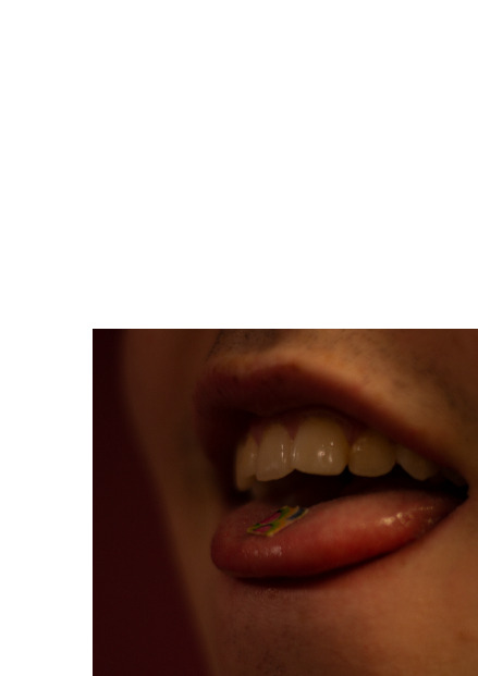
Text

Starting with an A3 sized canvas in Photoshop, I inserted one of the photographs I took. I then used the quick mask feature and a soft brush to isolate and select the mouth, removing it from the rest of the face:


I played around with the adjustment panel, increasing the overall brightness of the mouth by creating a clipping mask and adjusting the sliders in the Levels panel. I also felt that the image was too yellow: to counteract this, I went into the Selective Color panel and chose the ‘Yellows’ category, adjusting the slider until I achieved the desired effect. This is what I was left with:

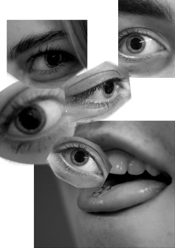
Good stuff. A common rumour regarding LSD is the belief that it helps to open one’s third eye, allowing them to view the world as it truly is. As a nod to this, I made use of another photograph I took of my friend’s diluted pupil. I again used quick mask to cut the eye out of the image, duplicating that layer three times:
Sick. As it stood, the image wasn’t looking particularly psychedelic (besides the symbolism), so I bumped up the saturation of everything and duplicated the layers. On the duplicated layer, I went into adjustments and unchecked R and B, leaving only the G channels visible. I then shifted this layer in order to achieve the trippy chromatic aberration effect seen below.

0 notes
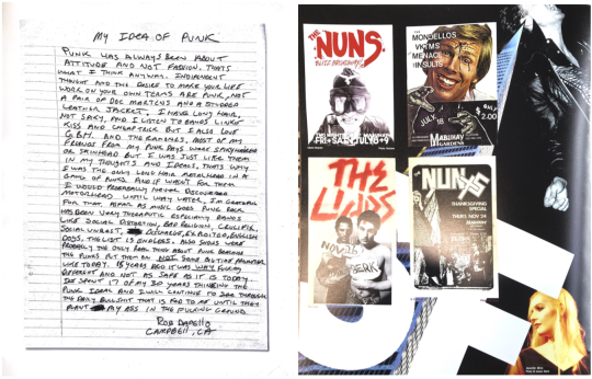
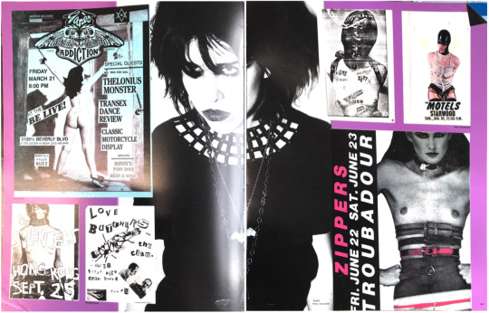

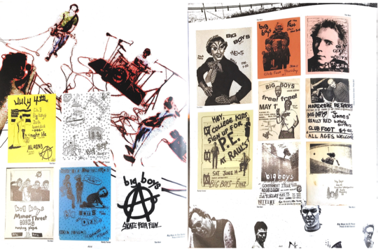


Text
Visual Research
A collection of the pages that I was most drawn to from the book ‘Fucked Up and Photocopied’ from St Peter’s House library (scanned using my iPad). The scans are not in order, and are not necessarily from the same spread.
One of my favourite things about this book is the layout and the careful selection of the images that were included on each page. In a way, the posters are more of a background element. Generally, the colour schemes seem to consist of three colours: black, white, and an aggressively bright colour for contrast.

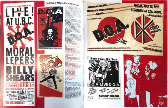


I like the wayward nature of the typography and the more handdrawn aspect that’s prominent in a lot of the poster designs. Punk is about breaking rules, and the rules of design are no exception. Straying away from clean and modern type is definitely something I’d like to play around with: I love the rawness of all of these.
0 notes