
Don't wanna be here? Send us removal request.
Statistics
We looked inside some of the posts by bryntrainorelective and here's what we found interesting.
Average Info
Notes Per Post
0
Likes Per Post
0
Reblog Per Post
0
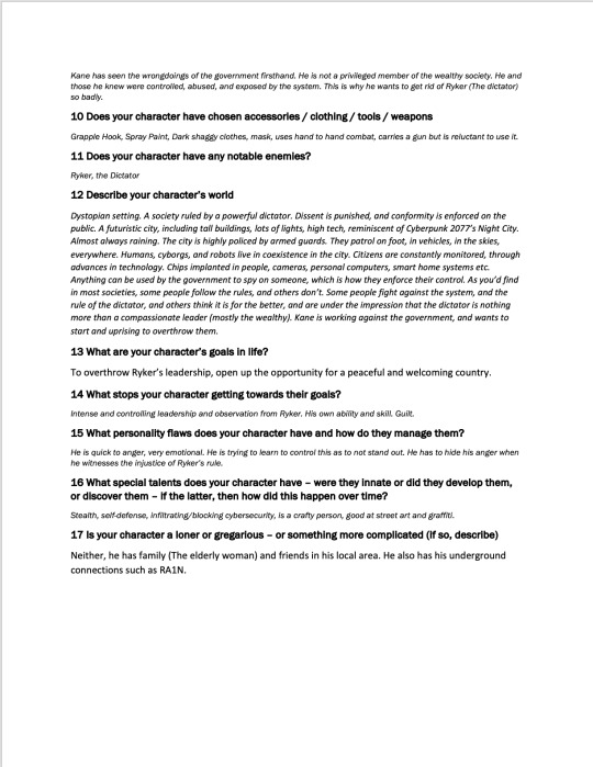
Reply Per Post
0
Time Between Posts
1 day
Number of Posts By Type
Text
17
Last Seen Tumblr Blogs


Fun Fact
The “We are the 99%” Tumblr blog became the slogan for the Occupy Wall Street movement.
Text
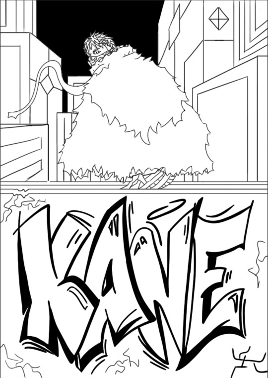
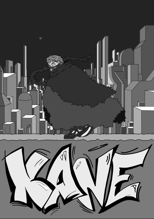
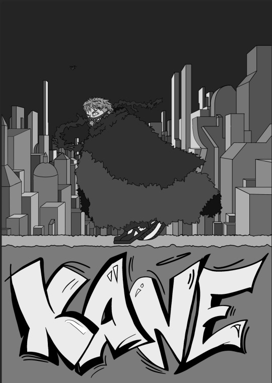
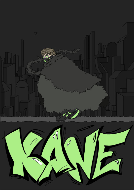
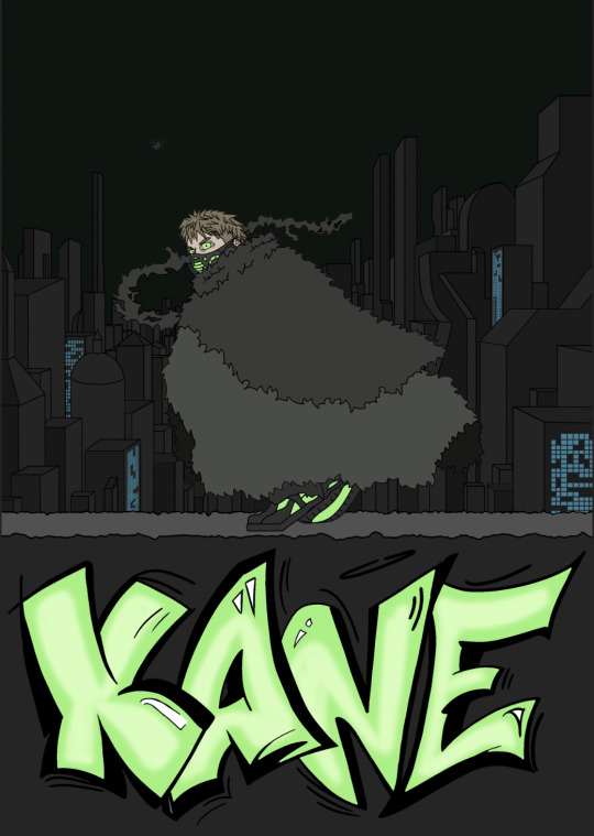
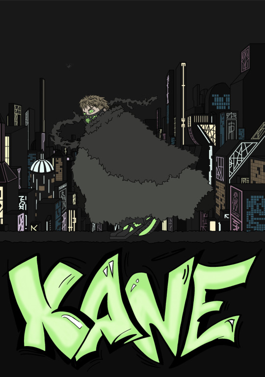
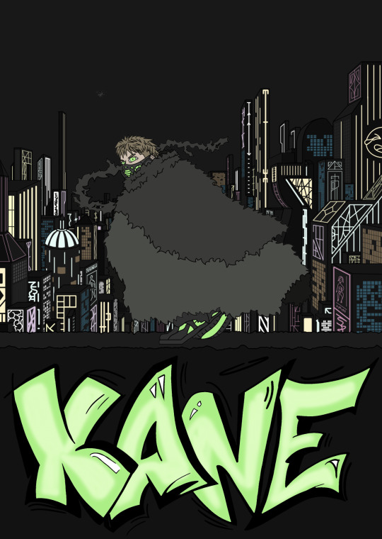
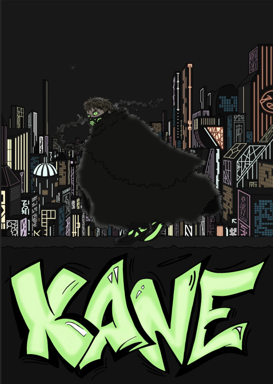
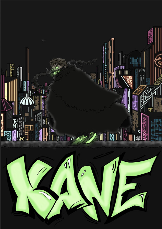
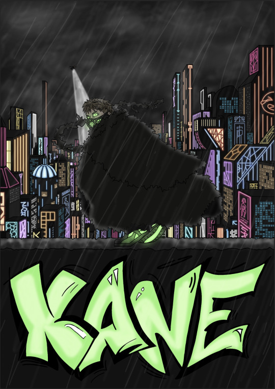
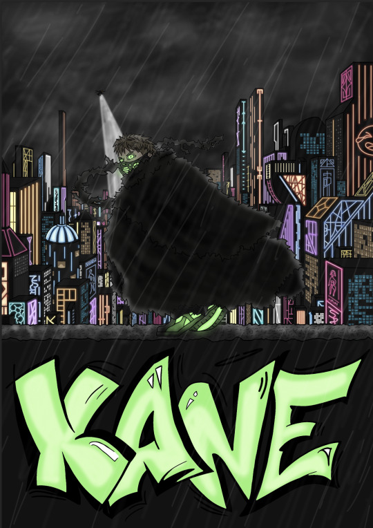
FINAL PROJECT: KANE PT2

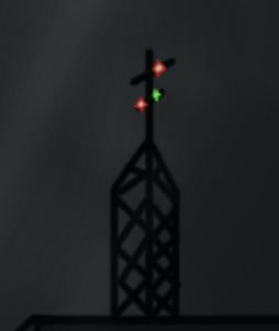
BOOM! This is the final version of the poster for Kane. Can you believe it, I actually did it.
In this final version, I added a couple extra little details into the background, this included a concert/party going on atop the club on the right side of the poster.
I know what you're thinking, "Why is Ryker allowing parties in a country like this?" This is the rich center of the city, filled with his close business associates and partners, he's slightly more lax here.
The other thing I added was a radio tower atop the top right building in the poster. I thought it was just a cool detail, made the city look more complete.
I also added some lines to other rooftops, just so they don't all look completely flat.


With that, the poster is finished.
I remember adding a slight blueish tint to the image along the way, but it was so subtle I actually forgot when it happened, so thats why I hadn't mentioned it.
Anyway, I am quite chuffed with myself for creating this. It obviously isn't the craziest thing ever, but I thought it turned out way better than what I had originally envisioned. I've never drawn an environment this complex before, so I thought I did an alright job.
If I was recreate this poster, I think I'd like to try a different composition. Like having Kane offcenter, rather than in the middle. Or it could be cool to have him walking on the street, blending in, and presenting the height of the buildings around him. A pose that shows off his design better could be cool too, since you can't see whats under his cloak, which is a shame.
Anyway, the digital character illustration class was crazy good for me. I improved my digital art probably tenfold to what it used to be. Comparing this poster to the first poster I made for communication design just goes to show how much I have progressed. I think I still need improvment on many things though, as I am absolutely nowhere near perfect.
0 notes
Text
FINAL PROJECT: KANE PT1
This will be the final post on for this class, and is in two parts.
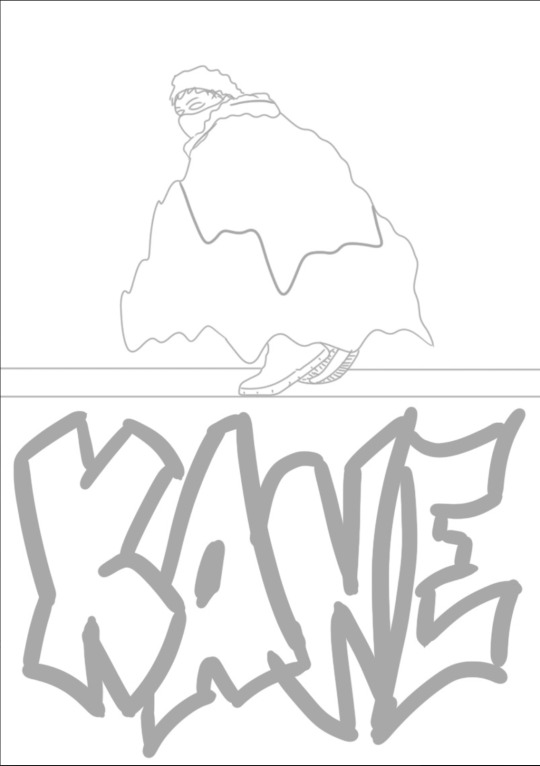
For our final project for the character Illustration Class, we had to create a poster of the character we had previously made, which places them in an environment/scenario that helps introduce them and their setting, as well as hinting at some features about their character. Below this post was 3 sketches I had created to choose from, which I called Tag, Flip, and Sneak. I chose to continue the process on the Tag poster, as I thought it was the coolest, and the feedback was the most helpful.
The decisive reasons for choosing Tag was because it presented the most elements about Kane's character, and also gave the best introduction for his setting, and his role in it. Kane lives in a neon cyber-punk-esque city, and Tag was the only poster that showed it. He also does graffiti, which this is the only one that includes it. It also had the best pose for his character. Kane is sneaky and swift, the flip pose and the sneak pose made him look more like a guns blazing type of person, which he is not. Tag also showed the seperation between Kane and the rest of the city. The idea was for him to be crouched on a wall looking over the rich city center full of the wealthy supporters of the main villain, Ryker (the evil dictator). This shows how he isn't apart of the supporting group, as he is in the dark, rather than the bright lights of the city center.
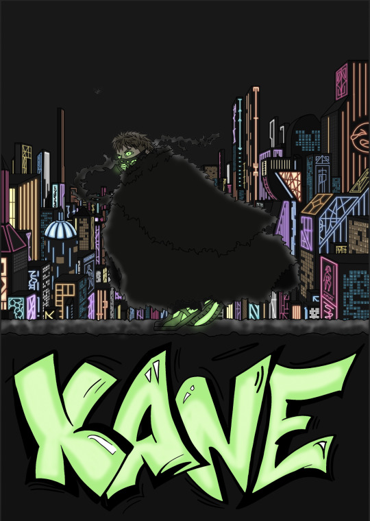
This is the original design:
The main feedback I recieved for this design was to use the rule of thirds, and to make the city look larger. So I took that feedback into consideration for the new design as I made some changes.
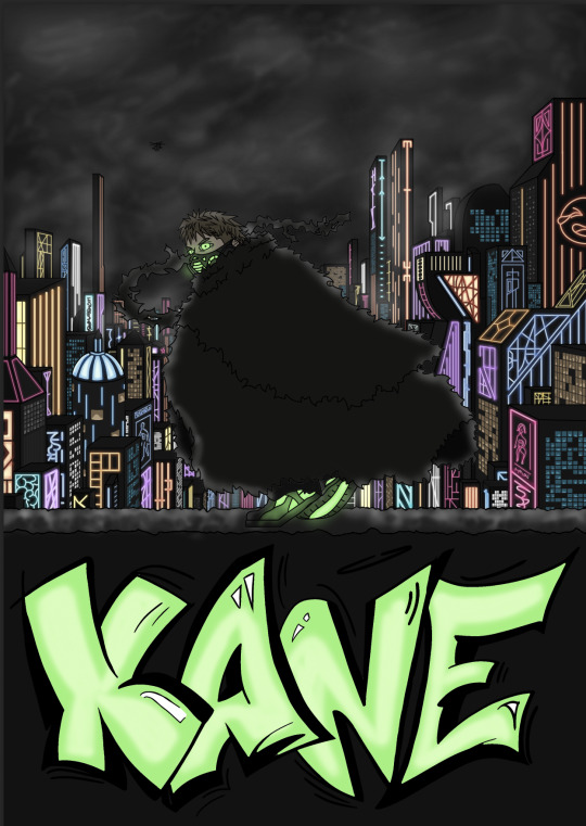
Here is the line drawing that I made for the final poster:
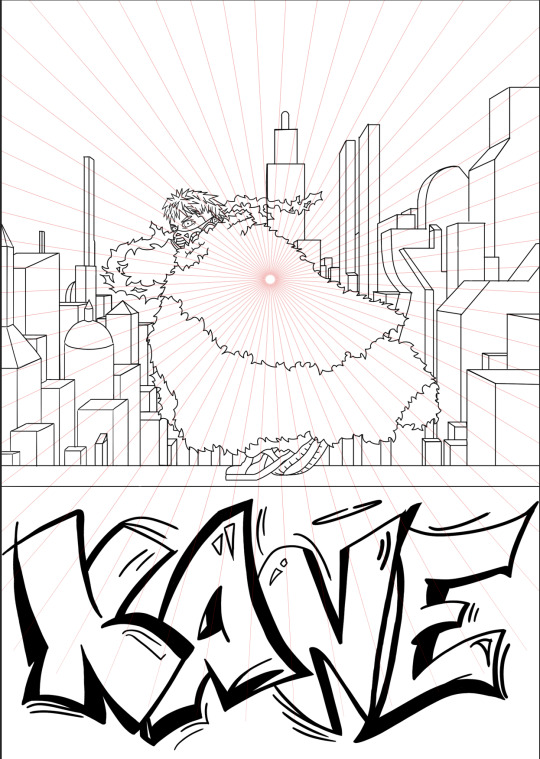
So, the changes I made include using the rule of thirds - one third for text, one for Kane and the city, the other for the sky above.
I also made the city larger by utilizing a vanishing point and perspective grid, which I learnt to create from the video mentioned earlier on my blog. With this, the city looked much more vast, and the buildings looked way taller. This is exactly what I was going for.
I tried to make some buildings in normal symmetrical shapes, and others in non-convential shapes to make them look familiar, but not the same as moderrn day buildings.
I also made Kane's clothing look like it was being blown in the wind. I tried to make different parts go in different directions, as the city is constantly raining and stormy, so I wanted the wind to look unpredictable. For example, the bottom of his cloak is sort of going to the right/towards us, and the scarf hanging off is going away from us.

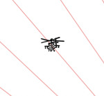
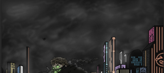
For the next rendition, I added a helicopter. The city is constantly under surveillance, even in the rich center. Ryker watches almost everyone he can, closely. So I added this helicopter to the sky, which I planned on adding a huge search light onto later on.
I also got rid of the big building behind him, as it kinda made the city look less deep, I wanted it to look like it continued on for a while.
There is also lines going through Kane, but they're just to make colouring simpler for the background (since he is currently transparent).
Next, I greyscaled everything. The amount of different layers I had was insane at this point (and that wasn't even the end of it) and I didn't event do the buildings individually, as I grouped them by side and light level.
These values ended up changing HEAVILY overtime though as I realised the buildings and Kane needed to be way darker.

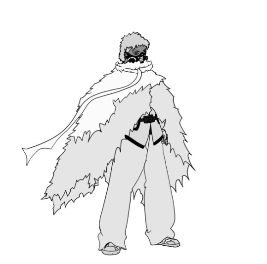
Here I coloured Kane and the text. I had a certain shade of green I liked, which I had used on the original design. I got all of the colours for Kane from the original design, but these got very dark eventually (except for the green, as it glows).
This was about the point at which I realised everything needed to be darker, after looking a reference images online. I found that the buildings were all pretty much black in the images, because the neon lights littering them just drown out any colour, as they overpowered them. i also found that the sky was always brighter than the surface colour of the buildings, which made sense after seeing it, as the lights of the city make it brighter.

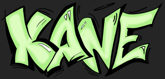
On this version I added highlights to the text, as I wanted to make the graffiti look futuristic somehow, so I added the highlights to make it look like it was glowing graffiti. Just a small touch, but I think it helped the graffiti look more like it belonged in the image by the end of it.
Here I started to add the details to the buildings. I started with blue windows, which were going to look bright, but not as bright as the neon lights. I didn't want every wall to have neon lights on them, so I added windows coloured in blue, orange, grey and white to make the buildings look more like buildings than just tall neon light displays.
Here is a photo of when I was partway through adding the lights. I also made the buildings and wall darker, again, the darkness/lightness of the wall changes a few times throughout so you'll just have to bear with it, as I think it turned out fine in the end.
I only was adding the basic lines for the lights, as the outer glow was going to come later.
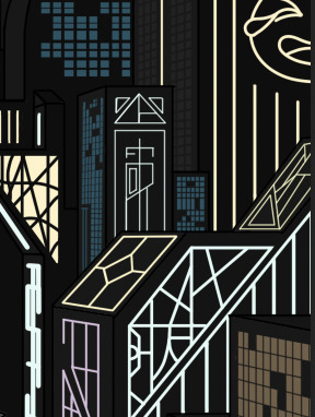
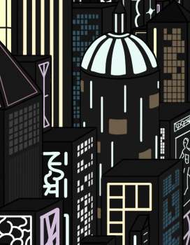
This is after I had added all of the lights and windows. This was such a tedious process, but I felt so relieved after I had finally finished it.
I was excited but also dreading adding the outer glow. I was excited because it would look sick, but dreading it because it meant I had to go over these all again. AND THE LAYERS. I had made different layers for each colour of window and light, it was getting a bit out of hand, but I had them sorted in folders so I managed it all okay.
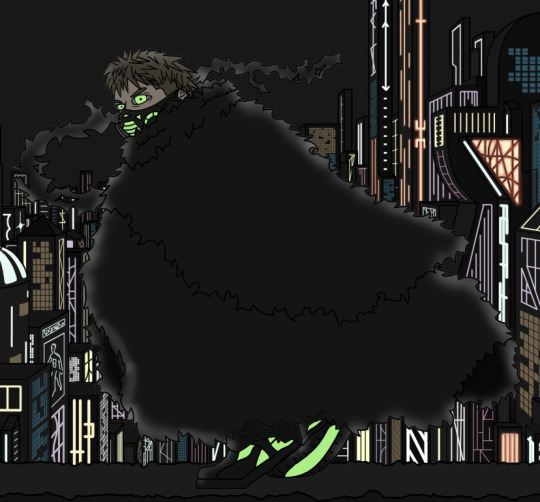
So here I screenshotted midway through adding the outer glow because I also added outer glow to Kane, and made his cloak darker. This was to make it look like the light was coming from behind him from the lights in the city. I had seen shading like this used a lot in many media to show light coming from behind, so I tried tried it myself. I just did it by dotting the edges with a low opacity brush, and deleting anything that wasnt on Kanes silhouette.
Now I had finally finished adding the outer glow to all the lights. It looks so good to me, the colours are way more vibrant, and the lights pop way more. I just did this by using a very low opacity brush over all of the lights in their respective colours, but with more saturation than the original line.
I also added glow to Kane's lights whilst I was at it, and added some light onto the top of the wall coming from surrounding buildings.
Here I added detail to all of the windows, to make them not all look flat and too similar. I just used the normal highlighting techniques and put random shapes onto some of them, I think it added a little depth to them that was much needed.
At this point I thought I just need to do the sky and the helicopter light and I was done, but I ended up adding some extra details which made this poster exceed my expectations.
So here I added clouds to the sky and fog to the furthest away buildings. I actually had no idea how I was going to approach the clouds, because I SUCK at them most of the time, but I was quite happy with these. I just messed around with a low opacity soft brush again, and made these by literally scribbling, which I found pretty cool.
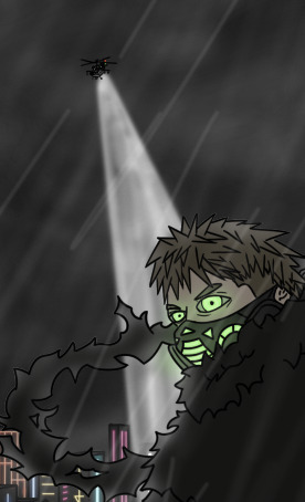
Next was the helicopter and rain. I added lights to the helicopter in red and green, and then a beam coming off of it. I just used a higher opacity white brush for the beam, beause I didn't want it to be a solid colour.
Take a guess what I made the rain with. BINGO! It was a low opacity soft brush, again. I found out it can be helpful for many things, so I used it quite a lot. I used different levels of softness to show some rain was in focus, and some wasn't. I found it added depth to the image, which was nice. I want this image to look like it stretches quite far back.
But now the environment was looking GOOD. I really liked the vibe the rain added to it.
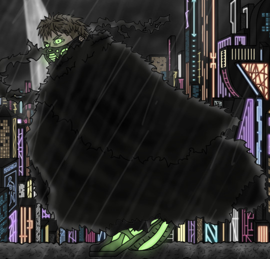

So here I added texture to Kane's cloak, and some lines to the top of the wall he is standing on. The lines on the wall were just to make it look a little rougher, as it's supposed to kinda be a run down wall, so I wanted it to have texture I guess.
Take a guess what I used to add texture to the cloak. LOW OPACITY SOFT BRUSH! It's so good for shading, which I feel is probably common knowledge for digital artists but I am just discovering it so I am allowed to be excited about it. Anyway, I added texture because he looked flat, and I didn't like it. His cloak is flowing, so now it looks a little bit more like it is flowing, subtly.


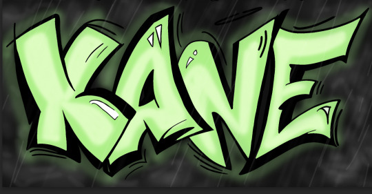
So here, I added outer glow to the graffiti, some texture/mist on the wall, and some detail to Kane's head. Same problem with the cloak, it was too flat, so I added some darker areas and some little streaks in some parts of his hair to make it have more depth. I also added some bags around his eyes, because I want him to look a little tired, he's got quite a stressful job I'd say. I added glow to the text to make it glow, pretty simple. I thought it looked more futuristic like that, and then the wall also looked to flat, so I just brushed over it with the ol' reliable low opacity soft brush.
CONTINUED IN PART 2 ^
0 notes
Text
KANE CRITS
We received critiques on our characters from classmates today. We stuck up our 3 poster designs onto the wall and let people write down feedback.

Overall the feedback I received was pretty good, and quite helpful. The main things were adding the rule of thirds to the tag one, and making the city look bigger, for the Flip one they said to add more into the background, and for the sneak they said to make the title clearer, and add detail to the environment.
I'm pretty sure I'm not going to do the sneak one, as it's my least favourite. It doesn't highlight the character as much as the other two.
I think I'll mess around with the other two and use the feedback to help me decide, unless I decide which one I want to continue with first.
0 notes
Text
KANE THUMBNAILS
After doing the thumbnail collection down in the post below, we had to select 3 to do a full line drawing for to show the rest of the class for crits.
I selected the Flip, Sneaking, and Tag sketches I did. Here are the detailed sketches below, along with a progress photo for each:
Flip


Sneak


Tag

I think I like Flip and Tag the most. I'd be happy with fully completing either of those, but I'd probably end up touching the line drawing for both. But I'll have to see what people say after the crits session tomorrow.
0 notes
Text
3RD LAST CLASS
Today, we learnt about many things, aswell as handing in our final character designs (in an idle pose). We are now beginning to create posters for our characters.
We learnt about what makes a good poster, what makes a bad poster, and themes within different types of posters. We watched a helpful video about themes in movie posters from a movie poster designer named James Verdesoto. He went over different colour schemes and compositions found in movie posters, and why they're used. I found it helpful, but I don't know if the techniques will totally apply to this task, as we have to try and introduce a character through this poster, rather than promote a movie.
We also looked at many other posters to study their compositional methods and techniques.
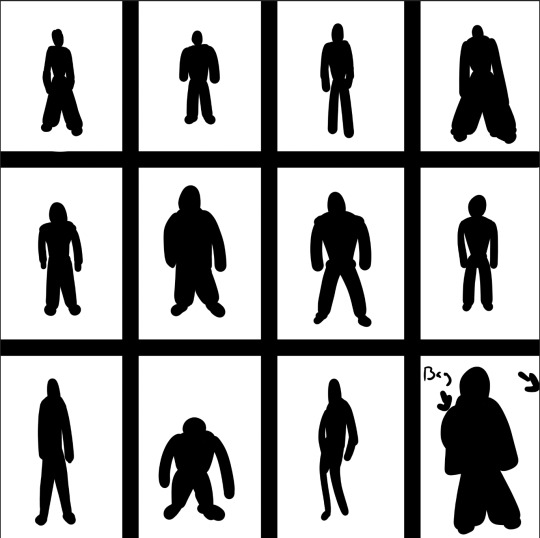
Then we started to create thumbnail sketches for poster ideas. I made 9, and I have selected three which I want to improve on for the crits next tuesday. We also had to create a sketch with a pose based on a photo. They required it. So I had a photo which I thought would look good point a gun, so I used it for the 8th sketch labelled "Gun".

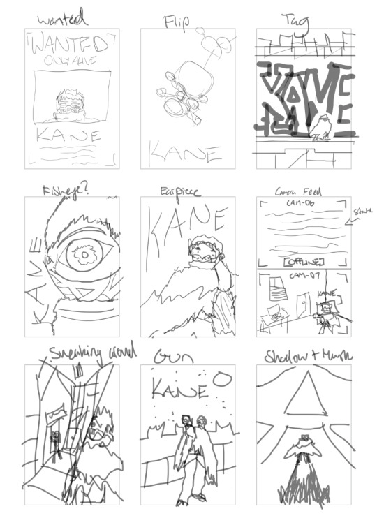
I made a figure in the pose and drew clothes around it, then erased the figure to create the final character in the pose. But, I don't think I'm going to go ahead with that one. The three I want to go ahead with are "Flip", "Tag", and "Sneaking around". I think those three are the coolest ones. I do like the shadow one in the bottom right, but I think it would be a better movie poster than the type of poster we are creating here.
The final thing of note we did was watch a video on perspective. At first I didn't think I'd need to watch it, but after watching it I am glad I did. I will most definetly be applying the techniques shown into my works in the future.
0 notes
Text
KANE PROCESS
I started to design Kane in a normal idle pose, since we were assigned it for homework.
We were to follow the process shown below, and go upto the final step, which is what we will be starting tomorrow.

The first step was the colour palette. We had to create a 5 colour palette for our characters. I chose the 5 colours below because I wanted them to be relatively muted and bland apart from the colour of the lights, which are bright and neon.

So the next thing was to decide on the silhouette, which was the activity in my last post, which I wasn't really a fan of. It didn't help me too much. All I knew was I wanted the character to have oversized clothes with some shagginess to them, which I did end up with.
I wanted the shagginess because jagged edges on characters sometimes imply speed and edginess, and I want my character to look nimble and stealthy, so I thought about giving him a jagged cloak that he can take off when he needs to. I wanted the oversized aspect to make the character look small, as Kane isn't supposed to be large, he is thin and short.
The outfit I made was inspired by cyberpunk fashion. Here's an example of Cyberpunk Fashion I found:

Anyway, the first thing I did was find a pose, we just had to do an idle pose so I didn't do too much with it, just someone standing on an angle. I saw a photo online which I used for reference which is in my moodboard. I thought the pose was cool so I tried to draw a figure in it, I think it turned out pretty well.
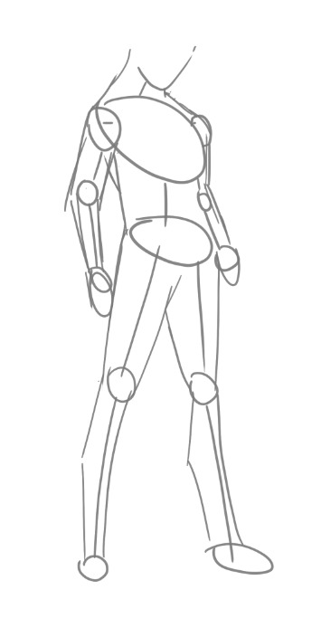
Next I started sketching the character over the pose. I did this twice because I couldn't really base a good line drawing over the first sketch. The second sketch had a little more detail than the first which made it easier to draw over.
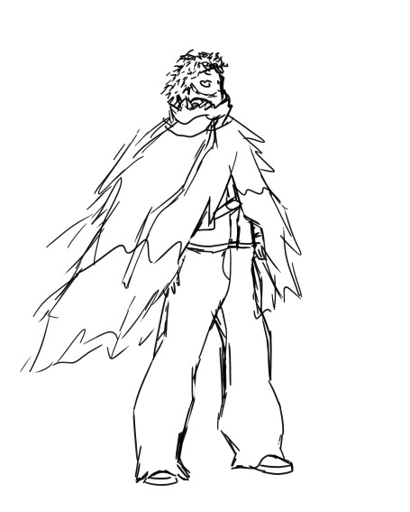

This is when everything started to kind of come together in my head, I was able to decide on details, such as the buckle on the shirt, and what the mask looked like.
I finished the actual line drawing, and decided I wanted a piece of fabric to come off the scarf area on the neck. I also added much more detail to the mask, and decided which areas I wanted to light up, which were the areas around the gas cylinder things and the part in the center over the mouth.
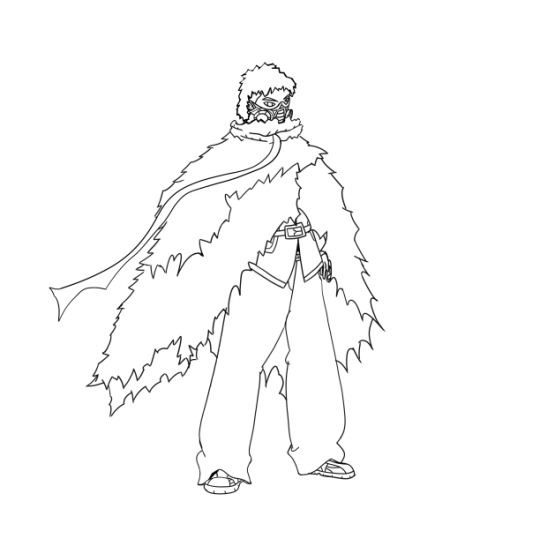
We were required to create 3 grayscale value sets for this, just to see what different colour schemes might look like.

My favourite is the top left one, as I wanted Kane to have darker attire, and dirty blonde hair, so it fit my vision the best out of the three.
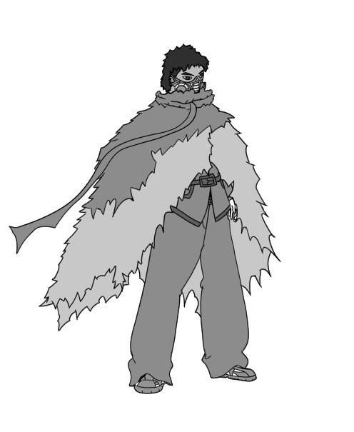
Next we had to create three colour schemes. I already kinda had a vision for what colours I wanted to include, so I didn't do 3 because I already knew what I was going to choose, since I'd already thought about this previously.

I coloured it in with the colours I had in mind. I wanted a super super subtle dark green on the clothing, as I thought it looked pretty cool. You pretty much can't even tell it's green. I wanted the hair to be dirty blonde, as I think it kinda works with the green lights in a weird way. But overall I like this colour scheme. I also only chose to have lights on the face because Kane uses stealth, lots of lights stands out too much, so he only had them on his mask and in his eyes.
Then I added shadows and Highlights, and some glow around the lights. I did the shadows a little differrent this time, as I was kind of sick of the jagged edges on all my previous works. I used the normal process, but then afterwards I'd erase the edges with a soft low opactiy erasor, this made them fade into dark rather than just have solid edges.


Then I added some dirtiness to the cloak because it looked too flat, along with some other details here and there.
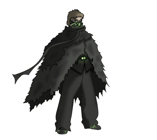
This is the final product, I added a couple more neon lights because I thought it made the character look more interesting and complete. I'm pretty happy with how it turned out, but I feel like I could've made it better if I had more time. But I guess we're saving our time for the actual poster rather than just the standing design, so it makes sense.
I'm excited to try making the poster, I think it'll be fun.
0 notes
Text
KANE SILHOUETTE
We messed around with silhouette. We learnt that silhouette is a very important part of making a character look unique. You ideally want your character to be recognisable from just the shape. The more stylised the character is, the easier this becomes, but the more realistic it is, the harder it becomes.
Honestly, I wasn't much of a fan of this exercise, because I'd rather just draw the character and then see what the silhouette looks like afterwards, rather than basing it on the silhouette. It's harder for me to imagine what the character looks like when I draw it this way, so I. think I'll stick to previous methods.
0 notes
Text
KANE ACTIVITIES
I finished my 100 word description of Kane for the final illustration. This could have a few tweaks in the future, depending on what elements of his character I want to highlight.

I then did the 20 Questions worksheet about Kane, just to come up with more information about him and flesh out his world more.
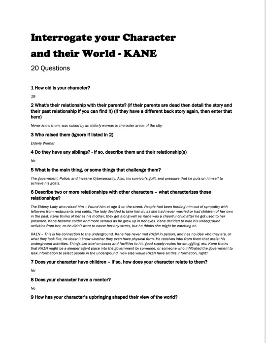
I came up with a few new things while doing this worksheet, such as his family situation, any friends or connections with other characters, and more.
I didn't really think I'd need to do this but I'm glad I did because it helped me decide many things about Kane.
0 notes
Text
KANE
I decided to go with my first idea for the character narrative. I thought it had the most interesting internal conflict, so it would make for the most interesting character.
I named the character Kane. No real reason why, just like the name. I then added more detail to the original brief I made about Kane:
At this point it's been submitted, I'm just waiting on feedback.
Then after doing that I made a little moodboard on my inspirations for this character:
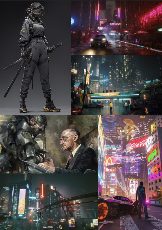
This is the type of vibe I want Kane to have, I think it looks super cool.
0 notes
Text
Character Narrative Homework
For homework we had to create 3 different character narratives. This involved coming up 3 character narratives that are as different as possible.
To create them, we had to fill out 4 categories: -SETTING -GOAL -CHALLENGE -TALENT
Setting involves where they are, the environment around them, and the current situation that environment is in. Goal is what they want to achieve. Could be short or long term. Challenge is what's in the way of them achieving that goal, we split this section into two: Internal Conflict - The struggle of the character within their own mind. External Conflict - The struggle of the character from an external force, such as society. Then Talent is what they're good at, what skills they have etc.
This was a plan formulated in class with some examples:
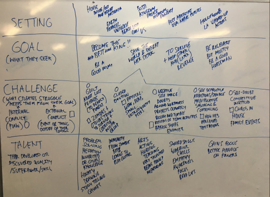
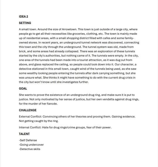
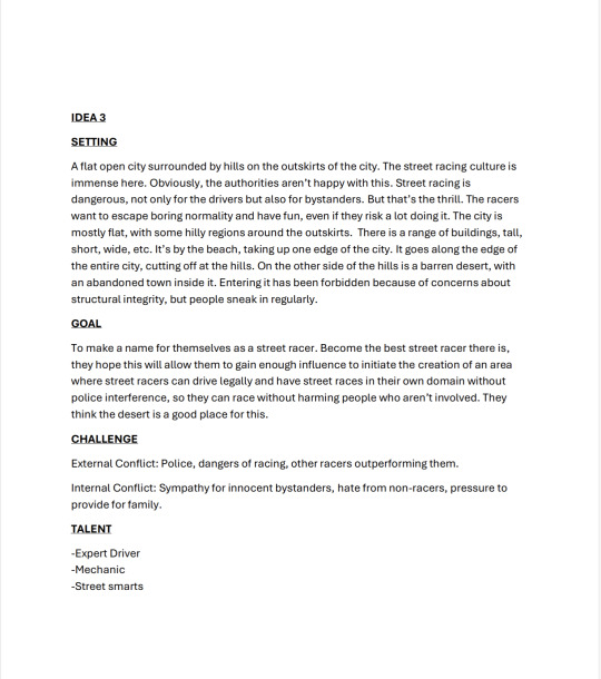
Here are the 3 narratives I came up with. I'm unsure which one I'm gonna want to develop into a character, as I like them all and they would all be very fun to design, so I'll have to see what I lean towards as the design process continues.

0 notes
Text
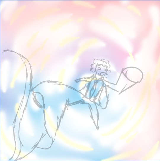
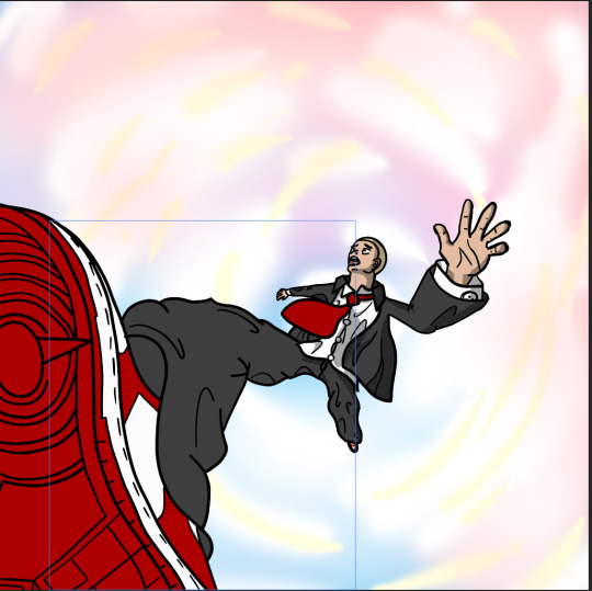
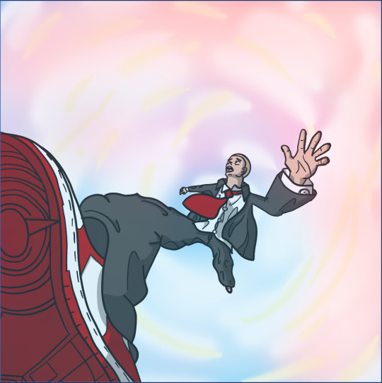
Free Time Drawing
I made this in my own time just for practice, so I thought I'd upload it. It's just a dude falling in the sky I guess.
There wasn't really any inspiration or anything, I was trying to mess with perspective and distortion and all that, as those are skills I want to improve along with proper proportioning in designs. I hate the idea of all my designs just being in blank stickman poses, so I want to get good at drawing with unique perspectives. I think it turned out alright in this image, I think if I was to do it again I'd try and figure out how to make the clothes look more like they're being blown in the wind, because I am not very good with clothes, and that is another skill I want to improve.
One thing I decided to do that was new was duplicating the background layer, making it almost completely transparent, and placing it on the top layer. I thought this made the character actually look like it was apart of the environment, rather than just being a drawing placed on a background.
Here is the process and the final drawing:


0 notes
Text
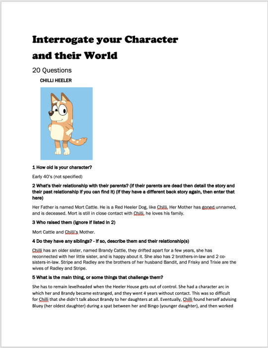
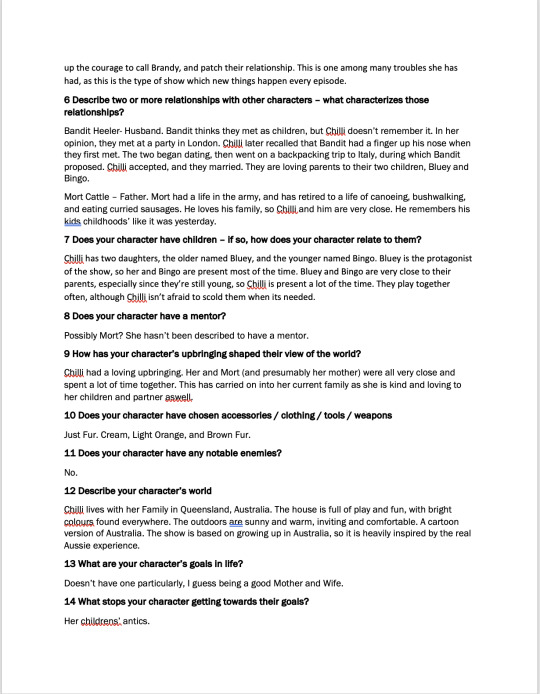
CLASS TASK
We were given characters in our groups, and were each given a task to work on to study the character in depth. Not their design, but their narrative. I was given a 20 question questionnaire to answer. Two others worked on a Moodboard together, and the last person worked on a Word Cloud.
The character we were given was Chilli Heeler, from the Australian children's cartoon, Bluey.
Here is my answered questionnaire:

CHILLI HEELER MOODBOARD

CHILLI HEELER WORD CLOUD

0 notes
Text
FINISHED BEATRIZ
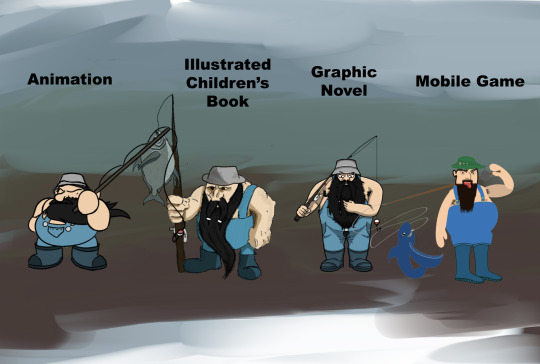
These are the final designs submitted for our brief on Beatriz the Dwarf. Overall much better than the first submission.
I'd have changed the green hat on the mobile game design, and potentially kept it a bit simpler, like how it was in the older version, but otherwise they are all pretty good.
They turned out much like I envisioned, so I'm quite happy with them. They did a great job.
0 notes
Text
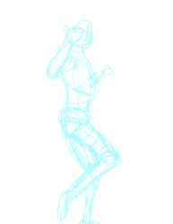
12 POSES PART 2
The second part of this homework task included selecting one of the 12 poses from those created, and illustrating a character in that pose.
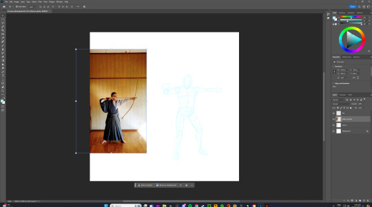
I chose the pose above, which was the 11th pose I made. I drew it from the video of the dancers that we were given, but I thought it kinda looked like an archer shooting a bow. Because of this, I decided to make a Japanese Archer.
I got a reference image for the clothing and colours, and then got to sketching.
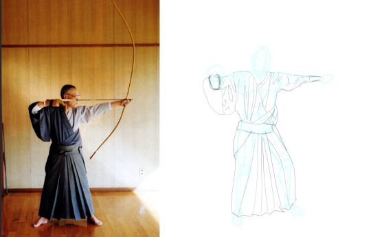

I ended up with this quick sketch as a base for the line drawing. I added hair because I wanted them to look younger, as the reference for the pose was from a younger person in the dance video, and I need to practice hair because I want to get better at drawing it.
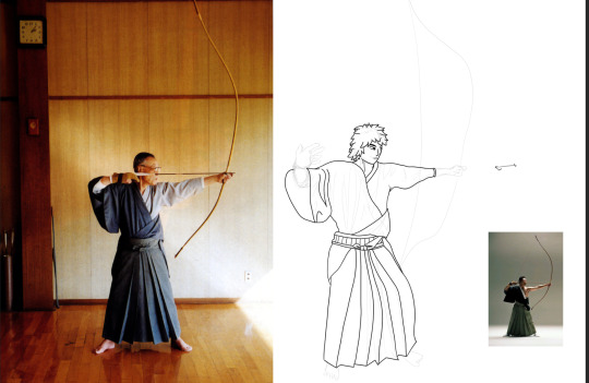
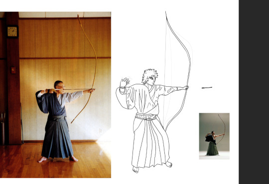

Eventually I ended up with this as the line drawing. It took quite a while, as I had to perfect proportions and actually draw the hands and feet with some semblance of detail and proper structure.

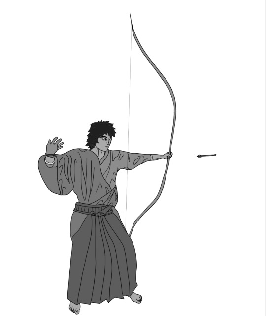
Then I did the values as normal, there was lots of tiny sections since the design had a little bit more detail than usual so it was a bit finnicky but thats okay I was able to handle it in the end.
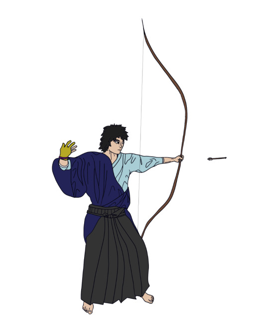
Then I added colour, I based the colours off of reference photos of all the items in the design - the clothing, glove, and bow.
Then I added some darker sections to the clothing, on the shirt, they act as shadows, but on the lower half they're just apart of the colour.
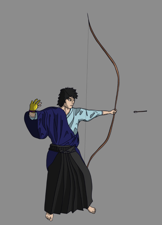
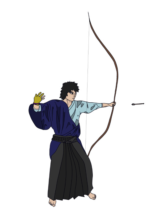
Then I added the actual shadows and highlights to the image, and it was finished.
This was cool to try and design, but it took me a long while to create, but thats alright as it was all apart of the process, I would've taken a break or something but I only had today to make it.
If I was to remake this, I reckon I'd make his left hand bigger, mute the colours, and maybe thin the lines out on some parts of the design. Other than that though I think I'm happy with how it turned out. I think I want to develop an art style at some point though, because I feel like my designs just look kinda MS Paint like, and I don't like that much.
0 notes
Text
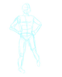
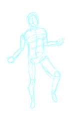
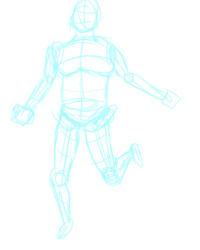
12 POSES HOMEWORK
We were given a homework task to draw sketches of a figure in 12 poses, after watching a video on how David Finch draws his figures. We were to create a series of 12 figures in dynnamic poses using his processes and techniques.

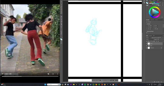
I used a video provided for refences on most of the poses. I'd just pause it on a part I wanted to draw and then go ahead.
The video about David Finch's techniques was very helpful, it definitely improved my figure drawing a lot. I sort of wish I knew about them before I drew Gweegus, as David Finch is a comic artist, so having these techniques might've helped me nail the Graphic Novel style better.
This task was pretty fun, I'd never really tried anything like it before, it's really good practice.

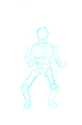
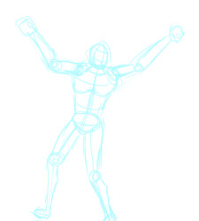
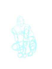
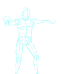
These are the 12 figures I drew, I think I did pretty well on these, since it's my first time drawing these techniques. I had a lot of fun, and I'll definetly be applying David Finch's techniques in my future figures.
The 12 figures close up:


0 notes
Text
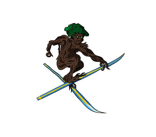
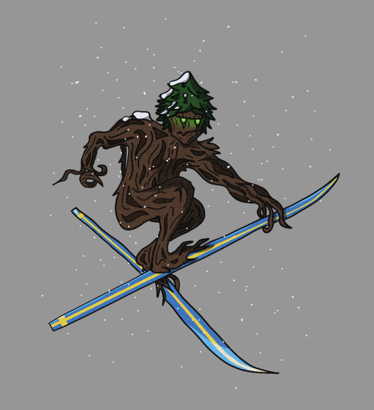
NEW VERSION OF GWEEGUS

These are all of the final versions of Gweegus, and the styles they're in. It would seem everyone was told to include the swedish ski design, which is pretty cool. The designs look much more in unison now, they actually look like the same character in different styles. I think these turned out great.
I like how they're the same character, but they all have individuality. You can tell they're the same, but also different.
If I was to do mine again, I'd lean harder into comic style, with thinner lines and more detail or something. I think that'd be cool.
0 notes
Text
GWEEGUS: OLD VS NEW VERSION COMPARISON
I'm way happier with the second version. The hair/leaves suit the design way better in my opinion. I also like the snow too, it adds an extra element to the design which makes it a little more interesting to look at.
0 notes