
Don't wanna be here? Send us removal request.
Statistics
We looked inside some of the posts by buffybotty and here's what we found interesting.
Average Info
Notes Per Post
9
Likes Per Post
8
Reblog Per Post
0
Reply Per Post
1
Time Between Posts
4 days
Number of Posts By Type
Link
6
Video
2
Photo
7
Audio
2
Last Seen Tumblr Blogs


Fun Fact
70% of Tumblr users say the Dashboard is their favorite place to spend time online.
Link
My Horror Fangirl Video Mashup with Of Montreal’s “It’s Different For Girls”
2 notes
·
View notes
Video
youtube
THE MAGICIANS | Season 3, Episode 9: Under Pressure (Full Extended Versi...
0 notes
Photo
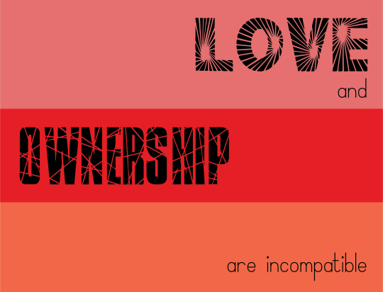


PSA for intimate partner violence. And three images that could further illustrate the design.
1 note
·
View note
Photo

My Flag for the imagined organization “Genre Fans United” (a holy trinity)
Horror symbol: The Claw. I found this to be the most communicative of the genre while not being too much more complicated of a shape than the star and triangle. Monsters we make, monsters we fight, monsters we are. The big ol’ claw reaches across a lot of territory in horror.
Horror color: Red! I mean, blood of course. But also arousal. Rage. Heart. Gothic textiles. Death and sex and all that.
Science Fiction symbol: The Triangle (or is it an arrow?) I did originally envision that the symbols at each corner would be the same color as their own leg/path. But after putting the claw in as black, I preferred the effect and made the other corners the same. This de-emphasized the arrow propelling one into the future, but the triangle in isolation feels right here too. It’s like an alien language or an alien tech. Simple, sharp, unsettling.
Science Fiction color: This soft, bright, blue. It’s like a laser beam. It’s like water. It’s like time travel. It’s like a hologram. It has the energetic feel of scifi.
Fantasy symbol: The star. Again, originally I envisioned the star to be merged with its leg, to have the feeling of magic shooting out of a wand. But now, the star simply IS magic. When you wish upon a...
Fantasy color: This fawny brown. Nature. Wands. Talking animals. Cottages in the woods. Old hands. Dirt. Trees.
Finally, the unifying color of the flag. This sickly lovely green. Green is often associated with life/spring/rebirth--- which is why I chose it. The genres of horror/scifi/fantasy move closer to the truths of life than most others genres, but don’t get credit much for it. They all deal with existential, institutional, social, ephemeral, and corporeal realms in ways that are often not recognized as “real” (and therefore not valid). This green validates. It says, I see you, I see what you are doing and it is life giving to those that love it. This green also is the perfect green to be found in all three genres-- rotting flesh, extra terrestrials, fairies (are just on combination, but there are many more).
I hope that this flag communicates a solidarity across genre fans, and shows how interconnected these forms of storytelling are.
2 notes
·
View notes
Photo

Flag design for Genre Fans (Horror, Fantasy, Scifi) Unitied
PSA on intimate partner violence
1 note
·
View note


Link
First Photo Roman. Music by Thomas Newman: “Yes” and “Everywhere Freesia” from the Meet Joe Black soundtrack
1 note
·
View note
Photo


My second soundscape. I wrote this one with my eyes closed. Paying closer attention to the direction and spacial location of sounds gave way to layers that I could experience simultaneously while honing in on. I was encircled by nature (insects/animals/rain drops) sounds at the most outer-space of the soundscape. Some of those were closer than others. The rhythms and loudness controlled where my attention was drawn at any given moment. The cars were more constant, intrusive, and gave the most directional information. I found myself thinking about the sounds that I usually hear when I am not consciously doing an exercise like this in other contexts. For instance, the buzzing of insects is usually a sound when it comes close to my ears that I have a strong survival reaction to. Also the direction of cars is essential to walking Giles everyday. We do not live in a neighborhood with sidewalks, and have to walk on the road, and I use sound to know when to move over into the grass. Overall, the soundscape encapsulated clearly the area I live in. Not quite rural, not quite suburb, but somewhere overlapping and in-between.
0 notes

Video
youtube
Norman McLaren’s Begone Dull Care (1949) got me thinking about the figure-ground relationship. In some of the more rapid sequences, the figure-ground relationship becomes unstable because the shapes/movements/colors/textures are overlapping and I cannot differentiate the figure to the ground based on usual tells (like relative size of the elements to each other). It was pleasurable to have the images and the music animating each other in such a way that seemed to give both more life than they could ever express on their own. The sequence in the middle utilizes common fate to guide my eyes to follow the lines as they move together, apart, in groups, and alone.
Makes me nostalgic for that sexy fish

0 notes
Link
Frank and Caroline Mouris’ “Frank Film” is an avalanche of visual and auditory information. And yet, because the colors, shapes, and categories of the cut-out objects stay the same as they spill across the screen (when we are hearing about hands we are seeing hands hands hands fingers fingers fingers nails nails nails), I am able to perceive the whole without being overwhelmed by the many parts. Often the cut-outs will spiral out from the center, following on the same line or curve in good continuation. Sometimes a bold color in an object dissimilar to the rest in the visual field will announce its difference and take focus for moment, exploiting similarity. Because everything is overlapping (including voices), I cannot separate anything. Everything is in proximity and nothing is disconnected so that everything can be experienced simultaneously.
0 notes


