
Statistics
We looked inside some of the posts by c-robertson and here's what we found interesting.
Average Info
Notes Per Post
10
Likes Per Post
0
Reblog Per Post
10
Reply Per Post
0
Time Between Posts
6 days
Number of Posts By Type
Text
17
Last Seen Tumblr Blogs


Fun Fact
Tumblr’s reach among the 26-to-35-year-olds in the US is 11%.
Text
Print Essay
The printmaking processes I see myself working towards are Screen printing and lino printing, what are these processes? Screen printing is the process of pressing ink through a stencilled mesh screen to create a printed design, this is an effective technique for creating bold prints, posters and other artworks this style is can even be used to print fabrics and textiles, allowing the user to have great freedom in making custom designs and products. Lino printing is the process of carving out an image on a piece of lino covering it in ink and pressing it on to a surface with use of a printing press or pressure, this technique is good for making both bold and detailed designs with the ability to print on almost anything and once a lino print is made the user will have the cut stencil always for future use, this makes this technique incredibly useful if kept in good condition.
Shepard Fairey born February 15th 1870, he is an American muralist and graphic artist, his work I have picked to look at is his very well-known 2008 “Hope” poster showing the U.S president Barack Obama during his presidential election. Fairey had always show an interest in the skateboard culture, he had started by designed and selling his own designed board and shirts, in 1989 he was experimenting with street art and made his first “sticker campaign” of Andre Rene Roussimoff, a professional wrestler, the work he made was captioned “Andre the Giant Has a Posse”. His work had gained massive attention and made his next work a great success selling at least one million copies and this was another sticker but more refined, this portrait had only one word, “Obey”.

In this artwork we can clearly see the U.S president Barack Obama, this was made during the 2008 presidential election, this gained massive support to Obamas causes and easily did help grow awareness and helped him win the election. The text is big and bold with using the black of Obamas suit to stand out even more, the success of this image come down to the symbolic value with him being the first black president it will be giving America a new start and hope for the future. The use of the mix of colours in this work help to make it look less plain and boring like most political posters, I don’t know if it was intentional but all the colours of the American flag are on this piece although the blue isn’t the correct shade, but the blue has also been used to show tone and light perception creating shadows on the face with the while colouring where the red has been used to completely shade one side of the face. I like this work, I think it’s the use of colour and the deeper meaning behind it, I don’t really take much interest in politics but I remember learning about this when I was younger and I liked how it seemed that America was going to become a better place and there would be far less hate and race crimes, but the current situations beg to differ. This work is overall successful.
Chuck Sperry born February 5th 1962, an American artist known for his many screen prints, he prints on paper and oak panels and have made limited edition posters for rock bands and political protest art, his work has ranged from that of astronauts on the moon to portraits of the famous. In 1984 he lived in Columbia for a year, in this time he made his first punk rock flyers, edited the Java (an underground newspaper) with Ann Wood. Sperry moved in 1985 to New York city and he co-made WW3 illustrious with Seth Tobocman and Peter Kuper, 1994 Sperry got his first commission from Arlene Owseichik, he created a Fillmore Auditorium poster for Bill Graham. Later Sperry joined Ron Donovan and Orion Landau and they made their own printing company called Psychic Sparkplug, where they made many rock posters, this became such a big deal because this was the first time a rock poster artists used metallic gold and silver inks in this genre.

Widespread Panic Lady Liberty, is the name of this poster made by Chuck Sperry. The first thing I noticed was the lady in this piece, she as a light blue skin with darker shades meaning there is shadow in this work telling us the light is coming from off the side, she has a flowery pattern on her skin matching with the flowers of the background. I feel that her eyes are a main focus, it just draws me in her green eyes work well against the pale blue and even with the black of her eyes match well with it. Also her hair is a light orange/ginger which stands out against all the colour used in this piece as there is no other colour that matches it and it covers the whole image, this just draws more attention to the lady. I don’t like the how the text looks, I actually didn’t notice it till I looked into this for further information so I thinks its hard to see the text, the darker blue makes it hidden I think if it was white rather than blue behind the text it would look better. This work feels calm and peaceful to me, the flowers, the women’s expression and the colours are inviting and calming she looks like she is laying on a field of flowers and is content. Now I do like this work, the colour is nice and pleasing to look at, its not plain or flat your eyes follow the image and scan the whole piece but as I said I don’t like the text, I just think its hard to notice.
Cyril Edward Power born December 17th 1872 – died 25th may 1951, English artist best known for Linocut prints. When WW1 broke out Power was commissioned into the Royal Flying Corps, there is some who think that what he saw during his service affected him deeply and its part of the reason why his work changed from architecture to artwork, he left his wife, his family and moved to London becoming an artist beginning his 20-year partnership with Sybil Andrews, 1920. Yes, he did do painting and etching with other art styles but it was his linocut work that showed his masterful use of colour, form, and line, he tried his best to capture the “rhythm” of life.

The name of this piece is The Merry-Go-Round by Cyril Powers. A very great looking lino print, the object in this is a merry go round in motion? I think it is in motion because the “seats” looks like they are swinging and moving around the centre, the use of placement and line art help shows things are moving as they are larger at the front and small in the back showing they are disappearing behind the centre. I’d say that all the swirling shapes in this piece are really good a leading your eyes over the work, I get a slightly dizzy feeling looking at the pattern in this even the stairs leading up to the first platform. I like this, I think it’s the use of pattern and colour I like as I do link prints so I can appreciate how difficult it can be to make detailed patterns and designs and it turns out great. I don’t like how wave all the lines are it makes me feel a little dizzy but overall I like this work.
So, in Conclusion looking all these different works I can say just by looking I have seen something for new interesting ideas and I have learnt some ways I could try stuff I haven’t done. I’d say the “Hope” art is my favourite out of the three I looked into, I just really like the colour, the style and the message/value behind the piece, the others I like too but not as much. Its clear that I have so much still to learn and I am very interested to learning more and making more of my own work.
Sources:
https://www.britannica.com/biography/Shepard-Fairey
https://en.wikipedia.org/wiki/Chuck_Sperry
https://en.wikipedia.org/wiki/Cyril_Power
0 notes
Text
Alasdair Gray Art Analysis
This artwork was made by Alasdair Gray is a very interesting piece. It shows an elder man sitting with a lion and a ruined building behind him with what looks like phoenixes perched on trees. At first, I wasn't sure what to make of this art but I actually like it, I think it’s the art style and how the image seems to have a much deeper hidden meaning, the symbolism makes this work more interesting and worth a second look, the art style is pretty simplistic and flat yet its busy and interesting to look at. I can’t help but notice how the old mans eyes are locked into making eye contact with the viewer it grabs your attention, this work is very thought provoking it gives me more questions than answers like what is he writing, what are the purpose of the birds, why is there a lion, what is with that odd ball in the raging sky. I want to know what the story is everything seems here for a reason but why? This man is either a poor homeless man or maybe a monk of some kind but whatever he is he looks content almost in a mediative state. Over all this piece is nice to look and has more meaning than it looks, a very good and interesting piece of work but I still want more answers.

0 notes
Text
Task: Printmaking Timeline
Photocopy Invention
In 1959 Xerox released the first modern photocopier, created by inventor Chester Carlson, they were called 914. Large, heavy and difficult to use, the copiers weren’t that reliable at first as many would catch fire during use. In order to photocopy the 914 used a rotating drum to that created an electrostatic image, then transferred to fresh paper with toner then lastly it was all sealed with heat, even with the risk of fire the machines could produce prints in only seven seconds. This marked the start of new photocopying technology and this would speak across the country heading to offices and other printing businesses.
The man behind all this Chester Carlson was signed for an agreement to license electrophotography in December 1946 for commercial use, however it would still be years before people would use this printing as we do now in modern day. Now adays copiers are far more multifunctional, used for copying, printing, faxing and scanning. More advanced ones are touchscreen and wireless, these machines have come a very long way in functionality.
business.com. (n.d.). History of Photocopiers. [online] Available at: https://www.business.com/articles/history-of-photocopiers/.
0 notes
Text
Task: Printmaking Timeline
Ancient Egyptian Printing
Scientists under the European Synchrotron, Grenoble, France and the University of Copenhagen, Denmark have made a discovery in the use of inks in ancient Egypt. They discovered red and black inks used in ancient Egyptian papyri 100-200 AD. This has birthed many hypotheses about Egyptian writings, an analysis on techniques mainly synchrotron has shown that lead was very likely used for drying rather than as a writing material, this is similar to 15th century Europe with the development of oil painting. The ancient Egyptians used black ink in their writings, black ink was used for the most of the written text whereas red ink was used almost like we use modern highliners, it was used to highlight headings, instructions and words of importance. As the result in decades of study from scientist and historians have come to the conclusion that the invention of ink had originated in ancient Egypt and in Mediterranean Cultures (ancient Greece and Room).
One of the scientists had this to say “By applying 21st century, state-of-the-art technology to reveal the hidden secrets of ancient ink technology, we are contributing to the unveiling the origin of writing practices,” Marine Cotte explained, a scientist at the ESRF, the scientist had more to say on the matter “Something very striking was that we found that lead was added to the ink mixture, not as a dye, but as a dryer of the ink, so that the ink would stay on the papyrus,”. They came to this realisation because they were unable to find any other you of lead (white lead, minium). Surpingly the ink recipe is related to paint particles that weren’t developed until centuries later, during the Renaissance.
Facility, E.S.R. (2020). Ancient Writing Practices Unveiled by Red and Black Ink From Egyptian Papyri. [online] SciTechDaily. Available at: https://scitechdaily.com/ancient-writing-practices-unveiled-by-red-and-black-ink-from-egyptian-papyri/.
0 notes
Text
Who inspires you? Why? (Printmaking heroes) Task: 1. Do you have a favourite printmaking image?
I personally don’t have any favourite print makers, but I do like the pop art style of Andy Warhol’s prints. I just like his work I think it’s the bright colours and the art style its self I like, it nice to look at and it eye catching so it grabs my attention.


Task: 2. What type of printmaking inspires you? Why? (Genre, style etc.,)
I don’t have any print/art styles that inspire me, I like all different types and styles. I would like to experiment with more styles myself to learn more about what I like, that said art/print styles I like are Pop Art, Engraving, Screenprints, Linocut, Digital Prints. I like these styles because they can all make a finished print look drastically different from each other and I would enjoy getting to try a wide variety of styles like these.
Task: 3. Who inspires you? Why? (Printmaking heroes)
I haven’t found any Printmakers that inspire me at least not yet, I just try different stuff and see what works. But I don’t really spend time looking at famous printmakers its something I may start doing as it could help with ideas and prints.
0 notes
Text
Task: Final Piece

This is my final piece for this task. Out of all my final experiments I like this one the most, its style is very noticeable and I feel the style is more eye catching than the other finals I made. The software I used for this was Adobe Draw and Canva, I used these softwares because Adobe draw gives really good control and digital drawing and Canva has a very wide variety of editing and effect options also it was all I had access to use.
0 notes
Text
Task: Final Piece

For this I created it using Adobe Draw on my phone, I was listening to the recycled orchestra while I made this. The music spoke to me and I just let it out, yes its random but I like it. Just the use of simple shapes to make bright and interesting artwork, sometimes simple is good.
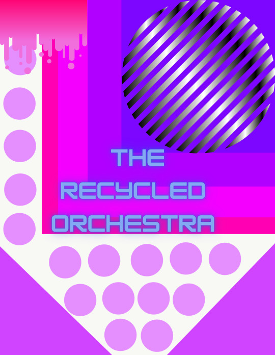
With this I had taken the first image and made some edits in Canva. I just felt that this needed more work to be less plain so I added some minor changes as well as the text so its clear what this work is for.
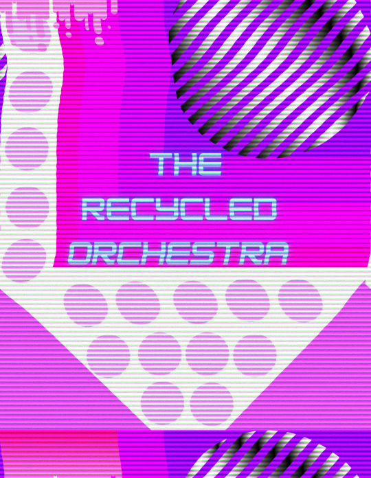
Once in Canva I decided to mess around with some effects, this one is BadTV-Rerun. I like how its distorted but still clearly visible, I feel this makes it look far more interesting to view. Its more eye-catching.
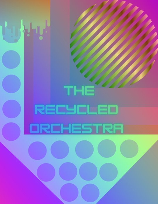
More edits from Canva, this effect is MixColor-Rainbow. Its interesting to see how the colours change and blend, yet its still not a massive change it still hold the original look but with a bit more flare and it looks less simple.
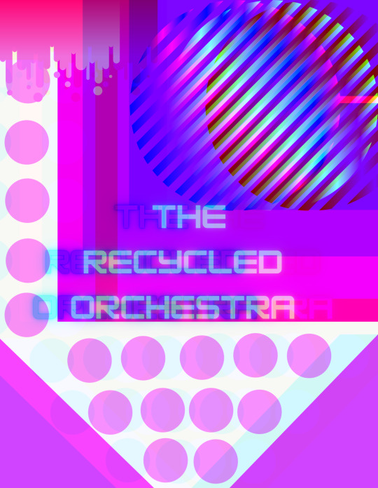
Effect Glitch-Split. This effect from Canva is just odd compared to the pervious two, its almost like a glitch program on a computer. Against the other two this stands out and is very noticeable, it looks wrong and somewhat broken. However its my favourite and I really like it because it stands out and because it looks wrong, its different and thats good.
0 notes
Text
Task: Music Response
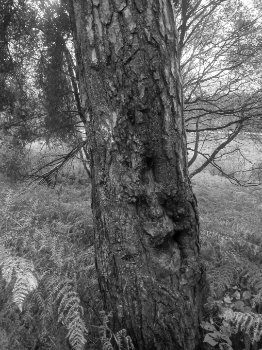
Music: Conductor
For this image I decided to relate it to a conductor, the reason is because its the main focus, the branches behind are small and little making the tree have a much stronger focus. I used Canva to edit, I made the image greyscale and then I added the Glitch Mirror effect. The Mirror effect makes the tree even more focused and commanding, the branches behind are lessened even more and I think it looks like the tress has a face and its looking straight at the viewer demanding attention. Lastly I added the Duotone Sepia effect, it makes the image look older and nicer to look at.
(This is the original image)


1 note
·
View note
Text
Task: Music Response
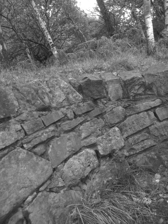
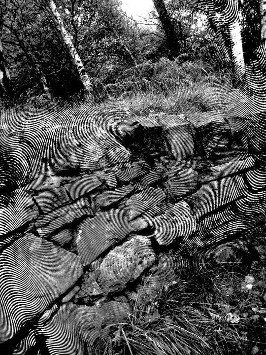
Music: Piano
The stones on image made me think of pianos, the white stone reminds me of the keys. I made the image greyscale and then did more editing on canva. On canva I added the Screen Semitone effect, I felt that I needed to add something more so its less plain and I picked semitone because the black lines added by the effect are like the black keys on a piano. So now the images relates to a piano more now.
(This is the original image)

1 note
·
View note
Text
Task: Music Response
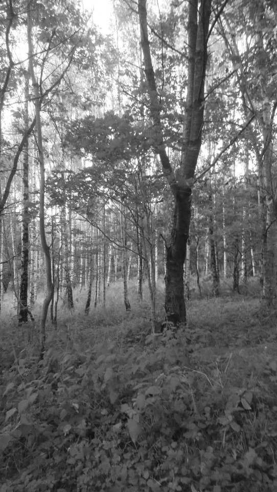
Music: Concert
This image I decided that with some editing I can relate this to a concert. My reasoning is that the trees are all standing together like a large group. I used Canva to make this, I made it greyscale then added Liquify Melt effects. I used the melt effect because it makes it look more uncontrolled and messy. I then added the Duotone Fuchsia effect to make the colour change as most concerts the crowd is like a bunch of lights. I pick these effect because it looked better than the others at representing a concert.
(This is the original image)


1 note
·
View note
Text
Task: Use Adobe Draw to make designs inspired by The Recycled Orchestra (Continued)
Just a quick draw I did one morning, was trying different things and getting myself more familiar with Adobe Draw.

1 note
·
View note
Text
Task: Use Adobe Draw to make designs inspired by The Recycled Orchestra (continued)
This is more Adobe Draw work I made while listening to the Recycled Orchestra but it was at a later date than my first. These are much better and I like them more. I was a little more familiar with Adobe Draw and I spent more time on these. I think they worked out well and I like them.

1 note
·
View note
Text
Task: Use Adobe Draw to make designs inspired by The Recycled Orchestra
This is the first time I used Adobe Draw and I had no idea what my stuff was going to look like when done. But I like them, they are random, a bit messy but it was my first try. While I made these I was listening to the Recycled Orchestra and my work is my interpretation of the music.

1 note
·
View note
Text
Task: Recycled Orchestra Logo
For my logo I decided to make something simple. First I got A3 size paper and spelt out “The Recycled Orchestra” with masking tape. Then I painted the paper, the colours I used was a blue and red acrylic paint. They mixed together and made a blend of colour but sadly this images doesn’t show it off that well.


1 note
·
View note