Last Seen Blogs
mysteriousshiver
a little bit amusing

gyannkoisutorateji-cg-blog
ギャン恋ストラテジー

blackstorm-50
BLACK STORM
yaraviths
Yaravith's
vivivolare
The Gayest Around
Text

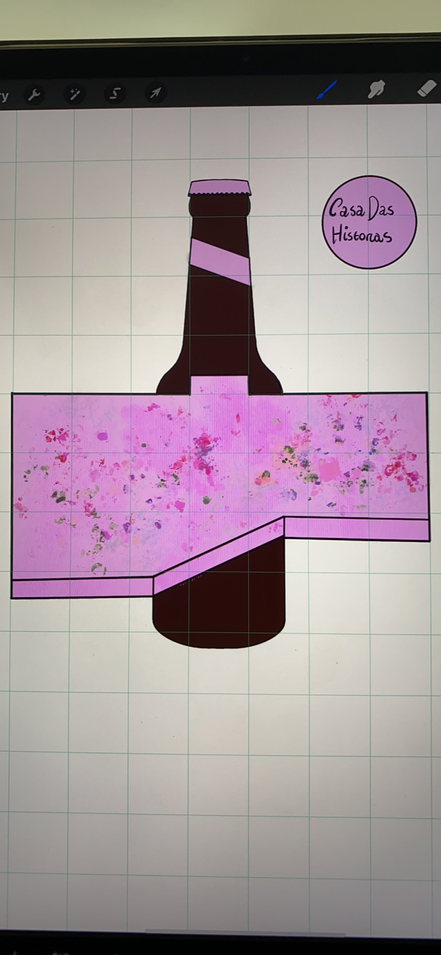
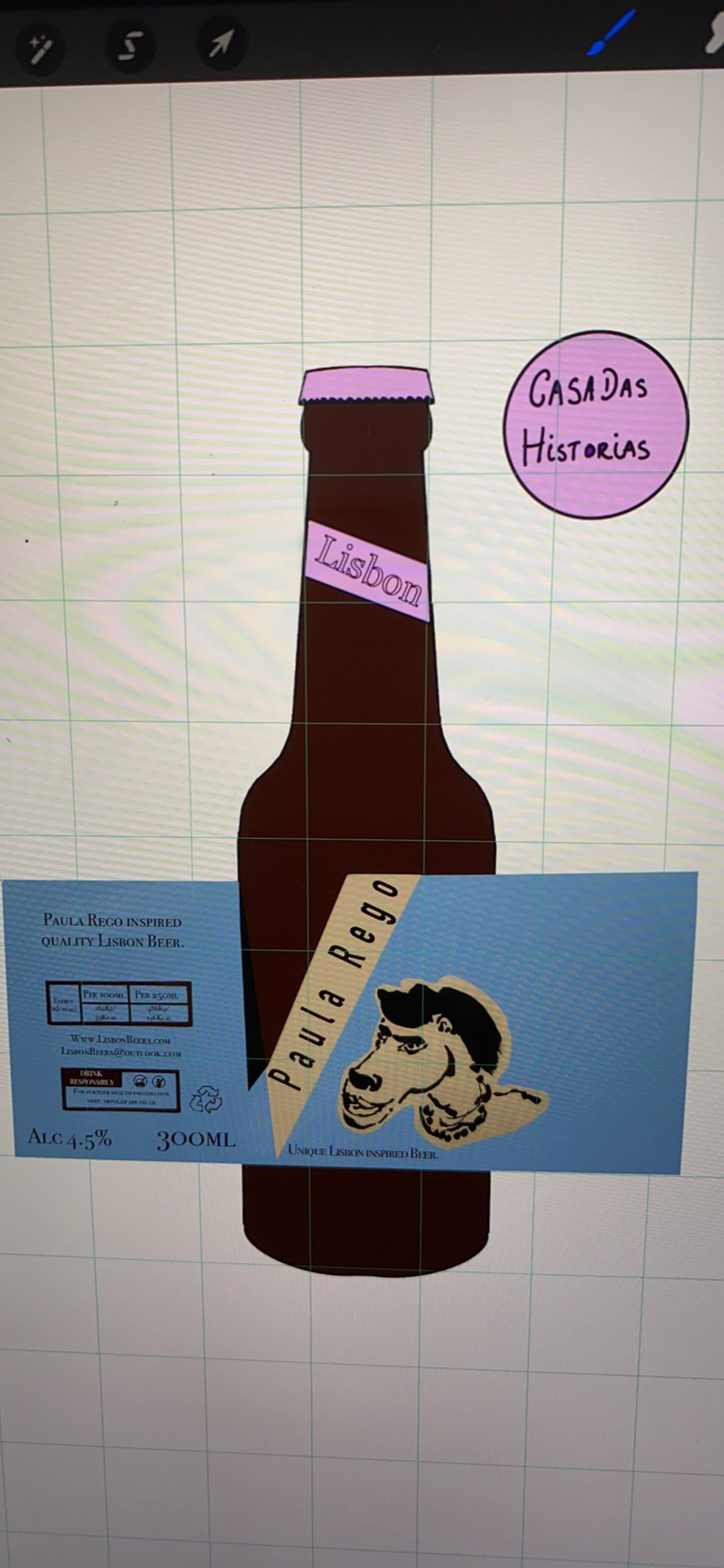
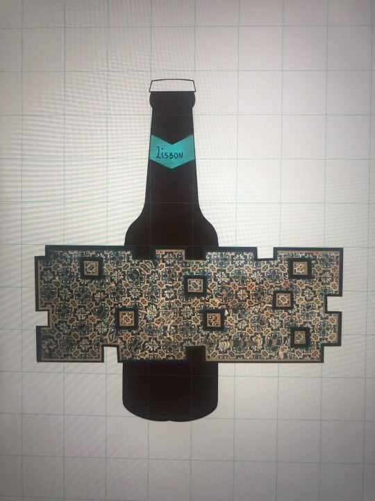
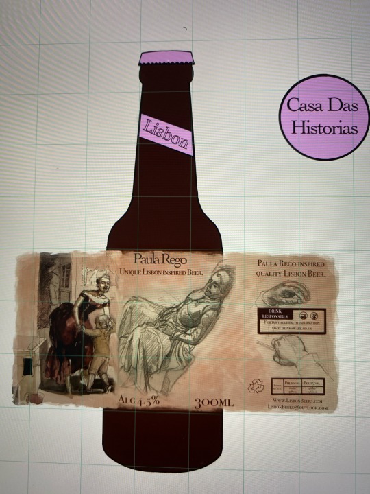
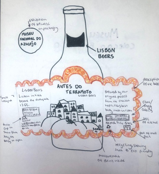
I have picked these designs to be my final packaging wrap. I have now one bottle for the exhibitions:
Museu Nacional do azulejo, museu colecao Berrardo and Casa Das Historias.
I’m happy with my outcome as I feel all bottles have a different feel, they are all eye catching and colourful to represent what I saw and felt in Lisbon. If I was to do this again I would experiment more with the imagery, maybe create screen prints and layer onto one another more. Referring back to my brief I have used both tiles and layering to create my packaging, I experimented with Procreate as a app to help me visually.
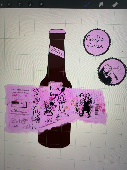
For my bottle caps I decided for them to have different designs but for it to be something collectible.
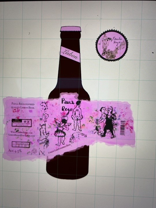
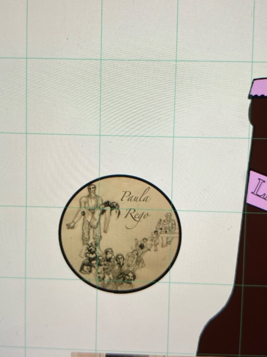
For my Paula rego cap, I used the pink colour scheme with a back line drawing finished off with her signature. I feel like this would make it more meaningful as there’s something to keep after/as you drink the beer.
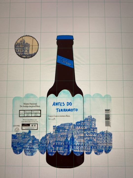
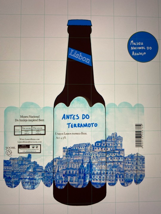
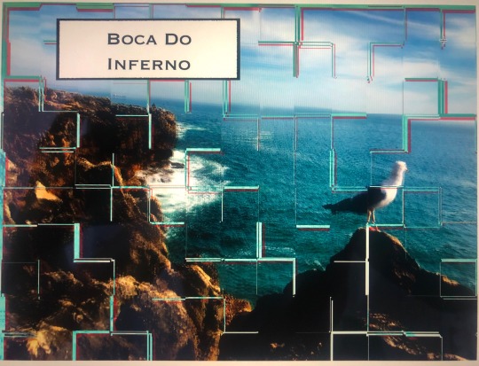
My Antres do terramotto cap is a couple of tile from the package wrap but more refined, the tiles are more clear and still follow the colour scheme of the bottle. For this cap I didn’t add a signature as the art work is a symbolisation of Lisbon before the earthquake, I wanted the focus of the bottle to be on that meaning of this and not the artist who created it, therefore I just had an image.
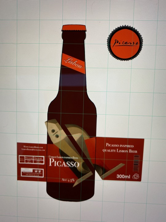
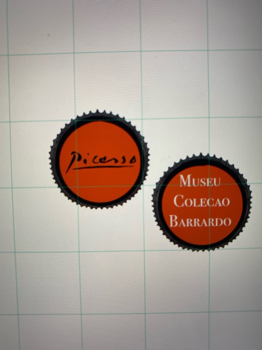
My Picasso cap is simple but sufficient, again following the colour scheme I added his signature so that it’s a memorable piece that can be collected. As my bottle wrap is mainly focused of the whole image I didn’t want to overpower that.
1 note
·
View note
Text


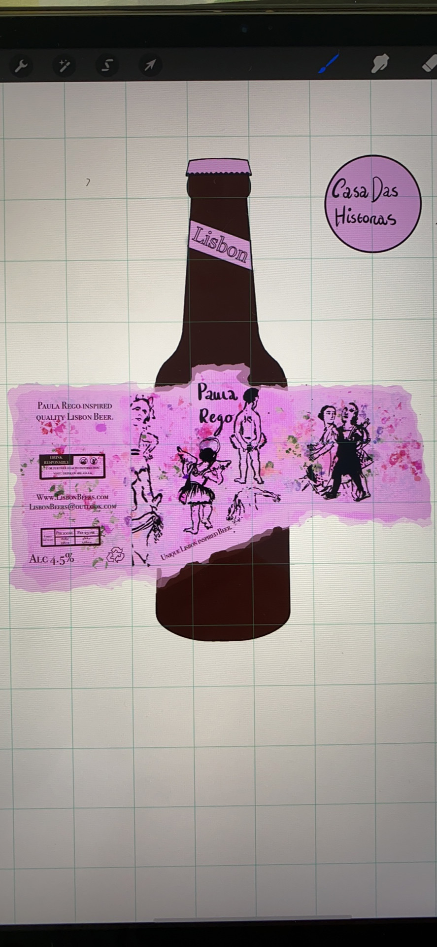
These are my final designs for my beer collection. The all have the same packaging information that beer wraps need. For my caps I decided for them to be different themed so that it’s more symbolic to the exhibition/artist.
I also changed the font of the ‘lisbon’ writting at the top of the bottle as I felt like it was too chunky and didn’t fit in with the context, I picked this font as it looks more elegant and fit with the wrap designs. I wanted to add some effect to the writing so I layered the text in both black and white, to corospond with the wrap either the white text is in front or the black. I liked the definition that it gave and was glad with my outcome.
0 notes
Text


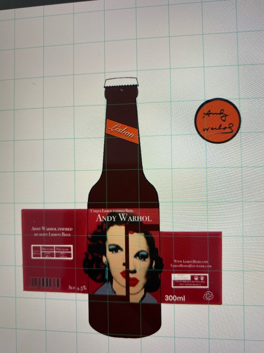
My final collection design was for ‘ Museu colecao barrardo’ I picked 2 artists from this gallery to create packaging on.
My next design was based on Andy Warhol’ artwork of ‘Marilyn Monroe’
I began with editing the image using effect tools, I liked my layout of my last design so I decided to do something slightly similar.
I continued developing my packaging layouts and details till I was happy with my outcome. For my bottle tops I decided to go with the same theme on all, so I inserted Andy Warhol’ signature on one design, and used the galleries name for another.
0 notes
Text
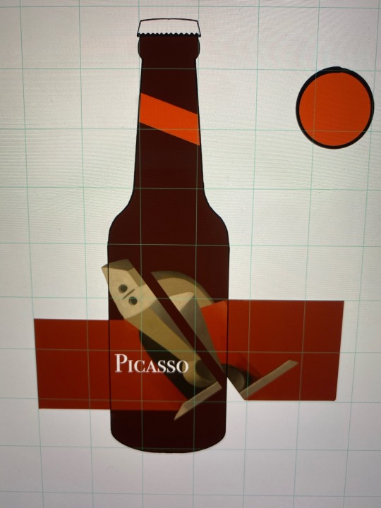


My final collection design was for ‘ Museu colecao barrardo’ I picked 2 artists from this gallery to create packaging on.
One being Picasso I picked his paining:
‘femme dons in fauteuils’
I cropped and sectioned his art work and created my own layout for the wrap around. I really liked my outcome, I used different effects and tools to make the image fit in but become the focus point too. I continued developing my idea with the positioning.
I then inserted my packaging details till I was happy with my outcome. For my bottle tops I decided to go with the same theme on all, so I inserted Picasso’ signature on one design, and used the galleries name for another.
As for my other bottles I found that having the signature made it more collectible and interesting as it has more value. So I decided to pick that design.
0 notes
Text


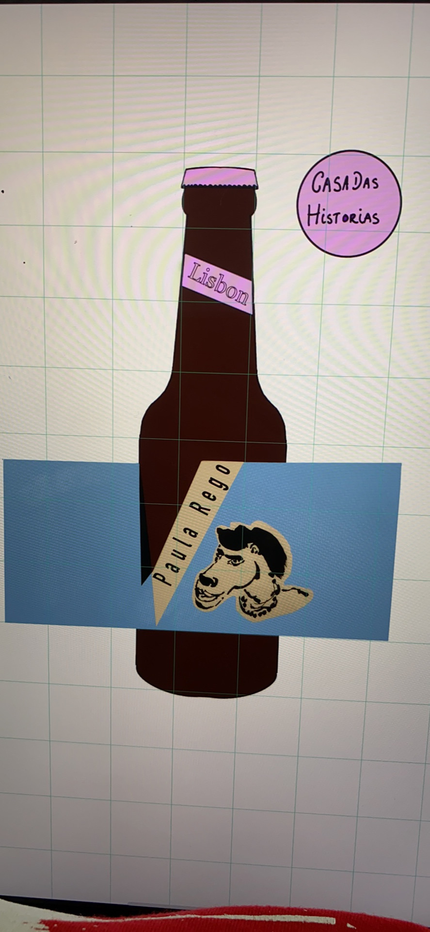
I decided to focus more on developing the caps on the beers so, I drew out some more designs.
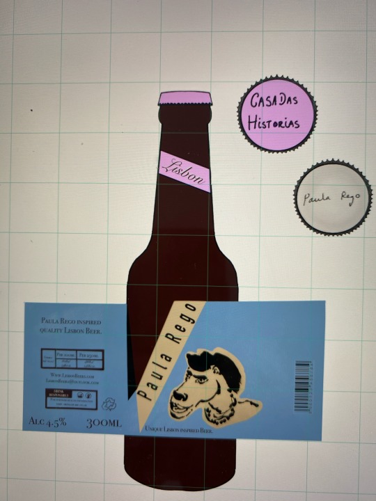
These are for the Paula rego bottles, I used her exsisting work to recreate a something collectible and memorial, I decided to use the signatures of the artists as this is something that all artistic customers would love to collect and would draw more attention to the bottles as a whole.
0 notes
Text


My next Paula Rego design was a lot more colourful, I decided to use her black line drawings and contrast it with one of my bright coloured backgrounds. I began by creating the backdrop, I wanted it to look floral and I brushed over it with a cardboard effect so that it seems more organic. After inserting the images I played about with the composition of the images and added another. After the packaging details bringing it together, I decided that the borders changed the focus point and made it look less like paper, so I experimented with creating different effects on the edges so that it fitted in with Paula Rego.
0 notes
Text

For this PaulaRego design I enjoyed using her work to recreate a more contemporary packaging piece. I created a layout with colour and inserted an edited photograph of her artwork. I then added in all the packaging details needed
0 notes
Text
I tried out a different background for my Museu National design but I didn’t find it successful and didn’t progress this idea
0 notes
Text


This was one of my Paula Rego designs, I began with the background and merged 3 pieces of her work. I decided I want to add colour so using the watercolour tool I created this effect. I experimented with black border frames but decided that it looked better without. I wanted to give an effect to the wrapp so I decided to make the edges look more rough, so that it fitted in more with her style of work. I layered colour to give this look and layed out the packaging detail so that it fits with the image perfectly.
I created a colour scheme for all of the different themes, Paula rego being pink, I decided that all labels would have the same design just different colours.
0 notes
Text


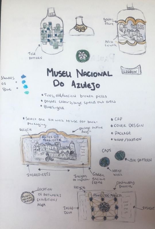
I started to draw out the designs that I liked and continues developing them further. I started with the background and frame as I wanted to have something gold to make the image stand out, after adding the artists work and packaging information I decided that it would look better without a frame so that the image is the focus point. I used a variety of different textures and filters to create the background on procreate and I like my final outcome.
0 notes
Text
I made a clearer plan of how and what information I wanted on my packaging which I continued drawing using procreate.
0 notes
Text
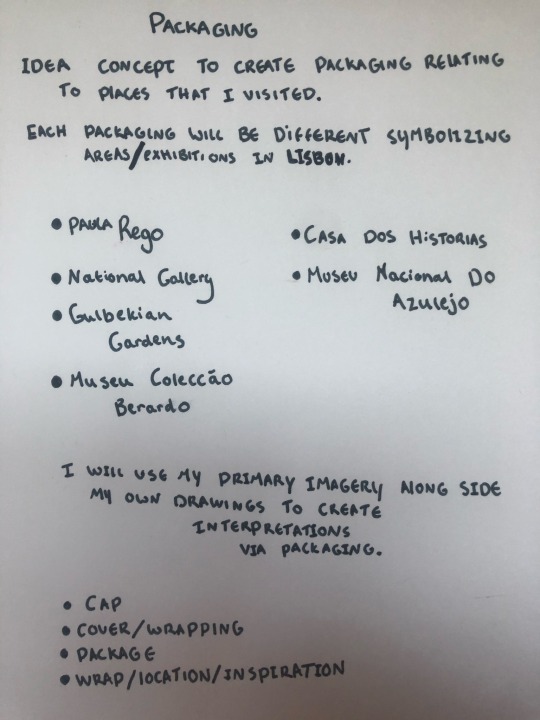


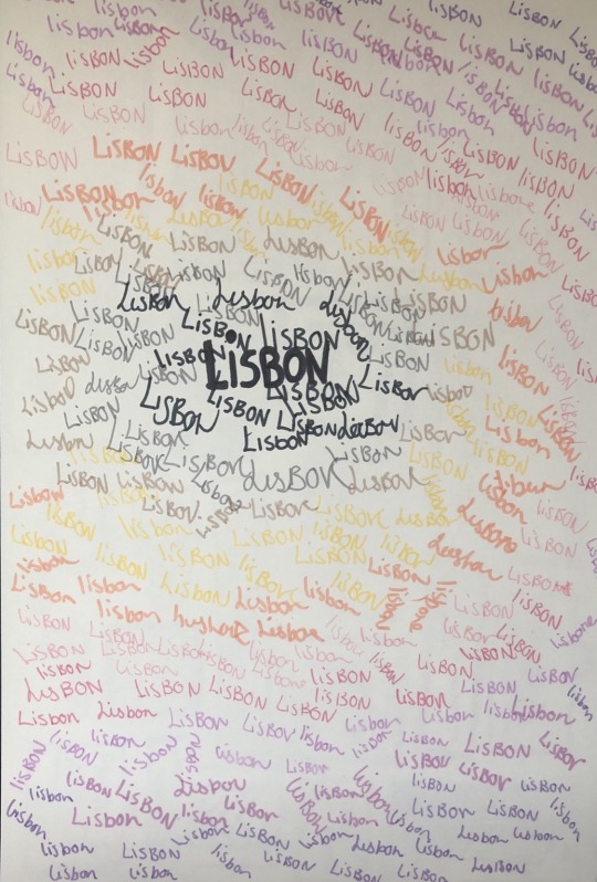
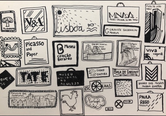
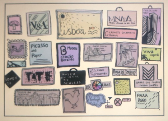
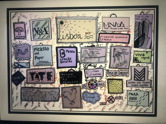
I began brainstorming ideas, to created imagery that symbolises differny places in Lisbon.
I picked 3 topic areas:
CASA DAS HISTORIAS- Paula Rego exhibition
MUSEU NACIONAL DO AZULEJO- Antes Do Teramoto
MUSEU COLECAO BERRARDO- Andy Warhol, Picasso
0 notes
Text
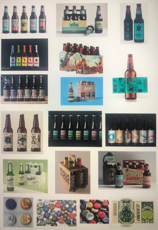
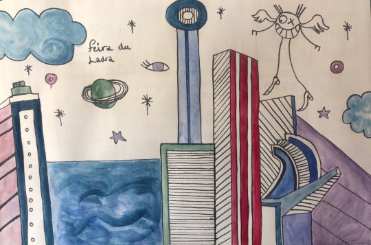
I decided to create imagery that shows layering for packaging. While looking into the city ‘LISBON’ I decided to collect imagery of beer bottles.
0 notes

Text

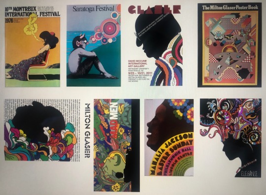
ARTIST RESEARCH: Patrick Thomas
I picked this artists becauseI like the way that he uses opposite colours such as red/ blue to layer imagery, I find that this creates a focus point and makes the image stand out more. I also created a response to this artists work by using my primary images and editing tools on photoshop.
0 notes
Text


ARTIST RESEARCH: Timothy Goodman
I collected inspirational pieces of Goodmans work that I felt would help me experiment and re create responses.
I like his work because It has a statement, his use of text is what creates his imagery which I done myself. Using places that I have visited for the project I created frames including this information which I then developed further by adding colour and editing in photoshop.
0 notes
Text

Beginning my project, I created a mind map based on the theme: Layers tiles& overlap. I want to use both my research and primary images to recreate using the themed method of layers and overlay.

0 notes