Text


Typography Blog #6
This work is titled Maison&Objet Trend Mook 2019. The fonts used are Coline Extreme, Girott, and Quadratt. I appreciate the contrast between the fonts and other design elements. The variety of serif and sans-serif fonts create movement and energy, and their contrasts plays off each other well. There’s lots of layers and elements to this piece that I really enjoy. It resonates with me because its so playful. I like the happy and vibrant vibe it gives off, and the way the fonts play with the images and the illustrations.
0 notes
Text


Typographic Blog #5
This work is called Maize magazine 06. I really like this work because it is minimalistic. I also like the way the red, black and white contrast with each other. In addition, the serif and sans-serif fonts contrast really well. I also really like the use of white space in this design. I resonate with this piece because it feels very ordered and flows well, and thats something I really appreciate in all areas of my life.
0 notes
Text


Typography Blog #4
This work is called Old Town Tavern. It uses Lydia, Harbour, Study, and GT Walsheim. I really like this work because it utilizes older looking fonts in a modern way. It gives me London vibes, and the aesthetic of the colors and the fonts is really pleasing to me. It resonates with me because it feels very calm and peaceful.
0 notes
Text


Typographic Blog #3
This work is titled “A Night at the Opera – Queen”. It includes the album cover and the track list for one of Queen’s albums. What I appreciated about this piece was its use of negative space, and how it balanced it on both sides of the album. I also appreciated the theming in both the type choice and in the designs. I was drawn to it because I am a fan of theatre, and the opera theming and theatre masks resonates with imagery I have seen before. I also liked the use of the script font, which made me think of fancy opera houses.
0 notes
Text


Typographic Blog #2
This work is titled “HA! Historia/Arte” and was created by Maria Ramos. The typefaces used in it are Archia and Solitas Serif. The work is merging history and art pieces together. I appreciated this work because of its minimalist design. The focus is on the art and content, and the design and type around it is very calm and quiet. I also appreciated that the serif font was used for the historical text. It reminds me of the fonts used in my own history textbooks in high school. This work resonated with me because I like minimalist design, and I appreciate visuals. This designed chose type that would not distract from the images, but still subtly add to the theme and story of the work.
1 note
·
View note
Text


Typographic Blog #1
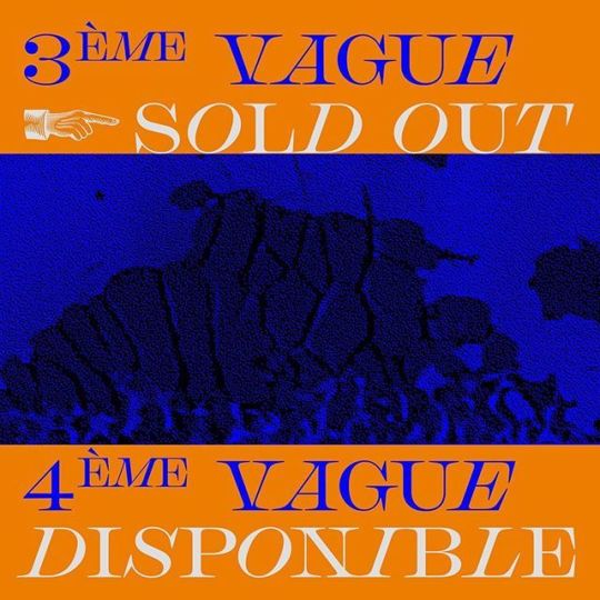
This work is titled Château Sonic 2019 and was created by James Todd. What I found interesting about this work was the way all of the design elements worked together. I liked how the orange and blue contrasted with each other, and the off white balanced with both of them. I also liked the use of a serif font (Chapman) with a sans-serif font (Nimbus Sans). The serif font gave the posters an antique/older feeling, while the sans-serif brought a modern day feeling. It resonated with me because of the older looking font that merged with modern looking design. It made me interested in the event, and made me want to go.
2 notes
·
View notes