Statistics
We looked inside some of the posts by caitlin-mackenzie and here's what we found interesting.
Average Info
Notes Per Post
6
Likes Per Post
6
Reblog Per Post
0
Reply Per Post
0
Time Between Posts
11 hours
Number of Posts By Type
Text
17
Last Seen Tumblr Blogs


Fun Fact
The Tumblr app for Google Glass was released on May 16, 2013.
Text
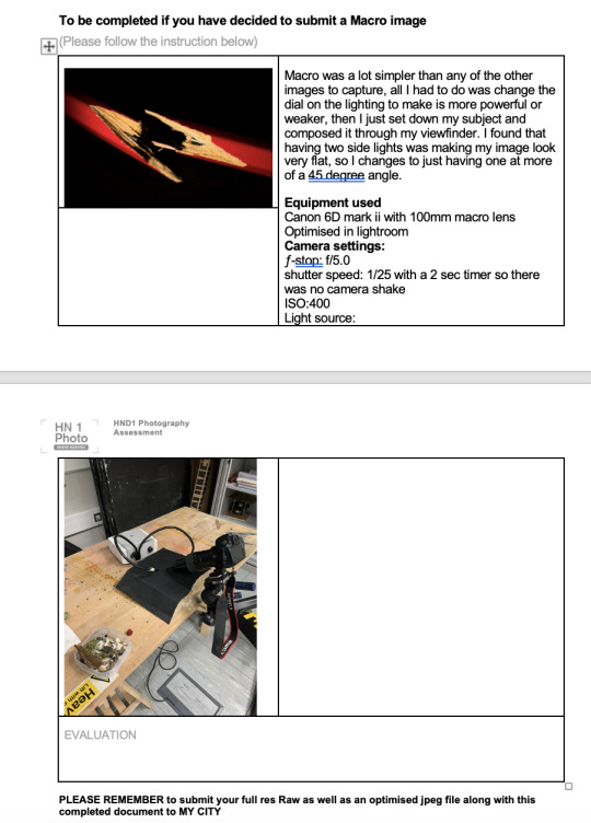
Structure research
EUGÈNE ATGET
this image by Atget works well as a perspective image as it is taken from the view of a person that would just be walking by rather than if the image were to be captured from a higher point of view maybe from above. Also from the angle that this image was taken we can clearly view how slim this structure starts off and how it widens towards the back, if the photographer was stood anymore to the left we may have assumed this structure was larger and the viewer would have free range to imagine what was beyond.

WALKER EVANS
I think this image by Walker Evans works well as an architecture image and also as art, because the three buildings have the same sort of build with the same four balcony sections it works almost as symmetry in a way even though one structure is a different height. the only negative about this image is that only the fronts of the buildings are visible so we are not able to see the depth and real size of them, however Evans goal may not have even been to educate the viewer on the building and maybe just for artistic purposes.

DAVID GOLDBLATT
Goldblatts architecture images mostly consist of the full structure in an image, something that I think goldblatt does well with this first image is composition, with the angle that they have taken this image at and with the slope of the roof it sort of acts as the leading lines of the image. From this image we can also tell -although it is in black and white- that they have captured this on a bright day because of the sharp shadow that is just under the roof and also in the background.


STEPHEN SHORE
When looking at Stephen shores architecture work I noticed that he rarely uses black and white and most of his images appear to be very soft and pastel, this is something that personally I am a big fan of. The thing that these two images -and many others of shore’s- is that they are taken face on there fore we are unaware of the depth of the structure, but we do get a good view of the front and how small and square these buildings are.


THOMAS STRUTH
During this research I looked through many of Struth’s images I noticed a reoccurring theme and this was that a lot of his architecture images include streets and have a main concept of leading lines this really gives his images depth and gives the viewer a lot to look at within the image I also think that the choice of black and white for these images enhances them a lot as we aren’t distracted by colour and the main focus is the pattern of the repetitive doors and Windows on these structures.


0 notes
Text
Moving Image - Analysing Ads
youtube
There are many companies that has created adverts that just stick with you and it eventually becomes a part of their brand, for Dulux that thing is the Old English sheep dog, I think many companies have found that when including cute animals in the advertisement people can't help but watch and when I company brings a bit of humour into it, it becomes the ultimate advert. Even today when you don't see this advert as much anymore people still refer to Old English sheep dogs as Dulux dogs this then becomes the perfect advertisement as the name is getting spread around whether it was intentional or not.
youtube
Apple as a company are always over exaggerating their adverts with up beat songs and extreme close ups of whatever new product they are bringing out (in this case it is the iPhone 12) they as a company never have trouble fitting in all the new features of the latest iPhone into a 1 minute ad. this advert in particular uses a very wide range of moving image techniques from extreme close ups to long shots also with some slow motion shots and tracking shots included when we are seeing a person on screen.
youtube
https://www.youtube.com/watch?v=wp3cu2oZN-4
This North Face advert works really well for selling products to their customers as they know exactly what their customers are using their clothing for and where they are using it, they show relatable situations on screen so that the viewer feels the need to own the product. Now in comparison this advert has many different shots these including many sky or birds eye shots showing beautiful landscapes possibly captured on a drone or from a helicopter and also many extreme long shots of actors on hight peaks of mountains
0 notes
Text
Moving Image
Equipment
Handheld Stabilizers

Gimbals

Vest Stabilizer Systems

Tripod

Dolly

0 notes
Text
Moving Image - Planning
youtube
This is the video I will be taking inspiration from, it isn't a usual advert it is rather just a 3 minute long sponsored video convincing you to buy a Lumix camera, the video includes a variety of still film clips that show the quality and things the camera is capable of. As there aren't many moving image techniques other than some pull focuses and some great compositions I will be adding more into my own video. I think this video works well as an advertisement for Lumix as it is a very simple yet effective video as it really shows a variety of things you can shoot on this camera and the moments you can capture.
when filming my own advert I will be attempting to add in some panning, tilting and pull focus shots. as for my equipment all I will be using is my camera and tripod as I will be on location looking for good compositional shots.
Storyboard:

1 note
·
View note
Text
Architecture Research
Berenice Abbott
This image by Abbott is a very good example of a perspective shot as it is showing the viewer exactly how this structure would look when walking through the streets and it successfully does the structure justice when showing the scale.

Perspective shot
Ansel Adams
I think this image in particular comes under the category of a detail show as well as human interaction as this isn't showing a whole building, only a section of one and the scale is also shown by the man standing on the top level so we are able to estimate with our own knowledge how tall this structure is. I enjoy this image in particular as we can tell it was taken on a sunny day because of the sharp shadows at the bottoms of the pillars, the sunlight is lights up the front side of the structure well but also shows some good contrast under the roof of each level.

Margaret Bourke-White
unlike the other images this one shows the interior however they have shot this in more of an abstract way as opposed to just shooting the staircase at the beginning she has shot it looking down from possibly the top of the staircase. this shows the scale of the interior well.

"Bourke-White’s image reveals her ability to impart grace and majesty to the bleak, utilitarian forms of industrial architecture. The dam’s massive concrete spillway piers, which stretch to the edges of the image, evoke the soaring walls of ancient monuments, or crenellated castle towers."
Lucien Hervé
I have chosen this images as I think it is a good example of a wide architecture shot as it incorporates the whole of the structure in the centre and also includes the structure below. as well as being a good example of a wide shot it also includes some human interaction without taking anything away from the building

Ezra Stoller
"I'm not interested in art photography," Ezra Stoller once said "I'm interested in architecture as it is, to look at and enjoy. But what I do is a job of work, that is what it is."
I have chosen these images to talk about as they both involve human interaction, in the first image we can see someone walking under an arch along the pavement however once you notice this subject your eyes are suddenly guided more up the image towards the roof of the building, its only then that you realise the large scale of this building. In the second image we also have some human interaction with someone walking down the stairs of the side of the building this helps the viewer see how large or small a structure is as everyone can easily base it off of the height of the average person. However Ezra used people in his images very lightly as he didn't want all the attention to be taken away from the architecture because people were focused on the people, I think this is why in these two images he has captures the people at a far distance so you are unable to make out what they look like. he wanted people to focus the stillness of his images and enjoy the actual structure infant of them rather than who a person was or what they looked like


0 notes
Text
Structure final

After going out and reshooting my structure on a better day and with my tripod I think it ended up looking a lot better, the only thing I would change if I did it again would be to put it into black and white to really accentuate the deep contrasts in the shadows where the sun cannot reach in the afternoon.
1 note
·
View note
Text
Structure Evaluation
In this brief we were tasked to go out and photograph a structure of out choice -whether it was a building or even a bridge- for this I chose the SEC Armadillo next to the Clyde, I chose this building as it was the first one that came to mind for me because of the its abstracts curves and how the sun can change the look of it throughout the day lighting up the under sides of the peaks. one of the things I actually enjoyed about this brief was trying to set up all my images on a canvas and make sure they work well together as a set. the main technique used in this brief was the perspective control that I had chosen to do in photoshop, I think this really helped enhance the images. A photographer I really enjoyed looking into during this brief was Ezra Stoller as I really liked the human interaction aspects that appeared in some of his images showing the sheer scale of the amazing structures without taking anything away from the actual building he photographed. If I were to change anything about my images I think I would convert them into black and white as I think it would have helped enhance some good contrasts and make them appear a little more professional.
0 notes
Text
Moving Image
Composition
Close Up
a close up shot In film usually shows from the bottom of the actors head to the top of their forehead with not much else to show apart from possible a very small part of the background. this type of shot works really well when showing the an actors facial expression or reaction these shots can also be used on objects
Example:

Long-Shot
a long shot in film is almost always showing the subject in its entirety while also showing a great amount of the background, this shot can be good in films when making a scene look large scale and the subject looking minor this could be showing a peaceful land scape or a hectic action scene.
Example:

Medium Shot
medium shots show an actor from the waist up so a fair amount of the background is still able to be seen, because you are getting equal amounts of background and actor bother are able to be emphasised at the same time without either out weighing the other and taking over the scene.
Example:

Birds Eye
a birds eye shot is just what it says, it is a shot that can be taken to show off and large amount of scenery from the point of view of a bird although it can also be known as an aerial shot , these are usually filmed using a drone, elevated platform, crane or even a floating object. this shot places you above the subject so you are able to have a clear view of what is going on in the whole scene.
Example:

Point of View (POV)
A POV is when shot appears on screen as if the audience were looking through the eyes of the actor meaning the camera is now taking the role of a particular character. However sometimes it doesn't even have to be the point of view of a person as It can be from the point of view of any object. This is why its called a 'point' of view as opposed to “eye” view.
Example:

0 notes
Text
Moving Image
Camera movements
Pan
A panning shot is a rotating shot along the x axis, moving your camera from one side of your shot to the other whether that be from right to left or left to right usually done using a tripod. with a panning shot you usually think of a slow moving pan showing a scenery of some sort however a pan can be any speed and can even become a whip pan which are used a lot in films with a high amount of action.
Zoom
zooming is one of the most used camera shots that is used. this is simply where you get closer to your subject just by zooming with your lens rather than actually having to move your body however, zooming can actually reduce the quality of your image if not used correctly.
Tracking shot
A tracking shot is where you follow the camera along side a particular subject and is usually done with the camera hand held sometimes done with a gamble to keep the camera steady, this particular shot is considered a staple in film making.
Dolly
dolly shots are very similar to tracking shots in the way that they follow the subject the show a scene for example to show how long a road is or how far an actor is travelling, a dolly shot works like a zoom shot however this time it is the actual camera moving in or away from the subject.
Pull Focus Shot
a pull focus is when a cinematographer will deliberately change the subject they are focusing on in the middle of filming, a pull focus helps to navigate the viewers eyes around the screen making sure they are following to subjects that were not noticeable before. this type of shot can be quite tedious to execute and has to be planned and figured out before beginning to film.
Tilt
the tilting camera movement is a lot light the panning shot however this is rotating the camera up and down horizontally as opposed to the vertical pan. these types of shots are very useful when showing the large scale of something whether it be a landscape shot or a tilting shot on an actor to show the audience they are inferior or superior. these shots are also usually done using a tripod
0 notes

Text
Unseen - Three finals

2 notes
·
View notes
Text
Unseen Before & Afters

Added more vibrance to the strawberry, removed any glare or specks from the glass, darkened the background

Added more contrast, colour corrected the paint and made it more vibrant

Darkened the background, brought out more of the colour on the forks

Made the pencil more vibrant, added deeper contrast
1 note
·
View note
Text
Structure - Contacts sheets
This is the second time I have shot my structure as the first time I did it it was a very overcast and cloudy day, so I decided to go back out in nicer weather and I think these have come out a lot nice.


0 notes


Text
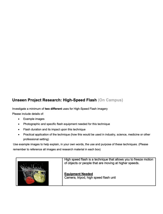
Unseen contact
the first image is my first attempt at using high speed flash with water and a subject and the second two contacts are the second time I tried. there was definitely an improvement between the two as the black background turned out to be the better of the two, the lighting looks a lot better on the newer versions and all round just looks sharper.


0 notes
Text
Unseen Editing
firstly I brought my image into photoshop from Lightroom and cropped it a little so that the subject was centred.


I used a variation of the patch tool and the dodge and burn tool to get rid of any unwanted glare or specks that appeared in the image.


I used a levels layer to darken the background of my image


Before: After:


0 notes