Statistics
We looked inside some of the posts by callum2020 and here's what we found interesting.
Average Info
Notes Per Post
2
Likes Per Post
0
Reblog Per Post
2
Reply Per Post
0
Time Between Posts
4 days
Number of Posts By Type
Text
15
Link
2
Last Seen Tumblr Blogs


Fun Fact
In 2020, Tumblr had 29.4 million users in the US.
Text
Collaboration
The collaboration with Glasgow University was a learning experience for both groups. it was a good experience because it presented us challenges that we could face if doing a professional shoot. most of the planning was made by the Glasgow University students and this was good from some points of view and probably quite realistic if this was a professional shoot. it was great that the students had done a mood board, that we and the models could refer to on the day.
As photographers one of the biggest learnings from this shoot was that we needed to be more in control. We got the information about this shoot as we had a meeting in the day before. This led to little planning and for us to think of ideas and bring other options to the table.
On the day of the shoot, it was important to keep upbeat, even if things didn't always go the plan. For example, the backdrop that was brought was too small as they wanted to have full length portraits. After a discussion we took both pictures that were full length and some that were ¾ and ½ length portraits to stop the background looking awkward.
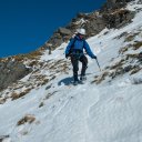
Contact Sheet

A mistake that we made, and I will always be double checking when borrowing kit is to make sure that all works properly. we turned up with a faulty studio light. in the end it mostly worked however we did have quite a few speed lights and a Rota light.
We started the process of editing the photos. We narrow down the photos a made a quick edit and met up with the students. They picked from the narrow down selection, and we went off and edited the photos that they were happy with. We use Google Drive to send the edited photos across which worked very well.
Final Images


0 notes
Text
James Grant
Grant is a Landscape photographer based in the UK. He specialises in all thing mountains, hills and the coast. He run workshop and has self publish a book and won two national competitions.
Some of James work below, images from hie website. https://www.jamesgphotography.co.uk


0 notes
Text
Contact Sheet - Landscape

landscape 2: didn't work very well to much of grass hiding the boat.
Landscape 3: really like the colours in the sky and reflection
Landscape 20: no point of interest your eye is searching for a focus point.
Landscape 10 and 13 I tired to use the flower in the foreground
0 notes
Text
Ansel Adam's Zone System
The table represent the whole tonal range from black to white, Pure black at 0 and pure white at 10. The camera dynamic ranges from zone 1 to zone 9. The texture appears in zone 2 - 8. The camera is trying to expose everything roughly into zone 5.
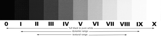

Example Image of have the full tonal range.

The camera is trying to expose the image at zone 5. If you meter for the highlights ( zone 8 into zone 5) we will lose a lot of detail in the shadow and they will mostly appear very dark. Also the whites in the image is appear grey and not white like how your eye see it.
If we do the reverse then expose of the shadows (zone 2 into zone 5) we will lose all the highlight detail and a lot of the image will be over exposed. As a rule of thumb you should have no more than 5% over exposed but there is exception! creative purpose.

In digital photography we can not recover the blown out highlight it is better to have the shadow under exposed and bring them back in post. Spot meter for the highlights. Example meter for your highlights then open them up but 2 or 2.5 stops.
Theoria Apophasis, Part 1&2 Ansel Adam’s ZONE SYSTEM in a nutshell for digital photography!!
youtube
youtube
Over exposed or pure white images can be amazing.
“Arctic Fox” by JimCumming


Final thoughts.
This will hopefully help with having a better understanding of how to expose and have more tones in my photos better and if I want to have part of the image over or under exposed part in my image then that okay if it is for a creative reason.
1 note
·
View note
Text
Filters
Neutral Density Filters
It is a lot like sunglass for your camera. It reduces the amount of light getting onto the camera sensor. The filter should not effect the colour of the image but this depends on the make, and how much you pay.

One of the main purposes of the filter is to have a shadow depth of field on a sunny day or other wise it would be over exposure. The other use could be to capture movement of water or clouds.
The filter come in different strengths from ND 0.3 which is one stop of light reduces to ND 3.0 which is 10 stops.
There are different types of ND filters. You can get ones that screw on the front of your camera lens, this is good as no light can get in around the edges. but can be quite expensive if you have a lot of different width of lens. You can get a mounted ND filter with is a square ND filter that fits into a mount that goes over the camera lens. This option is more expense however can be cheaper in the long run as you only need to buy the bracket.

ND Filter - Water

Graduated filters
A graduated filter is the same as a neutral density filter but only covers half of the lens so you can get the correct exposure for the sky.

Reference
https://uk.urth.co/products/variable-nd2-400-1-8-65-stop-filter?currency=GBP&variant=35444724105381&utm_medium=cpc&utm_medium=cpc&utm_source=google&utm_campaign=11004237482&utm_term=Gshopping-293946777986&gclid=EAIaIQobChMIsJnk_NaC-AIVjpftCh10gwNIEAQYAiABEgIflPD_BwE
https://www.google.com/url?sa=i&url=https%3A%2F%2Ffotographee.com%2Fsquare-screw-on-neutral-density-filters%2F&psig=AOvVaw0t4lbkg8_RR0tzBVh4tXag&ust=1653844203792000&source=images&cd=vfe&ved=0CAkQjRxqFwoTCJjQpvTXgvgCFQAAAAAdAAAAABAF
https://kenkoglobal.com/reviews/shoot_professional_photos_with_nd_filters/
https://www.google.com/url?sa=i&url=https%3A%2F%2Fen.wikipedia.org%2Fwiki%2FGraduated_neutral-density_filter&psig=AOvVaw1efRlKqJrM2qxaeaRXLWTx&ust=1653844372449000&source=images&cd=vfe&ved=0CAkQjRxqFwoTCLjr2MXYgvgCFQAAAAAdAAAAABAI
0 notes
Text
Landscape Research
What is your definition of landscape photography?
In my opinion landscape photography is capturing emotion using the outdoors.
Wiki answer: Landscape photography shows the spaces within the world, sometimes vast and unending, but other times microscopic. Landscape photographs typically capture the presence of nature but can also focus on man-made features or disturbances of landscapes.
Some Publication
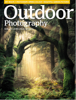
Outdoor photographer magazine.
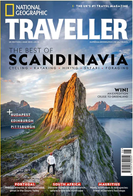
National Geographic
Black and White photography

Landscape in Marketing
Patagonia
This Is from the Patagonia website. They are an outdoor brand that sell clothes and gear. The whole purpose of them using landscape images is to inspire you. This could be you if you use our kit, or your adventure would be amazing if you buy from us.

Airline and travel agent, Monarch Airlines
They want to show off the places they are flying there. Could be used to show another side of the place.

Drink companies for example, John Harvey

Reference Images
https://en.wikipedia.org/wiki/Landscape_photography
https://www.google.com/url?sa=t&rct=j&q=&esrc=s&source=web&cd=&cad=rja&uact=8&ved=2ahUKEwiM8ZerwIL4AhUSmVwKHWk-AAsQFnoECB4QAQ&url=https%3A%2F%2Fwww.lightstalking.com%2Fphotography-magazines%2F&usg=AOvVaw1MzIiHa4erw-VfYZ1yVtbL
https://www.google.com/search?q=national+geographic+magazine&tbm=isch&ved=2ahUKEwiF3fnGwoL4AhUSohoKHUApD9oQ2-cCegQIABAA&oq=national+geograp&gs_lcp=CgNpbWcQARgAMgQIABBDMgQIABBDMgcIABCxAxBDMgQIABBDMgQIABBDMgQIABBDMgQIABBDMgQIABBDMgQIABBDMgQIABBDOgUIABCABDoGCAAQHhAIOgQIABAYOggIABCxAxCDAToLCAAQgAQQsQMQgwE6CAgAEIAEELEDOgYIABAKEBhQ2QpYtSxgkzxoAXAAeACAAUyIAdEJkgECMTiYAQCgAQGqAQtnd3Mtd2l6LWltZ8ABAQ&sclient=img&ei=CUGSYsW0C5LEasDSvNAN&bih=1000&biw=1920&client=safari#imgrc=QozT7IZucLhmtM
https://www.google.com/search?q=black+and+white+photography+magazine&client=safari&rls=en&source=lnms&tbm=isch&sa=X&ved=2ahUKEwiuhMDEwoL4AhX6QEEAHcLYDlYQ_AUoAnoECAEQBA&biw=1920&bih=1000&dpr=1#imgrc=BlAFvavBR3TuWM&imgdii=jv-FnwyR59jhKM
https://eu.patagonia.com/gb/en/climbing/
https://www.jamesgphotography.co.uk/wp-content/uploads/2016/07/Aphrodites-Rock-Sunset-Landscape-Cyprus-Landscape-Photography.jpg
https://static.livebooks.com/f12df9149e6342aab2a50a6c4de36263/i/a89fd845511d4ae587b4e1e018773783/1/4SoifmQp7LJ6yDtMuFY2x/Harvey_Bottle_RGB.jpg
0 notes
Text
Panoramic
youtube
How to Create Panoramic Photos: Stay Focused with Doug McKinlay, https://www.youtube.com/watch?v=iN-MUg2BJxw,
Use a tripod, ideally spirit level in it or in the camera.
Take pictures
Make sure there is a good over lap around 50%
Shooting manual focus and manual mode
Shoot vertical more pixels better quality but takes longer
there is going to be some crop so have extra room
1 note
·
View note


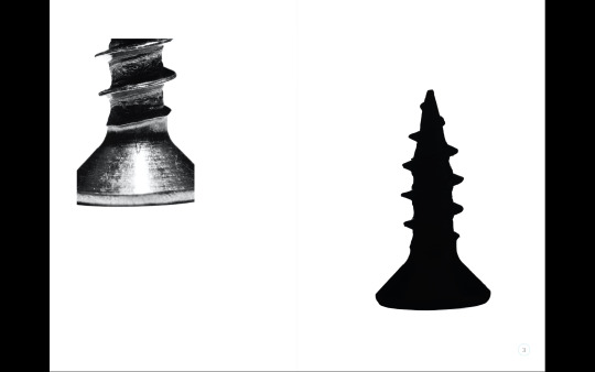


Text
Edit


For this series of images I had to do some editing on the background. When making the white background for this the light meter was saying f22 or higher but the image was still coming out a bit grey for the background, this is because of fall off inside the Len. In photoshop I open the image and used levels to make the background bright. After doing that there was still edges that were 99% or 98% white and I used the brush with a soft edge to fix that.
There was a reflection of the screw on the surface I selected the object and inverted the selection and got rid of the reflection.
The screw was too long to be taken in one photo so this image below is two image. I used mask and the transform tool to blend the images together.
0 notes


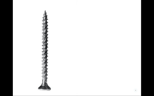
Text
Set Up
Kit
Tripod, Flash stand
Camera, Macro 65mm 5:1
2x flashes, one for background another to light the screw
tethered to Capture One shooting manual focus better to see it on a bigger screen
2x black card as flags, to stop anylight spill from the background


0 notes
Text
Zine Research
Paper
Paper comes in 4 types and has it unique properties.
Silk - Recommend choice with a smooth finish, safest choice for accurate colours
Gloss - Often used for photos as it is shiny and increases saturation.
Uncoated - Slightly rough look and dull colours
Recycled - rough texture and it dull colours a lot.
Paper Thickness
The thickness of paper is measure in gsm. it stands for grams per square metre. 130gsm is the standard thickness. The thicker the paper the more ink it can hold.
Covers
A laminated finish for the cover can be a good idea as it over protection and can look quite good. You can mix paper types from cover and inner pages. The cover is 4 sides, the front and back. Cover pages can be any type of paper can be a different gsm. It is always an option not to both with a cover and use the first image and last image.
Finishes
There are many option for different types of finishes, however there are two main ones
matt lamination - coating with a not shiny finish.
gloss lamination - coating with a shiny finish.
Bindings
There are many different types of binding. In zines the two main ways are staples and perfect bound.
Staples - known as saddle stitched binding, 2 stables holding the pages together
Perfect bounding - a soft back book. the pages are glued against a square spine.
a zine with 20 pages or less is usually stables as there is not enough of a spine.
Bleed
https://www.ffoton.wales/zine-print-guide
0 notes
Text
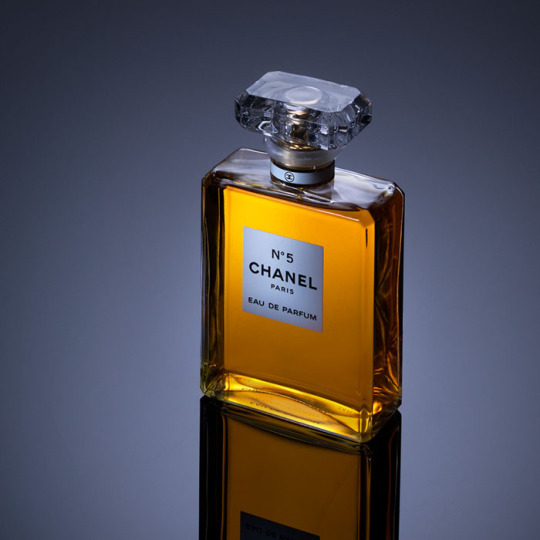
Research Bottle
For this project i really wanted to do a product shot. I would like to become a commercial photographer and i thought I would get the most out of this project if I did a product shot.
I love the high end polished looked. I want to create this look in my images.

I like the middle light seeing the white edges against the background. I like the highlight that runs the whole length if the bottle.

Richard Foster Photography - Above Image
I love the lines in the image above. It a beautiful image! it a low key image and it about the contract and the low angle.

Karl Taylor
Sharp looking image and I think it is appropriate for the water bottle.
Karl Taylor
It a clean and polished looking image. I like the light of the liquid. It is not straight one I think the angle is very import to this image. Really nice control of the light.

fimaron.com
I really light the reflection add more interest.
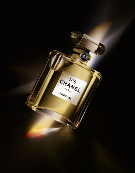
productionparadise.com
I don't know how they created this image. I wonder if it two images one for the bottle and the other the rainbow light.
0 notes
Text
LYV Bottle
Contact Sheet
For this shot we used the started with a similar set up to the Givenchy bottle. Then we began playing with the flags in the background. We quickly released that for this bottle because the label is translucent and the text is black you then can’t see the label.

Edit - Before/After
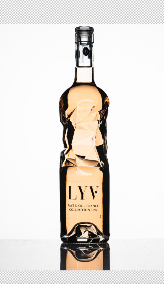

I made a cut out of the bottle and put on a white background.
First pass is spot healing and stamp layer to clean up bottle.
Made a stamp copy and convert to smart object and used the filter Dust and Scratches to clean up the image. Made a mask and used a brush to add the effect were I want.
Highlights I tidied up some of the highlight that I didn't want
2nd pass was more tidying up.
Marks centre - was getting rid of the black flags reflection in the centre of the bottle. I used clone stamp spot healing and copying part of the bottle and transforming them.
Colour Fix - the colour around the edge of the flags reflection was very saturated so I selected the colour of the bottle using the eye dropper tool and and then used the eye blending mode and a bush and painted over the areas that I wanted to change.
Text - The label was not quite central. I used colour selection and marquee tool to move the label.
Reflection - I copied the image and flipped it. I add a gradient and got rid if the small text using the clone stamp. I also add a blur to the reflection.
Final Image

0 notes
Text
CS Givenchy

Image 9 and 18 are lit with a light below the bottle. this made nice light on parts of the bottle but made the surface to bright.
Add black card to stop the light bending around the bottle.

Image 64 highlight on bottle below neck of bottle to small. need to use a strip box on it side.
Image 85 has a hard light below the neck of the bottle. used a extra layer of diffusion to get rid of it.

0 notes