
Statistics
We looked inside some of the posts by camirettinger and here's what we found interesting.
Average Info
Notes Per Post
15
Likes Per Post
14
Reblog Per Post
0
Reply Per Post
1
Time Between Posts
23 days
Number of Posts By Type
Text
15
Photo
1
Last Seen Tumblr Blogs


Fun Fact
The Tumblr office adopted Tommy, an 11-year-old Pomeranian.
Text
Final Portfolio Project


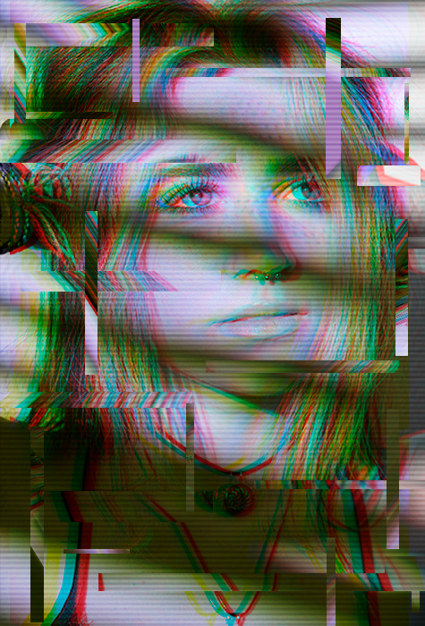
When deciding what theme I wanted to create for this project was something I have always wanted to learn more about. Glitches! When the images look warped it creates a whole new reality compared to the previous original image. As I started to work more on experimenting with this idea, it made more sense to combine the ideas of both photomontage and glitch together. These images are from different occurrences throughout the semester I took with a film camera. I wanted each photo to feel different but have the same feel at the same time.
To help make each glitch different, I took each photo on the printer scanner and started to move them to create the glitch effect. This process was a lot of trial and error as I couldn't see the result until way after I completed the scan. After scanning a single image a couple of times, I would combine the image’s best parts together to create the best glitch possible. After doing so, I created RBG color glitches in the image to make the image feel more cohesive.
2 notes
·
View notes
Text
Artist Research Assignment

I chose Cornelia Hediger for this artist research. She was born in Switzerland and currently works in NYC. She uses her photography to create a visual diary to express all things that reflect something her life. All her photos make you feel like you are a part of a dark, elusive, and surreal fantasy. One of her most popular series, Doppelgänger, creates photomontages of 6-9 frames fit into one frame. These images sometimes create claustrophobia but expresses a different perspective on things. Some of her images feel loud and very expressive with lots of color while others are calmer and even though not much is happening you get a sense that something may be off.
I love how her images make you feel like you are watching or interrupting in a private moment. The drastic high and low angles constantly keep me intrigued with her work. Something I realized about her work is that she has a very minimal media presence as she is a very private person. It made it fairly difficult to find her work and interviews with Hediger. Overall I really love her work and the way each image can make you feel saomething different every time.
1 note
·
View note
Text
ART TOUR 3

For the last virtual art tour I visited was the Digits: A Parallel Universe. This exhibition featured a group of artists and their works that create a different reality. The photograph featured here is by the artist Dennis Geller called End of the Day. This was created back in 2019 and created their own reality by altering their images in a different light.
Geller’s photographic journey started with the exploration of representational subjects. In the studio then in the woods, he honed his perception. As he got deeper into learning about the language of photography, he considered the role of light in his daily life. As well as the physicality of emotions in the abstract, science of perception, and the dimensions of time and transition.
I chose this image because it was slightly different from the rest and I love how the photograph looks inverted. The people on the bus look almost transparent like time is passing in this single frame and that is so fascinating how someone can portray that. It feels almost like completely altered or a painting because how detailed people clothes look.
0 notes
Text
ART TOUR 2

For the second art tour I visited was the Andy Warhol exhibit. I chose this exhibition because I already have researched his work and I really loved it! His images are so eccentric and fun and that’s what makes his work stand out from the rest. I love how different each piece yet they all match well together.
This exhibition is held at the Tate Modern and he features his never before seen works in the UK. The works featured within showcase the classic photographs of Coca-Cola, Marilyn Monroe, and Campbell’s soup cans. His queer identity and faith as well as immigrant ideas are all depicted his his exhibition.
I really loved this specific piece of work called, Elvis I and II, which was created in 1964. In 1960, he was inspired by the new wave of art at New York galleries and he wanted to create something similar. He started to create hand-painted images combining advertising imagery with expressive painting. This new style of art is more known to be called Pop Art. What was so cool about this was the technology that came after it. He wanted to start screen printing these images so he could reproduce his photographs onto canvas multiple times. He says that creating this pop art was “being like a machine” as everything was very machine like. He later says we should all be a machine because they don’t discriminate. Everyone should like everybody no matter the gender.
Warhol’s approach to his subject matter, individuals, and their relationships, was accessible and fluid, reflecting a decade of social change.
0 notes
Text
ART TOUR 1

For the first virtual tour I visited was Lynn G. Fayman’s exhibit, A Colorful Life. This exhibit caught my eye first in the MOPA gallery because it stood out from the rest with all the colors.
I thought this was so incredibly beautiful and I loved looking through her images. She brings all of her abstract photographs to life with vibrant colors. Every image has more than one bright color and they all contrast from one another. The use of lines and shapes creates a new image in your head of what it is every time it’s blows my mind each time I look at the images.
Fayman’s work mostly consisted in the 1900′s and the works featured in the exhibit were from 1949. She was a photographer and filmmaker and really experimented with color when it was just starting to become available. I feel like when I look through these images, I see how powerful colors can be to create a beautiful image and it makes me appreciate them so much more. She pushed the boundary with experimenting abstract photography and it really worked in her favor as people back then appreciated them then as we do in this modern time.
0 notes
Text
PASSAGE PT.2
https://youtu.be/dxY3Fvb5trg
With my video I wanted to create a passage of time through cooking breakfast. I wanted to create something that would be something I do almost every morning. I feel my stills are different from my footage because they are one, of a different dish and two, I didn’t get the birds eye view shot I wanted to create initially.
0 notes
Text
Blog Prompt: PASSAGE
I found this image from online to convey my passage of time. I want to create a baking/cooking video. I’m not entirely the best at cooking but I’m wanting to improve my skills and it makes me try a lot hard when there is a camera filming. I might record some sounds from cooking so you can really listen to it coming together. I think this shows a great transition of time.
0 notes


Text
Glitch


The first two glitches I used were of the RGB glitch. I wanted to mess around with the colors and warp effects. I turned my images into black and white and once I switched them to each layer of the RGB, it brought something different to the screen glitch. The last image I wanted to learn about the pixel sorting. I think it’s so interesting once I started stretching the image. What’s even cooler is that the image I used pixxel sorting on, it is a whole different image that happened to match really well! I feel like I’m learning a lot through each experiment. Glitch is one of my favorites to work with.
4 notes
·
View notes
Text
PHOTO PROMPT 2- IDENTITY
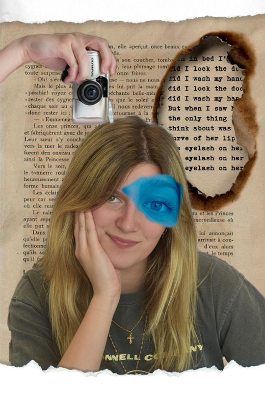

These are my two identity montages I created that represents different parts of me. The first one has somethings I enjoy such as reading, poems, photography which is featured with my favorite type: film photography. Under the burned part of the page is one of my favorite poems called "O.C.D." by Neil Hilborn. The second one is a picture of me with flowers growing from my body. I feel that every day I still am continuing to grow as a person and I want to keep improving my skill and grow more into the person I want to become. The text in the second photo is a quote from one of my favorite films of all time which is Shawshank Redemption. Film is a big part of my life so I wanted to incorporate it in my montage.
5 notes
·
View notes
Text
PHOTO PROMPT 1b: Composition and Perspective
PERSPECTIVE 1

PERSPECTIVE 2

FILLED FRAME

NEGATIVE SPACE
1 note
·
View note
Text
SCAVENGER HUNT

For the first photography “scavenger hunt” I wanted to focus on the elements of design and composition. While doing this, it will help me create a better structure for my pictures. For a couple of the images, I used a big light to give a big contrast between the subject and shadow. Out of the elements I wanted to focus the most on texture. Before this, I never really paid much attention to how important it can be to display texture in a photograph. Learning more about composition and design elements made me had a better understanding of the structure and visual techniques to produce better images.
1 note
·
View note
Text
Photographer of the week
Petra Collins:
She is a Canadian editorial portrait photographer and has taken many photos for many top world's fashion magazines. Her photos are full of creativity and dreamlike.
www.petracollins.com

Alessio Albi: He is an Italian photographer and he doesn't take ordinary portraits. He creates special moods and atmosphere into each shot. His models don't show nice faces, each of them tell a different story: love, fear, loneliness, regret, or tenderness.
http://www.alessioalbiphotography.com/

0 notes
Text
Introduction
Hello! My name is Cami Rettinger and I am a senior with 1 more semester at UTD. My major is Design and Production. I have taken a couple photography classes here at UTD and I learn more and more every time I take them! I take pictures to express myself and my favorite type of photography is portraits. I love taking pictures of people and taking them out of their comfort zone and feel more comfortable and feel good!
0 notes


Text
Artist Statement
At the beginning of the semester, I had an idea to have my final portfolio to have a fashion magazine feel with bright colors and funky outfit choices. Sadly, the coronavirus made it difficult for me to shoot. Luckily my friend and I have both been social distancing and she was down to shoot some photos in her cute apartment. My friend Paige helped with creating a cute color palette focusing on the colors green, pink, and blue mostly. I was inspired by her living room with very interesting features and with green painted flooring and a bookshelf full of different vases she thrifted.
The overall theme I wanted to portray was a day in the life of quarantine with a fashion magazine look. So I composed this series to start with her waking up and trying to find something cute and dance in the living room, read magazines and go on a picnic. I saw this trend where photographers put cling wrap over the lens and dab vaseline on the edges like a vignette border. Although some came out too blurry we came up with a couple of good ones with a dreamy hazy look. After shooting for a while, I wanted the colors to have a grainy and vintage feel to them to keep the images consistent with each other. I think natural lighting is the best lighting for the style I was going for so we used the windows in the rooms to help with soft lighting. For the outdoor photos, we had used the shade from the tree to prevent harsh shadows on her face. The images I have taken for this project has helped me learn the importance of color in photography and the techniques I used I learned throughout the semester.
1 note
·
View note