Text
2011-2014 Nissan Murano Cross Cabriolet: An Answer To A Question Nobody Asked

The Cross Cabriolet, if anything, is certainly a unique vehicle. It is essentially a Nissan Murano crossover SUV, a car that was already rather unsightly, with the roof chopped off and replaced with a convertible top. Why Nissan felt like this was necessary is a question that nobody knows the answer to, although rumor has it the chairman of Nissan’s wife requested it and the chairman did say it was meant for affluent aged customers (because so many seniors want a convertible SUV with looks on par with Frankenstein’s Monster). But however it happened this four wheeled bad idea exists and is ugly as sin.
Exterior Styling:
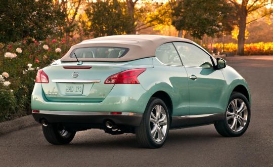
Now if your well acquainted with how I write about car styling, I like to compare the cars I write about with similar cars, but the problem is that (thankfully) there’s really nothing quite like the Nissan Murano Cross Cabriolet. There is one car that is relatively similar which is the Range Rover Evoque Cabriolet which is also an SU-Vertible, but the difference is that the Evoque is slightly larger than the Cross Cabriolet (but small for a Range Rover) while the Cross Cabriolet is a small crossover, so as a result we have to start by talking about the Cross Cabriolet by itself, and man do we have a lot to unpack.
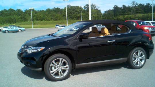
Lets start by talking about the how the Cross Cabriolet looks with the top up. The first thing you notice when you see the Cross Cabriolet with it’s top up is how terrible it’s proportions truly are! The Murano, while pretty ugly in hard top form although also not terrible, has relatively decent if not mildly awkward proportions. The Cross Cabriolet on the other hand has absolutely atrocious proportions! The #1 problem with the Cross Cabriolet (besides the obvious one which is it’s existence) is the ratio between the soft top and the rest of the car. The soft top is hilariously short and tiny while the normal Murano body looks ginormous in comparison. This is a problem that is also shared with the previously mentioned Range Rover Evoque Cabriolet and a couple other cars such as the infamous PT Cruiser Convertible.
There’s a reason that soft tops stylistically work on sedans and not SUV’s and that reason is that sedans and sports cars tend to have pretty small lower bodies while SUV’s tend to be a lot higher off the ground. This means that when a soft top gets put onto a sedan or a sports car it looks natural because there is a good ratio between soft top and lower body. However when you put the soft top on an SUV, everything below it looks ginormous and the soft top itself looks ridiculous.
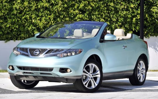
“But surely it must look better with the top down right? After all, it’s a convertible so the top will be down most of the time anyway right?” If your asking this I have an answer to your question, NO! The Cross Cabriolet looks ridiculous with the top down as well!
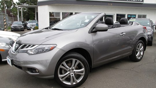
When you look at the Cross Cabriolet when it has it’s top down it becomes extremely obvious that the Murano wasn’t designed to have a soft top. The Cross Cabriolet with the top down looks unnatural, it looks more like it was modified as opposed to being an actual production car. On the the back there are two giant humps, presumably to help accommodate the shape of the Murano’s windows and the soft top, (pictured here). These humps make the back look bulky and strange. The Cross Cabriolet also has a much more squared off back end than the regular Murano which makes the already bulky rear end even worse (and much less practical)!
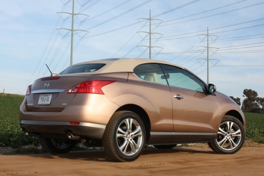
The Cross Cabriolet was also also extremely overpriced back when it was sold new with a sticker price of $56,000 in 2021 dollars (it was $47,000 in 2011 money). Who on Earth would spend that much money on a crossover with less space, lame-o performance, and from what I have heard an extremely clunky ride. However Due to poor sales (what a shock) Nissan did offer them at a large discount in the last couple years of it’s existence, not that the discount would make the Cross Cabriolet even remotely close to the world of “worth it”.
Interior Design:
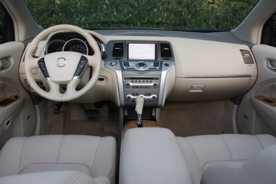
Inside the front seat of the Cross Cabriolet I am happy to report that it just looks like a standard second gen Nissan Murano. It had typical Nissan features like a very standard looking Nissan steering wheel and an infotainment system that some might recognize out of some other Nissan products, however there are some interesting things in the front end of the Cross Cabriolet that I can report on. For instance I find that the infotainment looks quite a bit off center due to the glovebox being so huge. The infotainment also really juts out which I am not crazy about. However, I like the beige color with wood accents that Nissan used in some of it’s mid 2010′s models like the Altima and this. The front seats also look quite comfy. Outside of that there’s really not much to talk about with the Cross Cabriolet’s front seat.
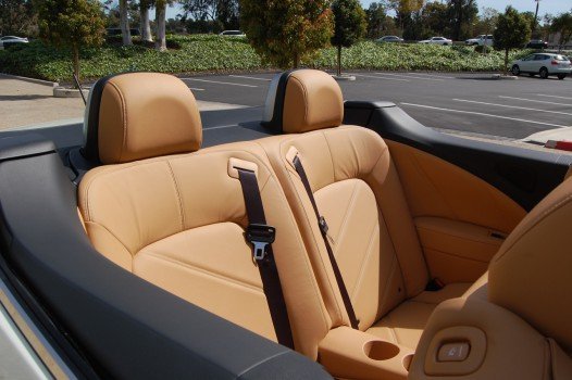
The rear seat on the other hand, well if you’ve ever felt like your job is pointless just remember that there was somebody in Japan (or Russia, both plants made Murano’s but I can’t find info on which one made Cross Cabrio’s) who installed rear seats in the Cross Cabriolet for three years! Now I have never been in a Cross Cabriolet and probably will never be in one (which I am fine with), but with that being said the Cross Cabriolet has some of the most pathetic back seats in SUV history. Yes I know it’s a convertible but still they are pretty lousy even by convertible standards. The front seat adjustment controls are also strangely located on the top end of the seats and are most easily adjustable from the back seat, but I suppose if your stuck in the back seat of a Cross Cabriolet you need as much help as you can get.
Pros and Cons:
Pros:
Uhhhh
I suppose that you could ride around with the top down and enjoy that
It is a great example of how some cars shouldn’t be turned into a convertible.
Decent amount of features in the front seat area and a decent sized glovebox
Apparently the front seats are comfy. Not that any of these make up for the small army of problems the Cross Cabrio has
Cons:
Absolutely hideous on the outside
Rather bland interior
Overpriced
Massive Blind Spots
Apparently the ride has massive cowl shake
Ridiculous rear seat adjustment placement
Considered one of the worst cars of all time
Final Verdict:
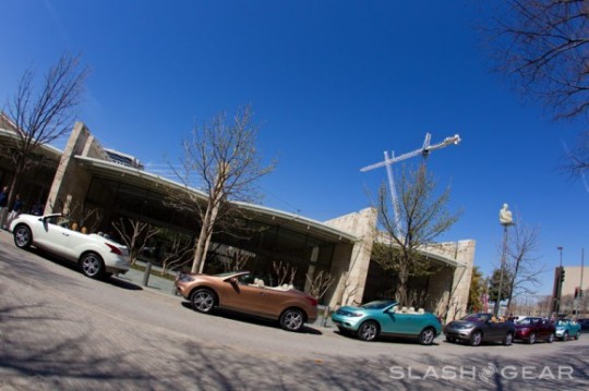
Just buy a used Murano. The Murano provides more practicality than a Cross Cabriolet, it looks better than a Cross Cabriolet, and it has the same amount of tech as the Cross Cabriolet. Sure you can’t “put the top down and feel the wind in your hair” but apparently driving the convertible Murano will make you wish that you actually bought a sane convertible like a BMW 328i which in 2011 costed around the same amount as a Cross Cabriolet and was simply better in every way.
Final Score
Exterior Styling Final Rating; 14/50
Interior Styling Final Rating; 17/50
Overall Styling Rating: 31/100
Next Review: A poor knockoff S-Class
#nissan#nissan murano#nissan murano Crosscabriolet#stylingsin#styling sin#rangeroverevoquecabriolet#the worst of the worst
1 note
·
View note
Text
2018-Present Day Toyota Century: Japan’s Rolls Royce.

If you are well acquainted with Japanese cars or just cars in general (or if you live in Asia), you have probably heard of the Century in one way or another. Whether it be the 90′s Century that had a V12 engine or even this car. But for those who don’t, the Century is Toyota’s Japan only answer to Rolls Royce, and it’s just plain cool!
Exterior Styling:

The Century’s exterior design draws inspiration from quite a few luxury cars without looking too much like a rip-off. Lets start with the most obvious one, the Rolls Royce Phantom. The Century has a very similar boxy side and front profile to the Phantom. This side profile looks good on the Phantom and looks just as good here. Although I am going to say something relatively controversial regarding this car and Rolls Royce, I actually like the Century’s exterior styling more than the Phantom. This is not saying that the Phantom is ugly per-say, it’s just that the Phantom feels a lot more bulky to me while the Century feels a little more sleek. I do however like them both and this should not be taken as a slight at all towards the Phantom’s looks! The grille also reminds me quite a bit of the 2018-2020 Lincoln Continentals grille, however this design cue is more of a coincidence if anything as the Century has had a grille similar to this one since the 90′s. However, this isn’t a review of the Phantom or the Continental (although you can expect both very soon), so lets get back to talking about just the Century!


The Century looks very sleek. The side of the Century is flat and simple while also looking luxurious. The Century does a wonderful job when it comes to its roofline as well. The roofline is elegant and sleek without looking too bulky which gives the Century a very tasteful and luxurious feel to it. The design of the grille is also very good looking! I feel like a lot of luxury cars these days (like Lexus which is strangely also owned by Toyota), go way too overboard with their grilles so the Century’s relatively simplistic grille is a breath of fresh air. I also quite like the fenders and wheels. The fenders add a very nice line to the car while the wheels have a very cool looking design that is reminiscent of multiple daggers meeting up at the Century badge. The Century’s best trait on the exterior in my opinion is its subtlety, it doesn’t look overly flashy and ridiculous while also looking very luxurious and stately. The Century is just quite simply very elegant.

The rear end of the Century in my opinion is not quite as good looking as the front and side ends but it still looks fine. I think that the symmetry between the tail lights and the badge looks great and very polished. I am not crazy about how much the trunk sticks out, but for the sake of practicality I can see why they did that and its such a small thing (you really only notice it when you view it facing the back dead on, from the front and sides this looks fine), that it doesn’t really impact my opinion of the Century that much. The Century text on the trunk area tells you what you are looking at while also being subtle and not too in your face (a large theme of the Century). All in all, the Century has a certain timeless elegance to it that a lot of modern luxury sedans lack.
Interior Design:

The first thing you notice about the new Century’s front dash is that the layout looks quite similar to the previous generations layout with the screen and radio in the middle and the dashboard gage cluster being all on a large screen above the wheel as opposed to physical gages. Now keep in mind, this is nowhere near a problem as the previous generation Century had a very nice interior and this one does as well. The infotainment-screen is incorporated very nicely into the dashboard. A lot of modern cars have giant infotainment screens that look like they were glued to the dash by a toddler so its nice to see the Century keeping it simple while also having the right amount of modern tech. I like the amount of greys and browns in the Century’s interior as well.

But since this is an ultra-luxury car, the front seat is most likely where the chauffer will sit, the back seat however is where all the action happens so to speak. The Century’s back seat is very comfortable looking. Almost everything in here is some sort of nice looking fabric and wood paneling. A lot of luxury cars don’t really pull off wood paneling that well but I feel like the Century does a good job in keeping the wood look restrained. The back seat touchscreen is also very well integrated. It looks sleek enough while also not being too intrusive. One of the most interesting and insane things about the Century’s back seat is that the passenger seat can be turned into a footrest for the driver. Although the last generation Century took this to the even more ridiculous extreme of allowing the driver to take the middle out and put their feet up on the passenger seat. However the passenger seat footrest is still pretty crazy if I do say so myself. The backseat of the Century, like a Rolls Royce or Maybach, takes luxury to insane and ridiculous extremes! As it should at a price point of $180,000 USD.

Pros and Cons:
Pros:
Very Sleek and modern exterior and interior
Luxurious Features
Iconic Vehicle in Asian Countries
Cons:
Styling is a bit close to other luxury brands (although this could also be a pro)
Not for sale in North America so if you want one you have to wait 15 years (Canada) or 25 years (USA)
Expensive!
Final Verdict:

The Century has always been good enough to compete with the best luxury brands on the market and the newest generation is no exception. The new Century is a very elegant and nice car and I can see people importing these into North America in the near future!
Exterior Styling Final Rating; 39/50
Interior Styling Final Rating; 41/50
Overall Styling Rating; 80/100
Next Review: A terrible looking SUV(ertible)
10 notes
·
View notes
Text
2006-2011 Chevrolet HHR: GM’s Ugly Answer to the PT Cruiser.

the Chevy HHR is a prime example of a car who’s design hasn’t really aged all that well. It is a retro styled crossover that just quite simply does not look that good these days. The reason I am writing about this odd retro Chevy crossover is because in my last post I wrote about how much I enjoy the retro-styled BMW Z8, which I believe is one of the best BMW’s of all time. So to contrast with the Z8 I would like to show this as an example of a retro styled car that isn’t that good.
Although, when reading this review keep in mind that the HHR and the Z8 are two different types of cars that are targeted at two different buyers so this is not intended as a comparison post, these are two different reviews and this is the last time I will mention the Z8. If you would like to hear more about my thoughts on the Z8 please read my post on it. Now with that out of the way, lets get started!
Exterior Styling:
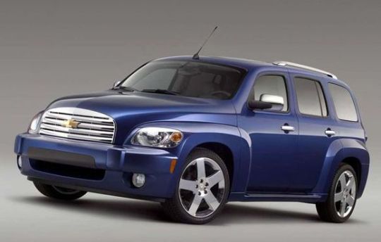
The HHR in my opinion is ugly. The rather boxy look really does not work with the tacked on “retro” elements and it makes the car look tacky as a result. The HHR was inspired by the Third Generation Chevrolet Suburban which I have always thought was a beautiful car (expect a review and maybe even a comparison post between that and the HHR later on).
The HHR does have some homages to the suburban, primarily with it’s rounded roofline and its more modern take on the Suburban’s classic grille. And while we are on the topic of grille’s and front ends of cars, can we acknowledge how the grille of the HHR looks like an afterthought? The front end of the HHR looks slapped on at the last minute. I have always thought that the HHR’s grille looked like a pigs snout.
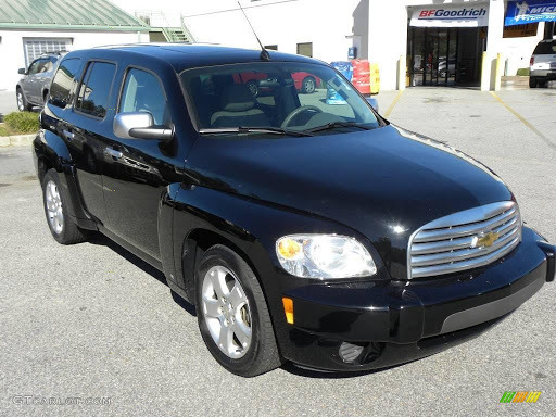
There’s also a problem with this cars design that I have noticed with a lot of GM SUV’s from the early 2000′s and 2010′s and that is the big and ugly rectangular fenders. Yes, the third generation Suburban had large fenders as well. But what separates the HHR and the Third Generation Suburban’s fenders is the fact that the fenders on the Suburban worked well with the grille and the headlights whereas on the HHR the headlights and grille look slammed on while the fenders crudely protrude out of the sides of the car. And as I mentioned before, this is not the only GM SUV to have this problem. The GMC Terrain from this era has this exact same issue! Large fenders can look great, why just look at the Corvette C3 which is one of my favorite ‘vette’s of all time! But the HHR’s boxy fenders aren’t doing it any favors.

The rear end of the HHR comes with it’s own problems but the main one in my opinion is the taillights. The dual circled taillights are rather ridiculous in my opinion. They look like pimples on the back of the car. However while we are on the subject of the back of the HHR I would like to point out something I actually like about it which is the roofline and overall shape. I feel like the shape and the roofline were a good homage to the Third Gen Suburban and managed to look like a good modern imitation of it. I truly thing that the HHR would be better if it did not look as awkward. GM bolted all sorts of crap on it to make it compete with the PT Cruiser which A: is not winning any beauty contests itself and B: was already considered outdated when the HHR first came out and was discontinued four years later.

And I suppose if I am going to talk about the HHR I am going to have to talk about the PT Cruiser. The PT Cruiser was a retro-styled hatchback introduced to the world by Chrysler in 2001. Contrary to what many people say about the PT Cruiser now, it was initially a huge success, even going on to be declared 2001 Car of the Year by Motortrend. 4 years later when PT Cruiser sales were just starting to decline, GM decided that Chevy needed to create a PT Cruiser rival. Interestingly enough, the PT Cruisers designer Bryan Nesbitt was poached from Chrysler by GM and designed the HHR which is where some of their similarities such as them both sharing headlights on the fenders came from. The only other car I found that is credited to him designing was the Seventh Gen Chevy Malibu which followed the time honored Malibu tradition of being....OK I guess.
And on that note it’s time to get into:
Interior Design:
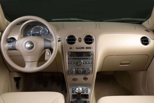
The HHR’s interior is fine. The interior looked at its best in this beige color. When it was black it simply made the HHR’s interior look cheap as hell. But overall the design is pretty simplistic and that is good. It looks very early 2000′s, which depending on who you ask is a good thing or a bad thing. The PT Cruiser had a much worse interior in my opinion. The HHR looks a bit like a more streamlined version of the PT’s interior. Which makes sense since I mentioned that the guy who designed the PT also designed the HHR.

There’s not much else to say about the HHR’s interior, it just looks a bit like a generic Chevy interior. It’s bland but bland is better than overtly ugly like the exterior, and it could have been so much worse. So in that respect the interior is certainly one of the HHR’s more positive points!
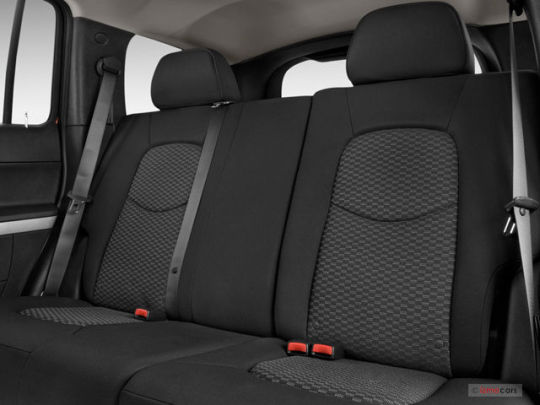
In the back the HHR had a bench seat which looked fine. It serves it’s purpose of hauling extra people and children around/being a decent load floor for cargo when put down. Not much really went on back there which I have no problem with. The HHR isn’t a Rolls Royce, it does not need to have a luxurious back seat!
Variants:

The HHR had a few different versions of it over the years. So here they are;
HHR SS:

This was the performance version of the HHR. It upgraded the HHR’s 155 horsepower to a respectable 260 Horsepower. I will admit that the HHR SS is actually kind of cool when looking at it from a performance standpoint. The HHR SS wasn’t too different from the base model when it came to looks. It got an SS badge on the side and a different looking bumper and grille. On the inside the HHR SS was basically the same as the base-model except the steering wheel had an SS Badge.
HHR Panel Van and HHR SS Panel:
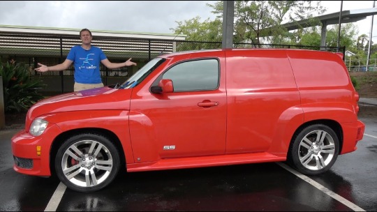
Chevy offered a panel van version of the HHR which looked like what it was, a Chevy HHR that was converted into a panel van. The back windows are completely gone for instance. There was no way to open the panel vans door from the exterior and you instead had to push a button on the key fob to open them (although there was also a button on the dash to open the doors in case that didn’t work).
The weirdest HHR variant however was the SS version of the panel van. That’s right, a crossover turned into a performance car turned into a van. No wonder a cash strapped GM cut this strange version of the HHR off after four months and only 216 units!
Pros And Cons:
Pros:
Decent Cargo room and way more practical than it’s rival the PT Cruiser.
The SS Version is actually quite sporty
Decent Interior
Cons:
Very Ugly
Can look cheap depending on what color you chose
Questionable reliability.
Final Verdict:

The HHR is an example of a retro design that just did not work! It’s certainly not the ugliest car ever made mind you, but it is certainly ugly and awkward. The interior is bland and inoffensive (which is certainly better than bad!).
Exterior Styling Final Rating; 18/50
Interior Styling Final Rating; 21/50
Overall Styling Rating; 39/100.
Next Review: A Modern Luxury Sedan
5 notes
·
View notes
Text
2000 - 2003 BMW Z8: Starting The Millennium In The Best Way Possible.

The BMW Z8 is one of my top five favorite BMW’s! The simplistic roadster design is sporty and sleek. The BMW Z8 was one of the first BMW’s of the 2000′s and it is truly one of the best.
Exterior Styling:

The Z8 is a beautiful car all around. Inspired by the original and also wonderful BMW 507, the Z8 invokes the retro feel of the 507 while also remaining modern and relevant (unlike some other retro styled cars from the early 2000′s). The Z8 has a fantastic use of shape, the Z8′s rather rounded and roadster shape makes the car appear elegant while also sporty. The rounded and bubbly headlights are very well cool looking and make the car look a tiny bit more aggressive.
Interestingly enough this car was designed by Henrik Fisker, who later went on to design the Fisker Karma and you can see a lot of design cues from this car in the Karma. The most obvious design cue that the Karma has from the Z8 is the horizontal grille. Unlike most BMW cars, the Z8 takes the normally vertical kidney grille and turns it horizontal. I feel like this works in this case, I think that the kidney grille would look atrocious on this car. The Fisker Karma also has the aforementioned headlights.

On the top; BMW Z8. On the bottom; Fisker Karma Revero

The rear end of the BMW Z8 is also quite impressive. I like the rather small tail lights as they aren’t intrusive and generally blend in very well with the sleek Z8. The rather rounded back end of the Z8 invokes the classic 507 as well. This truly does do a good job with being retro while not compromising the interior.
Interior Design:

The Z8 had a very minimalist interior. There are quite a few aspects of the Z8′s interior that shine out though. The number one eye catching design inside the Z8 is the steering wheel. The Z8′s wheel is a four pronged wheel with four separate spokes per prong. This is a very art deco looking design that works very with the Z8′s retro design. I personally believe this to be one of if not the coolest steering wheel BMW has put into a production car.
Another very cool element in the Z8 are the numerous oversized gages above the climate vents and radio. The gages remind me a lot of an airplane cockpit, with huge screens telling you everything you might need to know as you drive down the road in your Z8.
This car managed to look fantastic with an all black interior which is something many cars aren’t able to pull off. However, with red accents the Z8 also looks quite beautiful. However I feel like black looks a little more sleek and matches with the exterior more. The materials in the Z8 are also quite high quality and and good looking.

Pros and Cons
Pros:
Stylish and sporty exterior and interior styling that’s sure to catch many peoples eyes
A very fast and well performing sports car.
Supposedly pretty reliable
Cons:
Very impractical.
Expensive!
A bit skimpy when it comes to features and tech.
Final Verdict:

The Z8 is overall a very beautiful car and will always be one of my favorite BMW’s of all time. The design on the interior and exterior is beautiful and invokes the retro 507 without feeling too heavy handed.
Exterior Styling Final Rating; 45/50
Interior Styling Final Rating; 38/50
Overall Styling Rating; 83/100
Next Review: A retro styled car that did not work quite as well
2 notes
·
View notes