Don't wanna be here? Send us removal request.
Text

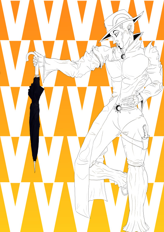
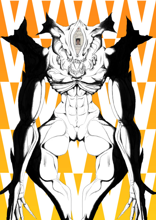
Art Piece 2: Narcissus and Rasputin
This piece of art came from the conclusion of my first art study where I was inspired by artists Hirohiko Araki and Piotr Jabłoński to do a character styled like Araki’s work but rendered in Pitor’s dark matte shadows present in his Destiny conceptual art. With that piece, I was quite pleased with the outcome, and realising that I had already lost such a tyrannical amount of time, I went straight onto the next piece in that style, choosing it for my project instead of going further, as I was by doing a piece to Ming Doyle for my second study, but I was already so strapped for time. While I think it’s quite sad that I couldn't pay homage to her in a piece that was going to be inspired by her husband's song Spiral of Ants, I was going to slightly reference it by painting the characters in a deep red and blue, however this didn't quite turn out as planned, so I instead left the white colouring to save on time.
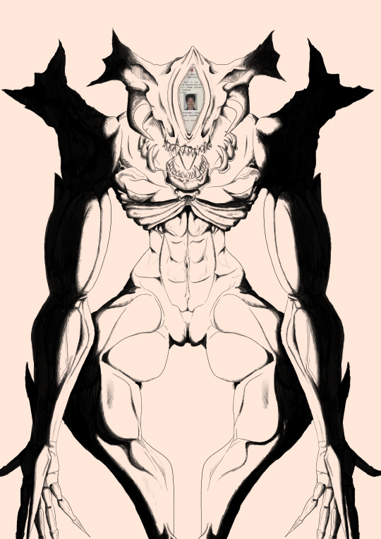
This piece took up considerable time in my project, and sadly I think it has been a let-down. While I put my all into the piece, trying to develop my skill by making the characters poses and bases by myself, only referencing clothing and an old image, I think that it has come back in a negative sense. I tried to add more depth by making some pieces of their bodies appear in the foreground, enlarging them and making them stand out, hopefully making the piece feel my dynamic, alas, I see that it looks quite uncanny, especially the human character, (Narcissus,) whose right hand looks abnormally long, what could have worked if the arm was more outstretched but due to its slack nature, it looks goofy.
Thankfully, I do like the rendering I did on the piece, a complaint with my previous work was that I doused it too much in shadow, leaving barely any detail in his torso or legs, so in this piece, I actively made it much lighter, leaving to a more detailed image, with some areas being bleached in shadow with only the light source leaving highlights, this was to make the piece less samey sue to there being much less darkness, as seen in his boots and hair.
I, again, made the characters a simple and rushed Tarot inspired card for the actual game based segment of my proposed game, I, again, Believe this was less successful than my last piece, mostly due to wanting to incorporate both characters in the piece, due to them being far longer than the last piece’s character’s head, that had to appear smaller on my proposed stock tarot card, taking far less space horizontally, making them seem quite squished even when they aren't taking half the card.
I tried to further innovate on this piece, especially on the background, using a more unique star shape for the pattern and using perspective warp to make it seem to flatten out into a floor, like a tarp thrown over a wall. I like how this came out, as it gives the character a floor to stand on what doesn’t need to be rendered as hard as the last pieces that IO left out due to time. I also, on the card design, slightly tilted the stars, giving a more dynamic look to the card than before. I also tried my hand at better clothing, adding areas of tension and shagginess, what actually came out quite nice, even if some of them might not be humanly possible.
Altogether, I can't say that I'm disappointed with the outcome, as I believe it is still held to a high quality that I expect in my work, however, I would be lying if I said I thought it was better than the last piece, even by incorporating more characters, trying more detail and trying to further my skills, it just looks far less interesting with far more errors. Things that could have led to this is lack of highlighting on normal materials due to the softer light, the use of blank white instead of a sun bleached variant and a lack of a secondary colour to show complexity and change in skin and clothing durability and / or thickness.
To improve, I could try to add more fragments from the previous piece into my next projects that were excluded here for time purposes. I could also try more interesting posing, which these characters have less of, just standing looking straight on, whereas the previous piece was more interestingly posed on their side.
0 notes


