Text
Final Work - Assessment 3
@shiyaoc + @siqichenadad1002
Final Video:
youtube
In class experiment video:
youtube

2 notes
·
View notes
Text
Assessment 3 Bibliography
@cassandraleeadad @siqichenadad1002
Artist Research:
Billie Jean: The Sound of Taste
http://www.artnau.com/2014/04/the-sound-of-taste-feel-flavour/
Intro video: https://vimeo.com/97520674
Ben Houge: Food Opera
https://nmbx.newmusicusa.org/food-opera-merging-taste-and-sound-in-real-time/
Relevant video: https://vimeo.com/73803258
Film advertisement created by Grey, United Kingdom for Schwartz: The Sound of Taste
video link: https://www.adsoftheworld.com/media/film/schwartz_the_sound_of_taste
Emilie Baltz: Lickestra
http://emiliebaltz.com/experiments/lickestra/
video link: https://vimeo.com/92058796
the performance presents a series of conductive ice creams that trigger various baselines and tones when licked
G.W. Bot’s “Resurrection Glyph – Midday”
Link: https://soundslikenoise.org/2012/08/11/listening-to-g-w-bots-resurrection-glyphs-midday/
Jan Davis’ “First Sighting Near Flooding Creek”
Link: https://soundslikenoise.org/listening-to-art/
This sound composition interprets Davis’ work by imagining how the unfamiliar sounds of the Gippsland marshlands heightened a sense of trepidation in the early colonialists. The White Woman is out of sight, yet her presence in the mythology of the landscape is palpable.
Contextual Research:
Sound bites: how sound can affect taste, 2011, https://blog.oup.com/2011/08/sound-bites/ [accessed 20 Oct 2018]
The Sounds of Food: Defamiliarization and the Blinding of Taste, Tara Brabazon, https://www.researchcatalogue.net/view/369386/369387 [accessed 20 Oct 2018]
Does Sound Affect Taste? Try it yourself | Earth Lab, uploaded by BBC Earth Lab, Youtube, https://www.youtube.com/watch?v=CONe3iW-xww [accessed 22 Oct 2018]
Janice Wang: How sound affects our taste perception, uploaded by Design Indaba, Youtube, https://www.youtube.com/watch?v=5O0p-NHaKTs [accessed 22 Oct 2018]
1 note
·
View note
Photo
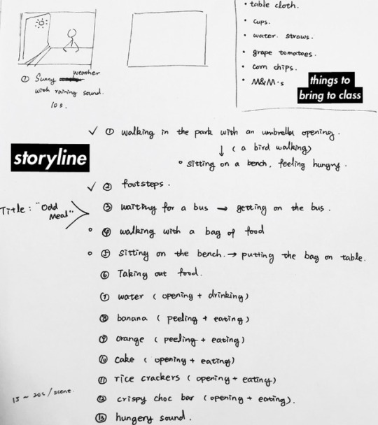
Planning for making + editing video
@shiyaoc + @siqichenadad1002
Affect & body politics
engaging the work with the audience = interactive engagement with the class after we play the video. They re-enact / try out some of the food with the sound
how to manipulate the audience = can we change their senses?
first impact = affect = strange/abnormal sounds with food
following feelings = effect = did it work?
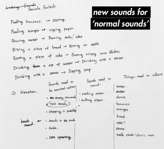
After we play our video, we would like the class to participate in a short picnic. Tasting some foods while a backing track is played to see if they are affected in any way.
1 note
·
View note
Photo
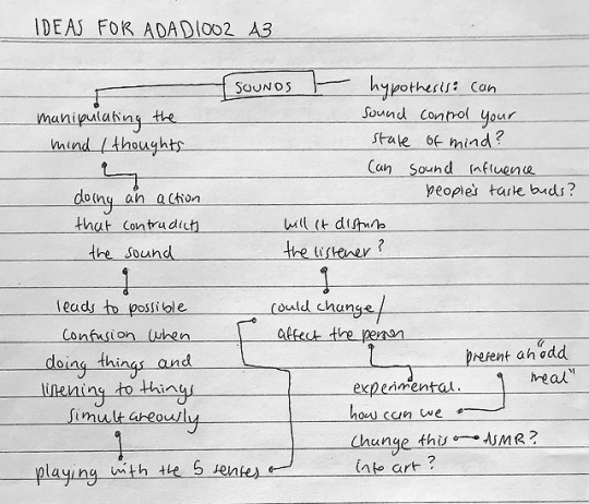
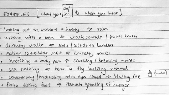
Brainstorming Ideas for A3
Inspiration: [sounds/audio mixed with visuals]
The inspiration that sparked our event branched from an article that explored how sound can affect our tastes. An experiment Charles Spence and Heston Blumenthal conducted, asked the audience to taste two samples of ‘bacon & egg’ ice creams. They played two different tracks, one of bacon sizzling and the other of chickens. It resulted with the audience finding the ice cream that had the most bacon flavour was when they played the sizzle sounds. However, both ice cream samples were identical. This experiment lead us to our idea of challenging this hypothesis.
Another article stated that “sound in whatever form has the harm to create balance and harmony or to create trauma and chaos” (Griffiths, 2017). One should be conscious of the sounds in their environment to see what kind of effects it will have on them.
References
n.a, 2011, ‘Sound bites: how sound can affect taste’, Oxford University Press, https://blog.oup.com/2011/08/sound-bites/, last viewed 22 October 2018
Dean Griffiths, 2017, ‘How Sound Can Have a Powerful Effect on Your State of Mind’, Psychreg, https://www.psychreg.org/sound-effect-mind/, last viewed 22 October 2018
1 note
·
View note
Text
Group Project Update
with @shiyaoc & @siqichenadad1002
Week 10:
Initially we thought about using an existing event to further create and enhance the experience. The event we wanted to draw inspiration from was the Mid-Autumn festival that happened in late September. The festival celebrates the full moon in the lunar calendar and has many cultural representations. Our idea was to gather some of the Asian characteristics and Westernise it in some way. That was as far as we got.
Week 11:
Shiyao had the idea to convey a specific emotion by touching a tangible object we make. This emotion was stemmed by a common phrase we all use in our daily conversations such as ‘I love you’ and ‘goodnight’. This is supported by having different textures and shapes that the user will feel to interpret what kind of emotion it was evoking.
Week 12:
Receiving feedback from the class, we decided to change our event again. We have come to the conclusion to engage specifically with visuals and sounds that contradict one another. For example, the action is to drink water, but the viewer will hear the sounds of soda bubbles. We want to make a video that collates these examples and incorporate it into a storyline that works in conjunction with the weekly concept of affect & body politics.
1 note
·
View note
Text
Artist Research - Ghada Amer
After the group discussion in week 10 and 11, our group decided to change our event to texting messages. We wanted to look into the emotions hiding behind simple words in messages like “good night”, “I love you” and reflect on the weekly concept affect in week 5 so we have been looking for artists that are creating their work with text and emotions.
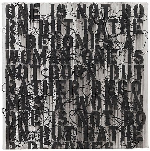
Ghada Amer, TEST #8 2013. Acrylic, embroidery and gel medium on canvas 20 x 20 inches / 50.8 x 50.8 centimeters
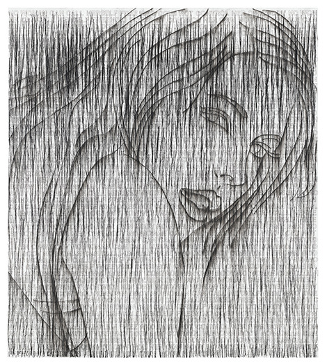
Ghada Amer, “NORAH”, 2014. Courtesy Cheim & Read, New York.
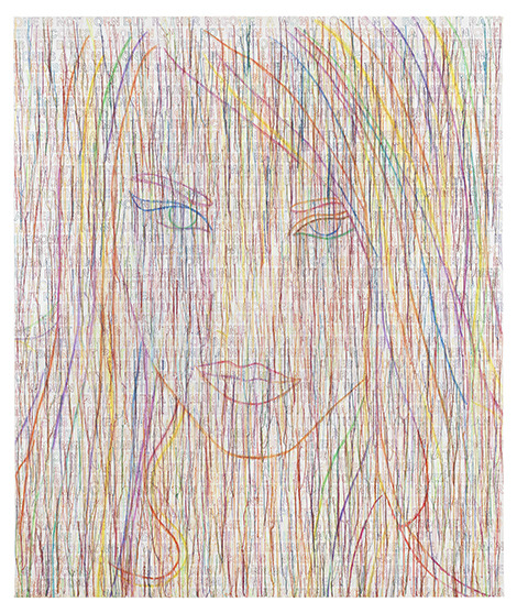
Ghada Amer, “THE RAINBOW GIRL”, 2014. Courtesy Cheim & Read, New York
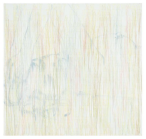
Ghada Amer, “MANDY”, 2013. Courtesy Cheim & Read, New York.

Ghada Amer “SUNSET WITH WORDS – RFGA”, 2013. Courtesy Cheim & Read, New York.
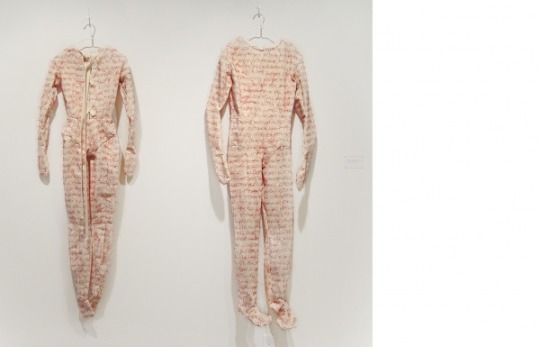
“Barbie Loves Ken, Ken loves Barbie,” 1995 embroidery on cotton fabric; edition 2/3, Courtesy of the artist and Gagosian, New York

Detail, “Barbie Loves Ken, Ken loves Barbie,” 1995 embroidery on cotton fabric; edition 2/3, Courtesy of the artist and Gagosian, New York
Ghada Amer, born in Cairo (Egypt) in 1963 and studied at the Villa Arson in Nice, France. Her embroidered canvases address cultural identity, religious fundamentalism, acts of sexual violence and confronts the language of hostility and finality with narratives of love and longing. Amer currently lives and works in New York and has exhibited at the Venice Biennale (Venice, Italy), the Sydney Biennale (Sydney, Australia), the Whitney Biennale (New York, NY) and the Brooklyn Museum (Brooklyn, NY).
Amer has been experimenting with text and words in most of her drawings, paintings and embroidered sculptures. She uses different material, colors and forms to express emotions, sexual violence and gender-relating themes.
Artist page: https://www.ghadaamer.com/
Images from:
http://info.kcai.edu/artspace/exhibitions/8140/ghada-amer-naughty-and-nice
https://artillerymag.com/ghada-amer/
https://artmap.com/cheimread/exhibition/ghada-amer-2014
Other referencing:
http://www.elizabethleach.com/Exhibit_Detail.cfm?ShowsID=284
https://artmap.com/cheimread/exhibition/ghada-amer-2014
http://info.kcai.edu/artspace/exhibitions/8140/ghada-amer-naughty-and-nice
3 notes
·
View notes
Text
Interrupting a signal
Glitch


5 notes
·
View notes
Photo
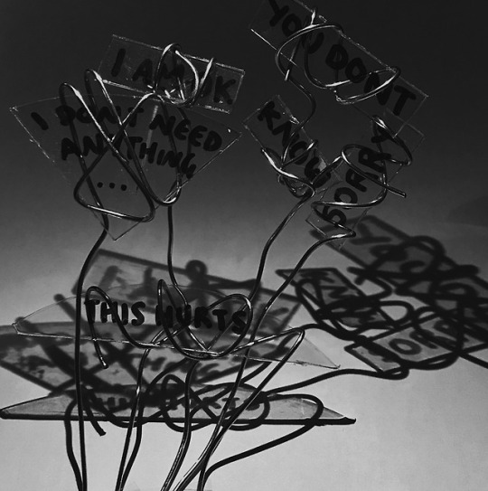

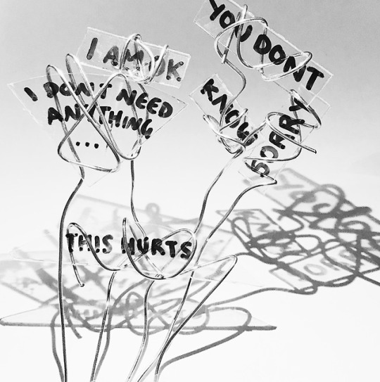
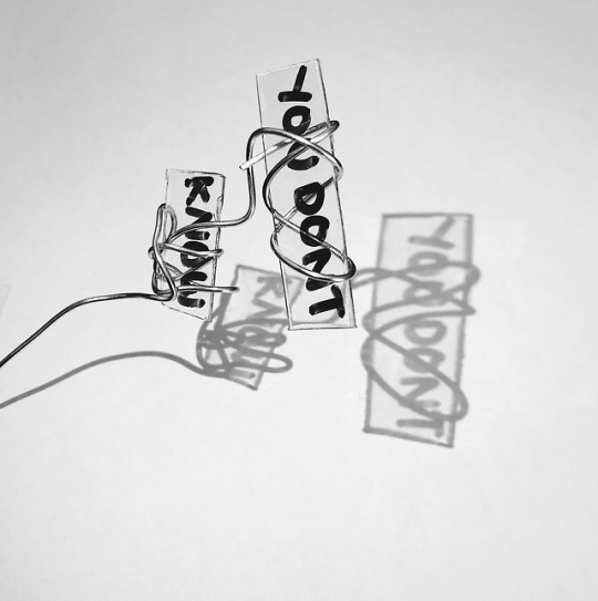
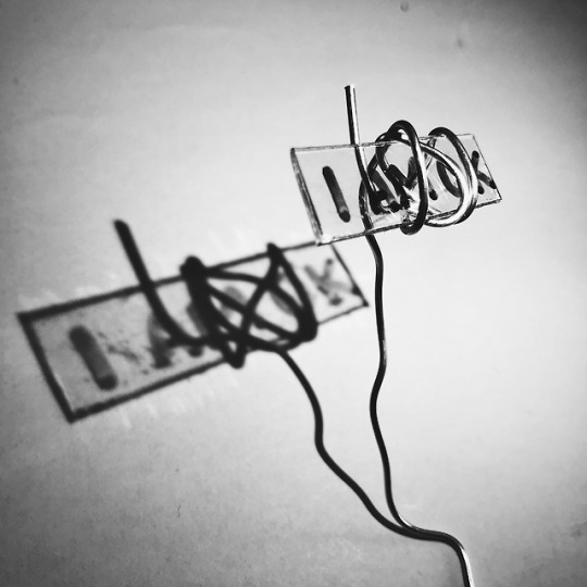
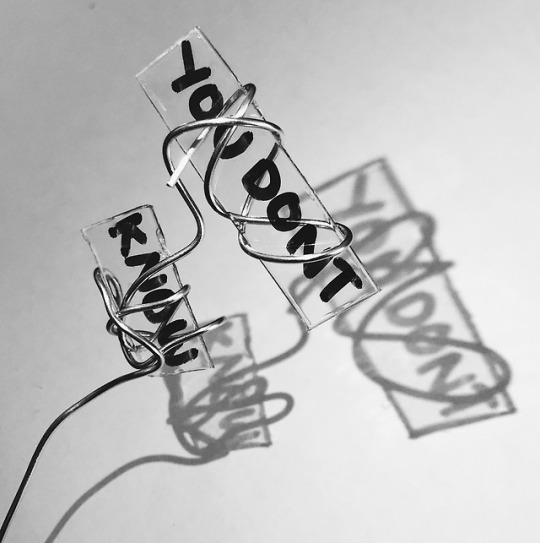
Final Work: Cassandra Lee (2018), “3 Parts to being Fine”
Artist Statement
At the start of this project, I knew I wanted to continue working with text and how particular words can affect people’s perspectives. Instead of taking the clean and dirty binary approach from the previous assessment, I chose a different pathway that tackles the other side of the human mind. Emotion. Not happy, nor sad, but in this perpetual limbo of feeling nothing but something.
The certainty of being uncertain is a new binary I came up with. I’m sure a lot of people have been in this position where something is bothering them but they themselves or the people around them don’t know the answers to what or why it is happening. As I was trying to research what this ‘concept’ was called, I found a site that listed ’13 lies people with depression tell’. The first lie they listed was “I’m fine.” This is an iconic line that everyone uses for many reasons, but the most common intention is that the individual doesn’t want to bother or worry the person asking. The fear of dragging or forcing someone into their problems is better to be avoided, as one thinks. Much of this conceptual thinking was based on my personal experiences. Frustration, sadness, and numbness are universal expressions and moods I wanted to convey on behalf of society.
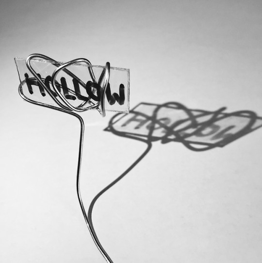
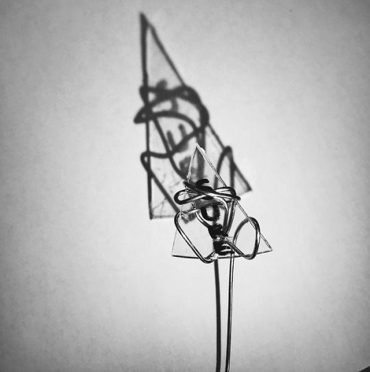
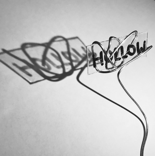
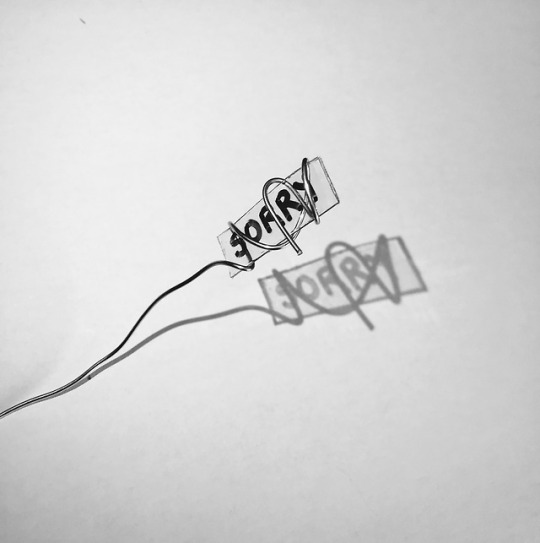
Most of my research was focused on the methods and mediums other artists and designers used. These ranged from artists who solely just used text and a flat medium, to designers making three-dimensional installations. But the two most influential artists who guided my final work are Robert MacPherson and Shai Levi. I was intrigued by MacPherson’s work that revolved around road signs and the choice of words he decided to put on it. His installation, ‘Mayfair: (Swamp Rats) Ninety-Seven Signs for C.P., J.P., B.W., G.W. & R.W.’ (1994–95) was overwhelming for the eye and at first glance, quite illusive. The repetitive elements and the tonal colours are what encouraged me to take a similar approach since I liked having this daunting reaction when I looked at his work, even though it was not related to the context whatsoever. I subconsciously created road signs when I cut out different geometric shapes and attached a piece of wire to it. These signs symbolise the act of emotional guidance, they aide the individual to isolation. Contrastingly, designer Shai Levi and her multiple dimension, illusion drawings invited me to explore with lights and shadows. Since I used CD disks, I played with its transparency with a torch and it gave off this intimidating shadow of these haunting thoughts. Experimenting together with MacPherson and Levi’s practice, allowed me to craft these photographic images.
The words and phrases I chose for this final piece reflect neglected feelings; thoughts that needed to be shared and words that pushed people away. The beginning of my experimentation, I focused heavily on interactive designs that allowed the audience to control how these objects moved. I couldn’t quite figure out how to make a larger scale of an original idea so I combined these experimentations and produced these photographs. The outcome of these three-part images is to evoke how these innermost feelings are being opened up to the outer self. The lighting exposure of dark to light help reinforce a sense of hope. The harsh edges of the signs, the rough font, the smudged fingerprints and the way the wire is entangled, is drowning the state of confusion, of nothing but something. Isolation and separation are refracted onto the surface, demonstrating the corrupted and clouded mind. The different movements and lines emphasise the maze-like road that occurs in one’s head. There are always two sides to a story. There is a good, and there is a bad. But sometimes, there is only one option. An option that closely sits on either sides of a maybe. And that is the feeling of being ‘fine’.
Bibliography
Cynthia W. Lubow, 2013, GoodTherapy, accessed 18/9/18 <https://www.goodtherapy.org/blog/lies-we-tell-when-we-are-depressed-0919135>
Sarah Schuster, 2018, The Mighty, accessed 18/9/18 <https://themighty.com/2018/03/depression-lies-liar-im-fine/>
0 notes
Photo
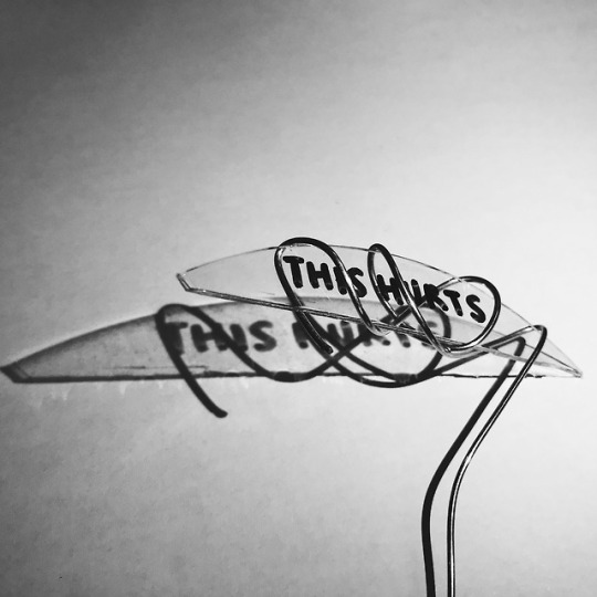
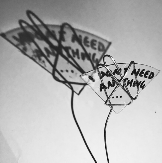
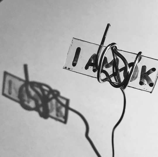
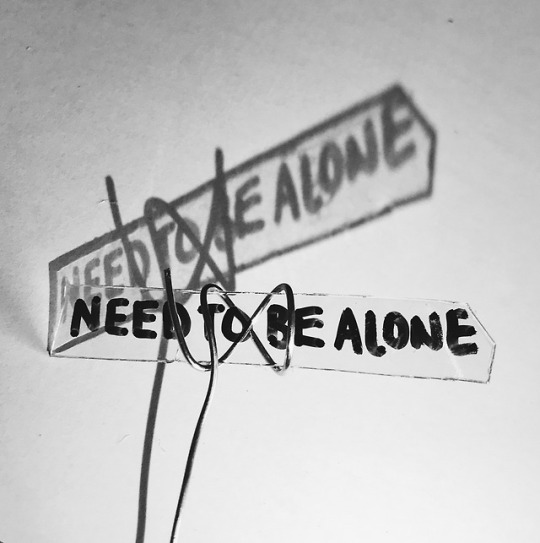
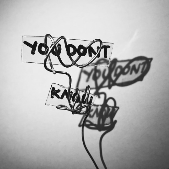
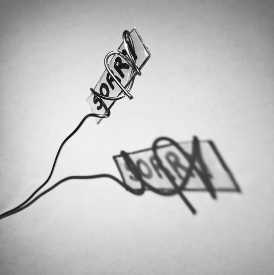

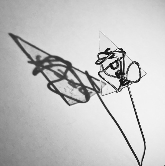
Process of Final Work
I repeated experiment #4 eight times incorporating different shapes of the sign as well as the text. I took multiple pictures of each, adjusting the angles to expand/contract/enlarge/shrink the shadows. Here are the final images I chose to display. I really liked how this turned out and for my final, I will most likely combine some of these signs together and photograph different versions.
I was inspired by a Spanish artist & designer Arturo Álvarez who made hanging fixtures of figures/faces with steel mesh to create shadows onto the wall. I applied his technique but in the most basic forms.
youtube
The video shows the combination of signs I put together and how the shadow moves and stretches depending on how the light source shines on. I also added an effect onto the video to enhance the rainbow sheen the disc had which isn’t really relevant for my final work but adds a fun element to it.
INSPIRATION:
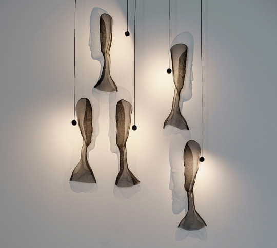
Arturo Álvarez (2017), ‘Conversas’ https://www.designboom.com/design/arturo-alvarez-nycxdesign-icff-conversas-shadow-lights-05-23-2017/
Moving shadows that give expression to a collection of figures and faces.
A series of stainless steel mesh shapes with a hanging light source to create dramatic shadows against the surrounding surfaces, expanding and contracting the faces
0 notes
Photo
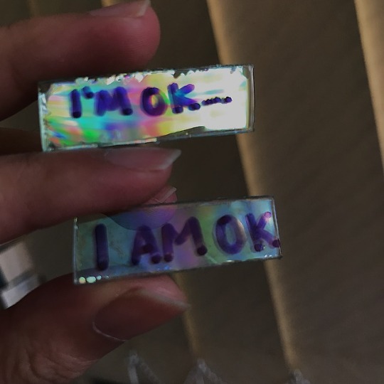
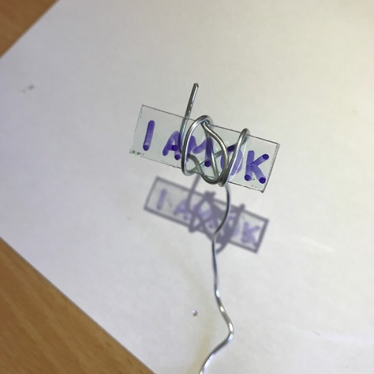
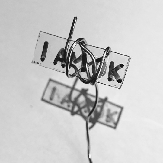
Experiment #4 - Signs
In this experiment, I decided to go back to my first experiment’s inspiration, Robert MacPherson’s artwork with road signs. I still wanted to use CD’s somehow and I ended up making mini picket-looking signs.
The first image was testing how the marker looked on the disk’s surface. The top had the holographic film and the bottom was bare. I decided that the bare surface worked well with the text since I had the idea to create shadows. I wrapped some wire around the sign and taped the extended wire to the table so I could shine a torch to play with the shadows. I wanted the text to be visible and readable on both the paper and the disc. I edited the image to black and white, sharpened it and cropped it to make it look tidier. The wire added movement to the image and intensified the tonal aspect of the image. Overall, I like how this experiment turned out and I’ll continue exploring with words that evoke a sense of emotional limbo.
0 notes
Text
Experiment #3 - Prisms
Since my previous experiments were heavily focused on the notion of two opposing views with understanding emotion, I wanted to expand this idea with a medium. I found that CD’s also have that two-sided factor. When light is shining on it, it reflects and refracts the vibrant colours of the rainbow. When it’s in the dark, it is much duller. I didn’t really have an idea on what to make so I started off by cutting it up like a pizza to make a prism of some sort. There was a lot of challenges with the process. It was difficult to cut neatly and the holographic print was separating from the disc. The objects I made were definitely not presentable so this experiment was a failure.
However, I did find that by removing the holographic film, the disc still had a rainbow sheen when light was directed onto the surface. I will probably explore further with this.
youtube
The video shows a disc moving in the light, and the two prisms that were made unsuccessfully.
1 note
·
View note
Photo
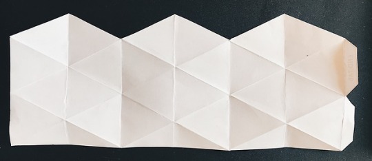
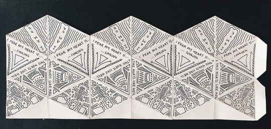
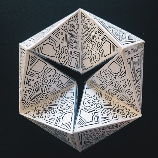
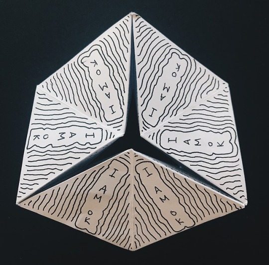
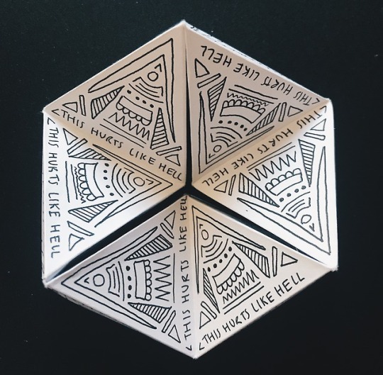
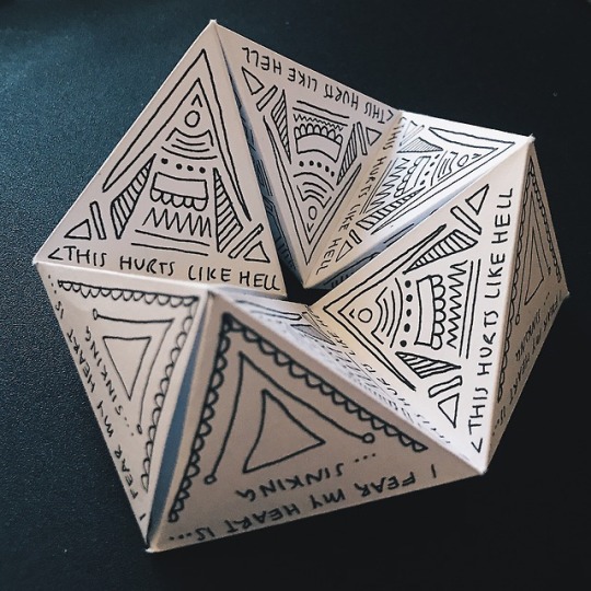
Experiment #2 Part 2 - 3D ILLUSION
Cassandra Lee (2018), Heartache
Following from the 2D experiment, I decided to make a 3D version. This time the words are emotionally deeper I guess. Creating things that people can interact with is a concept I would like to work on. This flexagon is like a kaleidoscope as the patterns on each help with the sense of delusion. I cut out a template and drew on all of the triangular faces so that each rotation would have something different to look at. It could look really cool if it was much larger and had a lot of detail on it so this can be an option for a final product.
This two-part process was inspired by the designer Shai Levi who makes two-dimensional metal outlines and plays with lighting and shadows to create a three-dimensional illusion. Instead of using her practice, I wanted to start off with something simpler by using pen and paper.
youtube
INSPIRATION:
Shai Levi
‘illusion drawings’ started with thinking about ways to create a maximum amount of space with a minimum amount of visual information.
translates 2D flatness into 3D constructs of metal bars
depth is emphasized with light – creates contrast with shadows, capturing the intricacies of their materials, edges, and imperfections.
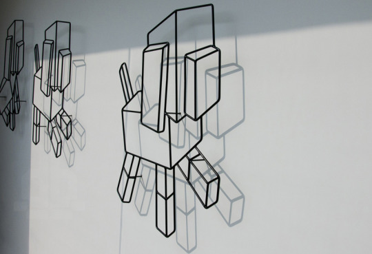
Shai Levi (2015) ‘A series of dog robots replicating themselves’ https://www.designboom.com/art/shai-levi-illusion-drawings-multiple-dimensions-01-05-2015/
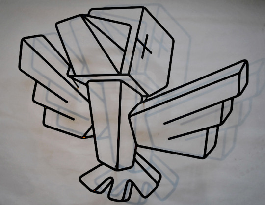
Shai Levi (2015) ‘Freedom Bird’ https://www.designboom.com/art/shai-levi-illusion-drawings-multiple-dimensions-01-05-2015/
1 note
·
View note
Photo
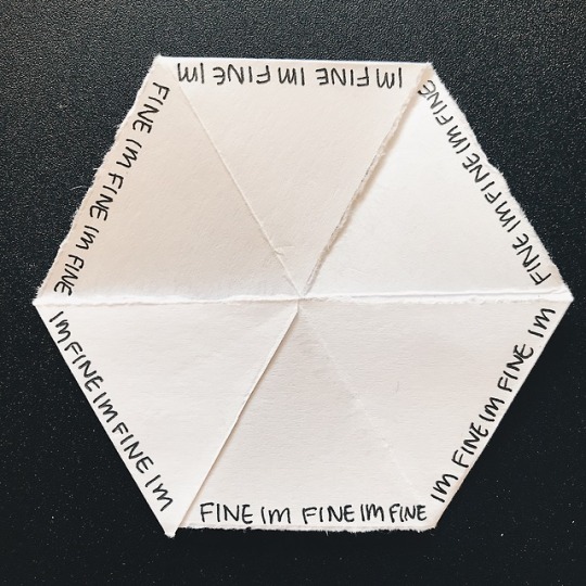
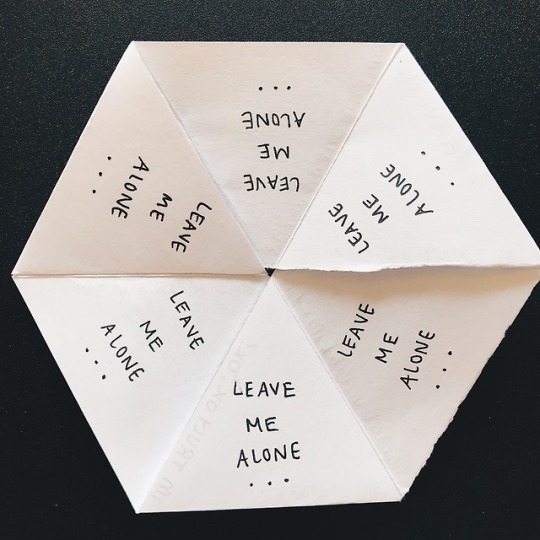
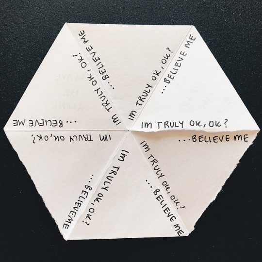
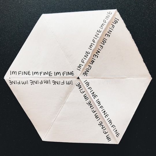
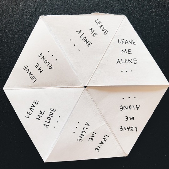
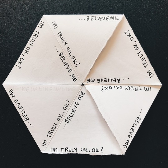
Experiment #2 Part 1 - 2D ILLUSION
Cassandra Lee (2018), Detached
Following from my previous experiment, I wanted to continue using text and interaction. These two-part mini products were inspired by optical illusions and kaleidoscopes. These movements enhance the words that are written.
This 2D “kaleidoscope” reflects a part of human emotions and how there are always two sides to one’s words. There are 3 lines on each face:
I’M FINE
LEAVE ME ALONE
I’M TRULY OK, OK?
As you flip the hexagonal faces, the 3 different lines shuffle. They produce 2 versions of each text and I thought it was fascinating how it changed. It compliments the notion of emotions and thoughts being two-sided. I would like to explore further with this technique, maybe add some more words, or patterns, a larger scale and or different materials such as cardboard. However, people who might want to try to play with it might get confused on how to.
Video showing how the faces change:
youtube
INSPIRATION:
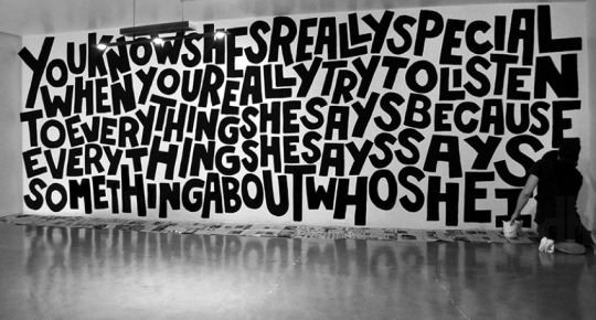
Timothy Goodman (2015) ‘curatorLA’ [mural] https://www.designboom.com/art/timothy-goodman-mural-conceptla-beverly-hills-california-10-01-2015/
I was inspired by his personal and reflective words about his experience
how the words are combined to form art and not sentences
it kind of looks like an illusion at first glance
0 notes
Photo
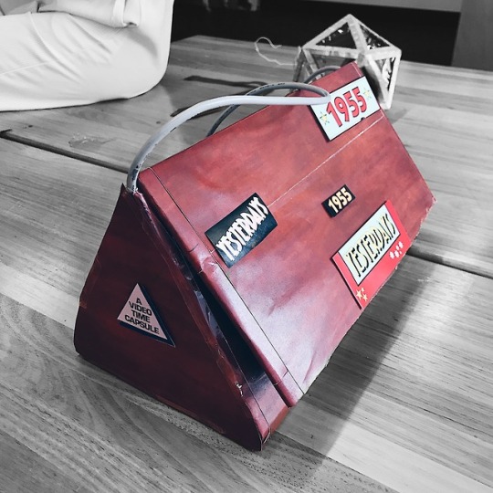
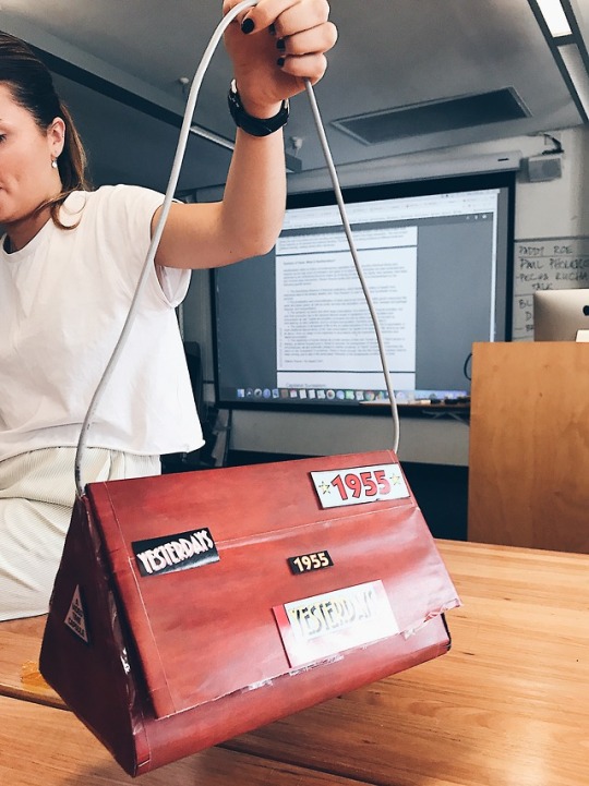
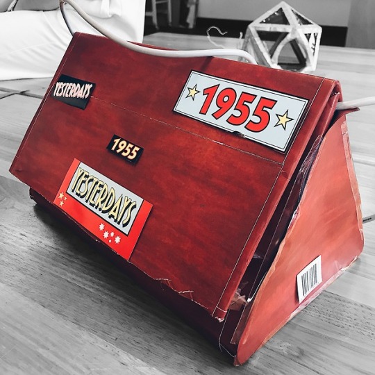
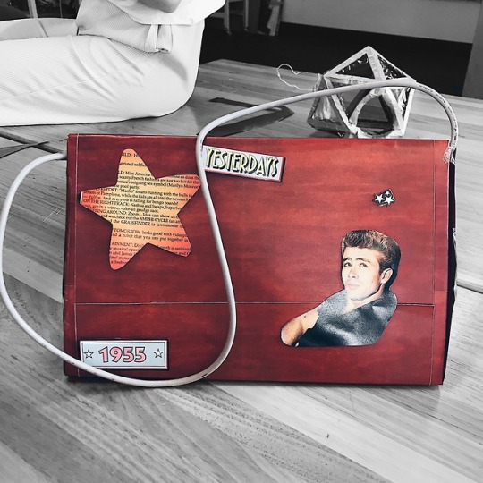

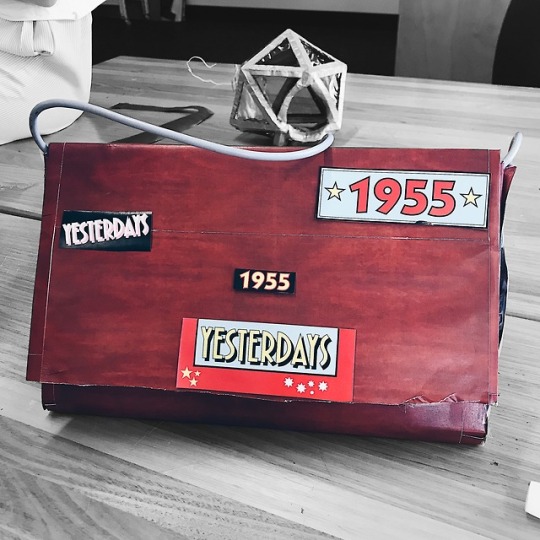
Value.‘Real Gucci’
THE Gucci bag of the year, limited edition VHS style. This vintage, industrial, fashion-forward handbag is the definition of luxurious.
1 note
·
View note
Video
youtube
Experiment #1 - Part 2/2
From the A1 feedback, I looked into the artist, Robert MacPherson since he explored a lot with text in his works. MacPherson incorporates a lot of familiar imagery such as everyday materials and visual elements from daily life, to honour the beauty of the mundane. One of these elements include road signs.
From his ‘Mayfair: Summer farm’ artwork, I gained inspiration to explore text and circular movements because of the egg shapes in his sign. So I used some cardboard and a piece of wire to create a moving mechanism of a face.
I used two pieces of cardboard, one with letters in the corners that reads “I’m ok” and the other with a happy/sad face. By rotating the first layer of the cardboard, the words can be taken into different contexts. I really like how it turned out and I might explore with interactive, moving pieces that draw out emotion.
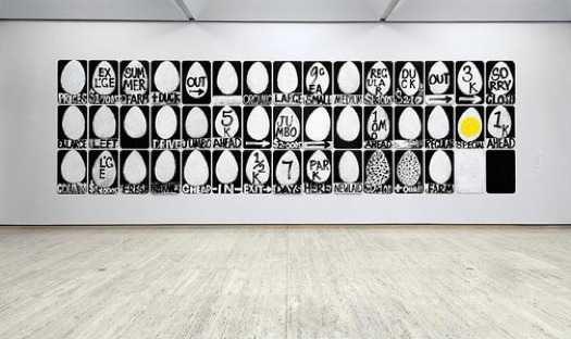
Robert MacPherson, Mayfair: Summer farm, forty-five signs for Micky Monsour, 1993 [painting] 280.5 x 957.0 cm https://www.artgallery.nsw.gov.au/collection/works/5.1998.a-ss/
Made up of 45 found masonite panels - hung on the wall.
They take the form of vernacular road signs.
Series is a tribute to rural Australia - our imagination is sent down the Aus highway on a journey of colloquial and commercial exchange.
2 notes
·
View notes
Photo
Exploring with Materials - Part 1/2
Reflection
Gathering feedback from my poster, I noticed people didn’t engage with it as well as I thought. So, I decided to take the concept with a different approach. Some ideas include:
use dirty and clean materials from the focus of my constructive binary
focus on using text because it can be manipulated in many ways
explore with paint – colour blocking
sculpture out of newspaper
In class [29.8.18]
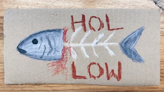
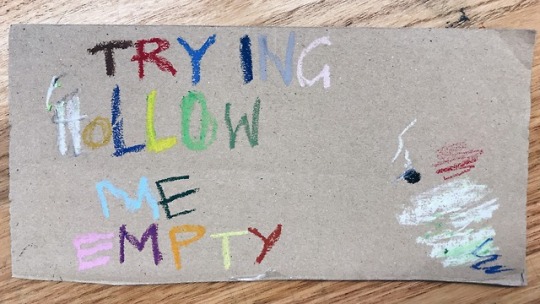
I brought in some cardboard and oil pastels to play around with since I have never explored with these together. I drew a random boneless fish with the tail and head still intact with the word ‘hollow’ sandwiching the empty body. This was just a rough experiment to test the colours, methods of using and blending oil pastels. I like the symbolism of the fish with hollowness, it might be interesting to look into. The second image was just testing out colours and some words that sparked some ideas when I was researching some artists.
1 note
·
View note
