
dear god i don't want to fail my exams UPDATE: DIDNT FAIL !!!!!!
Don't wanna be here? Send us removal request.
Statistics
We looked inside some of the posts by casskeeps and here's what we found interesting.
Average Info
Notes Per Post
123K
Likes Per Post
61K
Reblog Per Post
62K
Reply Per Post
83
Time Between Posts
23 days
Number of Posts By Type
Text
16
Note
1
Last Seen Tumblr Blogs


Fun Fact
In 2020, 44% of users from Denmark used Tumblr daily.
Text
I LOVE THE AENEID I LOVE IT SO MUCH I NEED TO SPEND MY LIFE STUDYING VIRGIL I LOVE HIM
is it sacrilege to say i enjoy the aeneid quite a bit more than i do the iliad and the odyssey
18 notes
·
View notes
Text
this makes me so so sad the aeneid is probably my favourite piece of literature in the world
the description of euryalus' death, the way amata plunges into fervour and madness, the way aeneas is just Some Guy who's had the world put on his shoulders
i love it so much and i genuinely don't believe that homeric epics compare in beauty
Honestly I wish Virgil had a more painful death. Heatstroke was too kind.
2 notes
·
View notes
Text
Feminist retelling with Greek Mythology is 9/10 times not feminist at all and instead ends up demonising the hurtful party in the original myth.
Like most Hades and Persephone retellings in order to give Persephone more agency they almost always demonise and villanise Demeter which is a major ick for me. In order to show her in the wrong because 'Girlboss Persephone' or whatever, they make her toxic and controlling and hysterical which is such....
Or another example I could think of is Circe by Madeline Miller, it's "retelling the Odyssey from Circe's perspective and a feminist lens" and this does not work for me because it is quite clear in Homer's Odyssey that Odysseus is a victim of sa by both Circe and Calypso and turning a victim into abuser is extremely poor taste to me. And sadly this is not unique to Odysseus but another Circe's victim from original myths Scylla was also villanised. (if you are interested in an analysis of Odysseus's time on Aeaea then I'd recommend checking this post.) In the retelling, Circe is so woobified, she's not allowed to have any morally greyness that's not excused by her 'trauma'
Or a few Medusa retelling where Perseus is shown to be misogynistic to kill Medusa when his original motivation was to save his mother Danaë from the King Polydectes unwelcome advances. And no, in the Greek Versions, Medusa was not turned into Gorgon by Athena, she was born monster. The origin of Medusa being a beautiful maiden who was cursed by Athena is actually Ovid because Ovid could not comprehend how Poseidon had sex with a monster.
Also have a huge bone to pick with 'The Song of Achilles', like if I think about the book from the perspective of an original story then its fineee 🤷🏽��♀️ but its not a original story, it's a retelling/adaptation and my god. The woobification of Patroclus and the demonising of Thetis and Deidamia?????? I will never forgive the book for how it portrayed Thetis, its criminal and lowkey misogynistic like Madeline girl what the fuck are you doing, she's two on two on turning rapists into rape victim in her retellings? and now she's writing the next book about Persephone and I'm terrified.
One of my biggest pet peeves about retellings is when the victims from original myths/stories are turned into villains of their original abuser and unfortunately a lot of Greek retellings fall into this pit
Also I wish authors would explore the tragedy of characters who are already doomed in the myths. This official recommendation of the book Clytemnestra by Costanza Casati please read it, I really enjoyed it <3333
31 notes
·
View notes
Text
If I get the privilege of meeting Virgil in purgatory like Dante did in his lil’ Christianity fanfic I am promptly kissing his brain and introducing him to Mitski
Like tysm for characterizing a mommy-issues, dad of all time, lover-boy mythical hero so well that he rotates in my mind like a Pop-Tart in the microwave 24/7
(also a little kiss on the brain to Homer for making him up)
10 notes
·
View notes

Text
frequently thinking about agamemnon being so pissed about his wife clytemnestra killing him that he tells odysseus in the underworld that that event made him misogynistic
62 notes
·
View notes
Text
aeneas makes me crazy dude. he never cared for the future of rome. all he ever wanted was in troy. people kept trying to tell him "its gonna be okay youre gonna make rome" and he went along with it because it was keeping the last things he had of troy alive. he sailed to so many places looking for a place that was safe to call home. no one would take them. he found other trojans, even! and his cousin (helenus) looked him in the eyes and said "you need to go to a land we aren't even sure exists". other trojans wouldn't take them. when he tried to assimilate in carthage, a safe place for his people and for Didos, the gods forced him to leave the person he'd fallen in love with in the most violent and horrible way possible. despite his best efforts troy is slipping from his hands. its been gone the day his fleet left the shore.
aeneas can't be human. he has to be a vessel for the gods exact, contradictory wills at all times or else the last people he has of his home will die. aeneas was named terrible grief for the grief he cause venus by being mortal, but it fits more the grief the gods have caused him. the gods willed him to be born. the gods started the war that destroyed his home, that killed his cousins. the gods turned him away from his fellow trojans. the gods forced him to break the heart of the woman he loved and the only other person hed met that somewhat understood. the gods forced him to war a second time.
aeneas grieves the life he couldve had had he just been a man. aeneas grieves himself who died in troy
721 notes
·
View notes
Note
Just want to say well done for passing (ignore that I’m like.. a month and a half late to say this) Although we didn’t do the exact same modules for classics it was still cool seeing you post all your stuff and seeing what bits I could take to my own ones. Very cool of you to post publicly. Thank you very much for doing it, hope if your at uni your having a good time and if not that you’ve found something equally as rewarding
thank you !!! i'm glad you thought it was cool - i've had a wonderful time compiling information !!
i will be going to uni next year for classics or classical studies (depending on where i get in) so am taking this year to read lots of virgil and study some latin !!! i hope your exams went well and you're also doing something enjoyable and rewarding !!! <3
2 notes
·
View notes
Text

the fisherman and the syren by frederic leighton (1856-1858)
12 notes
·
View notes
Text

UPDATE !!!
he looks like that because he is not a "typical" centaur (he is not part of the "wild race" of centaurs), and is more civilised and wise than the other centaurs - he is more human (civilised) than the centaurs we see depicted in the temple of zeus at olympia pediments and the ionic frieze of the temple of apollo at bassae !!
what do i mean by not a typical centaur ? i'm glad you asked ! centaurs are sometimes referred to as "ixionidae" - sons of ixion - as they descend from ixion and the cloud goddess nephele. cheiron/chiron, however, was the son of cronus (in horse form) and philyra, one of the oceanids. this makes him a) zeus' half brother, and b) not part of the race/family of centaurs - however, as he has the look of a centaur he's pretty much considered the "best" one !
this does not change the fact that i hate it however
the wedding of peleus and thetis - dinos by sophilos
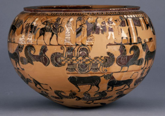
basic facts
date - c580-570 bce
style - early black figure
original location - ever so sorry but i have no clue we just know it was made in attica
function - dinos - mixing water and wine
size - 28.8cm tall, 42cm wide/deep
context
similar to perseus and the gorgons ! we're in attica, moving away from the corinthian tradition of decorating using rows of animal processions and floral patterns, and starting to prioritise the attic preferences of narratives - this pot shows the wedding of peleus and thetis! if these guys seem familiar, they should - thetis was a goddess of the sea and the mother of achilles ! it's also good to remember that this wedding is where eris brought the golden apple to start some divine infighting (and also the trojan war).
we know that this pot was painted by sophilos, because he signed the pot - this is the earliest attic potter that we can actually name! he signed "sophilos painted me" between the columns of peleus' house (not in english though !! ancient greeks did not speak modern english).
content
friezes of processing animals - again, we have some corinthian influence with the filling of space done by repeating figures of processing animals. these are less carefully done - the shapes are not quite as regular
floral pattern and animals - he's just not serving as much cunt as the gorgon painter - his floral pattern is less intricate than the one on the perseus+gorgons dinos
narrative frieze - LONG ASS PROCESSION - this shit is SO LONG it goes on forever and ever and ages. lots of gods and godly figures, some chariots.
then we have a cute lil repeating band at the top ! just to finish off the pot - this is also done a little bit haphazardly and there are a few inconsistencies with the incision
list of names to try to remember (as per the british museum):
peleus
dionysos, hebe, cheiron
zeus + hera
poseidon + amphitrite
hermes + apollo
ares + aphrodite
fates + graces + muses
athene + artemis
oceanus + tethys
eileithyia
hephaistos
stylistic features
the procession of gods
there are so many labels - this guy could write and wanted EVERYONE to know
as well as the labels, there is some use of item symbolism to demonstrate which person is which - peleus has a kantharos in his hand, dionysos is carrying a vine rod, etc. however, i'm going to go out on a limb and suggest that the easiest to recognise is cheiron because he has four whole legs (i HATE THEM why does he have two human legs and two horse legs)
hebe is SERVING. she's got the cutest dress ever which is a microcosm of the whole pot with its bands
we do have a little bit of attempt to show 3d concepts - some of the figures overlap, whereas others are in isolation. this adds a bit of variation to the very long line created by the procession
black-figure technique/era - specific points
incision has been used to create patterns and details, like the items that various characters are holding. but, as per early black figure, the lines are jerky and it makes telling what people are holding very difficult.
we have some painting ! there is purple paint on the robes of cheiron and dionysos, white paint on the flesh of hebe (it is important to note that white paint flakes off due to a chemical reaction with the clay !)
again, these guys have no clue what people look like under their clothes - hebe's stripy dress looks like it's still on the hanger because there is absolutely no indication that she is not flat as a board underneath it. similarly, cheiron's robe also looks very very flat. archaic artists just don't really understand how people look under their clothes (see: the sounion kouros - if i had three ribs per side and shoulderblades that were just concave lines i think i would be dead)
it's black-figure, we're going to be complaining about the anatomy. we still have the profile head with the full frontal eye, but we also have very long digits - those fingers and toes are LONG and i don't want them anywhere near me.
composition
decorative friezes
there is some symmetry here - if we take the floral design in the middle as our centre point, there is symmetry in that band, but again, we have a weird disjointed feeling looking down the pot. two rows below this design, the animals have a similar line of symmetry, but the frieze between breaks this vertical line
lots of emphasis on the horizontals - there are a few straight horizonal lines painted, maybe as a guide for the designs, maybe as a conscious decision - the one below the narrative frieze does act as a floor, so that one gets a pass from me
narrative frieze
the use of a procession is so good for a dinos bc it's a long ass space to fill, so what better to fill it in with than a long ass line ?
another time to remind you of hebe's dress - a mini version of the whole pot
lots of repeating shapes due to the monotony of the procession - you might be able to argue that the inverted "v" shape of the legs acts as a jagged-tooth pattern to draw the eye to the labels and heads.
scholarly references
"for the first time we see a long multifigure frieze ... devoted to a single major theme" - boardman
sophilos "liked the written word and made abundant use of it" - woodford
"conventionally and rather carelessly" - woodford
"ambitious, lively, but rarely precise" - boardman
final thoughts !!
i do not love this pot - i think it's clear that his intention was to portray the scene instead of decorating the pot for the sake of aesthetics. i would make a snarky comment about how he had to label the gods because he wasn't good enough at depicting them to make them identifiable but that is not the point of this - instead i will place more emphasis on the fact that it's cool we have written words on this pot.
9 notes
·
View notes
Text
i think ive been so enamoured with tragedy and unhappy endings recently because it's so common for us to take comfort in the idea that we're okay because we will be okay, you know, the whole "it'll be okay in the end and if it's not okay it's not the end" type thing, this desire to put our faith in things turning out eventually, and that's why people sometimes get upset if something doesn't have a happy ending that gives them closure. but i honestly think there's something equally or even more comforting in having to cope with the fact that in reality the happy ending can't always be counted on. in trying to accept that fact, you're sort of forced to find your comfort and meaning elsewhere, which is what tragedy is asking you to do. if you know a story is going to end badly, can you still invest in it? can you survive it for as long as you're asked to? because then you have to concede that the things that happen and the lessons you learn during the story still are meaningful and fulfilling even if they don't culminate. if the story is unfinished and the threads are loose and you don't get closure, can you still find a way to let this frustrating and unfinished experience mean something to you? you kind of have to. can you be okay with it if you aren't able to believe that things will be okay in the end? without looking forward, can you be okay right now
254 notes
·
View notes
Text
BACKGROUND OF THE LATE REPUBLIC: ROMAN SOCIAL HIERARCHY
patricians and plebeians
patricians
these families claimed to descend from the first 100 senators of rome - livy tells us these senators were handpicked by romulus (the mythical founder of rome) patrician families were the elite members of society, and had the highest amount of social and political power - cassius' accounts of ancient rome show us the advantages that patricians had - patricians were much more likely to have the backing needed to succeed in elections, and so had more political control than plebeians patrician families: julii caesares, claudii, sestii
plebeians
this term is used to describe non-patrician families. plebeians were originally a 'lower order', but the 'conflict of the orders' from the 5th to 3rd centuries bce enabled them to gain wealth and nobility this class was not specifically disadvantaged - they were able to run for political offices, but their lesser generational wealth meant they were unlikely to have the popular support needed to be elected there was one office that could only be held by a plebeian: the tribune of the plebs. however, clodius was able to hold this position by being adopted into a plebeian family, and used it to introduce the leges clodiae - a set of bills used to cement his popularity amongst the general populus and to effectively exile cicero plebeian families: fonteii (the family that adopted clodius), porcii (CATO THE YOUNGER YAYY)
nobiles, equites, novi homines
nobiles
the term nobiles (singular: nobilis) just means "known" - in the late republic, they are just families with prestigious reputations via the inclusion of a consul in their ancestry. this reputation allowed them greater success in elections, and badian notes that the nobiles were "remarkably untouched by the most violent political crises" - in the late republic, nobiles held over 90% of consulships nobiles: cato the younger
equites
equestrians - the equites were the wealthy business class of rome, whose influence increased with trade and commerce. they were identified by a gold finger ring and a narrow purple stripe on their toga equites: atticus (cicero's ,,, close correspondant)
novi homines (sing. novus homo)
literally "new man". novi homines were men who were able to become consul with no history of consulship (sometimes even senatorial rank) in his familial lineage novi homines: cicero
#i fucking love roman politics LETS FUCKING GOOOO#a level classical civilisation#a level classics#classics#classical civilisation#ocr classical civilisation#roman politics#ancient rome#rome
3 notes
·
View notes
Text
dionysus and the maenads - neck amphora by the amasis painter

basic facts
date - c550-530
style - late black-figure
original location - attic potter, found in vulci
function - neck amphora - coarse amphorae were used for storage of wine/oil/etc., but finer amphora were used in social and ceremonial contexts
size -
context
content
dionysus and two maenads - associates of dionysus
hint that he is a more exotic god - in the drapery of the maenads there is a panther skin
stylistic features
black-figure technique/era - specific points
maenads unpainted - unusual as they were usually painted white
frontal eyes with profile head
decorative motifs - palmette and lotus, double-layered jagged tooth, animal motif on shoulder
long digits
impossible twist at waist has been abandoned
added colour
incision
composition
attempt to show movement with the raising of the maenads' feet
dominant horizontal lines as all figures are standing
maenads more angular - enthusiasmos
dominant verticals, horizontals, diagonals
chiastic composition
pose
portrayal of anatomy and physical form
foreshortening and torsion
portrayal of movement
portrayal of emotion
repetition and pattern in poses of maenads - they are painted in step
scholarly references
"remarkable absence of black surfaces" - osborne
#a level classical civilisation#classics#a level classics#classical civilisation#greek art#ocr classical civilisation
2 notes
·
View notes
Text
metope xxvii

location: the parthenon at athens
date: 447-442 bce
subject:
centauromachy - can be related to the triumph of civilisation over barbarism and from there the recent greco-persian war
composition
chiastic composition - both figures create a leaf shape by the fact that their legs are near the centre of the metope, their torsos push outwards to the sides, and their heads are brought back into the centre of the metope
the body of the lapith is a gentle arc - this contrasts with both the curved catenary fold in the drapery behind him and the sharp angle between the horizontal equine half and the diagonal human half of the centaur's body
the lapith's body is displayed more frontally, allowing the sculptor to depict more of his musculature to enhance the narrative and depict the lapith as the more dominant figure
both the figures cross in the centre of the metope - this helps to establish that the figures have equal importance in the metope
drapery helps to fill the space - ensures there are no large empty spaces and demonstrates skill of sculptor
deeply carved - chiarocuro helps to enhance the impression of musculature
head of lapith, although missing, is thought to have been looking back at the centaur - adds focus
muscles are softly carved, and are much more realistic than earlier sculpture - evident in the pectorals, which are shallower than those of metope 26
emphasis on bone structure as well as musculature - the ribs are visible as well as the intercostal muscles
centaur is much bulkier - this makes him appear more brutish and emphasises the civilisation vs barbarism theme
scholars
griffiths pedley - "dominated by the tension of the fight"
cook: "the next moment will see the end [of the centaur], and meanwhile the action is frozen"
#a level classical civilisation#a level classics#classics#classical civilisation#greek art#ocr classical civilisation#greek sculpture#metope#parthenon
3 notes
·
View notes
Text
metope xxvi

location: parthenon at athens
date: 447-442 bce
subject
centauromachy - the battle of the lapiths and the centaurs
recent greco-persian war - the theme of civilisation vs barbarism evident in the centauromachy could be applied to the context - the sculptor is trying to portray that greeks = civilised and persians = animalistic and barbaric
composition
both the lapiths and the centuar have very strong vertical poses - this emphasises the strength of both figures
the verticals of the bodies are contrasted by the diagonal lines of the lapith's raised arm and leg
the left leg of the centaur is almost parallel to the bottom of the metope - this breaks up the vertical composition of the metope and fills more space
the shallowly carved drapery behind the lapith adds more depth to the scene and also fills more space - adds more visual interest
the lapith has a stone in his hand - it is clear to the viewer that his intention is to strike the centaur
the legs of the lapith are different lengths - the bent leg is shorter than the straight leg
the equine half of the centaur is much too small - potentially not the best subject choice for such a small space
bulging muscles in areas such as the pectorals and abdominal muscles
the face of the centaur is very flat and he has no neck
scholars
woodford: "both figures are awkward ... and clearly the work of a less accomplished sculptor"
cook: "the composition is dull, the poses improbable"
#a level classical civilisation#a level classics#classical civilisation#classics#ocr classical civilisation#greek art#greek sculpture#metopes#metope
1 note
·
View note
Text
augean stables

location: temple of zeus at olympia
date: 465-457 bce
subject
herakles used a shovel to reroute the alfenos river to clean out the augean stables
this relates to the theme of the triumph of civilisation over barbarism as herakles is using his intelligence as well as his brute strength
composition
athene is upright and columnar - a very strong vertical
this contrasts herakles' diagonals - his arms and torso+straight leg form opposing diagonals
athene's right arm is parallel to herakles' shovel
herakles, striding forward, takes up more space than athene - this makes him more prevalent and dominant within the composition
athene's drapery is modest and plain - she wears an unpatterned peplos, and no armour or aegis - she does, however, have her helmet on - this makes her more identifiable
herakles has a beard in this metope - this makes him appear less youthful and more matured than the metopes depicting the previous labours
the drapery of athene's peplos is carved very shallowly - this makes the drapery feel very two-dimensional and detracts from the realism of the metope
the lack of details in the hair make it feel unnaturally smooth
scholars
woodford: "confident in the midst of action"
#a level classical civilisation#a level classics#classics#classical civilisation#ocr classical civilisation#greek art#metope#greek sculpture#herakles
2 notes
·
View notes
Text
cretan bull

location: temple of zeus, olympia
date: 465-457 bce
subject: herakles fighting the cretan bull
composition
herakles and the bull are leaning in opposing directions - this creates a dynamic feel to the sculpture and also introduces chiastic composition
the two figures are turning their heads back towards each other - this brings the viewer's attention back to the centre of the metope - the musculature of both the bull and herakles
speaking of musculature, herakles is RIPPED - he has insane abdominal muscles, and they are reacting to the torsion of his body
his pectorals and abdominal muscles are over-exaggerated, though, and this creates a strange contrast with the smoothness of his hair
the left horn of the bull was created from a different piece of marble and added on later - this allows for more of a 3d effect as the horn protrudes into the space of the viewer
the twist in the neck of the bull increases the impression of depth in the metope
there is some very fine detail in the depiction of the cretan bull - the nostril is flared, and there are very thin wrinkles around the eye of the bull - this sensitive rendering of anatomy makes the metope much more realistic and "believable"
scholars
andronicus: "conflict of forces"
#a level classical civilisation#a level classics#classics#classical civilisation#ocr classical civilisation#greek art#metopes#herakles#cretan bull
1 note
·
View note