
Don't wanna be here? Send us removal request.
Statistics
We looked inside some of the posts by celiahamling-space and here's what we found interesting.
Average Info
Notes Per Post
0
Likes Per Post
0
Reblog Per Post
0
Reply Per Post
0
Time Between Posts
2 days
Number of Posts By Type
Video
8
Photo
6
Text
3
Last Seen Tumblr Blogs


Fun Fact
Mobile Tumblr US users spend an average of 4.04 minutes per session on the app.


Text
Final Design Analysis
Physical Qualities of the Design
The physical qualities of my final design feature a gently sloped path that weaves through a series of stacked rings. The rings are made of a fluorescent white tubing, contrasting the timber wood path with a bed of lush native ferns beneath. The facades of the surrounding buildings to the lane are veiled in a natural bark texture. This surface is an organic play on the concrete structures the lane is enclosed by which accentuates the calm, natural narrative of the passage. The path and stacks of rings gradually increase in height until the atrium of the lane, which opens into a mountain-like stack of rings with a circulating path around one of the peaks.
The layered curving lines creates a dynamic sense of movement that eases the eye through the space. The rings and intertwined path emulate a section cut of the earth, showing the various layers beneath the land. This illustrates connected, rolling organic forms found in great natural landscapes. The curving ramp encourages people to stop, meet, and talk creating serendipitous encounters. The tonal warmth, and unobtrusive forms create a sense of calmness as a break from the structures of the city.
Key Features of this Element of your Mihimihi
For my final design I wanted to combine all aspects of my mihimihi to reflect the comfort of home and rest. Auckland and Gisborne are the two places I call home... familiar physical environments that have facilitated so many fond memories of growing up. These are places of relaxation and cherished time with family and friends, as well as a tranquil environment in the sweeping valleys of the farm and extensive beach landscapes.
Auckland city is where I’ve come from and of what has shaped me into who I am today. Until moving to Wellington I’ve lived my whole life there. As a city I am so familiar with there is such an ease of returning here.
As well as my friends and family are my ultimate sense of home. Being with them is my complete sense of relief for the humbling appreciation of the people I can be completely open and honest with in times of happiness and solace. They are my ultimate sense of comfort and peace.
One word to describe your topic
In the bustling heart of Wellington city in Opera House Lane I wanted to create a serene passage that users can enjoy at their own peaceful pace. The lane’s location encouraged me to compose an artful place that people could simply walk through, or sit and be immersed in a calm natural atmosphere. The idea being to create a place of rest. I wanted the space to have a positive narrative, a break from concrete structures, for a place of sun, vegetation, of chat and respite. A rest for the body and mind.
0 notes
Text
Evaluation
The Space course asked us to design a passage in response to an element of your Mihimihi. I believe I emulated my mihimihi in composing a space that creates the sense of rest through warm, organic forms that gives users a sense of rest in the city landscape. I feel that the design allows people to leisurely interact and engage in the atmosphere as they please.
In evaluating my design I would have liked to explore the night time experience more. My initial idea was to have the rings illuminate as the sun went down, shown in a time lapse video achievable in Twin Motion, however due to Covid I did not have access to a computer that could run the program. As seen in my twin motion trials pre lock down, I would have liked to show silhouettes moving through the space to get a better idea of function in how people could sit in the benches along the main strip as well as on the ring in the atrium.
After consideration I also decided against putting subtitles on the drawing sets as I wanted to see them more like landscape scenes, and I felt these titles would have taken away from that.
0 notes
Text
Presentation Feedback
A title of your work and subtitle would really help nail the communication of the mihimihi inspiration for your work. Even labelling the elements throughout the design with what they represent would help in this communication.
More detail in the video? Worth a play/test on your blog at the least.
Mapping where perspective images are taken from as well can also be helpful to the visual communication of the design.
Your rendering stood out a lot, very clean and you know exactly what the focus is. I think that on the elevation, the buildings are clashing with your model a bit but I love that it shows you the realistic look of the space. The use of your background on the floor plan is effective, bringing in images of what the site/ area used to consist of. I loved that your design engaged you into the space making it feel more interactive with the space with walking to various heights.
I really like how you presented your design in the different views and the use of color, especially the orange. I guess you could add silhouettes/people in the video or in the perspective view. Or show a view during night, do the white objects light up? or light coming from the ground?
Really clear design shown through contrast and an effective animated theme and colour palette. The video gives a great idea of the design function and space and the music adds to the ‘experience’ of the video. Maybe some inspiration/mihimihi elements could be shown to get an even better idea of the design intent. Also possibly adding in more figures to get an idea of function and movement through the passage.
I really liked the use of the height of the space with your paths, and the plants below. It is a really effective design, especially with the contrast between the terracotta colored path and the greenery below. I think some lights in with the plants could help them to stand out more, and create some interesting shadows. As well as making the space more visually engaging at night.
A-MA-ZING. Tranquil flowing space that provides a clear atmosphere of combining nature with contemporary shapes and materials. It gives me a “wow i want to look around me” intrigued sort of reaction. I have no negative or improvement feedback. i think its great.
The orange in the design stands out nicely on your floor Plan and you have good context to where it is in the city. The concept of the video was really nice and it gave a lot of information that the still images couldn’t. I do think that sometimes it was hard to distinguish the buildings from the ground when the camera was close up creating some confusion towards the end.
The main point I took away from the presentation was to clarify how the design is seen in the drawing set and how the design and the walk through video. From this feedback I would like to map where the perspective and elevation shots are taken from, as well as adding titles to give a better understanding of the design. I’ll also explore the contrast of the buildings in the elevation drawing as there was some confusion about that. Overall I’d like to add more silhouettes to get a better idea of function and movement through the passage.
0 notes


Photo


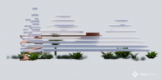

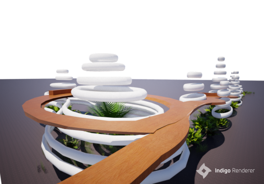
WK 6 - Indigo Renders
Indigo renders I am planning to use as the base for my drawing set
0 notes
Video
tumblr
WK 5A - Presentation Technique #3
The third medium I used was sculpture and videography to demonstrate the experience of light and atmosphere in my design. I created the spiraling form out of paper to emulate the series of stacked rings in my design, which I brought into the garden. This demonstrated context as it is contrasted by vegetation in the final design. As the camera pans next to the sculpture the viewer gets a sense of looking through the rings as they would walking through the design. Overall these mediums communicate the light and atmospheric narrative of my design as a serene environment that users can enjoy at their own peaceful pace.
0 notes
Photo

WK 5A - Presentation Technique #2
The second medium I used was physical collage to demonstrate contrast and materials of my final design. I collated images in the three distinct colours; of white for the concrete rings, brown for the wood pathways, and green for the ground vegetation. The collage medium demonstrates how the several different materials make up the design. Overall this medium reinforces the calm narrative of my design as the materials, while contrasting, intersect and meld together to welcome the eye through the space.
0 notes
Photo

WK 5A - Presentation Technique #1
The first medium I used to manipulate the elevation drawing of my design was Filter Gallery in Adobe Photoshop. I used the effects Cut out, Palette Knife, and Stained Glass to test how these digital filters depicted the forms of my design. The filters highlighted the layered circular forms and intertwining weaving pathway. Overall this medium elevated the calm, organic mood of my design through soft unobtrusive forms the guide the eye through the design.
0 notes
Video
tumblr
WK 4 - Learning animation in Sketchup
Animation made in Sketchup to show different perspectives of the design.
0 notes
Video
tumblr
WK 4 -Night Perspective Development
I then created 50 frames between the the layers showing lights off and on, then reversed this complete sequence afterwards. Additionally I changed each frame to have no delay between each other to create a smoother fade.
0 notes
Video
tumblr
WK 4 - Night Perspective Development
Key frames repeated to demonstrate the lights throughout the night.
0 notes
Video
tumblr
WK 4 - Night Perspective
First trial of using frames in Photoshop to create a short experiential video. Used to show the atmosphere of the installation in a night setting.
0 notes
Photo


WK 5 - Drawing Set Draft
This was my first draft of drawing sets which was useful in establishing the shot types and general layout I wanted to use in the final set. However I was not happy with the style of the set, and the renders and materials did not feel cohesive. I also felt there was a third element needed, which prompted me to add the vegetation underneath the walkway as well as the bark texture on the walls.
0 notes
Video
tumblr
WK 4 - Twin Motion Export trials
Further attempt to make a walkthrough video, need to create shorter clips to turn at every point, as to not go through the wood rings. Lights needed to be added in each group of rings.
0 notes