
Statistics
We looked inside some of the posts by charlieschapters and here's what we found interesting.
Average Info
Notes Per Post
2
Likes Per Post
2
Reblog Per Post
0
Reply Per Post
0
Time Between Posts
1 day
Number of Posts By Type
Text
17
Last Seen Tumblr Blogs


Fun Fact
In 2020, 27% of US Tumblr users had an annual household income of over $100,000.
Text
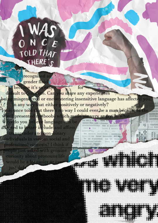

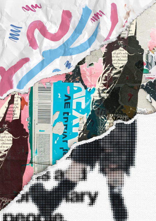
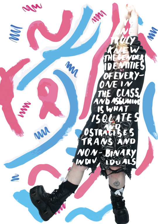
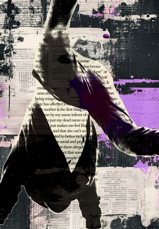
Final outcomes
My final series of posters for the Mini Learning Agreement brief.
Overall, I am pleased with the final outcomes. I pushed myself into unfamiliar territory, learned new techniques digitally, and experimented with lighting, photography, and different mediums.
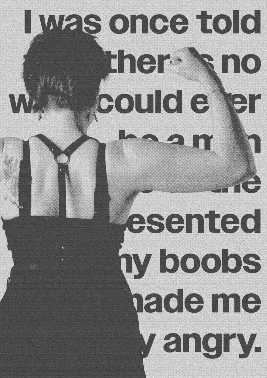
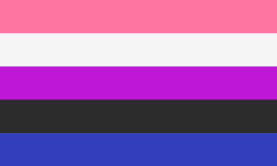
I wanted the pieces to be busy but not overwhelming to catch and maintain the viewer's attention. I used excerpts from interviews where the models expressed their experiences with language and gender. I also incorporated elements of each person's respective flag into the design.
I had a lot of fun designing these posters and I'm excited to push myself to see what I am capable of again in the future.
I was inspired to play with different analogue mediums by my research into Andreea Robescu and I was inspired by Aries Moross to play with different elements of photography in a more digital aspect to make them completely different from the raw files. The typography in the painted aspects were also inspired by both artists' styles.
1 note
·
View note


Text


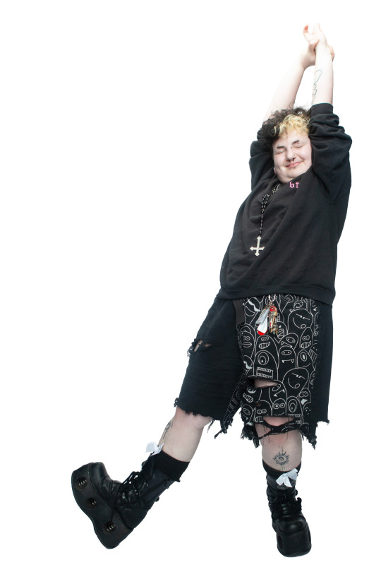
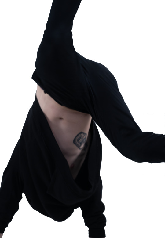
Model one
All assets and images used in creating the final outcome
0 notes
Text
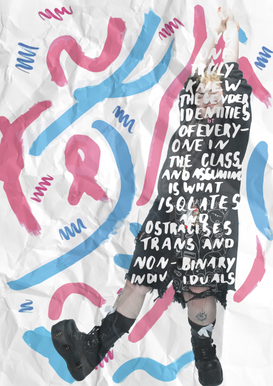
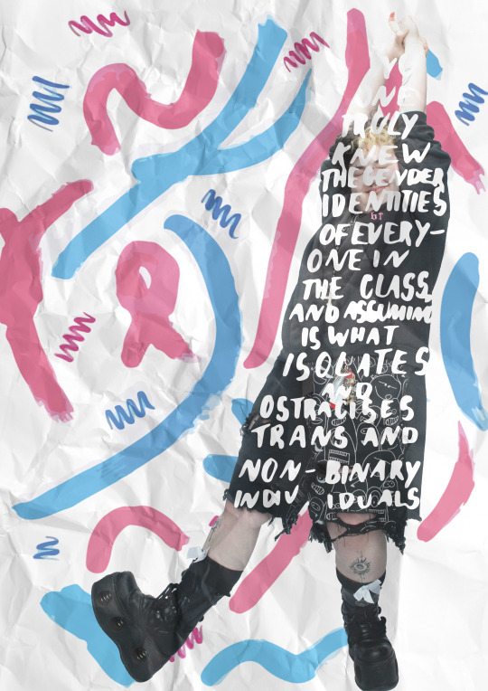
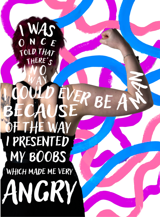
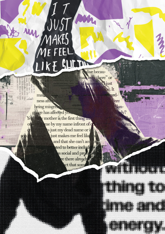
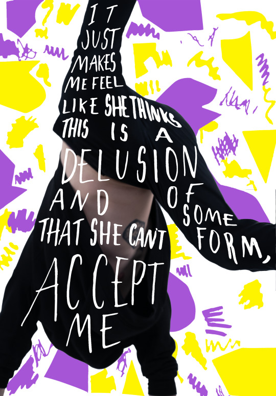
Model three: final outcome
Due to the refinement of the other posters, I don’t have as many different variations of this poster as I felt my system for the poster series felt quite set to me. I enjoyed the use of colours in this piece and incorporating the face into one of my designs as the other model photos chosen didn’t contain faces.
0 notes
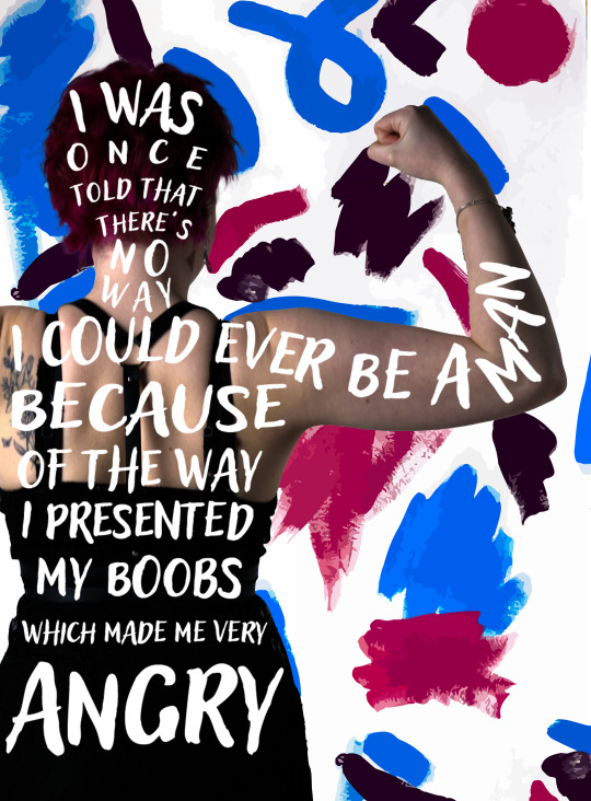
Text
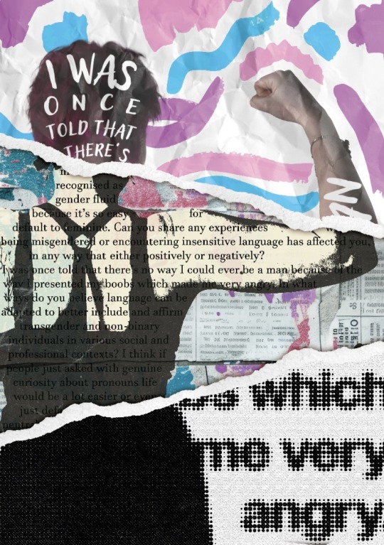
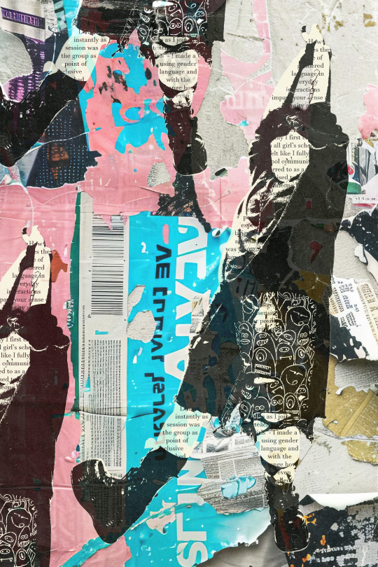
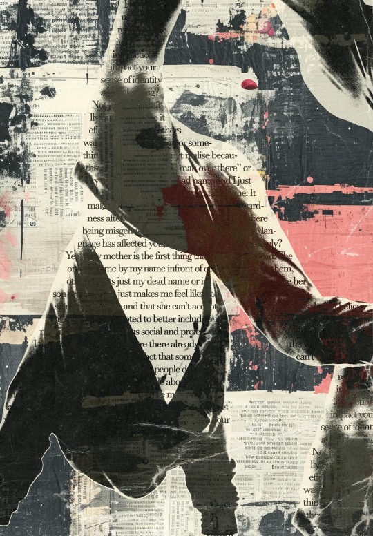
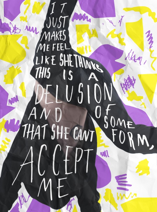
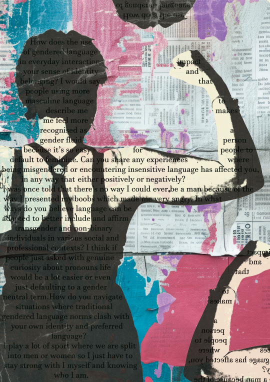
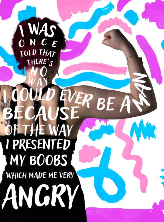
Model one: final outcome
After some feedback regarding the text size, some colouring and shadows from the paper tears, this is the final outcome for one of my poster designs.
0 notes
Text
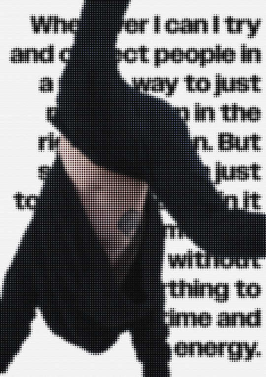
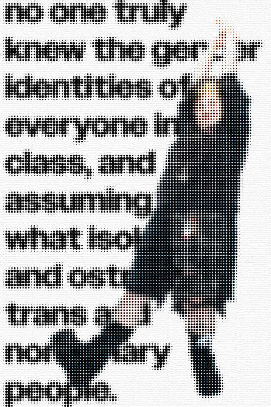
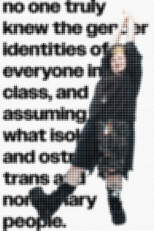
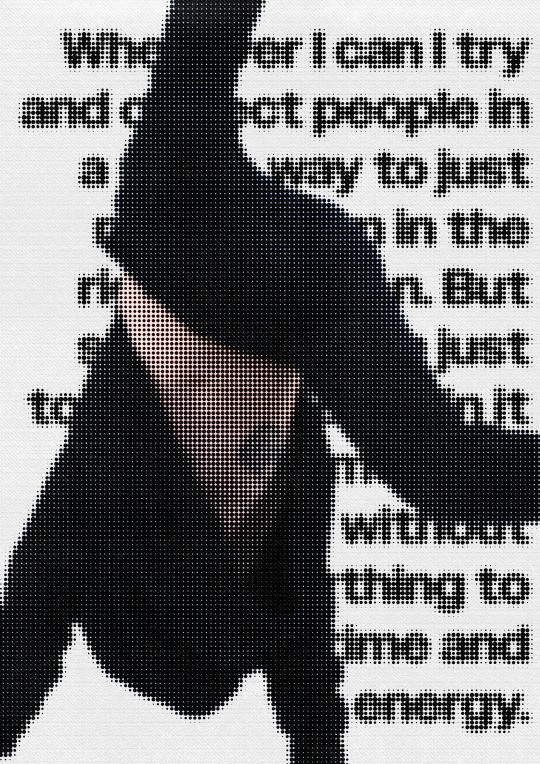
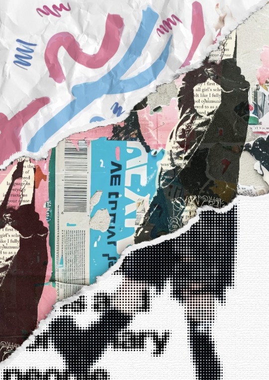
Model Two: Style Experiment Two
Using the colour halftone and burlap effects
0 notes
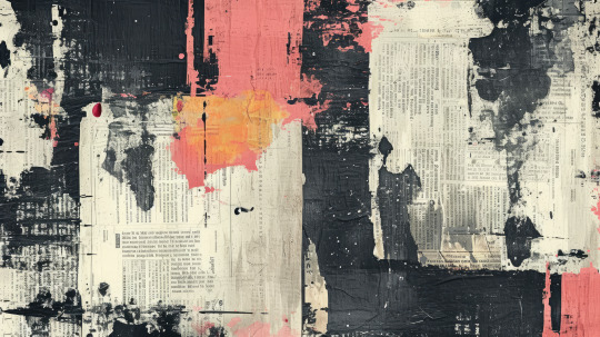
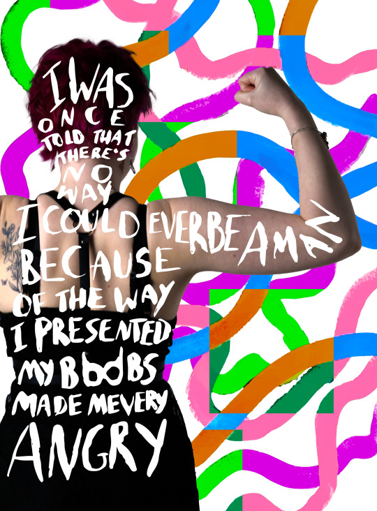
Text

First poster collage attempt
I combined the three different style experiments into one poster to represent the distinct and unique ways people present their genders and that it's not one way at any given time.
0 notes
Text
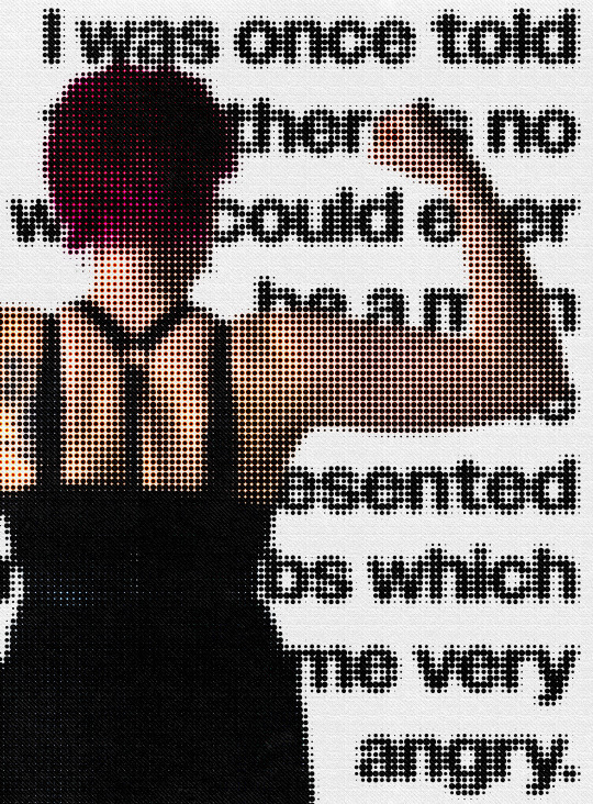

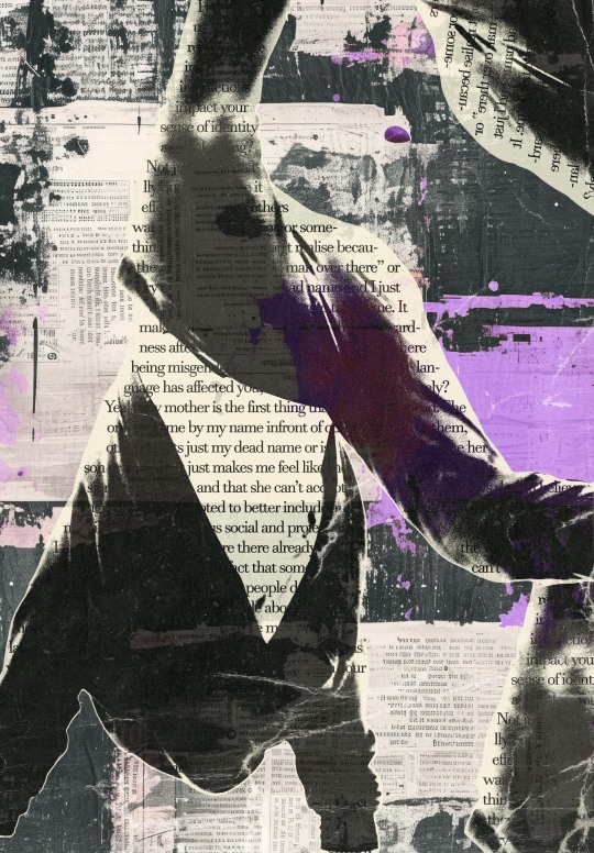
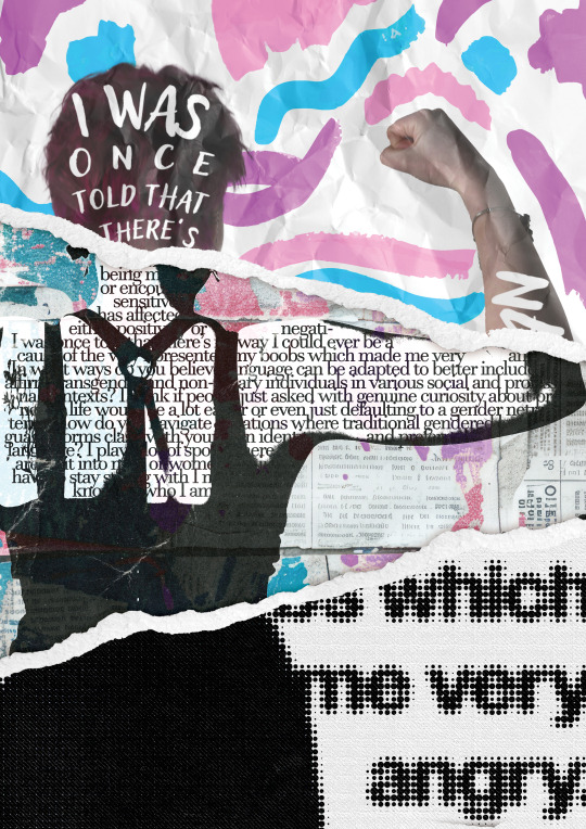
Model one: Style Experiment 2
I used halftone and burlap textures to create these outcomes
0 notes
Text

Model two: style experiments
Experimenting with textures and type.
0 notes
Text


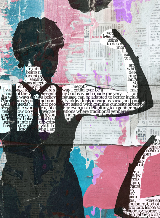
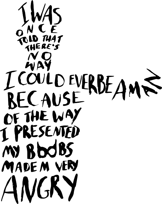
Model one: style experiments
Using a completely different style but the same colours representing the gender-fluid flag. The interview transcript was used inside the model's form.
0 notes
Text

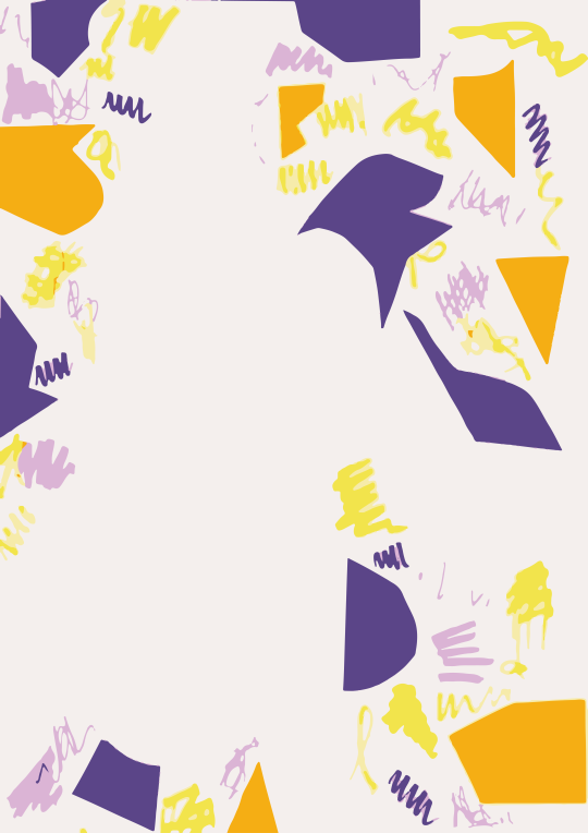
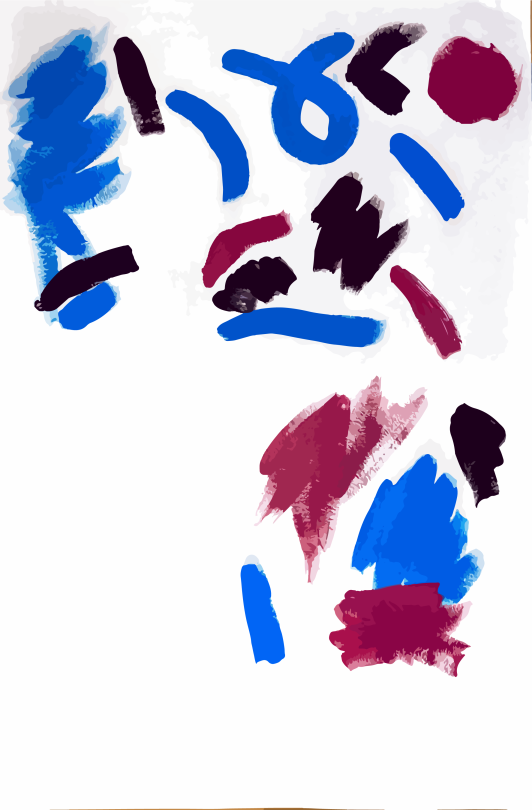
Model two: experiment one
Using coloured card to create shapes along with pens to create colourful elements in the background
0 notes
Text
Model one: experiment three
I focused more on the elements I liked from the other experiments and looked at the form and different areas I wanted to highlight
0 notes
Text

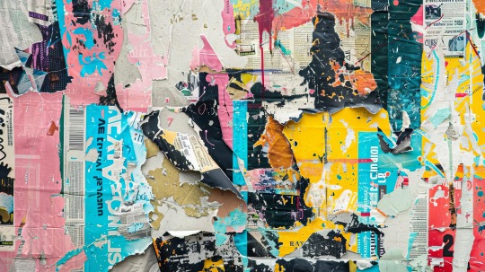
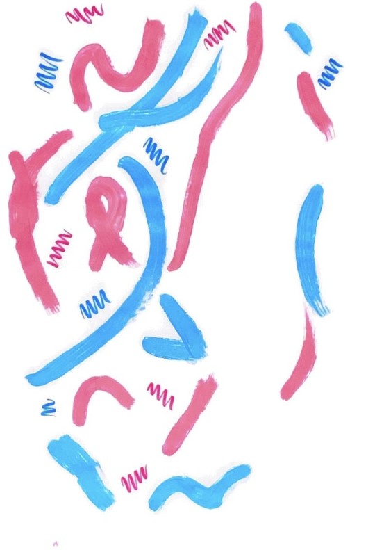
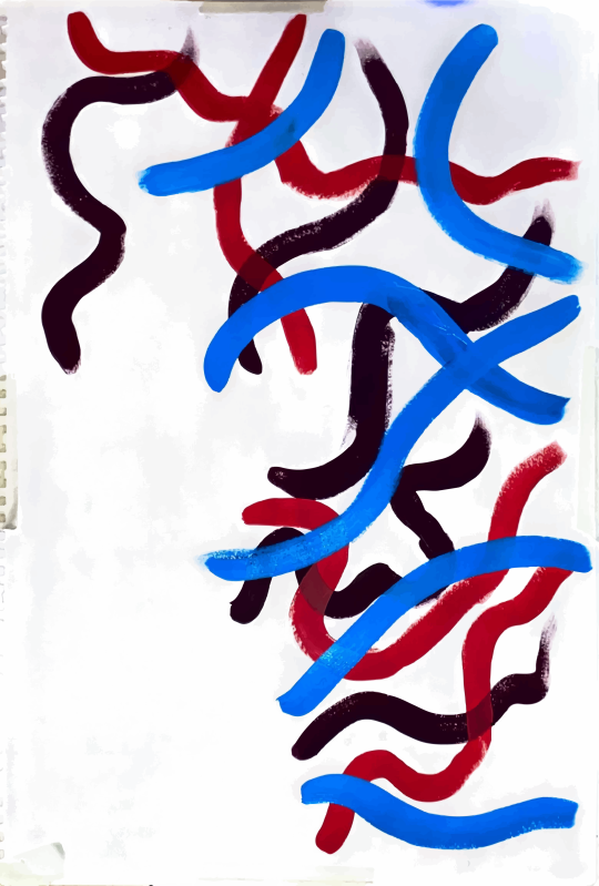
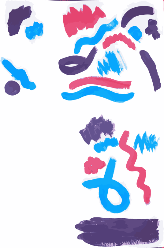
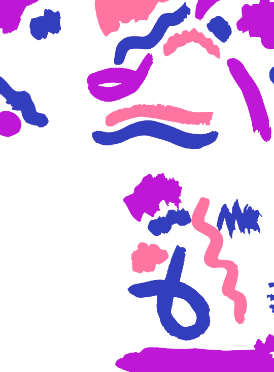
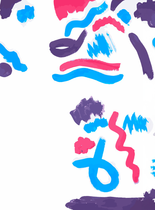
Experiment number two
Just experimenting with different paintings in the background - the colours haven’t been altered just yet as this is only an experiment.
I think I like the less consistent and more fluid background. It’s less overwhelming while still taking up a lot of visual space.
1 note
·
View note
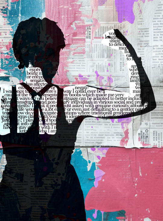
Text

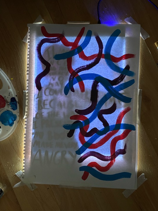


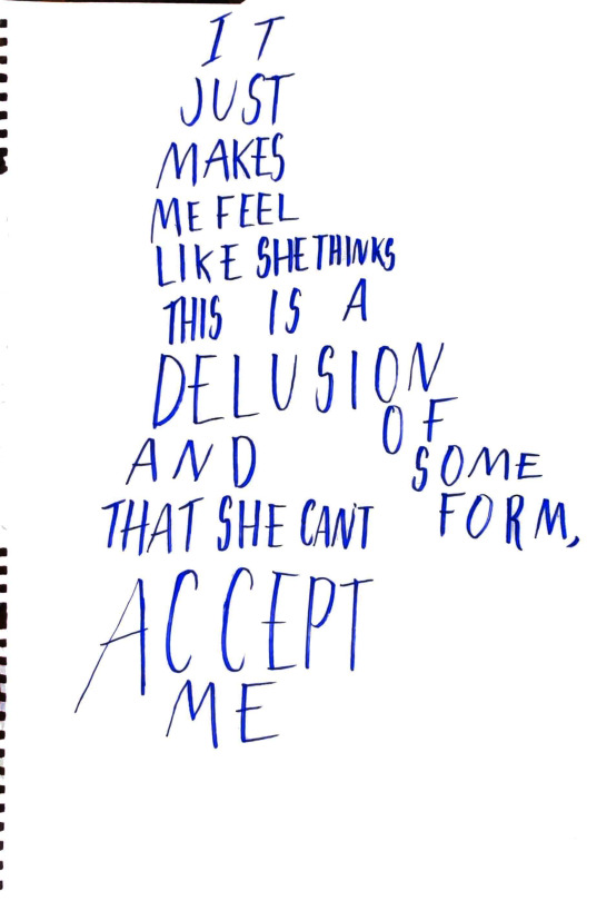
Model one - experiment one
Using a printout and a lightbox, I painted a rough idea of the text from the interview with the model. I used colours from the genderfluid flag (pink, purple and blue) in the experiment (black and white which are also in the flag are already present in the photo). I used Adobe Illustrator to turn the text and colours into vectors, corrected the colours and cleaned up the text a little.
Ultimately, I feel it is too similar to Andreea Robescu's style so I will try different things in future experiments.
0 notes