Don't wanna be here? Send us removal request.
Statistics
We looked inside some of the posts by charlottejacksonfineart and here's what we found interesting.
Average Info
Notes Per Post
1
Likes Per Post
1
Reblog Per Post
0
Reply Per Post
0
Time Between Posts
30 days
Number of Posts By Type
Text
17
Last Seen Tumblr Blogs


Fun Fact
Mobile Tumblr US users spend an average of 4.04 minutes per session on the app.
Text

Ron Cooper: Racers and Combos
July 2 - 30, 2025
Opening Reception for the Artist: Friday, July 4th, 5-7 PM
Imagine a valley running east to west. Surrounded by mountains and hills, roughly three miles across and ten long. Tracked by the sun, a hollow bowl filled with space and light. Small enough to be at a comfortable human scale. See a landmark, point to it, turn your feet there, and walk. Some evenings the sun, setting over the Pacific Ocean nearby, fills the valley with colored particles of golden light. This is the Ojai Valley, in California, where Ron Cooper grew up – cradled in a sort of crucible of light and space.
Now turn to Cooper’s latest iteration of his Vertical Bars series, the Combos. Made of long, thin boxes of Plexiglas, from certain angles, they appear to float. On their outward facing surfaces, color, texture and shimmer hover over the wall, while the boxes themselves are filled with light, so that the pieces are lit from within.
The world shapes us. Cooper’s childhood in the Ojai Valley shaped him profoundly, influencing not only his passions and perspectives, but the attitudes he brings to his working life every day. Part of this influence is of course the fascination with light and space, so beautifully transmuted into the Combos with their juxtaposed Plexiglas boxes that allow the pieces to become containers, or perhaps more aptly, valleys, of light, illuminating the sometimes diffuse and sometimes particulate pigments which he has painstakingly layered with lacquer on the front surface.
A spark of light from a lamp or a change in the angle of sun might set off a cascade of shifting hues. What was one thing becomes another. Moment to moment. Day to day. Different, fluid, transforming. There is room here for both choice and chance. Over decades Cooper has honed his skills with the contemporary materials he utilizes, experimenting with new sources of pigments (early on he even worked with pigments derived from pearlescent fish scales) as well as ways to change and disrupt his surfaces. However, just as there is an inherent element of the unknown to the way these pieces react to light under different conditions, Cooper’s process involves elements of intuition and improvisation, a dance between skill and chance, structure and the unexpected.
However, it is not just Cooper’s artistic output that has been influenced by these early origins. In the gallery along with the Combos are two of his favorite retrofitted racers. For Cooper, becoming an artist wasn’t a forgone conclusion, as a young man he was drawing hotrods, sure he would become the greatest car builder in the world.
But again, there was a transformation. Just out of high school, a yearlong trip with his best friend to Europe via New York brought him into contact with great museums and great art. Steeped in this wealth of art history, Cooper decided to pursue art, eventually receiving a scholarship to the famed Chouinard Art Institute. During his time at school and then working in studios in and around Los Angeles in the 60’s, Cooper was part of the loose collective of artists in the Light and Space Movement.
His love of cars never went away, as Cooper says he always had, “great, special cars.” But then about ten years ago Cooper built his first car, combining a ’29 Model A chassis with a ’31 A and a hopped-up touring engine. Since then, he has continued to build racing cars, as well as to race them himself, combining bits and pieces of classics as well as custom made parts. Here again is an example of the attitude toward creation he learned early – a confidence to pursue whatever physical or technical skills are necessary to complete a project.
Ron Cooper’s life has been filled with moments of artistic transformation. From his early experiences to his pursuit of art, his explorations of light and love of cars to his years long evangelism of artisanal mezcal. (Another fascinating tale of discovery and transformation … he calls mezcal “liquid art” for how the special liquor changes something “in the back of your head”.)
As Cooper says, “A work of art is successful if it changes the viewer.” The world shapes us, even as we shape the world. Ron Cooper rides this dynamic line, creating works that may just shape us, as well.
0 notes
Text


William Metcalf: DoubleTake
May 30 - June 28, 2025
0 notes
Text

William Metcalf: Double Take
May 30 - June 28, 2025
Opening Reception for the Artist: Friday, May 30th, 5 - 7 PM
They catch you unexpectedly, these paintings. Nearly seamless against the walls of the gallery, they come alive as you move in front of them. Color: almost limpid in its pure and glowing transparence. Acrylics painted onto cut-out geometric shapes of 3mm thick aluminum Alupanel, utilizing a minimum of colors and elegantly simple shapes, these works might at first seem uncomplicated. But something about the colors of these paintings is like falling through water. An unexpected moment of synesthesia. A visceral diffusion into color.
William Metcalf brings a collection of new pieces to Double Take, furthering the explorations of his work in the Transparency series, begun in 2013. This series leans into the challenges and artfulness of the two-dimensional painted surface in Art, highlighting the artifice of perspective, foreshortening, and chiaroscuro in contrast to the exaggeratedly flattened panels Metcalf utilizes. The techniques of three-dimensional illusion are on display here – but applied with the lightest touch, stripped down to their barest essentials. Non-objective, the works present geometric shapes seemingly overlaid and in contrast with one another. But as the viewer spends more time with these pieces, they may conclude that ultimately these techniques are all employed in service of a thoughtful exploration of color.
Divested of line, the colored planes are positioned next to or overlapping one another, paired against/atop a black rectangle. The careful modulation of the color’s hues provides that lift and shadow effect that suggests transparency. The color looks as if it is being shaded by the black, or changed in hue by its overlapping with the other colored panel.
The color choices and changes sometimes lean into the illusion. For example, a piece with one ambery-orange and one muted yellow panel set next to each other “over” the black panel. The overlapping parts appear to have shifted with the dark underlay – the orange toward a burnt umber, the yellow toward an ochre-brown. In other pieces the color shifts seem to highlight the illusion. For instance, a piece with two off-set layers, one a light tan, the other a dusty blue, overlaps with a section that is a brighter, almost yellow-tan, as if the blue has had the effect of blocking the effect of the black underlayer, rather than adding to the color-shift. The different formulation is used in another piece where the layers are dusty pink (and darker mauve where the layer overlaps with black) contrasted with a similar dusty blue. Here where the color overlap occurs the shift is unexpectedly to a brighter almost bubblegum pink.
Paired with Metcalf’s pristine surfaces, which allow for an almost pellucid access to the color itself, the carefully constructed elements combine to create works of art that feel somehow more like artistic phenomena, occurring spontaneously somehow from out of the void, objects or creatures imbued with a life and purpose of their own, rather than artful constructions.
It is fascinating to speculate how Metcalf has managed to achieve this. What alchemy of paint and shape, of time and light, have combined to allow these paintings to somehow become objects unto themselves, which can simultaneously be works of art but also essays (in the original sense of to try, to attempt), phenomenological explorations into the nature of color, of light, of art?
In the end, though, it is the experience that matters most: the double take, the flip back and forth between colors as the eye moves, the internal shifting in emotion and sense that follows the eye; the initial confusion over the way a color shifts, that resolves into a sense of depth; the essential, instinctive joy at experiencing color itself.
Image: Double Take Series, 2025, acrylic on shaped DiBond, 32.5 x 49 inches
0 notes
Text


Green Acres: A Group Exhibition
March 7 - April 5, 2025
0 notes
Text


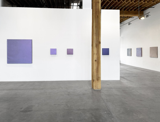
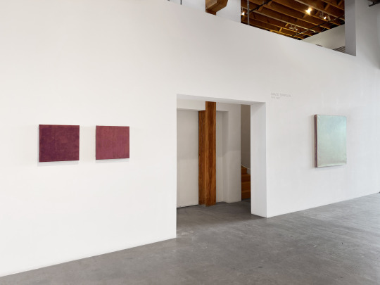
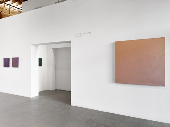
David Simpson: Paintings
January 31 - February 28, 2025
0 notes
Text

DAVID SIMPSON: Paintings
January 31 - February 28, 2025
Opening Reception: Friday, January 31st, 5-7 PM
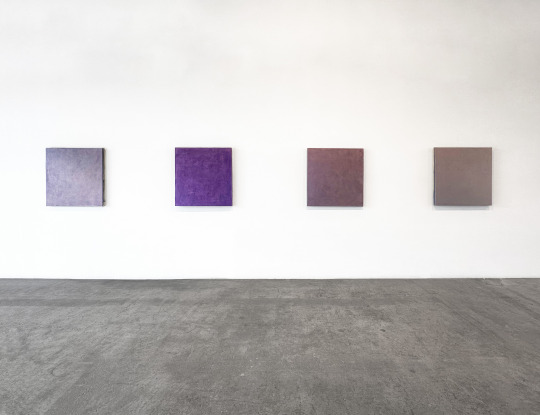
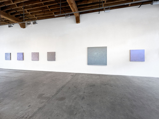
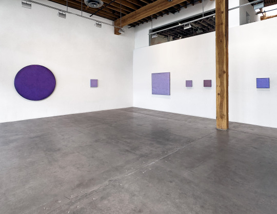
All throughout the gallery – glints and shadows. The sharp, shining spark of ice or gems, the nacreous luster of agates and shells below the tide, the ever-shifting depths of a cloudy sky shot through with light. This is what pulls us in, what makes us pause: these glinting, moody, always changing colors. The mystery of changing light and impossible depths.
Paintings brings together a collection of David Simpson’s celebrated Interference works from over the past 25 years. Simpson, who turned 97 this January, developed a fascination for metallic and interference acrylic paints in the late 1980’s. There are only six colors of interference paint available, each containing the characteristic micro-particles of mica coated in titanium oxide; however, due to the light reflecting and refracting qualities of the mica, these paints hold a remarkable spectrum of color potential.
Simpson was captivated by the possibilities of these mercurial paints and worked for many years developing and honing the unique techniques that allowed their changeable nature to be developed to the fullest. Using only one pigment, Simpson is able to tease out a boggling variety of shades and actions (the angles and ranges of color shifts) across his canvases. This facility with the paints required the development of a hand-crafted trowel which he designed himself, and of a layering technique which can involve applying up to thirty layers of paint.
The action and shifting of Simpson’s paintings are astounding. Once light hits the surface of a canvas, sinking into the paint – the coated particles are activated. Light bounces and reflects, back and forth within and among the particles, changing the visible color spectrum of the piece. A work which at first reads as a deep, shaded purple blue, like Saphire, can shift through a whole range of color, resolving into the color of an icy silvered sky.
These effects of change occur with a shift of light source, or with the physical movement of a person around the painting, viewing the light and painting from different angles. But the effects go beyond even this to include shifts in natural lighting throughout a day, and even to seasonal and regional changes in light quality and color. Perhaps unintuitively these paintings often show off their shifts even more profoundly in lower light, like twilight, where they can even seem to glow like embers with an internal fire.
The pieces in Paintings exemplify a whole range of experiences of these magical shifts. May Day seems to contain every hue, blue through purples and pinks, but then shifts to silver in certain angles. Odd Fog can read almost dark purple at one moment but then runs into peachy gold. The roiling deep blue of Burnt Offering ripples into the gold-copper sheen of sunlight through cloud. And the icy, pale aquamarine of Pale Dragon somehow shivers into a deeper lilac-blue.
Each painting different, not just from the others, but within itself different from moment to moment. They are alive. They breathe. They react. They change. There is a sheer cliff-edge breath-taking quality to these works: beauty.
What fascinated Simpson in his decade’s long exploration of the possibilities inherent in light and paint, also snags us, as viewers. The work is an endless surprise, changeable as light, as day, as weather. And somehow the sheer beauty of that shifting, moody to ethereal, earthy to celestial, tugs at something deep within our own human forms. The breathing, everchanging mutability of life itself.
-Michaela Kahn, Ph.D.
Image: David Simpson, Saphire, 2019, acrylic on canvas over board (Interference pigment), 34 x 34 inches
0 notes
Text


Max Cole: Jacob’s Ladder
November 8 - December 13, 2024
Artist’s Reception: Friday, November 8, 5-7 PM
0 notes
Text


Max Cole, "Twilight," 2023 acrylic on linen, 39 x 33 inches
Max Cole, "Silver," 2024, acrylic on linen, 39 x 33 inches
Max Cole, "Red Rock," 2023, acrylic on linen, 39 x 33 inches
Max Cole: Jacob's Ladder
November 8 - December 13, 2024
Artist's Reception: Friday, November 8, 5-7 PM
Black, soft and seamless as a midnight polar sky. The smooth gray of slick-washed river stones. Fine precise lines in tonal gray, taupe, brown – the colors of dust, of raincloud, and granite, the blackened patinas of desert varnish on rock. The slender slice of a bright white line across the dark – as of an impossible white bird sewing a line across a stormy sky.
These paintings, with their painstaking precision of geometric shapes and intricate lines, feel like compositions of time: some meeting place between the geological evolution of mountains and the centuries long generational construction of cathedrals. They have the affect of stones, relics, or ruins. Solid. Freighted with a weight of memory and existence. These works appear as antidotes to a common state of fleeting, depthless, ethereal, soap bubble contemporary life, an opposite and remedy of the Gertrude Stein idiom, “There is no there, there.” Max Cole’s paintings, most assuredly, are filled with thereness.
Too often works of such minimal geometric abstraction might read as mechanical. A hard edge produced through tools or machines. But Max Cole’s precision is human, hand drawn. There is a breathing quality, a quality of touch, that emanates from even its most exact lines. This quality of essences, of Platonic forms, is achieved rather from care, from time, from practice, and from a life lived in ascetic service to art.
The paintings included in Max Cole’s new exhibition, Jacob’s Ladder, continue a process of breaking open the Greek Cross forms which she began exploring in 2015. Here the cruciform structure is apparent but broken into and interrupted by tonal and linear blocks. In a deep, moody piece like Nightfall the form seems to sink away, falling into its dark background. This experience contrasts with Redrock, where the form pops out at us, with its banded blocks of earth-toned lines, which seem to rise three-dimensionally off the canvas.
The naming of the exhibition is not incidental. For Cole, the story of Jacob’s Ladder provides both a personal and philosophical/spiritual touchstone. The story, of a great ladder in the sky appearing to Jacob, appears in all the Abrahamic religions. Cole recounts a vivid memory from her childhood of singing the old spiritual, We are climbing Jacob’s Ladder, at the top of her lungs with a group of her friends. For Cole, the story is important as a parable for the ascetic life which provides a pathway to heaven. She writes, “In this case, the art itself becomes the deed. In a large sense, art is the same journey... the painting itself becomes a step up the ladder. In my opinion, this is a component of all good art. A search for a way to get beyond the purely emotional, intellectual or decorative and which has always been my goal. This has been a lifelong journey.”
It is easy to understand then how these paintings, with their inherent depth and gravity, could only be what they are as the result of years of focus, study, and attention. Each gesture, each stroke, is the result of lived experience, is a kinetic expression of a life lived in pursuit of art as spiritual endeavor, simultaneously purposeful and joyous.
1 note
·
View note
Text


James Drake: Tongue-Cut Sparrows
August 30 - September 28, 2024
0 notes
Text

JAMES DRAKE: Tongue-Cut Sparrows
August 30 - September 28, 2024
Opening Reception for the Artist: Friday, August 30th, 5-7 PM
Gallery Talk: Saturday, August 1st, 3 PM
Artist James Drake, poet Jimmy Santiago Baca, and David Chickey
Radius Book Signing in the gallery on August 30 and 31
In stark black and white, a woman stands with one hand folded purposely over another. Another woman, face dappled in shadow, looks upward with longing at something we, as viewers, cannot see. A flock of ghostly black sparrows are ringed by an elaborate, old-fashioned frame design. Elsewhere hands flex and flare into a gesture of wings.
Photographs. Drawings. Video. Text. James Drake’s Tongue-Cut Sparrows is a massive undertaking, bringing together an astonishing range of arts media, created and developed over the course of 30 years (and still ongoing). As with so much of Drake’s work, this series has its origins in the borderlands of El Paso, where he lived and worked for decades. The project was sparked in 1994 by curiosity over witnessing a group of people (mostly women) gathered outside of the El Paso County Jail, moving, gesturing, and signing up toward the prison. He asked a friend about what was happening and discovered that these were family, friends, and lovers of prisoners, using an invented language of signs and gestures to communicate to their loved ones over distance, and without having to submit to the timetables, strictures, limitations, and scrutiny of official prison visits.
He was able to negotiate an introduction to the group, and slowly gain their trust. Drake has an amazing ability (as witnessed in other of his ongoing projects) to connect and enter into the cultural context of another, to investigate and find common ground. As an artist, he found his subjects were often more willing to let him in and share with him – curious about his work and perspective. Over the course of two years, Drake met with members of this community, asking questions, learning about the language, taking photos and video, and eventually collaborating with them. While the usual communications that these women make are about ordinary sorts of subjects, (How are the kids? When is my lawyer coming? I miss you. I love you.), Drake asked them if they’d be willing to translate and sign texts by famous authors. Drake brought in many favorites, from Shakespeare, Lorca and Machado to contemporary authors like Cormac McCarthy and Jimmy Santiago Baca. The subjects chose works that resonated with them, often in Spanish and English versions. Drake captured some of these gestural performances on video.
The title of the project originally comes from a Japanese folktale in which a sparrow is rescued and befriended by an older couple. A jealous woman cuts the tongue of the sparrow, leaving it injured, unable to speak, and forced back into the woodland. The old man eventually finds his sparrow friend along with a whole community of magical sparrows, who are so grateful for his intervention that they offer him a reward for his kindness.
There is a Hokusai painting of the folktale, Shita-kiri Suzume (literally translated to Tongue-Cut Sparrow), showing an open-mouthed sparrow flying above a pair of sheers. Almost invisible is the tiny brown crescent of the sparrow’s tongue, floating between the two. To be “tongue-cut” is a violent and shocking image, a powerful metaphor for disenfranchisement and the prejudices and economics that so often silence individuals and communities. The ingenious and creative language developed by the group Drake encountered (and echoed by the existence of other groups all over the world, who sign in their own invented languages to loved ones in prison) is a remarkable response to silencing.
Through the years exhibitions of works from Tongue-Cut Sparrows have occurred all over the world, from the Venice Biennale in 2009 to the Albright Knox in 2011 and galleries in New York, Texas, and elsewhere. Following this exhibition at Charlotte Jackson Fine Art in Santa Fe, there are multiple more exhibitions planned, including for SITE Santa Fe in 2026 and a collaborative performance piece at Carnegie Hall in October of this year.
Drake’s unique and diverse assemblage of art (artifacts?), in many media, drops us into the middle of a dialogue, a story. We are in the position of the outsider – like a prison guard at the El Paso jail, or a random passerby on the sidewalk – witnessing a language for which we don’t have the knowledge of grammar or syntax, let alone vocabulary. With Drake’s work we are presented with a symbolic and metaphoric expression, articulating itself in multiple forms, numerous media, or perhaps more accurately – in multiple gestures. Painting, video, photography, poetry. Each is a part of a whole message: a love letter, a documentary, an essay of social anthropology, a novel. We are invited into this unknown, yet deeply human and familiar world, to translate for ourselves a deep and multifaceted story.
- Michaela Kahn, Ph.D.
left: James Drake, Tongue-Cut Sparrows X, 2018, charcoal on paper, 71 x 52 inches right: James Drake, Tongue-Cut Sparrows XI, 2018, charcoal on paper, 71 x 52 inches
0 notes
Text


METAL MASH-UP: Jeremy Thomas, Pard Morrison, Elliot Norquist
July 5 - August 3, 2024
0 notes
Text


METAL MASH-UP
JEREMY THOMAS, PARD MORRISON, ELLIOT NORQUIST
July 5 - August 3, 2024
Opening Reception for the Artists: Friday, July 5, 5-7 PM
Summer is heat and space and light. Summer is color. Summer is bold. Summer is perfect for sculpture. This summer, Charlotte Jackson Fine Art is excited to revive its themed group sculpture exhibition: Metal Mash-Up. A group exhibition is always a way to set up room for comparison and contemplation. The unique perspectives of different artists allow a viewer to relate to pieces in a whole new way. Metal Mash-Up, playing on the idea of a mash up in music or literature, features three talented artists whose metalworks offer a wide variety of forms, formats, approaches, fabrications, and colors: Pard Morrison, Elliot Norquist, and Jeremy Thomas. This diverse range of metalworks offers the chance to explore nuance, detail, and difference in ways that a single-artist show wouldn’t allow.
The first thing you see, entering the gallery, may be Pard Morrison’s large freestanding aluminum columns. These pieces are a bit larger than human scale – ranging from 6.5 to 12 feet tall and 1.5 to 2.5 feet wide. Covered in softly vivid blocks of woven colors, they are brush painted, contrary to what one might expect with metal sculpture of this size, using special industrial paints that offer a vast catalog of color options. On very close inspection, you can see the hand of the artist in the brushwork on the surfaces. Morrison weaves strips of colors together across the horizontal and vertical planes in varied patterns. Where the colors meet, lines sometimes disappear or overlap, or sometimes merge, morphing into different hues. These complex, interlaced and unexpectedly connected colors prove to be both thoughtful and mesmeric.
Turning to Elliot Norquist’s steel wall pieces and found object work, we find a shift in perspective, as well as in volume. These works perfectly balance the elegance and humor we’ve come to expect from Norquist’s work. Here the spare folded steel shapes of works from his Folded series (based on the intriguing shapes of folded paper scraps), with their spare colors, somehow seamlessly compliment the unusual Found Object – an industrial gear or wheel, painted green and set into a custom made metal stand. The Folded pieces play with new color tones and combinations, while the more anomalous Found Object references earlier site specific work, while still playing with new colors.
Also playing with a whole new range and use of color is Jeremy Thomas, who brings his familiar inflated steel forms to the exhibition. His complex, multi-form pieces, including both wall-mounting and floor sculptures, are given a whole different aspect through a new ap- proach to the utilization of color inspired by the colorwork of his recent inflated canvas pieces. Rather than using one or two of his signature bold, slick color choices and patinaed planes to coat and contrast, with his new pieces Thomas “pushes or pulls” the color in ways that highlight or thwart the angles and planes of the forms. The color combinations can be surprising – with flared out colors and subtly merging tonalities created using airbrushing. While Thomas’ inflated pieces are a way to visually record the effects of atmosphere and pressure (air pushing against form in ways that will always be unique to the moment) his changing use of color realigns us in rela- tionship to our expectations. We must look again.
A walk through the gallery is a walk through a landscape of strange forms, dazzling colors, and quite a few wonders. Each piece in Metal Mash-Up has its own story, it’s unique vocabulary of form, material, color, theory. Together they create something new, an experience that gives the viewer a new context within which to explore the possibilities of metal sculpture.
- Michaela Kahn, Ph.D.
From Left: Jeremy Thomas, Snapper Yellow, 2024, cold rolled steel, powder coat, & vinyl emulsion, 25.5 x 40.25 x 14.5 in.,
Pard Morrison, Bring Peace to Midnight, 2023, fired pigment on aluminum, 24 x 24 x 1.5 in.
Elliot Norquist, Black/Red Fold, 2024, painted steel, 36 x 52 in.
0 notes


Text

JOAN WATTS | ZAZEN
May 31 - June 29, 2024
Opening Reception for the Artist: Friday, May 31, 5-7 PM
These colors reach into you. Pierce the sternum, fill the solar plexus, root in the gut. Jewel-toned maroon, shadowed forest green, cool wet slate, warm turned earth, heart-of-iris purple, deepest navy sky: these rich and saturated colors anchor and ground the bottom halves of a series of square-format paintings. Rising from these fertile beds of redolent color blooms a collection of pale contrasting tones: petal yellow, sage green, fog, and topaz, palest aquamarine.
The series of paintings by Joan Watts, Zazen, included in this eponymous exhibition was featured in an exhibition in Wiesbaden, Germany at Galerie Ulrike Buschlinger in the late 1990’s and has never before been shown in the United States.
There are so many ways to approach the series: the pared down visual vocabulary; the square format; the minimal colors. The tonality of those colors and the intricate and painstaking layers of paint used to create the complex and yet simple surfaces. The soft white horizontal line created by grouping several of the individual paintings together. Each viewpoint reveals a facet of these works. But the viewer must go further, and ultimately inward, to join these facets together and see the series holistically.
While it is tempting to see horizons – with the paintings’ darker toned bottom halves rising to light colors above, the title of the series and familiarity with the work of Joan Watts (as well as the square format) suggest another direction altogether. By the late 90’s, Watts had been studying Buddhism for about a decade and by that time the practice had thoroughly shifted and influenced her artistic process. These pieces, as the title suggests, focus particularly on the primary, essential practice of Buddhism: zazen, or sitting meditation. So rather than landscapes, these pieces move the viewer from macrocosm to microcosm, from outward to inward, from distance to closeness.
With this perspective, the squareness accentuates a sense of balance – the feeling of solidity that might come from sitting still upon the earth. The darker tones and colors: body. The lighter colors: mind. Moving through the gallery, piece to piece, that initial impression of the colors rooting down into the gut makes sense. Moving between the darker and lighter halves we begin to intuit a common paradox of Buddhist theory and practice – the simultaneous coexistence of discipline and freedom, of being and nothingness, of solidity and intangibility, of structure and fluidity. Like other Buddhist art forms, Watt’s work exemplifies this dichotomy through a balancing of the qualities of precision and structure with a flowing and intuitive expression.
Now we can stand (or sit) with Watt’s paintings and experience them on their own ground. Root our feet. Take a breath. Aha! We can feel how that mysterious white line, balancing between dark and light, negotiating between dense and diaphanous, might just be breath, the joining of inside and outside. We can walk from piece to piece and feel how each individual painting shows the slightly different experience of Zazen. One day thoughts lead one way. Another day, memories arise. Yet another come emotions of sadness or joy. Another paradox. While the practice remains the same: sit, breathe – the experience is always a slightly different color.
In this way the small works on paper add one additional element to the whole. These tiny pieces feel like fragments, glimpses, bits of thought or imagery. They show glowing lines, fragments of larger layers and geometries. Taken in the context of the whole, of this experiential exhibition of Zazen – these little pieces appear like the bits of thought that can arise during meditation: the fragments of an idea or memory, the flicker of a color or feeling.
Take time here with Zazen. Breathe with each piece. Allow them to guide you.
- Michaela Kahn, Ph.D.
Zazen - Selection of 10, 1995, oil on canvas, 26 x 26 inches each
0 notes
Text

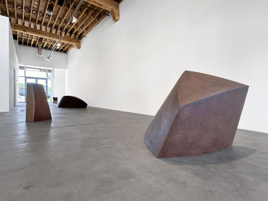
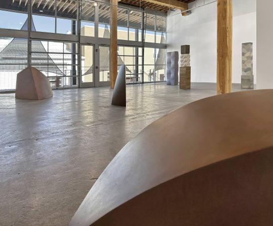
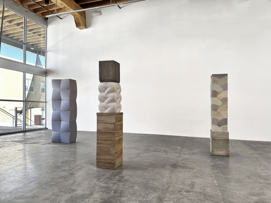

Tom Waldron: Steel and Concrete
April 26 - May 25, 2024
0 notes
Text
Tom Waldron: Steel and Concrete
April 26 - May 25, 2024
Opening Reception for the Artist: Friday, April 26, 5 - 7 PM
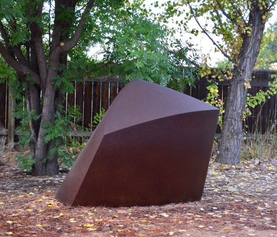
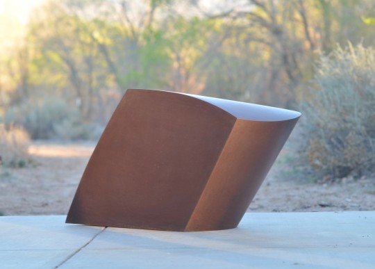
The eye follows a smooth plane, curving gently in pitch, slope on slope, sweeping to meet and create a line. A deep rust form tilts, leaning, forming a deeply shadowed side. A sharp, faceted arc sweeps to a point. Softly interwoven curves braid together in a column. A round oxidized shape seems to fold up on itself, caught in a moment just before it sprouts wings.
It is a trick of sculpture to put us squarely into the here and now. Mass. Volume. Weight. Sculptures inhabit space with us and we with them. They alter the air’s flow through a room. They radiate their own minute gravity. Fully art object, whether molded or cast, carved or welded, sculptures remind us that our world is multi-dimensional – not solely existing in the 2D hybrid mind/light no-space of our screens.
Tom Waldron’s work not only brings us to attention but challenges our perceptions with its deceptively simple forms. It is likely no surprise that Waldron’s entrance into artmaking was spurred by his love of the materiality and physicality of the process. The challenge and intense focus required of welding, it’s possibilities and generative power led Waldron to leave his studies in architecture to pursue sculpture.
Steel and Concrete brings together a disparate collection of Waldron’s work in different mediums. While he is best known for his steel pieces, this show also incorporates works in concrete, a dense gypsum plaster (Hydro-stone), and even in wood. The concrete and wood pieces have evolved slowly in relationship to the steel works. First, as simply materials for pedestals and bases. However, over time, sometimes the line between sculpture and pedestal would blur. Later, Waldron began to take some of the curved cardboard constructions that he creates as models for his steel works and use them as molds to cast concrete or hydro-stone pieces. In this format, Waldron saw the possibilities of using them like modules. Using wood allowed Waldron to explore wall-mounted work because of its lighter weight – but the medium also allowed him freedom to alter and find forms not possible in steel.
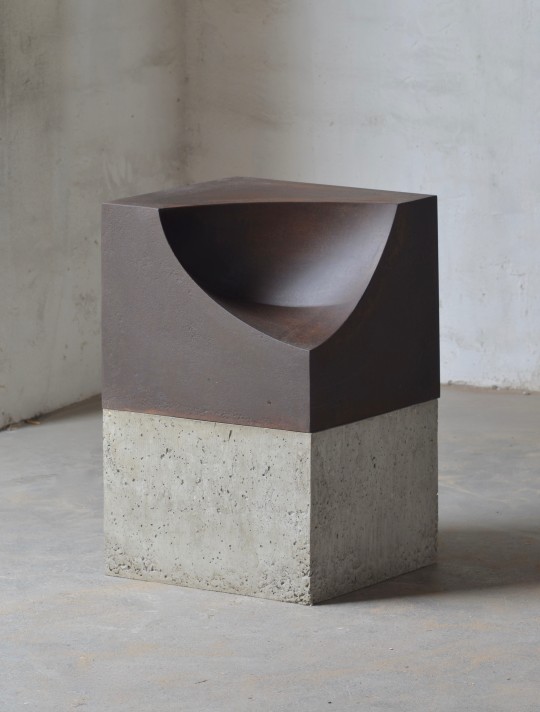
The pieces in Steel and Concrete, in each medium exemplify these different properties and effects – the steel pieces with their gently curved volumetric masses tend to encapsulate or bloom into space. Sledge, at over eight feet,and Agave, at five,seem like massive geometric creatures frozen in a moment of twisting growth. Ledge 2 tricks the eye into seeing a rectangular block from one angle – which then bulges and puckers from another. Mounted on a concrete base, Spoonful, inverts Waldron’s more familiar convex curves with a smooth concave scoop out of the sharp-edged steel square.
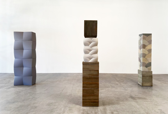
The concrete pieces included in the exhibition are all columnar – composed of regular interlocking shapes and modules which showcase the motion of uprising lift and rhythm. Shadow Column includes both a wood base and cap which contain a smooth, white, braided sculpture of hydro-stone within. Fan Column, on its wood plinth, is a complex composition of interlocking arced forms in alternating muted colors. His most recent piece, Six Color Column is comprised of gently curved blocks fitted together to create an undulating tower.
Finally, the wood piece, White Cloud 3, explores the same fascination with curved planes and elegantly intersecting lines as Waldron’s steel works – but makes good use of its lighter weight to create a more delicate shape that seems to sail out abstractly from the wall.
Step by step, each sculpture of Steel and Concrete leads the viewer through an experience, from objective observation through to subjective co-existence. Frozen curves intimate at the gentle slowing down of time. (We pause. We notice.) The density of the large steel works grounds our feet into the floor. (We find balance in space as they balance so elegantly in their twisted curved forms.) And the columns, rising slenderly toward human height, feel like fellow beings. (We stand with them, being.)
0 notes
Text
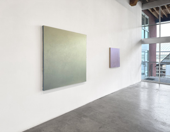
David Simpson: First Light
January 26 - February 29, 2024
0 notes