Last Seen Blogs

kk53i
無標題

jiinora
The Light At The End Of The Tunnel

daylightcomeandmewangohome
ᕕ( ᐛ )ᕗ

krzywy-swiat-blog
Crooked world

gormevizyonu2
Görme Vizyonu2
Photo


Here are my three final images for the Metamorphosis project, I tried to keep a consistent colour scheme throughout all three of the designs, as this ties them nicely together as w whole selection of images. I created all of them using Sketchbook Pro and I drew them all directly onto the program rather than drawing them by hand first then scanning them in, as with previous projects which I had done that, I don't think that it works as well.
The first chapter I created was the window design with a selection of off tone colours which weren't too bright but added a nice amount of colour. I think it has a nice sort of animosity to it which I was aiming for, it doesn't give anything away about the chapter but compliments the very start quite well. As I also wanted the image to be accurate to the time of the books creation, which was 1915 so I looked at images of interior windows from that era for inspiration.
The second chapter colours were slight different but not too much so, the colour does have a slight old fashioned ‘carnival’ feel too them but I quite like it regardless. It works nicely to translate the upside down perspective whilst also looking somewhat normal and ‘still’. Only problem is that I don't think it has as much shading therefore in comparison to the other images the contrast is a bit off. I drew a standard lightbulb rather than a light shade as it sits well with the era the book was created as well as it being more aesthetically better looking.
The third and final chapter image has a lot more shading but I didn't want to over do it so it isn't too contrasted. I didn't include the wallpaper design in the background therefore I had to incorporate the colour scheme into the covers of the bed and cloth instead. I managed to avoid drawing the cleaning lady without it looking super weird as well which I was pretty pleased with.
Overall I'm very happy with the overall finished images and I am pleased with how they look together.
0 notes
Photo


Here I started the next and final project for this module. ‘The Metamorphosis‘ written by Franz Kafka is a book about a man named Gregor Samosa waking up and finding he has turned into a bug. We were asked to illustrate the chapter pages for this book, with a total of 3 chapters and the choice between spot illustrations or full page illustrations.
I began by taking notes of significant parts of each chapter to help me illustrate the most important parts of each chapter.
I came up with several initial ideas while I was note taking and I managed to come up with a few ideas for each. I wanted to avoid drawing the bug completely to allow for an effective level of animosity, to do this I initially wanted to draw images that were from Gregors perspective.
For the first chapter I initially planned to do drawings of the characters at Gregors door, but from his perspective. I ended up deciding for my final design to do a window with rain falling down it, as this is the first thing that Gregor sees when he wakes up, I also think it works well as a subtle and ominous start to the chapter.
For the second chapter, my initial ideas were to draw the food platter given to him by his sister, as it is well described and would give an interesting image from his perspective. I also went through a few more ideas but I preferred the food one. However I ended up going with the idea of an upside down view of Gregors room, as e mentioned that he enjoyed being upside down in the second chapter, I also thought it would give a really unique quality to it. I ended up going with the idea of an upside down lightbulb with a small fly flying around it, as a slight nod to the bug theme.
For the third chapter I wanted to initially do the three lodgers at the dinner table, with one pointing at Gregor, I ended up going with another idea which was the cleaning lady covering Gregors body with a cloth. I liked this idea better as it allowed me to cover her face with the cloth as well as I drew it from Gregors perspective so he was covered as well.
Overall I liked all the ideas and I chose the three I thought would work best together as well as individually. I did do a few further developments and decided to add roman numerals as the chapter indicators.
0 notes
Photo


I have Blu tacked one of the designs to the bottle and I really like the way it looks however I will still try to test the octopus design as another potential design.
0 notes
Photo


I experimented with paper types and foil colours, however I most preferred the silver foil. I tested matte sticker paper, plain paper, glossy paper and glossy sticker paper. I liked how all of them turned out and had a hard time choosing one, so for now I have Blu tacked some to the bottle as I am still unsure. I also wanted the foil to be scratchy as I thought it looked pretty good and gives the anchor a ‘rusty’ look which I really like. So I scratched the foil with the end of a paintbrush and I feel like it gave it a really cool look.
Still have commitment issues with sticking the label to the bottle, also I will try to do the octopus design even though I really like this one!
0 notes
Photo


I decided to go with one of my other initial designs as I preferred the border and style and thought it fitted better with the style of the bottle, however I may experiment with the octopus one as well. I drew it out on my tablet initially and then I added colour to the line drawing then shading. I blacked out the areas which I had planned to foil. I just drew the typography using a fine liner, I liked the inaccurate sort of ‘wonkyness’ to it, it made it look a lot more illustrated than graphic. Overall very pleased with the outcome!
0 notes
Photo


I brought a 30cm glass bottle from Ebay that had a nautical feel to it, as it has small engraved ropes around it and a bubbled neck. This would be the bottle I use for my final design. Here I started to created the 3D tentacle using air dry clay, I modelled it on its own at first however it was very heavy and would take forever to dry, therefore i decided to twist some aluminium foil around it and use that as a base for my clay. This was much easier to mould it around. After this I moulded the small ‘suckers’ with small balls of clay which I stuck around the whole tentacle.
I wrapped the tentacle around the base as a stand and then wrapped it all the way up to the top of the neck. I then let it dry for a few days and painted a base layer of mod podge on the clay before painting it with white acrylic. Then I applied the colour on top with some shading, along with a final layer of mod podge as a top coat.
The final image is the finished tentacle, I now have to glue gun it to the base as its not stable enough to hold its own weight alone for long. I also need to apply the label once I have printed and foiled it.
0 notes
Photo


Here I created a small mood board for me to reference too with any other further designs I create, as I thought it would be helpful to have something to look at that encapsulates the style I was going for. Next to this i have some small sketches for my final 3D bottle structure, I also experimented with different label styles, e.g wrap around labels. I decided on just doing a single label without a wrap around as the tentacle would cover a lot of it.
For the second page, I looked at images of tentacles to help me understand the structure as im moulding it in clay. I drew them out as well to enlarge some of the smaller images and to also look closer at the ‘suckers’ of the tentacle, as i wanted to mould it as accurately as possible.
I also did a little bit of artist research on Ernst Haeckel as his illustrations are similar to the kind of style i was going for. For example his octopus drawing which I can relate well to mine as he uses a similar style, is bold in colour and uses accurate shading. I also really like his art style and would like to incorporate his accurate style, as I have now begun looking at real images of tentacles so I can attempt to reproduce them in a more accurate nature.
I will continue to experiment and research and experiment as i get closer to the end of my project.
0 notes
Photo


Here I did some further developments on the label design i originally wanted to go with (the octopus one) and I also came up with another design based on all the others i did previously, as I liked something about all the designs, such as the trident shape, so I put all these together into another design (right image) However I didn't like it as much as the octopus design, I just think that it works a bit better overall. I used pencil crayons to colour the design and a metallic marker to create the border, which would be the foiled area. I liked how the borders worked with both of the designs, however it worked best with the octopus design as its a more compact image, where as the trident one is a bit more loose and the border doesn't frame it as well.
I also left some spaces (the scroll and faded areas on the tentacles) for typography as I was planning to scan it in and experiment with different styles. I will experiment further with the label design.
0 notes
Photo


Here i decided to design some labels using gouache and fine liners. I loved how all these turned out, I experimented with borders and colours as well as the general design, altering it each time. I think the first three (pictured above) were the most successful as I liked how the oranges and blues worked together. I did experiment with greens and golds for the ‘trident’ shapes but the green made the tentacles look more like vines rather than a giant tentacle. I think I will use the blues and oranges together as they work the best.
0 notes
Photo


Here I did more typography research, however I decided to do some painted typography as an experiment (gouache paint), I liked how a lot of them looked but some were too much for the designs I had in mind. Although it was nice to see what a painted font would look like but I didn't think they had the ‘luxurious’ look I was looking for. I think I may stick to hand drawing the font in a fine liner style for my final piece.
0 notes
Photo


For our final bottle design, we must include one of the following three techniques, foiling, flocking and embossing. So today we experimented with all of them! I mostly liked the foiling and flocking as they have a really nice luxurious finish and i really wanted to include these in my final product. The embossing was cool but I could not see how I would at this moment add it into my work as it is quite a subtle effect.
After this me and my friends went to a local supermarket and took some first hand images of bottles for some research, I found three which are more suited to the style I wanted for my own bottle, however I added a couple more to my sketchbook that I thought looked quite jazzy. Then after looking at these bottles i decided to draw out some typography as I felt my initial ideas were not as effective so I did a few of these and I liked how they turned out, though I think a bit more refinement and development is needed.
0 notes
Photo


This week we were given a much longer project based on creating a potion/medicine or something that gives you super powers etc. I quickly decided that I wanted to do an underwater themed potion, with this I brainstormed some names first of all. I eventually came up with ‘Underwater Serum’ or ‘Underwater Tonic’ which I liked at first but they weren’t super good, so I thought if I tried writing it in other languages it could sound way cooler. I went through, Italian, Latin and a few more, but I finally came to the conclusion that I was going to call my potion ‘Neptune's Tonic’ (in English) which sounds much neater.
I also did a few quick idea sketches for the bottle designs, these were a basic bottle shape but with a 3D tentacle wrapped around it. I thought this idea (if successful) would look super cool on the finished product and I decided that making it out of clay would be the best idea. mostly because I can paint it and make it a shiny like octopus tentacle. My inspiration for this idea was remembering the ‘vigors’ from the game Bioshock, which were potions in the game which give you superpowers (which is pretty much exactly what we were asked to create) and they had cool over the top designs which is what I kinda want to go for, also I felt they would apply well to this project.
I then went on to create some initial label ideas (pictured above) and I did a few in pen and two painted colour developments of a couple. None of these are definitive ideas, they are just experiments and sketches at this point, but so far I have a lot of ideas of what i want the label to look like, now I just need to continue researching and developing current ideas.
1 note
·
View note
Photo


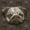
We were given our final editorial tasks where we were asked to be an art director for another student. I was given this article to illustrate: http://mentalfloss.com/article/509046/orlando-animal-shelter-sorts-dogs-hogwarts-houses
I began by drafting a some ideas, a lot were mostly dogs and Harry Potter- related images. I ended up with 3 initial ideas and i decided to go with the idea of drawing dogs related to the main characters from Harry Potter. First one was Harry Pupper (of course) and i drew another called Howlmionie Grainger.
I liked the Harry Pupper image the most and decided to go with this and develop it digitally rather than by hand, as I wanted to match the websites style, and after researching some illustrations from there, most of them were quite digital. (Also the website itself seemed to be quite fun and satirical, so I tried to achieve this with predictable puns and dogs in cloaks).
I finished the final piece on GIMP by applying colour and a square background for a little extra jazz and to make it look more editorial. I liked how the overall image looked but I know it could look a bit better, but im not super good with digital work so I applied what little knowledge I had to try and make it looks as smooth/finished as possible. Overall it is very fun and light hearted which I felt the website was as well as the article itself, so im happy with the result.
0 notes
Photo


This is the design process for my lizard ping pong gif, I created it as a piece of editorial work to go with the poem, ‘Ping Pong Paul’, from Anorak magazine (not official of course, it was a uni brief.)
Anyway, to begin I jotted down some initial ideas and sketches, these mostly centre around a human figure as I was planning to do Paul as an elderly man with a handlebar moustache, however I looked at some of the artwork for Anorak magazine, and it was clear than realistic human characters would not be necessary. I then proceeded to design a cat playing ping pong, again I didn't feel like this fit super well and looks somewhat unsettling, so I went with a lizard, well it was supposed to be a turtle actually, but the shell proved more than a bit difficult to blend in, so Paul the lizard was born. I scanned the image into GIMP rather than Photoshop, as I do not have this software, but it turned out pretty well after a few clone stamps here and there, along with some stop motion style layering, it turned out much much more successful than I expected. There are some things that I could improve, such as the arm animation (as you can see it is a bit jagged) as well as moving the eyes, which I initially planned to do, but with the tail and arm movements I felt it was a bit much. Only other thing I think it would need is softer edges, as it is a bit pixely and wobbly.
Anyway, please enjoy Paul the ping pong lizard!
1 note
·
View note
Photo


The first project for Illustration Applications, was to create an editorial piece for an article based around how parks are becoming too controlled, the illustration was to portray this idea whilst being colourful and playful.
For my initial ideas I though of 4 starting points (pictured above) the top two, which were my first initial ideas, were the least successful in my opinion, the bottom two however I decided to use, and I did some further development with these (pictured above).
The developments turned out well, I didn't change too much, other than adding extra bits here and there, then after doing some more online research, (looking at images of parks/ illustrations etc.) I came up with a completely different idea of two young children looking into a chained off/ sectioned park. Initially I added text to this image, however it works much better without so I swapped the sign for more chains. Overall I was happy with this so I chose this as my final idea. I went ahead and added colour, I decided on watercolour (for no particular reason other than i like the look of watercolour).
I liked the finished image, however I may improve it a bit with some digital work, as I didn't edit it at all, other than the size.
1 note
·
View note