
Statistics
We looked inside some of the posts by chloefashionillustrations and here's what we found interesting.
Average Info
Notes Per Post
20
Likes Per Post
20
Reblog Per Post
0
Reply Per Post
0
Time Between Posts
2 days
Number of Posts By Type
Text
17
Last Seen Tumblr Blogs


Fun Fact
In 2020, 27% of US Tumblr users had an annual household income of over $100,000.
Text


Catwalk look
This is my fourth and final illustration piece for unit 1 with using were to a catwalk look from the Spring Summer 2023 collections from in this perticular piece the fashion capital London. The illustration style was two different illustrator's styles merged together which are Alex Kim and Marloes Duyker. The catwalk look is from the designer Simon Rocha. For this piece I used pro markers, tissue paper, thread and ribbon. I sewn around the border of my illustration to show the development of the illustrator Marloes Duyker as she uses a sewing machine to create her illustrations so I used hand stitching to recreate her idea. Moreover I added a bit of thread on her face to add to the idea which I think it finish it off and look amazing. Next I used the pro markers to colour in the garment from the idea from Alex Kim it was hard to find the correct colours to match the designers piece. Then to create the colours to stand out I layered the dress using white tissue paper to get the right design and outcome I wanted. Finally finished it off by adding a little ribbon to match the designer design with the ribbon hanging off her dress in the original idea.
youtube
Simon Rocha catwalk show that inspired my piece.
4 notes
·
View notes
Text


Catwalk Look
This is my third final illustration piece for unit 1 with using were to a catwalk look from the Spring Summer 2023 collections from in this perticular piece the fashion capital Milan. The illustration style was two different illustrator's styles merged together which are Edgar Artis and Rachel Taylor. The catwalk look is from the designer Moschino. This piece was really wacky and fun to create as it had different intake for illustrations with using everyday objects such as the cotton buds I used. I used the media of watercolour to add the colour on the bodice of the garment and the smaller skirt before the mermaid tail which is covered in cotton buds to show the style of the illustrators. I used pencil shading for the skin to highlight the work and inspiration from Rachel Taylor style as she doesn't do skin tone in any other media apart from pencil which I found interesting.
youtube
This is the Milan catwalk show that inspired my piece for this catwalk look.
1 note
·
View note
Text
Just finishing up with a bit of more watercolour
1 note
·
View note
Text


Catwalk look
This is my second final illustration piece for unit 1 with using were to a catwalk look from the Spring Summer 2023 collections from in this perticular piece the fashion capital Paris. The illustration style was two different illustrator's styles merged together which are Mekel and Natasha Kekavonic. The catwalk look is from the designer Junya Wannabe. Her style in the catwalk reminded me of a rock punk style so I wanted to re encapture the style of it. Therfore I took the style of a messy illustration and a neat illustration. To start off with I drew my basic outline using the double up method with the straight line down the page. I used the watercolours as both illustrators included the media but as well as I could create a more interesting look with dripping effect and splashing the colour on. For this piece I wanted to keep the original catwalk look but the design of the illustrators and I think it went successfully. I added small details such as the colour on her face to show the styles of Natasha Kekavonic and I have added smudgy clouds to represent Mekel's work.
youtube
This is the fashion show that inspired my catwalk look.
1 note
·
View note
Text
My illustration in the making using chalks
1 note
·
View note
Text


Catwalk look
This is my final illustration piece for unit 1 with using were to a catwalk look from the Spring Summer 2023 collections from in this perticular piece the fashion capital New York. The illustration style was two different illustrator's styles merged together which are Tang Chiew ling and Lara Wolf. The catwalk look is from the designer Fe Noel. To create this piece I started off with a straight line down the centre of the page and using the double up method started to draw an outline in pencil. After I was happy with the result I had to figure out how to colour it with the media and inspiration from the illustrators for my illustration. I decided to use the leaves from Tang Chiew ling for the sleeve of the blazer. To recreate these I used paper and cut out leaves shapes to create the effect and used the colours from the designer garment to add the shading. I wanted to use watercolours for blending but also for the purple colours. Then I stuck every leaf on the sleeves with curling them to make it look realistic and 3D. Moreover I used watercolours on the draping of the blazer end to add the folds to the material and fabric which I saw in the catwalk look. I thought that I would challenge myself and colour the blazar in pastels to show the style of the illustrator Lara Wolf as she uses the media for her own work. It took me a while with trying to blend and get the right colours but it was worth it for the outcome. I also used the same media for the skin tone for the finishing touches. To finish it off I added hairspray so the media would set after the hours I put into my work. I really enjoyed making this piece as it was a spin from what I originally illustrated through unit one. I will take all the experience and skills developed from every piece I created in my future projects.
1 note
·
View note
Text


This is my second met gala inspired piece which encaptures the glam of the fashion world l with tailored made design. To create this piece I made it fill the page to add all the details highlight this design. As usual I drew a line down the page for my proportion and using a pencil I sketch a light quick outline of the reference photo. I found the shape and overall design of this dress really interesting and beautiful, so I futherly enjoyed illustrating this design. The video above shows the process of my illustration coming to life however it did take time to add the circles with some 3D elements and the texture. I took me almost three hours to capture the movement of the dress with the small details. I added different directions to finalise my garment in the illustration. Furthermore, I used a biro pen to add the detail and the hair for a strokes for a natural look and used coloured skin pencils to add her skin tone. Moreover, I wanted something new for the presentation.
1 note
·
View note
Text


This is my first met gala piece inspired illustration this garment is from Rihanna's gown. To create this piece, I used inspiration from the college piece from my previous illustration and I styled it into Rihanna's dress. I wanted to make it 3D because of the fabric on the original dress with the large polka dots reference. I used magazines for my media and found the colours I wanted a pink tone as I could not find the correct colours from the original dress, so I used my knowledge from my previous illustrations of colour theory and decided to use monochromatic method. I cut individual circles which took me a long time. I stuck on every single piece trying to add depth and texture to recreate the original design of Rihanna's dress. Even though, I used the illustrator's inspiration and as a reference I still wanted to capture the design of the illustration. Leading to, the no skin colour and the design of the legs. One area to improve for this is the proportion because for me it is not correct and not matching the full garment with the garment to the face which I struggled with as the dress was the focus and larger than the body in the reference photo. I wanted only half of a page to display the images as my illustration filled a whole page therefore it kept the focus to itself and I did not want to disturb the whole illustration with the use of media chosen - collage.
1 note
·
View note
Text


This is my final media experiment piece in this series which for this one I used the media of pro-markers. For this piece, I was not too sure how to use pro markers to make it look professional as I never used the media before. So it was a learning experience during this series, I found it hard to blend the colours together. Another problem I ran into was the pens were very watery and leaked through the page. I used a range of colours to make it look similar to my reference image. Furthermore, I wanted to challenge myself by trying a harder illustration because for me it is hard to draw faces and hands it took me a while to try. I love the face detail as it is my best one so far. I like how the proportions turned out good. At first I was going to draw only one figure however I was not too keen on my first one therefore I decided to have another practice and try again which was for the better. My overall, skill improved using the pro-markers and how I use them. After I had finished, I used a fine liner just to add the detail. One area I could improve is the hands as they look like claws or mittens but it comes with practice. Moreover, I kept the background quite plain as I wanted the focus on my illustrations as they are very colourful for this reason I remembered less is more in this case it worked. I just added a strip of card down the page and folded the illustrations pages to keep the focus on them.
1 note
·
View note
Text


One of my favourite pieces of work, is my fifth experimental piece with the use of collage. For these particular pieces, I wanted to try all three of these designs as I enjoyed making these illustrations. As usual, I started off with a straight line down my page to start my basic outline. For this experiment art, it was quite simple to draw the outline as it only had the focus on the actual garment then the figure. I think I was lucky as I like oragami and the use of 3D elements in my work. I started off by searching magazines for the right colours as you can tell the struggle was real it took me an hour to get the right colours for each illustration. To add depth and detail I folded the paper from the magazine to create the shapes such as the swirls and fans. It took a while, however it was worth it for my outcome. I enjoy collage for media so overall this specific experience and experiment illustration worked well for me. For the finishing touches, I used a thin fine liner to draw the figure, luckily for me this illustration did not have hands to draw as I find hands hard to draw. I also tried to add the detail on the faces matching the reference photo. Through this experience, I have improved my understanding of collages and skill. One area to improve is to keep the proportions correct and still keep the figure looking neat and nice, even if the concentration is in the garment.
1 note
·
View note
Text
Displaying more of the process of my illustrations. This one being the use of the media water colour.
1 note
·
View note
Text


To carry on with the media experiments, this is my fourth piece using the media watercolours. I really wanted to challenge myself to attempt something new for my illustrations, therefore I chose this specific reference photo as it had more details and a portrait which for me is hard to draw. At first, I started with a rough outline, using a pencil, of the face and tried to make it large to capture the detail of the illustration. For the first outline I decided his face has a turnip shaped face which made it easier to draw. Moreover, I used the process of drawing shapes I saw for the rest of the body to make sure it was in proportion to the face. I liked how this illustration has a unique quirky look with not a stereotypical illustration: seen as a figure in fashion generally. Furthermore, I liked the colours used by the illustrator for the shade of brown I soaked a tea bag for the specific colour I needed and after it dired I used some of my brown water colour to blend on my drawing. Plus, I am quite fond of the patterns the original illustrator created with the tartan strips to the camouflage design. Once my piece was coloured in, I used a fine liner to draw outlines for the small detail such as the eye and ears. I particularly happy with the outcome as it was fun but a little bit difficult because of its originality. One area I could have improved was making the colours blend better and has different shades to add depth. I do like the style of the illustration and maybe I might use inspiration from this piece in particular to incorporate into my future designs. In conclusion, I find I have improved my skills and knowledge of the media watercolours.
1 note
·
View note
Text
Showing my process of adding pastels to my new fashion illustration.
1 note
·
View note
Text

This displays my third experimental piece using pastels. Starting off with I used brown paper to start a simple sketch of my outline and I tried out different pastel colours which I found quite hard to match the figure however I wanted to challenge myself. I had to blend and create new colours and used the pastel colours I could see from my previous image. I draw a line in the centre of the brown paper to draw a figure and then used my new media. It was in proportion for me except the face, but I did it to manage the proportions. I found the material fun to use but awkward to colour the right design. In the video above it displays my effort of using a new media showing my determination and effort I use in every illustration I have created. After I applied the media, I used hairspray to set my illustration to let it look professional and clean so the pastels would not rub off. I kept my overall look to be clean and neat. I created a simple border with black card with triangles. I tried to create small flowers with new shapes for my background. I cut out letter from magazine for the capital letter for my title. Moreover, I find this process of media interesting to use but challenging. Overall, I am pleased and proud of every illustration I create so I do hope to improve and develop my skills with different medias. In the future, I would like to improve my shading and overall performance for my future illustrations.
1 note
·
View note
Text
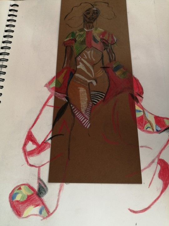
This is my second media experimental piece using coloured pencils. For me, it was quite easy with shading and quite calming with a therapeutic atmosphere as I have more experience using coloured pencils unlike with my first media experiment of ink. I wanted to challenge myself by using a different background and paper to colour my work in therefore I picked some brown card to match the reference photo but also to try something new. I really like how it turned out with something new with an individual design in my sketchbook with new presentation. The colours stand out more using the coloured card compared to my sketchbook page with creating a whole new perspective of using the media (coloured pencils) making more inspiration and experiments in my future pieces trying more colours which are innovative and not seen as a classic such as black card and white pencil. I like the overall effect and design of this illustration, but it is out of proportion for me with the two divergent backgrounds it I misjudged the outcome for the proportioning. I can still improve my knowledge and how to make pencil look clean and professional finish for the future. Furthermore, I wanted the focus on my illustration compared to the background, so I kept it plain and simple with the illustrations being colourful and eye-catching. One thing I would prefer is my drawing of the faces as it is still difficult for me to draw them, but I must keep practicing them for fashion illustrations trying to keep them realistic and interesting but still in proportion. Moreover, I like the body with creating movement in a different pose referencing back to my s curve figure with adding more depth and practice.
1 note
·
View note