
i took one good photo and now i'm in art school research account @chloejadeucaresearch
Don't wanna be here? Send us removal request.
Statistics
We looked inside some of the posts by chloejadeuca and here's what we found interesting.
Average Info
Notes Per Post
27
Likes Per Post
27
Reblog Per Post
0
Reply Per Post
0
Time Between Posts
8 days
Number of Posts By Type
Text
15
Link
2
Last Seen Tumblr Blogs


Fun Fact
12.7% of mobile users access Tumblr.
Text
Memento
We had to create another short film around the theme of momento, for this I chose to surround the film around a family member’s 50th birthday, instead of the recommended subjects of hair, bones, skin etc. Overall, I am fairly happy with the outcome of this film, however I feel that with more time I would’ve been able to produce something much more thought out and better presented.
I had a few issues in regards to choosing an audio clip as I could not decide on a fast paced piece of music or a slow piece. In the end I chose to use both, which are ‘Empty Space’ by James Arthur © 2018 as well as Macarena by Los Del Rio © 1993. i used the slower song by James Arthur because I wanted to show how a lot of people don’t have a big and busy celebratory day, even for momentous birthdays and the lyrics of the song were suitable too how the ‘empty space’ can refer to the empty space where the decorations should be or the empty space where the people should be. I also chose the ‘macarena’ by Los Del Rio because I thought the fast pace of it would almost be ironic as there’s not much going on in the film, another reason I used this song to play in the background is because its such a memorable song that is always played at birthdays and other celebrations, so it would remind everyone of parties from their own memories.
FEEDBACK
Cinematography is good
Editing is effective
Interesting
This film is probably in my top three out of the films I have made this academic year so far as I have included a lot of skill in it that I have learnt recently snd I also showed the deflation of the decorations which people may not think about doing when creating a film around this theme, the balloons are supposed to be the main thing that happens during this film showing how empty the entire day actually is.
10 notes
·
View notes
Text
Aftermath / What Remains
Over Christmas I had to create a film that shows the aftermath of an event, I first found this very difficult to think about as I thought the film would be boring due to the main event not being shown. As I was working constantly throughout the Christmas period I used this to show a side of the shopping centre that no one normally sees. My idea was to show how lonely people who work in retail are over Christmas. I also included footage from the final speeches and encores for the last show of popular West End musical ‘Bat Out Of Hell’ where the audience are giving a standing ovation and cheering as the cast left the stage.
My only restrictions and issues faced with his film would have to be my complete lack of time to think of a concept, record my footage as well as edit the actual film. However I worked around this by recording my footage as I was going to and leaving work at very early times in the morning and very late times of night, with only a few seconds of footage that includes any form of daylight.
FEEDBACK
New thought process with the end of the show, people normally focus on the show rather than the end of it
Shows how lonely your personal Christmas was and makes it feel more personal because of it
Technical skills and techniques are good
This is definitely my favourite film that I have made to date due to the way I worked around my timing issues and how the end piece turned out. I also like how it showed people how lonely Christmas can be for a lot of people as they may have not realised it before. The feedback I received for this film was also a lot more positive than what I received for the first film I presented.
0 notes
Text
Second Altered State film
An Altered state of depression part 2
This is my second film from the ‘Altered States’ project, in this film I have used mostly the same footage as the first film as well as some added newly recorded footage. In this film I have used a few more skills than the first altered state film due to being more comfortable with using adobe premiere pro.
I also had technological issues while making this film- so much that I had to redo the entire film as it was completely wiped. I wasn’t very happy with the way it looked the first time so I saw this as an opportunity to start fresh and complete it to a standard I much preferred.
FEEDBACK
New thought process with the end of the show, people normally focus on the show rather than the end of it
Shows how lonely your personal Christmas was and makes it feel more personal because of it
Technical skills and techniques are good
0 notes
Text
Altered States Films
An Altered State of Depression Part 1
https://youtu.be/ndGxZzflc3s
This is my first film from the ‘Altered States’ project, where we had to create two films to show the change of something. This brief was very broad and open however it was also very challenging. We were advised to create a slower paces film as well as a faster paced film, however as I struggled to think of any ideas and concepts for the faster film I decided to create two films with a slower pace, however I would edit them both differently and show the difference in the morning routines of two people who suffer with depression.
I faced a lot of issues during the making of this film, whether it be due to lack of ideas or technological issues. Technology wise I lost a few hours worth of editing, some audio as well as my final drafts when my device was serviced and wiped. So, I had to re-edit the final touches on my film.
PREVIOUS FEEDBACK
Cliché
Predictable
The music is a bit too quick and would be better if the music was slower or an acoustic version
Lighting changes a lot due to the light outside
Not a fan of the text at the bottom and how it stays there
Despite the loss of data I have seen it as a blessing in disguise and a way to re-edit the final parts, include different audio and slightly change a few of the minor details.
This film is probably one of my least favourite films that I have made to date due to the way it looks and the way it is made. If I had to do it again I would use a lot more of the skills that I have learnt and I would probably use different footage, different audio and probably change the narrative entirely.
1 note
·
View note


Text
Creating Promotional Banners and Posters
I used Adobe Photoshop to create posters and banners that I could use in the website and magazine that we would create later on in the project. In order to do this I looked at modern posters from films that were released this year as well as some older films in order to bring back the whole idea of modernising something older. When creating the portrait poster I had to combine three images due to the original images not being completely suitable for the purpose I wanted them for, I had one picture of the background screen of white roll that we used in the studio as well as two other pictures of the murderer as well as one of the victims.
Here is how the portrait poster looks:

I also created a landscape banner using Adobe Photoshop, but this time using only two images, one of which was sourced using Google images, but I just altered the saturation and contrasts. I decided to keep the background in colour despite the image of the murderer in the foreground in black and white in order to make him look more dark and ominous, In order to modernise it I used small details such as the film production company being Warner Bros™ as well as the variety of fonts and editing techniques.
Here is how the banner looks:

0 notes
Link
OFFICIAL BLOOPERS
I have edited a roll of bloopers as an attempt to add an aspect of comedy to the film. I used Adobe After Effects to edit them. During the editing process I did face a few challenges due to my lack of skill and experience with the software. I found myself using more of the simpler effects that after effects has to offer in order to create the blooper reel but I used them to the best of my ability and used them in a more complex way than necessary.
0 notes
Text
Making a Magazine- Advertising
I was given a rough template for a magazine design on Adobe Photoshop in order to create a promotional magazine to promote the release of our film, complete with photos, posters and text. In my magazine I decided to include a promotional poster and banner, both of which I created myself using Adobe Photoshop. I have had more experience using this particular piece of software due to photography being one of my personal interests and editing being a follow-up side interest of mine. As well as the promotional banners and posters I also included some of the test shots we took during the pre production stage of the project- the test shots being those in the studio and of the landscape we were going to use.
Here is how my magazine looks:

0 notes
Link
Making a Website on Wix- advertising
We had to use wix to create a website to advertise our movie, we all had to create individual ones to showcase our individual skills regarding website making.
Here is a link to the website that I created:
0 notes
Text
30 second elevator pitch
As a group we had to create a powerpoint presentation that will last 30 seconds as a way to describe our short film. Here are the slides that we created:


0 notes
Text
CREATING A TRAILER
I have recently created a trailer for our short film 'The Meeting', for this task I had to use iMovie due to a lack of skill and experience using after effects. I used a template to guide my way through the process and I decided to choose the template based around horror movies as ours contains horror film themes so it seemed the most suitable.
I had to combine some of the test shots I had available to me at the time, which evidently was quite sparse. Despite the lack of time, skill and tools I am quite proud with how it turned out.
1 note
·
View note
Text
twitter- advert
We had to create a twitter account in order to advertise our film to the public and get real time reactions from people. We also had to design the page as well tweet advertisements including hashtags in order to reach a wider audience.
Here is how my page looks:


1 note
·
View note
Text
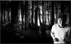
Trip to Tate Modern
We took a trip to the Tate Modern in London, during this time there was an organised exhibition called the shape of light which centres around the aspects of light in photography. This exhibition really interested me as photography is definitely one of the fields I would look into as a career in the future. Here are my favourite photos that I took during the day:


3 notes
·
View notes
Text
EDITING A PHOTO ON PHOTOSHOP
Over the past few days i have been editing a photo of a member of my team onto a variety of different backgrounds, some of which were taken myself and some of which were found on google.
Below the original image as well as the edited ones on different backgrounds, I decided to use both colour and black and white versions of the same background image to see how the main subject would appear in front of the different saturations. I definitely prefer the black and white versions as it makes the image seem more ominous as the person is supposed to be stabbing the person from the camera.
Here are how they turned out:


5 notes
·
View notes
Text
Experimenting with colour, light and shadows
Today we experimented using post-it notes and light in order to create shadows, as there were limited people in our group we had to improvise and use pens.
Here are some of our experiments:


2 notes
·
View notes
Text
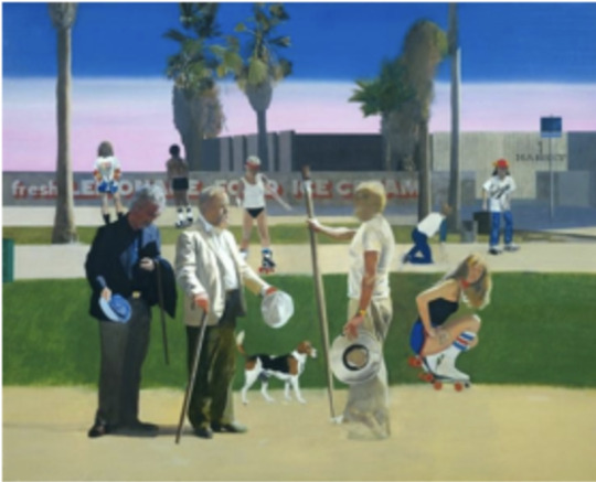
Recreating ‘The Meeting’
We were set the task of recreating a painting that we were given, I was given ‘The Meeting’ by Gustave Courbet. On the far right is where Courbet himself is positioned, in the centre is where Alfred Bryas will be found and standing behind him on the left is Bryas’ servant. Here is what the original looks like:

ADAPTATIONS
‘Have a Nice Day’ by Peter Blake is based off ‘The Meeting’. The painting shows three British artists, one of which is David Hockney who is in the place of Gustave Courbet on the right. Peter Blake is in the centre of the recreation in the place of Alfred Bryas and Howard Hodgkin is positioned behind Blake on the far left. Here is how the adaptation looks:
For the activity I created several adaptations, one of which used photoshop. Here are my adaptations:


0 notes
Text
Summer Project- Making a Wearable Sculpture
For the project over summer we had to create a wearable sculpture which took inspiration from art and architecture.
We also had to create a design sheet to show our thought process as well as our inspiration. Here is what mine looks like:

My design sheet shows three artists who interested me as well as a building I visited in order to see more interesting architecture. I also included my first idea and showed the progression to my final piece and how it related to the brief. In order to show what specific materials and techniques I used I included small samples of the main materials, these materials were; white lace, painted cardboard and wool that had been crocheted with the chain stitch.
VISITING
I visited an exhibition at the De La Warr Pavilion in Bexhill which showcased the work of Alison Wilding, an artist whose work I was interested in. While I was there I took a lot of photographs of the work on display, which I used for my design sheet.
I also visited Salisbury Cathedral, which I used as inspiration for my final piece. I feel like visiting the cathedral was beneficial to me as it was an example of architecture that really interested me due to the age and history of the building. I also liked the individuality and uniqueness of all of the details that can be seen in the cathedral, as the more in depth you look, the more intricate detail you find.
INSPIRATION
I took inspiration from the ‘Sliding House’ in Margate (also known as ‘From the belly of my nose to the belly of my toes’) as well as the stained glass windows from the Salisbury Cathedral. The main part of my piece was a recreation of the sliding house with crocheted squares hanging in front attached to lace and frames from glasses. The squares related to the stained glass windows as they were all the the same shape and size but with different patterns and colours- whereas the squares are all the same shape and size but with different colours running through them.
HERE IS HOW MY FINAL PIECE LOOKS


0 notes