Don't wanna be here? Send us removal request.
Statistics
We looked inside some of the posts by chloeokeeffefmptrendsyr1 and here's what we found interesting.
Average Info
Notes Per Post
1
Likes Per Post
1
Reblog Per Post
0
Reply Per Post
0
Time Between Posts
21 hours
Number of Posts By Type
Text
17
Last Seen Tumblr Blogs


Fun Fact
Average visit duration of Tumblr.com is 10 mins and 25 secs.
Text
Week 11 Reflection
This week on want to knuckle down on finishing everything on my blog, finishing my google sites and portfolio, tweaking little bits of my proposal and doing my evaluation. Luckily I‘ve already finished and finalised my magazine. I got all that done in one so I knew I had it done and didn’t have to stress.
0 notes
Text
Final banner & Google sites
This is what my final banner looks like. After struggling with what to put at the bottom, I finally decided on the first product photoshoot I did of my black baguette bag, because I liked the angles I used. I put those Images at the bottom of my banner and added some red rectangles to keep to the obvious black and red theme of my banner.

I’m extremely proud of how my google sites turned out. I think my GIFs look really nice next to my banner. At first I didn’t know which else to add, I added my three album covers but they looked really weird against everything else. Then I remembered my bleached images and thought they’d look so cool under my Gifs and banner. I also uploaded my magazine to a website called ‘Flipsnack’ which lets you create a digital magazine that you can flick through. After getting that uploaded and sorted, I embedded the magazine code and put it into my google sites. Adding it to my google sites means/lets you flick through it on there which I think it so easy and helpful.
I also really wanted to add more of images strictly related to my special effects, (what I based my magazine around) to show off as I thought it would really tie my google sites together. I thought of possibly adding in some up close images of the special effects I’ve done but the images I didn't have were really low quality. Luckily I kept the special effects makeup and I thought it would fit nicely on my google sites, if I scanned it in and had it along one strip at the bottom.


Overall I adored my outcomes for this project. I’m proud of how much work I’ve managed to produce on my blog and as amazing final outcomes.
0 notes
Text
Lino Print T-Shirt
After Wednesday’s lesson I thought the first print I did onto this shirt looked much more dull against the other four prints around it. I thought sewing with red thread would bring some colour back into it. I decided to hand sew it because I think using a machine would be easy as I’m not too confident using it yet, which is something I want to work on during the summer.
The thread was the perfect colour and thickness. I do enjoy sewing but this task got very tedious very quickly. I’m also not too sure that size needs I was using.


This is how much I did in a day. It seems to be taking a while but I think it looks so good. I think the contrast of the print against some thread works well.

Week 10 reflection
This week I want to I need to finally finish my t shirt. I think I’ve spent too long doing this, so I really want to use myself to get it done. I also want to try out a hand based process I discovered on TikTok called Bleaching. I want to attempt this on some edits/some potential magazine pages to see how they turn out.
0 notes

Text
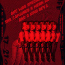
Target Audience
For my Final Major Project I wanted to create a fashion ‘Horror’ editorial magazine to support my chosen trend of Phantasmagoria, that also focuses on my love for horror movies and photography. I think my dark colour palette within my images reflects my trend really well.
I think my magazine will attract people of all genders aged between 16-35. It will definitely only attract people who are interested in horror.
0 notes
Text
GIF Workshop

Luckily I had enough time to create one more gif. This time I wanted to try and use some type, which I haven’t done yet. I still wanted to take advantage of having bleached and the original image, so I picked this image. Last night I actually created another “demon girl” edit using this image so I thought it would look really cool if I added it in. Like my first gif, I had to resize the bleached image to the original. I wanted to use a cool quote so I had a look on Pinterest and found “Not yet corpses. Still, we rot.” which I thought sounded poetically weird. I didn’t have any font that I felt fitted with this quote so I went to Dafont.com and found “Scream again” which looked really cool. I think it fitted excellently with the quote. I was checking to see if the layers would work as a gif when I thought it needed something more. So I decided that moving the font would finish it off really well. It just sat at the top in the centre so I duplicated the demon girl edit and moved it on it’s left side slightly, then I repeated that but making it a bit bigger. I thin doing that to the font on the demon girl edit work so well. When dropping the frames on top of each other, I had to be very careful not to mix them up as on first glance the frames al look the same.


After setting the time to 0.3 seconds, I checked the image size them exported it for web and saved it to my memory stick. I really like how this GIF turned out. I think, along with my second gif from this workshop, I’ll add this to my google sites.

0 notes
Text
GIF Workshop
This is my second gif and I much prefer it to my previous on. Creating this gif definitely took longer than my previous because of how many layers/frames I had. It did get very confusing but I’m super happy with this outcome, I think this is my favourite gif and I’ll definitely display this on my google sites. I used to same process as the other gif.


0 notes
Text
GIF Workshop
This afternoon's workshop consisted of producing gif to display on our google sites. We were advised to really experiment and use different shapes, I had a cool idea to use a rectangle over half of the image I choose.
I decided to use this image as I had the original image as well the bleached image. I thought using both of them layered over each other would work really well, then incorporating the shape would really make it pop.

I started by dragging and dropping both the original image and the bleached image into Photoshop and layering them on top of each other. The images were both different sizes so I had to size up the bleached one to the original image. After doing that I duplicated the original image and selected a dark-ish pink colour for the rectangle. I then merged the rectangle to the layer.


I made sure each layer looked good and I checked how well the gif would work by turning the layers on and off like it would do in a gif. I then saved each layer as frames. Then I drag and dropped the first frame into photoshop like usual, but with the other two frames I dropped them on top of the first frame and pressed enter so they’d stay in place. Before turning it into a gif I made sure the image size was right, otherwise when I export it, it’ll look pixelated.
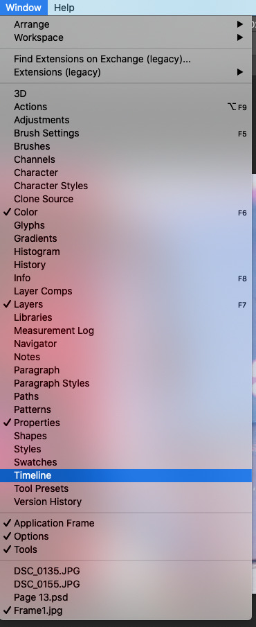
Then I went to Window, Timeline and selected Create Frame Animation, which put only the first frame into a gif so I went to the top right corner of the little area and selected make frames from layers, which turned it into a full gif.


When I create GIFs, I much prefer the time being at 0.3 seconds, so I have to type that in as it’s not a preset time. I think the gifs flow so much better at 0.3 seconds as opposed to 0.2. After setting the time, I exported it by saving it for web.
I think this gif is nice but I think I should’ve added some more layers.


0 notes
Text
Scanned in bleached images - Part 2
These are my (landscape) bleached images that I scanned in 600 resolution, so when I use them as pages in my magazine they won’t be pixelated.


0 notes
Text
Scanned in bleached images - Part 1
These are my (portrait) bleached images that I scanned in 600 resolution, so when I use them as pages in my magazine they won’t be pixelated.


0 notes
Text
Artist that link to my lino print t shirt
Yiqing Yin Spring 2013
Yiqing Yin is a Chinese-born, Paris-based Haute Couture designer, who showed off her craftsmanship with a collection inspired by Russian sculptor Naum Gabo, whose kinetic art influences came through in a number of looks. There was a dramatic dress sculpted from thick, dark red ropes and extra delicate pale- coloured dresses adorned in Swarvoski crystals, both of which fell in line with Gabo’s imaginative vision of what is and isn’t tangible. Yin also upheld her reputation for skilled pleated constructions via a number of intricate silhouettes ranging from Asian-style tuxedos to mini dresses.


Ashley V Blalock
Artist Ashley V Blalock crochets enormous red dollies that she then installs in site-specific configurations ranging from galleries, to stairwells, to trees outside. Her ongoing project “Keeping Up Appearances,” began in 2011 and has been installed at museums, galleries and gardens across the United States.

She describes the meaning behind Keeping Up Appearances : “Although non-threatening in a domestic setting, in the gallery and at this scale the [dollies] overtake the viewer and cover walls. Inherent is a compulsion to arrange and place and decorate in order to control or influence a perceived outward appearance. The red colour gives away the futility of such an act and hints at the unease that lurks below the surface of an obsessive need to control and arrange.”


Ashley is currently based in Southern California. She received a bachelor’s and master’s degree in sculpture and art history.

1 note
·
View note
Text
Artists that link to my hand based work
Meret Oppenheim

While living in France as an art student, Oppenheim made many unusual sketches for gloves. She designed gloves covered with fur in 1934 and gloves showing the hand’s bone structure in 1936 (the same year as her famous fur-covered teacup, saucer, and spoon titled Object). Elsa Schiaparelli’s avant-garde fashion house in Paris also commissioned her to create sketches of gloves and jewelry, which offered the young artist a chance to earn some money.


Rachel Wright

Rachel Wright’s ‘Dream Anatomy’ series explores these imagined realms inside the body. Because these garments are meant to be worn, the boundary between the internal and the external is blurred. The invisible is made visible: wear your inside on the outside. By using women’s slips and nighties, articles that were not originally intended for public life, she was playing with the line between the public and the private arenas.
Most of the garments and fabrics Rachel uses comes from thrift stores and garage sales. If you look carefully, you will find stains and worn areas: vestiges of a previous life, which I think is a much better approach to garment making. She says that she’s fascinated by the emotional patina that accompanies cast-offs, she also chooses to recycle worn garments because our bodies also bear the marks of our daily lives, both externally and internally.


0 notes
Text
Lino T-shirt part 2
This lesson I desperately wanted to get this shirt finished. I decided to cut my lino design in half as I wanted to position the lino on the left side of the shirt, just under the pocket. I got some advice from my peers and they said to put masking tape over the pocket and have the print slight on the pocket so when I take the masking tape off, it’ll look like the lino print is behind the pocket.
I really like the idea/illusion of making it look like the print is behind the pocket so I gathered all the equipment I needed. (u tool, ink, plastic screen, two rollers and a spatula thing) I decided of using red ink as my design is of veins/blood vessels. I dolloped a fair amount of ink of the plastic screen using the spatula/lollipop stick. I rolled out the ink around the plastic screen then added a bit more to make sure there would be enough to cover my design as I wanted to make sure the design comes up nice and bright on my shirt


0 notes
Text
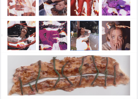
My Final Magazine
This is my completed magazine layout. I decided to keep the colours separate, so I put the reds first, then the purple edits then the greens. With a previous project, I produced a magazine but I laid the images out in whatever order, colour-wise, which I think is why I wasn’t too happy with it. Whereas this time I really want to keep my magazine clean and in the best way I think it’ll look.
I’m immensely proud of myself about how the edits I produced looked against the bleached images. I think doing the bleaching process on some of my images was such a blessing in disguised as I think most of them just needed something more to make them stand out and that process really did that. I’m also happy that I steered away from doing primarily red edits because I really wanted to expand and red was the colour I immediately correlated with horror, so I was only producing those coloured edits and it honestly got a bit tedious. So even doing one or two green and purple edits really gave my magazine good variety.
I love the front and back cover. The back cover doesn’t exactly fit with the green edits but I think having the normal edit as the front cover and then having the bleached version as the back cover was such an amazing idea.


0 notes
Text
Banner (site) Layout/s
This is my banner layout so far. After putting the string background on the banner, I decided to keep my entire banner to a black and red colour palette. I definitely need to add 2 more to the outside shoot that I started placing around the top of the banner.


0 notes
Text
This mornings workshop consisted of us creating digital banners to display our photography throughout this project. If Covid didn’t exist I’d have a physical banner that would be displayed in my own exhibition but because it does exist, I have to create a digital banner that I’ll attached to a google site along with a GIF.


I created a new canvas on photoshop with the width of 30 centimetres and height as 84 centimetres that’ll make it really long canvas. As a collective group we all had to put our chosen trend and whether it was women's or menswear. We don’t need to put our names as it’ll be on our google site page. Everyone also had to use the ‘Bebas Neue’ font so it looked more neat and professional.

I started with putting images into the canvas to experiment with. I wanted to keep to collections of specific photoshoots since I had as I have so many. The images I used are from my most recent special effects photoshoot. I took the brightness down on each image to make it the tiniest bit darker.
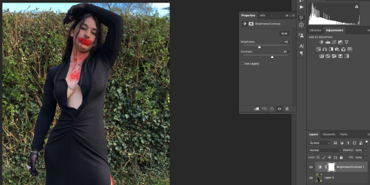

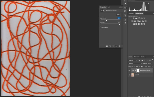
I really wanted to incorporate the red string that I’ve used throughout this project in the background of my banner. I had already scanned the string in but in the scanned image, it looked orange not red so I tried tampering with the brightness and contrast but it still had a tint of orange.
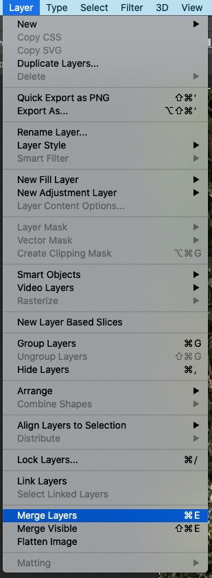
Someone gave me an amazing suggestion to use the Hue/Saturation to change the colour instead of just using the brightness and contrast, which worked so much better. After I merged the hue and saturation layer to the scanned image, I copy and pasted it onto the banner then moved it to the second layer so the images that I already had on there would be in front of it.

0 notes
Text
Week 9 Reflection
This week I want to take full advantage to Tuesday’s photography to get a few more images to edit with and put into my magazine or display on my google sites. I need to get edits completed so I can get them printed off, ready for a process I want to experiment with offsite next week.
0 notes