
Don't wanna be here? Send us removal request.
Statistics
We looked inside some of the posts by chloeslater-contextlog and here's what we found interesting.
Average Info
Notes Per Post
42
Likes Per Post
29
Reblog Per Post
13
Reply Per Post
0
Time Between Posts
10 days
Number of Posts By Type
Text
17
Last Seen Tumblr Blogs


Fun Fact
Tumblr Inc. has $15.1M in annual revenue.
Text
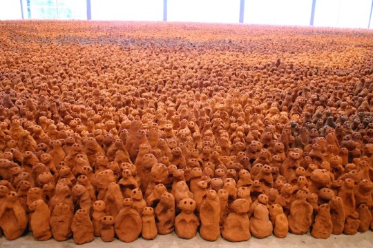
Damián Ortega

Cosmic Thing - 2002

Porous Structures - 2019
Controller of the Universe - 2007

Champ de Vision - 2008
Damián Ortega was born in Mexico City in 1967 and works as an installation artist, photographer, and cinematographer. Ortega began his career as a political cartoonist and has no prior art education or degree, but his passion for blending humour with observations of social, political, and economic climate through art spurred him on to pursue his career as an artist.
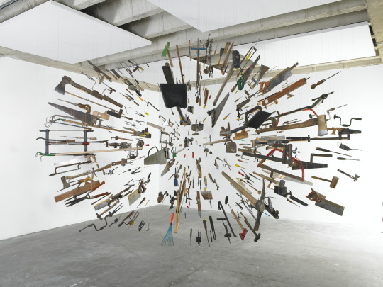
Ortega mainly works with sculpture using objects that have been deconstructed and transforms them into – often suspended – precise arrangements. These arrangements are often made to represent buildings, diagrams, faces, words, and solar systems. The artist starts these installations through drawings and sketches and once they have been transformed into 3D installations, he photographs and films them. Ortega’s work manages to take everyday objects and metamorphosize them into magical and awe-inspiring experiences. There is a certain dynamism to the artists work which is very present in his 2007 installation ‘Controller of the Universe’. The artist had taken an array of tools you could find in any shed and suspended them in the air in a spherical shape, with the front of the objects pointing in toward the centre. This work reminds the viewer of an explosion and what it might look like if you paused it. There is a sense of danger and unease to the work as many of the objects have blades and if you were to stand in the centre, discomfort and anxiety could definitely be felt.
In the artist’s 2008 work ‘Champ de Vision’ over 6,000 small, coloured discs had been suspended in particular points in order to create the illusion of a human eye. This work is centred around the viewer’s experience as you can walk through the installation, inspecting the discs up close, and step back, allowing you to see the imagery of the eye. There is also a partition at the far end of the room where the viewers can look through a lens to view the installation. Ortega stated about the work that “The original idea was about decomposing an image, separating it into its minimal particles, so that a person could walk into it and become a part of a molecular, almost atomic world—inhabiting the space that exists between ink dots suspended in space.” Ortega’s ‘Porous Structures’ approaches the idea of the mundane from a new perspective once again and the artist explores the intertwined relationship between the natural environment and modern civilisation, while also commenting on the circular nature of life. There is something quite bodily about the structures as there is a softness to them, which contrasts with the hard materials (sand, cement, brick, clay, and crystals).
2 notes
·
View notes


Text
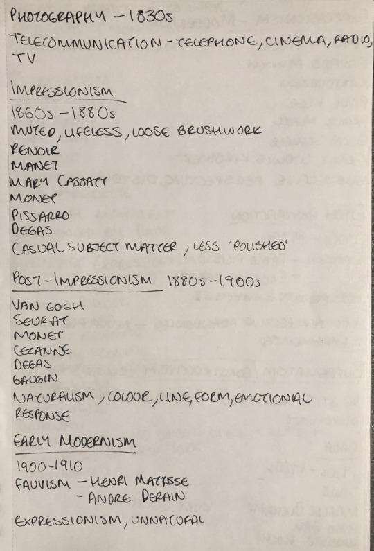
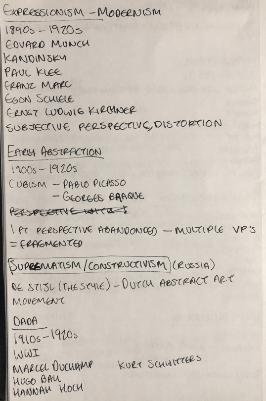
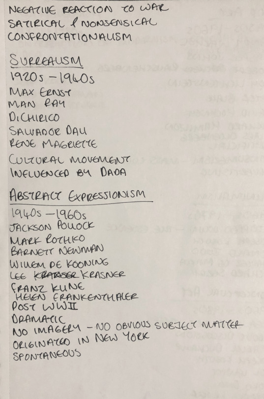
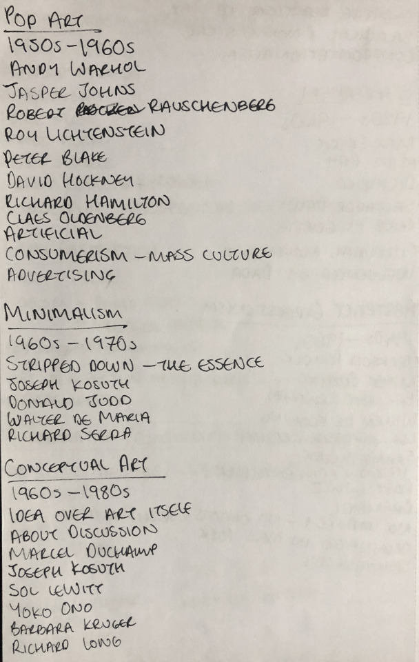
Lecture Notes 27.01.21


3 notes
·
View notes
Text
Lecture Notes 20.01.21


3 notes
·
View notes
Text
Lecture Notes 13.01.21

3 notes
·
View notes
Text
Artist Compare & Contrast
Andy Goldsworthy & Antony Gormley
Antony Gormley and Andy Goldsworthy are two unique and inspiring artists who play with the relationship between art and its surroundings. Both artists have and continue to influence modern site-specific art in various ways, despite being almost polar-opposite in terms of material and subject matter.
Goldsworthy’s goal is to create a symbiotic relationship between the work and its surrounding, which is why the artist works with natural materials, using only his bare hands to construct his ephemeral installations. Although Gormley’s work also centres around the relationship between the work and the space surrounding it, he most commonly uses man made materials such as lead and steel, affirming his work as a permanent creation. Goldsworthy’s use of natural materials allows his work to almost blend in with the surroundings and harmonise with them, whereas Gormley’s work often stands in contrast to the location – emphasising that we live in an industrial, man-made world.
Gormley focusses on the human form as the base of his work, in order to explore the relationship between internal and physical space which stands in opposition to Goldsworthy’s naturalist work that doesn’t have a clear sense of subject matter and is often spontaneous. Goldsworthy has also created permanent works but remained using natural materials such as found rocks or tree branches in order to maintain harmony with the environment.
Use of natural colour is something the artists both utilise as Gormley often keeps the colour of the material as is, and Goldsworthy is the same. The lack of synthetic colour allows for the artists’ work to achieve another harmonic relationship between the art and the location. Despite Gormley’s man-made materials, the artist’s choice not to brightly colour his creations allows for unity within his site-specific work, which is the essence of Goldsworthy’s work.
Overall, these two successful artists differ in style, material, and subject matter; Goldsworthy continues to achieve naturalism through his use of raw material and enhancement of the beauty of nature and Gormley creates a break between the surroundings with his almost ominous human figures influencing the space. Their similarities in natural colour and creating relationships between art and world link the two artists in a way that allows viewers to delve deeper into what it means to create site-specific work – and how art can be used to impact the world around us.
2 notes
·
View notes
Text
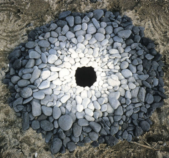
Andy Goldsworthy
Andy Goldsworthy is a British artist and environmentalist specialising in photography and sculpture born July 1956 in Cheshire, England. Goldsworthy studied fine art at Bradford College of Art (1974–75) and at Preston Polytechnic (1975–78) in Preston, Lancashire, where he received his Bachelor of Arts degree. After leaving college, Goldsworthy lived in Yorkshire, Lancashire and Cumbria. In 1985, he moved to Langholm in Dumfries and Galloway, Dumfriesshire, Scotland, and a year later to Penpont. In 1993, he received an honorary degree from the University of Bradford, and he worked as a professor of Sculpture at Cornell University from 2000–2006 and 2006–2008.
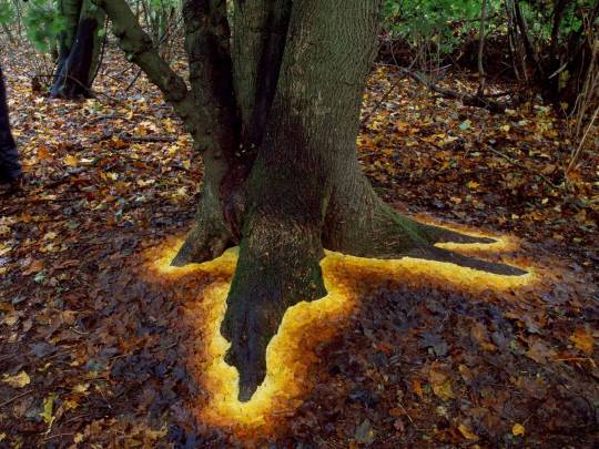
Andy Goldsworthy’s work is centred around naturalism as he works with and in nature, often using flowers, leaves, stones, sticks, snow, pinecones, and icicles. Goldsworthy works to rearrange the natural forms into whimsical compositions which enhance and emphasise the beauty of the natural world. His installations are site-specific, meaning the artist takes the location into account whilst working in order to create a harmonious relationship between the work and the surrounding area.
Goldsworthy’s work can be permanent or ephemeral depending on the materials used, and he approaches each differently. Permanent works made from stone or branches for example require planning and preparation whereas his transient sculptures are short projects, sometimes improvised. It is important for the artist to consider light, weather, material and time when creating his shorter-lived installations so he can successfully document his work through photography. The time of day, natural light and weather are crucial in creating contrast and colour within his photographs.

Early morning calm, knotweed stalks pushed into lake bottom, made complete by their own reflections. Derwent Water, Cumbria. 20 February and 8-9 March 1988.
Goldsworthy’s beautiful and fragile installation ‘Early Morning Calm’ where the artist had pushed knotweed into a shallow area of the lake and created a half spider web-like shape is my personal favourite piece the artist has created. The calm water perfectly reflects the shape Goldsworthy has built creating the illusion of a full spider web floating above the lake. The extremely minimal background in this image also helps create this illusion and convey a sense of whimsy within the natural landscape. The artist, working by hand, would have to create this piece in a timely fashion with great patience and care as any strong wind or movement of the water could ruin the installation – it is presumed that Goldsworthy took the weather, in particular, into account for this piece so he could avoid this. The foggy weather condition adds an extra layer of whimsy to the image, making for an extremely atmospheric photograph. The fog also adds emotional impact to the image as it conveys uncertainty, danger and even insecurity, which can be related back to the artist’s installation; the insecurity and uncertainty correlating with the creation’s unstable and fragile nature, and the danger stemming from the idea of the spider web.
Other iconic works:

10 notes
·
View notes
Text
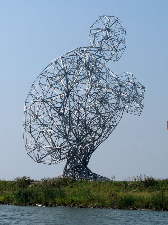
Antony Gormley
Sir Antony Mark David Gormley is a British artist and sculptor born in West Yorkshire, England in 1950. Gormley grew up in a Roman Catholic house alongside six other siblings, with a German mother and a father of Irish decent. He attended Ampleforth College and went on to study archaeology, anthropology, and the history of art at Trinity College, Cambridge, from 1968 to 1971. He then travelled to India and Sri Lanka to learn more about Buddhism between 1971 and 1974. After attending Saint Martin's School of Art and Goldsmiths in London from 1974, he completed his studies with a postgraduate course in sculpture at the Slade School of Fine Art, University College, London, between 1977 and 1979. At Slade School of Fine Art he met artist Vicken Parsons who became his assistant and later in 1980, his wife.
Gormley’s work centres around space and the human figure as he explores the body’s interaction with its surroundings, the space created by the sculpture and the body’s interior presence. Gormley began creating his figure sculptures by using his own body as the mould for a full body plaster cast, which he then used to help shape the different materials he worked with – commonly lead, iron, concrete and clay – into a figure.
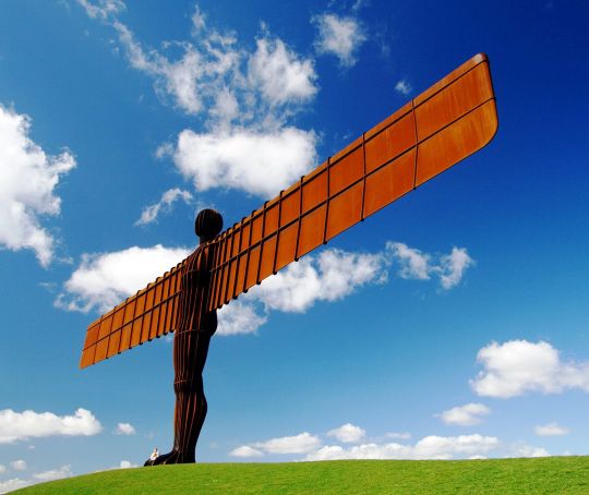
Angel of the North, 1988 – Gateshead, England
Gormley has created many public works that are displayed in different countries around the world. One of his most infamous public works is the gigantic 20 meters tall, 54 meters wide installation ‘Angel of the North’, made entirely of steel. This piece – like much of Gormley’s work – was created based on the artist’s own body and the wings were designed to be angled forward slightly in order to create “a sense of embrace”. As Britain’s largest sculpture, the angel has become a symbol of endurance, strength, and stability.
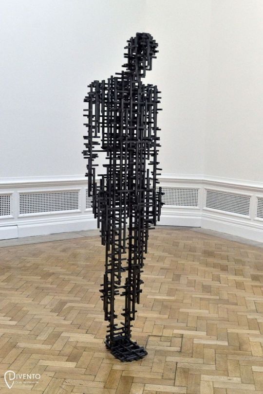
Subject II, 2019 – Royal Academy of Arts, London
In more recent years, Gormley has begun to use infrared computer software to digital scan his body in order to create the base of his sculptures. The use of digital technology allows Gormley to manipulate the figure and play with the shape before physically making the sculpture. Recent works have become more ephemeral with figures made from delicate tangles of wire or geometric blocks that slot into one another like a puzzle. A prime example of one of these figures is ‘Subject II’ (2019), which embraces Gormley’s central theme of space as the viewer is able to see how the figure correlates with the physical space and its internal space.
Other iconic works:
Field, 1989-2003
Exposure, 2010 – Lelystad, Netherlands
6 notes
·
View notes


Text
Christian Marclay
Christian Marclay is a Swiss-American visual artist and composer born in San Rafael, Marin County, California in 1955. Marclay was raised as a child in Geneva, Switzerland and studied at the Ecole Supérieure d’Art Visuel from 1977–1980 in Geneva, Switzerland. From 1977–1980 he studied sculpture at the Massachusetts College of Art in Boston. He also studied as a visiting scholar at Cooper Union in New York in 1978.
Marclay's work explores connections between audio and fine art by transforming music and noise into a physical form through film, photography, collage, sculpture, performance and video. Marclay began his musical exploration that mixes sound and art with performance using turntables in 1979 as a student. Sound artists like John Cage, Yoko Ono, and Vito Acconci were influential in developing his practice and the artist has collaborated with many musicians (such as John Zorn, Elliott Sharp, Fred Frith, Zeena Parkins, Shelley Hirsh, Christian Wolff, Butch Morris, Otomo Yoshihide, Arto Lindsay, and Sonic Youth among many others).
Over his career, Marclay has practiced various different techniques in producing his work, sometimes manipulating or damaging records to produce continuous loops and skips. The artist has also produced more conscious musical pieces which have been carefully recorded and edited to create a specific sound. Marclay has been credited with being the first non-rap DJ to make an art form out of the turntable, treating the instrument as a means to rip songs apart, not bridge them together.
youtube
The Clock (snippet) - 2010
Marclay’s most notable work ‘The Clock’ - a 24-hour compilation of time-related scenes from movies across the decades - debuted at London's White Cube gallery in 2010. The artwork itself functions as a clock as its presentation is synchronized with the local time, resulting in the time shown in a scene correlating with the actual time. The final product used around 12,000 clips from film and television and took the artist three years to edit together.
youtube
Guitar Drag - 1999
Another of Marclay’s works is the 1999 video piece titled ‘Guitar Drag’ which depicts a guitar tied to a pickup truck, being dragged along the road. The video itself is rather simple but the sound produced from the setup elicits an uncomfortable, almost painful, response in the viewer as the guitar is scraped along the road. The video has underlying political implications as it was created in reference to a horrendous crime committed against James Byrd Jr., a 49 year-old black man, who was dragged to death behind a pickup truck in Jasper, Texas by three white supremacists. Marclay shot the video in Texas and featured the setup process of tying a rope around the guitar’s neck, plugging it in to the amp, and duct taping the cord onto the guitar. He lays the guitar on the dirt ten feet behind the trailer hitch, climbs into the truck and starts driving. The use of a guitar amplifies the painfulness of James Byrd Jr.’s death as the guitar makes a noise akin to screaming, becoming almost human-like. This work is one of the few politically charged pieces Marclay has produced.
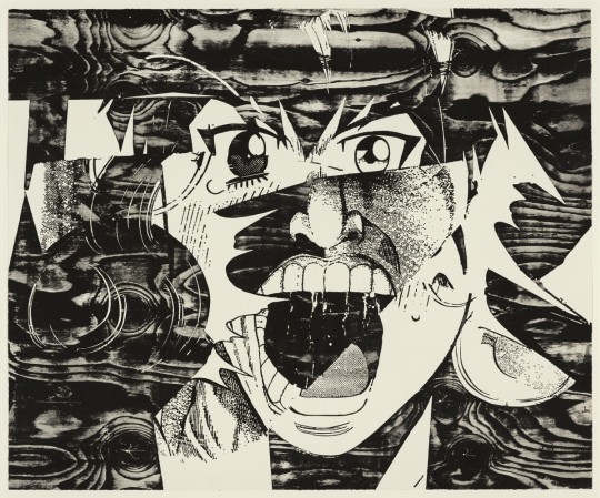
Scream (Curls), 2017 - Woodcut ,81 x 98 cm
The 2017 exhibition ‘Screams’ - his first in Hong Kong - included a series of large-scale woodcut prints that explore the intersection between sound and the visual arts. This series of expressive prints are created through a combination of printmaking, collage and digital technology. Snippets of screaming faces are cut out of comic books and Manga and collaged together, creating entirely new faces that take on a haunting, mask-like quality. These emotionally charged amalgamations of characters - often crying, yelling or sweating - radiate an explosive sense of energy and sound, despite not producing any actual noise.
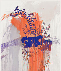
Actions: Splashhh Splosh (No. 8), 2012 - Screenprint with hand-painted acrylic, 152.4 × 106.7 cm
Another successful exhibition of Marclay’s is his 2015 installation at Aargauer Kunsthaus in Switzerland titled ‘Action’. The exhibition explores the onomatopoetic potential of written words through graphic collages, much like those seen in comic books. The exhibition features both video animation and paintings/works on paper. The use of onomatopoeic words in these paints further creates a link between Marclay’s love for the combination of visual art and sound, as the viewer can almost hear the noise of the paintings.
3 notes
·
View notes
Text
Artist Compare & Contrast
Wayne Thiebaud and John Bellany are both some of the most recognised and celebrated artists of the 21st Century, and their success can be attributed to their striking individual styles. Although at first glance the two artists seem to be entirely different, their use of techniques, colours and approaches to art are quite similar.
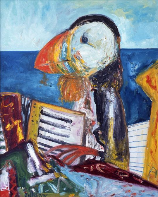
Wayne Thiebaud’s distinctive impasto-style paintings bare many similarities to that of John Bellany’s vibrantly coloured pieces. Thiebaud’s thick application of paint is a technique that Bellany can be seen using in the likes of his puffin figure painting titled ‘Self Portrait’. *1
Bellany has a unique, slightly tormented, paint application technique which results in visible brush strokes and marks coming through in his paintings. As Thiebaud’s impasto painting requires the artist to use extremely thick layers of paint, palette knife and brush marks can also be seen in his work, similar to Bellany. *2
The vibrant colours that can be seen in Bellany’s work are often featured in Thiebaud’s work –although a more subtle, muted colour palette usually dominates the majority of the canvas. Each of these artists use bold colours in different ways, creating opposing effects in their work. Thiebaud often uses warm and cool tones in the same painting as he is drawn to the juxtaposition of the contrasting colours. Bellany also uses warm and cool tones in his paintings, yet the two evoke different emotions; Bellany’s work tends to be more blatantly personal in terms of subject matter and Thiebaud’s work appears to be targeted toward the viewer.
Bellany’s family and home oriented works are lathered with his own personal symbolism and this is evident through his subject matter. Although at first glance Thiebaud’s work would appear as impersonal still lifes, his work – like Bellany’s – is also rooted in his personal and family life. Bellany’s more direct display of subject matter stands in contrast to Thiebaud’s subtle style of symbolism, yet both artists are essentially eluding to the same personal contents.
Reference image *1
Reference image *2

4 notes
·
View notes
Text
Wayne Thiebaud
Wayne Thiebaud is an American painter born in 1920 in Mesa, Arizona. In 1921 his family moved to Southern California where Thiebaud spent most of his childhood. During high school, he became interested in stage design and lighting, and worked part-time at a movie theatre where he made posters for lobby displays. He studied at the Frank Wiggins Trade School in Los Angeles and worked as an apprentice cartoonist at Walt Disney Studios. From 1938 - 1949, he worked as a cartoonist and designer in California and New York. He served as an artist in the First Motion Picture Unit of the United States Army Air Forces from 1942 - 1945. In 1949, he enrolled at San Jose State College before transferring to Sacramento State College, earning a bachelor's degree in 1951 and a master's degree in 1952.
Thiebaud is best known for his still life paintings of edible treats and everyday objects in his singular illustrative style. His most popular subject matter includes colourful cakes, slices of pie, candy pieces, such as lollipops, and the winding streets of San Francisco. Many of Thiebaud’s works provide a glimpse of his own childhood memories, such as eating his mother’s baked confections or selling hot dogs and ice cream cones on the boardwalk of Long Beach, California. Thiebaud’s paintings reflect his deep affection and nostalgia for the traditions of American life – mainly the abundance of food.
Some of Thiebaud’s most iconic works include:

‘Green Dress’ (1966) - Oil on Canvas, 182.9 x 152.4 cm
‘Green Dress’ follows a more personal theme as Thiebaud's daughter, Twinka, is featured in this work. The figure’s blank expression results in a sense of detachment, which is slightly curious given his personal connection to the figure.
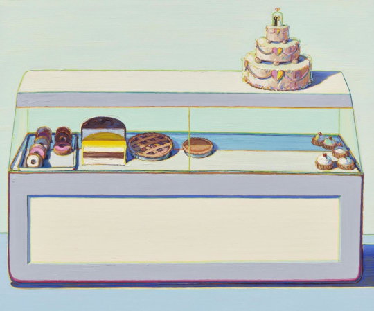
‘Bakery Case’ (1996) - Oil on Canvas, 152.4 x 182.9 cm
‘Bakery Case’ is another still life piece featuring cakes that may have a deeper, symbolic meaning; the bakery case represents the unreachable, perhaps challenging advertising that suggests goods are easily attainable.
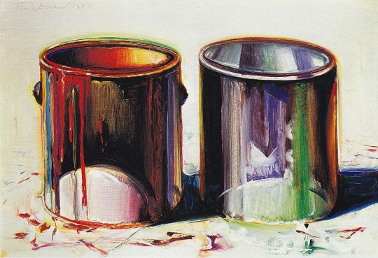
‘Two Paint Cans’ (1987) - Oil on Canvas, 34.9 x 50.5 cm
‘Paint Cans’ is a still life piece that many believe may be Thiebaud’s way of referencing painters who came before. The choice of subject matter - two cans - might be inspired by Jasper Johns' Painted Bronze (Ale Cans) (1960).
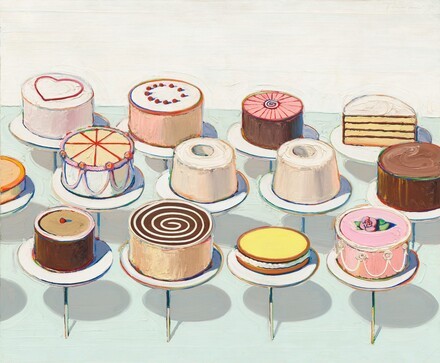
‘Cakes’ (1963) - Oil on Canvas, 152.4 x 182.9 cm
‘Cakes’ features thirteen colourfully frosted cakes and pies which are instantly recognisable American bakery staples.
Thiebaud’s work is characterised by his thick application of paint, which creates a creamy and inviting texture to his cakes. This technique is also known is ‘impasto’ painting (where paint is laid on an area of the surface in very thick layers, usually thick enough that the brush or painting-knife strokes are visible). The artist’s choice to incorporate cool toned shadows to his often warm toned subject matter creates a satisfying juxtaposition. A flat opaque cream coloured background can be seen in many of Thiebaud’s works and the artist used outlines, or halos, of complimentary colours to make his objects stand out – he called this technique ‘halation’. The outlines in his work remind the viewer of the outlines often seen in cartoons, and he may have taken influence from his time working as an animator for his paintings.
Repetition and pattern are two elements that appear in many of Thiebaud’s works as objects are often displayed in rows. His piece ‘Cakes’ is a prime example of this repetition as not only are the cakes neatly lined into rows, but the shadows they produce are all of similar size and colour. The use of repetition in a painting can create a sense of unity, harmony or movement and this can transform a still life painting into something more intriguing.
2 notes
·
View notes
Text
John Bellany
Influential Scottish painter John Bellany was born in Port Seton in 1942. In the early 1960’s he began studying at Edinburgh College of Art, further going on to study at the Royal College of Art in London. The artist has had many successful exhibitions in several cities and states around the world - mainly in the US and the UK - and has received notable awards for his work. Bellany underwent a liver transplant in 1988 after years of suffering from alcoholism brought on by his depression. The artist then died in 2013.
Some of Bellany’s most notable works include:
‘Chinatown’ (1987) - Oil on Canvas, 152.5 x 122 cm
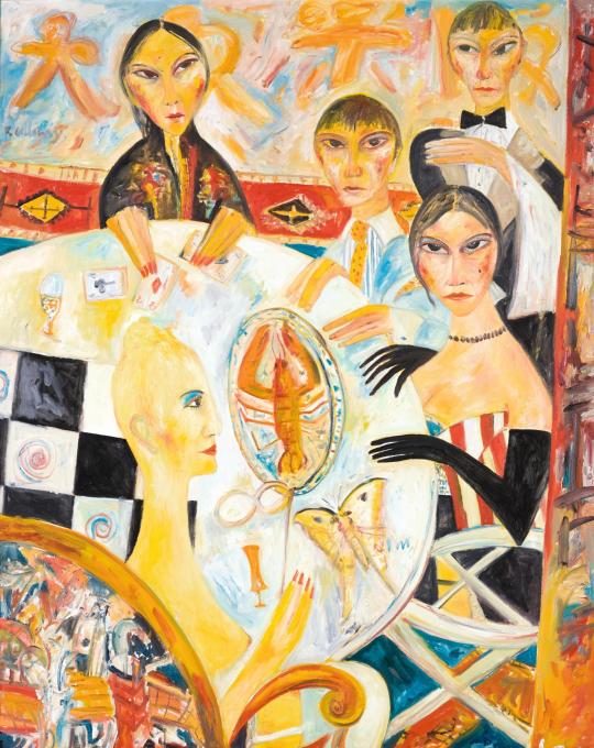
John Bellany was commissioned by London Underground in 1987 to paint his piece ‘Chinatown’. The work itself addresses his allusion to a power struggle between the East and West – the woman near the bottom of the piece is Western and her opera glasses establish her as from the past when the West dominated China. In this piece, it is suggested that China now dominates the West as the woman in the foreground is naked, having been stripped of her power and authority. Traditionally on a Chinese table, the head of the fish points towards the eldest member of the family or the most honourable guest. On this Chinese table, in the centre of London, guests prepare to eat the Western delicacy lobster. The lobster points to the fortune-teller whose cards present a diamond and a spade – which envision death for both sides.

‘My Father’ (1966) - Oil on Hardboard, 122 x 91.20 cm
In Bellany’s portrait titled ‘My Father’, the artist paid close regard to the weather-beaten quality of his father’s hands and head. These details convey the figure’s physical tribulations of life as a fisherman. A tattoo depicting the words ‘True love Nancy’ can be seen on the figure’s arm – this is a tattoo Bellany’s father dedicated to his wife Nancy (the artist’s mother) who was a highly important person to him. Bellany’s father even quit being a fisherman in 1951 for his wife who experienced anxiety over her husband constantly being out at sea. One of Bellany’s own paintings depicting fishermen can be seen at the bottom of the piece, with his father’s arms resting on it.
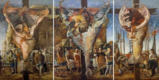
‘Allegory’ (1964) - Oil on Hardboard (triptych), 212.40 x 121.80 cm, 213.30 x 160.00 cm
The large triptych piece ‘Allegory’ was inspired by the 16th century Isenheim Altarpiece by Matthias Grünewald and Nikolaus Hagenauer. The work centres around Bellany’s recurring themes of religion, death and his birthplace – fishing village Port Seton. The crucified body of Jesus Christ is replaced with carcasses of crucified fish and the mourning figures surround him are replaced with laboured fishermen.
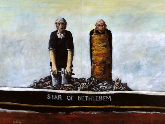
‘Star of Bethlehem’ (1966) - Oil on Hardboard, 184 x 245 cm
‘Star of Bethlehem’ continues the theme of home as fishermen are yet again depicted in this work, gutting a fish inside a boat named ‘Star of Bethlehem’. At an early age Bellany often spent his time gutting fish for his fishermen father and grandfather and the boat itself was a real boat based in Eyemouth (a small town in Berwickshire, in the Scottish Borders).
Focusing on Scottish history and symbolism, Bellany’s figurative works combined maritime imagery and Christian iconography with representations of the lives of ordinary working people. The image of the boat runs throughout Bellany’s work, both as a mainstay of Scottish fishing-village life, and as a metaphor for inner voyages. His practice fostered a profound engagement with themes of loss, survival and redemption.
John Bellany’s works are large compositions often heavy with symbolism, specifically the sea, religion and humanity’s flaws. Nearly all of his work is figural, often depicting the lives of fishing communities on the East Coast of Scotland. Working largely from memory, the artist creates sketches first to work out the composition. Bellany draws inspiration from Scottish primitive painters such as Robin Philipson and Alan Davie, eventually joining them in becoming one of the most influential Scottish painters of all time. Working in a vigorous expressionist style, Bellany was credited with pioneering a painting style that married native painting with the influences of Impressionism.
The artist mostly worked using oil paint on canvas or hardboard where textural brushwork which has been built up in layers - using quick, fluid strokes - is applied in an energetic way. Dry brushwork is also used to apply the paint in many works which adds another complex layer of texture to the surface. Although, there is some realism created through the use of tone in his works, the figures have been stylised in a way which is very typical of Bellany – creating simplified and exaggerated versions of the features on the figures.
Bellany’s earlier work often featured a fairly realistic and neutral colour scheme and the oil paint application seen in works like ‘Allegory’ and ‘My Father’ has allowed Bellany to achieve subtle, variations in colour through the blending and layering of the paint. The way the paint has been layered has allowed him to harmonise the colours throughout the painting.
After the 1970s, Bellany explored much more vibrant colour schemes and often used raw primaries. Many of his late 90s to early 2000s work incorporated bright yellows and oranges, which both have positive symbolic meanings of joy, happiness, warmth and enthusiasm. This vast use of warm colours could be interpreted as a shift in the artist’s mood as much of his work became more optimistic after his liver transplant operation in 1988.
2 notes
·
View notes


