
chshi2000
nm3217: cheong hui shi
welcome to my creative tent โ๏∀๏ใ
11 posts
Don't wanna be here? Send us removal request.
Last Seen Blogs

vinreportcheckcom
VINReportCheck.com

doublezeroafarina
DoubleZero

justalurkerwhoisverybad
Horrible person (hopefully not a bot)
takechanceonme
Broken but never shattered.

nandagrossioficial-blog
Nanda Grossi Oficial
Text
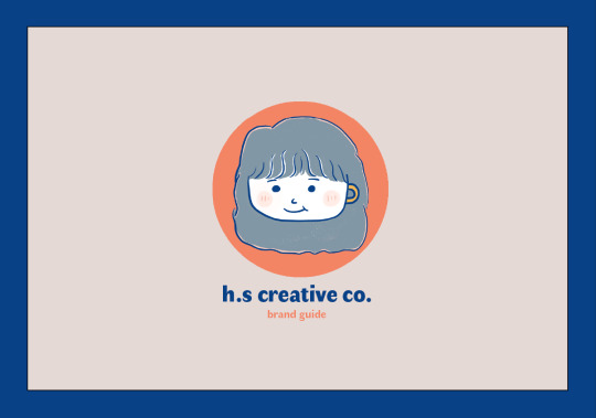
Final Project: Personal Branding
For my final project, I have decided to work on option 1, branding for myself. Let’s start exploring how my brand guide has come into fruition!
(For HD quality of brand guide: view here: https://drive.google.com/drive/folders/1XwwOiQDTosKOCg8jYsEWof2GG7gWCO-C?usp=sharing)

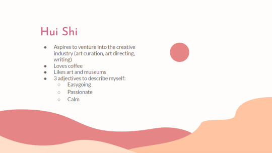
Beginning with the conception of my branding — I had the vision of creating a brand guide that is stylish, unique and personable. It should be reflective of how I wish to portray myself, or rather, who I am as a person, based on the three adjectives that I can closely identify with: easygoing, passionate and calm. What came into mind, firstly, was the colour palette. As I am extremely fond of bright, pastel and bold colours, I have chosen to go with a colour palette that is refreshing to the eyes and evokes a sense of liveliness and youthfulness.
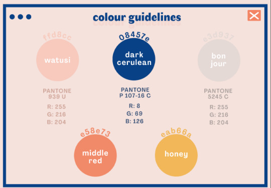
Based on the feedback received in the past few weeks, many have expressed that the chosen colour scheme complements the personality of the brand guide, which is a huge delight to hear! While experimenting with the primary colour palette of Watusi, Dark Cerulean and Bon Jour, I figured that it would be more versatile to throw in more shades of brighter colours to liven up my brand guide. Thus, I have picked Middle Red, reminiscent of salmon pink and a shade of mustard yellow, named Honey. The primary colour palette will be used as the foundation and base of my resume, logo and name card, whereas Middle Red and Honey will be utilised to give my collaterals some vigour.
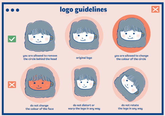
I have always wanted to experiment with a doodle concept for logos and therefore I decided to hand-draw it and subsequently, vectorise it using Illustrator. The logo is a sketch of myself, in cartoon form! There are several details that I have added to the logo along the way, the most significant feature (and one which I am most proud of) being the “cup handle”, or rather, the ears of my face. As I am a huge fan of coffee and have been a barista for over a year, coffee is basically inseparable from my identity. As some of my classmates have pointed out that it is not very obvious at first glance, I’ve painted the cup handle yellow to make it stand out, while remaining subtle at the same time. Another feature worth mentioning would be the blushing characteristic (two pink circles on my cheek) — no special reason behind it, I just thought it was cute and it fits my personality!
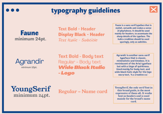
As for the choice of typeface, I have chosen Faune and Agrandir as the main typefaces to work with for the brand guide. I particularly like the look of Faune, as the cursive ends of the letter evokes a sense of quirkiness. After the last round of feedback, I have included some instructions in my typography guideline. Faune should be mainly used for headers and sub-header, whereas Agrandir is versatile enough to be utilised as body text and header (for the logo, see name card). The reason why Agrandir (Wide Black Italic) is not recommended to be used as a header font for the rest of the collaterals is because it is very jarring, bold and distracting — thus, it should only stay with the name card. Same with YoungSerif, it should only be used for the main text for the name card given its uniqueness and the quality for it to stand out prominently from the rest of the texts in Faune.
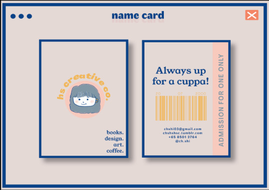
With an art gallery ticket concept chosen for my name card, I have incorporated a bar code at the back of it. This design choice is motivated by my love for the arts and specifically museums, with the intention of drawing in “visitors” to connect with me and have a cup of coffee. The “ADMISSION FOR ONE ONLY” feature is reminiscent of tickets that require you to fold and tear along the dotted lines upon admission.
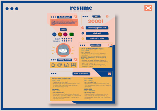
I have the utmost fun doing up my resume — it has always been a design aspiration for me to try out the “windows webpage” aesthetics as it has been a trendy style amongst illustrators. With the webpage frame as one of the main style characteristic for my resume, it segments my resume in an orderly fashion while giving it a sense of playfulness or as Amelia has mentioned, “tech-savviness”. It is heartening to know that the intended message is conveyed through my design. Based on the feedback given by Lydia, I have swapped the positions of my introduction (”Hello there!” box) with the skillset segment (”Skills”), as it captures the attention of the viewer directly such that they can know me better. Amelia has also mentioned that the logo should be the most visually striking feature in the resume, thus it would be better to reduce the font size of the “2000!”.
Overall, it has been extremely rewarding and fun experimenting with the different features of Adobe Software, enabling me to map out my vision of branding myself as a creative company. Thank you for tuning in! :)
3 notes
·
View notes


Text
Week 7: In-lecture exercise F

The hue yellow expresses excitement, enthusiasm and buoyancy. This specific shade of yellow is a pastel and it gives off a soft and calm energy at the same time. In the context of the photo taken, it is effective in conveying the energising effect of a Big Breakfast, complementing the food plating.
This shade of brown is slightly darker and this hue is picked up from the sausages pictured in the chosen picture. It has a tint of redness in it. Brown is a common colour employed in food photography. It contrasts against the bright yellow and this particular hue is commonly associated with food items that can afford the process of “food browning”.
This is a softer, duller shade of brown, picked up from the skins of the sourdough. I would associate this colour with food items such as bread and coffee. It is interesting how for different shades of brown we would associate it with different food items.
This green hue is picked up from the salad and it is reminiscent of olive trees, environment and nature. When this cool colour is being employed it gives the Big Breakfast a cool tone.
This dull pink is picked up from the centre parts of the bacon. It is a slightly muted shade of pink, giving the Big Breakfast a tinge of brightness while not necessarily taking up the spotlight like the pastel yellow.
0 notes
Text
Assignment 3: Infographic

For Assignment 3, I started off by brainstorming ideas with a lead question in mind: What kind of infographic do I wish to see? As I have recently visited National Gallery Singapore, I thought it would be appropriate to create a historical timeline about art movements. While the exhibits in National Gallery Singapore house largely contemporary art pieces, I was interested to know more about the movements prior to modern art. After several hours spent on research about art history, I also gathered information about the typefaces, color schemes and art style that I wish to adopt in this timeline infographic.
The main challenge that I perceived before starting on the assignment was how can I make intelligent use of the space of an A3 or A4 document to display information spanning across decades. I gained inspiration from plenty of past infographics displayed in Pinterest.


I was captivated by these infographics, mainly because of the designers' creative use of geometric shapes and images. In the infographic about Church History, the designer also paid deliberate attention to the balance and scale of the infographic, such that the 'heavy' and 'bold' images of the human figures do not overpower the other smaller, miniature icons. As for the first infographic, I was instantly inspired by the use of geometric shapes (circles) to frame the photographs. Thus, I decided to adopt that in my infographic, by creating clip masks of iconic art pieces from each art movement period.
Russian Constructivism, an artistic and architectural philosophy developed in Russia during the Soviet period, is one of my main inspiration for the style of my infographic. I was partiuclarly intrigued by the use of simple lines and shapes in the Soviet propaganda posters to create a sense of dynamic movement, and wanted to replicate it in my timeline infographic, thus the use of a diagonal timeline instead of a horizontal or vertical one.


I chose to adopt primary colors of blue, red and yellow after coming across a brand guide for Russian Constructivism on Behance. These colours certainly ties in with the purpose of my infographic, which is to convey an abstract, often misunderstood notion of Western art to the general public in a more palatable manner.

(Photo credits: https://www.behance.net/gallery/34545875/Russian-Constructivism)

During the critique, my peers have suggested for a more consistent use of labels for the art periods. The top half of the infographic consists of labels that are horizontal initially, while the bottom half consists of labels that breeds into the 'rectangles' of other art periods. Some of my classmates thought that was slightly confusing and could be standardised throughout the whole infographic. One feasible way for me to standardise was to ensure the text labels are all vertical, given the space constraints.

I used Photoshop mainly for the assignment, as shapes such as rectangles and circles can be easily created using the shape tools. One of the main tools utilised was also the 'create clipping mask' feature, which allowed me to combine the geometric circles with the iconic art pieces.
Overall, this assignment has been one that was experimental and to a certain extent, out of my comfort zone, as there was many considerations such as space constraints, visibility of the texts, harmony of the infographic and also aesthetics sense that had to be taken into account.
3 notes
·
View notes
Text
Assignment 2: Mental Break


For this assignment, I wanted to tell a story that is relatable to students of my age - dealing with deadlines, stress and Zoom fatigue while surviving in the midst of an ongoing pandemic. As I have been staying on campus in a Residential College for the past few weeks, on top of academic stress, my peers and I acknowledged instances of loneliness and isolation even when we are surrounded by countless people in the same building, due to zoning restrictions.
There has been great emphasis in my Residential College’s community on the importance of taking care of one's mental health as we adjust to the new changes. Through my photographs, I wanted to convey the message that having a safe space for you to get away from your work is extremely important. I am lucky to be in an environment where such a space is being granted to me - The Oasis, a mental wellness room where I can practise mindfulness and seek calm amidst the calamity.
This space was being set up by an interest group named LoveTembusu, to allow students to reconnect with themselves and look inwards to reflect on their state of mind. The space is characterised by minimalist furnitures - tents, white sofas, fairy lights. There are also donated books on psychology, mindfulness and mental health in the room, as well as scented candles for aromatherapy. I wanted to capture this sense of tranquility in my assignment as I document the story, involving a friend of mine.
The story begins with the protagonist, rushing for her coding assignment in her room. Based on a true event, there have been many instances where she is overwhelmed by the complexity of her coding assignments. In the first two rows of the photoboard, I deliberately changed the hue and saturation of the photos. Compared to the original photographs, they are tainted with more red hues and are much more saturated. The reason behind doing so is to convey the stress and sense of urgency that is felt by the protagonist, as she rushes for her deadline. Red is often associated with emergency, passion and fury.
The photos are shot from different angles - left and right side profiles, as well as a bird's eye view of her cluttered room and desk.
The second row of photographs document her leaving her room, that is to her, a “stress zone”. I toned down the red hues and saturation for the photos, as a way to show her leaving behind her stresses. In the third row of photos, I chose to decrease the red hue drastically after the feedback session, as one of my classmate pointed out that the hue difference can be greater to show the artistic intention as explained by me during the critique session (that is, to show the anxiety in rushing for deadlines). I played around with the ‘Image Editing’ tool on Photoshop, and decided to go with green-yellow hues that shows the serenity of the space and complement the environment of The Oasis. I have also added a grainy texture under the filter gallery tool, to give the photos a "film" look. This is based entirely on my personal aesthetic preference.

According to feedback by another classmate and also Ms Curie, it would be wiser for me to capture the spaces of The Oasis more, which I have adjusted for the 7th and 8th photos. The juxtaposition between the protagonist’s cluttered room and The Oasis certainly conveys the message of my storyboard more effectively.
0 notes
Text
Assignment 1: Commentary
Upon receiving the assignment brief, there are two main questions that I had on my mind: what challenge would I want to embark on? What are my current strengths and limitations as a designer? I wanted to give myself the challenge to explore more of the Adobe Suite applications that were taught in class. While there are certain techniques that I could adopt from tutorial classes such as the pen tool in Adobe Illustrator, I knew I had to think out of the box to create an abstraction that maintained the key characteristics of the chosen object, while simplifying it into a sleek, identifiable icon.
As I was scrolling through my photo gallery, I identified a photo that I have taken back in 2017 when I was on holiday in Zaandam, Netherlands. I have fond memories of my trip to Zaandam, and I remembered being blown away by the architecture, landscapes of rivers and windmills. The photo was taken in a windmill farm named Zaanse Schans. The chosen object of abstraction, the green windmill, remains to be one of the most majestic windmill that I have witnessed.
While playing around on Photoshop and Illustrator for the assignment, my main focus was to retain the geometric-like wings while abstracting the rest of the body of the windmill, even possibly simplifying it further into a slimmer version of the original windmill in the photo, to an icon that could possibly be interpreted as a wind turbine.


The above photos are processes made on Adobe Illustrator to ‘Image Trace’ the windmill into a sketch-like illustration. This was a step that was not specifically taught in class but a tool that I have picked up along the way while experimenting with Illustrator in the past few weeks. The core reason as to why I chose to use this feature is so that I can retain the shading in stage 1, before I further simplify and abstract it into shapes that are monotonous.

Moving forward, I found it easier to create geometrical shapes using Photoshop, for stage 2.

The next following stages of abstraction are done on Photoshop.
However, by stage 4, I was stuck in a rut wondering if I should maintain the bulky body of the traditional windmill or further stripping it down to a thin, rectangle that mimicked the body of a wind turbine. I decided to proceed with the latter as a way to experiment, as seen in the final stage of the photo below, which was brought to class for critique. Going into the critique, I wanted to know the opinions of my peers and Ms Curie on whether if it is wise to abstract the windmill further into something that resembles a wind turbine.

Some of the comments that I have gotten from the critique are:
The angles of the windmill wings should be consistent throughout all stages
There should be 4 wings instead of 3 in stage 4 and 5 for consistency
Maintain the stubby, bulky body of the windmill, don’t make it a wind turbine, if you want the last stage to resemble the photo in stage 0
Some of my tutorial classmates have pointed out that the transition from stage 3 to stage 4 is rather drastic, with many changes happening at one go, such as the changes in angles of the wings, the 4th wing pointing downwards disappearing, as well as the object turning from 3D into 2D. It was a fruitful critique as Ms Curie and my classmates pointed out details that I otherwise did not thought of, such as the consistency of the angles of the windmill as well as the bulkiness of the body and its importance. Ultimately, I left the class wanting to refine the purpose and goal of what I want out of this abstraction exercise. Conclusively, I thought that it was more meaningful to retain the key characteristics of the traditional windmill, that is, the bulky body. This was a characteristic that did not cross my mind as I approached the brief initially.
The improved version below features changes made to the abstraction in stage 4 and 5, incorporated with the remarks and pointers from the critique session.

0 notes
Text
Week 6: In-lecture Exercise E

This particular typographic representation uses the same typeface for the header and the body texts. Such a presentation makes it difficult for readers to focus on the body text because the only distinction between the title header and the body text is the boldness of the typeface. Furthermore, the body text are in all caps, making it unnecessary concentrated and strenuous on the eyes for the readers as they screen through the body paragraph. A suggestion would be to consider contrast in the choice of typeface for the title header and the body text. For the body text, a sans-serif font such as Futura or Brooklyn could be used to enhance the qualities of the title header as well as for better readability (body text).
Futura

Brooklyn

Another factor that affects the readability of the text in the photo above is the alignment of the body paragraph. The body text is center-aligned, and this form of alignment was highlighted in the lecture as an “instinctive” act to make the paragraph appear balanced. However, this example demonstrates the opposite, where the body text is confusing on the eyes especially with the typeface that can be said to be a Slab Serif with bulky and thick letters (that are not filled in). At one glance, it is not easy for readers to read the paragraph from one line to next as the starting point differs for each line. A solution would be to utilise left-alignment instead.
To add on, the typeface used is reminiscent of the Montreal High School font, which is largely utilised in the context of high school or college yearbooks. It is important to be aware of the messages that is sent as we utilise this specific font, as it can convey the idea of a varsity event (which is desirable if the purpose is aligned, but otherwise, it would be misrepresentative).
0 notes
Photo


Week 5: In-lecture exercise D
Photo A is an eye-level close-up shot that I have taken of my Nalgene water bottle. I would use this photo if I am informing my target audience about the product, for example, if I am selling it on the internet. It gives a clear image of the real size and shape of the bottle at one glance.
Photo B is shot through a semi-low angle positioning, with the bottle toppled on the table. Comparably, when I shot photo C again at a lower angle but with the bottle standing up straight, photo B looks more like a professional image due to the alignment to composition and rule of thirds. There is also the tendency for images shot at a low angle to make the subject or object look bigger than it actually is, giving a false image.
Photo D is shot at a high angle, displaying the look of the bottle from top down. It gives the audience a clear view of the bottle when it is laid down nicely, showing some form of sophistication.
0 notes
Text
Week 4: In-lecture Exercise C
The print advertisement depicts a stack of sliced tomatoes placed on top of each other, some of them attached with the sticker labels of the HEINZ Tomato Ketchup. The stack of sliced tomatoes together form a cohesive picture that is reminiscent of a tomato sauce bottle, which is what Heinz Tomato Ketchup is known for, as seen in the reference picture below. The signifier, is thus, a tomato ketchup bottle.

The creative use of sliced tomato stacks to “build” a tomato sauce bottle signifies the freshness and rawness of the tomatoes used to make the Heinz Ketchup. Heinz is conveying the message that the tomatoes used to make their tomato sauce are grown organically, instead of using artificial flavourings in their product.

0 notes
Text
Week 2: In-lecture Exercise B


Source: https://www.adsoftheworld.com/media/outdoor/kfc_unalike
I have chosen a print advertisement from KFC for critique - the advertisement depicts a chicken filet right in the middle of the print and it is painted with a bright red background as well as bold white words which emphasises the singularity of each chicken filet. In this advertisement, the art direction places great focus on the distinct features and physicalities of each chicken filet, to convey the “delicious uniqueness of its real tenders”, and that no two chicken filets look or taste like each other. For the campaign, over 200 visuals of chicken filets in different shapes and sizes were placed together to form a cohesive print.
It is interesting how even though the print advertisement is traditionally simple (a picture right in the middle, big coherent font, logo of the brand), when presented together with 200 different chicken filets of different physicalities their differences are accentuated. The “one-of-a-kind chicken filet” message that KFC is trying to send across is effectively communicated through this massive juxtaposition created by placing 200 different filets side by side. At one glance, the striking feature of the print advertisement is obviously the chicken filets, photographed at different angles from each other.
One shortcoming of the piece would be that putting so many visuals for the print campaign can easily make the piece appear abstract and less attention-grabbing. As the words are extremely tiny, this reduces the effectiveness of the copy in persuading or informing the audiences about the distinctiveness of the product. The audience are more likely to be captured by the visuals and photos of the filet, then looking past the copy, instead of paying equal attention to both.
0 notes
Text
Week 1: In-lecture Exercise A
Today’s in-lecture task was for us to sketch a “machine/design that you think will enhance your creativity”.

Immediately, as I was sleep-deprived, I thought of my favourite beverage, which is coffee. As a coffee lover, I love experimenting and trying out new types of coffee. Recently, I’ve been hooked to home brewing and have been doing so for the past year, enjoying various coffee with interesting taste profiles. A good cup of coffee is more than just a pick-me-up, it actually boosts my mood and enable creative ideas to flow more naturally in my mind.
Pictured in the sketches above are a cup of Ethiopian coffee, a pour-over coffee brewing kit, as well as an alien coffee addict.
1 note
·
View note