
Last Seen Blogs

very-distant-lands
Warning: heichou booty


tess-timony
before this i was willing to die

afloweronthemoon
who?

amorimsanguenovo
Amorim Sangue Novo
Text
Summary Post
Throughout this WOII module, It has truly helped me to improve in expressing and communicating my ideas more in my work and during presentations. Apart from that, I have also improved in my essay writings in terms of referencing and citations.
I would say that it has helped me especially in Studio and Craft. For Studio’s trading card assignment, it has allowed me to dive deeper into the history of my chosen designers, getting a better understanding and evaluation of their design style. From there, I am able to create trading cards that similarly match their art style. As for craft, I am able to create work that is both visually appealing and communicates its message effectively.
Moreover, the visit to the Open Studios on week 12, which is where both diploma and BA students had their work on display for public viewing, really inspired me with the various works and designs that the students had done. It was very eye opening and insightful, and I got to understand and learn about the thought process behind it.


In conclusion, WOII has helped us to shape our perspective on things around us and in our work, and deepened our understanding in design and art history.
(204 words)
0 notes
Text
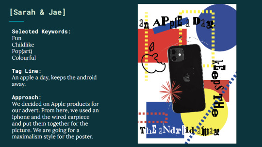
Week 11 Post - Modernism
In philosophical terms, postmodernism refers to the state or condition of society that exists after modernity, which is also known as postmodernism going against modernity. Modernity focuses on simplicity while post modernity focuses on complexity. In design terms, it means breaking organisational rules, going against modernism, usage of strong colours and dramatic layouts instead of traditional compositions. In other words, less is boring, more is better.
For week 11, we are grouped in pairs to choose an object and create an advertisement from it. My teammate and I decided to create an advertisement for iPhone. We used an iPhone and an Apple earpiece, and put them together for the advert image. As for usual iPhone advertisements, they are mainly minimalistic, neat and organized. From here, we experimented around with distortion, overlapping and disorganization of the elements, basically going towards maximalism while maintaining readability of the texts and ensuring that the intention of selling a product is evident.
I would say that postmodernism is rather popular now as it is praised for its bold and refreshing approach, which gives designers a chance to break free from traditional rules and formality in their work. (Rosenberg, 2020).
Furthermore, postmodernism embraces individualism and experimentation which allows people to play around with combinations of materials, colours and textures. This allows the definition and the meaning of the subject to become more flexible and fluid.
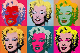
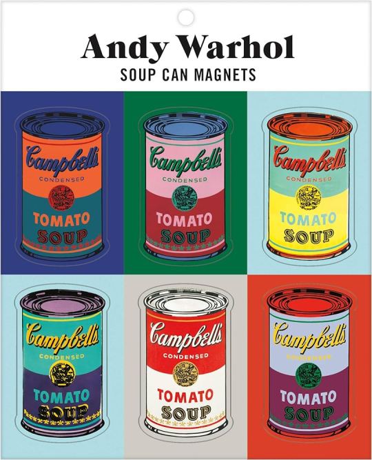
For example, Andy Warhol, a famous postmodern artist whose work are frequently disregarded as anti - aesthetic and vulgar, his style which is usually pop art is able to create historical artistic movements and provocation while showing great details in his work. Till today, his works have inspired people across the world. (Why is Andy Warhol significant in the contemporary art world? 2020)

(Word count : 278)
References :
Rebecca RosenbergRebecca Rosenberg is a freelance copywriter. “Postmodern Design: What Is It and Why Is It Popular?” NewHomeSource, 12 Feb. 2020, www.newhomesource.com/learn/postmodern-design/
“Why Is Andy Warhol Significant in the Contemporary Art World?” V1 Fine Art Advisory & Broker - v1.Artworks.Com.Sg, 13 May 2020, v1.artworks.com.sg/news/why-is-andy-warhol-significant-in-the-contemporary-art-world/.
Dew, Dr. Jamie. “What Is Postmodernism and How Does It Affect Our Culture Today?” Lifeway Voices, 21 Feb. 2020, voices.lifeway.com/culture-current-events/what-is-postmodernism-and-how-does-it-affect-our-culture-today/.
0 notes
Text
Week 10 - Poststructuralism
Post-structuralism refers to our perception and interpretation of the world and everything around us. There is no right or wrong in what people interpret as everyone's interpretation is different. There is no definite or fixed meaning in things as it changes constantly based on cultural, political, social, and economic position in the world.. In connection to design, it also means deconstructing a structure into something else that still communicates the same idea instead of being literal. (Andrews, 2024)
For week 10’s activity, we roamed around the school to take several pictures that include ‘texts’ and ‘images’. We were then grouped in pairs to match the two pictures together. From this activity, I realised that we can actually match random texts to any image just by how we view it and create its own meaning. This shows that the meaning or the idea changes constantly as everyone’s perspective varies from the same object.


Recently, There is a growing number of designers who prefer deconstruction rather than minimalism and structured layouts as they wanted to explore more on their own personal style and experiment with techniques. (Milhaud, 2023)
For example, David Carson, one of the most widely recognized designers of the deconstruction movement, his works are mostly messy and chaotic which shows no rules of structure or composition. He usually experiments with overlapping and misalignment of elements to express its meaning which feels more raw and gives off personality. Despite the chaotic composition in his work, the design is communicating less literally as the visuals itself is able to tell the audience what it is about. (Reynold, 2015).


( 260 words)
References :
Andrews, Kimberly Quiogue. “Poststructuralism.” Showing Theory to Know Theory, Showing Theory Press, 28 Feb. 2022, ecampusontario.pressbooks.pub/showingtheory/chapter/poststructuralism/.
Milhaud, Nina. “‘maximalism’ Is Making Interior Design Fun Again.” CNN, Cable News Network, 22 Aug. 2023, edition.cnn.com/style/maximalism-interior-design-living/index.html.
Reynolds, Josh. “Strong Island Project: 06 - Research: Deconstruction in Graphic Design.” Medium, Medium, 7 Dec. 2015, medium.com/@reynoldsjosh/research-deconstruction-in-graphic-design-6180ec2f1b58.
0 notes
Text
Week 4&5 - How to analyze a Work of Design
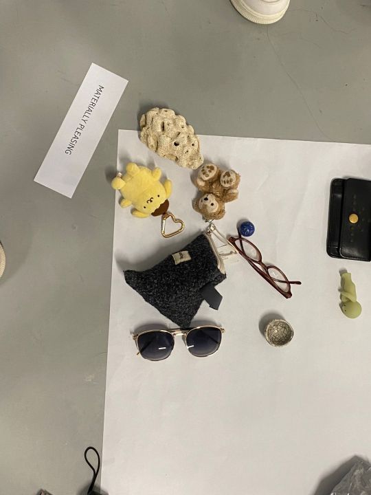
There are a few components to consider when analysing a work of design. We have to consider the process and the purpose of the design, like what is the function and how it is being created. Besides that, we also need to take note of the medium or material that is being used and how it is being used, and what is the intention behind it. Furthermore, we have to look out for the type of elements used and what principles they follow to create their work. For week 4, the class brought three personal items to discuss its significance to us, the craftsmanship and the context of the item. After the activity, I discovered that everyone’s item has its own backstory and it is also interesting to hear how some of the items were created and their origin. Then, we categorised the items into four parts, personal significance, historical significance, materially pleasing and well crafted.
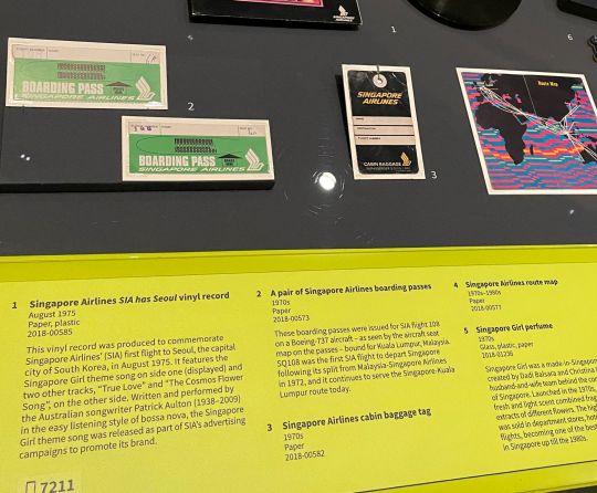
For week 5, we visited the National Museum to explore various antiques and design works. One of the works that caught my attention is the 1970s airline boarding pass at the Now Boarding exhibition. It shows how the old airline boarding pass looked back in the 1970s. Apparently, it is made of paper and you have to write down your flight number and seat number onto the boarding pass. As of today, airline boarding passes now come in both physical and digital form. It is easy to use and all flight information can be found upon scanning the barcode. Apart from its function, boarding passes now are made with thermal paper that is of better quality and material which is thicker and durable. There's also a difference in the design of the boarding pass between the 1970 and the modern. The old boarding pass has very minimal texts while the modern boarding pass has more texts and it is arranged orderly so that it is easier to read the information.
Word Count - 326


Now Boarding exhibition (NMS website)
Website : CNN
Pettersson, Henrik. “Final Call for Paper Boarding Passes? A Visual History of The Beloved Memento.” CNN, Cable News Network, 2 Sept. 2023, edition.cnn.com/interactive/2023/09/travel/paper-boarding-pass-history-emirates-dg/.
0 notes
Text
Week 3 - Semiotics
Semiotics refers to the study of signs and symbols. It includes signs, logos, gestures and it is used for symbolic communication. It consists of the signifier and the signified. Semiotics explores how the signs and symbols are produced and interpreted. Signs that can be used to convey meaning in various contexts like advertising, art and everyday communication. Semiotics is also a framework for understanding how these visual symbols or elements are able to communicate to the audience. Furthermore, semiotics is also connected to design. Designers use signs and symbols to convey meaning and ideas in their creations apart from visuals.
Here is an advertisement poster that I came across. From the visuals itself, the image shows a man who is unbothered, being sandwiched between Donald Trump and Kim Jong-Un as they were arguing with each other. Without knowing the context, it may look like a poster about political issues involving the two world leaders and how the public did not react to it.
Apparently, this poster is an advert for JBL noise-cancelling headphones. If we look closer around the man’s head, we will be able to see the shape of a headphone, which looks like the man is wearing it.
From research, this advert depicts Donald and Kim Jong-un bickering and comparing on who is more powerful, thus causing a huge commotion. However, we wouldn't be able to hear all that because of the JBL headphones. This advert is trying to promote JBL headphones for its noise cancelling function, and it is trying to emphasize on how good it is in blocking off unwanted background noise.
Word Count - 266

Title : "Block out the chaos : World Leaders"
References :
Kong, Cheil Hong. “Toby Hong - JBL - Block Out the Chaos: World Leaders: Adforum Talent: The Creative Industry Network.” Toby Hong - JBL - Block Out the Chaos: World Leaders | AdForum Talent: The Creative Industry Network., 2018, www.adforum.com/talent/81852141-toby-hong/work/34569152.
Chase Dyess, MBA. “Semiotics: The Unspoken Language of Graphic Design.” Medium, Medium, 25 July 2023, dyessdesign.medium.com/semiotics-the-unspoken-language-of-graphic-design-592db4f6c226.
0 notes
Text
Week 2 - Aesthetics
I noticed that people have different interpretations of aesthetics. Most people will refer to aesthetics as art, taste or appreciation of beauty. Aesthetics can come in various forms like visual, auditory, literary and many more. In design terms, it refers to a design’s pleasing qualities. Both aesthetics and design are closely interconnected. Designers use aesthetics in their designs to communicate ideas, experiences and emotions to the audience. They would consider principles like balance, proportion, hierarchy and symmetry to create and design elements and spaces that are aesthetically pleasing.
For week 2’s activity, the class head down to a nearby mall from school to walk around and look out for interesting signs or shop signs. From this activity, it helped me discover how the various shops create and design their shop signs in a certain way or look to attract customers. These are some of the store signs that I found interest in. I realized that most of the store signs are loud and vibrant in colour and also used bright colours, like neon blue or red and bright green. The vibrancy of the colours really do make an impact as it really catches my eye from afar, which is really effective in attracting customers. Apart from that, they also used large size text fonts so that it is big and clear for the public to see from afar, also to capture the attention of the customers. By using both elements together, it creates an effect which is eye-catching and easily visible from a distance so customers are able to look out for that.
Word Count - 263


References:
Richard. “The Importance of Aesthetics in Design.” IndieFolio Blog, IndieFolio Blog, 11 Oct. 2017, blog.indiefolio.com/the-importance-of-aesthetics-in-design/.
graphiczoo. “Graphic Design Subscription Services On Demand: Graphics Zoo.” Graphicszoo.Com, 2024, www.graphicszoo.com/article/importance-of-aesthetics-in-graphic-design-and-why-your-business-needs-it.
Pachiannan, Deepak. “The Battle of Aesthetics vs Functionality: A Design Dilemma.” LinkedIn, 7 Feb. 2023, www.linkedin.com/pulse/battle-aesthetics-vs-functionality-design-dilemma-deepak-pachiannan.
0 notes