This is zee Artspace of CJ, Graphic Design Student | Insta: @cj.artspace
Don't wanna be here? Send us removal request.
Statistics
We looked inside some of the posts by cjartspace-blog and here's what we found interesting.
Average Info
Notes Per Post
7K
Likes Per Post
5K
Reblog Per Post
2K
Reply Per Post
17
Time Between Posts
19 days
Number of Posts By Type
Text
1
Video
1
Photo
12
Last Seen Tumblr Blogs


Fun Fact
Tumblr.com is the 103rd most visited website in the world.
Text
Direction
For the past year, I’ve struggled to visualise the direction I want to head in. As a Designer and Artist, I know I have the Skill, I know I have the Means. But, do I have the Direction. After perusing a blog post from someone already in the Design Industry, I’ve found that Branding my be my deal. Link to Blog: https://www.trailway.co/blog/branding-design-for-sisola-direct-trade-coffee All my life, I have been one annoying, efficient, calculating, and pedantic bastard. One could argue that those qualities would make a good Lawyer, as I’ve actually been told. But, to me, the Law is both boring and infuriating. Nah, I want something that I’ll enjoy sinking my teeth into. Along comes Branding, wearing a sultry suit comprised of Direction, Planning, Brainstorming, Data Collection, and Efficiency, all tied up in a neat bow of Creativity. I don’t know how I never saw the bulb flicker before, but it sure did light up once I saw a tasty snippet of a Design Brief in the link above. I have quite a long journey ahead of me, but, it is definitely one I am new-foundedly excited to trek.
2 notes
·
View notes
Video
youtube
This is a video of me creating a simple design. I really enjoy colourful art, so, I wanted to create something colourful. The process was somewhat difficult, but, I got there in the end. The video is 14 mins long, but, it’s sped up to 4x.
1 note
·
View note
Photo


Weekly update #4 I managed to get OBS Studio to record something I created. The second image is something I created on a whim. I just thought of how Music has influenced and helped me over the years and this is what came out of my brain hole. Since the video was over 30 minutes long with me kerfuffling about, I decided I needed to edit it, nothing fancy, just to compress the length. So, I used Premiere Pro to take the video down to about 14 minutes. Of course, nothing ever works out on the first go, so I first had to “Remux” the video in OBS to make it MP4 format, which is compatible with Premiere. As of writing this, I am only just finishing up the rendering of the video. I am probably going to create a youtube channel just to host this video. As Instagram won’t let me upload a 14 minute video, and I’m not particularly interested in creating videos of my art as such.
0 notes
Photo


Weekly Update #3: Since I recently started back in Affinity Designer with Vector Art, I’ve started to think about the possibilities with such a style. The limits, the specializations, etc. I started off with making a simple logo of a leaf, a flower, and a nut. I first started sketching the general outlines in pixel mode, then I went to vector mode. I initially wanted to make the logo look 3d, but, I suddenly had the thought of a cut-out design, something minimalist. All of this was drawn from imagination, something I’m proud of. In the end I was very happy with the result. For the top-most image, I wanted to try out some Isometric Art. I play a lot of games, personally, and one of my favourite types is the RTS Genre. I was originally going for a zombie-chase scene in a dilapidated city, but the scope of it daunted me, so I decided to do something simple to start off with, dip my toes in, so to speak. What I ended up with far exceeded my own expectations, I’m extremely happy with the way it turned out. I am especially happy with how fluid and versatile Affinity Designer is; the isometric grid has a partner-widget that helps you to assign shapes to the different planes of reference, e.g. Top, Front, Side. With both of these pieces of art in the front of my mind, I am very excited to continue with Vector Art. In particular, I am very excited to try out a series of Isometric Scapes, whereby I set a scene in a small environment. Snippets, if you will. Not only will this hone my skills, but, I really enjoy the concept of entre-sized art.
0 notes
Photo


Weekly Update #2 I had my first shirt print delivered today! First shirt I ever designed, first shirt of it’s kind! The print quality is amazing, and the shirt quality is top notch! Super happy with the way it turned out. :) I’m continuing to work on different designs, I have a whole list of stuff. Mostly, I’m working on weird and kooky stuff. But, there are some relatable ones as well. One such design is my “Coffee and Books Make Me Happy” design, which I made for my Sister. I’m having a ton of fun with Affinity Designer so far. Very easy program to use. Even though there aren’t many tutorials for the program out there, I found it easy enough to tinker with it and learn for myself. I’m toying with the idea of putting some guides out there. Maybe do some tutorials on how to make simple designs and put them up on Skillshare, a site that I frequently use to learn new things.
0 notes
Photo


Weekly Update: 1 Yesterday, I started to vectorize my Pugschemi illustration using Affinity Designer. During the 4 hour tute, I was fiddling around with the outline, trying to figure out why the lines wouldn’t properly fill with the brown base colour. After wracking my brain for some time, I finally remembered what I initially learned with vector art, I had to form a complete line. So, after 4 hours of stupidity, I finally was able to get the base outline done, and get the inner outline working. For the inner outline, I traced the original image to where the part on the left intersected with the bottom outline. I then added the new outline to the base outlines layer and confined it to the shape, thereby getting rid of the extra part on the left. For most of my posts, I’m going to try doing mainly vector art, so I can get better at the program I’m using.
0 notes
Photo

Trent Kaniuga is an Artist from the US with a self-described “painterly” style. He has spent many years acquiring knowledge and skill on both traditional and digital art, which has gained him many jobs along the way. Trent has worked for such companies as Blizzard, Capcom, Taniko Games, and Riot Games, designing characters, weapons, and landscapes, among others. Trent’s “painterly” style really caught on to me. I really enjoy the way he blends painting with realistic elements. He takes simple shapes and lines, and turns them into breath-taking works of art. Recently, I stumbled upon one of his videos on youtube in which he explained how to paint with value, rather than go straight to colourization, I am currently studying that in my spare time. Trent has created a graphic novel series called Twilight Monk, which is heavily influenced by the style he has accrued over time. I really enjoy the way he conveys a story without needing to resort to words, through most of his artwork he paints a picture of movement and action by using gestures and poses which caught my eye in the above image. Trent’s work is important to me in the way that, it helped me get over a sort of artist’s block. His work inspired me to create my own characters, my own weapons, to stop worrying about what the finished piece is going to look like and just go with the flow, to respect painting with values and utilize their potential in creating depth.
0 notes
Photo


Transmetropolitan, written by Warren Ellis, and illustrated by Darick Robertson is one of my favourite Comics. I really like the quasi-realistic cartoon aesthetic to the art style. What really drew me into this comic was the “Crusading Egalitarian” nature to the main character, Spider Jericho. Spider has this passion to “fix” the world, and a kick-arse mentality. Humour abounds in this comic, from background sight gags, to things like the Bowel Disruptor as seen in the photo above. Over time, I really came to enjoy this art style. The detail is simplified, as cartoons usually are, but, with a realistic edge to them. The artist does a really good job on shading and detailing every single piece of the environment and the characters. The background to every scene is littered with information, not just bland. Every page sets the scene very well, the artist does a great job of conveying action and telling a story. The cyberpunk scifi atmosphere is heavy in this comic, one of the biggest themes being “you can plug into anything”. From bio-enhancements like prosthetics, through clothing and body aesthetics, even the background characters feel real, nothing seems pasted in. Advertising is everywhere, much akin to our current state, which the artist makes seem more invasive, yet colourful and interesting. The artist has a style that I would love to emulate once I get used to Illustrator, he seems to create such smooth lines, yet makes everything seem “gritty” and “punk”. The artist’s style makes nothing seem out of place, yet, equally, keeps things fresh. I’ve never been much into comics, but, once I started reading Transmetropolitan, I was hooked.
0 notes
Photo
Please. Somebody. Make. This. Happen.


If LEGO did first person shooters.
Full Video
7K notes
·
View notes
Photo


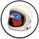
Romantically Apocalyptic is one of my favourite Webcomics. Vitaly S. Alexius is the Artist behind most of the pieces in this Comic. I really enjoy this style of Art. Vitaly often combines images from real life, such as a building or plane, and inserts them into his Art, often heavily painting over them to create some weathered effects. Vitaly’s art style really drew me in, partly for the post-apocalyptic aesthetic, but, mostly for the simple realism in his work. His Art is simple in stroke, which lends to an easier understanding of what kind of effect he’s going for, going for a realistic look without cluttering up the canvas with too much detail. The sense of humour in Vitaly’s Art is very enjoyable, from something as simple as a sight-gag, to a play on words, there are endless instances where the morose story is lightened up a bit by Zee Capitan telling Pilot or Snippy to go and do something dangerous, or stupid. Such as the time when Zee Capitan met Snippy and invited him back to Her house, only to find out it’s a cardboard box with “windows” cut out of the side. I think that Vitaly’s style is very easy to enjoy from the initial find, I wasn’t a big fan of Comics when I first discovered Vitaly’s work, but, the beautiful artworks, morose story, and often silly humour really drew me in. I have no doubt that I’ll be enjoying his work for many years to come. For anyone who may want to check out Romantically Apocalyptic. Tell Vitaly I sent you and he may reward you with a free wheel of cheese*. http://romanticallyapocalyptic.com/ *Cheese does not actually exist. Vitaly may or may not know me^. ^Vitaly does not know me. Beans*. *Or Cake.
0 notes
Photo

I’ve discovered something about my artistic process. I often get these lightbulb moments of inspiration. Most of the time, I start something from scratch and end up either finishing it, or leaving it for another time. I currently have 12 projects on the go, only 2 of them have been finished. But, you know what the cool thing is? Neither of them were the first thing I drew. I discovered that, during these lightbulb moments, I have so many ideas running through my head that it’s hard to put pen to paper and get them all down. But, adapting my ideas to projects I’ve already started is super fluid. Now that I have 12 projects on the go, at any moment, I could potentially have a future-complete work of art waiting right in front of me, ready for the bulb to light up and show the way. Even if you don’t think something you’ve drawn is “good”, keep it. Don’t delete it, don’t abandon it. You never know when you’ll think of the perfect addition that would really suit something you don’t think is worth keeping. Every. Single. Piece. Of. Art. Is. Worth. Keeping. Insta: cj.artspace More artwork on the way. :)
#Art#Popart#Glitch#Artistic#Process#Project#Artwork#Keepyourart#Neverletgo#Student#Designer#Graphic Design#Student Artist#Inspriation#Inspire#Draw#Sketch#Paint#Digital
0 notes
Photo


“Smile” “People should smile more.” my inner monologue said. *Flash* What? *Flash* Inspiration came calling, inserting itself into the long hours of a morning. This piece of art was created in a lightbulb moment of inspiration. The second photo is the one I cropped for use in this piece. The rest of the piece flowed as smoothly as conversation with a loved one. My main intent with this piece is, in my opinion, to offer a sliver of what makes me smile. Art in its simplest form; for art’s sake. :) I hope anybody watching enjoys this piece as much as I enjoyed creating it.
#Art#Popart#Smile#Inspiration#Aesthetic#Kettle#Rhubarb#Simplicity#Smilemore#Happiness#Sliceofpie#Muffin#Uni#Student#Learning#Experimenting#Heylookatthis
0 notes
Photo


Project 1 for Uni completed - M u z a k First image was the basis for the final. F.R.I.E.N.D.S was the inspiration for the lettering. I like to think that Music is full of my best and most cherished friends. I really dig the Aesthetic style of art, especially Mighty Boosh; hence, the bright colours. The middle panel was made by cropping and reversing the top and bottom. I then gave it a gaussian blur, to make it stand out. One of the reasons I’m attracted to Aesthetic art is that, it’s a mystery. Everyone knows, yet, nobody can explain. “There’s just something about it.” Insta: https://www.instagram.com/cj.artspace/
0 notes
Photo


Cage Experiment PNG for Art Class I initially used a screenshot from the movie The Wickerman. I wanted the background to be transparent, so, I erased the spots between the cage parts, giving more focus to the cage. I then used Photomosh to pixelate the image, saved it, then put the pixelated image through Giphy. Using Giphy, I added BEES as text to the bottom line. I then used the “bad tv” filter to add noise to the image, which seemed to add “pain” in turn. Overall, this was a fun and successful experiment.
1 note
·
View note