
Don't wanna be here? Send us removal request.
Statistics
We looked inside some of the posts by clairegraphicinformationdesign and here's what we found interesting.
Average Info
Notes Per Post
0
Likes Per Post
0
Reblog Per Post
0
Reply Per Post
0
Time Between Posts
3 days
Number of Posts By Type
Text
17
Last Seen Tumblr Blogs


Fun Fact
In 2020, Tumblr had 29.4 million users in the US.
Text
A2 Final Board Design
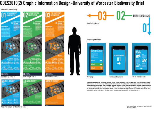
Creating information graphics for ‘The university biodiversity reserve’. Including three designs for the information boards for the different biodiversity areas within the campus. Also way finding design which supports the information boards. The way finding is for directional purposes and provides directions to the different biodiversity areas. A4 leaflets for the three different biodiversity areas which provides people with information on biodiversity and what the university does for biodiversity. It also provides information on wildlife, wildflowers and the benefits of walking. Supporting web pages which provides digital content for the ‘The university biodiversity reserve’. All the different elements of design use visuals to help simplify information. For example the use of icons and colour coding. All these elements create a piece of information graphics which also creates brand identity for ‘The university bio reserve.’
0 notes
Text
Mobile phone mockups


Bringing mobile designs to life by creating mockups on a mobile. Shows how the designs works and looks on screen. Helps client get an idea of the final outcome.
Mockup taken from: http://www.anagramdesign.graphics
0 notes
Text
Final Mobile Designs
Bring the uni bio reserve content onto screen. Which provides people with more information on the different areas and what wildlife would you would find in the area.

Homepage consists of information of what biodiversity is and ‘what we do as a university’. I think that important to include as it shows what the university is trying to do for biodiversity. Also helps to promote the subject and make people aware. Colour coding comes back and the different areas are divided into sections. Swiping on an area brings you to that content.

Once swiping on an area it brings you to the homepage of the area. Design work links well with the information boards.

Once you have entered an area on screen different content will shows. For example information on wildlife. I have just designed a page on wildlife to show an example on how it would look and work. However, this could be expanded by creating more pages with content of wildflowers, university mile and the benefits of walking.
0 notes
Text
Final Leaflets


Three different leaflets prompting the three different areas of the university bio reserve. Design work links well to the design work on the boards. Again the use of colour coding. Each leaflet contains information on biodiversity and what the uni does for biodiversity. However, they all have a section with different information. For example ‘Area 01′ leaflets gives information on wildlife, ‘Area 02′ leaflet gives information on wildflowers and ‘Area 03′ gives information on the benefits of walking. Each leaflet also contains an image of the map of the university showing the location of the different areas and the university mile route.
I think all the designs are coming together now and are creating a brand identity for the university bio reserve. I think the colour coding works really well with the different design elements and helps to link them all together.
0 notes
Text
Designs for mobile and leaflet

Ideas for how to show the university bio reserve on screen. Ideas for homepages and pages to show information on wildlife and wildflowers. Moving towards the idea of creating separate pages for the different areas. Again could use colour coding.

Ideas for leaflet on the uni bio reserve which would be placed at reception. Lots of different ideas exploring different content and layouts. Moving towards the idea to create the design work linking to the information board. Also thinking of creating three different leaflets for the different areas. Each individual leaflet will have an area that contains different information. For example ‘Area 01′ might include information on wildlife and ‘Area 02′ might include information on the benefits of walking.
0 notes
Text
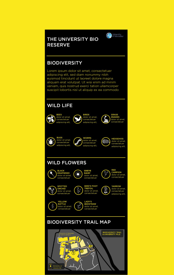
Final board design and way finding design

Final board design which contains information on biodiversity, benefits of walking, wildlife and wildflowers. Also includes a map indicating where the different areas are and the route of the uni mile. Design style creates a modern and professional approach. I think the different icons help to simplify information and work well as a visual. All the boards have the same information at the moment as it is just an example, however, client could change this. The three different boards represent different areas. They are all numbered and colour coded.

Boards work well with the way finding as each area is the same colour as the board for that particular area. Way finding will be placed on the floor. It is simple, but modern. Design works well with the boards. Way finding simplifies the information and shows the directions of the different areas through the use of a diagram and colour coding. I think it is a cleaver design which delivers the information quickly and efficiently.
0 notes
Text
Way Finding Designs
Bringing designs for way finding onto screen.

Creating directions on the floor to guide people to the different areas. Have developed this idea three times changing a few different features. Personally think this design works well as it is clear and simple to follow. Delivers information quick and simplifies information.

Creating a small board which will be placed in the middle of all of the different areas. Board clearly shows the direction of the different areas. I have developed this idea further by creating the numbers in different colours to link with colour of the board. At the moment I am think the colour scheme will be blue, green and orange. However, this could change.


Again creating directions on the floor. This design creates a diagram approach which helps to direct you to the different bio reserve areas. I have developed design by creating one using colour coding. I personally think this design works well. It is unique, visually pleasing and cleaver. Again delivers information quickly and is straight to the point.
0 notes
Text
Designs for way finding
Generating different ideas for ways to give the public directions to each of the different bio reserved areas in the university.

Exploring different ideas of creating way finding on the floor to give different directions to the different areas. Thinking about numbering the different areas and creating a colour coding system which also works with the different boards. Also exploring the idea for creating a board to give directions to the different areas.

Again more ideas on how I can create directions on the floor to the different areas. Also thinking of creating posts that go on the wall or on the fences around the university campus which gives directions to the different areas.
0 notes
Text
Here East wayfinding system, by Dn&co
“Dn&co has designed the signage and way finding system for Here East’s digital and creative campus at the Queen Elizabeth Olympic Park in east London.The tech hub’s signage system is inspired by electronic circuit diagrams, while digital screens embedded into walls display a sequence of digital maps, signposting and brand messages, developed by digital agency Poke.” (Aimée McLaughlin, 28.November. 2016)

Electric circuit design on the floor of building creating a diagram.

Information on the wall explains whats on that floor with icons.

Bold letter on side of the building for directional purposes. Also image shows information board which is also digital. I personally really like the design of the board as it creates a futuristic approach. I think it is unique and I haven't seen any other information boards in this style. It creates the illusion that it is a piece of abstract art.

Again creating a electric circuit diagram, but in this case its used to show the numbers of the different floors of the building.
I think the design for this way finding works really well. It is very different and visually appealing. I think it is also very creative. It is very loud and bold. I also think the use of one colour works well.
0 notes
Text
Harriman Steel creates London Fashion Week wayfinding
Way finding designs created by Harriman Steel senior designer Stina Smith and designer Sean Clarke. Way finding created for London Fashion week back in May 2010.

Way finding for the event consists of boards and directions on walls around the building to help direct the public to the different areas. Image of above is of a welcome board. Simple, but effective design. Design is modern, elegant, bold, expensive and trendy. All of those characteristics link with the event.

Directions printed on a wall. Showing what is upstairs and what is downstairs. It creates a friendly approach by using the terms ‘this way’ and ‘that way’. In smaller print states what is ‘this way’ and ‘that way’. Style of the font creates a modern approach. Typeface is bold and goes unnoticed. I think the style of the arrows works well creates the impression they are hand drawn.

Again similar to image above. Using the same style. However, this design in on a pink background.

Again similar to both images above. Shows how all the way finding links together and how it’s important that the same aesthetic style is carried out throughout the design.
I think the way finding design is simple, but clear. It is straight to the point and does the job. I think the stye of typeface works well. Designs are very clear and also visually appealing. I also think it works well how the directions have been placed on the walls.
0 notes
Text
Way Finding- Inspiration
“Wayfinding is how people engage seamlessly in a built environment. Creating these systems is a strategic exercise and design process, which combines many disciplines from behavioural psychology to product design, graphic design and engineering. It all starts with good analysis of a building or urban space.The main aim is to provide effective navigational designs for large, complex environments..” (Pelin Morris, June 2019)
Way finding is made up of graphic language such as typography, colours, symbols,icons, patterns and more. It is used to navigate and deliver information clearly.

Way finding showing different floors of the building and directions to the parking. I really like the fonts used in the design and the layouts. Design is simple, but elegant.

Similar to design above. Use of similar typefaces and creates the same style. Design board showing different elements of way finding used on a project. Looks really professional. It is simple, but creates a elegant and modern approach.

Again a design board showing different way finding elements for a project. I think the layouts and icons as visual works well. I also like the bold numbers with type over lapping the numbers. Something similar to this could work well for my project.
0 notes
Text
Design Development

Looking back at the designs I developed onto screen. Design above was a design I really liked the concept of and I thought the whole idea worked really well. However, I thought the design of the boards and colours used were slightly poor.

I have developed the first idea further by sticking to the same concept but changing the design of the boards slightly and changing the colour scheme. Design is inspired by one of my other designs I developed onto screen. I think this design looks more visually appealing and professional. I also think the colour scheme is stronger.


Developed previous design by changing colour scheme ever so slightly and typeface of the numbers. Inspired by image above from pervious research. I think it looks slightly more professional and is creating a modern approach towards way finding design.
0 notes
Text
User Testing
I have created a questionnaire on what people look for in information design and focusing on my designs on the information board.
User testing questionnaire
Age
10-15 18-25 25+
Do you think an illustrative approach or symbolic approach would work better for an information board?
The use of symbols as it is clear and is more professional. Rarely see illustrative information boards these days. Depends on the content.
When creating visual directions what do you want to see?
Arrows Icons Wording Numbers Maps Colour coding
Do you think the use of colour coding could work well when creating design work giving directions?
It is different, however, could work.
Looking at my designs which one is the strongest?
The three different boards which have been numbered.
What style would you like to see on an information board?
Formal Informal illustrative professional modern and trendy
User testing questionnaire
Age
10-15 18-25 25+
Do you think an illustrative approach or symbolic approach would work better for an information board?
Depends who the board is for. In this case use of symbols as it is for a university campus which has a population of young adults/ mature adults.
When creating visual directions what do you want to see?
Arrows Icons Wording Numbers Maps Colour coding
Do you think the use of colour coding could work well when creating design work giving directions?
Yes as it could help simplify information.
Looking at my designs which one is the strongest?
Second one (orange board).
What style would you like to see on an information board?
Formal Informal illustrative professional modern and trendy
User testing questionnaire
Age
10-15 18-25 25+
Do you think an illustrative approach or symbolic approach would work better for an information board?
Depends on content. Illustrative approach could be appealing.
When creating visual directions what do you want to see?
Arrows Icons Wording Numbers Maps Colour coding
Do you think the use of colour coding could work well when creating design work giving directions?
Yes it is simple ,but could be effective. Don’t see it often.
Looking at my designs which one is the strongest?
Second one (orange one|).
What style would you like to see on an information board?
Formal Informal illustrative professional modern and trendy
User testing questionnaire
Age
10-15 18-25 25+
Do you think an illustrative approach or symbolic approach would work better for an information board?
Illustrative
When creating visual directions what do you want to see?
Arrows Icons Wording Numbers Maps Colour coding
Do you think the use of colour coding could work well when creating design work giving directions?
Yes,it could be fun and different.
Looking at my designs which one is the strongest?
The third one.
What style would you like to see on an information board?
Formal Informal illustrative professional modern and trendy
User testing questionnaire
Age
10-15 18-25 25+
Do you think an illustrative approach or symbolic approach would work better for an information board?
When creating visual directions what do you want to see?
Arrows Icons Wording Numbers Maps Colour coding
Do you think the use of colour coding could work well when creating design work giving directions?
Yes as I think it would help to make information clear. It will also help to locate different areas.
Looking at my designs which one is the strongest?
The second one.
What style would you like to see on an information board?
Formal Informal illustrative professional modern and trendy
It is clear that people look for a clear design that is straight to the point and delivers information efficiently. It is also clear that people do like to see visuals in this type of design instead of just wording. Some people said they prefer an illustrative approach whereas some people prefer seeing icons. However, one person pointed out that the design work ‘is for a university campus which has a population of young adults/ mature adults.’ This has influenced me to stick to the symbolic approach within the design rather than going down an illustrative route. People also pointed out that they do look for a professional approach within this type of design. This task has been very useful as I have got a clearer idea on what the general public look for in this type of design and also it gave me some feed back on my designs so far. However, if I was to do this task again I would ask more people as I would get a broader range of opinions.
0 notes
Text
Designs-onto screen

Bringing some of my rough ideas onto screen. Design above is inspired by one of my mood boards. Creating a design with a strict colour scheme and features lots of icons as visuals. I think design looks professional and concept works well. However, I don’t think it works well for the company I am designing for.

Design above is creating visuals using icons similar to the pervious design. I think the use of icons as visuals works well as it is delivering the message to the viewers quickly and also creates a professional approach. I personally really like this design as it creates a modern and professional approach. Design is visually appealing. I wanted to create a modern piece of infographic design compared other nature information boards (looking back at research).

Dividing information on board into four different sections. Using a navigation system which is numbered and colour coded. I think the concept for this board works well as information is delivered quickly and clear. Boarded is easy to navigate information. I think the style of the numbers create a visually pleasing design element.

Example of how the boards could work with the way finding. Stuck to naming the different areas with numbers. Idea of directions painted on the floor which navigate you to the different areas. Use of colour coding for example colour of the blocks will be the same colour of that area board. I think the concept works example well as it is a design that works together and helps to direct the public to the different areas in a cleaver way. It also puts information across to the public quick and clearly. However, I personally think the visual design of the boards could be improved.
0 notes
Text
Past Students Work Analysis

A. Suitability for brief:
Work relates to the brief as student has created information boards which features a map which also relates to way finding. Also student has stuck to the brief by reaching all of the main requirements.
B. Colourschemes used
The colour scheme is green, white and grey. Main colour used is green. The reason for this is because it links to the what the brief is. For example creating way finding and information boards to ‘support family cycling.’ Which is an out doors activity and has direct links with nature. Green is a colour which is associated with nature.
C. Art style or visual treatments
The design features illustrative elements, icons, a photographic element and a diagram (map). I feel that all of these are appropriate as all of these elements help to simply the information on the board making it easy, quick and clear to take in the information.
D. Use of type
Sans-serif font has been used which works well as it creates a modern and friendly approach. It is also clear to read.
E. Use of corporate ID
Yes I think it is appropriate as the corporate ID comes across professional and clear. I think it works well how the student has created a banner with the company identity on.
F. Visual complexity
I don't think the design is over complicated. I think the design is straight to the point and information is clear.
G. Use of additional photoshop elements
The design board features photoshop mocks which helps to show different scenarios of their design in the real world. I think these mockups have been used effectively as you get a clear idea what the design would look like in different scenarios. Also helps to see if the design is successful and brings the designs to life.
H. Suggested further improvements.
Looking at the design board I personally think all the different design elements work well, however, I personally think the information board could be improved. I personally don’t like how both of the separate information is on their own board next to each other. I think it is a creative idea, however, I personally don't think it works very well. I think the board with the information on isn’t very visually appealing. However, I do like how the student has created the boarders of the circle relating to a wheel of a bike. I think it is a creative idea and links with the brief.

A. Suitability for brief: Work relates to the brief as student has created information board, way finding and mockups of different design elements. Student has stuck to the brief by reaching all of the main requirements and the different design elements relate to the clients briefing. B. Colourschemes used Colour scheme of green and white. Links well as brief is linking to outdoors/nature.
C. Art style or visual treatments Lots of different visual treatment has been used here such as photographic, diagrams, map and icons. It works well as it has been used to simply information in a visual way.
D. Use of type
Use of a sans-serif type which creates a professional, modern and friendly approach. It is clear to read.
E. Use of corporate ID Corporate ID created by the students works well. It is clearly and professional.
F. Visual complexity
Looking at the design board overall the design is slightly complex as it is very detailed and packed with information. However, I think it works well and all of the visual elements are appropriate.
G. Use of additional photoshop elements
Lots of different photoshop mocks have been used on the design board such as mobile phone mockup, leaflet mockup and a mockup of the information board. I think it is effective as it brings the students designs to life and helps to create an understanding of what the final printed piece would look like.
H. Suggested further improvements.
I don't think this piece of work could be improved. As I think the design meets the brief and looks very visually appealing. You can see the design has been carefully thought out and student has thought about many different elements. I think all of the design elements on the design board work well together.
Final Overall Q
Yes as it has has made me think about the end result and how it’s important that all the design elements on the board convey the same design style.
0 notes
Text
More Designs

Exploring new ways to show the information. Designs showing more detail. Idea to number each board with the area. Idea to have the section highlighted in the colour blue, however, now I am thinking that it would work well if each board had their own colour.

Again thinking about colour coding and colour schemes. Thinking about another way to create way finding design inspired by research.
0 notes
Text
Information graphics inspiration

Leaflet on global health
Leaflet is illustrative, bold and colourful which grabs you attention. Lots of diagrams, visuals and numbers used to simplify information. Personally think colour scheme works really well and layout is effective. I think the use of bold numbers grabs your attention and using numbers can also locate information which I am thinking about doing on the biodiversity board.
UNIQUELY CHARLOTTE: A NEIGHBORHOOD GUIDE | CHARLOTTE MARRIOTT CITY CENTER-https://lemonly.com/work/uniquely-charlotte-neighborhood-guide


Information graphics design showing different neighbours in the city for new comers and also shows different things you can do in those areas. It is a visual guide. The guide is colourful and illustrative. It creates a fun approach. It grabs your attention. I do think this type of design would attract the younger generation. The reason for this is because it is very illustrative, colourful and creates a less formal approach.

Information graphics- Think like a genius
Creates a diagram with visuals to show different ways to think like a genius. It is easy to read and easy to absorb information. It is a much more appealing way to show the information rather than if these points where just listed.
0 notes