
Don't wanna be here? Send us removal request.
Statistics
We looked inside some of the posts by clairesmajorproject and here's what we found interesting.
Average Info
Notes Per Post
0
Likes Per Post
0
Reblog Per Post
0
Reply Per Post
0
Time Between Posts
6 days
Number of Posts By Type
Text
17
Last Seen Tumblr Blogs


Fun Fact
130K people were victims of a chain letter scam that affected Tumblr in May 2011.


Text
SOCIAL MEDIA CONTENT


Having a social media campaign allows the campaign to reach a wider audience. The connect features the ‘circuit design’ aesthetic which links to publication. The written content is direct and straight to the point. The content directly speaks to the audience. I think using phrases such as ‘Stop scrolling, start living!’creates a powerful contrast with the social media platforms.I think this idea would be extremely effective. For example, if someone has been scrolling for 30 minutes on a social media platform and see this content they will want to know more about the campaign. It might also persuade them to ‘Start living!’.
0 notes
Text
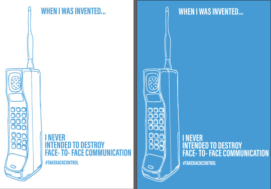
FINAL POSTER DESIGNS FOR CAMPAIGN

The final posters for the campaign consist of a series of three posters. The posters create a minimalistic approach. They are bold and straight to the point.

The posters feature three different illustrations of three different phones from different eras. Same illustrations used in publication which helps to link these two different design elements together.

The tone of voice is dramatic, direct, informal and uses emotive language. The posters tell a story.
0 notes
Text
POSTER CAMPAIGN DEVELOPMENTS

Linking to publication there is going to be a campaign which persuades young people too ‘stop scrolling and start living’. The campaign is called ‘Disconnect To Connect’ which is the same title as the publication. Posters feature illustrations of phones from the publication design which links this element back to the publication. Using informal and emotive language. Posters will tell a story. They are dramatic and draw the audience in.
Looking at the designs above I have decided to stick with the white on blue design which will be developed further.
0 notes
Text
PUBLICATION COVER DEVELOPMENTS


Progression for publication cover.The strongest design is the third one which will be developed further. I think sticking to white background for the publication works the best as it links to the rest of the pages. However, the white on blue works well. I will be taking this consideration further and explore with white on blue for poster campaign.
Back cover

Originally the back cover was going to be left blank as it is only a small information booklet. However, I think including a few words on back is necessary. The written content in the image above sums up the publication in a few short sentences. I think it works well as it grabs your attention. It is powerful and straight to the point.
0 notes
Text
MOCKING UP PAGES ONTO SCREEN
Content pages


Taking some of my content page designs on to screen. Exploring with different layouts and different ways to present the content on this page. I think the strongest solution for this page is the last image. I think it works well with the circuit theme of publication. I will be taking this design further into my final publication.
Mobile phone growth


Exploring different ways to display this content on a page. I personally think the strongest design is the first image. I think the information is clear and visually appealing. I will be taking this design further in my final publication.
History of mobile phones

Exploring different ways to display this content. The image above is a design that I have developed onto screen. I think it works well, however, I don't think it is the best solution. It is busy and difficult to navigate content. Also the images are very small.

Here the images are clear, however, layout is very messy. Difficult to navigate information.

I think this is the strongest solution. It is easy to navigate information, clear and readable. Also I the images are clear and not to small. I will be taking this design further in my final publication.
Social media growth

Example of how a design put on to screen has not worked.

Developed a new solution. Easy to navigate information. Information is clear and relevant. Every piece of information graphics is comparing data of four different social media platforms.

Developed further by producing hand drawn information graphics. The style of information graphics links with illustration style of the mobile phones which helps to create a strong design aesthetic linking with other pages. I do not want all of my pages to look too different. I will be taking this design further in my final publication.
Mobile phone usage


Use of hand drawn information graphics to represent data from ‘mobile phone usage’ survey. Experimenting by changing some of the key elements red in order for them to stand out. This design will be taken further in my final publication.
Addiction


Design taken on to screen which works extremely well. I think the digram created to show how ‘mobile phones use are own psychology against us’ is clear and conveys the information efficiently. I will be taking this design further in my final publication design.
Communication

This design on screen has not worked. It is busy and difficult to navigate information. The icons do not work well with the publication design aesthetic.

Developed a new solution for this page. I think it works extremely well. The information graphics used within this page links with the design aesthetic. It delivers information clearly and is easy to navigate. I will be taking this design further in my final publication.
0 notes
Text
DESIGN ELEMENTS

Thinking about the different typefaces for headings and text for publication. Thinking about colour scheme for publication. Also starting to developing circuit illustrative elements onto screen.

Exploring different colour schemes for publication. Also exploring using a gradient. However, warming to the idea of using blue and white as this links to the technical theme.
Developing the circuit design elements on to screen. Thinking about different ways to create abstract circuit illustrations. Also exploring the idea of creating a circuit to form a number.
INSPIRED
The circuit designs are inspired by the London Underground map design by Henry Beck in the 1930s. The circuits create this mechanical and technical approach similar to the Underground map.


0 notes
Text
PUBLICATION DESIGNS
Designing for publication using the territory ‘circuit’ as a design aesthetic. Thinking about layouts, visual elements and written content to include within the publication.

Circuit territory is exploring creating an asethic theme of abstract circuit designs. This territory links to the topic of the publication as it creates visuals linking to technology and mobile phones.
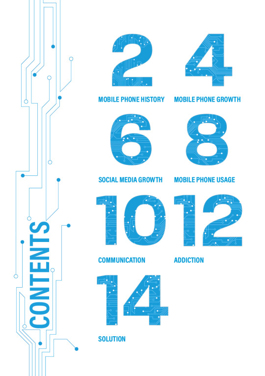
Publication pages:
History of mobile phones- Brief history of mobile phones which shows how mobile phones have developed over the years.
Mobile phone growth- Showing statistics on how many people own a mobile phone and looking at some key statistics of some countries.
Social media growth-Showing statistics on the key social media platforms that young adults use.
Mobile phone usage- Using the survey I conducted to provide different statistics on how young people use their phones.
Addiction - Exploring phone addiction. Page will include information such as how it can impact mental health and how phone addiction is similar to drug addiction. Page will also include how mobile phones/apps use are own psychology against us.
Communication- Looking at the cons and pros of mobile phone communication. Also exploring question “Are mobile phones destroying communication?” Exploring online connections and offline connections.
Solution- Offering ways of how we can use our phones to benefit us and how to use your phone less.
Page designs

Content page which is exploring different layouts and ways to show the different pages. Thinking about ways to incorporate design territory within the content page. For example exploring the idea to create circuits which form numbers. Also thinking about using the design aesthetic around the header or as a navigational tool to direct the readers eyes to the different pages.

History of mobile phones which explores how mobile phones have developed over the years. Thinking about presenting all of this information using a timeline. Using illustrations to show the visual developments of the phones throughout the years. The written content will briefly state the technical developments over the years. The timeline will only feature key eras. I have also explored different layouts and thought about different ways I could present this information.

Mobile phone growth which is focusing on how many people own a mobile device/smartphone. Exploring the idea of showing statistics using a world map which will point out some countries mobile phone statistics. Also thinking about different ways I could show this information by exploring different layouts.

Social media growth which is focusing on statistics of different social media platform. For example how many users use the platform and percentages of the key ages that access the platforms. Thinking about different ways information graphics can be used to simplify and present information.

Mobile phone usage which is focusing on how young people used their mobile phones. Information used on this page is primary information which I gathered from the survey I conducted earlier on in this project. Again page will be information graphics based and packed with statistics. Exploring different ways I can present information using different info graphic elements. Also thinking about different layouts.

Mobile phone addiction which is exploring phone addiction. Using infographics and illustrative elements which explains how app design uses are own psychology against us. Again page is packed with information which has been simplified using visual elements/info graphics. Also exploring different layouts and other alternative ways that this information could be presented.

Communication page which is focusing on the pros and cons mobile phones have on communication. Again thinking about visual elements to help convey information. Also exploring different layouts.

Solution page is delivering a solution to the reader. Content will provide tips on how to use your mobile to benefit you and how to use your phone less. Again thinking about ways to use info graphics to present information clear and efficiently. Exploring different layouts and alternatives ways to present information.

Exploring different ways that I could incorporate the design aesthetic to each page within the publication.
0 notes
Text
REPORT TERRITORY


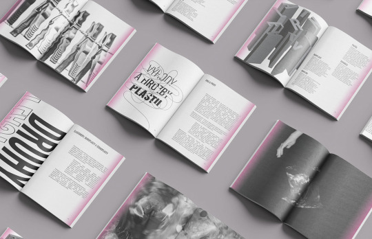
Rough designs for creating a publication using a report aesthetic. Using clean information graphics and a clean layout. This design aesthetic works well. I will be combining the clean information graphics aesthetic with the circuit territory. I think the ‘circuit’ territory works well with the theme of technology and the ‘report’ territory works well with the use of information graphics to simply information in my publication.
0 notes
Text
MINIMAL AND EDGY TERRITORY


Rough design exploring different layouts and possible content. Thinking about keeping it minimal with negative space on pages. However, these designs create more of a minimal approach without the edge. I will not be exploring this territory anymore as I don’t think this theme is suitable for the publication.
0 notes
Text
TERRITORIES

Creating a publication using circuits as the design aesthetic. Thinking about sticking to a colour scheme of white and cyan throughout the publication. Information would be simplified throughout the publication using information graphics.

Minimal design with a slight twist. Would be minimal with a slight edge. Would use information a graphics again to present all the information.

Idea to create a report approach with the use of a clean minimalistic approach. Would use clean information graphics. The style is easy to read and navigate information.
0 notes
Text
BEHANCE- DESIGNERS PUBLICATIONS
A collection of designers on Behance creative publications.
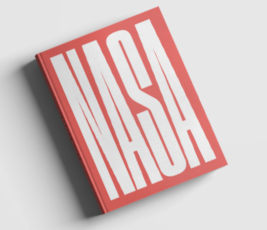
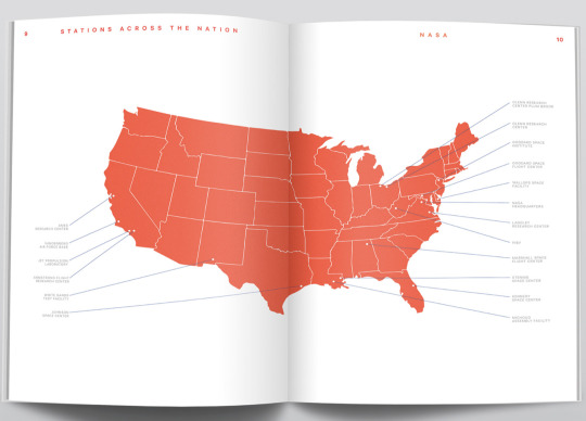
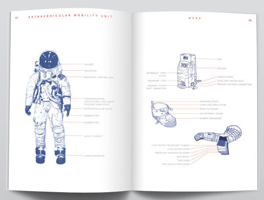
Nasa Infographic Book- Conner Nielander


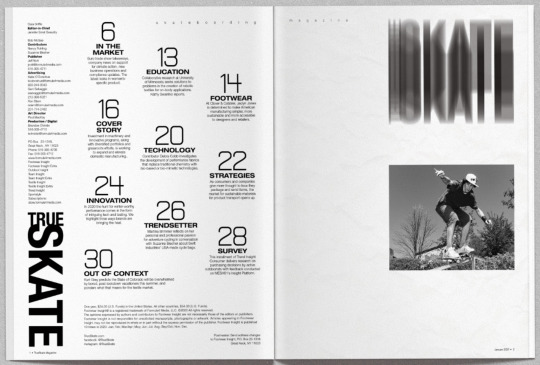
TrueSkate Magazine Prototype- Paul MacKay

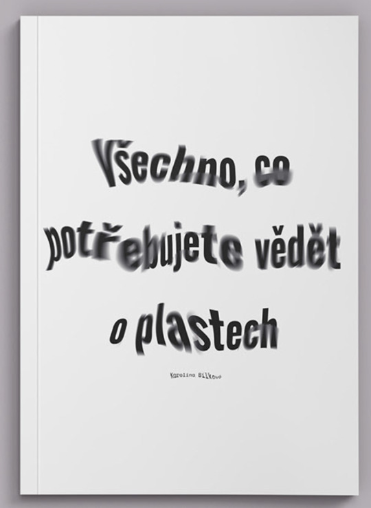
Gradient Publication- Karolina Bílková

New Design Process? Graphic Design-Research / PhDPaulina Urbańska


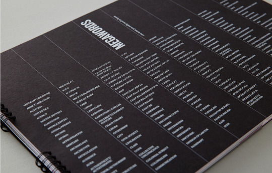
2017 ISTD – 'MEGAWORDS'-Michael Belias


0 notes
Text
LAURENCE KING PUBLISHING
Laurence King is a British publishing agency. They work with lots of designers, illustrators, artists and other creatives. They tend to publish creative books. Their books are beautiful designed. Books consist of creative layouts, types, photography and sometimes feature illustrative elements. Their publications are creative and their pages are visually appealing.
How to Raise a Plant and make it love you back-Morgan Doane and Erin Harding


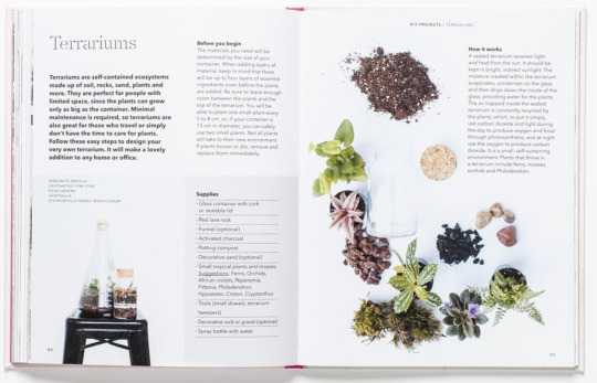
Publication uses lots of visuals such as illustrative and photographic elements. The layout of the publication is clear and creative. The layouts make the publication visually engaging and easy to navigate the text. The design aesthetic works well with the topic of the publication. It creates a clean and fresh approach.
The Street Art Manual- Bill Posters


The cover of this publication creates a minimalistic approach. The illustration creates visual for the written content. The cover states clearly what this book is about.
Page uses information graphics to provide instructions to the reader. The information graphics creates an illustrative approach which provides clear and detailed instructions. The layout guides the readers attention to each of the different steps. This example shows how illustrations can be a effective solution when creating information graphic.
How to Set up & Run a Fashion Label, Third Edition- Toby Meadows

Cover is simple, but very effective. The imagery creates a clear visual that links with the written content. It is a minimalistic design that is very clear and works well.
Double page spread which uses information graphic elements. The layout and use of font creates an editorial approach which links to the topic of the publication (fashion).
0 notes
Text
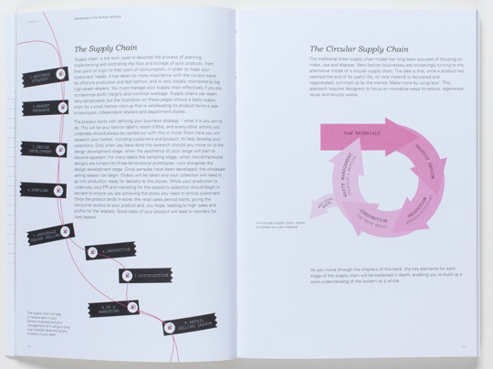
FELTON ANNUAL REPORTS
Nicholas Felton is a designer who has created personal annual reports. His annual reports are interesting and are information graphic based.
2012 Annual Report
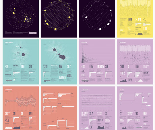

“Contents of the 2012 Annual Report were collected with an early version of the Reporter app. Throughout the year, randomly scheduled notifications prompted surveys while the app gathered information about location, weather, ambient audio and recent photos in the background. This sampling approach enabled the 2012 Report to answer questions about social context, tool use and consumption with a fidelity not previously possible.”
Felton’s 2012 annual report is creative and packed with infographics. It uses creative layouts, bold headings, detailed charts and diagrams. The colour scheme is playful. The use of colour has also been used to make information clear and to make certain elements stand out. I personally think the aesthetic style works well and is visually appealing.
2006 Annual Report


“Building on the unexpected popularity of the 2005 Annual Report, the 2006 edition relied on a more regimented and detailed data-collection process. This is the first printed edition and includes detailed eating, drinking, reading and location data that required meticulous record keeping throughout the year.”
Annual report is again packed with information graphics. I personally like the design aesthetic. The aesthetic of this report is unique, edgy and bold. It creates a slight minimal approach. I think the colour scheme works well. It shows how the use of a colour scheme with three colours throughout the whole publication can create a powerful impact within a design. Out of all of his reports this one if my favourite. I think the design aesthetic works very well. I think the use of diagrams overlapping headings is unique and eye catching. Some of the report creates a slight messy approach which works. The design aesthetic is slightly rebellious.
2005 Annual Report

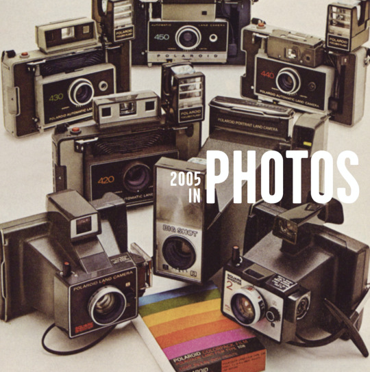

“The original Annual Report was created to encapsulate the previous year and share its contours with friends and family. The document was designed hastily using sources available at the end of the year, including lists, photographs, a calendar, browser history and data from Last.fm.”
This annual report is slightly different compared to Felton’s other reports. It’s uses photographic elements. Each topic has a cover page and then a page with infographics which delivers info on each topic. I think the cover pages works well and introduces the topic using visual content. The infographics used is very simple compared to his pervious reports.
0 notes
Text
INFORMATION GRAPHICS INSPIRATION

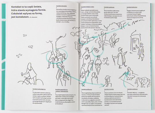
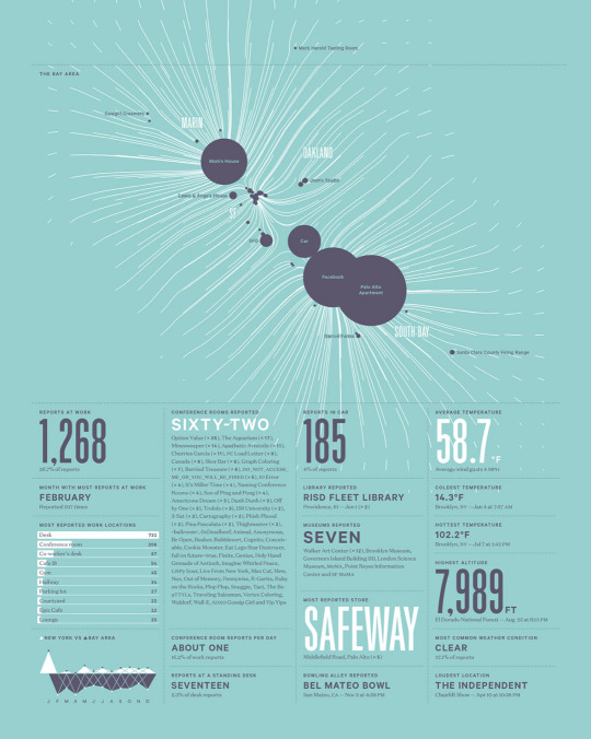
Information graphics real estate concept which shows the viewer each of the steps in real estate. Clear piece of design which simplifies information using visual icons, headings, layout design and diagrams (lines) to guide the users focus. All of these visual elements help to simplify information which allows the viewer to absorb information quickly and efficiently.

Designer Drishti Khemani created a piece of information graphics on his creative process. The piece explains his design process using diagrams, layout design, illustrative elements and headings. Design is visually appealing and works really well. However, maybe the use of two colours could help to make content standout more.

Information graphics timeline on the ‘History Of The Combustion Engine’. Design is very visually pleasing. The design aesthetic works extremely well. The layout of the timeline is unique and creative. The layout of the different years of the timeline is creative and works well. Notice how the designer has used a strong colour scheme which helps to locate the information clearly and efficiently. The colour scheme also helps to make it visually appealing. This piece of work shows flexibility and the creativity you can have when creating a timeline. Using a timeline within my publication designs is definitely something to consider.

Information graphic creative template. Something similar to this design could work well within my projects as it is linking to mobile phones. It shows a possibility of creating infographics on an icon or illustration of a mobile phone. This would directly link the information to the direct source (mobile phones). This is a creative idea which I will consider to explore more detail.

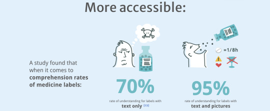
Information graphics which shows the percentages of fresh fruit that goes into this brands juice. A simple, effective and cleaver idea. The designer has used the different types of fruit to form a pie chart which states the different percentages.I think using a photographic visual of the ingredients works extremely well.
0 notes
Text
INFORMATION GRAPHICS
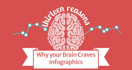
Why your brain craves infographics -by neomam studios
Neomam studio has a page on their website which is a infographics piece which describes ‘Why your brain craves infographics’ using information graphics. The piece is cleaver and adds a sense of wit.
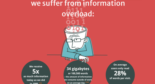
The piece is made up of different sections that explains info graphics and why it is useful. For example explaining facts such as “we can get the sense of a visual scene in less than a second.” It uses illustrative elements to simplify all facts that relate to the topic.

It sums up all of the positives of info graphics such as it is more persuasive, more accessible, more engaging and many more benefits.

The infographic piece also shows how long you have been reading this. It also states “It’s no wonder that infographics have been so successful.” I think this is cleaver and promotes the topic they have explained with the use of info graphics.
Design Terms You Should Know
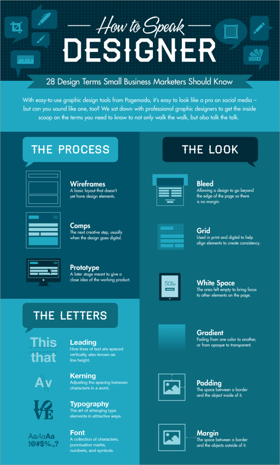
Infographics created by a company called Paegemo. The company deigned this infographics for ‘amateur designers’ to be familiar with design phrase they might need to know when using design software. Piece is very clear and simplify lots of information by using visuals. It is quick to read and easy to navigate to the piece of information that is relevant to you. Colour scheme is visually appealing and also helps to quid information.
How to Use Social Media for B2B

Social media infographic piece by Real Business Rescue. It provides lots of statistics and communicates important facts. Easy to navigate information. The use of shapes and angles navigates the reader to the highlighted points.
What Happens in One Internet Minute?

Infographics showing what happens on each social media platform/website in one minute. Interesting piece of infographic packed with information. Notice how all other the info and statistics create a clock shape using a circle format.
0 notes
Text
DESIGNS FOR POSTERZINE
Concepts for posterzine idea. Thinking about content, visual content and design aesthetic. Using pervious mind map and mood board as a guide line.

Designs started with thinking about potential written content and visual content for the cover. This helped to think about what the posterzine should be called and to identify possible design aesthetics.

Developed one concept further from the first set of designs. Thinking about the visual content and the possible aesthetic theme. Also thinking of the name of the posterzine. I think ‘disconnect to connect’ works very well. The name is catchy and sums up what the posterzine is all about. This name would also work well for the publication route. Using a circuit aesthetic also works well as it links to topic and relates to technology. Creating circuits using an abstract approach would be interesting and visually intriguing. This theme could also work for the publication route. I will be taking this idea further and making it a potential territory for the chosen route (publication or posterzine).

Developed pervious design further. Thinking about the content that could go in the posterzine whilst sticking with the ‘abstract circuit’ theme. The design concepts explore the idea of including some information graphics within the posterzine as this will help to simplify information.

Design concepts explore a potential territory which is ‘distorted’. Thinking about potential cover designs and the content that would be included in the posterzine. This design aesthetic creates a eerie and edgy approach. This idea could work well with the topic of the posterzine. However, I would have to explore the territory in more detail.

Design is exploring another approach for the posterzine. Thinking about a minimal design and thinking about illustration style.
These designs allowed me to think about the content in the posterzine. They also allowed me to think about the design aesthetic and think about the layout. It helped to identify what would work and what won't work at an early stage. It also helped to develop some ideas for potential territories. After these designs I am moving towards the idea of creating a publication as I do not think a posterzine will work with the amount of information that will be included in the final outcome. The use of a posterzine to present information may be unclear. It may also be unable to navigate information efficiently compared to a publication.
0 notes