
cloudsm-m
hyperfixate on fictional characters with me
Currently likes:
podcasts
anime
cottagecore
272 posts
Don't wanna be here? Send us removal request.
Last Seen Blogs

sassyzanne-blog-blog
My Turning Page!

its-princess-frey
Dylas' bitxh

nomenjapan
NomenJapan

craftyscamp
SCAMP’S PARTY WORLD🏳️⚧️

textileartlove
Love for Textile Art
Text
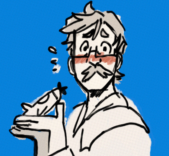
THIS?! You mean.. this..model airplane?? no.. its not mine..
3K notes
·
View notes
Text
great pretender is literally just makoto getting played by everyone around him and me getting intense second hand embarrassment for him
292 notes
·
View notes


Text


him being a tumblr sexyman AND canonically bitchless is the funniest thing ever
7K notes
·
View notes

Text
There's no pain and there's no pressure
No humiliation
There's no fear and there's no shame
There's no pulse now is it so strange?💀
Aurelio Voltaire — Dead Girls
2K notes
·
View notes
Audio
Bungo Stray Dogs the Movie: BEAST OST album is now available on Spotify. Other albums such as anime OSTs & character songs also accessible.
Bungo Stray Dogs OST 1
Bungo Stray Dogs OST 2
Bungo Stray Dogs OST 3
Bungo Stray Dogs DEAD APPLE OST
Bungo Stray Dogs Wan! OST
Bungo Stray Dogs Character Songs 1
Bungo Stray Dogs Character Songs 2
Bungo Stray Dogs Character Songs 3
119 notes
·
View notes


Text
I had this idea and immediately had to make it!
My first fnaf fanart!

829 notes
·
View notes
Text
huggy wuggy makes brain go brrrrr
(my art glitched out oh no !)
7 notes
·
View notes


Text

my favorite genre of freak: could kill me wit h just their teeth
2K notes
·
View notes
Note
your comic of long haired mob and reigen is AMAZING! if you dont mind me asking, how did you make the colors in your comics look uniform (ie: blue in that one comic) and yet still recognizable of their original/normal color palettes, did you use a layer mode? or something else?
OKAY THIS IS. a challenging question to answer, even though it’s easy in practice.
The Doozy ABoT comic is a bit of an exception to the rule of how I color in general, but I can show you a glimpse into how that color process went. Also I use Sai for everything listed.
I’m using a picture I haven’t colored/merged yet to show what I mean, since you need to keep the lineart separate for my process to work. You can see how I color lineart here. Here it’s just at 30% lumi&shade.

Ya start with ur flats. Rad. (and always have backup flats on a duplicated layer)

getcha some faded blue set on a grouped screen layer.

Some faded blue on a multiply layer
(this is where i divulge from how i usually color comics, to be continued below **)

Because the comic was a night scene, i leave the darks/contrast as is, since you lose a majority of it in dark scenes, and just apply an orange screen layer where the light’s gonna hit them.

select the inverse of that (with some space to give that weird shade-line in my stuff) and add some more blue on a screen layer and viola! you got my basic process for coloring that comic. and you didn’t even have to do much to preserve the original color palettes in people’s minds.

**back to how i normally color comics (here i used faded purple on my screen/multiply layers)
your average scene is very well lit, so it’s important to show the regular contrast as is. so – you get your sucker all done up, then

you adjust the brightness/contrast/color deepen until it reflects the difference you started with. now u have your original set of hues looking like it got passed through a purple color filter, but functioning better imo.

I personally like it a little toned down, so I add back in some of that reserve flat layer. I eyeball it, but this was around 52% opacity.

Multiply layer where your shades go. (with more faded purple)

Luminosity layer on top of the shades to make that solid line in my darks I was talkin about. (with even more faded purple)

And you can have an optional screen layer in the highlights (by selecting the inverse of your shade layer.) Here I used yellow bc why not.

That is the other important thing about my art. My shades and highlights are kept to 1-2 colors. Here it’s orange and green

Here it’s blue and red. The simplicity looks better to my eyes.
aight you made it to the bottom go treat urself to smth nice
4K notes
·
View notes
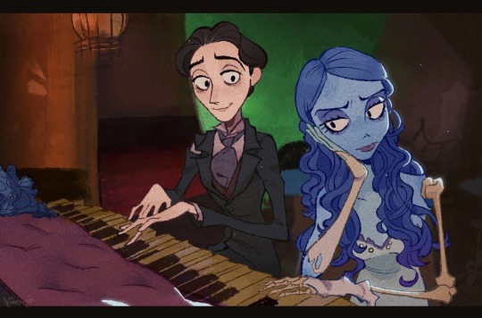
Photo


an adjustment period
i drew this in like 8 straight hours and now i guess it’s time to put my face in the earth or smth

6K notes
·
View notes