
the purpose of this blog is to show my understanding of design terms, post art and media that i enjoy, and analyze it using what i've learned in foundations of design.
Don't wanna be here? Send us removal request.
Statistics
We looked inside some of the posts by cmykarfa and here's what we found interesting.
Average Info
Notes Per Post
4
Likes Per Post
4
Reblog Per Post
0
Reply Per Post
0
Time Between Posts
4 days
Number of Posts By Type
Photo
9
Video
2
Text
1
Last Seen Tumblr Blogs


Fun Fact
Tumblr was named as a finalist in Lead411’s New York City Hot 125 in Aug 2010.
Photo


Analysis
In these designs by Bri Marie, scale and proportion are used in interesting ways to create fun, unique characters. Geometry is used to build the bodies of the characters. Spheres for the heads, half spheres and cylinders for the shoes, and cylinders and spheres for the arms and legs. In general, these characters seem really large, and the proportions of the heads compared to the bodies is small; you could say the ratio of the size of the head to the size of the body is around 1:6. We can also see what the human scale is in relation to other objects, like in the third image, where we can see the human next to a dog. Lastly, the aspect ratio of these images is square, or 1:1. The scale and proportions used in these helps to create silly, stylistic characters that are full of personality.
Glossary
Scale is the size of one object in relation to other objects in a design.
a certain relative or proportionate size or extent (A human is 7.5 heads tall.)
a standard of measurement or estimation (The UFO was as big as a football field.)
point of reference by which to gauge or rate (My puppy is twice as big as your chihuahua.)
Aspect Ratio refers to the proportions of the height and width of an image. It defines its overall shape, and it is usually shown as W:H (W is the width and H is the height).
Geometry - spheres, cubes, cylinders can be used to build more complex objects
Hierarchy - Arranged according to importance or power. What’s bigger or taller is often more important or harder to kill.
Human scale - sets the stage for the story happening to human-sized characters
Proportion - The size of the parts compared to the whole. Relativity.
Ratio - a ratio tells us what proportions mean to each other. Measuring one thing in terms of another. That monster is twice the size of the human. Their ratio is 2 to 1.
Relativity is how objects appear in context with each other.
0 notes
Photo

Analysis
Emphasis is when a something in a design or scene is given visual priority, so your eye is drawn to it first. In this illustration by Matt Forsythe (which is the cover for his book called Pokko and the Drum), the focal point is the frog, since it’s contrasted in size and color from the flowers and plants around it. While everything in this image is really colorful and saturated, the colors of the frog are darker and less pastel, making it stand out, and there is a glow around it to further separate it from the background. The frog is also isolated - there aren’t any other frogs or other animals shown near it. The placement, of course, also helps to inform the viewer of what is being emphasized, because he’s positioned right in the center. However, I wouldn’t say the focal point causes all other elements here to subordinate, because the background is still really special and interesting to look at. Aside from emphasis, I really love this illustration, and the use of color and texture in the artist’s work.
Glossary
Emphasis - Pow! Something in a scene dominates. In other words, the designer gives visual priority to part of a scene in order to draw the eye there first.
Contrast in size, color, texture can make one thing stand out from the many things around it.
Focal point - The focal point demands attention, it is accentuated, contrasted – the star or the most prominent component of a scene.
Isolation - Feature a single element alone, away from other elements to create emphasis.
One Element - Eliminate everything else in the composition and the thing that’s left will grab the attention such as a bold title or symbol.
Placement - Position your most important design component in a place to grab attention, such as the center of a poster.
Subordination - The focal point has the visual power while other elements of the scene are subordinate.
Whole over Parts - Sometimes we don’t want the eye to go somewhere specifically such as in an establishing shot at the beginning of a story. We want to show an overview of the environment before we jump into the story. We might look at a map with lots of details. The whole map is the important thing. When we select a place on the map to visit, then that spot becomes the focal point and the Emphasis shifts from the whole to the specific. Another example is that the whole game is more important than its levels.
0 notes
Video
youtube
Analysis
(Contains spoilers for the movie A Quiet Place.)
Horror and thriller movies tend to make good use of rhythm in their soundtracks and pacing. Most good movies do, but I feel like it’s especially important in these genres. A Quiet Place really utilizes sound, and the lack thereof. In this clip from it, there are many different types of rhythm used. There is alternating rhythm between the sounds and silence. The stillness and lack of auditory dialogue (the family mainly uses ASL to communicate) throughout the movie creates just as much (if not more) tension as when something makes a sound. There is also progressive rhythm. After the boy screams, the beat in the music intensifies and the hearing aid starts ringing, before everything goes silent. In the parts where they are trying to show the girl’s perspective, they take all of the sound away because she’s deaf. These moments, like the one at 0:33, make the silence feel even more tense than the scary music. When the creature attacks the car, we suddenly hear sound again - the glass shattering, the monster clicking and screaming, and the car being rocked back and forth (which are also an example of polyrhythmic patterns). And then right after this it’s quiet again as the shot changes to focus on the father picking up the axe and standing up (another example of alternating rhythm). The music also changes here. Where before it was suspenseful and what you would typically expect from a scene like this, now it’s just sad, and anticipating. The pace slows down. There is even a rhythm to his signs when he tells her he loves her. Lastly, there is conceptual rhythm to the shots from 1:30 to 2:02, where the shots go back and forth between showing the father, the girl, the mother, and the boy, and then the girl and the father again. It further intensifies and moves along the scene, foreshadows, and evokes emotions in the viewer to see the expressions on each of the family members’ faces while knowing what is about to happen next.
Glossary
Rhythm is caused by patterns in movement. What are those footsteps in the dark room? Are they slow or fast? Running or sneaking up on you? Rhythm controls the pace of action in your story. Rhythm can be repeated character types, weapons, or color strategies. We see and hear rhythm throughout nature as well as in our digital environment. Rhythm organizes units into patterns. Rhythm is created through repetition, alternation, and progression.
Alternating��- Alternating rhythm is a form of repetition and is predictable. We switch back and forth from one thing to another like a tennis match. Alternating rhythm can create tension, such as switching close up head shots of one character arguing with another.
Audio Rhythm - sounds that create patterns such breathing or shooting rounds of ammo.
Conceptual Rhythm - Intensifies, moves along, or calms the story. Conceptual rhythm coordinates visual and audio rhythm with the pace of your story.
Contrasting Rhythms are two or more sounds or motions at obviously different tempos.
Legato means music in a smooth flowing manner, without breaks between notes or a smooth flowing motion.
Polyrhythmic patterns - Use of simultaneous contrasting rhythms. A battle scene has many (poly) rhythms such as big guns, small guns, shouts, rumbles, footsteps, and explosions.
Progressive rhythm is a pattern that changes over time to more or less intensity. Progressive rhythm makes us feel that. something is in an evolving state of change. We can tell when the battle is heating up by the rhythm of the sounds and the actions of the characters running toward or away from the fighting.
Repeating - the same thing again and again gives us a feeling of predictability.
Rhythm and motion - When a motion repeats, speeds up, slows down it creates a rhythm. The rhythm of tai chi is slow. The rhythm of Kung Fu is fast.
Staccato derives from the Italian verb staccare, meaning “to detach,” and can now describe anything - not just sounds - made, done, or happening in an abrupt or disjointed way.
Visual Rhythm - When motifs such as lines or shapes repeat visual rhythm forms.
0 notes
Photo


Analysis
(This contains major spoilers for the movie Jojo Rabbit.)
The theory of Chekhov’s gun says that if something is introduced at the beginning of a film, it must be foreshadowing or important in some way, and has to be used again by the end. For example, if there is a gun shown on the wall in the first act, it has to go off later in the story. It creates unity in a story, bringing elements together and sometimes creating an “ohhh!” moment. In the movie Jojo Rabbit, the gun is Jojo’s mother’s shoes. They are a significant part of her character. Before we even see her face, we see her shoes. At first, they are a symbol of the fun, carefree nature of Jojo’s mother, and the beauty that he sees in her. But then they become the symbol of tragedy. Jojo finds out that his mother has been hanged when he is walking in the town square and walks right into her shoes, which is how he immediately recognizes that it’s her. The repetition of shots of her shoes leads up to that heartbreaking moment and makes it even more meaningful when it happens. In each shot, Jojo’s head is also positioned near or next to her shoes, connecting them to each other with proximity. Contrast is also used as a unifier. Your eye is drawn to the shoes in each scene: the first time you see them, they stand out against the blue background. Then with them being positioned right next to Jojo’s head, still the most colorful thing in the shot. And then finally in the last shot, where they are completely still and everything else moves. These are all unifying strategies used to pull the story along, create interest, and emotionally punch you in the gut near the end. There is unity in when it all comes full circle and you realize, “oh - that was why they kept showing her shoes.” The audience puts it together right as Jojo does.
Glossary
Unity is an entity that is a systematic whole. A fusion or union of parts in harmony to create a oneness. A game is a unity based on a fusion of levels.
Alignment is a common axis that creates relationship, the line up creates meaning. Alignment in games can help you find your way on the map or aim true with your weapon. Alignment of troops or vessels indicates organizational strength. Maps are visually aligned with the edge of the frame. Your stats are aligned in a table.
Beat Boards are used to illustrate major story points before the rest of the storyboard is completed. Beat boards are a series of single drawings that depict key focal points in a scene. Beat Boards can be compared to a children’s book illustration because an individual picture shows a complex story. Beat boards can serve in art direction to indicate how the shot is staged and show color strategies, using shapes and colors, but are not detailed sketches. Making sure the beat boards relate to each other creates unity.
Composition is the arrangement of visual elements within a shot. The three basic shot compositions in filmmaking are long-shot, medium-shot, and close-up.
Conceptual unity a palm tree, an ocean beach, and a beer unify around the concept of ‘vacation’.
Contrast creates variety within a unit, draws the eye to a focal point, creates drama. Contrast is a unifier. Contrast is when a character or object has a strong darks and lights compared to the scene around it. Size contrast is a gigantic space cruiser compared to much smaller fighters.
Proximity is when closer distances connect elements and far apart elements create separation and sometimes magnetism
Repetition states that things that look alike relate to each other. Shapes or colors that recur in the image create rhythm and recognizable situations.
Unifying Strategies manipulate contrast, repetition, alignment and proximity to create visual unity and to pull a story along.
Visual unity is a group of repeating or similar elements that create balance or form a structure.
0 notes
Photo

Analysis
Point can mean many things. In this painting by 9jedit on Twitter for one, we have the points, or the smallest visual components of a piece, which shown here are the stars in the background. Since the image isn’t the best quality, you can also see some pixelation in parts of it, like in the bottom corners. There is also the focal point: the moon in the center. Just because it’s right in the middle doesn’t make it the focal point, but it’s also emphasized by the bright color, and the rays that emanate outwards from it. The way that the whale and the floating person surround it also emphasize this. It draws the viewer’s eyes in and adds a bit of magic to the piece. The point as in the moving target would be the person floating aimlessly through the sky. Lastly, the point of the piece seems to be to tell a story, and to evoke a sense of wonder in the viewer.
Glossary
You have an idea sparking in your brain. You open a sketchbook or create a new file. You ponder a blank page or layer. You move your pencil or stylus. You land on a point. Your point moves and leaves a trail that evolves into a visible something. Groupings of points can stimulate human imagination to form familiar shapes. Ancient storytellers grouped stars into constellations of mythological beings. We group pixels into characters, animations, and game levels.
Point is the smallest visual component.
Pixel is a recently invented groovy word. The word “pixel” was first published in 1965 by Frederic C. Billingsley of Jet Propulsion Laboratory to describe the picture elements of video images from space probes to the Moon and Mars. A pixel is the basic unit of programmable color on a computer display. Think of it as a logical - rather than a physical - unit. The physical size of a pixel depends on how you’ve set the resolution for the display screen. Each visual composition on your screen is made of thousands of illuminated points of hue and value.
Focal point is the feature of a design or work of art that is the most interesting or important or the most strongly emphasized.
The Point is what a player will tell a friend about the game if they like it.
The point is the mission or a moving target.
The point of no return (PNR or PONR) is the point beyond which one must continue on one’s current course of action because turning back is dangerous, physically impossible or difficult, or prohibitively expensive. The point of no return can be a calculated point during a continuous action (such as in aviation). A particular irreversible action (such as setting off an explosion or signing a contract) can be a point of no return.
0 notes
Video
youtube
Analysis
Motion is extremely important when portraying action. It can add energy, drama, suspense, and more, depending on what kind of motion is used. The other day I came across this short animated film on Youtube by lemoncholy. (Please watch the video before reading this, I don’t want to spoil it for you!) “Camera motion” (I’m putting this in quotes because there isn’t a real camera used, the animator just did a really nice job making it seem like there is one) is portrayed throughout, from the pan up at the beginning to the smaller, subtler movements like when he falls and drops the glasses and the camera moves up and down as if raising its head with him, or from 0:33 to 0:38 where the camera moves to the right and then to the left and zooms in on the shadow, or when the boy is running past the pillars and the frame sort of shakes and then pans to the left. This all does a great job capturing the panic and fear of the boy as he’s running. These “camera motions” add to each scene, and make it seem like the viewer is following a gaze or moving along with the boy. In a way it feels like it’s simulating eye movements. There is anticipated action at around 0:57, when the boy raises the broken bottle and his silhouette flashes white, before he is still. Then, we can see that the 180 degree rule is followed in the shots where the boy and the dog are looking at each other. The boy is framed to the left of the dog, and for added consistency, his shoulder/back is shown in the left corner of the frames that focus on the dog. Motion blur is used at 0:19 when the dark shape moves past him, giving us an idea of how quick this thing is, adding to the fear. Motion blur is also used in a slightly different way in the moment before the boy puts on his glasses, to portray how blurry everything looks from his perspective without them, though the blur of the background is done in a really interesting way, with sharp shapes and textures that then clear up into the walls of the building behind him. The way that motion is used in every bit of this film adds so much to it. And this is unrelated to motion, but I love the symbolism at the very end.
Glossary
Motion is action, reaction, energy, what’s happening, gestures, dynamics, mobility, exertion, labor, and progress through space. Motion varies with your story. Motion indicators in storyboards are arrows, blurred lines, smears, zooms in and out. Your character is dramatized and embodied as a personality through gestural actions.
The 180-degree rule in filmmaking is a basic guideline regarding the on-screen spatial relationship between a character and another character or object within a scene. By keeping the camera on one side of an imaginary axis between two characters, the first character is always framed right of the second character. Moving the camera over the axis is called jumping the line or crossing the line; breaking the 180-degree rule by shooting on all sides is known as shooting in the round.
Anticipated Action is a dramatic action frozen in time, the tension mounts, we feel anticipation. We expect the sword to swing or the finger to pull the trigger or the couple to kiss.
Camera Motion - Arrows are standard cues, a simple and recognizable way to show motion or progression in a storyboard.
Kinesthetic Empathy is a player’s actual movement when responding to action in a game. Leaning into a curve in a driving game is kinesthetic empathy.
Line of action is an artistic concept, an invisible line that captures the thrust and vitality of the movement. The line of action can be drawn by artists as the first element to capture or exaggerate the pose.
Motion Blur - when your eyes or objects are in motion, the image will suffer from motion blur, resulting in an inability to resolve details. To cope with this, humans generally alternate between saccades (quick eye movements) and fixation (focusing on a single point).
Optical movement is an optical illusion. Although the image is not moving, it appears to move.
Stillness is calm, quiet, inaction, and peace. Stillness is the opposite of motion. It can be used to contrast with motion.
0 notes
Photo

Analysis
Pattern and texture are principles of design that can often be found in real life objects. Something I’ve gotten into lately is learning about punch needling. I think it’s something I’ll be trying to take up in winter break. I think the tufting adds extra dimension to an image. The texture here is a tactile texture, not a visual one, because in real life you could touch it and feel the raised bumps of the embroidery. Though I guess you could say that the way the viewer sees the photo through a screen makes it more of a visual texture. The embroidery also creates a pattern. Each of the little hooks of yarn used to create the flowers are visible, and the way they are repeated over and over creates an alternating pattern. There’s even a woven pattern in the fabric itself. Pattern and texture can create rhythm and add dynamicity to a piece.
Glossary
Pattern is an arrangement, configuration, array, formation, guide, matrix of repeated forms. Patterns create rhythm and can be used to predict and organize design elements such as using a grid. In software development patterns are conventions for describing and documenting recurring design decisions within a given context.
Alternating pattern means to occur in succession, such as day alternating with night. To pass back and forth from one state, action, or place to another such as alternate between happiness
Chiaroscuro is a technique of painting or drawing using a predictable sequence of light and shade to achieve a three-dimensional quality. From the wayback machine: [1680–90; < Italian, =chiaro bright (< Latin clārus) + oscuro dark (< Latin obscūrus)]. Chiaroscuro has been digitized to give depth and dimension in every 3-D video game or animation object.
Collage is a technique of an art production, primarily used in the visual arts, where the artwork is made from an assemblage of different forms, thus creating a new whole. Collage is a prototyping process used to assemble colors, textures, silhouettes and other assets to test ideas, colors, size relationships.
Gradient is continuous change, darkening, lightening, increasing or decreasing color saturation. A gradient is created when two or more different colors are layered to paint one element while gradually fading between the hues or values.
Grid means a rectangular system of coordinates used in locating the principal elements of a plan. and depression.
Progressive patterns create active change, momentum by shifting in a direction, increasing, escalating, or accelerating.
Radial balanced patterns are based on a circle with its design extending from its center. A few examples of radial balance are; a star, the iris in one’s eyes, and a wheel with spokes.
Texture of something is the way that it feels when you touch it, how smooth or rough it is. The texture of an object depends on the unique structure of its molecules. Fur may feel soft or coarse, metal may be oiled and shiny or rusted and rough.
Tactile textures are physical, touchable textures that you can actually feel on your skin in the real world, like when you pet a cat or dog.
Texture mapping is a process in which a two-dimensional surface, a texture map, is wrapped around a three-dimensional object. When wrapped, the 3-D object acquires a visual surface texture. Texture maps create high frequency detail, surface texture, or color information on a computer-generated graphic or 3D model.
Visual texture is an illusion of texture. Pixels or traditional drawing and painting media can be manipulated to give the impression of texture, while the surface actually remains smooth and flat. The texture on an ancient wall, a vehicle, or a creature’s scaly or slimy skin increases the immersiveness of a game. Texture artist is a career path. Texture artists are close observers as they collect, organize, and use textures to create believable surfaces.
Verisimilitude is the appearance of being real.
Trompe l’oeil is the representation of an object with such verisimilitude that it deceives the viewer.
0 notes
Photo

Analysis
Creating space and depth even in a simple 2D drawing can really level it up. In this illustration by vewn, there is a foreground, middle ground, and background. The trees that appear closest to the viewer because they are larger than the rest are in the foreground, those that are near the horizon line are in the middle ground, and the teeny tiny trees on the cliffs are in the background. Trees in the mid ground and background are placed higher up in the composition to appear further away, which is called vertical position. Overlapping of the trees is also used, and the diagonal shapes of the shadows on the ground are used to create depth and pull the eye of the viewer up towards the cliffs.
Glossary
Space is an area, expanse, territory, distance or range. Variable spaces expand or contract as our stories unfold. A closeup has a short range. A wide shot covers a lot of territory.
Atmospheric Perspective - value contrast and color saturation decrease with distance. Brightness increases as objects fade further into the background. In addition, objects such as mountains may appear more blue.
Diagonal Shapes pull the eye in a direction to create the illusion of depth. If the diagonal is going back like a railroad track or fence-line the eye will follow it into the perceived distance.
Elliptical Perspective - an ellipse is an oval shape. Elliptical perspective provides visual clues to the location of curved surfaces in space. Look straight down on a glass of water. The rim of the glass is a circle. Move the glass to the side, the rim now appears as an ellipse. Line up the rim at your exact eye level, the ellipse now appears as a straight line.
Foreground, Middleground, & Background- the 3 treatments of objects in space support design to achieve depth. This template for placing and sizing objects in the picture plane shows variations on the foreground, middleground, background configurations.
Foreshortening is when an object’s dimensions appear shorter when angled toward the viewer. At the same time the part coming toward the viewer is enlarged.
Linear Perspective is a system used by artists in which the relative size, shape, and position of objects are determined by drawn or imagined lines converging at a point on the horizon.
Overlapping is when part of one object is obscured by another object. The obscuring object appears to be in front.
S-Curve or Winding Path - in an image of a landscape, S-curve or winding path will draw the eye of the viewer into a perceived distance.
Size relationships is when objects appear smaller as their distance from the observer increases.
Transparency or Opacity is when we feel like we can see objects through a glassy, gauzy, smoky, or dusty layer. The transparent/opacity adjustment affects the saturation and color of objects to give a feel of depth.
Vertical Position places objects higher up in the composition to appear further away.
Volume is the amount, expanse, extent, magnitude, size, aggregate, bulk, dimensions, or mass of an object. The volume variable indicates the amount of territory needed for each object in a scene.
1 note
·
View note
Photo

Analysis
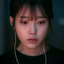
Value in design in The Last of Us and The Last of Us Part II is very important to the atmosphere of the world that the games take place in. The dark values in the game typically contribute to its sense of eeriness and suspense. As you creep through dark, abandoned buildings with your weapon drawn, thinking about what could be lurking in the shadows, it’s the use of value as emphasis that makes you jump when you see something, whether it’s the black silhouette of an enemy walking around far in the distance against the light background, or a Clicker suddenly illuminated by light as it jumps out at you from the nearby darkness. In this image, the way her bow is aimed combined with the value contrasts and the green light source creates that tension and suspense. The light values from the bright green light cast on Ellie’s face heavily contrast the darker values in the rest of the image, and when viewed out of context, it makes you wonder what it is she’s aiming at. Value strongly influences the tone of every moment of the game.
Glossary
Value in design is lightness or darkness on a scale of white to black (with white being the highest value and black being the lowest value). Value is widely considered to be one of the most important variables to the success of a design.
Chiaroscuro (English: kee-AR-ə-SKOOR-oh, -SKEWR-, Italian:; Italian for “light-dark”), is the use of strong contrasts between light and dark with bold contrasts affecting a whole composition. Chiaroscuro is a technical term for the use of contrasts of light to achieve a sense of volume in modelling three-dimensional objects and figures.
Light and dark - Every element in your design has a value from 1% black (almost white) to 100% black. Value is relative to everything in the composition. Every color has an underlying value somewhere between white and black.
Value as emphasis happens when a strong contrast in value draws attention to itself such as on this ancient Greek vase illustrating value contrast in the service of visual storytelling.
Value and space - Designers use dark and light values to create the illusion of light as it falls on objects. Value is used to create the illusion of highlights and shadows. Highlights and shadows combine to create the illusion of a light source. The pattern of light and dark can create dimension, volume, and mass.
Value patterns appear regularly in the world, in human-made design, and even in abstract ideas such as stories. The elements of a pattern repeat in a predictable manner. Night and day is a value pattern common in stories.
0 notes
Photo


Analysis
Color is used to influence the tone and mood of a design. The Midnight Gospel, a Netflix cartoon made by the creator of Adventure Time, uses color in a very special way. In the show, the main character travels different planets in the universe, having philosophical conversations with creatures he meets on the way, and the atmosphere is supposed to be surreal and whimsical and cosmic and trippy. The colors used in the series are exactly that, and play a big role in the impact that the show has on the viewer, helping to create visuals that are pretty magical. The show’s overall palette consists of a lot of pastel, cool-toned colors, and they are incredibly saturated in a way that, to me, is sort of reminiscent of older cartoons from the ‘90s. In the images above, saturation similarities are used along with value contrasts, which creates a sense of unity and depth. The cool colors have a calming, comforting effect on the viewer, while the high saturation makes you feel like you’re really being transported to these other worlds. If you haven’t watched this series, it can be a lot, but I recommend watching it even if it’s just to look at the beautiful colors and animation style.
Glossary
Visible light spectrum is the segment of the electromagnetic spectrum that the human eye can view. This range of wavelengths is called visible light. Typically, the human eye can detect wavelengths from 380 to 700 nanometers.
Color Psychology - Color psychology is the study of the effect that colors have on emotions, behavior and feelings of people.
Color Systems - Color systems classify color and analyze their effects.
The additive color system is used for colors of light such as light emitted from computers, phone screens, and projectors. Red, green, and blue are the primary colors
The subtractive color system is used for pigments such as ink, dye, and paint. Cyan, magenta, and yellow are the primary colors.
Color to Show Depth - Change in Color is to use color to separate the foreground, mid ground, and background planes to create the illusion of depth and is commonly used in animation.
Color Wheel - The color wheel, or color circle, arranges a pattern of hues around a circle. There are several versions of the color wheel or color circle. The circle connects relationships between hues to illustrate color strategies. (see 12 Chromatic Strategies) Color wheel history goes way back.
Local Color - Local color is the natural color of an object unmodified by adding unrealistic light and shadow or any other distortion. The color that the eye observes is altered by lighting conditions such as time of day or the surrounding environment. The local color of a lemon is yellow.
Palettes - The definition of a palette is the range of colors used in a particular composition or by any person who uses color such as an artist, house painter or interior decorator. An example of a palette is Vincent Van Gogh’s limited palette of hues in his Starry Night painting. Starry Night’s palette is a variety of blues, greens and yellows.
Properties of Color - Properties of color are hue, saturation, and brightness. The H, S, and B in the Photoshop Color Panel stand for hue, saturation, and brightness.
Hue is the named color around the color circle such as red, orange, green, yellow, violet, and blue.
Saturation is the intensity or purity of a hue. Fire engine red is more highly saturated than brick red or the color of red wine.
Brightness is the perceived intensity of light coming from a source such as a screen. On a color screen, brightness is the average of the red, green and blue pixels on the screen. Brightness is important to both color perception and battery life on mobile devices. Brightness of a screen can be adjusted.
Symbolism of Color - Symbolism of color in art and anthropology refers to the use of color as a symbol in various cultures. There is great diversity in the use of colors and their associations. Diversity in color symbolism occurs because color meanings and symbolism occur on an individual, cultural and universal basis. Color symbolism is also context-dependent and changes over time.
Color Strategies
1. Monochromatic means variations of a single hue such as a light blue and a dark blue or a greenish aqua blue and a lavender blue.
2. Achromatic color strategy integrates variations of black, white, gray, and a full range of neutrals.
3. Full Spectrum Strategy represents the full circle of spectral colors by incorporating at least five of the base hues.
4. In the Achromatic/Chromatic Mix strategy Achromatic colors dominate the composition with a chromatic hue accent.
5. Warm/Cool: Contrasting ‘temperatures’ of warm & cool. Cool colors appear on the green/blue/violet side of the color wheel. The colors on the red/orange/yellow side of the color wheel are called warm. Emphasis is on the contrast between warm and cool achromatics: brown - gold (warm), grays - silver (cool)
6. Saturation Similarities/Saturation Contrast
Saturation Similarities: Hues may vary in this strategy, but all colors must have the same or very similar saturations.
Saturation Contrast: Hues may vary but all colors must have significant contrast of saturation.
7. Value Similarities/Value Contrast
Value Similarities: Hues may vary in this strategy, but all colors have the same or very close values.
Value Contrast: Black (or dark desaturated hues) contrast with white (or very desaturated tints of hues). The Value Contrast strategy demonstrates strong distinction of value with the strongest example being between black and white
8. Complementary Dyad creates a strong hue contrast. Complementary hues are located directly opposite each other on the color circle
9. Split Complementary strategies are based on two complements. To create a split complementary color strategy select one hue and contrast it with the hues on either side of its complement, such as Red & YellowGreen/BlueGreen.
10. A Tetrad strategy uses four equilateral hues from the color circle, such as Red, Orange, Green, Blue.
11. A Triad strategy uses three equilaterally balanced hues from the color circle, such as primary, secondary, or tertiary.
12. Analogous strategies collect 2 or 3 neighboring hues on the color circle.
1 note
·
View note
Photo

Analysis
Shapes and silhouettes are extremely important in animation, and I think this walk cycle by Andrew J. Bell serves as a good example of what it can do for something even as simple as this short gif. Abstract shapes are used in the design; pretty much all of the shapes that make up the character are abstract, and create a biomorphic design. Even though the scarf, hat, and dress are organic shapes, when put together like this, the viewer can tell what they are. There is a lively bounciness to the character that is created by using squashed and stretched shape profiles. When the character is mid step, the the silhouette is stretched upwards, and when either foot meets the ground, it all becomes squashed. This exaggerates the motion of the character and makes it both more realistic and fun to watch.
Glossary
Shape is the external form or appearance characteristic of someone or something; the outline of an area or figure. As a verb, to shape is to give a particular form. As artists, we shape our characters outward appearance by using shapes.
Abstract Shapes and Abstraction (see Non-objective Shapes) - Abstract means no recognizable objects. Abstraction is a sliding scale from realism to completely non representational. Abstract shapes can be used in backgrounds and textures.
Biomorphic - Biomorphic is a free-form pattern or design with a shape suggestive of a living organism, especially an amoeba or protozoan.
Curvilinear Shapes - Curvilinear shapes are s-curves. Curvilinear shapes inform Jessica Rabbit’s character design and can represent a winding river vanishing into the distance.
Distortion - Distortion is exaggeration, contortion, reform, slant, twist, or warp in ways that depart from reality.
Idealism - Idealism asserts that the physical world is less important than the mind or the spirit which shapes and animates it. Idealists choose the soul, the mind, or the psyche over the body, the material, and the historical. When ideals (of appearance, or proportion for example) regulate the way an artist represents the world, her work can be described as Idealistic. The leading artists of the High Renaissance - Leonardo, Raphael andMichelangelo - are all associated with varying forms of Idealism, as were ancient Greek sculptors.
Non-objective Shapes (see Abstract Shapes) - Non-objective shapes have no object as a reference and no recognizable subject matter. Non-objective shapes are often used to simplify design shapes. Geometric shapes such as a triangle, square, and circle are abstract until you put them together to represent a house or a smiley face. One Minecraft block, away from the game, is anon-objective shape. Inside the game that same block, depending on its color and texture could represent a part of a landscape, sheep, or sword. The block as part of a character or environment inside the game would no longer be abstract.
Positive and Negative Shapes - Positive space is the subject, focal point, or areas of high interest in any composition. Negative space is the area around the areas of interest. All compositions balance positive and negative space. Yes, stuff in the negative space can point to the focal point to make it most obvious. Positive and negative create a whole. Every composition is a combination of positive and negative space. Wield the positive and negative spaces with control and story-telling magic to become a design master.
Realism or Naturalism - Realism, or naturalism, attempts to represent subject matter truthfully, without artificiality or exotic or supernatural elements. In the visual arts, illusionistic realism strives for the accurate depiction of lifeforms, perspective, and the details of light and color.
Rectilinear Shapes - Rectilinear is a boxy shape made with straight lines. For example, the screen you are looking at is a rectilinear shape filled with little square pixels, and pixels are also rectilinear. A storyboard is a series of drawings in a linear set of rectilinear frames.
Representational - Representational means objects that players can name. The object represents something from the real world, or something that has the verisimilitude of realism. A cartoon bunny can represent a rabbit without being realistic. Representational is a sliding scale from realism to almost abstract. 2 dots and a curve can be arranged into an abstract pattern or they can be arranged into an emoji that represents a smiley face.
Silhouette - Silhouette is a profile or shape that is easy to identify.
Squash and Stretch - Squash and stretch are shapes profiles that emphasize motion. The stretched position shows the form in an extended condition. When you do a sit up your belly squashes and your back stretches.
1 note
·
View note
Text

Analysis
Lines are used to create drawings, or to sketch out characters ans environments. In this drawing by Hana Chatani, line as value is used in their clothing, showing how the shorts and T-shirt are darker, and also depicting shadows on the pants, as well as on the shirt where it's being grabbed. The lines used are explicit, making the drawing easy to read. Heavier line weight and overlapping lines are used to create depth and shadow underneath the flowers and the person on the right. Lines are being used in a simple but very expressive way to visualize these two characters, making a drawing that is fun to look at and inspiring enough to add to my illustration board on Pinterest.
Glossary
Lines have both a direction and a length. Line means a mark, streak, stroke, slash, path, stripe, border, contour, striation, course, route, and track. Curved, bent, thick, wide, broken, vertical, horizontal, burred, or freehand, lines delineate shapes, forms, and spaces, volumes, edges, movement and patterns. Not only that -- lines create both 2D and 3D objects and figures. Lines are awesome and powerful.
Contour Lines - Contour lines indicate the edge around an object or the changes in volume within an object. Contour lines dramatize changes of plane within the form. The curve of a belt around the waist is a contour line.
Diagonal Lines - Diagonal Lines are useful to draw the eye into a composition such as toward the vanishing points. Three common types of diagonals are 1) actual diagonal lines 2) objects placed diagonally in a scene 3) a diagonal line created by the viewpoint such as the Dutch tilt.
Dutch Tilt - Dutch Tilt (known as a dutch angle, canted angle, or oblique angle) is a type of camera shot that has a noticeable tilt on the camera’s “x-axis.” The Dutch tilt camera technique was introduced by German Expressionists in the 1920s — so it's not actually Dutch. Directors often use a Dutch angle to signal to the viewer that something is wrong, disorienting, or unsettling.
Explicit Lines - Explicit means clear, direct, and obvious. If a drawing is easy to read it may be that the lines are explicit, clean, with efficient use of variety. There are explicit lines around the frame of the Dutch Tilt illustration.
Gesture Lines - Gesture Lines capture motion, such as in an action pose when gesture drawings are used in storyboards.
Implied Lines - Implied lines in 3-D scenes a line in a scene that is not physically there but is suggested by points in the art. Implied lines suggest the edges of an object or planes within an object. The line may be broken such as a dotted line, it may be defined by value, color, or texture, or it may not be visible at all. With implied lines, our brain interprets that aline exists.
Line as Value - Line As Value has a long history. Artists have used line drawings to create value, or shading, and to achieve the impression of volume.
Line of Action (Also see motion) - Line of action is an imaginary line that extends through the main action of the figure. When you draw an action figure you can capture the line of action on one layer then draw the figure drawing on another layer.
Line Quality - Line quality is the expressive essence of lines. Varying the line quality makes objects appear more 3-dimensional and exciting. Range in line quality heightens descriptive and suggestive potential. A single line can change in darkness and width, can vanish altogether to mentally reconnect later on an edge.
Line Weight - Line weight refers to the thickness or thinness of a line.
Lost and Found Lines - We don’t really need a strong contour line around every part of an object because our brain will fill in the blank where the edge disappears. When a line fades out and then restarts further along the edge it is called a lost and found line.
Psychic Lines - Psychic lines are invisible. Psychic lines form between characters or between a gun and a target, or a hand pointing in a direction. There is no real line yet we feel a line. Eyes looking in a direction, especially characters looking at each other create a psychic line.
1 note
·
View note