
Statistics
We looked inside some of the posts by colorcomictheory and here's what we found interesting.
Average Info
Notes Per Post
2
Likes Per Post
2
Reblog Per Post
0
Reply Per Post
0
Time Between Posts
18 hours
Number of Posts By Type
Quote
1
Text
11
Last Seen Tumblr Blogs


Fun Fact
70% of Tumblr users say the Dashboard is their favorite place to spend time online.
Quote
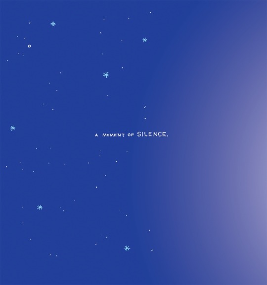
...the idea that cancer, like a MALEVOLENT PINWHEEL, tended to spread in ever-growing arcs from a single central focus in the body...
Siddhartha Mukherjee, The Emperor of All Maladies
1 note
·
View note
Text
Welcome!
Artists, Scientists, Writers, and specifically Graphic Novelists, all have a common ground - they all dive deeper into their respective works hoping the audience will take note and interpret beyond the surface. Color Comic Theory is going to explore the specific color use through an array of cancer comics to provide personal insight from an artistic point of view. Enjoy! :)
(- Matthew Mewhorter, Cancer Owl)
0 notes
Text
Intensity
When multiple colors are used in art, the vibrance can sometimes reflect the personality of the main characters. In Cancer Vixen, Marisa has a bold presence which is captured perfectly through the art.

In The Death of Captain Marvel, Mar-Vell’s superhero status cannot be missed as the intense hues capture his actions all while conveying yet another bold personality.

1 note
·
View note
Text
Feeling Blue
Emotion is the key to any form of art, the way something makes an audience feel is what distinguishes masterpieces from the mundane. In film it is much more simple to showcase feelings as moving pixels and sound usually do the job. So where does that leave comics? Due to this popular phrase, we often associate the color blue symbolizing sadness. In comics we get to explore the literal use of blue shades in order to emphasize grief.


Here we see a powerful mood of sorrow as Mar-Vell’s friends/comrades gather around to morn him impending death. In the second picture the transitioning of color to a cold blue takes a literal representation as death is like this in the real world. Grief, loneliness, and pure emptiness fills these panels and reflects a reality of many cancer patients and their loved ones.
0 notes
Text
No ROYGBIV?
No worries! Not every color has to be included in order to make a point. Actually, the lack of the rainbow can sometimes draw out darker and intense emotions. The black and white scale can encompass what families are feeling during these dark times.
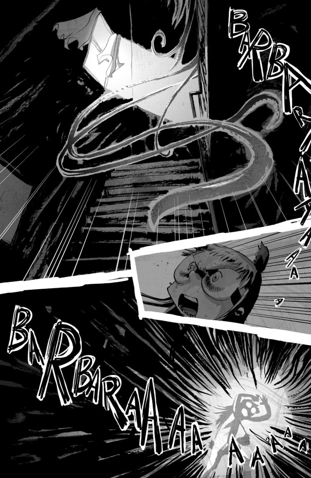
From I Kill Giants, Barbara encounter this pitch black void which is later revealed to be a room where her mother, who is suffering from cancer, resides. This black color gives off the feeling that gravity is crushing the girl, inducing panic and anxiety. The color black seems to hold a weight on her, which keeps her from accepting her reality.
0 notes
Text
No ROYGBIV? Pt. 2
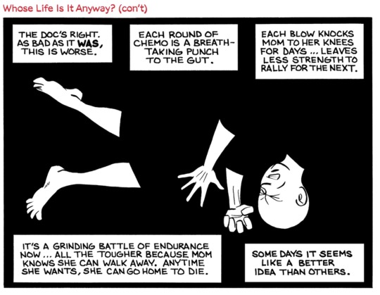
In Mom’s Cancer, the mother is filled in a void of her own as the artist engulfs her in it. In this the use of black and white portray the gut wrenching emotions of afflicted patients who have to go through painful chemotherapy. Also note the significance of her middle body in black as it is where the heart and soul lie.
0 notes
Text
Light vs Dark Pt 1
An old retired phrase, yet it still holds its ground in many stories. Light vs dark, evil vs good, all concepts we hear growing up. In cancer comics this stays prevalent as it helps distinguish the us from the illness.


The giant Barbara faces emits dark tones while she remains surrounded by light. This is an intentional use of shades as it emphasizes her will over the giants. The giant is the supposedly enemy, and like any other form of art darkness = evil.
0 notes
Text
Light vs Dark pt 2
Cancer Vixen, takes a different approach to the light vs dark as it is in color.
A dark blue night followed by an illuminating light.

At last a glimmer of hope as the candles light manages to provide warmth. Light vs Dark here stands for hope. The shading and warm color use of the light is supposed to comfort and reestablish any faith that may have been lost. Marisa, the main character, holds on to this feeling of hope as she battles her inner turmoil with cancer and how it may shape her life.
0 notes
Text
In a Grey Area
What happens when you mix the colors white and black? We get a middle ground color of grey. Significance? Plenty! Cancer comics seem to use the color grey as a symbolism of confusion.

Whether it is the patient or loved one understanding the process of cancer can be a confusing time. The term “in a grey area” is displayed literally to provide emotional context of being puzzled. In black in white comics shading is a key player in helping to decipher and tie in a meaningful message. In Mom’s Cancer, we see that grey is being used to indicate an unclear mind.
0 notes
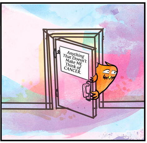
Text
Before
Black and white can also be used to show a grim time. Often times commercials use this effect to gain attention and market their products in order to improve someones life. Black and white used as the before, and color used as the improved version.
0 notes
Text
Remarks.
Cancer comics use colors in their art to relay powerful emotions to the audience. This is meant to captivate us and teach us something we have or have not experienced. Picture art in the combination of phrases can move mountains, as one can interpret the message in its own way. Color particularly adds an extra factor that sheds light on this illness. The color, or lack of, stands in for metaphors as words alone cannot relay the message of the graphic novelists. “The easiest way for us to access innate visual language seems to be with a crayon”(MK Czerwiec, Graphic Medicine Manifesto: The Crayon Revolution). With this said I’ll leave you with a science fact, in respect to light, white is the cumulation of all colors, and black is the absence...
0 notes
Text
After

Here in the mother’s after moment she is depicted in color. Almost as if the cancer before drained the color out of her. Now she is given her color back, showing her power has been taken back from the cancer. Something that cancer patients may experience and be able to connect too.
0 notes