
Don't wanna be here? Send us removal request.
Statistics
We looked inside some of the posts by communedesign and here's what we found interesting.
Average Info
Notes Per Post
2K
Likes Per Post
1K
Reblog Per Post
398
Reply Per Post
7
Time Between Posts
20 days
Number of Posts By Type
Text
17
Last Seen Tumblr Blogs


Fun Fact
Tumblr has 411 employees.
Text
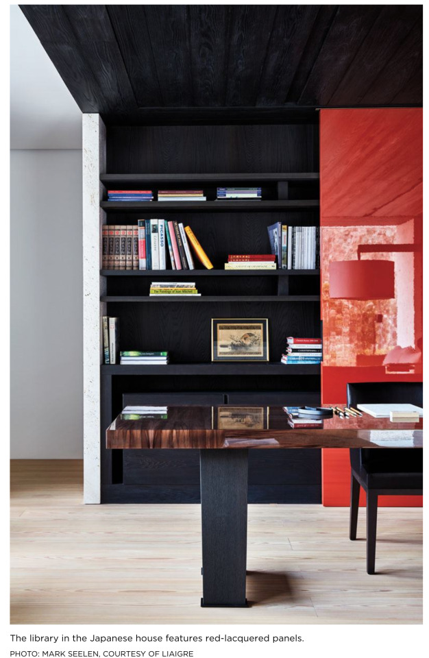
Christian Liaigre, 1943-2020
“This mellifluous minimalism has been created by Christian Liaigre, a Paris-based furniture and interior designer, whose noble, sculptured African-inspired stools and tables in wedge and iroko woods furnish the hotel. The result is a marriage of Franco-American style that seems both International and homey. Think of a bedroom where there are three telephones (including a portable), a CD player and a lounge lizard’s lilac banquette — but also a foyer where guests are welcomed with artsy books (the paintings of Alex Katz, the life of Paul McCartney and the art of Africa).”
Suzy Menkes, “Loft Life at SoHo’s Mercer: Zen and the Art of Hotel Serenity”, The New York Times, March 31 1998.
The last line of this paragraph from an article written just after the opening of the famed Mercer in SoHo speaks to something we’ve long admired of the late Christian Liaigre. He had a keen awareness of the elements that make a space feel both incredibly special and yet unexceptionally familiar. Perhaps ‘lived-in’ suffices. We owe a great deal of gratitude to him for his pioneering of the modern hotel ambiance wherein a patron is made to feel very much at home while being consistently reminded of the thoughtful details that encompass the hotel’s design.
Thought Liaigre was masterful in his understanding of both comfort and function, he designed with a level of restrained sophistication that was unique to that aforementioned Franco-American style. Born in France to a family of horse breeders, it’s clear that his appreciation for the small details of a design came directly from this equestrian world, where the color of stitching on a saddle would be as important as the quality of the leather from which it is made.
The Mercer Hotel, iconic as ever, comes clear to mind as the epitome of this effortlessly chic style, but only serves as one example within the vast portfolio of Liaigre’s work. In honor of his recent passing, we’ve chosen to focus our attention on several of his quintessentially “Liaigre” projects. You’ll find in the images below his designs for villas in Switzerland and South Korea as well as his flagship showroom.


66 notes
·
View notes
Text
Jorge Zalszupin, 1922-2020
We’ve been having an intense heatwave this past week in LA. It’s the kind of heat that hits you square in the face as soon as you step outside, and wraps around each inch of you as if to remind you of your imminent vulnerability to the elements. It’s also the kind of heat that’s forcing us think about the ways we as humans and we specifically as designers respond to climate, to environment, to temperature.
This same week, we learned of the passing of a hero: Polish-Brazilian architect and prolific furniture designer, Jorge Zalszupin. We take pause on the fact that we are honoring all 98 years of this man’s life during a time when we’re experiencing the sort of weather he undoubtedly endured throughout his career in Brazil. The shapes embodied by his furniture ask us to feel the radiating heat in our bones. They’re evocative of melting and morphing and succumbing to nature’s reality.
Of course, Zalszupin is part of a group of Brazilian architects and designers we call upon frequently for guidance and inspiration (think: Tenreiro, Neimeyer, Burle Marx). His architectural roots, however, stem from Paris via Bucharest where he studied, and Warszaw, where he was born. It was in Paris where he became sparked by the prospect of moving to Brazil and working with the sorts of architects that seem to only exist in that part of the world. So Zalzsupin made the leap. He moved to Sao Paolo and began designing furniture using materials sourced from his newly acquired homeland. He eventually formalized furniture design as a profession and joined the firm L’Atelier, where he designed the infamous pieces we’re showcasing here.
We are forever in awe of his attention to detail and use of native materials, so we took care to include a few key detail shots here.
Thank you, Jorge Zalszupin, for your strikingly beautiful work. We hope to continue to honor your legacy of thoughtfulness, of an unrelenting application of native materials, and of connecting deeply and consistently to nature first.

All photos via Espasso, R&Company, and Mass Modern, unless otherwise noted.


56 notes
·
View notes
Text
Parks
2020 has undeniably become the year of the road trip.
To honour this last bastion of summertime in America, we’ve dug up one of the most prized books in our library, Parks by Brian Kelley. It’s a meticulous documentation of US National Parks maps, guides and brochures from the past hundred years or so, though we’ve chosen to focus on our favourites from the sixties. This group of ephemera when bound together form a really beautiful record of the sort of publicly available art we risk overlooking. Each is bold and thoughtful in its aesthetic but remains utilitarian at the core. To acknowledge how clever they are as artworks feels like being in on a secret, and perhaps adds to why we find them so compelling. Here’s to more of that. To finding the beauty in the everyday, to celebrating the democratic places we can all share and to spending our time exploring.
Drive safely, America.
____
No claim to original U.S. Government works. All of the material shown in this book are property of the United States National Park Service, unless otherwise indicated. © National Park Service U.S. Department of the interior.
Photographs and scans © 2019 Brian Kelley


119 notes
·
View notes
Text
Clara Porset
What makes Clara Porset’s work so broad, so variant, and so universally admired is marked quite simply in the chapters of her life story. She was a vagrant of her time, a person of the world who collected the teachings of each of her adopted homes. Though Cuban by blood, she fled to Mexico as a young girl, educated herself in Paris, in New York, and even at Black Mountain College in North Carolina, only to finally weave all of these experiences into a life rooted back in her native continent. Understanding and honoring the vast and deep Mexican craft tradition became her raison d’etre. And as such, perhaps no other artist understood the usage of native materiality in the ways she seemed to. But, combining this deep appreciation for the traditions of Latin America with a uniquely traveled -- and modern -- perspective gave Clara Porset a voice that handily spans time and place.
To put it short, it is beyond time that we honor Clara Porset for the contributions she herself made to the history of mid-century design. For years, she was overshadowed as the female half of a heterosexual life (and design) partnership. But records and all accounts detail at length the monumental work for which she was responsible. Throughout her career, she designed for incredibly respected people (Barragan, for example) and was the sole contributor to many exhibitions, all the while providing designs under hers and her husband’s name for a series of furniture companies, architects, and interiors firms.
Clara, thank you for your perseverance and your incredible vision. The balance we aim to strike between an unapologetic exploration of modernity and an equally as stubborn insistence on tradition was your very vision. We look to you and we thank you.
All photos are taken from the book Clara Porset’s Design: Creating a Modern Mexico.


Drawing for the furniture Clara entered into the competition Organic Design for Home Furniture, Museum of Modern Art, New York, 1941

Clara and her chief of production in the workshop, circa 1951-1952


Chairs by Clara in Julius Shulman’s studio, Southern California, 1952

Xavier Guerrero at the Ciudad Escolar Camilo Cienfuegos, Cuba, 1962

Clara Porset and Xavier Guerrero


Clara’s office on Hamburgo Street, Mexico City

Exhibition El arte in la vida diaria, Palacio de Bellas Artes, 1952

Exhibition El arte in la vida diaria, Palacio de Bellas Artes, 1952


The Shulman House, Southern California, 1952

Chairs, Pierre Marques Hotel, Acapulco, 1957

Garden Chairs and Table, Pierre Marques Hotel, Acapulco, 1957

Chairs and Table, Pierre Marques Hotel, Acapulco, 1957

Beach Chairs, Pierre Marques Hotel, Acapulco, 1957

Pool Chairs, Pierre Marques Hotel, Acapulco, 1957


Iconic pieces from Clara’s catalog of work:


Wonderful posters representing the many exhibitions Clara was featured in:


84 notes
·
View notes
Text
Paul Revere Williams
One of the things we cherish about LA is its unabashed approach to architecture. The motley crew of buildings on any given block could reasonably be described as brutalist or Spanish revival or mid-century modern and none of this would be out of place. It’s a weird, beautiful mess of a thing, this city we call home, and we don’t often pause to think about just how it ended up this way.
Paul Revere Williams (1894-1980) is, in large part, the reason why. He was the father of the built city of LA, and it wouldn’t be far-reaching to say that it was he who set the audacious tone for architecture in LA. Because he lived here during the dawn of the movie industry, during the build up and the destruction of the historic downtown core, and during the formation of the haunting web of LA freeways, Williams was able to bear witness to this city in its adolescence, when it was at its most impressionable. Because of this, any and all architectural styles were fair game to Williams and his collaborators, and Williams embraced this with an unprecedented ability. His accomplishments were many (he served as architect for the US Navy, he was the first African American member of the American Institute of Architects, he designed for Frank Sinatra & Lucille Ball..) and this city is forever indebted to his brilliant mind.
Below are a few examples of Williams’ most iconic buildings and the ones from which we have sought most inspiration. It is impossible to capture the sum of his architectural parts, because his portfolio is simply so vast. To see more and learn about his impact on the landscape of LA, we highly recommend watching the PBS documentary, “Hollywood’s Architect”

Paul Williams served on the board of architects designing the new LAX, completed in 1961

Roosevelt Naval Base, San Marino, 1943
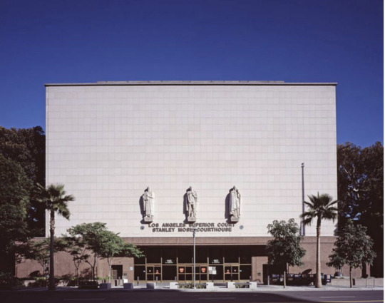
LA County Courthouse (Joint venture with JE Stanton, Adrian Wilson, Austin, Field & Fry), 1955

Saks 5th Avenue, WIlshire Blvd, Los Angeles, 1930
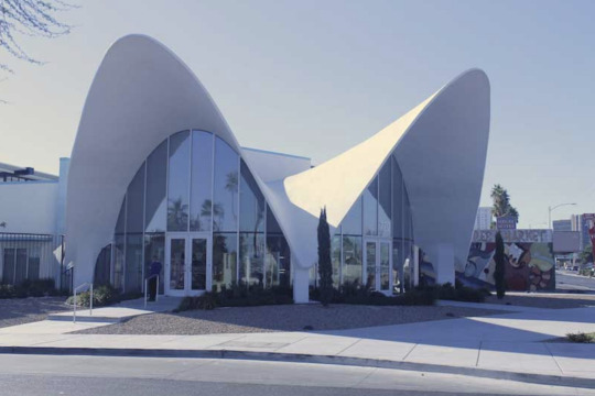
La Concha Motel (now the Neon Museum), La Vegas, 1961

Al Jolson Shrine at Hillside Memorial Park, 1950

Shrine Civic Auditorium, Los Angeles, 1921
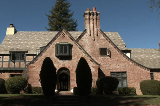
John B Green Residence, Los Angeles, 1927

Second Baptist Church, Los Angeles, 1925

Palm Springs Tennis Club (with A Quincy Jones), 1947

Palm Springs Tennis Club, 1947
Palm Springs Tennis Club, 1947

Paley Residence, Los Angeles, 1938

Zodiac Pool at the Paley Residence, Los Angeles, 1938

Zodiac Pool at the Paley Residence, Los Angeles, 1938

Zodiac Pool at the Paley Residence, Los Angeles, 1938

Beverly Hills YMCA, 1929

Paul Williams in the Fountain Club at the Beverly Hills Hotel, where he renovated and added what is known as the “Crescent” extension, 1949

Paul Williams (second from left) explaining his model of the Golden

Poster of Paul R Williams from the Office of War Information, Domestic Operations Branch News Bureau, 1943
The following images are from the book Paul R. Williams, Architect: A Legacy of Style.


The following images are from the book Paul R. Williams: Classic Hollywood Style


56 notes
·
View notes
Text
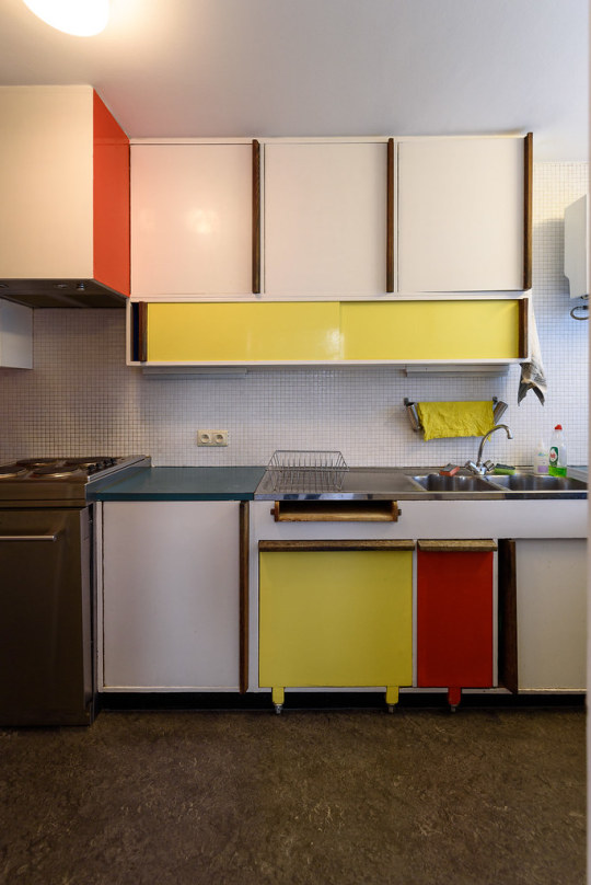
Renaat Braem
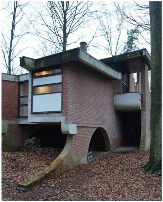
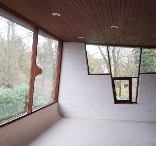
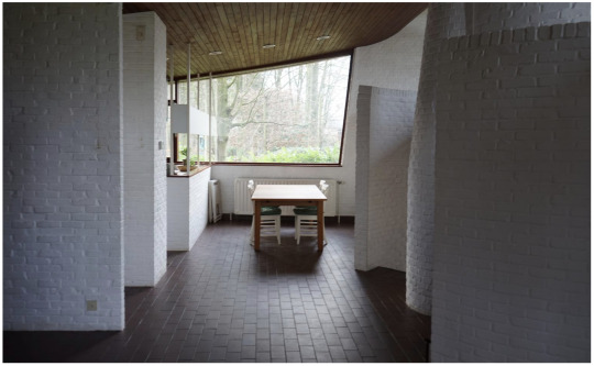
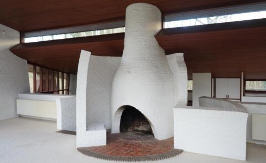
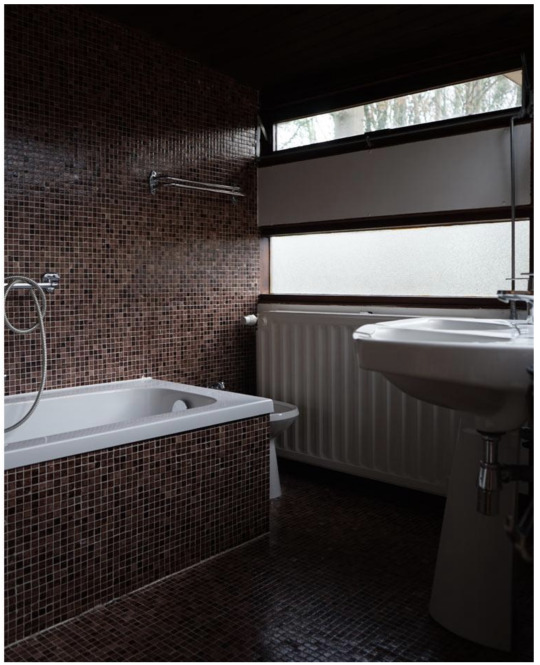
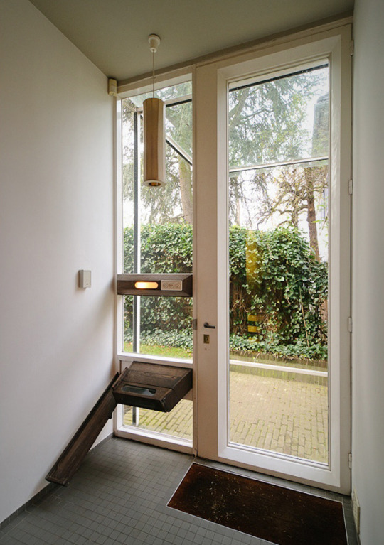
Wanderlust is consuming us at the moment. Our mind’s eyes are whisking us away to the places where our feet cannot, and we’re here to help supply the imagery. This week, we’re mentally in Belgium, observing the architecture and design of one of the country’s finest, Renaat Braem (1910 - 2001). Having grown up in Belgium at the height of the art deco era, Braem’s attention to the decorative -- but prescriptively simple -- details marks his architectural practice. This careful balance is something akin to very few others practicing architecture at the middle of the 20th century. If, however, Le Corbusier comes to mind here it’s because Braem worked for (and undoubtedly absorbed from) his Paris studio just after graduating in 1936. His young mind was acutely impressionable to the minutia of Le Corbusier’s design process, which is why we see such similarities in terms of volume proportions and experimentation with materiality.
The two homes shown here we feel represent Braem’s aesthetic succinctly but thoroughly. The first is the Alsteens House in Oversije, Belgium and the second is Braem’s own home in Antwerp. At Commune, we tend to align ourselves with designs that employ unexpected colour and unusual material combinations, but that are restrained in their careful placement of each. His home kitchen is perhaps the holy grail example of this and we’re big fans.
The last image shown is of a chair designed by Braem. It’s fascinating to see the connections and contrasts that appear between furniture designs and architectural designs from the same hand. In this instance, the balance of shades and expressiveness of form relate directly to the curves and tonality in his architecture.

Alsteens House, Overijse, Belgium
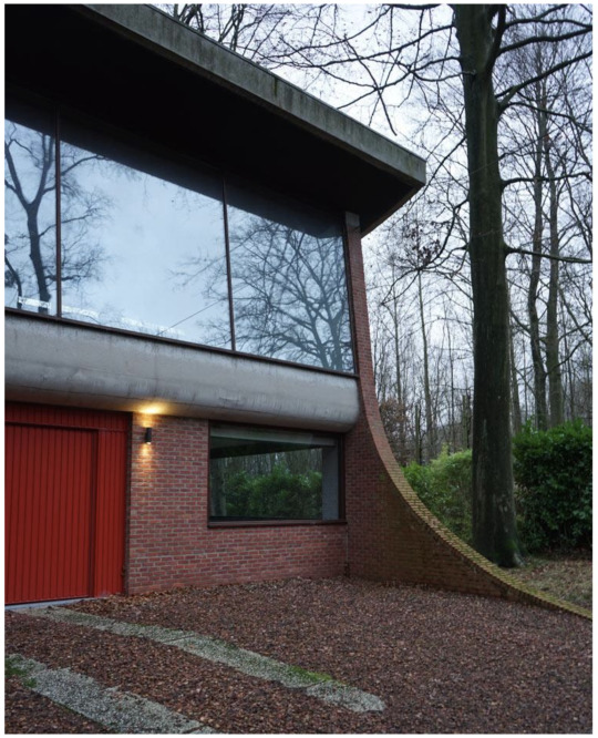
Alsteens House, Overijse, Belgium
Alsteens House, Overijse, Belgium
Alsteens House, Overijse, Belgium
Alsteens House, Overijse, Belgium

Alsteens House, Overijse, Belgium

Alsteens House, Overijse, Belgium
Alsteens House, Overijse, Belgium

Braem House, Antwerp
Braem House, Antwerp

Braem House, Antwerp
Braem House, Antwerp

Braem House, Antwerp

Braem House, Antwerp

Braem House, Antwerp

Braem House, Antwerp

Braem House, Antwerp

Organic Chair, 1952
41 notes
·
View notes
Text
Finding Solace: de Kooning
We’re committing ourselves to inspiration. As creatives, we find solace in our work; we must come together in reassurance that this solace is indelible. At times of fear, we’re grounded by our creative touchstones, and for this we’re committing ourselves to gratitude as well. While the world is heavy with a grief of the sort that feels deep and immovable, we hope our Daily can be a source for pause on the beauty that persists in the face of it all. Over these next several weeks, as we settle into new routines at home, we’ll be highlighting artists who have sought comfort in their creative environments. We’re inspired by these artists throughout history – and now – who have retreated to their homes, to their studios, to be immersed in the solace of their work.
We’re inspired, we’re grateful, and we’ll get through this together.
————
For the last of our “Finding Solace” series we’ve decided to feature another set of photos from Daniel Frasnay’s “The Artist’s World” (barring the first three images, which come from an archived spread on de Kooning’s home and studio in AD, 1982). We’re staunch admirers of Frasnay’s photography because he offers an intimacy often unexplored in profiles of artists and their process. These photos in particular include portraits of de Kooning which reveal how playfully he interacted with his surroundings in East Hampton, where he lived from 1963 until his death in 1997.
We love this space not for its grandiosity but for its character and for its clear and deep resonance with who de Kooning was as a painter. Paint pots are overflowing and newly christened canvasses are left teetering in the vastness of it all. However, the impossibly tall and bright ceilings handle the frenetic colours ever so gracefully. This balance feels -- dare we say -- evocative of a de Kooning painting itself. And it this realization, perhaps, that becomes the grand thesis of this Finding Solace series we’ve embarked upon. In our quest to see creative people in their spaces, we’ve unearthed something simple and pointed. There will always be something toothsome about discovering an artist’s studio married with their work, because the artists and their spaces are truly mirrors of each other.
A short video, produced by Christie’s, featuring the long island home can be viewed here.


23 notes
·
View notes
Text
Find Solace: Miró
We’re committing ourselves to inspiration. As creatives, we find solace in our work; we must come together in reassurance that this solace is indelible. At times of fear, we’re grounded by our creative touchstones, and for this we’re committing ourselves to gratitude as well. While the world is heavy with a grief of the sort that feels deep and immovable, we hope our Daily can be a source for pause on the beauty that persists in the face of it all. Over these next several weeks, as we settle into new routines at home, we’ll be highlighting artists who have sought comfort in their creative environments. We’re inspired by these artists throughout history – and now – who have retreated to their homes, to their studios, to be immersed in the solace of their work.
We’re inspired, we’re grateful, and we’ll get through this together.
————
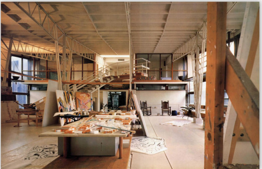
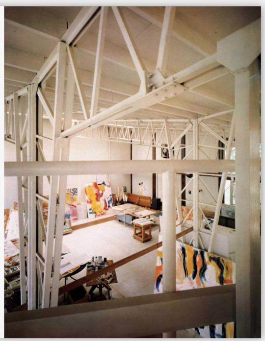
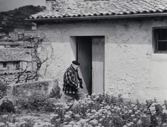
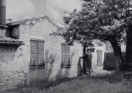
For our solace this week, we’re traveling to Mallorca. This was where Joan Miró manifested his dream-like studio, Taller Sert.
We’re particularly interested in the history of the architecture behind Taller Sert, and how it both successfully exposed and happily engulfed Miro’s artistry. In terms of the built structure itself, the plans were drafted by renowned Spanish architect Josep Lluís Sert, with construction completed late in 1956. Sert sought to embrace Mallorca’s unique hillside geography and sun drenched mediterranean climate. Upon reflection, the organic shapes of the roof structure mimic the hills within which the studio is nestled. Hallmark usage of concrete serves as contrast to the native earth tones of the existing land, highlighting the environment further.
Being an artist’s studio, the space planning was meticulously determined by usage. Walls were sized according to Miró’s specific canvas dimensions, storage was provided in ways that begged the inspired painter to live amongst his objects-as-muses. Shelves were provided generously for display. Light was beckoned in. The studio ultimately became a space indicative of the work being made within its walls: as far reaching in modernity as it is grounded in history, as decorative as it is primitive.
All images are by Daniel Frasnay from his book “The Artist’s World”.


80 notes
·
View notes
Text
Finding Solace/Picasso
We’re committing ourselves to inspiration. As creatives, we find solace in our work; we must come together in reassurance that this solace is indelible. At times of fear, we’re grounded by our creative touchstones, and for this we’re committing ourselves to gratitude as well. While the world is heavy with a grief of the sort that feels deep and immovable, we hope our Daily can be a source for a pause on the beauty that persists in the face of it all. Over these next several weeks, as we settle into new routines at home, we’ll be highlighting artists who have sought comfort in their creative environments. We’re inspired by these artists throughout history – and now – who have retreated to their homes, to their studios, to be immersed in the solace of their work.
We’re inspired, we’re grateful, and we’ll get through this together.
————
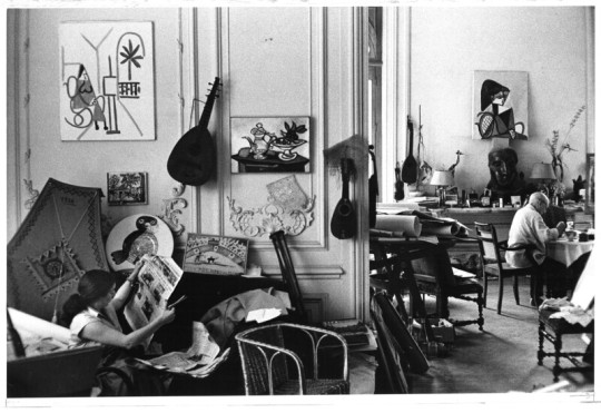
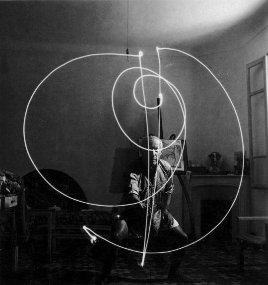
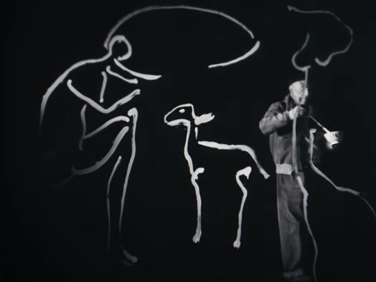
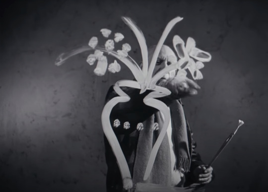
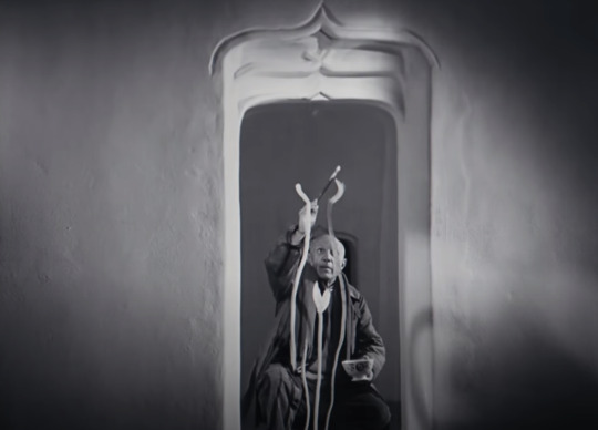
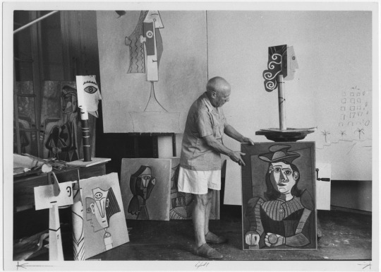
This week’s focus is on Picasso and his studio on the ground floor of the famed Villa La Californie in Cannes. The swaths of fabric, iconic furnishings strewn and juxtapositions between the ornate villa walls and his canvases of abstractionism reveal that Picasso’s working environment mapped itself much like the composition of his artwork. It is rife with a playfulness and whimsy for which we all seem to find ourselves yearning these days.
Images here are from a series of photographs taken by David Douglas Duncan as well as stills from this incredible video we found: https://www.youtube.com/watch?v=jyaPbReAumw
The importance of working his environment was put perfectly by Picasso himself, in conversation with Brassai:


66 notes
·
View notes
Text
Finding Solace/Constantin Brancusi
We’re committing ourselves to inspiration. As creatives, we find solace in our work; we must come together in reassurance that this solace is indelible. At times of fear, we're grounded by our creative touchstones, and for this we’re committing ourselves to gratitude as well. While the world is heavy with a grief of the sort that feels deep and immovable, we hope to be a source of pause for the beauty that persists in the face of it all. Over these next several weeks, as we settle into new routines at home, we’ll be highlighting artists who have sought comfort in their creative environments. We’re inspired by these artists throughout history – and now – who have retreated to their homes, to their studios, to be immersed in the solace of their work.
We’re inspired, we’re grateful, and we’ll get through this together.
------------
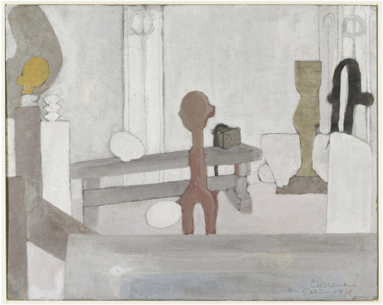
This week’s focus is on Constantin Brancusi, and the world he created at Impasse Ronsin, a series of studios in an alleyway in Paris' 15th arrondissement. Although he was first to move there in 1917, the Impasse Ronsin became a creative incubator where Brancusi lived and worked amongst many colleagues and apprentices (as in the likes of Yves Klein and Isamu Noguchi, respectively) until his death in 1957.
Though incredibly seminal artists occupied the other studio spaces over his tenure there (a very casual list including Man Ray, Marcel Duchamp, Max Ernst, Les Lalanne..), Brancusi’s studio was at the physical heart of it all. He knocked down walls and opened up ceilings to create spaces in which he would display his work. As a sculptor, he was keenly aware of the relationships his three-dimensional works had with their immediate environment. For this very reason, his studios and galleries became works of art in their own right. The pieces were placed in space just so, one could easily presume with the intention to catch light at certain times of day, or to interact within a specific palette of colour and texture. The volumes together formed miniature skylines, which undoubtedly evolved both out of necessity and with great care.
Pictured here are photos of Brancusi and his studio throughout the years he lived and worked in the space. There are also really beautiful depictions of the studio he rendered in paint and charcoal. Lastly, you’ll find images of the studio as it was commissioned to be recreated for the Centre Pompidou. The architect for that project, completed in 1997 was Renzo Piano.

Constantin Brancusi in his studio.

A self portrait of Brancusi, the first artist to move into the Impasse Ronsin in 1916, with his white collie, Polaire (copyright Succession Brancusi)

Atelier Brancusi, 1956, Impasse Rosin (Copyright Succession Brancusi - Photo courtesy of Paul Kasmin Gallery)

The layout of the studios, drawn by Brancusi's friend, the painter Alexandre Istrati (copyright Succession Brancusi)

A postcard of Rosin (courtesy of Paul Kasmin Gallery)

Japanese-American sculptor Isamu Noguchi, who apprenticed for Brancusi at Ronsin), 1927 (copyright Archives of the Isamu Noguchi Foundation and Garden Museum)

Brancusi's sculpture-filled studio (copyright Succession Brancusi)

"Untitled (View of the Studio with Endless Column, Beginning of the World, Adam and Eve, Bird in Space, and Torso of a Young Girl", Constantin Brancusi, 1922, via MoMA

"Untitled (Self-portrait in the studio)", Constantin Brancusi, 1922, via MoMA

"Untitled (View of the Studio with Bird in Space), Constantin Brancusi, 1923, via MoMA

Studio in 1921 (Brancusi, Tristan Tzara, Berenice Abbott, Mina Loy, Jane Heap, Margaret Anderson)

Swiss sculptor Jean Tinguely (left) and the French painter Yves Klein with collaborative spinning object "Excavatrice de l'Espace" 1958 (copyright Roger Viollet/The Image Works/Artists Society New York)


"View of the Artist's Studio", Constantin Brancusi, 1918 (via MOMA)

Reconstruction of his studio in situ at the Centre Pompidou, by Renzo Piano


copyright Adam Marelli

copyright Adam Marelli

copyright Adam Marelli
72 notes
·
View notes
Text
Commune ♥️ Japan: Ikebana
We’ve been spending a great deal of time in Japan over the past five years and as our projects there culminate we’d like to highlight a few things we love.
This week we’re focusing on something born right out of the city that’s consumed us: Kyoto. It’s a practice called ikebana, or “making flowers alive”. We find ourselves completely and utterly obsessed with its core principle that one small object (in this case a plant or a flower) can show us the depths of the beauty in our universe. Nothing superfluous need be present, a stem or leaf itself is enough to understand the beauty. This restraint and respect for a humble material is something we so admire about Japanese design, and ikebana embodies it fully.
The trajectory of ikebana as practiced in Japan follows the growth of Buddhism from the sixth century onwards. Once Buddhism arrived by way of China, many people converted, temples were built, and the ritual of leaving offerings for Buddha quickly took hold. These offerings often arrived in the form of flowers, and naturally, the flowers began to be arranged and sculpted in specifically meaningful ways. This history is rooted in the Rokkaku-do temple in Kyoto, where the earliest school for ikebana was formed: Ikenobo. It was there where the principles of ikebana were established, which now act as a set of guidelines by which to practice ikebana everywhere. These rules dictate shape, line and form and demand that the arrangement is naturally graceful in its simplicity, but always reflective of the maker’s emotions. This relationship of the maker to the arrangement is critical, as the makers are asked to arrange the ikebana in quiet solitude in order to emphasize clarity of emotion. In terms of color, each stem is evaluated for its respective physiological effects (the messages the color gives to us from nature itself), and is left as minimally altered as possible. In short, the arrangement should feel ‘found’ instead of ‘forced’.
There are thousands of schools of ikebana at this point, but they all harken back to a few key principles: simplicity, balance, and manifesting an aesthetically pleasing prepresentation of heaven/earth/humanity (each aspect of the arrangement represents one part). Since the point of ikebana is for the maker to connect to nature, the latter three symbols are critical in understanding why it’s such a simple arrangement and why it’s so minimal. For example, in the Moribana style, the tallest branch represents heaven, the medium height flower or branch represents the human, and the lowest height branch represents the earth. They exist in beautiful harmony. The shallow bowl they sit in exists to remind the maker and the viewer that this is a serving (offering) and not just a pretty arrangement.
The images here are from three books we have from the 1960s. Beyond the fact that they show textbook examples of ikebana, we think the colors and proportions are out of this world.


94 notes
·
View notes
Text
The Los Angeles of John Baldessari, 1931-2020

“Don’t look at things — look in between things.” - John Baldessari
In between things. The intersection of unlikely subjects. The cracks in our everyday. John Baldessari loved these places. He sought them out through his artistic practice. His work became a means to understand our world better by exposing the seemingly mundane and the regularly overlooked. Through the usage of simple techniques such as bold text paired with unexplained imagery, unexpected colours added to otherwise dull scenes, or pairs of images in apparent resistance towards one another, Baldessari highlighted aspects of humanity that oft fell to the background. This started a unique dialogue within the realm of contemporary art, and began right here in his Los Angeles studio.
A Californian by birth, Baldessari chose to plant himself in and around the LA for what appears to be very strategic reasons. After stints teaching at various art schools, his legacy was forged most deeply at UCLA, where he mentored an impressive roster of students who have become the face of American contemporary art. In fact, it can be (and is) said that Baldessari was responsible for the renaissance of art in Los Angeles. The sense of humour in his pieces, the embracing of the absurd and the boring, have always felt so quintessentially LA and perhaps always will. LA at its core is a city filled with opposites, we have no trouble finding ‘beauty’ in unexpected places. The same can be said for Baldessari’s pieces. Beyond the compositional genius, Baldessari’s pieces reveal what it looked like to be a human who observed thoughtfully, and without restraint; and who embraced all of the quirks and nuances of a richly varied home.
Thank you, John, for your indelible mark on this city and for forcing us to think and discover. We’re forever grateful.

The Backs of All The Trucks Passed While Driving From Los Angeles To Santa Barbara, California. Sunday 20 January 63. 1963. Courtesy of John Baldessari Estate.

The Spectator is Compelled... 1966-68. Courtesy of John Baldessari Estate.

Tips for Artists Who Want To Sell. 1966-68. Courtesy of John Baldessari Estate.

Pure Beauty. 1966-68. Courtesy of John Baldessari Estate.

What Is Painting. 1966-68. Museum of Modern Art, New York.

I Will Not Make Any More Bring Art. 1971. Museum of Modern Art, New York.

Kiss/Panic. 1984. Courtesy of John Baldessari Estate.

Untitled. 1986. Museum of Modern Art, New York.
Bloody Sundae. 1987. Courtesy of John Baldessari Estate.

Planets (Chairs, Observer, White Paper). 1987. Courtesy of John Baldessari Estate.

Rollercoaster. 1989-1990. Museum of Modern Art, New York.

e.g. Grass, Water Heater, Mouths & etc. (for John Graham). 1994. Museum of Modern Art, New York.
The Overlap Series: Jogger (With Cosmic Event). 2000-2001. Courtesy of John Baldessari Estate.

Noses & Ears, Etc: Blood, Fist And Head (With Nose And Ear). 2006. Courtesy of John Baldessari Estate.

Prima Facie (Fifth State): Warm Brownie / American Cheese / Carrot Stick / Black Bean Soup / Perky Peach / Leek. 2006. Courtesy of John Baldessari Estate.

Engravings with Sounds: Sniffle. 2015. Museum of Modern Art, New York.
59 notes
·
View notes
Text
Erte & Harper’s Bazaar
Maybe it’s the holiday spirit, maybe it’s a cleansing exercise for the upcoming decade, but this week we’re indulging in something lighter.
We’ve found an intriguing series of magazine covers designed by the renowned Romain de Tirtoff (aka Erte, aka what “R” & “T” sound like in French), while he was contracted with Harper’s Bazaar in Paris from 1915-1937. During his tenure at the magazine, the Russian born designer was responsible for over 200 covers, though he later went on to design the costumes and sets for films that would come to define the Art Deco aesthetic. His work wasn’t limited to the film set or the stage, however, as he also made a name for himself in fashion, jewelry and interiors.
Because we’re now officially in the winter season, we felt it only appropriate to highlight our favorite covers from the winter months over which he presided. They’re emblematic of the best of this time period in an exceedingly pleasing way. They’re bold and sharp and have a sense of playfulness to them that we’re going to wish for this new year.
With that, happy holidays and happy 2020.
Love,
Commune


42 notes
·
View notes
Text
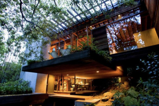
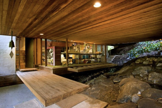
Ray Kappe, 1927-2019
“Throughout my architectural career the house and housing has been a vital part of my practice... Southern California has always been the nation’s leader in modern housing. One of my goals from the beginning was to develop repetitive modern housing for the “masses.” My earliest work was comprised mostly of small wooden post and beam houses, and I completed 50 of these homes in the first ten years... I was interested in the possibility of diversity within a common system both in terms of plan relationships and spatial qualities.
My own “dream house” (your term) for my family, was based upon this system, designed in 1965, and built on an uphill site, with underground springs, in Rustic Canyon, Pacific Palisades, in Los Angeles... My architecture is about resolving problems related to the site, the client’s program, structure and construction systems, environmental response, progression through space and space itself.”
An excerpt from an interview of Ray Kappe by Curbed LA on December 11, 2006.
There’s one particular line that sticks: “diversity within a common system”. Though this related directly to the democratic application of shape and material, it lends itself broadly to much more. It’s what made Ray Kappe’s vision for Southern California architecture so aspirational. Each structure was not to be dismissive of its plot, but was designed to serve as a unique opportunity for preservation and enhancement of the common (eco)system. Though Kappe focused largely on urban planning projects and public use spaces, at the foundation of his practice and this vision were residential projects. Each one was approached in the same careful, considered manner, underscored by his respect for the land. The “diversity” of each structure followed organically, and none was as encapsulating as his personal home in the Rustic Canyon neighborhood of Los Angeles. Built between 1965 and 1967, the house sits above the topography of the land on a series of clever concrete pillars traversed by redwood beams. As described on his website, it “tiptoed over the site, sparing trees, stream, and the delicate beauty of the topography”.
Thank you, Ray Kappe, for reminding us to distinguish and share the common resources we have. Thank you for reminding us to seek out diversity within these resources, and to utilize the planning of space to enhance our collective lives. Thank you for reminding us to tip toe instead of stomp.


494 notes
·
View notes
Text
Shaker
“A Shaker chair, spare and elegant, will give instant and familiar visual pleasure to the eye schooled in modernist design. But like certain strains of modernist art – geometric abstraction, say – it may also be read as an ideal of order and balance, which has particular urgency in an uncentered late 20th- century world.” An excerpt from the New York Times on August 2, 1996. This is a beautiful sentiment. When all feels uncertain, unknown or "uncentered", we turn with urgency to the traditions that ground us, to the "balance" from which we came. We set off in search of the basics, and come up to the surface with the common denominators that link us all. Design is at the mercy of this right now. And on this week of tradition making, in this time of unrest, we're exploring a foundational tenet of American design.
Technology has offered us a multitude of hands with which to manipulate and experiment beyond our wildest dreams, but the basics -- the simplest forms -- remain the most appealing. Since 1776, those forms have been largely shaped by a small group of religious folks in New England known as the Shakers. Living under rigid lifestyle mandates which demanded humble work, the Shakers rejected unnecessary adornment in all of their surroundings. They believed in the principle notion of an ideal form and of honesty in materiality, which needn't be manipulated. At the core of Shaker design was a reliance upon these things that we can all share -- a simple piece of local wood, the necessity for practicality, the acceptance of natural imperfection. This is what we admire so much about the design. It is at its core democratic, it is accessible, and it offers beautiful solutions to the everyday lives of the people using the spaces.
Each image here is an example of Shaker design between the years of 1776 and 1937, at which point their community was dispersed. Each piece of furniture, bottle of medicine, or tool exemplifies the Shaker belief that form should not undermine function, but should enable it.
The following images are from the archives of The Shaker Museum in Mount Lebanon, NY and from the Metropolitan Museum Archive.


40 notes
·
View notes
Text
Benjamin Betts
If we have to sum up the intention of design, we’re left with a description that reads something like defining the undefinable. We’re hoping to create beauty, of course, but that beauty is dictated by a larger force at the mercy of human consciousness. All that we do is subject to our viewers’ emotional response, the people who experience our spaces ultimately dictate how or if the space feels beautiful. So, we’re here on a mission to parse the formation of that very feeling of beauty; or in other words, to map beauty onto a 3-dimensional axis.
None of this is new. It has propelled artists and pioneers for as long as consciousness has allowed. Benjamin Betts (architect, philosopher, psychologist born in 1832) was someone for whom this question of mapping consciousness became a lifelong goal. He recognized that we each have an individual filter through which we synthesize all that we encounter, and that there exists a symbiotic relationship between our consciousness and the physical manifestation of the world. He posited, “...each carries its own world with it, and if there is any ground of relation between my world and your world or other worlds, that ground exists in you or me and not in the world, except only as it is a part of each independently”. Betts wanted to understand these individual truths we each carry and emotions we each feel by approaching their evolution like an indisputable mathematical equation. In his 1887 publication, “Geometrical Psychology, or, The Science of Representation”, he plotted a series of diagrams based on a complex analysis he drew of human response and evolution. As convoluted as much of this sounds, it scratches at something we question every day. Much like the spatial design we’re concerned with, Betts sought to translate the subjective into a universal objective. What resulted might not explain much of human consciousness, reasoning or emotions, but becomes something striking on its own, and we love that. The diagrams read as natural forms, and quite ironically, they’re beautiful.


#benjaminbetts#beauty#human consciousness#emotional response#artist#pioneer#architect#philosopher#psychologist#geometrical psychology#spatial design
47 notes
·
View notes
Text
Tibor Reich
It is an overwhelming thing to observe the physical manifestations of one person’s life’s work all at once; that is, to hold in your hands a piece of who this person was and what they chose to leave behind. This is what I kept thinking as I pulled neatly stuffed cardboard boxes down from a long wall of shelves in a small south London studio. It was a rare sun-bleached afternoon and I’d ventured an hour by train to see the archive of Tibor Reich, a creative savant who wove the backbone of England’s textile identity during the mid-twentieth century. It was that afternoon when it became clear to me that Tibor’s life’s purpose wasn’t to produce for production’s sake, but to impart on the world a record of what living felt like. The fabrics and ceramics and drawings he created were just a byproduct of that sincere quest.
Tibor’s potent imagination was sparked in the countryside of Hungary, where he was born in 1916. He studied in Vienna at the seat of the Bauhaus school, and brought an inspired way of thinking to a grey and rigid England in the late 1930s. It was in England where he eventually founded his fabric company, Tibor Limited, and where he came to produce a vast amount of work for people and places of all kinds (i.e. for the Queen, for airplanes, for vinyl flooring companies...). He developed new techniques for photo manipulation as inspiration for textile repeats. He built an incredible homestead in the Warwickshire countryside as his family grew (and produced an incredible array of Christmas cards along the way). He created his own colour-coding language, because, of course he did. By taking in all of the sights and experiences the world could offer, Tibor produced a world of his own. Here are some of our favourite pieces. The images included here are sourced from a book about Tibor and his life, Tibor Reich: Art of Colour & Texture.

A 14-Year-old Tibor in Hungary

Tibor had yearned to be an architect. This rendering is an example of the many drawings Tibor produced as a young man as he was exploring this passion. However, because his parents were in the textile business, they convinced Tibor to study textiles when he moved to Vienna for art school.

One of Tibor’s first experiments in woven textiles.

Tibor at Leed’s University.

A printed textile taken from one of Tibor’s many sketches of London. He seemed to be fascinated with urban planning and the patterns humans took in their daily lives.


Original sample books from Tibor LTD.


Advertisements for Tibor LTD fabrics, shown in situ.


Tibor’s fabrics have ended up on many obscure applications. Here we see Tibor in the Concorde Jet, completed in 1976 with Tibor LTD upholstery.


Tibor developed a completely original method of photo manipulation, leading to the construction of some of his most successful fabrics. This is a physical example of the way in which Tibor was determined to understand the world around him by capturing it, and reproducing it.


Tibor also had a hand in developing a ceramics line.

And tiles.


The home Tibor built for himself and his family became a sort of incubator for his ideas.

Tibor developed a language called Collingo. It allowed him to code all of his patterns (and most aspects of his life) within a colour system. In this way, his patterns can be reproduced within a near perfect quality control system.

#Retrospective#Journey#Archives#Tibor#TiborReich#English Textiles#Mid-Century#Hungary#Vienna#Bauhaus#1930s#TiborLimited#Textile Design#Textile Science#Colour#Texture
204 notes
·
View notes