
Don't wanna be here? Send us removal request.
Statistics
We looked inside some of the posts by communication-design-studio and here's what we found interesting.
Average Info
Notes Per Post
0
Likes Per Post
0
Reblog Per Post
0
Reply Per Post
0
Time Between Posts
19 hours
Number of Posts By Type
Photo
3
Text
14
Last Seen Tumblr Blogs


Fun Fact
69% of Tumblr users are millennials.
Photo

Catalogue Flyer Design
This is much better than my initial poster design. It is more accessible to the target audience and relates to the product itself
0 notes


Photo

For my advert, I think a catalogue space would work well for my clientele
The target audience for Intertwine are over-middle-age and prefer not to shop online, so a tangible advert would serve best
These catalogues are free in the shop or sometimes mailed in the post
0 notes
Photo

I did this rough poster idea for an advert, but after our class today where David presented ways in which advertising is proposed to us, I want to take another direction
This is banal, rushed, the elements look ���plopped’ onto the poster with no real thought
The idea was that this would hang inside the supermarket or hardware shop
0 notes


Text

Testing different cardboard tones and weights
My outsource printer has supplied me with a 332gsm brown with pinker undertones rather than yellow which I prefer and I have the choice of which side to print on (rougher or smoother) I chose smoother and the weight is perfect. Sturdy enough for the box itself, but also easy enough for me to fold precisely :)
I had to outsource a printer to digitally print white on brown cardboard. I didn’t have enough time to screen-print myself, but the process of working with the printer taught me how to split CMYK layer for print which is pretty cool
$200 out of pocket though *cry*
0 notes
Text

Poster design thumbnail as advert for my string
0 notes
Text

I played with some gold fastenings on my test prints and I’m happy with how these look. I will use this on my final box
It will bring up the cost of my string product but this caters to my target audience
0 notes
Text


Issues with printing white ink digitally on brown cardboard on uni printers
My solutions:
- change colour
- screen print (don’t have enough time)
- outsource printing ($$)
0 notes
Text


Peer feedback was really interesting and critical. Very objective and helpful. All the critiques written, mention ideas we moved past through our group process. I aim to bring these back into the final outcome
0 notes
Text


Slide planning for summative brand book taking on feedback from formative presentation
I forgot to add here a page for the advert I will create for our string brand!
0 notes


Text

I made this prototype with recycled cardboard I had from packaging for a toy
The cardboard is approx. 2mm thick and is very strong and durable compared to store bought string box pictured below which is very flimsy card - almost paper thin and not durable at all

I will need to do some card stock testing to find which thickness will be ideal for folding and printing but will also stand the test of time
The idea with our box of string to be an extra level of environmentally conscious, we want the user to be able to re-use the box and refill it with one of our balls of twine sold separately. This means the box needs to last for it to be used and re-used time again
0 notes
Text


First B+W test print on paper to scale
This is helpful for me to see which typography may need increasing/decreasing in size
+ placement of illustrations
And overall feel of design to scale
Next will be to work on finding card stock to print on and deciding final colours after formative feedback

0 notes
Text
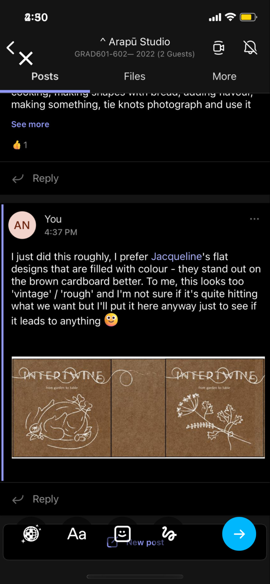
I quickly digitised my illustrations (from previous post) and put them into the dimensions of our chosen box die-line
I uploaded this to our group teams just to get the ball rolling for packaging design concepts
As said in my teams post above: this was very first stage design and it feels unfinished and in need of development
Possibly some colour? Additional illustration? Less text? Different heir-achy?… these all need to be explored further
0 notes