
Don't wanna be here? Send us removal request.
Statistics
We looked inside some of the posts by contexts22-blog and here's what we found interesting.
Average Info
Notes Per Post
1
Likes Per Post
1
Reblog Per Post
0
Reply Per Post
0
Time Between Posts
9 hours
Number of Posts By Type
Text
12
Last Seen Tumblr Blogs


Fun Fact
The Tumblr app for Google Glass was released on May 16, 2013.
Text
MAGAZINE TASK
My research for the task...
History of jeans advertising
The first pair of women’s jeans were made in 1934 by Levi Strauss & Co. these jeans were marketed across the Western United States to the women working on the ranches.
Levi Strauss & Co. had been manufacturing men’s jeans since the 1870s so this was also a first for advertising women’s jeans.
In the 1940s Levi jeans became well known for its working clothes, in these adverts, which were aimed at a rural audience, they didn’t have many women in them, interestingly in these adverts only one of the women are wearing jeans, yet she’s facing away from the camera.
It wasn’t until the 1950s that jeans became leisure wear instead of working clothes, in this image, instead of looking away from the camera the female model is facing the viewer, it appears as if it’s more acceptable for her to be wearing jeans in this ad.
Youth culture became popular in the 1960s with Wrangler introducing their new Avondale fabric for womens jeans.
The fabric was meant to reduce the need of ironing the jeans as it was a lot smoother and softer.
A lot of denim designers decided to try shock advertising as this would attract more attention and controversy, an example of this was a campaign by a brand called Jesus Jeans, their advert got a lot of attention and became very memorable, although the company didn’t last long some companies decided to stick with their classic adverts in the 70s, after this young culture trend Lee jeans makes an ad to appeal to Americans wanting the whole American values back, so start introducing the typical picnic basket setup back into their ads.
In the 1980s Calvin Klein started making more provocative adverts, hiring Brooke Shields to star in their TV commercial who was only 14 at the time, Calvin jeans then went on to be the most popular brand of jeans of the decade.
In the 1980s a new style of jean became popular, the Jordache jeans were well known for being very tight fitted which wearers particularly liked for showing off their behind, with unique embroidery on the back pocket, this ad shows off the brands signature sexuality into a classic Western scene.
Levi’s jeans ad on the other hand wanted to reach out their audience as being timeless and dependable, this ad came out in 1983.
In the 1990s a model named Anna Nicole Smith ends up being the new Guess jeans model and makes sales rocket for the company, showing that using sex needs for advertising works.
Versace released a designer jeans line, using different models for a “sexy female fashion” ad campaign, featured in this ad Nadia Auermann and Claudia Schiffer show off their very impossibly long legs. In 2009 True religion jeans release an ad featuring supermodel Gisele Bundchen, the ad shows off attitude.
In 2010 a jackass style ad was released by Diesel, the slogan “be stupid” encourages users to live a “regret free life”.
0 notes
Text
Task 9
GUY BORDIN

This image of two women eating has ben made very sexualised by their facial expressions and the way they’re eating the sausages looks inappropriate and how they’re wearing minimal clothing.
They’ve been represented quite strongly as being feminine by wearing the pink and purple eyeshadow and being well groomed with their nails painted and hair done, and the way they’re laying seems quite suggestive and and dainty.
This image could be seen as offensive to some people as its sexualising women over something basic such as eating and could be seen as making women into objects.
IRVING PENN

This image could be seen as offensive as its ‘idealising’ a certain body shape, which is skinny with big boobs and long hair which can be to a lot of people a very unrealistic goal, they’ve got her bent over which is very suggestive and it looks like she's posing quite uncomfortable which looks un natural. In a lot of photography women are portrayed to be more submissive and sexualised which I think could stem to a lot of complains within the photography industry.

MICKAEL JANSSON
In this image you can quite clearly see the gender roles, the men are made to look uninterested in the woman and very masculine where as the woman are made to look slightly more desperate for the mens attention with their legs wide open looking in their direction, this is quite a common thing in photography to have the male looking masculine and the women are usually made to look more slutty and sexualised, I think this can give men unrealistic expectations of what woman are really like.
1 note
·
View note
Text
Task 8
Richard Avedon

Richard began working as an advertising photographer in 1944 for a department store, but was soon hired by an art director for Harpers Bazaar and his work soon starting appearing in magazines.
He set up his own studio in 1946 where he began providing his own images which also included shooting for Vogue and Life and soon became chief photographer at harpers bazaar.
In 1952 he became the editor and photographer for the theatre arts magazine, he had a very unique style of trying to capture models full of emotion rather than blank experessions.
I really like his work, I think it looks sleek and tidy which I find really ascetically pleasing, I like how he really experiments with his models, there are a few images I found where he goes crazy with the hair and makes it into different shapes of experiments with blowing it in the wind, it doesn't feel really typical and plain.

STEVEN MEISEL

He was born in 1954 and from a young age had always been fascinated by models and beauty, drawing models in his spare time, his inspiration came from magazines such asVogue ad Harpers Bazaar, his mother and his sister were big icons of his and he often dressed about models such as Gloria Guinness and Babe Paley.
He managed to meet models like twiggy by asking girlfriends of his to phone up modelling agencies and pretending to be Richard Avedons secretaries.
He studied many different courses at the High school of art and design, but ended up majoring in in fashion illustration.
I think his work is so artistic which makes it really interesting to look at, especially the bottom one I like how they’ve added the apple as a prop, it adds something extra to the image and brings a bit of colour too as the whole image is very black and white.
I like how the whole image is vey simple yet theres really bold eyeliner on the model, it makes it a bit more dramatic.
0 notes
Text
Task 7

KAREN KNORR
I really like subculture photography, I think people can feel quite conformed sometimes and are afraid of being different so I think this raises awareness of being who you want to be and not worrying about other peoples opinions.
Like how in the image above you can see that they feel comfortable around each other and they just seem happy in themselves as they have their arms around each other and seem really chilled.

I like how different this image is, they’re both looking into the camera which draws you into the image, also because she’s got eyeliner on the way it is, it leads you into his face which makes a nice transition between the heavy make up and then they guy who's wearing no make up.
0 notes
Text
Task 6
“The Advertising Standards Authority (ASA) is the UK’s independent advertising regulator. The ASA makes sure ads across UK media stick to the advertising rules (the Advertising Codes).
The Committee of Advertising Practice (CAP) is the sister organisation of the ASA and is responsible for writing the Advertising Codes. The ASA and CAP are committed to regulating in a way that is transparent, proportionate, targeted, evidence-based, consistent and accountable.”
It’s the ASA that respond to any complaints that have been made against adverts and they also make sure that advertisers stick to the rules and regulations, they work mostly on ads that have potential to be complained about such as age restricted products.
The goal is to help ads before they’re published so that they can avoid complaints, they do this with training and giving the correct advice to avoid any problems.
I think the advertising standards is really necessary as some companies take it too far in the hopes of shocking their audience, which may be effective but it doesn't mean its morally right, viewers can respond quite literally to adverts and if somethings being published thats quite shocking, viewers can easily get immune to it and see it as being normal rather than shocking, which is really worrying in cases as some brands have used rape as a form of advertising and i don't think this should ever be seen as normal.
0 notes
Text
Task 5

You can see that this advert would be aimed at older people who can afford this car and the colours are quite mellow, if this advert was aimed at a younger audience then it would’ve used loud, punchy colours.
The advert is trying to get you to buy the car, it does this by making it look sleek and appealing, theres a city in the background which could suggest that its a car for wealthier people that live in the city, this could make it more desirable for that audience as they may feel its a car they need and they’ve made it look fast by having the road blurred out as if its travelling really fast, it also gives the viewer to see what it would look like in motion.
The key communication in this advert is the text that they have in the top corner, they’re saying how you NEED this car and making people feel like they not only want it, but its something they need.
This advert definitely targets the esteem needs on the hierarchy chart, they’re playing on the fact that this car will make you feel amazing and they’ve used the word ‘escape’ which suggests that driving this car is a fun escape from everything thats stressing you out which could relate to the stressful city workers it appeals to.
0 notes
Text
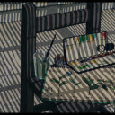
Task 4

I really like the composition this image, I think it flows really nicely from left to right which leads you to the character, you can tell he’s at the work place because he’s got his uniform on so it tells a story in the image itself.
The lighting is mainly on the sheet of metal as there are a few harsh shadows on the man, so its giving you an idea of the workplace by drawing attention to the types of materials there.
The colouring of this image is quite unique, its got greyscale too it and looks quite grimy which I like, it relates to the job more so tells more of a story.
The man is leaning on the wall with quite a stern expression on his face which could indicate that he’s in more of a serious job, if it was an image of a clown then the character would most likely be smiling, so its giving you an indication of what kind of a character this person is and what there job is like.
0 notes
Text
Bibliography
Task 2- BJP IPA 2017 http://www.bjpipa.com
Task 3- Ruth Harriet Louise https://en.wikipedia.org/wiki/Ruth_Harriet_Louise https://www.google.co.uk/search?q=contemporary+photographic+portrait&client=safari&rls=en&source=lnms&tbm=isch&sa=X&ved=0ahUKEwji4e-u1c_TAhVkLMAKHQLOD2IQ_AUICigB&biw=1264&bih=744#imgrc=YkG0n-o6RN15OM:
Task 4- https://www.google.co.uk/search?q=editorial+portraits&client=safari&rls=en&source=lnms&tbm=isch&sa=X&ved=0ahUKEwiqm6Gy3M_TAhVkCMAKHftkAFQQ_AUICigB&biw=1264&bih=744#tbm=isch&q=editorial++whelder+portraits&imgrc=28BKGBdds0w0yM:
Task 5-https://www.google.co.uk/search?q=print+advert&safe=strict&client=safari&rls=en&source=lnms&tbm=isch&sa=X&ved=0ahUKEwi8lqiX_9DTAhWGCMAKHZr5B24Q_AUICigB&biw=1324&bih=902#imgrc=_
Task 6-https://www.asa.org.uk
Task 7-https://www.google.co.uk/search?q=karen+knorr+subculture+photography&safe=strict&client=safari&rls=en&source=lnms&tbm=isch&sa=X&ved=0ahUKEwifnKz1jNHTAhVHIMAKHbudAiMQ_AUICigB&biw=1324&bih=902#imgrc=ZsWeVp7gb3EIAM:
Task 8-https://en.wikipedia.org/wiki/Richard_Avedon
https://www.google.co.uk/search?q=steven+meisel&safe=strict&client=safari&rls=en&source=lnms&tbm=isch&sa=X&ved=0ahUKEwjtl7nJldHTAhWoAsAKHUN7DEkQ_AUIBigB&biw=1324&bih=902#imgrc=79-697gM2DY0EM:
Task 9-https://www.google.co.uk/search?q=irving+penn&safe=strict&client=safari&rls=en&source=lnms&tbm=isch&sa=X&ved=0ahUKEwipq6uIndHTAhXhLcAKHS0SAssQ_AUIBigB&biw=1324&bih=902#imgrc=_
0 notes
Text
Task 3

This is a historical portrait that I looked at by Ruth Harriet Louise, it was a self portrait she’d done as one of the only female successful photographers in Hollywood.
This portrait says a lot about the character herself, you can tell by this image that she’s rather wealthy and successful by the clothes she’s wearing, she’s got lots of fur on which would suggest wealth and she's got an expensive looking necklace on as well.
The way she’s looking away from the camera could suggest that she’s quite a shy character or that she’s very important so can look away from the camera, her clothes are quite bold and stand out in front of the dimmed background.

This image stood out to me, I really like the lighting on her face because it makes her eyes stand out, and thats the main focus of the image.
the way she is sat looking directly into the camera feels quite natural and relaxed, it doesn't feel posed like it does in the studio, and I like how the background looks like it’s outside as it creates more mystery to the image, having the background blurred out looks really effective as it draws you into the face and as she’s wearing green clothing that blends in, it isn’t too distracting.
As the hand comes up into the image it almost leads you up to the face which I like, it’s indirectly leading you up to the face which gives you the vocal point, I don't like it when theres too much going on in the image as I find it too distracting.
0 notes
Text
Task 2

Shock Photography
This is an image taken by Shawn Lloyd and It’s clearly meant to shock the audience by using an image of a young girl smoking, we’re not used to seeing children smoking as they’re seen to be very innocent so it gets you thinking about how if you find it horrible for children to smoke, then why do adults do It to? The girl also looks drowsy and unwell which could be because of the smoking.
She's dressed in all pink with curly hair which emphasises the fact that she’s young and innocent and gives a bigger negative impression.

This advert really had nothing to do with the image, without the caption you’d have no idea it was about O2, but they’ve caught on and realised that animals are very popular so this advert could draw more peoples attention and they’re such a well off brand that they can afford to have adverts that are slightly funnier and not strictly all about them.

I found this image on the BJP’s IPA page, this was the most recent winner and it was selected from a series of photos named Joyce, when initially looking at this image it would be hard to tell what it’s about and the meaning behind it, but it was actually a part of a self portrait series that reflected on “modern rituals of seduction and the laboured construction of femininty”.
0 notes
Text
Task 1
I’ve always been an artistic minded person, mainly studying art throughout school and a bit in A-level, when leaving secondary school I joined the Plymouth College Of Art to do a BTEC in Illustration and Graphic Design, it was through practicing different areas of art and experimenting a bit with photography in my graphics course that Photography was something I wanted to pursue, I felt like it would be a good career opportunity as well as something I’d enjoy.
I think I’ve been shaped into the person I am today by just allowing myself to be creative and try out new things, I think its important to experiment and have fun with things and by trying lots of new things I’ve been able to find things that I really enjoy doing, and thinks that I dislike.
Ever since I can remember I’ve always loved taking photos when out and about, it’s never been a serious passion but its something I’ve always enjoyed, I’d taken a year long course in year 9 on photography but it was more focused on how to use photoshop and not how to actually use the camera, so I never took it seriously and just continued to study art, through doing art in Art college I was more exposed to the photography world and I started to take a liking to it, so tried doing one of my graphics design projects using all photography and I ended up enjoying taking photos more than I did drawing and it was something I always found my self doing in my spare time where as I only drew when I had to for projects.
I feel like there is so much for me to gain from studying a degree in photography, as photography is very new to me I’m learning new things all the time, which can be hard to keep up with at times but its reassuring knowing that I’m really benefiting from this course as every day I learn new things that I didn't know before, I’d like to think that I will have a career in Photography when I leave this course and I feel like doing a course in photography rather than being self taught teaches you not only about how to take great photos, but how to run your own business and all of the things I never thought of before joining this course.
I wondered for a long time if going to university was the right choice for me, I currently work at Morrisons and when it came to leaving my BTEC course in Illustration and Graphic design, I knew that I didn’t want to pursue it any longer but wasn't happy at the thought of leaving education and just working at Morrisons, I wanted to better my CV and have a degree and by this point I was really starting to enjoy photography in my spare time and could really see myself in that kind of profession, I knew I’d really struggle self teaching as I find it really hard to hold lots of information without practice and I knew the equipment wouldn't be available so I knew University was the right choice for me.
My outlook on life is quite relaxed, I think it’s just important to be happy, I know most people strive to be successful with highly paid jobs, but I know I’d rather be in a less well paid job as long as it made me happy and I think that outlook mainly comes from my parents being this way, neither of my parents are in highly paid jobs but they’re happy as they are.
I’m not really sure what kind of photographer I’d like to be at this point, I started the course striving to be a wedding photographer and it’s something I’d still be happy to do, but since joining the course I’ve learnt about all of the other possibilities in photography so it’s something I’m yet to decide, I think it’ll come to me in third year when I’ve been doing it for longer, right now I’m just happy with experimenting and learning.
0 notes
Text
Evaluation
Overall I feel like I’ve learnt a lot from my contextual lessons, I’ve had the opportunity to experiment with lots of different techniques such as magazine making and cinema graphs which I will find useful in the future, and having the study tasks to record it all has really helped me look at more photographers and analyse their style which can inspire me in my own work.
I’ve found it really helpful to learn about being in the business as well as just the perks of being a photographer as I feel like its really important to learn the earth truths about being in the business as well as the good parts too otherwise I would've gone into it thinking it was a lot easier than what it really is, its made me realise how much I need to work for it if its something I want and how important it is to connect with other art makers if I want to get my name out there.
I think its been good that we’ve learnt from the beginning with learning about lighting and camera techniques and its been helpful to note it all down in blogs for me to come back to.
0 notes