
The story of the development of a mathematical model of the spread of Coronavirus in the UK. The model has been produced to challenge the misinformation and lack of transparency the government has displayed in explaining the rationale for its course of action in addressing the epidemic.
Don't wanna be here? Send us removal request.
Statistics
We looked inside some of the posts by coronamaths and here's what we found interesting.
Average Info
Notes Per Post
0
Likes Per Post
0
Reblog Per Post
0
Reply Per Post
0
Time Between Posts
9 days
Number of Posts By Type
Text
17
Last Seen Tumblr Blogs


Fun Fact
Tumblr Inc. has $15.1M in annual revenue.
Text
Coronavirus Numbers and Scenarios 15th October
It's been a month since I last posted about the spread of the disease and a lot has happened since then. Principally the government's decision to emerge too early and very quickly from lockdown has resulted in a rapid resurgence of the disease - not as fast as the original onset but fast enough to be dangerous. Here are the latest graphs with results from the model I have developed compared to actual figures and showing some scenarios like circuit breaking.
Graph 1

This shows the current numbers from the beginning of August which is when we fully emerged from lockdown. You can see that the model (red line) is very closely following the actual figures (blue = PHE (govt), purple = ONS (Office for National Statistics). This corresponds to an R-rate of around 1.44. Two points: the blue govt line dropped dramatically around mid-August because of previous inaccurate data recording (losing about 5,000 deaths from the govt figures); there is a slight downturn in the govt figures around 14 October. I suspect this is just a data blip but we'll need to wait and see.
Graph 2

This shows what happens if there are no further interventions and the R-rate continues at 1.44. It shows a peak of around 2600 deaths a day (rolling average) around 31st December. The NHS would be totally overwhelmed and there would be an estimated 220,000 deaths in total
Graph 3

The government has implemented a strategy of tiered regional lockdowns. SAGE, the scientific advisory group, does not believe this will work. It's report was ignored over 3 weeks ago. So what else could be done? This scenario looks at a return to the level of lockdown before 1st July -i.e. schools closing, return to work from home and limited socialisation. The R-rate was then about 0.9. This shows the curve peaking around 13 November at 440 deaths per day (rolling average) - so sustainable within NHS resources. Total deaths drop to around 87,000 but the lockdown to achieve this has to continue through to June 2021.
Graph 4

A proposed alternative is a "circuit-breaker". This scenario shows a national shutdown to pre-July levels with the R-rate at 0.9. The break lasts for 3 weeks and then we return to the present level of activity over the next 60 days (i.e. the rate at which lockdown was previously eased from the start of July). The effect of this is a temporary drop in the number of deaths but then there is a resurgence. The peak is much less than no intervention and moves out to March.
Graph 5

This scenario is similar except the R-rate is dropped to 0.75, equivalent to the measures imposed at the peak of the first wave. Again there is a drop in the number of deaths followed by a resurgence and the peak moves out even further to the end of March. This and the previous scenario suggest that the single circuit-break simply delays the inevitable. It suggests that for circuit-breakers to work they must be re-imposed every 3 months or so.
About Me
Don’t forget you can check my post on “Background and Credentials” if you want to find out more about me and what I am posting. You can get to that and other posts as I add them via the Index to posts. Click here: Index to Blog Posts
0 notes
Text
CORONAVIRUS NUMBERS UPDATE 9th SEPT - SECOND WAVE
It’s been two months since my last blog, largely because the number of people dying has been relatively small and the curve relatively flat until recently so there has been little to comment on. Also, of course, the government suddenly decided to change the definition of how they would count deaths so I’ve given that some time to work through the system.
Although the government has decided to change it’s decision-making basis to be focussed on “cases” I still have no faith in the figures being produced and am sticking with “deaths” as being a far more accurate predictor (despite the bizarre definitional issue) of the trajectory of the disease. The reality is that the government’s collection and compilation of data has been totally shambolic whether it’s the number of deaths or cases or tests. The closest to what seem to be proper, statistically sounder data is what is published by the Office for National Statistics.
So let’s have a look at some of the figures and possible future implications.
Daily Deaths
Here is the updated graph upto 9th September. I have changed the vertical scale to a logarithmic scale so we can see much more easily what has been happening over the last couple of months.
Figure 1:

As usual, the chart compares the 7-day rolling average figures from the model (red), the Public Health England (PHE) figures (dark blue) and the ONS figures (purple) for all Covid related deaths which are both actual figures upto 28th August and projections from then. The main features are:
1. From 5th March (date of first death) through to point “A”, roughly around the second week of June, all three sets of figures were tracking more or less consistently. The government PHE figures were consistently below those of the ONS; and the model hovered between the two, though tracking the ONS figures more closely.
2. On 9th June I posted the apparent discrepancy in the government figures - they had moved above the ONS figures which shouldn’t have happened. This is shown up much more clearly with the logarithmic scaling of the graph.
3. Two months later the government said that it was going to change the definition of a COVID death and around about 11th August they reduced the total death figure by just over 5,000 (all of which were from England, not the three other countries of the UK). They also altered all their figures retrospectively on the web-site. I have NOT changed the historic figures but shown this anomaly instead as a single step-change which will be a constant reminder of the discrepancies in government data-handling. So at point “B” the government figures drop down to below the ONS figures and more or less in line with the model.
4. However, something else happened at the beginning of August - point “C”. The ONS figures started diverging from the model. In other words the actual number of deaths was no longer falling as fast as the model predicted. So what had changed? This was when virtually all the lockdown restrictions were removed, which had started from the beginning of July. The implication, therefore, was that increased socialisation during July was leading to an increase in the R-value which translated into more deaths than otherwise expected.
5. At first sight though, this seems to be a bulge rather than a consistent trend because the ONS curve starts dropping again to point “D”. This 4-5 week bulge would correspond, with the time lag, to the increase in socialisation as a result of the easing of lockdown restrictions from mid-July onwards.
6. Point “D” though is a little worrying because it is showing a fairly significant upturn (although a few more data points would give more confidence to this). This is in line with the forecast I made in my last blog of 14th July.
These observations can be can be visualised more clearly by just looking at the tail of this graph from 1st August onwards (Fig 2).
Figure 2:

The divergence from the model from around the 4th September could indicate an upturn in the disease. So to show the implications of this I have re-calibrated the model to match the actual data curves as closely as possible. The assumption I have made is that the relaxation of lockdown constraints has led from 1st August to an increase in the R-value up to 1.2 by the start of September.
Tail-end figures now look like Figure 3:
Figure 3:

We can see that the re-calibrated model is now following the actual data more closely and projecting a slow daily increase in the number of deaths going forward, assuming that no other corrective (effective) action is taken by the government. So it’s reasonable to project that forward with the same assumptions.
If we do then we get the following Figure 4 which gives a projection through to the end of June 2021:
Figure 4:

This shows a second wave peaking in early March 2021. You can see that the shape of the curve is very different from the first wave. This is because the government had no controls in place in the first wave and delayed making critical decisions until too late. Hopefully those lessons have been learned and hopefully they will get track and trace working properly. The controls help to flatten the curve so there is a shallower rise and a lower peak. But the downside is that the total number of deaths in the second wave will be double the first wave, if nothing else changes giving a projected number of deaths from the two waves of around 160,000.
This might be mitigated because recent research is suggesting that the mortality rate is dropping and I haven’t yet changed it in the model. Conversely, though, recent research is also suggesting that immunity from the disease is not guaranteed if you have already had it - and I have assumed so far in the model that those infected will not be re-infected.
SUMMARY
1. The government has redefined what is meant by a COVID death and reduced its total by just over 5,000. The figure is now more closely aligned to the Office for National Statistics and the model I’m using.
2. The current numbers are suggesting that the government figures for the number of deaths, if accurate, are diverging from the model (Figure 2).
3. This could be a strong indicator that we are actually already in the early stages of a second wave.
4. Re-calibrating the model based on a gradual increase in the R-value from 1st August, when the final major constraints on lockdown were lifted, to a value of 1.2 at the start of September shows a potential match to actual data (Figure 3) and a second wave upturning in early September and peaking in early March 2021 (Figure 4).
5. This shows a projected number of deaths from the second wave of around 105,000 by the end of June 2021.
6. This could be mitigated by recent research showing a decline in mortality rates. Conversely though recent research also suggests that having the disease may not confer permanent immunity.
STATISTICAL ISSUES
1. The three data sources have different bases so I have used some factors to relate all three to the same base of the UK.
2. The PHE figures are UK deaths from all settings, attributable to COVID and where there has been a positive test for COVID
3. The ONS figures are the actual number of deaths registered each day and attributed to COVID either directly or as a comorbidity. But the ONS only publishes these figures for England and Wales. I have now added the equivalent actual figures from Scotland and Northern Ireland upto 28th August. I then use the ratio of the total figures up to 28thth August divided by the PHE figures to that date to give the projection of the total (ONS+) figures through to the current date.
4. The ONS figures are collated to approximately ten days before their publication (weekly every Tuesday). From that date I estimate figures until the next report is produced. The estimate is based on the same factorisation as in (3)
About Me
Don’t forget you can check my post on “Background and Credentials” if you want to find out more about me and what I am posting. You can get to that and other posts as I add them via the Index to posts. Click here: Index to Blog Posts
0 notes
Text
CORONAVIRUS NUMBERS UPDATE 14th JULY 2020
I have delayed this week’s blog on the Coronavirus numbers of deaths and the model of the disease because of the recent government announcement about discrepancies in the data they have been publishing.
As the ITV announced:
“The UK government is to stop publishing daily coronavirus deaths after health secretary Matt Hancock ordered an urgent review into how Public Health England (PHE) calculates the figures. The health secretary called for a review after researchers claimed the way Covid-19 deaths are reported across England has led to an ‘over-exaggeration’ of the figures due to ‘statistical flaws’. PHE's calculation of the figures means England’s deaths from coronavirus appear far higher than any other part of the UK, experts behind the study said. On the coronavirus statistics page on Saturday, a statement said the government would be pausing the UK-wide updates until issue was ‘resolved’."
What a surprise!!
I have two immediate questions:
“Why has this taken so long to identify?”, and
“How does this affect modelling the future course of the disease?”
Why has this taken so long to identify?
This story goes back a long while. In my blog post of 9th June I included the following chart and comment:

“The PHE curve has also crossed over the ONS curve which shouldn’t happen since, by definition, the ONS data consists of ALL COVID related registered deaths, whether tested positive or suspected whereas the PHE data is only deaths which have tested positive ….. suggest a data quality issue which could be either:
a) There is a large backlog of deaths awaiting registration (which would bring the ONS numbers up retrospectively) ….. then it would support the contention that the curves are flattening faster than they should;
b) Alternatively, the PHE data has been delayed for some reason so that the deaths being reported over the last two weeks actually occurred earlier. This would bring the curve down to probably below the model which would indicate no change as yet in the behaviour of the disease. “
It now appears that this discrepancy could be caused by a difference in recording between the government/PHE and the Office for National Statistics (ONS). This could have gone back to as far as 28th April which is when the government first acknowledged that the figures it was reporting were approximately 4000 deaths lower than the real figures - it then adjusted its statistics retrospectively. This is what I posted at the time:
“Up until about a week ago the government, in its press conferences, was authoritatively presenting us with numbers of deaths which were way, way below what was actually happening. This was blown out of the water on April 23rd by a Financial Times expose and the government has been scrabbling over the last week to get accurate figures in place …... Not only are the figures underestimates but Public Health England seems to be re-writing history. The dataset it publishes every day has been altered retrospectively so that the figures conform with the new definition all the way back to the beginning of March.”
Ever since 28th April I have preferred to compare the model to the ONS figures. As I commented then:
“These are much more accurate figures than the government publicises and are consistently higher - approximately 60% - because they include corrections on the hospital statistics and everyone who has died in the community.”
The reality is that the government’s collection and compilation of data has been totally shambolic whether it’s the number of deaths or cases or tests. The closest to what seem to be proper, statistically sounder data is what is published by the Office for National Statistics.
How does this affect modelling the future course of the disease?
Firstly here is the updated graph upto 14th July.
Figure 1:
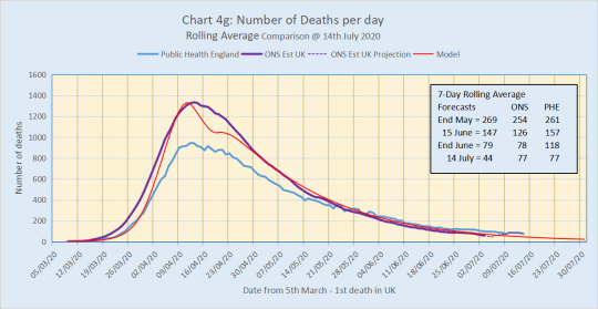
The chart compares the 7-day rolling average figures from the model (red), the Public Health England (PHE) figures (dark blue) and the ONS figures (purple) for all Covid related deaths which are both actual figures upto 3rd July and projections from then. The main features are:
1. ONS figures continue to lie below the PHE figures (the official government figures presented on the DHSC web-site), which shouldn’t happen.
2. The model forecast for End June was a 7-day rolling average of 79, compared to the PHE data of 118 and the ONS actual figure of 78.
We need to look more closely though at the tail of this graph.
Figure 2:

Essentially we have two versions of reality - the ONS data and the PHE (government) data; and the model is nestling between the two, much closer to the ONS data at the end of June.
So what does this tell us about future projections?
The model is the litmus test because it estimates what would have happened if lockdown had continued. The presumption is that if lockdown had continued through to October then the virus would have petered out and be much more controllable then. Historically, after the peak of the disease, the model has followed the ONS version of reality much more closely and is still doing so. This would indicate that, despite the one-off stories in the press about local lockdowns etc, the measures for easing lockdown would seem to be working OK at the moment and are not yet showing any adverse effect on the number of deaths.
BUT, if you believe the other version of reality, the government data, the story is different. This would suggest that the easing of restrictions is having an adverse effect. The government figures do seem to be diverging from the model suggesting that, even though the numbers are dropping they are not dropping fast enough and could be a strong indicator that we are actually already in the early stages of a second wave.
So to show the implications of this I have re-calibrated the model to match the current government data. Tail-end figures now look like Figure 3:
Figure 3:

We can see that the re-calibrated model is now following the government data very closely. So it’s reasonable to project those forward with the same assumptions. If we do then we get the following Figure 4 which gives a projection through to the end of June 2021:
Figure 4:

This shows the second wave upturning in early September and peaking in early February 2021. You can see that the shape of the curve is very different from the first wave. This is because the government had no controls in place in the first wave and delayed making critical decisions until too late. Hopefully those lessons have been learned and hopefully they will get track and trace working properly. The controls help to flatten the curve so there is a shallower rise and a lower peak. But the downside is that the total number of deaths in the second wave will be double the first wave.
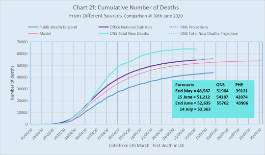
If we look at the cumulative numbers then Figure 5 shows this through to the end of June 2021.
Figure 5:

This shows a projected number of deaths from the two waves of around 160,000. The model projection for the first wave is around 55,000 so the second wave would be around 105,000 through to the end of June 2021. This corresponds closely to the figure quoted this week by the Chief Scientist, Sir Patrick Vallance, of “upto 120,000”.
So, we have two very different stories. Until data quality is seriously improved, proper forecasting is difficult
SUMMARY
1. The government recently announced discrepancies in the data they have been publishing and has stopped publication until the issue is resolved.
2. Why has this taken so long to identify? This was evident from 9th June (Chart 4h dated 8 June) which showed the government data curve crossing the ONS data curve, which shouldn’t happen. The likelihood is that the discrepancy started as far back as 28th April when the government was forced to correct its figures by 4,000.
3. The numbers are suggesting that the government figures for the number of deaths, if accurate, are diverging from the model (Figure 2). This shows two versions of reality - the ONS data and the PHE (government) data; and the model is nestling between the two, much closer to the ONS data at the end of June.
4. Historically, after the peak of the disease, the model has followed the ONS version of reality much more closely and is still doing so. This would indicate that, despite the one-off stories in the press about local lockdowns etc, the measures for easing lockdown would seem to be working OK at the moment and are not yet showing any adverse effect on the number of deaths.
5. BUT, if you believe the other version of reality, the government data, the story is different. The government figures do seem to be diverging from the model suggesting that, even though the numbers are dropping they are not dropping fast enough and could be a strong indicator that we are actually already in the early stages of a second wave.
6. Re-calibrating the model to follow the government data shows a second wave upturning in early September and peaking in early February 2021 (Figure 4). This shows a projected number of deaths from the second wave of around 105,000 by the end of June 2021. This corresponds closely to the figure quoted this week by the Chief Scientist, Sir Patrick Vallance, of “upto 120,000”.
7. So, we have two very different stories. Until data quality is seriously improved, proper forecasting is difficult.
STATISTICAL ISSUES
1. The three data sources have different bases so I have used some factors to relate all three to the same base of the UK.
2. The PHE figures are UK deaths from all settings, attributable to COVID and where there has been a positive test for COVID
3. The ONS figures are the actual number of deaths registered each day and attributed to COVID either directly or as a comorbidity. But the ONS only publishes these figures for England and Wales. I have now added the equivalent actual figures from Scotland and Northern Ireland upto 19th June. I then use the ratio of the total figures up to 19th June divided by the PHE figures to that date to give the projection of the total (ONS+) figures through to the current date.
4. The ONS figures are collated to approximately ten days before their publication (weekly every Tuesday). From that date I estimate figures until the next report is produced. The estimate is based on the same factorisation as in (3)
About Me
Don’t forget you can check my post on “Background and Credentials” if you want to find out more about me and what I am posting. You can get to that and other posts as I add them via the Index to posts. Click here: Index to Blog Posts
0 notes
Text
CORONAVIRUS NUMBERS UPDATE 30th JUNE 2020
The latest ONS weekly report has been published, which is based on actual registered deaths attributed to Covid-19, either directly or as a co-morbidity. These are much more accurate figures than the government publicises and aves been consistently higher. Even though the government was forced to change its reporting after 28th April it is still significantly under-reporting the cumulative number of deaths. Here are the latest versions of the charts.
With the additional two week’s worth of data it appears that there is now some consistent indication from the mortality figures that the easing of lockdown is having an adverse effect. However, there are also some concerns about data quality.

CHART 4G compares the 7-day rolling average figures from the model (red), the Public Health England (PHE) figures (dark blue) and the ONS figures (purple) for all Covid related deaths which are both actual figures upto 5th June and projections from then. I have also included the ONS figures for excess deaths (light blue). The main features are:
1. ONS figures continue to lie below the PHE figures (the official government figures presented on the DHSC web-site). This is strange and is discussed below in relation to chart 4h2, together with the fit of the curves.
2. The model forecast for Mid June was a 7-day rolling average of 147, compared to the PHE data of 157 and the ONS actual figure of 122.
3. The model forecast for the 30th June was a 7-day rolling average of 79, compared to the PHE data of 118 and an ONS projection of 118.
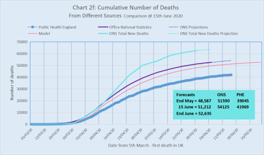
CHART 2F compares the cumulative figures from the same sources.
The main features are:
1. The model line which is closely tracking, though slightly lower, the ONS Covid figures is still projecting total deaths in excess of 50,000 by the end of June. The model projected total is just over 54,000 with the disease petering out in the second week of October if we remained in lockdown.
2. The difference between the model and the ONS figures is largely explained by the difference in the two curves in March and April as can be seen in Chart 4g.
ISSUES

The main issue now is whether the actual data is following the model curve or not.
First let’s look at Chart 4h1 and go back to 23rd May. This is when a significant blip occurred in the figures published by PHE. It may be a coincidence but this was also 15 days after the VE Day celebratory weekend which was the first time that lockdown was broken by a major event. 15 days is approximately the average lead-time between someone catching the disease and dying.

This was followed by two further blips each about 5 days apart and then by the data curve bouncing twice off the forecast epidemic curve, which is seen more clearly in Chart 4h2 which zooms in to the data from 1st June. After the second bounce the actual data remains above the forecast curve and starts pulling away from about 19th June. By 30th June it has pulled even further away from the forecast curve and started to flatten out.
This is exactly the sort of behaviour we’d expect to see in the early stages of a resurgence of the virus.
Finally, one caveat is that the PHE curve has now firmly crossed over and changed position with the ONS curve which shouldn’t happen since, by definition, the ONS data consists of ALL COVID related registered deaths, whether tested positive or suspected whereas the PHE data is only deaths which have tested positive.
This suggests that there may be a data quality issue which could be either:
a) Inherent data inconsistencies in the way the two sets of data are collated
b) a large backlog of deaths awaiting registration, which would bring the ONS numbers up retrospectively and support the contention that the curves are flattening faster than they should;
c) It could be that the PHE data is based on a preliminary diagnosis of COVID which isn’t subsequently upheld on the death certificate - so artificially inflating the current numbers;
d) Alternatively, the PHE data has been delayed for some reason so that the deaths being reported over the last two weeks actually occurred earlier. This would bring the curve down to probably below the model which would indicate no change as yet in the behaviour of the disease.
I have no way of knowing which of those possible explanations, if any, may be correct. That would require access to the source records.
SUMMARY
1. Cumulatively, the model continues to track the ONS figures very closely, though running slightly lower (Chart 2f)
2. The model forecast for Mid June was a 7-day rolling average of 147, compared to the PHE data of 157 and the ONS actual figure of 122.
3. If this continues then the projected number of deaths directly associated with COVID-19 is just over 54,000 and the disease appears to peter out in early October, if we remained in lockdown.
4. With the additional two week’s worth of data since my last report it appears that there is now some consistent indication from the mortality figures that the easing of lockdown is having an adverse effect.
5. A note of caution though - there could be a data quality issue which hasn’t been corrected. The PHE curve has been quite erratic since 22nd May compared to before and has also crossed the ONS curve which shouldn’t happen.
STATISTICAL ISSUES
1. The three data sources have different bases so I have used some factors to relate all three to the same base of the UK.
2. The PHE figures are UK deaths from all settings, attributable to COVID and where there has been a positive test for COVID
3. The ONS figures are the actual number of deaths registered each day and attributed to COVID either directly or as a comorbidity. But the ONS only publishes these figures for England and Wales. I have now added the equivalent actual figures from Scotland and Northern Ireland upto 19th June. I then use the ratio of the total figures up to 19th June divided by the PHE figures to that date to give the projection of the total (ONS+) figures through to the current date.
4. The ONS figures are collated to approximately ten days before their publication (weekly every Tuesday). From that date I estimate figures until the next report is produced. The estimate is based on the same factorisation as in (3)
5. The excess deaths are the difference in the the number of deaths in any given week with the average of the same week over the last five years. Again the figures from the ONS are for England and Wales only so I scale up in the same way. I don’t project these beyond the date on which the report is based because there is no obvious factorisation to use.
About Me
Don’t forget you can check my post on “Background and Credentials” if you want to find out more about me and what I am posting. You can get to that and other posts as I add them via the Index to posts. Click here: Index to Blog Posts
0 notes
Text
CORONAVIRUS NUMBERS UPDATE 16th JUNE 2020
The latest ONS weekly report has been published, which is based on actual registered deaths attributed to Covid-19, either directly or as a co-morbidity. These are much more accurate figures than the government publicises and has been consistently higher. Even though the government was forced to change its reporting after 28th April it is still significantly under-reporting the cumulative number of deaths. Here are the latest versions of the charts from last week.
With the additional week’s worth of data it appears that, so far, there is no indication from the mortality figures that the easing of lockdown is having an adverse effect. However, there are some concerns about data quality.
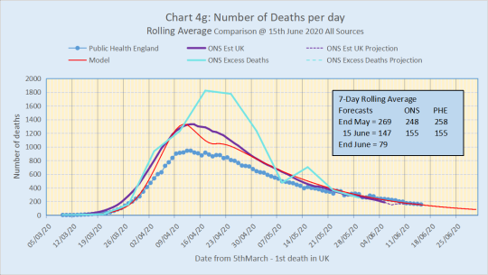
CHART 4G compares the 7-day rolling average figures from the model (red), the Public Health England (PHE) figures (dark blue) and the ONS figures (purple) for all Covid related deaths which are both actual figures upto 5th June and projections from then. I have also included the ONS figures for excess deaths (light blue). The main features are:
1. ONS figures have dropped below the PHE figures (the official government figures presented at the daily press conference). This is strange and is discussed below in relation to chart 4h, together with the fit of the curves.
2. The model forecast for 31st May was a 7-day rolling average of 269, compared to the PHE data of 258 and the ONS actual figure of 248.
3. The model forecast for the 15th June was a 7-day rolling average of 147, compared to the PHE data of 155 and an ONS projection of 155, so the model is tracking the current data curves very closely..
CHART 2F compares the cumulative figures from the same sources.
The main features are:
1. The model line which is closely tracking, though slightly lower, the ONS Covid figures is still projecting total deaths in excess of 50,000 by the end of June. The model projected total is just over 54,000 with the disease petering out in the second week of October if we remained in lockdown.
2. The difference between the model and the ONS figures is largely explained by the difference in the two curves in March and April as can be seen in Chart 4g.
ISSUES
The main issue now is whether the actual data is following the model curve or not.

The good news is that looking at Chart 4h, which is a section of Chart 4g for May/ June, suggests that despite the strange blips in the data from 23rd May to early June the figures seem to be stabilising and are following the model curve very closely. This suggests that, so far, there is no indication from the mortality figures that the easing of lockdown is having an adverse effect.
The serious sign to look for is if the actual data curves in chart 4h start to flatten which would be an early indicator of the start of a second wave.
One caveat is that the PHE curve has also crossed over the ONS curve which shouldn’t happen since, by definition, the ONS data consists of ALL COVID related registered deaths, whether tested positive or suspected whereas the PHE data is only deaths which have tested positive.
This suggests that there may be a data quality issue which could be either:
a) There is a large backlog of deaths awaiting registration (which would bring the ONS numbers up retrospectively). We’ll have more of a feel for this in next Tuesday’s ONS report. If this was the case then it would support the contention that the curves are flattening faster than they should;
b) Alternatively, the PHE data has been delayed for some reason so that the deaths being reported over the last two weeks actually occurred earlier. This would bring the curve down to probably below the model which would indicate no change as yet in the behaviour of the disease.
Just to throw something into the melting pot …… if I were a conspiracy theorist I might suggest that the peak on 23/24 May was due to the VE day celebrations, was actually a lot higher and was suppressed to give a better picture in preparation for easing the lockdown.
SUMMARY
1. Cumulatively, the model continues to track the ONS figures very closely, though running slightly lower (Chart 2f)
2. The model forecast for the 15th June was a 7-day rolling average of 147, compared to the PHE data of 155 and an ONS projection of 155.
3. If this continues then the projected number of deaths directly associated with COVID-19 is just over 54,000 and the disease appears to peter out in early October.
4. The actual data seems to suggests that, despite the strange blips in the data from 23rd May to early June, the figures seem to be stabilising and are following the model curve very closely. This suggests that, so far, there is no indication from the mortality figures that the easing of lockdown is having an adverse effect.
5. A note of caution though - there could be a data quality issue which hasn’t been corrected. The PHE curve has been quite erratic since 22nd May compared to before and has also crossed the ONS curve which shouldn’t happen. We do know that the government changed some figures retrospectively but we don’t know exactly why or how they decided to to do that.
STATISTICAL ISSUES
1. The three data sources have different bases so I have used some factors to relate all three to the same base of the UK.
2. The PHE figures are UK deaths from all settings, attributable to COVID and where there has been a positive test for COVID
3. The ONS figures are the actual number of deaths registered each day and attributed to COVID either directly or as a comorbidity. But the ONS only publishes these figures for England and Wales. I have now added the equivalent actual figures from Scotland and Northern Ireland upto 5th June. I then use the ratio of the total figures up to 5th June divided by the PHE figures to that date to give the projection of the total (ONS+) figures through to the current date.
4. The ONS figures are collated to approximately ten days before their publication (weekly every Tuesday). From that date I estimate figures until the next report is produced. The estimate is based on the same factorisation as in (3)
5. The excess deaths are the difference in the the number of deaths in any given week with the average of the same week over the last five years. Again the figures from the ONS are for England and Wales only so I scale up in the same way. I don’t project these beyond the date on which the report is based because there is no obvious factorisation to use.
About Me
Don’t forget you can check my post on “Background and Credentials” if you want to find out more about me and what I am posting. You can get to that and other posts as I add them via the Index to posts. Click here: Index to Blog Posts
0 notes
Text
Schools and The Government’s Gamble - Part 2
It didn’t take long for the government’s U-turn on opening up all schools. Now it looks as though even September may be contentious. Some primary school classes started again from the beginning of June, but how safe was it and what was the government’s gamble? The numbers never really stacked up but, rather than admit that, the government is trying to spin it and pin the blame on logistics, the teachers, the unions.
Boris Johnson announced on Thursday 28th May that all five of the tests the government had set had been passed, so the time for the next stage of easing the lockdown had arrived. This meant that on Monday 1st June early years and year 6 of Primary schools would open up. That decision was claimed to be based on the scientific evidence.. On 22nd May another batch of SAGE reports was at last released including several on the issue of opening schools.
I did an analysis of some of the charts published and posted that as “Transparency and the Government’s Gamble on Schools” on 24th May. The main conclusion was that there was roughly a 60% chance of the R-value going above 1 as a result of that first stage of opening schools. In other words the government was gambling against the odds based on SAGE’s own figures and thousands, if not tens of thousands, more people would die if this was not mitigated by a fully effective test and trace system (which we don’t yet have).
Since then several things have happened:
1. Three scientists from the SAGE group expressed the view that it was too soon to starting easing the lockdown - deaths were still high (around 300-400 a day rolling average); the estimated number of new cases was high (around 8000 a day based on the ONS survey); and the track and trace system was not fully and effectively operational.
2. The Deputy Chief Medical Officer, Jonathan Van Tam, stated during his last press conference that we are now in a highly dangerous position where any easing not properly done could tip us back onto a course for a second wave of the virus by raising the R-value above 1. He qualified this by saying that the easing would have to be accompanied by an effective track and trace system.
3. Someone’s pointed me to another SAGE report which contains more data on the options for opening up schools.
4. The government has announced, coincidentally and conveniently, that the R-value has fallen, the range now being 0.7 to 0.9.
5. Boris Johnson admitted in parliament on 3rd June at PMQs that the Critical Alert level is still Level 4, which doesn’t correspond to their own condition for easing the lockdown.
So the implication of the government gambling is still there and I’ve re-done the calculations to bring them up-to-date.
SAGE Report: Modelling and behavioural science responses to scenarios for relaxing school closures
To repeat from my earlier post, what we seem to know is that:
1. The risk to children of primary school children is very low. They are the group with the lowest mortality rate, but there are indications of complications (symptoms similar to Kawasaki disease)
2. Children appear to have the same chance of being infected as other age groups.
3. There is no clear evidence that children transmit COVID more or less easily than other age groups so we must assume the risk of catching the disease from an infected child is the same as from an infected adult.
So, given this, it would appear that scientific evidence is being sought to support whether or not opening schools would bring the R-value above 1 and hence expose the general population to the increased risk of the disease growing once more.
The single, most telling conclusion in the report is:
“….. it is not possible to be sure that any specific set of policy changes will result in R remaining below 1. SPI-M cannot say with consensus, which combination of useful policy changes will result in R remaining below 1.”
The report describes the results of simulations from four independent organisations - London School of Hygiene and Tropical Medicine/ Cambridge University, Public Health England, Bristol/Exeter University, Warwick University.
Eight main scenarios for relaxing school closures were explored with some options for varying the infectiousness of the disease and the adherence to the various social rules for combatting the transmission of the disease. So this resulted altogether in 18 simulations. Interestingly none of the scenarios the organisations were asked to model is what the government is actually proposing which is an obvious limitation in providing the “science” on which the government is claiming to be making its decision.
From those 18 I have selected the seven simulations which are based on an infectiousness of 1, as per point 3 above. I have then chosen one scenario (full opening of all schools) just to show the different potential outcomes from the simulations. Each simulation generates a number which is the multiplicative effect that the scenario would have on the value of Rt relative to the base scenario which is the current position of schools (I.e. accepting only vulnerable children and children of key workers). Those multiplicative effects are shown in Fig 1 and their effect on the value of R is shown in Fig 2.

Figure 1 shows that:
1. There is quite a wide range in the multiplicative factor between the various simulations. This reflects a lot of uncertainty in the effect of opening all schools.
2. All the simulations result in a multiplicative factor greater than 1, as would be expected, hence increasing the value of Rt..

Figure 2 shows that:
1. When the base Rt value was 0.85 (mid point of range 0.7 - 1.0 at 24th May) all the simulations (blue) increased the value to 1 or above
2. When the base Rt value is decreased to 0.8 (mid point of range 0.7 - 0.9 at 28th May), one of the simulations (pink) kept the value below 1.
3. As in Fig 1 there is a wide range of potential Rt values within the seven simulations
So, given this wide range and the assumption that no one organisation ostensibly is better placed than any other to forecast the effect, what’s the best way of finding the likely Rt value resulting from any given scenario and therefore the potential gamble the government is taking? I decided to remove the outliers and then select the models that fitted most closely to the infectiousness of 1 and the adherence of 1. This resulted in the three models shown in Table 1.

(Note: The average for PxS is the average of the 3 values from the 3 models, NOT the multiplicative factor given by multiplying the average values of primary and secondary schools)
If we take the average of these three models and apply the multiplicative factors to the ‘current’ estimated R-values and range then we get the following results:
PRIMARY SCHOOLS

This is the least risky of the options but even so there is a 45-63% chance that this will result in the R-value going above 1.
SECONDARY SCHOOLS

Opening secondary schools increases the chances of the R-value going above 1 to upto 84%.
ALL SCHOOLS

Finally, if all schools are opened then the R-value will definitely go above 1.
PRIMARY SCHOOLS - 3 YEARS
Finally, I have re-done the calculations from my previous post based on the new information available from the SAGE report.
Because there was no scenario corresponding to what the government was proposing I needed to build that planned scenario from scratch - I.e. derive the multiplicative effect of a “year 6, year 1 and early years” scenario. To do this I have assumed that all primary school years would each have the same multiplicative effect.
So let’s start by looking at the multiplicative factors for primary schools and secondary schools for each of the three models and the average (see Table 1):
This should be simple. There are seven school years in primary, so each year separately would have a multiplicative factor of P^(1/7) and the planned scenario would have a multiplicative factor of P^(3/7), where P is the total multiplicative effect of opening all primary school years..
BUT, it doesn’t appear that the multiplicative factors can be compounded simply. For example, Table 1 shows that the product of the primary school and secondary school factors is greater than the factor for all schools, for all the models (and indeed in general for the other models) and for the average which suggests there’s some sort of dampening effect taking place.
That also suggests there would be a similar dampening effect if you were to combine individual years in a scenario. In the absence of other information I have assumed that the dampening effect for primary schools will be the same. So for the average of the models this:
1. Increases the notional Primary school factor by 1/(0.9014);
2. Creates an annual undampened multiplicative factor for a primary School year of (1.234/0.9014)^(1/7), say M1;
3. Creates an annual dampened multiplicative factor of ((1.234/0.9014)^(1/7))*(0.9014^(1/6)), say M2
4. Then the multiplicative factor for the planned scenario would be M1 * M2^2, or 1.18 .
So applying this multiplicative factor to the R range of the base scenario gives the results shown in Table 2 and Fig R1d.
This shows that, when the R-value is 0.85, opening reception and years 1 and 6 of primary schools would raise the value to 0.95 and extend the potential range to above 1 with a probability of 0.35. This was the situation on 25th May when Boris Johnson announced the “unofficial” opening - so a 1 in 3 chance that that measure would raise the R-value above one.
By 28th May the R-value range had conveniently reduced giving a lower R midpoint of 0.8. This results in the second line of table 2 which paints a much more optimistic picture - roughly a 1 in 33 chance of the R-value being above 1.

SUMMARY
1. In my post of 24 May I looked at the chances of the increase of the disease in the population as a result of schools opening. This is an update based on changes that have occurred since then.
2. By opening up schools on 1st June the government was taking a gamble. What odds are the government prepared to gamble on?
3. The indications are that the risk to children of primary school children is very low. They are the group with the lowest mortality rate, but there are indications of complications (symptoms similar to Kawasaki disease) so there may be longer-term medical issue we are not yet certain about.
4. So, given this, it would appear that scientific evidence is being sought to support whether or not opening schools would bring the R-value above 1 and hence expose the general population to the increased risk of the disease growing once more as a result of it being spread in schools.
5. The key to this is the SAGE report “Modelling and behavioural science responses to scenarios for relaxing school closures” which gives specific results from a number of simulations of eight scenarios from four different organisations.
6. Interestingly none of the scenarios the organisations were asked to model is what the government is actually proposing which is an obvious limitation in providing the “science” on which the government is claiming to be making its decision.
7. The single, most telling conclusion in the report is: “….. it is not possible to be sure that any specific set of policy changes will result in R remaining below 1. SPI-M cannot say with consensus, which combination of useful policy changes will result in R remaining below 1.”
8. Charts R1a to R1c show the effect on R of opening primary schools, secondary schools and all schools. Opening primary schools is the least risky option but even then there is upto a 63% chance of R going above 1, whilst opening all schools definitely pushes R above 1.
About Me
Don’t forget you can check my post on “Background and Credentials” if you want to find out more about me and what I am posting. You can get to that and other posts as I add them via the Index to posts. Click here: Index to Blog Posts
0 notes
Text
CORONAVIRUS NUMBERS UPDATE 9th JUNE 2020
The latest ONS weekly report has been published, which is based on actual registered deaths attributed to Covid-19, either directly or as a co-morbidity. These are much more accurate figures than the government publicises and has been consistently higher. Even though the government was forced to change its reporting after 28th April it is still significantly under-reporting the total number of deaths. Here are the latest versions of the four charts from last week.
At this stage there is still some early evidence that the curves are not declining as fast as they should, which is slightly worrying.

CHART 4G compares the 7-day rolling average figures from the model (red), the Public Health England (PHE) figures (dark blue) and the ONS figures (purple) for all Covid related deaths which are both actual figures upto 29th May and projections from then. I have also included the ONS figures for excess deaths (light blue). The main features are:
1. ONS figures have started to drop just below the PHE figures (the official government figures presented at the daily press conference). This is strange and is discussed below in relation to Chart 4H, together with the fit of the curves.
2. The model forecast was a 7-day rolling average of 269 for the 31st May, compared to the PHE data of 258 and the ONS projection of 211.
3. The ONS figures for excess deaths closely follows the ONS curve for Covid deaths upto about 12th April and then sharply diverges. The debate is whether the big gap between the two after 12th April is due to under-recording of Covid deaths on the official death certificates, or deaths caused as a direct result of people with other medical conditions not being able to receive the necessary medical care.
4. The discrepancy is shown more clearly in Chart 16 which compares the three data sources on May 29th.

CHART 2F compares the cumulative figures from the same sources.

The main features are:
1. The model line which is closely tracking, though slightly lower, the ONS Covid figures is still projecting total deaths in excess of 50,000 by the end of June.
2. The difference between the model and the ONS figures (about 3000) is largely explained by the difference in the two curves in March and April as can be seen in Chart 4G.
3. The model projected total is just over 54,000 with the disease petering out in the second week of October if we remained in lockdown. So, allowing for the current difference with the ONS figures, there is a potential range of 54-57,000.
ISSUES
Because the government has now started its exit strategy the figures will start changing from the trajectory you see in these charts. So I may need to change one or two parameters in the model to reflect what the government is doing. The serious sign to look for is if the curves in chart 4G start to flatten which would be an early indicator of the start of a second wave.
Looking at Chart 4H, which is a section of Chart 4G for May suggests that this may be starting to happen.

1. You can see more clearly that the data curve for PHE data is clearly crossing the model forecast. It has been above the model curve for the last eight days. This suggests that the disease is not slowing down as fast as it perhaps should be and is starting to flatten.
2. One significant feature is the blip shown in the circle around the 24th/25th May. This is 16/17 days after the VE Day long weekend. Of course this could be a coincidence but it does correspond very closely to the time lag between being infected and death.
3. The PHE curve has also become more erratic after 22nd May.
4. The PHE curve has also crossed over the ONS curve which shouldn’t happen since, by definition, the ONS data consists of ALL COVID related registered deaths, whether tested positive or suspected whereas the PHE data is only deaths which have tested positive.
5. Both points 3 and 4 taken together suggest a data quality issue which could be either:
a) There is a large backlog of deaths awaiting registration (which would bring the ONS numbers up retrospectively). We’ll have more of a feel for this in next Tuesday’s ONS report. If this was the case then it would support the contention that the curves are flattening faster than they should;
b) Alternatively, the PHE data has been delayed for some reason so that the deaths being reported over the last two weeks actually occurred earlier. This would bring the curve down to probably below the model which would indicate no change as yet in the behaviour of the disease.
6. Just to throw something into the melting pot …… if I were a conspiracy theorist I might suggest that the peak on 23/24 March was due to the VE day celebrations, was actually a lot higher and was suppressed to give a better picture in preparation for easing the lockdown.
SUMMARY
1. Cumulatively, the model continues to track the ONS figures very closely, though running slightly lower (Chart 2F)
2. The model forecast was a 7-day rolling average of 269 for the 31st May, compared to the PHE data of 258 and the ONS projection of 211
3. If this continues then the projected number of deaths directly associated with COVID-19 is in the range 54-57,000 and the disease appears to peter out in early October.
4. The number of deaths is open to interpretation as shown in Chart 16 which shows the figures from three different sources on 29th May
5. Worryingly there is some evidence that the disease is not slowing down as fast as would be expected. You can see more clearly, from Chart 4H which shows that the data curves for PHE data is crossing the model forecast. This suggests that the disease is not slowing down as fast as it should be and is starting to flatten. One significant feature is the blip shown in the circle around the 24th/25th May. This is 16/17 days after the VE Day long weekend. Of course this could be a coincidence but it does correspond very closely to the time lag between being infected and death.
6. A note of caution though - there could be a data quality issue which hasn’t been corrected. The PHE curve has been quite erratic since 22nd May compared to before and has also crossed the ONS curve which shouldn’t happen. We do know that the government changed some figures retrospectively but we don’t know exactly why or how they decided to to do that.
STATISTICAL ISSUES
1. The three data sources have different bases so I have used some factors to relate all three to the same base of the UK.
2. The PHE figures are UK deaths from all settings, attributable to COVID and where there has been a positive test for COVID
3. The ONS figures are the actual number of deaths registered each day and attributed to COVID either directly or as a comorbidity. But the ONS only publishes these figures for England and Wales. I have now added the equivalent actual figures from Scotland and Northern Ireland upto 29th May. I then use the ratio of the total figures up to 29th May divided by the PHE figures to that date to give the projection of the total (ONS+) figures through to the current date.
4. The ONS figures are collated to approximately ten days before their publication (weekly every Tuesday). From that date I estimate figures until the next report is produced. The estimate is based on the same factorisation as in (3)
5. The excess deaths are the difference in the the number of deaths in any given week with the average of the same week over the last five years. Again the figures from the ONS are for England and Wales only so I scale up in the same way. I don’t project these beyond the date on which the report is based because there is no obvious factorisation to use.
About Me
Don’t forget you can check my post on “Background and Credentials” if you want to find out more about me and what I am posting. You can get to that and other posts as I add them via the Index to posts. Click here: Index to Blog Posts
0 notes
Text
CORONAVIRUS NUMBERS UPDATE 2nd JUNE 2020
Introduction
The latest ONS weekly report has been published, which is based on actual registered deaths attributed to Covid-19, either directly or as a co-morbidity. These are much more accurate figures than the government publicises and has been consistently higher. Even though the government was forced to change its reporting after 28th April it is still significantly under-reporting the total number of deaths. Here are the latest versions of the three charts, which I’ve extended through to the end of June.
I said in my last post that because of the time lag in the number of deaths we wouldn’t expect to see a change until last week of May at the earliest. Worryingly there seems to be some early evidence that the curves are not declining as fast as they should.
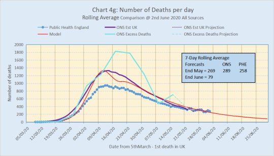
CHART 4G compares the daily figures from the model (red), the Public Health England (PHE) figures (dark blue) and the ONS figures (purple) for all Covid related deaths which are both actual figures upto 22nd May and projections from then. I have also included the ONS figures for excess deaths (light blue). The main features are:
1. ONS figures are still consistently higher than PHE figures (the official government figures presented at the daily press conference) although that gap is closing, running cumulatively at about 32% higher to date and at about 12% higher in the days leading up to 22nd May.
2. The model is still a good close fit to the daily ONS figures although the projected ONS curve and the PHE data curve have now started to cross the model forecast. This is worrying because it could indicate that the disease is not slowing down as fast as it should and may even be starting to flatten out leading to a long gradual increase.
3. The model forecast was a 7-day rolling average of 269 for the 31st May, compared to the PHE data of 258 and the ONS projection of 289.
4. The ONS figures for excess deaths closely follows the ONS curve for Covid deaths upto about 12th April and then sharply diverges. The debate is whether the big gap between the two after 12th April is due to under-recording of Covid deaths on the official death certificates, or deaths caused as a direct result of people with other medical conditions not being able to receive the necessary medical care.
5. The discrepancy is shown more clearly in Chart 16 which compares the three data sources on May 22nd.

CHART 2F compares the cumulative figures from the same sources

The main features are:
1. The model line which is closely tracking, though slightly lower, the ONS Covid figures is still projecting total deaths in excess of 50,000 by the end of June. The projected total is just over 54,000 with the disease petering out in the second week of October.
ISSUES
Because the government has now started its exit strategy the figures will start changing from the trajectory you see in these charts. So I may need to change one or two parameters in the model to reflect what the government is doing. The serious sign to look for is if the curves in chart 4g start to flatten which would be an early indicator of the start of a second wave.
Looking at Chart 4h, which is a section of Chart 4g for May suggests that this may be starting to happen.

You can see more clearly that the two data curves for PHE data and the ONS projection are crossing the model forecast. This suggests that the disease is not slowing down as fast as it should be and could be starting to flatten. One significant feature is the blip shown in the circle around the 24th/25th May. This is 16/17 days after the VE Day long weekend. Of course this could be a coincidence but it does correspond very closely to the time lag between being infected and death.
SUMMARY
1. The model continues to track the ONS figures very closely, though running slightly lower.
2. The model forecast was a 7-day rolling average of 269 for the 31st May, compared to the PHE data of 258 and the ONS projection of 289
3. If this continues then the projected number of deaths directly associated with COVID-19 is just over 54,000 and the disease appears to peter out in early October
4. Worryingly there is some evidence that the disease is not slowing down as fast as would be expected. You can see this more clearly from Chart 4h which shows that the two data curves for PHE data and the ONS projection are crossing the model forecast. This suggests that the disease is not slowing down as fast as it should be and is starting to flatten. One significant feature is the blip shown in the circle around the 24th/25th May. This is 16/17 days after the VE Day long weekend. Of course this could be a coincidence but it does correspond very closely to the time lag between being infected and death
STATISTICAL ISSUES
1. The three data sources have different bases so I have used some factors to relate all three to the same base of the UK.
2. The PHE figures are UK deaths from all settings, attributable to COVID and where there has been a positive test for COVID
3. The ONS figures are the actual number of deaths registered each day and attributed to COVID either directly or as a comorbidity. But the ONS only publishes these figures for England and Wales. I have now added the equivalent actual figures from Scotland and Northern Ireland upto 22nd May. I then use the ratio of the total figures up to 22nd May divided by the PHE figures to that date to give the projection of the total (ONS+) figures through to the current date.
4. The ONS figures are collated to approximately ten days before their publication (weekly every Tuesday). From that date I estimate figures until the next report is produced. The estimate is based on the same factorisation as in (3)
5. The excess deaths are the difference in the the number of deaths in any given week with the average of the same week over the last five years. Again the figures from the ONS are for England and Wales only so I scale up in the same way. I don’t project these beyond the date on which the report is based because there is no obvious factorisation to use.
About Me
Don’t forget you can check my post on “Background and Credentials” if you want to find out more about me and what I am posting. You can get to that and other posts as I add them via the Index to posts. Click here: Index to Blog Posts
0 notes
Text
Data Quality and Accuracy
This is simply my Facebook post from 9th April
Introduction
When I first saw the government strategy for dealing with the Coronavirus epidemic I was deeply concerned. Why? Because the concepts of “flattening the curve” and “herd immunity” and the numbers within the time-scales they were talking about just didn’t stack up.
Those two features are mutually incompatible goals within a short-term timescale. “Flattening the curve” means DECREASING the number of infections in the population whilst “herd immunity” implies INCREASING the number of infections and therefore, by implication, the number of deaths. I couldn’t believe that they were even contemplating “herd immunity” as a strategy - effectively it means “do nothing” and let the virus just rip through the population.
So I decided to build a model of the spread of the disease to get to the bottom of what was going on. The model was based on early research reports on the spread of the disease in China and calibrated against the early figures being published by Public Health England. I have been running the model since the middle of March and posting results and comments. The model was tracking what was actually happening from 31st January to around 24th March and then started to diverge. There was no obvious reason for this so I suspected there was something wrong with the underlying data.
This post is a commentary on initial analysis I have done of data quality and accuracy from official sources.
Data Sources
Before I lay into the official statistics let me recommend a report recently published by the Intensive Care National Audit & Research Centre. It seems to be a thorough and comprehensive analysis of Coronavirus cases who have gone through ICU. Here’s the link: https://www.icnarc.org/About/Latest-News/2020/04/04/Report-On-2249-Patients-Critically-Ill-With-Covid-19
But we go from that to the chaos of official statistics. There are three main sources of data which present differing and sometimes apparently contradictory data which is also limited in some way- Public Health England, The Office of National Statistics and the datasets presented at the daily Press Conference (which you can download).
The main statistics published regularly by Public Health England early on were “cases” and “deaths”. Since they were the only information available at the time I used these to calibrate the model.
Cases.
“Cases” are people who have tested positive for the virus. There was limited testing at the beginning, and probably through to around 20th March. So in this period “cases” were effectively people tested who would be admitted to hospital - I.e. the more serious cases and therefore were a suitable proxy for the model and during this period (through to about 24th March) the model accurately tracked those.
But the testing regime then changed and ramped up so the “case”, although useful for medical purposes, became meaningless as a statistic because testing has never been random and is totally biassed by the population being tested. If you increase testing you will inevitably increase the number of cases so using the “case” as a statistic to assess growth or decrease of the disease is meaningless until testing is randomised and applied to the general population. Yet they continue to show this daily in the press conference.
The more meaningful statistic, which should have been used from the outset, is hospital admissions. These have only been released recently. Why not sooner? There’s no clear reason or explanation - admissions are routinely collected.
Admissions are now being released as part of the Press Conference dataset, but they only cover England and Wales. So I have scaled these up to include Scotland and Northern Ireland. Then I ran the model (unchanged) with both the cases and admissions data.

The results are in Chart 12 which shows:
1. The chaotic nature of the “cases” statistic (blue line)
2. The admissions (purple line) is obviously going through daily ups and down but is vaguely following the same pattern as the model but below it

We can smooth these curves to remove some of the day-to-day variation by using 5-day moving averages. These give Chart 12a instead which shows more clearly:
1. The similarity between the model and admissions but with the model predicting higher results.
2. The model reaching a peak on 1st April and the admissions data possibly peaking at around the same time
3. At the peak time the model is about 60% above the admissions data.
Why the difference in figures at the peak time?
The model originally was never designed for “hospital” cases, it was looking at “serious” cases though I assumed originally that serious cases would inevitably be hospital cases … but it turns out that’s not necessarily true and that serious cases were occurring in the community.
What has recently come to light is that the government has NOT been publishing the true number of deaths and is still not doing this in its press conferences - it is only presenting hospital deaths and not including deaths in the community. So let’s look at that now.
Deaths
The Office of National Statistics publishes information about the number of deaths as actually recorded on the death registers. These reports are produced weekly and are also a week behind so the most recent report is only upto 27th March but the statistics make interesting reading because they are very different from the hospital figures. See Chart 4b for the comparison.

This shows:
1. The blue line of hospital deaths is running well below the model;
2. The ONS figures for deaths after 27th March are just projections based on scaling up from the hospital admissions (they are running about 70% higher). But with the scaling up they match the model very closely.
The daily variation can be smoothed out again using 5-day rolling averages as shown in chart 4c which shows a peak being reached on 10th April, although statistically this could vary by a day or so.

The ONS figures should be the most accurate and the difference has been attributed to deaths in the community. If that is the case you have to ask why people in serious condition are not being admitted into hospital.
The more you look at the data the more questions it throws up …..
In summary, related to what is being presented at the press conferences:
1. “New Cases” is a spurious statistic and yet is still being presented and used to comment on whether the spread of the disease is changing
2. The true figures for the number of deaths is not being shown
3. The model, and the behaviour of the “admissions” curve suggest that we have passed the peak of hospitalisation unless something else changes (e.g. if social isolation actally started later or didn’t reach its target)
4. The model and the behaviour of the “ONS deaths” curve suggest that we are now close to the peak of deaths.
5. On other data presentation issues you may have noticed that the “global�� presentation has been changed from a logarithmic to a linear scale, which changes the shape of the curves and could be misread by anyone not familiar with how this scaling works.
Currently the model is predicting around 25000 deaths in total with the epidemic petering out at the end of May although again this is all dependent on whether the government makes any other changes to its attempts at controlling the disease.
Cross-reference
See post on Data Quality of 1st May
About Me
Don’t forget you can check my post on “Background and Credentials” if you want to find out more about me and what I am posting. You can get to that and other posts as I add them via the Index to posts. Click here: Index to Blog Posts
0 notes
Text
DATA QUALITY
This is simply my Facebook post of 1st May 2020
Nothing from the model today but I have always said that the model is only as good as the data on which it is based. So I’m just going to do a quick audit of some of the data the government has been presenting us. This helps me in ensuring the model is as accurate as possible but also it’s to ensure that everyone understands exactly what the government has been doing with its data and how we should be careful in interpreting data being presented to us.
DEATHS
Up until about a week ago the government, in its press conferences, was authoritatively presenting us with numbers of deaths which were way, way below what was actually happening. This was blown out of the water on April 23rd by a Financial Times expose and the government has been scrabbling over the last week to get accurate figures in place. So now we have the “new” set of authoritative figures which supposedly includes death in all settings (I.e. community & care homes etc). But if you go onto the government Covid web-site and look carefully at the notes about the data you’ll see the following:
“The data do not include deaths of people who had COVID-19 but had not been tested, people who were tested positive only via a non-NHS or Public Health laboratory, or people who had been tested negative and subsequently caught the virus and died”
So the figures we are being shown are still underestimates. Theoretically the Office of National Statistics should be presenting the definitive figures in their weekly report but I wonder if they have been required to change their definition as well. I hope not.
Not only are the figures underestimates but Public Health England seems to be re-writing history. The dataset it publishes every day has been altered retrospectively so that the figures conform with the new definition all the way back to the beginning of March. Whilst I don’t have a problem with this statistically it lacks transparency. Without looking at the small print anyone just viewing the figures would think that PHE had been correctly reporting from the beginning. If they wanted to be transparent they would have kept their original figures alongside the new ones. Where has the old data gone? There is a link on their site to archived files but none of the files there contain any data. Worrying. Also PHE no longer publishes hospital statistics but gives a link to the NHS site instead, so now there is yet another source of data.
HOSPITAL DISCHARGES
These have never been published so we have no idea of how many patients have actually recovered and, therefore, what the death rate in hospital is.
HOSPITAL ADMISSIONS
This is one of the key statistics that gives an understanding of the later stages of the disease but its has been a data debacle from the beginning.
Upto 12th April the press conference datasets referred to “hospital admissions” but what they really meant, it seems, is bed occupancy - the charts they showed referred to people in hospital beds. On 13th April the datasets referred confusingly to the same numbers as both admissions and hospital beds. By 16th April the datasets now referred to hospital beds only and by 28th April the datasets now referred to “people in hospital with illness related to Covid19”. Finally by 30th April they now started reporting on real admissions and have included those from patients in beds separately. It seems incredible that people with knowledge of healthcare statistics could make such an elementary mistake from the start in confusing admissions with people in hospital beds, which are completely different.
THE R VALUE
Over the last few days the government has just started talking about corona having a reproduction rate, or R-value, of 3. In other words one person will on average infect 3 others. I believe that they were mistakenly using a lower figure originally in their modelling which could partly explain why there didn’t seem to be an urgency in introducing the lockdown earlier. Why do I believe that?
At the famous conference when Johnson first mentioned the plan for “herd immunity” (which they have been denying ever since) the chief scientific officer let slip that they would be looking at a level of immunity of 60% in the population. That was a very specific number, which actually corresponds to an R-value of 2.5 which was the mean value that was coming out from early research work in China. That R-value would have led to a slower spread of the disease - hence perhaps contributing to the lack of urgency.
CAN WE DO ANYTHING WITH THE NEW DATA?
I’ve managed to get what I think is a consistent set of data for England hospital bed occupancy, admissions and deaths.. I’ve taken the last two and the ONS statistics on deaths and put them together on the following chart which has some interesting features.

The peaks between the two curves for admissions and deaths are about 6 days apart, which suggests that that is the average length of stay in hospital of those patients who die. That also confirms one of the changes I made in the new version of the model.
There is also a 7 day gap between the peaks for hospital deaths and the ONS stats, which includes all other deaths. This would suggest a separate epidemic of “community spread” from “hospital spread”.
One of the crucial statistics the figures give is the death rate in hospital, which is around 33%. In other words for every 100 people admitted to hospital on a particular day you would expect, on average, 30-35 deaths 6 days later.
Although the admissions curve is declining it seems to be flattening slightly and is still well above 1000 admissions a day which would mean say a continuing 300-400 deaths in hospitals in England for a further week.
The ONS curve is running considerably higher (about 70%) - it includes all deaths in the UK in hospital and community settings and deaths in which the patients may not have received formal tests.
It’s a pity that this information wasn’t made public earlier and that we were treated to a presentation of misleading and confused data instead. Just my view.
Reference:
This is a follow up to an earlier post on data quality on 9th April
About Me
Don’t forget you can check my post on “Background and Credentials” if you want to find out more about me and what I am posting. You can get to that and other posts as I add them via the Index to posts. Click here: Index to Blog Posts
0 notes
Text
CORONAVIRUS NUMBERS UPDATE 26th MAY 2020
The latest ONS weekly report has been published, which is based on actual registered deaths attributed to Covid-19, either directly or as a co-morbidity. These are much more accurate figures than the government publicises and has been consistently higher. Even though the government was forced to change its reporting after 28th April it is still significantly under-reporting the total number of deaths. Here are the latest versions of the three charts, which extend through to the end of June. There is little evidence so far of the curves changing as a result of the government’s stage 1 easing of lockdown. However there is a time lag in the number of deaths so we wouldn’t expect to see a change until last week of May at the earliest.

CHART 4G compares the daily figures from the model (red), the Public Health England (PHE) figures (dark blue) and the ONS figures (purple) for all Covid related deaths which are both actual figures upto 8th May and projections from then. I have also included the ONS figures for excess deaths (light blue). The main features are:
1. ONS figures are still consistently higher than PHE figures (the official government figures presented at the daily press conference) although that gap is closing, running at about 31% higher to date and 12% at May 15th.
2. The model is still a good close fit to the daily ONS figures although running slightly higher. If I changed the level of social isolation by just 1% the lines would be more or less identical over the last four weeks.
3. The model continues to show quite high daily death rates towards the end of May (240-260 deaths per day) falling to below 100 a day by the last week of June which is slightly encouraging.
4. The ONS figures for excess deaths closely follows the ONS curve for Covid deaths upto about 12th April and then sharply diverges. The debate is whether the big gap between the two after 12th April is due to under-recording of Covid deaths on the official death certificates, or deaths caused as a direct result of people with other medical conditions not being able to receive the necessary medical care.
5. The discrepancy is shown more clearly in Chart 16 which compares the three data sources on May 15th.

CHART 2F compares the cumulative figures from the same sources.

The main features are:
1. The model line which is closely tracking the ONS Covid figures is still projecting total deaths in excess of 50,000 by the end of June. The projected total is just over 54,000 with the disease petering out in the second week of October.
ISSUES
Because the government has now started its exit strategy the figures will start changing from the trajectory you see in these charts. So I may need to change one or two parameters in the model to reflect what the government is doing. The serious sign to look for is if the curves in chart 4g start to flatten which could be an early indicator of the start of a second wave.
SUMMARY
1. The model continues to track the ONS figures very closely.
2. Deaths by the end of May are projected to be 240-260 a day
3. If this continues then the projected number of deaths directly associated with COVID-19 is just over 54,000 and the disease appears to peter out in early October
4. There is no evidence yet of any change resulting from stage 1 of the exit strategy.
STATISTICAL ISSUES
1. The three data sources have different bases so I have used some factors to relate all three to the same base of the UK.
2. The PHE figures are UK deaths from all settings, attributable to COVID and where there has been a positive test for COVID
3. The ONS figures are the actual number of deaths registered each day and attributed to COVID either directly or as a comorbidity. But the ONS only publishes these figures for England and Wales so I adjust them upwards in line with the equivalent ratio for the PHE numbers I.e. (No. PHE Deaths UK)/(No. PHE Deaths England & Wales).
4. The ONS figures are collated to approximately ten days before their publication (weekly every Tuesday). From that date I estimate figures until the next report is produced. The estimate is based on the same factorisation as in (3)
5. The excess deaths are the difference in the the number of deaths in any given week with the average of the same week over the last five years. Again the figures from the ONS are for England and Wales only so I scale up in the same way. I don’t project these beyond the date on which the report is based because there is no obvious factorisation to use.
About Me
Don’t forget you can check my post on “Background and Credentials” if you want to find out more about me and what I am posting. You can get to that and other posts as I add them via the Index to posts. Click here: Index to Blog Posts
0 notes
Text
Transparency and the Government’s Gamble on Schools
In his speech outside Downing Street on 27th April Boris Johnson talked about the way forward and promised “I want to serve notice now that these decisions will be taken with the maximum possible transparency and I want to share all our working and our thinking, my thinking, with you the British people”.
This hasn’t exactly been forthcoming since then. Data presented at the daily press conferences has certainly been adjusted. The regular international comparison was dropped just after the UK topped the European charts for deaths. After April 28th the government was forced to amend all their death figures upwards by about 4000, although we are still not seeing the correct figures. One piece of data which has been missing from the start is how many people have actually recovered from the disease. Why? You’d think that would be good news.
In terms of the “working” Johnson mentioned, there is still no clear explanation of how, for example, the R-number is being calculated nor on how decisions have been reached - for example advice on wearing of masks, the strategy for test track and trace, and the opening up of schools.
On May 5th the government did start publishing some of the earlier SAGE papers although not all with perhaps the level of transparency that you might have expected! Look at this for example:

Ever since the government announced its intention to have a limited opening of schools from 1st June there has been a clamour to see the evidence on which that decision would be based. Eventually another batch of SAGE working papers was posted on the government site yesterday. There are a number of papers related to children but I have not been able to find a single paper with definitive decision criteria which would indicate how that decision would be made.
What we seem to know is that:
1. The risk to children of primary school children is very low. They are the group with the lowest mortality rate, but there are indications of complications (symptoms similar to Kawasaki disease) and little evidence of research into possible long-term effects.
2. Children appear to have the same chance of being infected as other age groups.
3. There is no clear evidence that children transmit the COVID more or less easily than other age groups so we must assume the risk of catching the disease from an infected child is the same as from an infected adult.
So, given this, it would appear that scientific evidence is being sought to support whether or not opening schools would bring the R-value above 1 and hence expose the general population to the increased risk of the disease growing once more. That is what is shown in an interesting set of slides from SAGE summarising the results of simulations of various school opening scenarios. The key number they were looking at was the change in value of R in each of the scenarios. Here’s one of the slides (Figure 1) that summarises that.
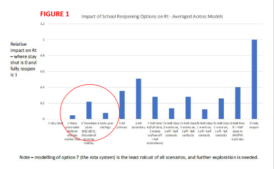
There were four separate organisation who ran their own models independently. These were London School of Hygiene and Tropical Medicine/ Cambridge University, Public Health England, Bristol/Exeter University, Warwick University.
The R-value for each of the scenarios is the average of the four models. Interestingly none of the scenarios the organisations were asked to model is what the government is actually proposing which is an obvious limitation in providing the “science” on which the government is claiming to be making its decision.
The closest we can get is looking at the three scenarios in the red circle and adding the R-values together with a bit of adjustment. I can’t find a publication with the actual data in a report so we’ll have to estimate from the graph (by creating equivalent graph in spreadsheet). So it looks as though:
1. “More vulnerable children and key worker kids” (scenario 2) contributes around 0.05 to the R-value;
2. “Early Year settings” (scenario 4) contributes just under 0.07; and,
3. “Transition years 5/6/10/12” contribute around 0.22 but only year 6 forms part of the government’s proposal. From the figures, one primary school year is equivalent to an R-value increase of 0.06
4. Adding these values together gives an increase of R of 0.18.
The government also announced yesterday that the latest estimate of R is in the range 0.7 to 1, with an implied average of 0.85. Adding the increased value to this average brings the R over 1, which would be contrary to the government’s tests for relaxation of lockdown, especially given that other relaxation measures have already been taken. The alternative calculation would be to add the 0.18 to each end of the R range which would give a new range of approximately 0.88 to 1.18 suggesting, crudely that there’s only a 40% chance of the R-value remaining below 1.
The aim of this blog is not the safety of children (very important but with a very low risk) but the longer term (I.e. within next 3-4 months) increase of the number of deaths in the population. That will occur if there isn’t an effective test and trace system in place. If R goes above 1 and is not mitigated through test and trace (which we don’t yet have) then thousands, if not tens of thousands, more deaths will occur. So the government is gambling against the odds based on SAGE’s own figures.
You have to ask, what odds are the government prepared to gamble on?
Summary
1. By opening up schools on 1st June the government is taking a gamble. What odds are the government prepared to gamble on?
2. On 27th April Boris Johnson talked about the way forward and promised “I want to serve notice now that these decisions will be taken with the maximum possible transparency”. That hasn’t exactly been forthcoming.
3. On May 5th the government did start publishing some of the earlier SAGE papers. But the few papers related to schools didn’t appear until last Friday (22nd May).
4. The indications are that the risk to children of primary school children is very low. They are the group with the lowest mortality rate, but there are indications of complications (symptoms similar to Kawasaki disease) so there may be longer-term medical issue we are not yet certain about.
5. In my post of 17 May I looked at the chances of there being an infected child in a school on any day. What I want to look at now though is the increase of the disease in the population as a result of schools opening.
6. The key to this is a slide used in a SAGE presentation which shows the average results of models from four different organisations. See Figure 1. This shows the change in the value of R if schools are opened in different ways.
7. Interestingly none of the scenarios the organisations were asked to model is what the government is actually proposing which is an obvious limitation in providing the “science” on which the government is claiming to be making its decision.
8. The closest we can get is looking at the three scenarios in the red circle and adding the R-values together with a bit of adjustment.
9. This gives an increase of R of 0.18.
10. The government also announced yesterday that the latest estimate of R is in the range 0.7 to 1, with an implied average of 0.85 So, adding 0.18 to this takes us above 1 and the disease will start increasing again.
11. The alternative calculation would be to add the 0.18 to each end of the R range which would give a new range of approximately 0.88 to 1.18 suggesting, crudely that there’s only a 40% chance of R remaining below 1.
12. In other words the government is gambling against the odds based on SAGE’s own figures and thousands, if not tens of thousands, more people will die if this is not mitigated by an effective test and trace system (which we don’t yet have)
13. You have to ask, are these odds acceptable?
About me
Don’t forget you can check my post on “Background and Credentials” if you have want to find out more about me and what I am posting. You can get to that and other posts as I add them via the Index to posts. Click here: Index to Blog Posts
0 notes
Text
The Impact on Deaths of Delaying Lockdown
From Facebook post 14th April
Introduction
When I first saw the government strategy for dealing with the Coronavirus epidemic I was deeply concerned. Why? Because the concepts of “flattening the curve” and “herd immunity” and the numbers within the time-scales they were talking about just didn’t stack up.
Those two features are mutually incompatible goals within a short-term timescale. “Flattening the curve” means DECREASING the number of infections in the population whilst “herd immunity” implies INCREASING the number of infections and therefore, by implication, the number of deaths. I couldn’t believe that they were even contemplating “herd immunity” as a strategy - effectively it means “do nothing” and let the virus just rip through the population.
So I decided to build a model of the spread of the disease to get to the bottom of what was going on. The model was based on early research reports on the spread of the disease in China and calibrated against the early figures being published by Public Health England. I have been running the model since the middle of March and posting results and comments. The model has been accurately tracking the number of deaths.
Why am I qualified to comment? I have a first degree in mathematics and a masters degree in “operations research” (essentially application of mathematical modelling techniques to aid decision-making). I also started my career in modelling health and social care with the Institute of Biometry and Community Medicine
What might have happened if? …..
Worldometer keeps track of international comparisons (see chart). It’s showing that we are currently suffering 132 deaths per million population, compared to Germany at 33, one quarter of our rate; we and Germany both recorded our first case at almost the same time. So why does Germany seem to be dealing more successfully with the outbreak? The view is that we did too little too late and that if we had tested, tested, tested and shutdown much sooner we would now be in a much better position.
Worldometer Stats

So I have run the model with two alternative scenarios of the same social isolation regime as now but: (a) starting from March 5th, the official date of first death, and (b) starting from 15th February, the half-way point between that date and the date of the first registered case. The results are shown in Chart 9 (originally published 3rd April, updated 12th April). The model scenarios are compared against published data on deaths (blue line is hospital deaths, purple is ONS data on TOTAL deaths and projections).

The current model (red line) with isolation starting from 15th March (when “nudging” was being promoted rather than full lockdown) was closely tracking actual data so I am confident about the accuracy of the working of the model up to that time.
What the chart also shows though is the dramatic difference in the the number of deaths when isolation is started sooner:
1. If we had started on 15th February, about 2.5 weeks after the first case was registered then the number of deaths could have been kept to double figures (model gives 24 - yellow line);
2. Delaying the start of isolation from when the first death was recorded to the time of the first death would have increased the number of deaths 100-fold (model estimated 2300 - orange line).
3. And, in comparison, starting the isolation regime from 15th March looks as though it could result in a further ten-fold increase in the number of deaths (model estimates 25,000 - red line) unless:
a) further isolation measures are enforced,
b) those aged over 60 take extra-special care to self-isolate (because the stats show they have substantially higher mortality rates);
c) and life-saving equipment is delivered
The differences are so dramatic because the number of infected people is increasingly exponentially at a fast rate. That rate was a doubling every 3-4 days from 3rd March NOT, as mentioned by Michael Gove, several weeks later.
Credentials
Don’t forget you can check my post on “Background and Credentials” if you have any doubts about the authenticity of what I am posting. You can get to that and other posts as I add them via the Index to posts. Click here: Index to Blog Posts
(Retrospective Note, 22nd May. This is a follow-up on original idea posted on 21st March and has been updated on 9th May. At the time this was version 1 of the model which I subsequently re-calibrated once it became apparent that the data being provided by the government was incorrect. Basically I changed the value of R but, as a result the outcomes became worse. See ….. https://coronamaths.tumblr.com/post/618488061921296384/could-we-have-done-better-9th-may). For original post see: https://coronamaths.tumblr.com/post/618846658425470976/the-start-3-21st-march
0 notes
Text
The Start #3 - 21st March
My posts started on Facebook on 20th March. The posts were a little frantic to begin with as you’ll see and then settled down as I started to use the model in a more exploratory way.
Facebook 21st March, second post
This is a damning indictment of the government’s incompetence in handling the pandemic. By deliberately choosing not to enforce isolation sooner the government has caused tens of thousands of more deaths than should have happened. I am basing this on the epidemiological model I have developed.
FIRST THE CURRENT NUMBERS:
1. Actual number of confirmed cases today = 5018, model predicted 5079
2. Actual number of deaths reported = 233, model predicted 223
3. So I’m underestimating deaths by about 5%
4. Model predictions for tomorrow are: number of cases = 6483, number of deaths = 285
NEXT THE “WHAT IF” NUMBERS, assuming the model continues in the same way:
1. If the government reaches its target of 75% isolation of the population within the next eight days then the epidemic will peter out by roughly 28th May with about 24,100 deaths
2. What would have happened if the government hadn’t dithered and took immediate action on isolation when the first death was reported? This was on 5th March when there were also 114 serious confirmed cases. In this case the epidemic would peter out on 29th April with 2,100 deaths
3. So the government’s flawed strategy of hand-washing and carry on as normal will have resulted in a TEN-FOLD increase in deaths (or about 22,000 extra deaths). AND WE COULD HAVE TAKEN ACTION EVEN EARLIER - first recorded case in UK was 31st January.
Credentials
Don’t forget you can check my post on “Background and Credentials” if you have any doubts about the authenticity of what I am posting. You can get to that and other posts as I add them via the Index to posts. Click here: Index to Blog Posts
(Retrospective Comment 22nd May. At the time this was version 1 of the model which I subsequently re-calibrated once it became apparent that the data being provided by the government was incorrect. Basically I changed the value of R but, as a result the outcomes became worse. See ….. https://coronamaths.tumblr.com/post/618488061921296384/could-we-have-done-better-9th-may)
0 notes
Text
The Start #2 - 21st March
My posts started on Facebook on 20th March. The posts were a little frantic to begin with as you’ll see and then settled down as I started to use the model in a more exploratory way.
Facebook 21st March
Hate to be a Cassandra but when we've been lied to from day 1 about Corona in the UK we need some truth about the data. So here's a daily update on my model:
1. Model is accurately predicting new cases and matching the historic changes over the last 55 days
2. Yesterday total cases reached 3983, model predicted 3980
3. Yesterday total deaths reached 177, model predicted 175
4. Difficult to interpret Boris's waffle about 20,000 deaths, turn of tide in 12 weeks etc. But yesterday a figure of 75% was quoted for the degree of isolation they are targetting.
5. So plugged that figure into model which resulted in 24,000 deaths reached by end of July so that could be what Boris meant
6. BUT and it's a big but, it doesn't end there because by end of July there is still insufficient immunity in the population - only reaches about 2% so, without vaccination, the disease will continue for a very long time
7. Peak number of cases in hospital at any one time looks like about 11000 - way, way above resources available (i.e. ventilators) which would suggest that death rate in hospital will increase
8. Looking 18 months ahead the number of deaths has risen to 72,000; immunity in the population is running at about 5% and hospital case per day are 2500 - but these figures are speculative based on us continuing in exactly the way we are now.
Credentials
Don’t forget you can check my post on “Background and Credentials” if you have any doubts about the authenticity of what I am posting. You can get to that and other posts as I add them via the Index to posts. Click here: Index to Blog Posts
0 notes
Text
The Start #1 20th March
My posts started on Facebook with this post on 20th March. The posts were a little frantic to begin with as you’ll see and then settled down as I started to use the model in a more exploratory way.
Facebook 20th March
You may have noticed in my posts that I have been scathingly sceptical about the government’s Corona modelling that has been going on. So I decided to build my own model. The results match very closely to what has been actually happening in the UK to date but the future projections are frightening.
The reason for this is that to get the match with actual data I have had to assume a death rate of over 60% of hospitalised patients. This just didn’t sound right. Whenever the experts have been questioned on death rate on TV they have always been very cagey, so I’ve done some probing.
The attached photo is a clip from the Public Health England web-site and here’s a quick interpretation of what’s going on:
1. To be a hospitalised case you probably have to show more serious symptoms
2. There are only two outcomes for leaving hospital - either dead or recovered
3. Number of recovered cases = 79
4. Number of deaths = 144
5. So number of cases so far with outcomes = 79 + 144 = 223
6. So death rate, once hospitalised, = 144/223 or around 65% - very close to the figure I had to assume for my model
I suspect that this, or somethng similar, is what was shown at the beginning of the week to the government by Imperial College which caused the very sudden change in direction from “wash your hands” to virtual lockdown.
Credentials
Don’t forget you can check my post on “Background and Credentials” if you have any doubts about the authenticity of what I am posting. You can get to that and other posts as I add them via the Index to posts. Click here: Index to Blog Posts
0 notes
Text
CORONAVIRUS NUMBERS UPDATE 19th MAY 2020
The latest ONS weekly report has been published, which is based on actual registered deaths attributed to Covid-19, either directly or as a co-morbidity. These are much more accurate figures than the government publicises and are consistently higher. Even though the government was forced to change its reporting after 28th April it is still significantly under-reporting the number of deaths. Here are the latest versions of the usual two charts, plus one new chart, which I’ve extended through to the end of June. There is little evidence so far of the curves changing as a result of the government’s stage 1 easing of lockdown. However there is a time lag in the number of deaths so we wouldn’t expect to see a change until last week of May at the earliest.

CHART 4G compares the daily figures from the model (red), the Public Health England (PHE) figures (dark blue) and the ONS figures (purple) for all Covid related deaths which are both actual figures upto 8th May and projections from then. I have also included the ONS figures for excess deaths (light blue). The main features are:
1. ONS figures are still consistently higher than PHE figures (the official government figures presented at the daily press conference) although that gap is closing, running at about 32% higher to date and 14% at May 8th. This is despite the fact that the government was forced to change its figures after 28th April to include community deaths
2. The model is still a good close fit to the daily ONS figures
3. The model continues to show quite high daily death rates towards the end of May (200-250 deaths per day) falling to below 100 a day by the last week of June which is slightly encouraging.
4. The ONS figures for excess deaths closely follows the ONS curve for Covid deaths upto about 12th April and then sharply diverges. The debate is whether the big gap between the two after 12th April is due to under-recording of Covid deaths on the official death certificates, or deaths caused as a direct result of people with other medical conditions not being able to receive the necessary medical care.
5. The discrepancy is shown more clearly in Chart 16 which compares the three data sources on May 8th.
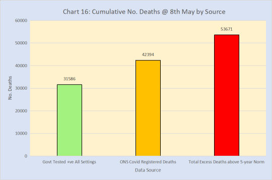
CHART 2F compares the cumulative figures from the same sources.

The main features are:
1. The model line which is closely tracking the ONS Covid figures is still projecting total deaths in excess of 50,000 by the end of June. The projected total is just over 54,000 with the disease petering out in the second week of October.
2. The excess deaths is starting to flatten.
ISSUES
Because the government has now started its exit strategy the figures will start changing from the trajectory you see in these charts. So I will need to change one or two parameters in the model to reflect what the government is doing. This will be largely trial and error over the next week or so because we are not being told what the government expects the impact of their changes to be - especially in the R-value but also in the figure for the level of social isolation. We’ll see what happens this time next week.
SUMMARY
1. The model continues to track the ONS figures very closely.
2. Deaths by the end of May are projected to be 200-250 a day
3. If this continues then the projected number of deaths directly associated with COVID-19 is just over 54,000 and the disease appears to peter out in early October
4. There is no evidence yet of any change resulting from stage 1 of the exit strategy.
STATISTICAL ISSUES
1. The three data sources have different bases so I have used some factors to relate all three to the same base of the UK.
2. The PHE figures are UK deaths from all settings, attributable to COVID and where there has been a positive test for COVID
3. The ONS figures are the actual number of deaths registered each day and attributed to COVID either directly or as a comorbidity. But the ONS only publishes these figures for England and Wales so I adjust them upwards in line with the equivalent ratio for the PHE numbers I.e. (No. PHE Deaths UK)/(No. PHE Deaths England & Wales).
4. The ONS figures are collated to approximately ten days before their publication (weekly every Tuesday). From that date I estimate figures until the next report is produced. The estimate is based on the same factorisation as in (3)
5. The excess deaths are the difference in the the number of deaths in any given week with the average of the same week over the last five years. Again the figures from the ONS are for England and Wales only so I scale up in the same way. I don’t project these beyond the date on which the report is based because there is no obvious factorisation to use.
Credentials
Don’t forget you can check my post on “Background and Credentials” if you have any doubts about the authenticity of what I am posting. You can get to that and other posts as I add them via the Index to posts. Click here: Index to Blog Posts
0 notes