
creativecraig
Craig Allen
IXD Student - Belfast School of Art
693 posts
Don't wanna be here? Send us removal request.
Last Seen Blogs

aagym1111
Untitled

coatsey-1978
Untitled

isleofthenightfury
Motogp 18 Download Full Version

mobilesocial
Socialnet and mobile

litagomelikes-blog
Frøya
Text
UX Belfast: Designing for Behaviour Change (Part 2)
Next up we had Andi Jarvis. Not a designer but a Strategy Director for Eximo Marketing, Andi focused his talking all-around People and how they are predictable. Unlike many talks which have a start, middle, and end, Andi explained his talk through a series of example studies. A wine comparison, a vacuum cleaner, and a goldfish study were just a few example studies that Andi talked about.
Take the wine comparison study, people were given three different glasses of wine and told to score them from 1 (being the lowest) and 5 (being the highest). People when judging the first one scored it quite harshly, the second was an improvement and the third was the highest-scoring of them all. So having collected all the scores, the wine tasters were then revealed that it was the same wine in all three glasses. People feel obliged to score indifferently, by controlling measures like showing the content of what is in a glass of wine we can see that the way we present and market content has an impact on our audience.
Andi then introduced the term FAB which means Feature, Advantages, and Benefits. This is the process of stating features, showing the advantages, and then the benefits of the product to the audience. However, marketers love to over-explain features. Andi has redesigned this system to appear in the order of BAF; Benefits, Advantages, and Features. He then used the vacuum cleaner study as an example. Marketers would traditionally state the features of the vacuum, then advantages, and finally the benefits over others, by the time they've got past the features the audience is already bored and lost interest. However, by changing the order and putting benefits first, you immediately capture the audience's attention as they now know why your vacuum is better than their current. Next, you tell them the advantages which add to the benefits, now your audience sees the advantage over their current vacuum. Finally, you tell them the features of your vacuum that create the advantages and benefits so good. By restructuring the content structure, your audience engagement is dramatically changed with your audience being engrossed and intrigued.
Another study Andi talked about was the goldfish study. Back in 2000 Mircosoft stated that by 2015 out attention span would dramatically be increased. However, with the interventions of technology, it appeared that our attention span was actually less than that of a goldfish (8 seconds). Shocking stuff, right? Well, actually it turns out this was completely fabricated. Microsoft never actually did the study, their comments back in 2000 were linked to another study that was taken and not executed accurately. In fact, there are suggestions that a goldfish's attention span could be up to 50 seconds.
KISS
K - Keep
I - It
S - Simple
S - Stupid
When we are approaching an audience with a product or service, one of the main things marketers tend to do is overcomplicate the pitch and details. People do not understand technical jargon or terms as your audience are most likely not specialists in your product's field. Keeping it simple, explaining that your product does this, here is how you will benefit from our product, and this is why you need it, allows the user to understand be on the same level as you. Being on the same ground as your audience makes them feel more comfortable and as a result more approachable.
Andi raised the point, people believe people who look the part. For example, if we see a doctor in a white coat, we instantly believe his word is the gospel. In fact, doctors rarely wear white coats anymore and in fact, this person could just be a paid actor. The moral is to judge people's cases with the evidence they provide, do not just instantly believe because they look like they know what they are talking about or are dressed stereotypically.
0 notes
Text
UX Belfast: Designing for Behaviour Change (Part 1)
Having learned about the importance of behavioural design throughout the lockdown period, I was extremely interested to attend the latest UX Belfast webinar. UX Belfast is a series of webinar talks hosted by Rick Monro, Product and UX Designer at Puppet. Throughout these series of webinar, Rick normally invites a few guest speakers to share their knowledge and our experience on different UX topics. This event was all about "Designing for Behaviour Change", we were lucky to be joined with Amy Bucher and Andi Jarvis.
First up was Amy, a Behaviour Change Designer at MadPow in Boston and the author of Designing for Behavior Change. Amy's talk was titled Behavior Change Design for Products People Actually Use, and was incredibly insightful to see how someone from a scientific background applies their knowledge to the design process.
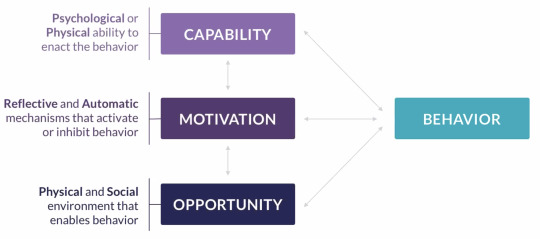
One of the main things Amy talked about was the COM-B model. This is the structure of behaviour change, it is split into three sections; Capability, Motivation, and Opportunity. The structure is as like above, to achieve a successful behaviour change, we need to consider these three different sections throughout the whole design process. Throughout my course, I was also introduced to the COM-B model, it is an extremely good way to see how all interactions of a user reflect and engage with their behavioural outcome. To achieve a successful behavioural change when designing, we need to consider what parts of these sections make the user go in the current direction, and what we can alter/change to achieve the goal that we aim to achieve.
Amy focused specifically on the motivational aspect of the user's behaviour. She talked about the Self Determination Theory, this focuses on two aspects controlled and autonomous. Controlled aspects are a good for short term change but often do not work well for long term change.
Amotivated - I have no desire to do this.
External - Someone told me I have to do this.
Introjected - I've internalised the nagging" Better do this.
Above are all aspects of controlled measures. From the examples highlighted you can see that controlled motivation is often not the key, it makes people complete tasks through a forced feeling of emotion rather than natural want.
Identified - Doing this will help me achieve goals I really value.
Integrated - Doing this is part of who I am.
Intrinsic - I love doing this; it feels great.
Autonomous on the other hand is the best way to achieve long-term change. Above are all aspects that make up autonomous motivation. Again from the examples, you can tell that users feel that they are personally benefiting from completing the tasks, they change their behaviour more naturally as they see personal benefit or gain.
Amy used another really great example of motivational behavioural change for guiding students towards better motivational quality. Using fundamental psychological needs such autonomy, competence, and relatedness, We can create a long-term behavioural change in student's mindsets steering them in a more determined and positive way.
Autonomy - I can make my own meaningful choices.
Competence - I am learning, growing, and succeeding
Relatedness - I am part of something bigger than myself. I belong.
So having shown the different ways, how can we test our behavioural change for effectiveness and efficacy. Amy explained that there are many different ways in which we can test for behavioural change and measure effectiveness and efficacy. Below are just a few different ways which we can use to test behavioural change;
Randomised Control Trials (RCTs)
Quasi-experimental studies
Real-world comparisons
Pre/Post evaluations
Case Studies
Surveys
0 notes
Text
Stroke Association - Cognitive Problems after Stroke - Tips for Family & Friends
One important part of the entire stroke process is the carers that are there to support the survivor. Often we forget to see family or friends as part of the cycle and take their care for granted. We need to ensure that carers understand exactly what is the issues that the survivor suffers from and how they can help to aid them on the road to recovery. Within the Stroke Association's Cognitive Problems after Stroke guide, there was a section including tips for family and friends. I could have included this in the previous post however we need to emphasis the importance of carers within the cycle their impacting role each carer has. Often we think tasks can be easy to do but it difficult to understand the issues that a survivor suffers, physically, mentally or emotionally. Below are just a few tips stated from the guide, these might be obvious to some but it is a good reminder to remember through the whole recovery process both the good and difficult times.
Do's
Be patient
Be encouraging
Help support them
Do Not's
Make thinks too complicated
Do everything for them
0 notes
Text
Neuralink

The future of our healthcare is very much being guided with the technology that we are creating. One of the leading businesses pushing the boundaries of our healthcare and also our limitations of the mind is Neuralink. Founded by Elon Musk (founder of companies such as The Boring Company and Tesla), Neuralink's mission is to develop an "ultra high bandwidth brain-machine interfaces to connect humans and computers." This seems like such an unrealistic goal, however this is a typical BHAG (Big Hair Audacious Goal) just like IBM and Tesla's goals when they first started business.
Currently Neuralink are using their implant chips at the testing faze to show how they can increase intelligence amongst pigs, as seen on their first live demo back in August 2020. Along side this, Neuralink are also looking to use their technologies to tackle issues such as healing loss and Parkinson's disease by stimulating nerves and areas of brain.
“We can save and replay memories. The future is going to be weird.”
- Elon Musk, Neuralink
Looking towards the future, Musk believe's that Neuralink has the potential to create an entire interface in your mind. Just like a mobile phone interface, Elon hints that using AI within Neuralink we will have no need for any device again, we will simply use our mind.
It is quite scary to see the thought of this in the future, however this isn't the first time the human race has been like this. Looking back during the 60's,70's and 80's the prediction of our future made people laugh and scared at what it might look at with films and predictions trying to give a visualization of this. In order to improve our abilities we must evolve in all areas, technology included. We must embrace what Neuralink and other businesses are trying to discover, as it will benefit us all in the future.
0 notes
Text
Babylon Health

One of the most talked about businesses within the health tech industry is that of Babylon Health. Babylon Health is a remote consultation provider that allows doctors and medical professionals to communicate with patients through text and conference calling on their platform. Their aim is to create "an accessible and affordable health service in the hands of every person on earth."
Through the use of their application users can ask questions about their health that they maybe be concerned about. The application can then provide feedback on the matter and if more action needs to be taken. If the concern is worrying, the application will then schedule you an appointment to speak with a doctor or medical expert to examine and give solution to their issue. This provides an easier platform to diagnose concerns, increase efficiency for medical professionals as well as reduce waiting times within hospitals.

The application allow provides health checks such as mood, nutrition and activity. This feature allows users to take control of their own health and check if they are living a health lifestyle. The app also allows users to monitor their own health through activities such as steps or monitor personal mood. By having these features we can now allow users to be more independent with their health and not rely on daunting Google search results (which normally cause worry than peace of mind).
Platforms like Babylon Health are become increasing important within our health system. Remote consultations are a great way to decrease the waiting time in hospitals, especially ones A&E which can take 9 hours to get diagnose a patient.
0 notes
Text
UX Bites: Designing for users by designing with users
Recently, I attended one of the UX Bites webinars held by the folks as Fathom. Held over lunchtime, UX Bites is a webinar series create by Fathom to allow them to share some insight into current topics and projects that they recently carried out. This webinar focused on designing for users by designing with users, something that can often be forgotten in the design world. The talk was held by Gareth Dunlop and Andy Robinson and split into two sections, each taking one section.
First up we had Gareth, who talking about different ways in which we can place ourselves in scenarios to think not like a designer, but the audience we are designing for. The first method he talked about was "getting out of the way", this technique allows us to get out of the way of the user's way. By getting out of the way as a designer and understanding from a user's viewpoint we open out a whole new way of realisation. Two main things come out of this exercise; we understand what the user wants, and how they will get it. This means we see the process the user takes rather than the process we have become design blind by due to creating the pathways, etc. It allows us to also see if the user has any pain points or areas of confusion when trying to use a service or view certain content through a process.
Another key point Gareth said was, "We are designing with not for". This was a really big point I took away from this whole webinar. We have to always remember we are the designer, not the intended audience, so for our designs to achieve the goal that we want, we have to design with and just what we want or what we think the user wants.
One of the ways we can understand to design with and not for is through user testing. Not just user testing as in within lab or an interview-style but within a person's home. By doing this we can see how a person uses the product or service daily, this allows us to understand the pain points they have during everyday life rather than a controlled environment such as a lab. One thing we need to question throughout testing both before, after, and during the design process is "has it a big impact" does the product or service we are testing/designing have a big impact on the user both physically and mentally. Normally processes like this really affect the audience we are designing for. Take an elderly user who is trying to use a conference call platform. If the impact is positive the user will feel confident in their ability and skill when using the platform, however, if the impact is negative, this can cause the user to feel like they are incompetent of using the platform and possibly other platforms as a result.

When gathering research or completing testing for user feedback, one of the methods Gareth talked about was the axis above. He explained how different tests have not only different results but also different types of information. One way in which Fathom, breaks down all different types of testing is through the user of the grid axis, as seen above. It is split Qualitative vs Quantitative and Overvational vs Attitudinal. Each test has its purpose and use, it really depends on the data that we are looking to collect. Take for example analytics, on the grid they are placed between Observations and quantitative. This is accurate as from analytics we do use any user input in terms of their opinion but more from the data collected from their actions. Analytics are also more quantitative than qualitative, as we using a large grouped collection to see the main trends of data rather than considering each user's data individually.
Next, we had Andy, who was talking about how we can user test during a pandemic. These forms of user testing are the main way in which Fathom is currently using to gain user insight and feedback. Just like the axis, there are different methods of testing remotely for different outcomes, it all depends on the type of data that you are looking to gain from the exercise. Take interviews, for example, Fathom tend to complete interviews either by the telephone or a conference call. So why do we have the two options, well firstly telephones most people have and they are quick to make. Conference calls require more IT literacy but allow us to analyse more aspects such as emotions, facial features, etc. The answer as to what one is best to use, it dependant on your audience and their tools that they have access to.
Andy then mentioned a key point, "why do we do research". We can research a lot about an area or a product, but what is the main goal as to why we are doing it? One of the main reasons we do research and testing is to discover unknowns. Currently, most of the data we see on the internet is already known, along with the information that we currently know from designing a product or service we need to discover the things that we are currently unaware of. One main way to do this is to think like the user and research based on the user's routine. This allows us to have a better insight into how, when, and where the product is used as well as the pain points of using the product and the process involved.
Another point Andy touched on was getting a balance of research. When completing research it is often easy to get carried away and go down "rabbit holes". We need to remember, to have the best impact, we need to have a collection of research. There are two main categories which we can split research into; User Opinions and Facts/Statistics. We need to ensure that we have a balance between these two categories as having sided research can give a bais feel, dramatically impacting the overall outcome of the product and the experience of the user.
When designing and researching we need to remember the two main key focal points, the user's experience, and their pain points. If we design a product or service that is designed for and not with, we miss the entire goal as to why we are doing the task in the first place. By focusing on the user's needs and requirements we can ensure that we are designing with, creating a better experience, and removing the pain points.
0 notes
Photo


Lumosity
Audience and Purpose
For those wanting to push their cognitive skills (mainly education)
Main audience of 8+
Lumosity is a cognitive training program for people who want to improve their processing skills and also encourages users how to learn about how their mind works.
Branding
Lumosity mainly uses shades of aqua and orange in contrast with a white background throughout the application. The aqua also switches with the white becoming the background, unlike Peak, the aqua is much darker than their blue. These colours are well executed with balance being carefully considered, this allows people with visual impairments to be able to see all content without difficulty but still changes up the style so it does not feel repetitive.
Another aspect I thought that was well executed was the use of iconography. Throughout the entire platform, icons have been used to assist with understanding of sections such as instructions. The detailing of these icons are also quite good as they are detailed enough to aid text content without being distracting or overwhelming, this is something I need to consider as my audience might suffer from focusing and processing issues.
Onboarding Experience
The onboarding experience was much different compared to Elevate and Peak in terms of structure. Firstly you are asked to tell the platform about yourself, I think this is quite warming but also gets a clear insight as to what stage of education the user is at. This section is also very clear and easy to understand with it being drop down and selection, there is no need to think about typing input this makes it quick and stress-free for the user to complete whilst also adding to the data collected by Lumosity to access their complete audience.
After the tell us about yourself section, we are then shown a annotated list stating "select the areas you'd like to practice". I think this a very important section of the onboarding experience as it give the user control of the content they want to see and target they want to focus on. Giving users sense of control is extremely important as it makes them feel connected to the platform and will enhance engagement. My only issue with this list, is the colour. I think they have got this completely wrong as they start with an aqua blue which when clicked turns to white, this makes it seem as if everything is already clicked when you first see it but is actually not.
The assessment is another important aspect of the onboarding experience. After you sign up you are hit with "We have 3 goals for you today", this makes it seem as the assessment is part of the goals for today. It makes the user feel encourage to perform and not switch off during it. This empathic language makes the user feel engaged as it set a target for this one day. I think short and long term goals are extremely import to get the most out of the user and push their development. I will certainly be using this within my platform as fatigue is extremely common post stroke, I want to get the most out of each user during the smallest amount of time.
Features
One of Peak's best features is the gaming experience. Before you play the game you are given a quick, simple instruction on how to play the game selected. The use of animated tutorials/how to guides are extremely useful, especially for an audience that suffer from memory issues. This is something I need to achieve when designing my application as in order for my audience to improve and gain success, they need to know exactly what is expected within each game.
Lumosity's main feature is their gaming experience. After you select a game you are given a brief, step-by-step instruction guide on what is exactly required. Animation has been used within this to show correct and wrong answers however it is not as effective as it could be. I think slightly more stubble animations would really enhance the user's experience and make it feel more enjoyable. One major concern from their game play is time. Each game is extremely repetitive and long, by the time you're 30 seconds into a game you have already became bored. I think a shorter time that was more intense would get much greater results and satisfaction from the user. Ratio of game play is also very confusing, currently I am playing on an iPhone XS which has a notch. All the dashboard are onboarding screens uses the full real estate of the screen however the game play has massive black borders making it feel from an older device (such as iPhone 6). They state "new games" for their premium users however I feel this is just recycled, old generation gaming content.
The scoring section at the end of the game is nice. Unlike the game play, it really grabs your attention with the animation of the graph. I also really enjoy the use of the encouraging heading within the section. I boosts the users confidence and makes them feel like they're heading the right direction. Stubble animations make a real impact on the user's experience with the application and can easily make or break your application if not used.
Another feature I thought was quite interesting was the games section. Using a breakdown of all games categorically, allows the user to take control of their recovery and select games that they enjoyed playing rather than ones they felt forced to complete. This has also been designed with consideration, as although there is a lot of content if has been designed with a even balance of visual to text. I do have some criticisms of this feature to, for example there is no daily limit per category. User's progression could stall as they could only focus on categories they find easy and avoid the main impactful topics. Another fault with this section is that there is no use of colour association. When a user sees a category they do not know what section is targeting certain areas. This is a bit disconnected and I think adding colour to even the title of each category will translate recognition to many users.
The statistics section is well presented but I feel it could be more. Each section has been used in a bar scoring system with a total to the right. However what exactly is the score out of? Cognitive LPI (Lumosity Performance Index) is seen a lot throughout this page but unless you click the information icon you don't know what any of the data you see is for or compared to. I think this needs to be highlight more to show exactly what the measure is and what it is compared to.
One of the best features of Lumosity is their history, tab within statistics. The use of a calendar to clearly see what days you used the application and total per week is extremely effective. The same way Snapchat uses streaks, it becomes addictive to keep each streak up with losing giving a feeling of regret. This is a feature I really intend to use with is being a clear way for users to see their activity.
Although not explained well, the actual break down of the cognitive LPI is actually extremely nice. Each section is included with progression shown through use of comparison over the previous 4 weeks. I think this is also extremely nice as it give the uses a sense of progression over a short period of time. This is something I will consider within my application as many users suffer from short term memory loss. I feel this would be a great way to show progression and that they are improving.
The insights feature is also quite nice with the user having the ability to see progress reports of each topic within the Lumosity. Through this section the user can see each report such as game progression viewing things like highest score or community such as area streaks. I think this is a nice touch however I feel they need to focus more on their actual application such as gameplay before venturing out into these delighter aspects.
Things I Liked
Games category section
Activity Calendar
Performance Insights (4 week)
Game Score animation
Balance of content
Gamification of unlocking stages
Improvements
Ingame screen balance
game's length
Repetition of game play
Cognitive LPI explanation
Category guidance
Overall Reaction
Over all Lumosity is a good solid platform for those looking to expand their cognitive skills. Features like the history tab are super nice and effective creating a engrossment. However the application is let down by the main gameplay. I feel this needs to be really focus possibly re-designed as it is lacking in quality and enticement towards getting the best results. I will take aspects especially the history tab into great consideration with designing my application.
0 notes
Photo


Peak
Audience and Purpose
For those wanting to push their cognitive skills
Main audience of 14+
Peak Brain Training is a mobile application that focuses on your cognitive skills using stimulating games and workouts.
Branding
Just like Elevate, Peak uses a vibrant blue and white colour scheme throughout their application. This works well in some cases such as the image to the left, other times I think they have used too much of the blue, such as the image to the right. This has resulted is a very bright screen making it difficult to read to the average user never mind taking into account users with visual impairments. This strong blue is shown throughout the application and they also use different colours to associate different categories of improvement but again the colours clash with each other and there is no thought for accessibility. This is something that I need to be aware about when creating my own application.
One aspect that was used successfully was the use of iconography. Throughout the onboarding experience, emojis, game overviews, icons were used to aid heavy written content to visualise and allow for quick processing. This is something that is done quite often in both health products and games.
Use of typography is quite good, again using a san-serif font just like Elevate, this makes it easy to read and process. The use of highlighted words is another prominent use of typography through out the application. Key words are highlighted in bold making it easier for users to skim read written content and spend more time improving their cognitive skills.
Onboarding Experience
The onboarding experience was a straight forward procedure, and fairly similar to Elevate's. The use of yes or no question throughout the onboarding experience allows for users to process and sign up quickly whilst being informed of how they are improving and what they are improving.
The categorical colours are also used throughout the onboarding experience. As you can see above in the "games to remember", this is coloured yellow/orange throughout. This allows the user to associate all games and data through this application that are using this colour to be part of the "memory skills", this is known as colour association. As stated above in the branding section, I think the colour is over used on the onboarding experience making it hard to read and see content. For my application the balance between using colour and over using is such as key aspect as it has a big influence on the audience that will be using my application.
One aspect they have got right which Elevate didn't was the positioning of the assessment section. This is the first step after you have signed up. It is better to allow the user to understand and commit to your application before trying to force them to use it. I feel Peak have got a better balance and by removing the assessment from before the sign up of the onboarding experience allows for content to be more digestible and most importantly improves the speed of sign up.
Features
One of Peak's best features is the gaming experience. Before you play the game you are given a quick, simple instruction on how to play the game selected. The use of animated tutorials/how to guides are extremely useful, especially for an audience that suffer from memory issues. This is something I need to achieve when designing my application as in order for my audience to improve and gain success, they need to know exactly what is expected within each game.
Another feature within the gaming aspect of Peak's application I thought was well executed was the different methods used in game play. Before with Elevate, I was critical on how they relied on multiple choice questions and did not change the method up. Within Peak's game play, each task is completely different such as ordering, memory plotting or word searching. Using different methods in which tasks need to be completed, make the user consider what is required, making them use different part within their brain, This method also makes the experience more enjoyable as they are not repeating the same task and potentially getting board.
The style of games being presented are also very well executed. Although Elevate's games were more details and illustrated, I think Peak's style works very well too. They allow the user to really focus on the challenge removing any distractions and aspects that are not adding to their progress. I think this is actually more effective as although Elevate's is illustrated and immersive, it can be potentially distracting and take away from the main goal. I need to consider the balance of graphic design vs intent to achieve a good sense of effective immersiveness.
The animation within the scoring section of the application is impressive. There is a slight anticipation as you wait for your score to be revealed, building excitement. The use of different animation also an experience that which could potentially be quite deflating seem more enjoyable. The use of icon going from large to small and inplace also is quite eye catching highlight the user's achievement giving the user the sense of achievement, confidence and positivity, this is something I will need to achieve in order to be successful as mental health has a massive impact on stroke recovery.
The in game graphics and animation are a very high quality. They engage with the users decision making extremely well with clear effects both pros and cons to their answer. I especially like the touches of detail such as the launch pad at the start, the blurring of stars in the boost of a correct answer. The games through are really engaging and making learning fun and enjoyable. I did however find multiple choice games very common. Just like the onboarding assessment I feel other types of interactions and testing could have been done to make the games not seem repetitive or like guess work. I feel that Elevate have focused on the gaming interaction well but have put their main goal of "improving people's mind" on the back burner.
Another aspect that was essential to this application was the communication of data and gamification. As you can see from the image above the use of high scores and positive reactions such as "good job" really interact with the user's experience. I also like the use if the lines around to the icon to indicate the achievement, this give the user a sense of where they are at this stage and how much they have to go to the next level.
Scoring and data tracking are also a big feature on the Elevate application. As you can see from the image above you can see the scoring of the user's results across the board. They have again used the colour code to associate colour with categories which sticks in the user's mind. One thing I did not like was the ranking system below, you either had to play more games to get a ranking or pay for the upgrade. I understand they are pushing for subscriptions for premium access however I do think ranking and data should be able to be seen based on assessment and games played already.
Things I Liked
Iconography
Range of games
In game style
Presenting of data
Animation
Badges for each section (gamification)
Improvements
Accessibility
Colour balance
User Experience
Data summary starts off low even after assessment (not good for emotional support or confidence)
Some screens are very content heavy, could be stripped
Overall Reaction
Peak is definitely on the right track in terms of both creating great skill games for improvement as well as data for analysing. However I feel there is a lot of room for improvements. The main improvements being accessibility, colour balance and user experience. Designing a application with many features is great but if you do not get crucial aspects such as accessibility right, you've already been defeated. Consideration for all users is extremely important and this is something I cannot stress enough. I intend to put accessibility, user experience and colour balance in the highest category of consideration for my application as I aim for my targeted audience to use my application, without struggling or being confused.
0 notes
Photo


Elevate
Audience and Purpose
For those wanting to improve communication and mathematics skills
Main audience of 16-60 year old
Elevate's mission is" to improve people's minds." I think their application is very broad in terms of audience range, this can go in two directions. Firstly it widens their market space and growth increasing revenue. However this flip side to this, is that with targeting a wider audience has this diluted their experience and product?
Branding
Throughout the entire application, Elevate have consistently used this vibrant blue with white. I think this works extremely well creating a balance that is not overwhelming to their user. To go along with this a easy-to-read san-serif typeface has been used both in a light and medium weight. With this being a content heavy application, the typeface is so important. As their application is extremely content heavy, another aspect Elevate needed to consider was language. User's spend so much energy focusing on testing their knowledge, they do not want a complicated language used during the dashboard. Elevate have got this correct, combing an easy-to-read typefaces along with clear, easy information that is informative without being complex.
Iconography is a big aspect throughout all gaming applications, Elevate, have used a clear set of icons throughout their application that are instantly recognised with the description of their usage. The hexagon shape is also used throughout the gamification aspect of their application. This created a "honeycomb" effect that shows all of them connect together even if the icons are not shown together, this is something you instantly think purely through association. Animation also plays an extremely important factor in their brand. Smooth transitional animations are used no only in game play but also in the onboarding experience and the main dashboard.
Onboarding Experience
One of the biggest parts of any application but especially tracking applications, is the onboarding experience. In order to be successful, you need to get all the information that you need in order for someone to sign up, background information such as age as well as clear instructions on how to use the application. Overall I think Elevate have got this correct. With clear overview of features assisted with illustrated animation, users can clearly see the main features, how they will benefit from the application and what exactly they are signing up for.
Tracking and improving applications also have the extra onboarding of an evaluation test. I think this could have been done better. Yes, they are keeping the in flow with the clean onboarding style however I do not believe their evaluation is really getting the best baseline from each user. I think they could have got a more accurate measurement from using different method of engagement or positioning of where the assessment takes place.
One other aspect I did think needed improve on is the "I don't know" option. The main answers are highlighted within a blue button whilst the "I don't know" option is at the bottom of the screen out of the focal point. This makes people have the urge ton guess, reflecting on inaccurate baselines. This also can affect confidence of the user as they may feel "stupid" for not knowing the answer after a few questions. We need to highlight and make people aware that "I don't know" is okay to click and there is nothing to be ashamed about it.
Features
Obviously the main feature of Elevate's application is the gaming. During the dashboard section the first thing you see is the "suggested" option. This is a great example of how we can tailor each user's experience based on their individual needs. If we can push people towards the area's that they need to improve this will overall have an effect in both their knowledge as well as their progression on the application. I think Elevate have achieved this, my one criticism is that it is not push enough. The whole part of this application is to improve where people are weak. We need to show the areas for improvement as there is no reason for the user to keep focusing on the areas that they are already at a high level of.
Another aspect that I thought was well executed was the overview of the game. Before the user enters the game they are given their previous high score, difficulty as well as the benefits/target areas for this game. This is a nice feature as yes most people will just hit next but for some users they may be curious as to what exactly they are aiming to improve as well as get the competitive edge such as set a new high score.
The in game graphics and animation are a very high quality. They engage with the users decision making extremely well with clear effects both pros and cons to their answer. I especially like the touches of detail such as the launch pad at the start, the blurring of stars in the boost of a correct answer. The games through are really engaging and making learning fun and enjoyable. I did however find multiple choice games very common. Just like the onboarding assessment I feel other types of interactions and testing could have been done to make the games not seem repetitive or like guess work. I feel that Elevate have focused on the gaming interaction well but have put their main goal of "improving people's mind" on the back burner.
Another aspect that was essential to this application was the communication of data and gamification. As you can see from the image above the use of high scores and positive reactions such as "good job" really interact with the user's experience. I also like the use if the lines around to the icon to indicate the achievement, this give the user a sense of where they are at this stage and how much they have to go to the next level.
Scoring and data tracking are also a big feature on the Elevate application. As you can see from the image above you can see the scoring of the user's results across the board. They have again used the colour code to associate colour with categories which sticks in the user's mind. One thing I did not like was the ranking system below, you either had to play more games to get a ranking or pay for the upgrade. I understand they are pushing for subscriptions for premium access however I do think ranking and data should be able to be seen based on assessment and games played already.
Things I Liked
Iconography
Animation
In game style
Strength lines around the hexagon icons
Colour coding of each category
Progress Report at end of session
Improvements
Empathy toward User
Onboarding assessment
Multiple choice is over used within gameplay
Ranking requires multiple days of game play for access
Recommendations could be pushed more
Overall Reaction
Overall I think Elevate have created a good experience. The overall user interface has been well designed with the in play gaming design being their strongest feature. Iconography has been used at the highest level with transitional animations in both the onboarding, dashboard and gameplay being extremely effective and enjoyable. I do however think there is room for improvement within this application as I think they need to reassess their strategy towards getting user the best results, multiple choice questions are used too much in the same style. I think they could change up their approach to make games enjoyable and less repetitive.
0 notes
Text
Benchmarking
Just like any product or service, in order to gain an insight into what my intended audience want, I need to explore the current market. I will test and and explore the current options within the market as well as expand into similar markets to gain a future sense of knowledge. Throughout my write ups I will discuss the following:
Branding
Audience and Purpose
Onboarding Experience
Features
Things I liked
Improvements
Overall Reaction
Benchmarking is a method that is vital to all aspects of a product or service, this includes new start ups as well as established businesses. It is key to understand your audience but also your competition including current, past and rising. I aim to create audits to gain a better insight into my audience's current experience including; mental models, must haves, pain points, look and feel.
0 notes
Text
LumiHealth

Video Link - https://player.vimeo.com/video/460017705
One way in which we can enhance our health is through the use of gamification. Singapore Health Promotion Board have teamed with Apple to create a gamified experience through the iWatch. This platform has been designed to promote and engage Singapore citizens and residences to live a more proactive, healthier lifestyle.
LumiHealth's aim is to reduce bad habits and promote new, healthier ones. By introducing small healthier steps the aim is to have an impact on avoidable and self caused health issues. Though the use of incentives for reaching milestones, users will receive a range of rewards such as eVouchers which they can spend within LumiHealth's merchants.
During this time of COVID-19, it is especially important to ensure everyone is doing their best to promote a healthy lifestyle. With lockdown measure it can be near impossible to meet with clubs, groups or teams. By creating schemes like this we can encourage self driven incentives to keep on top of our own health.
0 notes
Photo


Stroke Stories Podcast Quotes
Having been active on social media platforms and involved with different stroke support groups, I then came across the Stroke Stories Podcast via Instagram. After concluding a podcast, the Stroke Stories Podcast would then post one or two highlighted quotes from the interview stating how the individual felt during their time of either being informed about the stroke, how it impacted their lives, the recovery process or their mental health through the entire journey. Above are just a few quotes from survivor's podcasts which were posted on to their Instagram page. It really shows how a stroke can affect each individual differently and although each survivor suffers different issues they are there for each other. I intend to listen to a few of these podcasts to really get into the mind of each individual and to understand their struggles of recovery and the dramatic impact a stroke has on an individual's life regardless of their age or occupation.
0 notes
Text
Quibi: The Rise and Fall

Quibi a mobile streaming service that offers short-form video content on a subscription basis. The idea was that someone could watch an episode inside 8 minutes rather than 30 minutes. Founder Jeffrey Katzenberg once stated that Quibi was "New TV", he thought the subscription mobile-based services would bring users to their phone rather than there televisions. Launched on 6 April 2020, the platform took mobile streaming by storm, generating USD 1.75 billion from investors. With Jennifer Lopez, Chrissy Teigan, Liam Hemsworth and Gabrial Iglesias just a few of the household names to be found on the platform, how did Quibi go from a guaranteed success to closing their doors inside 6 months? One of the main issues was the platform, stating that it was purely for devices Quibi had completely written off any chances of being used within televisions. When advised by members of Quibi's internal team about bringing their content to television via an application, their suggestions were quickly denied. Mobile is great when you're on the go but people want to see content on as big of a screen as possible, why deny them the opportunity. The next problem came with their subscription terms. You could pay USD 4.99 or 7.99 per month for the service, so what is the difference? With the USD 4.99 per month, this entitled you to all of Quibi's content but you had to watch adverts. A subscription platform which you are paying for short-form content but yet you have to endure long, dragging adverts, defeating the whole purpose. The USD 7.99 per month was advert free which begs the question, why even have the USD 4.00 subscription as an option? With Subscription-based platforms such as Netflix and Amazon Prime being more expensive than USD 7.99, was there actually a need for the cheaper subscription? Behind the scenes wasn't much better. Conflict at all levels was resulting in catastrophe errors and purchases such as Recce Wetherspoon's USD 6 million salary for completing 6-minute voice overs. Trail periods also caused for concern with only 2 million sign-ups after the trial period, this was considerably lower than their predicted 7.4 million subscribers. The pandemic was the final straw to Quibi's platform. With the platform being based for on the go commuters, this was dramatically impacted due to everyone working from home. This resulted in usages, sign-ups and turn over to be dramatically impacted, resulting in the once USD 1.75 billion invested company to file for bankruptcy in October 2020.
0 notes
Text
Stroke - Recovery Flow

Now that I had gained an understanding of the different types of strokes, I then turned my attention to the recovery process. From early research, it was clear of the two main paths in which stroke rehabilitation is segregated into physical issues and mental issues. I used these two paths to separate the stroke recovery process, gaining an understanding of how issues can occur and the considerations needed to be evaluated when discovered. As you can see from the diagram above, I focused on two main aspects: Severe side effects and complete recoveries. Within severe side-effects, I dove deep into the issues raised from the research that I had conducted, using multiple pathways such as paralysis, sensory, memory, etc, I was able to develop a clear understanding into the wide range of possible effects that can occur during an individual's rehabilitation. I also used this diagram to show the interchanging links between mental and physical issues, highlighting how progression or regression within one can impact the other. From this research, I discovered that to achieve the best possible recovery for each individual, the importance to focus on both physical and mental issues is key. Within the complete recovery pathway, I looked at how a complete recovery could be accessed. Each individual's definition of recovery is completely different due to the different lifestyles we live and the different effects once suffered by the stroke attack. Throughout this process, I constantly referred considerations back to everyday tasks and the consideration within both physically and mentally. The creation of this flow via Miro, allowed for me to clearly see each pathway that I had discovered and researched upon, showing indications and factors to be considered during any recovery process regardless of the issues that each individual has suffered or is suffering post-stroke.
0 notes
Text
Stroke - Type Flow

Following on from the creation of my detailed mindmap, I conducted further research into the different types of strokes that occur. Having gained an understanding of the different types of strokes, I also followed this up by analysing symptoms that commonly occur when suffering a stroke or signs indicating a possible stroke. After discovering indications and causes of different types of strokes, started to see similarities between the development and indication stage. I then went back to Miro, creating a flow diagram to layout my findings in a clear pathological format. This allowed me to see the clear process of each stroke type and view the differences and similarities between each.
Miro Link - https://miro.com/app/board/o9J_kinW8vw=/
0 notes
Link
Branding Basics: Telling a story with your brand
Whilst scrolling through Indie Hackers, I came across an interesting article by Tyler Scionti which explores the importance of brand storytelling. The Article title, "Branding Basics: Telling a story with your brand" explains how we hope to grow our brands into universally recognised names. "Distinguished businesses exemplify several techniques that are universally applicable."
To achieve successful storytelling we must perform well in several categories, those being:
Target Audience
Value Authenticity
Design Content to be Shared
Having introduced the main categories for success, Scionti then gives us examples of brands that are currently using the same measures of success.
Whole Foods
We often think of Whole Foods and think supermarket, however, Whole Foods know that they are more than just a supermarket. They recognise the customers shopping at an organic supermarket often embrace a healthy lifestyle and promote a cleaner environment. Rather than just advertising the product based on their category of food type, Whole Foods provide value to their customer through active social channels such as Youtube about their products and the sources they come from such as fish caught by local fishermen in Norway.
Airbnb
Thinking more than just leasing or renting travel accommodation, Airbnb understands there is more to travel than the place you are staying at. Through immersive content and topics such as travel stories and inspiration, Airbnb published both online and in print their very popular "Airbnb Mag."
Throughout their website, Airbnb highlights and reveal stories from places around the worlds, showing the curious travel the hidden gems to each place. Airbnb also share stories from previous visits from customers, highlights the real people that use their services and the numerous adventures supported by Airbnb.
Spotify
Spotify knows each customer has a completely different music taste and personality, providing customisable and tailored playlists based on the music each individual loves to hear.
They have also begun to expand by providing a microsite to students allowing them to see what songs, genres and playlists are popular across different universities. Spotify gives its audience control to tailor content that suits their needs and lifestyle.
GoPro
When it comes to GoPro we often think it is a point-of-view camera that records daily events however the GoPro brand is much more than just a camera. Take for example their YouTube channel, all of GoPro's content is produces from their products, something that is unique.
Rather than sharing their own story, GoPro allows their audience to share their own individual stories through the help of the GoPro products such as freestyling over a landmark or sharing a music event. They haven't just stopped at YouTube, GoPro has also expanded their unique content creation to other social platforms including Twitter and Instagram.
Overall brand stories are unique to the individual brand but the elements that create the story are very much the same. Having an important story can motivate internal members and your audience to go further, putting that bit extra into built relationships. To achieve this we must follow through with these core elements and ensure that they are consistent through our entire brand identity.
0 notes
Video
undefined
tumblr
Apple: Within Hospitals
Above is just one example of how Apple is improving healthcare within hospitals. This video shows the impact of IOS devices and applications are being used to improve efficiency and show transparency between medical professional and patients. The Epic Haiku application has also had a tremendous impact within this hospital. The ability to have all medical files, scans and results in one application is invaluable. Previously they used computers on wheels and before that it was all paper-based. The innovation of healthcare technologies has allowed for medical professionals to see patients insights with out having the read a serious amount of paperwork. This also allows medical professionals to be more efficient with their invaluable time, increasing the number of patients they can consult per day. Patients also have gained more control over their health through the introduction of these health apps. Each patient can view their own records, results and scans at the touch of a button. The ability to do this is incredible, it allows patients to get an insight as to what exactly is going on with their health and builds a more transparent and trusting relationship with their doctor or medical personnel. This efficiency and transparency are exactly what I am aiming to achieve through my platform. I want patients to be able to see their own health record and recovery statistics, giving them more control over their progress. I also want to improve efficiency for medical professionals, their time is crucial and the ability to monitor and track their patient’s progress is time saving but also potentially life-saving.
0 notes