
Statistics
We looked inside some of the posts by creativeenquiry01 and here's what we found interesting.
Average Info
Notes Per Post
0
Likes Per Post
0
Reblog Per Post
0
Reply Per Post
0
Time Between Posts
1 day
Number of Posts By Type
Text
17
Last Seen Tumblr Blogs


Fun Fact
When “GIF” was named word of the year in 2012, Oxford Dictionaries U.S.A. credited Tumblr for pushing the word.
Text
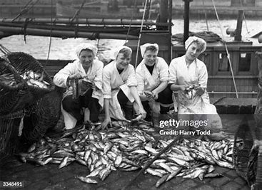
Degree Show - 'The Herring Girls'

Final Installation
I have completed my final installation and I am over the moon with the result. The aspect that had the biggest impact is the LED light I got from Ruth. It cast an amazing shadow over the map giving it lots of volume and depth.


I love the close ups of the map because it really shows all the movement in the shadow and reflects the hills and valleys of Scotland.
This also allows you to see the small copper pins which are practically invsiale letting the map float off the wall.


I experimented with supporting work to see how it would look. Nothing seemed to work and probably for the best because the map has great impact by itself.


I also made a paper template and marked x's where I wanted pins in the Map. This was a very useful tool because it was easy to tape up the paper and hammer my holes for the pins. Then I could pin the map into the right place and tear the paper away from behind. This led to a lot less mistakes when getting the holes in the right spots which meant there was less touching up to do on the wall.


Finally, the lighting which was the most important part in pushing the piece to its fullest potential. I tried out a couple of stained acetate sheets to change to colour of the LED light to a warmer tone. But the shadow was not as strong so I stayed with the cold blue colour of the light.
I also played around with the angle quite a lot to see how the shadow would cast from different spots. But I liked having a strong angle so the shadow could reach far beyond the edge of the Map.
I would just like to say a quick thankyou to all the lectures that have helped me throughout the year. Studying at COGC has been a fantastic experience where I have learnt so much. Thankyou!
0 notes
Text


Studio Space Finished
I am very pleased with my studio space. I feel it shows the amount of work I have and keeps it clear for the lectures. There was quite a lot to fit on my desk, so I hope it isn't too crowded. I have left name tags on each of the piles to show what they are. I did this because I wanted all the different lines of developmental work to be separate and therefore would hopefully be easier to see and discuss.


Something I should have done is add another tag for my found objects which are in these wee box on the corner of my desk. I thought it would be better to have the found object contained in a small space since some are quite dirty and the seaweed quite smelly.


I have also arranged all the plaster works together, both models together and I didn't forget to include my book. I know this book was part of a work shop and not my Creative Enquiry project but it was a great learning experience and I really enjoyed my time in the class. I will definitely be doing this again in the future which is why I included it

Looking at all my work like this feels like a huge achievement, and I am very proud of all the work I have done over the year. It has been a lot of fun and a lot of learning.
0 notes
Text
Business Cards Printed!
I am so happy with the result of these business cards!! They look professional but yet fun and creative. They came in a wee box which is handy, and even though I only ordered 50 on the website, it looks like they sent me more.
They only thing I would say is I would have liked them to be slightly bigger. They feel a bit small in the hand but the paper is hard and tough which is good.


0 notes
Text

Preparing work space for assessment
I have started the process of displaying my work in the studio. My main aim is to keep the space clear and easy to navigate so I have grouped them together. Gelli plate prints, collagrpahs, Gyotaku, screen, roller and textile experiments. I am pleased with the number of areas I have explored such as the Gyotaku, something I wish I had tried is kitchen lithograph using tinfoil, coca cola, olive oil and a pencil. I will have to do this in the future.

There is still a come things to tidy up for example I have some bags to take away from under the desk, I want to bring some of my found objects in to display, and clean some of the paint of my desk. I think these will add a nice finishing touch to make the space a bit more welcoming.

0 notes
Text
Hanging the Map - New Pins

This time I am using different pins. They are slightly shorter, stronger and copper coloured with the end rounded of to make a circle. I like this much better then the dot at the end because this one is less intrusive. I love the copper colour as well because it feels more natural and rustic like the map.
I used the same holes as last time so it was quick and easy to mount on the wall. This got me thinking that I could make a template of the map in paper and mark out where I want the pins. I could use tape to position the template which would be a lot easier to move around and help me get the pins in the right place. I will have to take account of the weight and flexibility of the fabric which will act different from the paper.

0 notes
Text
Screenprinting
Because I am still unsure of what I am going to be displaying with my final piece, I decided to do some more screen printing and experiment with more imagery found in old photographs.
I looked up more images of the herring girls and used them for inspiration.
I first used this image of the Herring Girl statue gutting a fish. I like the idea but in practice I didn't find it that effective. I did like having the gutting knife or 'cuttag' in the design, so I should try putting the knife in a different context.


Another fun image is this one below with the fish pouring out of the net. I thought it could be visually interesting to have the fish and nets combined. But I don't really like this either with one big fish, but next time I could try having a small group of fish in a net. Because I do like having the netting pattern along with the subject matter.


I also kept seeing a lot of barrels in the photos which was to be expected, this was a good opportunity to try some new imagery.


I quite like these prints, but they are quite simple and there's not much story to them. I like how I made each barrel slightly different with lines and borders going in different directions and the shadow at the bottom makes a huge difference.
I also really like the rough edge to the fabric, which I have kept on all of my prints. I think it feels more natural and authentic.
0 notes
Text

Screenprinting
The photo below was online and titled 'Herring Girls at Yarmouth'. I hadn't seen this technique before and didn't know what they were doing. After some research, I found that they were hanging the fish to dry or to be smoked. I liked this image and thought it would be a good opportunity to experiment with some new imagery. I also saw some more images of the fish hanging by hooks, which could make a better image because it would be clearer and more visible.


When drawing the image on tracing paper for screen printing I added the word Herring to title the image. I wasn't sure on my decision and after printing a few times I knew I didn't like it. I cleaned and dried the screen and then taped over the word very carefully as not to cover anything else.
To get a nice ombre effect I tried a few techniques like swirling the squeegee around when pulling the ink but the one the worked the best was taking a palette knife and swirling the two inks together before pulling the ink over the screen.

.
0 notes
Text
Practising hanging my final piece.
After discussing my previous techniques with the backing board with Lorna and Louise it came to my attention that I could be thinking about this too much. And worrying about the outcome too much.
Louise recommended hat pins so I ordered some offline and tried hanging my piece in the studio.
I first hung the piece up with Blue Tack and marked x's on the wall where I wanted pins. Then with a hammer and nail I made guide holes for the long hat pins. This is the piece right now. It's still in 3 pieces, not including the islands, and I like how it's looking so far. I really wanted to flatten it out by ironing or steaming but when it was on the wall all the folds and bumps gave the map lots of movement and reminded me of the hills and valleys in Scotland.

I also paid special attention to the gaps between the sections of the map. I moved the gap slightly wider after the first hanging and I didn't like it. The map began to feel disjointed and disconnected which is not what I wanted at all. But I moved it again to close the gap and used small sewing pins to join the parts together. As seem further below to the left.


But the benefits of this experiment were that I absolutely fell in love with the shadow that is created but the rough textured edge. Having it out a good few inches makes all the difference.


I did run out of pins though and couldn't hang up the islands but I have ordered more. A problem with the pins is that they are quite flimsy and some bent during this process. I found that I had to hammer the hole very straight to try avoid the pins bending with the weight. It also helped when I could anchor the pin by putting it right through the board. But I didn't want pins sticking out on someone else's board in the degree show so I'm going to have to combat this problem.
I'm thinking having 2 board back to back will work, but I have ordered shorter, stiffer pins which I will experiment with aswell.
0 notes
Text
Screenprinting
I have really enjoyed printing throughout this project and I wanted to branch off into more techniques because I did a lot of collagraph and lino towards the start, screenprinting was left behind a little.
I am loving this simple net design. It's slightly abstract but still has enough visual diversity and interest. I also really enjoyed doing the ombre effect because I see a lot of fishing nets that change colour halfway up or have lines of colour wrapping around so I tried to recreate this. When doing dots of colour like below the ink ran through the mesh too much and bled across the fabric. But I can try again with this because when it worked it looked really good. Maybe if I put the dot just before where I what it and use the squeegee to moved the ink. This should avoid the bleeding of the ink.


These fish are herring which have already been packed. I felt it would be interesting to have a stack of fish rather than just one or a select few. It reminded me more of the herring girls with their hands full of fish.
0 notes
Text
Casting a fish
With algernate
After printing the herring several times, I wondered what else to do with it? Because this was the type of fish the Herring Girls were working with, I thought it was a great opportunity to try and recreate the form to show at the degree show.
I first set up all my materials including palleteknifes, spatula, whisk and a whole bag of alginate. This fish is long more than anything else so I used a plasting box and sectioned it off with cardboard to create a wee space.


The alginate sets quite quickly so I had to act fast. I had a jug of water sitting stand by and all my tools. Using the whisk to get the alginate smooth was an excellent trick I learnt online while doing some research beforehand. I then used the spatula to scrap any leftovers out of the bowl.


Once it was in the box I shook the box to get it flat and used cardboard cut-offs to push the alginate into the corners and create a smooth suface. I then got the fish in and tried to get it centred, making sure that the fins were up, tail out and mouth open to get the best effect. I banged the box a few more times to get some air bubbles out and hopefully settle the fish in nicely.

I didn't have to wait very long for the mould to set and then carfully took the fish out. I am pleased with the outcome. There is a lot of detail in the head and scales but quite a few bubbles. I'm sure this is something I can work around or won't be too noticeable.


I then mixed and poured some plaster, which wasn't enough so then I very quickly mixed more and poured that as well. I though of just casting the fish and not going above the level of the alginate, but the tail does not have much depth so I decided to cast it with a big backing like I did with the bobbins. But I am going to try just casting the fish next time to see what happens. I am glad that I lined the cardboard with masking tape because it meant the cardboard didn't stick to the plaster like last time.

Overall, I really enjoyed this and I'm excited for the results! Next time, I want to cut the alginate to change the angle of the sides because I don't like the weird corner angle. Then create walls for the new shape and pour again. I think I could display these in the degree show with my map because the cast will be white and not busy at all, so all the focus will still be on the map. But I am going to keep trying to get a nice finish on the outline and fish.
Results

I am very pleased with the results of the alginate mould. Apart from a couple of air bubbles I think it's done a good job of capturing detail and it looks really alive.

My next step with this would be to trim the edge very gently just to get rid of the smooth unnatural edges of the plastic box in which it was cast. I started doing this on the bottom right hand corner with a pair of small fingernail scissors. This worked well and I think that fact that the plaster wasn't fully dry made a big difference.
0 notes
Text
Instagram reels
This was definitely a challenge but a lot of fun. It helped me learn more about what I was doing, how I was working, and if there was anything that I kept missing. It was easy to spot these things because I was watching myself while editing the video.
It's also a good way to inspire others into printing or art in general, and it could help teach some people. I want to do more of these but while doing other techniques. Maybe hanging my degree show or other printing techniques to show variety on my art page.
Casting Found Objects with Alginate and Clay
After using my found objects for printing I decided to cast them with plaster to branch out my use of techniques and materials.
Using clay for the seaweed and shells I first rolled out a piece of clay till it was about half an inch think. I used a cardboard cut out and traced around the edge to get a circle. I also used this circle for the base for my walls.


I placed the seaweed where I wanted it and gently poked it in place so it wouldnt move. I also added some horse hair for texture. Then with cardboard ontop I used a rolling pin to make the impression.
For the second clay impression, I pushed the shells into the clay which was quite simple. My next decision to do the same with the cray fish was by impulse, but I'm quite glad I did it. One of the legs broke off at the body and I spent ages trying to glue it back together but to no avail. In the end, when I used the cray fish again for the alginate mould I used tape to hold it in place while it set. Which worked fine.


The walls are made out of cardboard and several different types of tape due to running out of masking tape. But they worked and I didn't have any leaks!
For the alginate I got all my tools ready so I could act quickly. Once mixed, I poured it into my box and tapped it on the ground to get rid of bubbles and flatten the surface. When putting the cray fish in, I just went for it and submerged it. After doing this I knew it would be hard to get out, which it was and it broke into several pieces.


This was a very enjoyable experiment and I liked using plaster again. The results were varied but I think I have learnt some tools for the future.
Starting of strong with the seaweed impression which captured a lot of detail and depth in some areas. It reminds me of a spiders web and I like how the hairs have added tiny delicate strands. The method of using cardboard as walls was not so useful because it stuck to the plaster and was a bit of a mess. Next time I could use wood or clay.
I am also pleased with the outcome of the shells and cray fish as well. I have got some details but not a lot of depth. I don't really like the composition either because it feels a bit scattered.


Lastly, the alginate mould didn't go according to plan, but it was a fun learning curve. Because the claw was much bigger than the end, it broke when trying to get it out of the mould. I also think I took the plaster out the mould too early which might be why it broke. My favourite part is how the head emerges from the plate like he's poking his head above the water. This would be an interesting idea to work with and is something I could do later in my artistic process.


link to online document with research on printing found objects.
0 notes
Text
Gelli Plate
I liked the idea of using all my collagraph plates for something and gave them a shot on the gelli plate. When going into it I had my roller prints in mind and I wanted to create a grid like effect with the plates. This worked out alright, I didn't mind having them grouped together but I thought it was far more effective to have one or 2 at a time and no more.


But when using just one plate I also used seaweed and other found objects to create texture in and around the print.


For the pink one below I first used seaweed which always makes sure a lovely wirey effect. I then rolled ink on a plate and printed it. It was not too clear so I painted on it with acrylics.


Results
The outcome of these prints are definitely varied, but I enjoyed seem what the materials could do. For example some of the collagraphs plates made wonderful work of making prints, others didn't do so well. In the two below there is some detail and a reminiscence of the image, which is quite nice that it is not so clear because it allows more of the map to come through.


These other two were the more successful prints. The two herring girls are clear but quite boring because there's not much else going on. But the fish heads are great. After printing the plate on top of the seaweed print, it makes a lovely double layers effect, giving the seaweed and map depth. I also love the pink and green combination. I always feel that they stand out well together.


0 notes
Text
I also knew that I needed a simple yet effective image for my card. Something that wouldn't be too busy and looked good close up. My patch prints were perfect for this so I experimented with different ones.
Business Cards


These are some of my potential business cards. I used images from this project because it felt more relevant and the cards would fit in with my installation at the degree show.
I honestly much prefer the picture going over the full card because it feels more cohesive and highlights the text.

0 notes
Text
First experiments with hanging my final piece
I was quite unsure on how to proceed with the map because I had always thought of backing it onto a large piece of tapestry. After trying that, with the help of others, we decided it was too busy and the focus needed to be on just the map.
My first thought was to back the piece with something stiff. This would help support the weight and could make it easier to hang.


I made a cut out of the smaller part of the map and used pins to secure the two together. I didn't want to do anything permanent because I wasn't sure on which route to take. To be honest I was pleased with the outcome but I wanted it off the wall more. My favourite aspect was by far the shadow.

After this, I practised pinning small prints up to get an idea of how to could look with that space between the wall and fabric. I loved this negative space and it really made the prints stand out.


The only thing I wasn't sure on was how the material would act on a larger scale. The print above it slightly drooping in the middle and I was worried the map would do that.
The next step here is to get longer pins and practice on the big map.
0 notes
Text

Screenprinting Backgrounds
After the last session of printing my fish, I knew that the gelli plate was too small for the fish and I wanted a full background to print my fish onto. So I made a large open screen around A3 size to print some backgrounds.
I played around with lots of colours and techniques here to get some very interesting effects. I like it when the inks fall into one another and create waves and movement like below.


I also like the more cloudy prints and I feel these might be better to print on because it would make the fish stand out more and there wouldn't be any competition for attention between the two.
I wrapped these up in newspaper and took them home to be printed on. On the way home, some newspaper got stuck to one of the prints which I started to scrap away. After using water to rub the paper off the image was left on and this was a very happy accident. It adds detail and dimensions to the print but in such a subtle way. I want to try and recreate this because it's so effective and the materials are rapidly available.

Results
I am very pleased with the results and I managed to develop my compositions further. I printed the fish 4 times on this one and I love how it looks like a school of fish swimming about underneath the water.

The pinks worked well too. It's fun, bright, and lighthearted. On the first one the print is very clear with lots of detail captured around the face and scales.
The second has plenty of detail too, but I feel the background is too busy to make the fish the centre of attention.


I love this blue colour, and because the background print is so subtle the fish stands out a mile. I also like having them offset but my initial plan was to have the top one even further back but because of some confusion with flipping the fabric and placing the fish it turned out like this. I think it looks better this way because it is more natural.

I am a bit disappointed with this print because I didn't get the fish centred, and overall the composition is underwhelming. I'm thinking I could crop the print bottom and top leaving the rough edge on both sides. This could make the composition look more purposeful.

Lastly, one of my favourites because of the rich orange blended all over the canvas. The bottom fish is a bit messy with a shadow print just above the initial outline. But I still like this print and the upside down composition makes my eyes go a bit dizzy but I like this because the print becomes more thought-provoking.
Another important note is the material I am using. Over the course of the project I have used many different types of fabric and I feel good quality canvas makes any print or painting look more professional. This is why I choose to continue almost completely with canvas and not cheaper fabrics.
0 notes
Text


Book Binding Class
This was so much fun and learning how to properly made a book has opened up so many oppertunities for my work. First of all here are the tools we were using, the bone folder (3rd in from top) was by far the most usful as I used it for everything and it helped get a nice clean edge which made everything look more professional.
Other tools include a needle, book awl (to make holes for the needle and thread) and a cutting knife, 2nd from top

First we made this simple booklet by folding a simgle piece of A3 paper and then sewing the spine trhough the cover. This was a simple yet important task and will allow me to make simple sketchbooks in the furture.

With the techniques we had learnt so far, we moved onto a thicker hard back book with more pages and different sewing techniques. The first step was to fold the pages just like beofre but we used 6 sheets of A3 paper. We then used a template and book awl to get the right places for the needle to be threaded in and out. The stitch we used for this book was called the french stitch. Sewing was tricky and explaining it would be trickier. But essentially it was a rise and repaet process, with figure of eights, kettle stitches and looping in and out of previous stitches to hold the sections together. You can see 6 sections below which consist of 8 pages each. Thinking about it I love the process of stitching by hand because it is very intimate task and I felt connected to the book like I do to a piece of art I have spent hours or days working on.


After this it was a lot of gluing. First the end papers were added which are the red pages. This will be attatched to the inside of the front cover. Then the spine was covered in mesh to support the pages, then covered with a leather binding. This binding was folded and glued in order to support each side. After this the boards were covered in a paper of your choice and carfully glued down to avoid creases or air bubbles. This was the most exciting part becaus all the elements of the book were coming together.
The last step was one of the most simple but still had to be handled with care. The board must be glued and positioned away from the spine and in line with the inside pages. To check this I was flipping gently between the front and inside of the book to get the right position. Once both covers were on and I used the bone folder on it, and then it was time for the press. This made a satisfying indent on the inside of the front cover and made sure that the glue could bond to both the page and the board.
Speaking of glue, book binders glue is called EVA and it is PH neutral which mean it wont react with the paper. It is also reversable so water will wash the glue away making any mistakes easily changed.


This workshop gave me a new perspective on books and how much works needs to go into them. I was thinking about historical books and how long it would have taken to make one. Even the paper would need to be made, the board soruced, and thread weaved. Its a good way of getting some perspective on how much is readily available to us.
Now I have these skills I will be making lots of sketchbooks and note pads and I could put my own prints or drawings on the covers to make it more personal.
0 notes
Text
Gyotaku - On Textile
For this session I knew I was going to be printing on fabric because it was flexible but strong. I had been using my gelli plate and I printed some backgrounds for the fish using steel wool and sponges.
But I first started on plain fabric and tried some different compositions. I was definitely getting the hang of it after practising with a slightly thicker ink. The prints were coming out really well too! I am getting a lot more detail than last time and of course the fabric isn't ripping.


I next printed on the backgrounds I had made. I loved these even more because with that bit of colour they really came to life and the texture of the steel wool looked like bubbles in the water. Some colours worked better than others, the dark blue was not a good one but the burnt orange was a winner. It looked like old rust and contrasted fantasticly with the dark fish.


I want to try this again but with a bigger background. It was annoying only being able to get two-thirds of the fish on the colour so that is an aim for next time. I wil probably have to use an open screen to get the background big enough or buy a bigger gelli plate. I think I am leaning towards screenprinting because I haven't experimented with it a lot during this project so far.
0 notes