
Don't wanna be here? Send us removal request.
Statistics
We looked inside some of the posts by creativegabe and here's what we found interesting.
Average Info
Notes Per Post
0
Likes Per Post
0
Reblog Per Post
0
Reply Per Post
0
Time Between Posts
26 days
Number of Posts By Type
Link
1
Text
2
Last Seen Tumblr Blogs


Fun Fact
Tumblr.com is the 103rd most visited website in the world.
Link
My Bitsy game idea was based on the idea of loss, which is obviously not the happiest subject, but I felt that as subject like that can be easily relatable to most people as we have all lost someone or something. The game itself is actually very short but it’s more about the message behind the game rather than the actual game play itself. The game has many interactable objects and characters which give away subtle hints and clues as to the character your playing as’ situation. *SPOILERS* Story explained: The man follows a mysterious person in his garden which leads him to the flashback of his son getting knocked off his bicycle in the street and killed, the story doesn’t describe or show his wife's death but he is lead to a cemetery where the man discovers his wife was the one leading him and you can interact with their gravestones and the ghosts of his wife and child.


Above are screenshots shown on how I produced the game. At the start of the game I used the front door key variable to add a bit of interaction for the player in order to acquire the key upstairs before leaving. Once the door is unlocked I used the exit function to lead to another scene which is exactly the same as the house but without the person outside in the garden to create the illusion that the person had mysteriously disappeared from the garden. I also use the black and white monochrome colors to give a more morbid feeling to the game. I use multiple tiles for walls and the top of the walls to create a 3D effect to make the world seem more detailed and use slide transitions on the road area to create a seamless road effect.
Overall I feel the game itself is detailed graphically and has a fairly simple story but tells a nice message in the idea that you have to let go of your past, emphasized with the quote at the end. Things I could of done better was add more detail to the roads and made the story and game play a bit longer but the game was more for the narrative aspect not the game play.
0 notes
Text
My Stop Motion Animation Film
youtube
The overall idea/message I try to get across in this film is the way the media (in my opinion) nowadays spends so much time covering Covid stats and figures etc that people start to forget about other things going on in the world like war and poverty, things like that. In the film mid way through the guy photographing the guy fighting in the War has his attention diverted because of Covid appearing (basically signifying beginning of Covid). This conveys the message that I previously mentioned. Also at the end Spider-man falls over and runs away which basically conveys the message that Covid is too dangerous even Spider-man can’t beat it.
In terms of production of the film I just used the Stop Motion app on my phone and used a piece of A4 paper(for clear ish ground) and a couple of figurines I had from when I was younger, obviously the choices of figures were limited hence the appearance of Spider-man and a World War 2 German soldier in the film but the worked fine. I also used play dough for the Covid virus itself(the big green blob thing) and at times used play dough to help stick figures fret to the ground because the kept falling over. Picture below shows setup

Overall I think the film is okay,obviously not crazy budgeted or anything but I made use of what I had available to me, I think next time things I could do better would be to hold the a4 down to the desk with tape or something and try not to move actual pieces of the set around that don’t need moving in between frames, but it’s not that noticeable(I don’t think). It’s also hard to get the figurines to do the poses I want without them falling over so could change that next time.
0 notes
Text
My Colourisation Piece


Source : https://fineartamerica.com/featured/hot-air-balloons-in-black-and-white-over-fields-randall-nyhof.html
Idea:
This is my colorisation piece I’ve created in Photoshop, my idea was to go for a black and white image which had certain objects in different colours standing out, in this case, the hot air balloons. The colours on the balloons are a selection from some of my favorite music artists (Glass Animals, The Wombats, Nirvana and Dan Croll are present in this photo) album covers, with each individual balloon’s colours representing a different album .

Dreamland Glass Animals Album Cover ( Large balloon in the middle)

Beautiful People Will Ruin Your Life, The Wombats Album Art (Right hand middle balloon)

How to be a Human Being, Glass Animals Album Cover. (Second balloon from the left)
Production:
In terms of production I found the original hot air balloon image online in monochrome, using adobe Photoshop I used a number of techniques achieve the final result shown above. The main technique I used on the main balloon(largest) in the middle was the “quick selection tool” the tool allows you to mark out certain areas, in this case certain squares on the balloon, once the appropriate squares I had selected I filled using the “paint bucket tool”, this allows for more time efficient colouring compared to using the “paint brush tool”.
When finding the appropriate colours to use on the balloon, I would copy and paste each album cover onto the canvas and used the “Eye dropper” tool to accurately select different colours from the album artwork. This technique is showed below. I’ve also used the “dodge tool” and the “burn tool” to lighten and darken different sides of the balloons to create an effect that there is sunlight coming from the right hand side off screen(you can see the lighter right hand side of the balloon on the Dreamland balloon!).
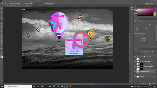
(Album cover onto canvas using eyedropper tool for different colours)

When dealing with too small of squares, zooming in, to reveal the pixels I used the paint brush tool from a 1 to 5 pixel diameter to create a realistic shading of the different squares

“Dreamland” shown on the balloon I used the warp tool in order to shape the text cut from the album artwork to give the illusion that the writing is actually on the balloon due to perspective. Tutorial used for this: https://www.youtube.com/watch?v=1Hda3PradB4
More album artwork can be seen on the other balloons, “Zaba” on the far right balloon is written representing a Glass Animals Album.
Evaluation:
Overall I’m happy with how this image turned out, I’ve used a range of different techniques in Photoshop using multiple layers and other functions, in particular I’m most satisfied with the two balloons on the right. An area I could improve in is the techniques used on the Dreamland balloon, the colours look too solid, the squares are not shaded correctly so you can see every square unlike the How to be a human being balloon to the right of it.
0 notes