
Ba Contemporary Art Practice documentation for the Creative Project module
Don't wanna be here? Send us removal request.
Statistics
We looked inside some of the posts by creativeprojectsophie and here's what we found interesting.
Average Info
Notes Per Post
1
Likes Per Post
1
Reblog Per Post
0
Reply Per Post
0
Time Between Posts
5 days
Number of Posts By Type
Text
17
Last Seen Tumblr Blogs


Fun Fact
Forty percent of Tumblr users are between the ages of 18 to 25.
Text
PROJECT STATEMENT
This project explores neurodiversity, exploring misconceptions and ableism through my experiences as an artist with autism and dyslexia. I focus on ableist language, raising awareness of its harmfulness, and recording my responses through art. My intention is to share my experiences to broaden understanding and create conversation. By creating interactive and visually stimulating pieces, I encourage acceptance of sensory seeking and play. Overall, my work explores the challenges and joys of everyday life as a neurodivergent individual.
0 notes
Text
INSTALLATION OF FINALISED WORKS:


Work installed using command strips, nails and white tack. Developments related to the final works displayed on desk and on the wall across from the desk.
reflecting on installation: experienced unexpected mishaps with my install. My plan for my 3D shapes was to hot glue gun these onto board as there was no secure way to attach these straight to the wall - however I kept having issues with the glue gun which later resulted in some of the pieces peeling off from the board which I then had to secure back on with super glue which I borrowed from a classmate - this was much more successful.
I then attempted to temporarily attach my work to the wall to ensure I was happy with the layout but had issues in doing this as to the weight of my works and so required a helping hand from a couple of classmates. I decided to change my layout as my original plan was to have the 3D pieces on the right side of the board and the other works collated together but this didn't work as well compositionally as l'd thought and felt my 3D work was chucked to the side. It made more sense for me to have these pieces at the centre and so l had to do some more planning to get the composition right.
I also underestimated how many command strips each of my works would need and ran out of these for one of my pieces which I had to improvise and use glue dots.
Overall, the installation didn't go to plan but I am pleased with the final outcome and have learned from these mishaps and will ensure to have more materials to work with by expanding my toolkit for when installing in the instance of not going to plan.
EVALUATION:
For my Creative Project, I chose to follow route B, as I was very interested in exploring my ideas of my theoretical area within my critical practice module, which is the importance of neurodivergent artists in a neurotypical world, focusing on experiences and misconceptions. I started planning my project through a mind map, which was crucial as it allowed me the freedom for ideas to flow and to think about the different pathways my project could take. It also allowed me a starting point for this project.
In my initial plan, I mentioned I wanted to explore misconceptions and ableist statements in a literal sense. I also mentioned exploring being wired differently, the puzzle piece symbol and focusing on text and sensory materials. This and many more ideas were written into my timeline to work on each week, which I initially found beneficial due to having a variety of ideas to explore and a detailed plan. However, in hindsight, I felt I gave myself too many areas to explore and expected too much of myself. Looking back, I underestimated the time I would take to explore these areas, not including research and my other modules, so I found my timeline unuseful, which resulted in steering away from this. Despite this mistake, I realised this during my first few developments. I considered I had set out too many areas to explore and created a checklist, prioritising the ideas I enjoyed that I knew I wanted to explore more, such as my text work and sensory pieces. Pinpointing a clearer, more manageable set of ideas benefited my work as it allowed me to fully focus on finalising my developments into successful pieces rather than just lots of developments.
My research was crucial in exploring my areas of misconceptions and ableist statements; it led me to discover that internalised ableism is possible in many disabled people; this was something that I was able to explore within my text work – sharing my experience of internalised ableism cause by the opinions and viewpoints of society. My artist research was also very influential within my work, as Mel Bochner was my main source of inspiration and led me to experiment with ableist terms in bold and intense ways.
Upon reflection, I am really pleased with the outcome of my resolved works and felt these fully conveyed the ideas I intended to explore; it felt empowering and almost therapeutic for me to explore language that would typically make me uncomfortable and shy away from and embrace colours and textures that bring sensory joy.
However, I would have liked to develop my ‘The things you say’ work; this was time-consuming – I would’ve liked to develop this into a larger scale work to create more of an impact on these harmful words as I felt they’re almost hidden away due to the small scale. I feel I have only scratched the surface with my concepts of neurodivergence; I would’ve liked to explore more of my textural works, looking at creating interactive and moving pieces and more work focusing on my experiences with my neurodiversity perhaps looking at my dyslexia and OCD as I felt a lot of my main focus was autism and could’ve delved deeper into neurodiversity as a whole.
0 notes
Text
FINAL SUBMISSION FOLIO

“The things you say” Acrylic on board, A3, hand cut out letters with board.

“I am trying my best” Acrylic on A3 canvas board.

“Why don’t you understand?” Paint pens and acrylic on board.

”IDIOT” Acrylic on A2 board.

“Crowd” acrylic on A2 board.

“The journey” Modeling paste and acrylic on A2 board and gloss varnish.

“Overstimulation” Acrylic and modeling paste on 3D wooden objects, gloss varnish.

“The only piece missing is your understanding” Digital collage.

“DUMB” Digital collage.

“Too bright, Too loud” Digital collage.
0 notes
Text
Collage work
reflecting on my ideas of exploring text and imagery of the puzzle piece as well as imagery of wires and electrical equipment, making work to show neurodivergent issues of isolation, misunderstanding and misconceptions- i thought about how I could explore this through digital college as this would allow me to freely work with such imagery and text without he limits of materials, scale, I thought this would best give me the freedom to experiment and convey my ideas which I could then develop physically if necessary.
From the beginning off my project I planned to explore subject matter of the puzzle piece, as per my research this is a very harmful symbol to the autistic community - the symbol representing that we have a piece of us missing and need to be ‘fixed’. And so I first began exploring this within collage.
Puzzle piece subject matter

I thought about how I could respond to the puzzle piece symbol and it’s harmful representation through text and my initial response was “the only thing missing is your understanding” which I believe is true - there is nothing missing or lacking of an autistic individual, the only thing missing (that will actually help us than any ‘cure’ or treatment) is an understanding which will better our livelihood. Added the jigsaw puzzles to show the connection with the text, and using the colour red to show the intense emotion associated with the puzzle piece symbol, I feel this was lacking so I experimented with some imagery.

I decided to use to photos of myself as i child playing alone, I felt this was fitting to the text as I was often misunderstand as a child for spending my time alone - often people thinking there was something wrong but I was completely happy in my own company - I felt it was fitting to show all I needed was understanding. I really liked how the images blended with the text and the colours.

I then decided to experiment a bit differently, this time using a silhouette of myself as a child - I decided to use a childhood photograph as this was a time in my life I was probably most misunderstood. I also played around with creating missing jigsaws to link to the text, I felt this worked really well.
overall, I am really pleased with these two works I feel the text is strong in conveying the effects of misconceptions caused by the puzzle piece and capturing my thoughts and response to this - which I feel response and discussion especially through art is very significant.
I really liked the socket I collected with the missing button, i felt this related to the misconceptions of autistic people having a piece of them missing but I also resonated when I was younger undiagnosed- feeling like there is something wrong with me and that I am broken, similar to this socket and so I decided to experiment with this.
I experimented with layering photos of myself as a child, I edited the photos to be negatives to play on having a piece missing, I also added some static imagery that I took a picture with on my phone, I thought the colours and textures of this made it look more interesting and distorted. I then edited one of the images with the text “something’s missing” although I didn’t enjoy how this looked and that it implied that there is something missing as an autistic individual, this then made me think about the imagery as a whole and that it seems to imply there is a piece of us missing rather than the opposite effect I was hoping for and so I felt this was unsuccessful.


More experiments
I decided I wanted to experiment more with text, this time working more with imagery. I thought about using photos from when I was a kid, undiagnosed with autism as this was a time for my I was less understood and things were difficult for me growing up especially undiagnosed. I want to explore forms of text reflecting on my experiencing and working with bright saturated and overwhelming colours to share my experiences of overstimulation, sharing how sometimes the world feels as an autistic person.


This was more of a experiment to see which ways I could work with photos, how I could blend these and work with colour and exploring methods so I didn’t put much thought through to this apart from tuning text that has often been said to me.


I then thought about how I could create a collage exploring my experiences of undiagnosed autism as a kid and so I selected a photo from primary school - in the picture I am trying to focus on my work but I recall primary school being very overwhelming for me as to the noise, the lights and just overall sensory issues so I thought about how I could edit this image to look exactly how it feels. i did this by layering colours ontop of my image and blending these, I duplicated the image of myself 3 times so that I could shift it slightly to make it even more distorted, then adding a different colour for each layer to blend - specifically focusing on using the primary colours as this felt most relevant.
I then reflected on how I felt in school, things I wish I could say out loud and be understood and so I thought about “it’s too bright” something to would’ve thought to myself constantly in school as to the bright unnatural lightening used which was overstimulating for me. I did this in captials as I wanted it to feel extreme and so I copied and pasted the text to cover the entire image and blended this slightly.


I then felt like it needed something else, that the text was too simple and so I thought about how I could add to it by using “it’s too loud” and so I did this similarly with the previous text but aligned it in the middle of that text so they are below one another - I really enjoyed how this looked how even more overstimulating it became. However in the image above I feel the text of myself is too much and would prefer to get rid of this or have it more subtle on the body.

This image was accidental when I tried to select just the body so I could erase the text, instead it selected the background and by doing this it highlighted the background, changing the colour. Despite this being a mistake I actually really liked this, I especially liked how the colours of the background and the figure are different that makes it stand out without erasing the text from the figure.

After the accident, I then undid that an continued my plan of erasing the text from the figure. I liked how this turned out and was exactly what I was hoping to do but I feel this is just less successful than the accidental image, I especially feel that by taking away the text away from the figure it takes away that these words are both coming from me but also taking over me and so I feel the previous image is more successful which is why I am considering it for one of my 10 final images.
0 notes
Text
Development 5: 3D sensory work continued
Since I decided I should refine my current work and so I thought about how i could develop my textural/sensory 3D work.
I especially liked the plaster block one I did as I liked the weight to it, however the modelling paste didn’t stick to this well and pealed and so I thought about how I could work with clay or wood. Clay would allow me to be more experimental and create different shapes but wood is less fragile.
Considering cost of wood and the limited time left for the project - I decided to go to the wood work room in the college where I could access scrap wood. This was very helpful as there was plenty of wood cut into sizes and some sanded to what I wanted - at this point I was unsure what I planned to do but gatherer interesting shapes and various sizes that I thought may be useful for me.

However my only negative with these pieces I selected as some heavily needed to be fixed with being filled in and sanded. As seen in the photos one of the blocks had holes in them that needed to be filled and and some sanded down.


Filled in with clay and allowed this to dry and sanded down the excess of clay.
I then started to think about what I wanted to do with these shapes, i thought about if I wanted to make a more 3D piece that could be held similar to the cubes I created - however the wooden pieces are flatter than I would’ve liked them to be for a 3D piece, I thought about how the smaller squares could be glued together to make a cube but they weren’t in similar scale and whilst working at home, I didn’t have the tools to cut the wood down.
I also then had to reflect on my previous 3D sensory experiments, how I felt these seemed like a toy rather than a piece of art and that the viewer being able to hold the piece is what made it feel like a toy rather than the piece itself - I reflected on how the sculptures being placed on a wall differentiated from this from being a toy and that depending on how I exhibited the sensory sculptures were important. And so for these wooden pieces I considered how I could arrange them on a wall together, keeping the sensory aspect of the original experiments but having them arranged on a wall for the viewer to still touch and interact with.
However, down the line I will have to consider how I will safely secure these to a wall, considering the weight of the wood and ensuring they were safe and secure enough to be touched without moving.
I liked the idea of having them arranged together and thought about how I could use the modelling paste to create flowing designs that would follow onto each shape. And so I played around with the images of the shapes and playing around with colour and designs.


I especially liked the last design were some of the patterns on the shapes continue on with the others. I also enjoyed the colour scheme of the shapes - I decided to use colours that catch attention but also engaging for sensory seekers, bright colours can sometimes be associated with overstimulation but when sensory seeking they can be soothing and more engaging.
Deciding I was happy with the colours I began painting the wooden shapes based on the last image idea.


This was quite a difficult process as the imperfections of the wood continued to show - the worst of as the red block where the filled in sections continued to show despite painting white first, I thought about I could cover on-top of this with the modelling paste but would have to change part of the design. The orange shape also continued to show pen marks which I had tried to get rid of with sanding down but was unsuccessful, I then painting it white and then orange but still shows - again I thought I could cover this with modelling paste. The yellow also had a darkness to it from the clay and so this will need to be sanded down further and painted again. I plan to fill in the section that need filling again, sanding and re panting to get the shapes perfect.

Before this I took a photo of the planned arrangement of the shapes and I was really enjoying how this looked - the bright colours definitely have an attraction about them which urge you to look further and engage.
Attempted to refill and sand the red block down so that the circles aren’t noticeable.

considering I am working at home and working with limited materials I found it difficult to sand the block down and fill the holes in, I tried to repaint it to see if this was fixable but it was not going to plan and would require alot of attention to get it looking the way I want. During this process it also had me thinking how I was going to install this specific block onto the wall as its quite heavy compared to the rest of the wooden items and so I began reflecting further on this block - if it was worth trying to save with wasting time and material and having to consider the time left for this project, I decided it would be best to scrap this block and stop further work on it.
because of this I had to revisit my plans and think about what I could do in replace of the red block or if the composition would work without it - although I realised I had another spare blank block that I’d yet to use and decided I could paint this red and see how this works in replacing the previous red block.


Played around with different compositions, I was very drawing to the last one and felt this looked most visually interesting and so despite having to scrap the red block - I feel this composition still works well with the smaller one in replacement. I now have to re plan the designs I plan to do with the modelling paste.

Outcome of the design, I followed some aspects from the previous designs such as the circles, conjoining lines etc but this time I decided to add a silhouette figure in the centre on the circle - my reasoning for this was I felt the piece lacked something. The piece itself is a sensory work made to be touched and engaged with by the viewer, embracing sensory joy, however apart from this I felt it lacked meaning and so I thought deeper about the work and how the bright colours and patterns remind me of sensory overload and so to build on this concept I thought adding an individual in the centre would show the overstimulation surrounding them. I was much more pleased with this idea and felt it tied in all my ideas into one, i also feel it will go well with the rest of my works that are bright and colourful and include silhouettes. My reason for using a silhouette instead of a painting of an individual is because by using a silhouette - any viewer can imagine/interpret themselves in the artwork. I have used a silhouette of myself and so the artwork is more focused on the female perspective of overstimulation.
Before beginning the textural process with modelling paste - I reflect on my previous works with the best and considered the struggles with piping and getting the lines and such perfect. Working with a zip lock bag as a piping bag wasn’t effective in getting perfect smooth lines, I also had issues moving around the work as I had to move myself around the work rather than moving the piece which resulted in messing up the lines and so considering both of these issues I bought a cake decorating set that comes with piping materials and a rotating plate which I thought would be useful for the issue of moving around the work.

Started by using chalk to draw the shapes, slightly altered these designs to what I felt would work best.
started piping each individual shape,

Mostly successful but continuously kept having errors with holes in the modelling paste, I believe this is because I wasn’t squeezing the piping back hard enough


Had a few mishaps with these specific block, the modelling paste kept popping as it came out of the bag and resulted in gaps which I tried to fix with a paint brush but this didn’t turn out very well and looks flat and has unwanted texture to it - I hope to smooth out these errors with sandpaper once completely dried. I also got unwanted paste of areas of the blocks and so I had to then go and repaint these the following day after allowing it to dry slightly.
whilst waiting for the paste to completely dry I decided to start making the silhouetted figure. I decided this would be best made with clay as it’ll be easy to form and create a smooth surface to it than if I want to do this with the paste.

I plan to glue this directly onto the circle shape once all is dried and painted.

Decided to paint the figure blue, I felt it needed to be colourful rather than black as planned as I felt this just looked out of place with the bright colours and sent a negative message (tone regarding black representing sadness and emptiness) I felt the blue was more upbeat and matches well compositionally considering the blue colour of the pattern is the only colour that connects around each panel and connects right back to the blue silhouette. I decided to try gluing the clay figure on way gorilla glue as I wanted to make sure it was secure enough and wouldn’t fall off, I could’ve used a glue gun which most definitely would’ve worked but would make the figure stick out and not seamlessly attached as planned. The gorilla glue worked well after applying heavy pressure to it for 10 or so minutes.
I also decided to varnish each of the panels including the clay silhouette to give a glossy shine, but also so that this would enhance the colours and make them brighter which it did, also making it more satisfying and smooth to touch as my intention is also for the pieces to be touched if I can ensure the are secure enough when installing. my plan for installing is to hot glue gun them to white board which I will then hopefully attach to the wall with nails or screws. My alternative was to use command strips but I realised the hexagon piece has no backing and doesn’t have a wide enough area to attach the command strips to - some of the shapes might be too heavy for the command strips also.
FINAL RESULT (before installing onto wall)

Overall, I am pleased with how this work has developed. Considering this work has developed from my glue gun fidget blocks to this I feel it has developed significantly and successfully. My concerns with my first experiments were that they seemed more like a toy rather than an art work and I had to reflect on how I could develop this further to make it feel and look like a piece of work which can be critically appreciated but also reflected upon in its relation to neurodivergence and sensory aspects. I feel working with the wood was a huge importance to the development as a more practical material - as it is more durable but also easiest to work with considering the modelling paste didn’t react well with the plaster experiment.
I also feel working with the modelling paste was very significant also - it allowed me more freedom to create the designs I wanted and the colours I planned rather than the glue gun colours that weren’t predictable and texture wasn’t satisfying to touch - the sensory aspect of the work is very important and the modelling paste is much more interesting to touch and so I’m very glad I went with this route. I also feel my planning is what made this work more successful to my prior developments as I made sure to fully plan this out from patterns to layout and colour scheme before starting which prevented any failures. I am also pleased that the wooden materials used were up-cycled/recycled from the wood tech department, as part of my art practice it has always been very important to me to make use of any unwanted materials as much as possible and I was able to do this for this piece of work. However, I would’ve liked the shapes to be more refined, for example the circle isn’t perfect and a different texture from the others and same for the hexagon which has gaps - if I could’ve done anything different I would ensure the shapes were perfect and perhaps provided more various sizes and shapes. I would’ve also liked to have made sure the modelling paste textures were perfect - as there was some issues with the lines which results in some being un even and unwanted texture and the circles which arent smooth and as round as planned.
close ups


0 notes
Text
Development 5: 3D textural/sensory work continued
Reflecting on my work so far and the ideas I have yet to complete, I wanted to start these ideas such as my 3D fabric stuff and jigsaw piece painting. However , I had to consider the time left and how long it would take to develop, experiment and refine these ideas and so I decided I should refine my current work and so I thought about how i could develop my textural/sensory 3D work.
I especially like the plaster block one I did as I liked the weight to it, however the modelling paste didn’t stick to this well and pealed and so I thought about how I could work with clay or wood. Clay would allow me to be more experimental and create different shapes but wood is less fragile.
I decided to experiment first with clay, I initially planned to create a square or shape piece of clay that I would then create textures onto this but my plan slightly changed the more I planed around with the clay.

I first used tools to create textures that I thought could be interesting to touch and then I thought about how I could make this more interesting and relating to my other works by adding a silhouetted figure in the centre with the same textures ontop - I thought about how this represented overstimulation and feeling like ur body is being taken over by the overstimulating world around you, hence the shapes continuing onto the figure. It also reminded me of ‘spacing out’ as to the shapes used.
I then allows for this to dry and started planing how I would paint this.


I experimented with bright saturated colours that would appear overwhelming, I felt the red and yellow didn’t work well together and reminded me of a circus and so I decided the blue and red looked better as this also supported the spaced out idea by resembling space and planets.,

I started by painting the shapes first to prevent these from being effected by the blue if had started with the background first. I wish some of the shapes had been thicker as it’s quite difficult to see them and notice their colour, such as the pink round shapes in the top right. However, I really enjoyed how this turned and how it came to life after painting - the shapes and textures are interesting to touch but also visually interesting on its own as to evoking a sense of overstimulation. I plan to apply gloss varnish to protect the paint but also so that it is smooth to touch. My only negative is that I wish this was larger scaled as it is quite small and by being small this doesn’t evoke a sense of overstimulation.
FINISHED WORK


Complete work after varnishing, very pleased with how the varnished turned out and is much more stimulating to touch as well as being brighter in colour.
0 notes
Text
Development 4: Painting
When working on my textural painting which I added figures to, I cut out these figures and painted them - using a blank sheet of paper underneath to not make a mess. However, after completing the painting process of these figures I really enjoyed the composition created with them.


I really enjoyed the compositions and colours used - I was very interested in the overwhelmingness of the figures overlapping with the intense colours used and rough brushstrokes - it immediately reminded me of overstimulation of crowds and noise. The overlapping this and painting blending into one another from each individual reminded me of the noise of being out in the world in a busy place - how each noise blends into one another and becomes an overwhelming blob of people. I really resonated with this composition, despite being completely unplanned and unintentional it envisioned exactly how I view the world during overstimulation.
and so I plan to create a work focusing on this idea working with silhouetted figures and bright saturated colours, I am also interested in adding other subject matter like buildings in the background to show this is how I feel out in public. The purpose of this work would be to show the experience of overstimulation for an autistic person, what this looks like and feels and putting this into perspective for the viewer.
Starting the work

Decided to use greyboard as this is a great cheap alternative for working with canvas or wooden board. I decided to work a2, I was deciding between a1 or a2 but after reflecting on my other works that were a2 size I thought about when installing it will be best to work a2 size so that they are similar in scale.
I decided I wanted to work with a bright background for the work I originally considered working with bright yellow or blue but I had realised I have worked with both coloured for backgrounds for my other works and so I decided I would meet in the middle and work with a bright green. I wanted the background to be bright to go be almost harsh on the eyes but also so it clashes with the bright colours I plan to use for the foreground to create that visual of over stimulation.
However, during the process I ran out of the bright green I was using and had mix my own which was slightly duller than I wanted, I decided to roughly blend some white yellow and darker green tones as I thought this may be interesting for when I had the figures ontop with a lot of brushstrokes and so I thought I’d match well.

Completed cutting out the figures. I decided to make them quite large compared to my last ones as I was working a large scale but small enough to allow me to overlap them a lot. RESULTS


At first I wasn’t sure I was enjoying the green background and felt I should’ve gone for white or yellow but after completing the figures I decided this worked better than I thought it would.
overall the work is overstimulating as planed and resembles exactly how it feels to be in an area with many people and crowds and the noise associated. It represents exactly how I feel when walking through crowds and experience sensory overload.
0 notes
Text
Text work continued
I decided to reflect on my work so far, specifically looking at my text work. I really enjoyed my text work with the ableist words and my repetition work of the ‘why don’t you understand’ work, I felt these were very successful in sharing my experiences of being a neurodivergent person along with bringing awareness to ableism by using ‘shock factor’ terms and slurs accompanied with bright saturated colours which evokes a sense of overstimulation.


I reflected back to my experiments, looking at my ‘idiot’ repetitive work, I really liked how this worked looked especially with the simplicity of format and straightforwardness of the text - i especially like the word I used for this - that it wasn’t various different words but a singular word repeated showing it’s often appearance. I think I felt a closer connection with this work with the words idiot because the word ‘idiot’ is something I often say to myself and feel that I am an idiot - often said by my inner critique and internalised ableism. And so because I enjoyed how the small idiot work looked and because I had even lore of a personal link to this word I decided to make a larger scale work. However, this time I plan to use stencils which I borrowed instead of cutting out the letters out of board as this was very time consuming and I have to consider the time I have left for my project - I also wondered if stencils would look better or give a different feel to the work.
I also considered making this work more destructive and less perfect as my cut out text works have been very well put together and neat. I also reflected on how I often try to perfect my work and when this isn’t perfect or not exactly how i planned I feel like an ‘idiot’ and stupid for not succeeding which I feel is a result of ableism and so I feel by trying to make this work less perfect and going with the flow will embrace the word idiot but also reject it and act as response to it in a positive way. Despite this personal meaning, the work itself will represent my internalised ableism and allow to the viewer to perceive this in a physical way.

To avoid the perfectness and excessive planning I often do I decided to just go straight into the work and following my instincts and what feels right. I started with painting a turquoise colour, slightly blending in some blues, yellow and white.

Working with the stencils, I worked in random colour orders of different shades and variations for each row and letter, going with the flow and what feels best - this was quite difficult for me to do with a plan and I often sat reflecting on what colour should go next. And as much as I tried to make the letters perfect in neat rows and aligned with one another this didn’t go to plan - and so I tried to embrace this by purposely making them slightly non aligned and purposely g dragging and smudging the letters to make them off putting.
photo taken of the stencils, i like the negative space around the mat


I liked how the words started looking with the smudges created with the pallet knife and so I decided to to continue this more. One thing I hoped was that the text was more vibrant to contrast with the background. I also thought about my first experiment with the paint drips and how I enjoyed how this looked and so I thought I could incorporate this also.

Adding more drips, pull and drags. Enjoying much more how like his looks and the slight chaos of it all.
FINAL RESULTS

Reflecting on the final outcome, i quite enjoy the lack of perfectness of the work and by the pull and drags, droplets of paint and drips overlapping the text I feel it creates destructive feeling to the work that shares the destructive sense of mind when feeling like an idiot or being called this but I feel it also shows a destructive response to this word, showing my anger towards this word that I constantly hear. Although , I feel I could’ve improved the work by doing a few layers of the paint for the text so that it isn’t as transparent- i like that it shows the textures of the paint and brush strokes which is engaging to look at but I am concerned it looks rushed, although, this may work well in representing the text ‘idiot’.
0 notes
Text
Development 3 (Continued)
As per my plan to create a sensory painting based on one of my digital thumbnails, I plan to create an A2-sized painting with model paste, as this was most successful in my experimenting and developments.

I started by drawing my fluid shapes onto A2 greybeard, although I began drifting away from the original shapes and plan as I was enjoying the fluidity of the shapes and getting into the motion of making these and so the outcome of the composition is slightly different.

I then started adding on the modeling paste from the piping bag, I had some difficulties with this as was difficult to move around the large scale without smudging other areas or messing up the shape. I also had difficulties with air bubbles in the piping bag which resulted in It 'popping' and creating gaps within the lines which I had to go back in and more paste to fill the space- this resulted in some sections being un even and having a slightly rough surface compared to the rest of the lines. i tried to smooth out the lines as best as I could with a wet paint brush but some are still imperfect but I plan to smooth this over with sand paper before painting.


I then added in the dots as planned, this was slightly difficult as they were completely smooth and have a swirly like texture to them because of the technique used to make the dots and so I again plan to use sandpaper to smooth these out.


Completion of the patterns with the modelling paste. Once fully dried I plan to sand down the rough edges to ensure they are smooth and comfortable to touch and then paint the full background before painting the patterns.
With the extra modelling paste I decided to make a small a5 experiment so that I could best decide the way to paint this. I was curious if I should paint the entire piece with the background colour and paint ontop, but unsure how this would effect the foreground colours - or if I should paint each colour separately and so I made a small experiment to test what would work best.


Waited for the paste to dry and then painted it yellow, after this drying I then attempted to apply the foreground colours within the patterns and painting the modeling paste but this was unsuccessful- the paint was streaky and patchy and too effected by the yellow which gave the colours a yellow undertone making the blues look grean, and the pinks looking orange-y. After this quick experiment I decided I would be best to paint each section separately starting with the yellow background then working within each shape.


Started painting the yellow which took multiple layers of paint as to the colour of the substrate with the light colour of paint. In hindsight I wish I used white board instead of greyboard.

enjoying how the colours look together so far as they compliment each other really well and create a soft relaxing atmosphere so far.

Finished painting the background colours, again I’m really loving how the colours look together I believe using pastel colours were a good idea as I these feel these are very relaxing and create a feeling of happiness.,

More development, started painting the modeling paste sections. This was slightly difficult to not get onto the other areas of the painting so I had to be very careful.
Thinking about the work so far and I felt like it is lacking something, my intention was to create a sensory artwork that the viewer can touch but also be visually stimulating. However, it lacks any meaning apart from this besides from embracing neurodivergent needs and joy. I thought about how I could add to this work:

Felt this would be a great addition to the work to give it something else and add meaning to the work, perhaps even a hidden meaning as it’s not exactly straight forward what it represents which will result in the viewer to dwell deeper into the work and reflect on it.


Considering different colours for the silhouettes, if I should have the light toned colours, the darker tones or black silhouettes. I feel the coloured tones look much better but I made have to experiment to see if the darker or lighter tones look best against the background. I am also considering whether to paint directly onto the work or if I should paint and cut out the silhouettes onto card or board to make them stand out - board may be too thick to cut out so small and so thick card may be best. By cutting out card and then gluing on will allow me to decide if this is the right development for the work or if the work looks better as it was without permanently painting onto the work.
started the process of the silhouettes, I printed them out then used tracing paper onto white card which I have cut out and will then paint.
photI’m graphs of the process - really liked how the cut outs looked.


Started placing them around, was really happy with how this was looking - I was worried if a pritt stick would be suitable for sticking these down but it worked perfectly.

I then felt there was an off balance with the silhouettes and that there is a noticeable empty space on the right between the green and orange and so I decide to do another cut out to put here, I decided to do pink as there is now one at each side and the centre.
FINAL RESULT

I am much more happy with how this looks with the extra silhouette and much more pleased with the results.
I then added a few coats of varnish to the work, to give it a nice glossy texture which will be more satisfying to touch as the work is intended to be touched by the viewer, this will also protect the work from stains, marks etc. The purpose of the varnish was to also seal in the cut outs which are now secured from picking and peeling off.


Overall I am really pleased with how this work turned out, I really enjoyed the textures and as planned the work is very sensory stimulating as to the bright colours which are very engaging to look at and the textures and patterns which are interesting to touch especially with the gloss texture which makes them smooth. And so this work went to plan, however I decided it lacked meaning and felt something could be added to the work and so I added in figures climbing and walking around the shapes and meeting dead ends or looking trapped within the shapes showing the difficulty of navigating life as a neurodivergent person. And so I am very pleased with this work and it’s now newfound meaning. However I felt I could’ve improved with the modelling paste and painting as there were alot of gaps in the paint between the paste and board and so I felt if I had mixed the paints in with the modelling paste this would’ve resolved the issue however may have resulted in waste of the paste as I would’ve had to mix plenty to ensure I had enough. I also wish I had completed this work on a deep edge canvas so that the work is outwards from the wall and more inviting to touch but also because this would be a more secure substrate to hang and prevent damaging the work, however I had to consider costs for the work and working with a small budget.
Considering titling the work “The journey” as this provides context to the patterns representing pathways but also because this represents the work as whole as to the journey of the patterns.
0 notes
Text
DEVELOPMENT 3 (continued)
As per my last post after completing my thumbnails - I decided to make a small canvas experiment, first painting the design and then using the glue gun.


I drew a quick sketch of this and the began painting, making sure to continue onto the edge as this would be important to continue the glue gun textures around the edges to continue on the art work.
I then worked with the glue gun using colours similar to the paints. I again found it somewhat difficult to work with the glue gun, finding the right pressure and making lines without separation or going too thick and thin in sections - I found the glue gun to be quite unpredictable when making shapes which was difficult for me to work with. However I continued one with this until the work was complete.


There was complications with the glue gun and changing the colours as sometimes the colours merge in between switching from one colour to another and so when I was doing the clear lines for the centre part - the pink glue seeped through and had one piece of glue that was slightly pink and so I left this to dry and then peeled it off which took some of the canvas and the paint with it - I then added the glue ontop again thinking this would be okay but the white of the canvas is very visible and bothers me that this is different than planned. Although I thought I could relate this to my concepts of neurodiversity and feeling alienation and how all of the colours are in their own sections, colour coordinated and somewhat perfect but the one single white piece of your is the only one different.
overall, I liked how the final outcome looked as to the design with the 3d texture aspect but I feel the glue looks too imperfect - it looks visually interesting when captured by the light as to the shadows created but when looking closer it isn’t visually satisfying to look at or especially touch like I’d planned and so I have decided I would like to create a lager version of this perhaps with one of the different designs but with modeling paste as this is more predictable and easier to work with since the glue is very unpredictable and requires to work very fast. I feel mastering the glue gun techniques will also take some time and so I after continue the time left for this project and prioritise a method (the modeling paste) which works best.
EXPERIMENTING
As a quick experiment in my spare time - I created a cardboard box which I paper mache with (which wasn’t very successful as it resulted in a lot of unwanted lines. I then painted this which I regretted as I should’ve drew the patterns first and painted these separately but instead I painted the full box and tried to paint the patterns on box which wasn’t going to plan and so I used paint markers as this seemed to work better. I created likes and shapes as I went along and didn’t initially plan this as I wanted to do a quick experiment how the textural work would be experienced differently in a 3D form.
and so I then added the glue gun textures and shapes to this. Again, the shapes weren’t done very well and didnt look as I planned it to however I was more interested and what the final outcome would be as to creating a 3D sensory form that can actually be held unlike the paintings that I plan to create that’ll just be touched and not held.


Adding glue


overall, the box was interesting to touch and hold and I quite like the ability to actually hold the work and “play” with it although I feel this is more like a fidget toy or cube rather than an art work. Perhaps if it was of much larger scale it would feel more like a piece of art however then it would be difficult for the viewer to actually hold it and play around. And so I plan to put this idea on hold until I develop my paintings further and perhaps if I have time I will work on this as.
I decided to experiment again with different materials for my idea of a 3D textural sensory work and so during my time down at the casting room for my other project - I took some time to make a plaster cube. I was interested to see if the experience of a sensory work would be affected by weight, perhaps more comforting to hold compared to the light weight of the box above, but I also considered the smooth texture of the plaster, which I enjoyed with my other plaster works for my other project.
I built a wall with wooden panels which I then secured with clay, the shape kept moving when trying to stick the clay down to avoid spillage of the plaster and so I originally had a cube like shape but this then changed to a rectangle.


Once the plaster fully dried, I sanded it down to get rid of any unwanted textures, however some still remained, as well as parts of the clay that I couldn't get rid of.
This time, I decided to use the modelling paste to see if this would be more effective than the glue gun textural-wise, so I used the paste and a piping bag and cut a very small hole to allow me to make small intricate shapes.


I then allowed it to fully dry; once it dried, I then had a feel for the textures to see how this felt - however, some of the paste kept lifting completely off the plaster, as if rejecting it.

Despite this issue, i was still keen to see how this plaster and modeling paste box would turn out once painted compared to the first experiment and so I used superglue to secure the paste that was peeling off.
I then painting the box in a pase layer first and then applied the different colours for the texture - this was much more efficient and resulted in no white parts and made it much easier for me to paint the colourful parts - despite some of the paint going onto the background.


Once all dried i then added a layer of varnish to try seal the past but also give it a smooth glossy texture. This experiment was somewhat more successful - I enjoyed the textures and aesthetic more more with this work since it was much more interesting and calming to touch compared to the previous experiment. However - the paste seems to reject the plaster which is an issue as the modeling paste will eventually just all peel off with it being touched by the viewers which was my intention.
Therefore, so far both of these experiments have had their negative aspects. I also thought that by using a firmer and heavier material and small size it would make the work feel and look more like an art work rather than looking like a fidget toy but disappointing it still feels this way and so I may want to put this development on hold and focusing on my works and ideas that are more successful before continuing these 3D works. I have also considered that I plan to work with fabric to create 3D sensory works and so the might be more successful for a 3D work compared to these works.
0 notes
Text
DEVELOPMENT 3: Sensory painting/Sensory experience work
As per my ideas list I planned to ‘make art work using sensory equipment and textures, items that are stimulating and interesting to touch, smell or to look at such as using colours combinations that are soothing - this could be something to consider in any artwork, making the artwork stimulating yet accessible for neurodivergent people with lack of concentration for art’.
My initial plan is to make a sensory painting, a piece of artwork that allows a sensory experience. I plan to make a painting with 3D aspects that the viewer can touch and feel around allowing a playful and joyful sensory experience. My reasoning for this was to engage the viewer with neurodivergent experiences, allow them to enjoy the work and engage with materials just as I do when making my works which often bring joy and calmness with engaging with such materials. My idea is to using modelling paste which will allow me to make various textures and patterns that will be both visually engaging and interesting to touch, I will then paint on-top of these textures using bright saturated colours that are visually eye catching and stimulating to look at - I want the work to stand alone visually so that viewers can engage visually and with their hands - so that the work is inclusive.no matter how the viewer decide to engage with the artwork.
initial planning

I made these initial plans when I started the project but I may drift away from these as I am now more interested to just explore the modelling paste and see where these patterns and textures take me. It is important for the artwork to be visually stimulating but not overwhelming and so I don’t want to work with too many different materials.
Before beginning the development and experimentation stage, I attempted some research to see if other artist have explored interactive sensory paintings before - this is was quite difficult as there were very few results. However I found an artist with ADHD that has been exploring similar concepts but with hot glue which I may also want to experiment with.
ARTIST RESEARCH - KYLA YAGER
Video on TikTok showing her processes:

Inspired by Kyla Yager, I may research into getting coloured glue gun sticks to experiment with and making 3D objects.
EXPERIMENTING
Experimenting with texture with modelling paste. Working with the modelling paste from a piping bag as this allows the freedom of ‘drawing’ with the paste and creating interesting patterns and more control of the media.
a small amount of the paste goes a very long way as o used a few scoops with the pallete knife and this lasted quite some time.


Working in A4 sketchbook
it was initially tricky to work with the piping bag as i cut the hole a little too big and so the size of the forms created is very dependant on the size of the hole cut into the piping bag. It also took some getting used to applying the right pressure so that the patterns created aren’t flat but 3D. I then decide to cut down an A5 board which I then painting to apply the paste on with various patterns and shapes which I will then paint ontop of to create a small sensory experience development.


I will then later paint ontop of the paste once it has fully dried which takes a day or two to completely harden. Paint cal also be mixed in with the paste to work directly with the colour although I’ve found in past works working with the paste that this often results in some of the paste being used as it’s difficult to determine how much of what colour you will use and results in waste in majority of the piping bags as one will be required for each colour and so I decided to just paint on top as this will allow me the freedom to add whatever colours I decide.
Using a nail file to smooth out the hard and jagged parts of the paste

painting the textures once they are fully dried


Worked with a random select of colours, it was quiet difficult to paint them without accidentally touching the background and ruining this and so i had to be very patient when painting but once it was painted I felt it looked much better and more visual interesting - although this is just a development to practice with the material I felt it turned out well as to the sensory aspect as it does feel interesting to touch - however, when planing towards a more developed finalised work I would like to plan a series of thumbnails of colours and patterns to follow with a more clear idea.
I also bought coloured glue gun sticks to experiment with inspired by Kyla’s work.

Experimented with the original glue first and then worked with the colour to create different shapes - it was slightly difficult with me as I’ve not used the glue gun to ‘draw’ with before and so it was difficult getting the correct pressure and avoiding stringy parts of the glue which seemed impossible to get rid of when creating dots or narrow lines.

I quickly created patterns with pens to use the glue ontop of as I wanted to see how the coloured glue would look against the coloured background and to challenge myself to follow the patterns and create shapes ontop of this. Although this was quite difficult as the quick designs were too small to work within for the size of the glue and so I will need to worker larger scale for experimenting or go straight into a larger scale development at around A3 size. The glue gun texture was less satisfying to touch as it was for the modelling paste , I found this was because the texture of the glue is smooth and plasticky but the background (the paper) is not and so I feel it would me more effective if I used a gloss finish for working with the glue gun so that all the textures are the same.
Again, I plan to create thumbnails for these developments and so I can create two using both the modelling paste and the glue gun.
Some quick thumbnails created digitally using procreate -


My plan was to create fluid patterns with colours that I find calming. I really enjoyed the fluidity of the shapes, how they move around the page and around each other - there was something calming about these shapes to me and was also relaxing for my to create which I believe is something important within this type of work - creating work that actually helps calm and stimulate my own sensory needs.
I decided to make a small canvas experiment, first painting the design and then using the glue gun.
0 notes
Text
DEVELOPMENT 1: TEXT WORK (Continuation)
As per my previous text work post I planned to develop my text painting further as I felt it was lacking. I planned to paint a portrait outline and add bolded black text “I am trying my best”.

Developing this digitally so see how it will look. I liked the outline style of the portrait as this matches the background text but the test being black and full opposite of the rest of the text.

I first did a quick sketch of the figure in pencil and then went in with a paint, using a dry brush stroke along with this in some areas to match the textures of the letters in the background. I then finished my drawing and was about to begin drawing the face but then I took a step back and decided I really liked how it looked without the face - I felt it was much stronger this way and something about it felt more intense and off putting without the face, similar to how the text makes me feel. I also thought about how using faceless person allows other people to imagine themselves in this position.
I then worked on the text which was quite challenging for me as I was doing this without any template. I felt like some of my letters were smaller than others and despite measuring before painting the letters I felt some were also too close together and squished on the word trying. However I feel this doesn’t take way from the work but actually adds to it as so to how the letters on the background aren’t my own writing - symbolising these words are coming from other people, and the foreground text is my response to these words - using my own writing to symbolise this comes from me.
Overall, I am really happy with how this turned out and I am glad I decided to work further on this painting as it now looks like a finalised work and is more effective because of the response of the text combined with the words in the background.
working on developing my second develop further:

As per my previous posts I will be developing this work further by creating a larger version on a more secure substrate and accompanying this with large black text in the foreground in response to the “why don’t you understand” -


Started the process by cutting a piece of greyboard into a square shape, I enjoyed the square shape of the experiment as this is different from what l usually work from. I first painted the substrate red and then allowed this to dry before working with posca paint pens to write the "why don't you understand". I started writing in capital letters and clearly but the more I wrote the words they became mixed with lowercase and so l started adding some lower case versions of the word and some scribbled and loosely written.


Finished text
I now plan to add the large black text in the foreground in response to “why don’t you understand” and so I had to reflect alot on how I would respond to this if someone were to say this to me or how I would want to respond. I considered “why don’t you understand” in a negative way as often when someone has said this to me they say it in a degrading way.
and so I experimenting digitally with different text:


When doing this I also thought about how I often ask myself “why don’t you understand” how I would response to these thoughts if I meant them in a negative - often when I feel I’m not smart like everyone else or not reacting as I should or communicating as well as everyone else - I thought about how I wish I could tell myself and other people to F off. I’ve often say I need time to process and help me understand in instances where I absolutely do not understand and need extra support understanding a question or a person point of view which is delayed by my autism and dyslexia but after many years of hearing people ask why don’t I understand - I become sick of explaining this and so sometimes I do wish I could just say “fuck off” or shut up. I feel a lot of neurodivergent people will relate to this - sick of explaining themselves and wish they could just tell people to shut up about it. And so this text is we the one that stood out most to me and had the most impact and so I have decided to go ahead with this text. It also felt valid in the instance that the text “why don’t you understand” has been asked as many times as it has been written in this work, which is a lot, that most people would be fed up and want to say “fuck off”. In a way that these words are being said by myself to myself, the word fuck off is used in a positive tone of telling my thoughts to leave me alone in a way.
I now plan to paint the text on top, measuring the scale and ensuring it is centre in the work and fills the space. Completed work:

I found it slightly tricky to get the measurements of the text right; I spent a while using a ruler and measuring out what scale I would have the text so that both rows of text fit correctly in the centre of the piece and ensure the space between the text is all equal. I then drew the letters with a pencil - this was quite difficult to see because of the busy background, and so in hindsight, I should have used a whiter pencil to see the letters better for when painting. I then used black paint for the words as this would best stand out against the colourful background. Overall, this turned out very well, however the bottom text seems more to the right and not centre which is off putting although this is not significant to the final outcome of the work and doesn't take away from what it represents - if anything the imperfections adds to the context of "fuck off".
I am glad i decided to upscale the work and continue developing this work further - I feel the business of the background text shows the overstimulation with both my autism and dyslexia but most importantly by having the 'why don't you understand' repeatedly overlapping in the background with the words 'fuck off' ontop shows my reaction of difficulty to understand and processing but also the deep-rooted ableist connotations of being asked why I don't understand something and how often this has been said to be in a negative way. From a different viewpoint, it also shows the internalised ableism and insecurity of struggling in a neurotypical world where we often ask ourselves why we do not understand, why we don't get it, and so the word fuck off asks as a positive response by telling those negative thoughts to leave me alone.
Despite this, I feel I could improve the work better by choosing a different substrate that is more durable, as the greybeard is most likely to bevel and be difficult to display on a wall. If I had completed this on canvas it would've also been interesting to continue the text onto the edges of the canvas and so this is something to consider in the future. I also wish the text filled the space more as I should've made it larger to do this as its slightly smaller than I planned.
0 notes
Text
Ideas List
Made a clear written list of the ideas I have so far, I felt I keep getting muddled up with my ideas and my head was jumping from one idea to another and so I thought writing down my ideas clearly in the form of a checklist would allow me to focus on one idea at a time as I check them off instead of jumping to and from ideas and getting confused. I also feel it will be useful for me to take this into the studio with me each day so l am never stuck on which step to take next. I decided not add in my artist research as I already have a word document with each artist I plan to look at already pre written down.
Ideas written down very briefly as I can refer to my notes on my first post when completing each task.

0 notes
Text
DEVELOPMENT 2:
Within my work I had the idea to play on statements that are constantly said to neurodivergent individuals. I thought about the idea and statements that we are 'wired differently.
Throughout my work I wanted to take things in a literal sense and so I thought about how I could collect wires and other electrical items to play on this idea that we are wired differently.
I started brain storming ideas and thought about how I could have wires tangled and accomy with imagery or text like "if only they were wired correctly". I also thought about how I could have tangled wires sculpted in the shape of a person, or perhaps this imagery could be painted, although I think it would be interesting to make a 3D sculpture with wires in the shape of a head or full body sculpture with wires with the head all scrambled wires, this could even be 2D using the wires on a board or canvas making it into a multi media work. I also thought about how I could experiment with the wires on the OS projectors and project this imagery.
For this development I have started by gathering materials I think will be useful for this idea, throughout the next couple of weeks I will be gathering wires and other equipment, I want to focus on recycling wires that are no longer used or already damaged/broken as i have to consider the cost of buying these products but also not wanting to destroy an already working material to make something from it - I am considering ways of making this work without being wasteful and so l plan to ask my friends and classmates if they have materials that are no longer wanted or damaged.
Materials

Scrap wires from the inside of an electrical wire that I deconstructed from a previous project in HND. Will need a significant amount of wires in order to experiment with my ideas.

Wall socket from our kitchen that was broken and had to replace, I kept this as as I thought it was relevant to my concept as there is a piece missing - following on from the idea that neurodivergent people have a piece missing from them and need to be fixed.

Dead light bulb, thought could be visually interesting and that I could possibly reuse it instead of discarding it so decided to keep it.
Planning:

Some practicing with the wire as this is a material I’ve worked very little with:

Ran out of wire, slightly difficult than what I imagined it would be by finding way to bring the wire back without cutting it an reattaching new wire and so after this experiment of trying out the wire, I watched some videos of methods for making wire figures.

Completed this much more improved wire figure, I enjoyed iow it looked and the joints made from the wrapping of the wire which makes it accurate and easier to shape into different body language. Accidentally made one of the legs longer than the other but this was just a misstep in my process of learning.


shaping the wire into body language.
The more I played around with the wire figure and spent time reflecting on it I began feeling this idea wasn’t strong enough for my concept. I Initially planed to work with wire as to reference to the common term that autistic people are weirded differently but this idea felt lacking when I started working on it. Instead of giving up I decide to continue on working with a different method, looking at wire portraits as I thought I could create a series of portraits perhaps with different style of wiring to show these differences of wiring of the brain.
I digitally drew some ideas I came up with


Creating a wire portrait with a ‘cloud’ shaped wire ontop to show overstimulation but play on words of being wired differently.
I began this by digitally tracing an image of myself, completing s continuous line drawing and printing this kit to complete my wire portrait ontop of.


more documentation of process


I taped down parts of the wire so it would stay still. I found it overwhelming when the wire was all scattered and over the place and not staying in place from what I wanted, I began finding it difficult to process and following the image as to the amount of wire surrounding me although I continued with this process as best as possible.

when it came to taking the tape of and detaching this from the paper, the portrait altered and changed and spring out slightly looking very different from what I had planned. I continued to take photographs of this as I thought it could still look promising and interesting with shadows and light.


Still, I wasn’t happy with the result as this wasn’t what I hoped for and the wire was less compliant to work with that I expected and just wasn’t creating what I initially planed in my head. These were still interesting developments and I did like how the shadows looked but it just didn’t feel relevent to my concept as to the ideas I planned to create and works I have already created.
And so I have decided to put this development on pause to focus on my other experiments that I feel are more relative to my concept and make more sense for me to focus my time on and if I have time after this I would like to continue with working with the ‘wired differently’ narrative.
0 notes
Text
DEVELOPMENT 1: TEXT WORK (Continuation)
Looking back at my previous post- I plan to experiment further, on a larger scale and working towards different texts, using multiple different words on the painting instead of just one.
My plan for this work is to firstly work on a base layer of paint, and working onto that. I really enjoyed the pull and drag technique of the paint with card that I did for my experiment and so l decided I would continue this using various colours - instead of using card perhaps playing around with the palette knife and see what this creates. And so, I bought a2 white board which I then cut down to a3 as I was concerned about the time it would take to fill it with text considering I have to individually cut them out - depending on how this turns out I may way to upscale later.
I decided to work on white board again which I used for my small development as I had to consider the cost of these materials I was using and the white board is an affordable sturdy substrate that I have used many times before.
However I had some issues when applying a base layer of paint, the board started to lift and bevel which I then had to wait it down to get it back to its original shape - this is one of the downsides of this material, however was easily fixed. I then mixed a lot of soft colours and went straight in with a large pallet knife, dragging the paint in horizontal and vertical lines with each colour.

After each layer built up with every colour, I immediately fell in love. I felt so immersed in the textures and colours overlapping one another, all the individual shapes they made unique to every drag I made with the palette knife. I became very fascinated with it and found myself staring at it countlessly. I felt the colours complicated each other so well and there was something so stimulating and joyous about it, my intention was to use this technique to make something overwhelming and difficult to look at but this was the exactly opposite effect. In a way, it reminded me of happily stimming, being stimulated by colours, lights and textures.
I revisited the painting the following day, looking closer at the marks made, I found interesting shapes I never noticed before and kept finding even more shapes the more I looked closer.


Interesting little faces.
The more I looked at the work and remembered my intention to add text to this, I began to love the work as it’s own - I thought about how I planed to make sensory works that are visually stimulating for the viewer and this was exactly what I had made, the work seemed perfect on it’s own.
I really wanted to reflect on this decision to use the painting for the text or as a completely separate work and so I decided to begin cutting out my chosen words whilst I thought about this.

My process consisted of printing out the whole text onto a3 paper, cutting the separate words down then working on one word at a time, tracing them with a scalpel using my chosen material, white board to create the letters that I would then paint and mount onto a painting. (Purpose of this is for the letters to physically stand out, painting it on in my past development isn’t efficient in the words being clear)


This was a very long intense process cutting the words out the white board. It took a lot of time and patience to cut them out perfectly as some letters would tear or have accidental scoring through them. Letters with curves were the most difficult, taking a lot of scoring to get them out without tearing.
I did consider at one point if this was necessary but then revisited my experiments and thought about how much more effective the work looks with the text standing out, rather than it being flat and blending into the background.
Reflecting on the process of the words: During this process it was quite difficult emotionally for me to cut out the words, despite them being JUST words, they weren’t. They are harmful words I have heard repeatedly and said to towards me throughout my entire life. I almost felt like I was getting my anger out when cutting these words which in a way was healing for me. Sometimes I would catch myself off guard and in shock looking down at the words and seeing them for what they are. Everytime I see or hear these words an immediate panic goes through my body and I felt that everytime I saw them.
As this process was taking so long and was eventually hurting my wrist I decided I would using another a3 sheet of white board and begin creating another painting for the text incase I do decide not to use the first one. I decided I would use the same technique but more intense colours to capture that feeling of overstimulation and being overwhelmed.

This work definitely felt different to me, it felt more overstimulating and difficult to process all the colours, shapes and layers. Perhaps this was because I was actually overstimulated and drained when making this work after spending hours cutting the letters out. And so I have decided to use this painting for the text.
My plan now is to continue working on cutting out the text and planning what colour the text will be.


Finished cutting out the text, despite it being time consuming and difficult I am really happy with how they turned out. They aren’t completely perfect but I am still happy this as I didn’t want it to look like a machine did this, I wanted it to look like it came from me and I feel through the jagged edges and creases in the letters so this. I also kept the piece of white board I cut the letters out from as I thought this could be beneficial from some experiments, using the board as a template.


digitally editing my photograph to decide on colours for each word, this took some time as I wanted each word to be its own brightly coloured text but it took some messing around in selecting the colours that worked best with the background and in harmony with each word.
My plan is to now paint the text, like in my experimentation I liked how when I was painting the letters how the excess paint looked and the absence of the letters. I decided that whilst I’m painting the letters I could create another work using the absence of the letters and so I painted a canvas board to do this ontop of.


deciding what colour to do the background for the text. I decided that the pale yellow colour compliments the colours of the letters well, there’s also something quite nostalgic about these colours and remind me of childhood which I thought could be interesting to look further into as many of these words I have been said to when I was a child.

I went for a more lighter yellow, almost beige looking as a I thought that the colours I planned to use were quite bright and didn’t want them to clash with the background.


painting more text, i liked how the first two words looked, the green and blue but the letters then started looking blocky with the way that I was painting them, I would like it to look more blended like the green text and so I plan to work on this next. I also plan to re use the text over and over again before gluing it onto my next work, having the words overlap in different directions to make it overwhelming and difficult to read - I want the viewer to have to struggle to make out what the words say. I thought by having multiples of the words this work could show how often I hear.

I am liking how the colours are looking, it looks as overwhelming as I hoped it would although some of the colours like the green and a blue and the darker pink are not as I hoped they would look and so I plan to re paint them in a brighter shade so they’re are more clear, also for the pink to look more pink as it almost looks red and I don’t want it to clash with the red I will later use for the word psycho.

Repainted the words to how I wanted them to look and continue painting the rest at planned.
FINISHED RESULT FOR PAINTING 1:

I glued down the letters by using mount spray, I had a few problems with this as was difficult to place the letters with it being so sticky and they kept moving around - which resulted in some parts of the background having a shiny appearance from the glue although I feel this did not negatively effect the work as whole and is not noticeable but perhaps in the future I will use tweezers or another tool that I can place the letters on so that it’s less fidgety than using my hands.
I am pleased with how the work turned out and it’s outcome is exactly as I’d hope it would be, overall the painting looks very overstimulating with the many colours and busy background - i feel it shows well my experience as an autistic person and with the words accompanied with it, I feel it shows my overall experience as an autistic person very well. Another reason why I think this piece is successful is because it evoked the emotions I hoped it would - when I look at the words it makes me uncomfortable and I almost feel the need to hide it or avoid looking at it when other people are around. Perhaps this is because I’m nervous of what people might think or I thought this was perhaps because I feel these words are what other people think or say and that I’ve brought it to life for everyone to see - it almost feels confrontational in a way like ‘yes I know these words are being said so here they are for you to look at’ almost reflect on in a way. I hope the viewer will look at the words and the contrast of positive bright colours and wonder why these negative words are with such contrast and by this recognising these word are negative.
Something I would’ve done differently would be to use a canvas, my reason for this is because I am disappointed that the board I used has bevelled and canvas would’ve been much more suitable to prevent this and look more professional. Although I had to consider the costs when creating this work and considering working on a low budget I feel I managed well. Another thing I would’ve done differently is upscale the work, my reason for this is because I don’t want the words to feel they are being hidden, small that no one can see them. I feel if the work was in much larger scale perhaps even larger than A1 this would force the viewer to look at these words and not hide away from them. Although this would be challenging considering cost and time.
considering titling the work “the things you say” as this is exactly what it is, the things people have said to me and so in a way it’s calling out the viewer as it’s most likely each and every viewer has said one of these words whether in a harmful way or not and I hope this will create a reflection amongst viewers and create discussion.
RESULT FOR PAINTING 2:

Completed by painting round the cut out letters from the previous piece. I really enjoyed the overlapping and repeating of words, I feel it shows how often these words are said to neurodivergent individuals but by also showing the overlapping and flows direction of the words it shows how insignificant these words are in the neurotypical view that they are said so effortlessly and casually flow out. There is also a childlike quality about the work that I liked, the yellow background with the combination of bright colours remind me of primary school but also the block like style reminds me of the letter blocks in school. I feel this show that there is an innocence to these words, that some neurotypical don’t actually realise the harm in this type of language.
Overall, I am pleased with how it turned out considering it was just an experiential piece. Although, I feel there is something missing perhaps if I reflect further I can develop this further.
More experimenting:


liking how my previous overlapping words turned out I decided to do a quick experiment on scrap cardboard pieces I had collected. I first painted it red and then used a large variety of posca pens to ad the text “why don’t you understand?” Repeatedly and overlapping in vacuous directions. I really like how this turned out visually especially when photographed - I would be interested to develop this further into a collage. The only downside is it’s so overlapped that it’s quite difficult to read what it says, but in a way I feel this works well with the text and finding it difficult to understand - almost looked like the inside of my head.
Thinking about how I can develop my work further as I felt some of them were lacking something:


Thought about the words that were used in this work and how they're commonly used to put neurodivergent people down for not doing enough or not fulfilling tasks correctly or simply just not acting "normal"
I thought about how I feel when I have been called an idiot for simple mistakes, being called lazy for struggling to complete what is viewed as simple tasks or even being called mental or crazy for when I am overwhelmed and present this. I feel annoyed and misunderstood in these instances, I often think to myself "I am trying my best" as that's all I can really do to live up to neurotypical standards. And so I thought it would be interesting to use the words "I am trying my best" ontop of the ableist words. I am also interested in doing a portrait of myself, a simple outline with black paint to match the style of the text as a way of showing that this is my experience. However I would like to do the text bold to contrast with the background text to overshadow these words.
I also looked at this work and thought about how I could add more text in response to the “why don’t you understand” similarly, responding with text bolded ontop in my response to the background text.

I thought about when people have said to me “why don’t you understand” “why don’t u get it” “do i need to repeat myself” and many other negative ways of putting it, I thought about how all I need is more time to process. I often struggle in real time situations where questions are being asked or something is being explained to me and I am expected to respond on the spot - this usually results in me misunderstanding as it’s taking my brain longer to process what is being said, whether is this is a cause of my autism or dyslexia and both I find it difficult to process things with so much going on around me and so I often just need a little more time process things. And so that’s why I thought about using the text “give me time” as a way of responding.
I would like to use this way to develop further however I feel this work should perhaps be created on a more reliable subtract and of bigger size as this was just a small experiment on cardboard - I would like to recreate it in larger and on substrate like canvas or thick board.
I think these two works will be interesting as a way of responding to the common ableist terms and words used towards neurodivergent people, my first text work was more of brining awareness to the words used towards me but these two works will have a response of what I think and what I feel.
0 notes
Text
DEVELOPMENT 1: TEXT WORK
(Artist research and contextual research on different post)
Mel Bochner’s work I was inspired by:
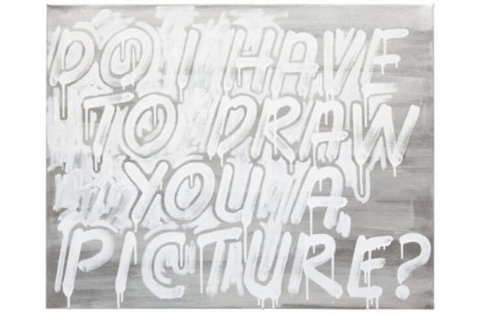
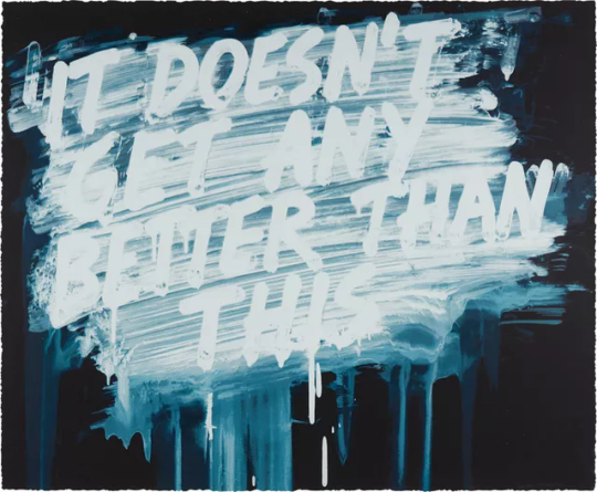
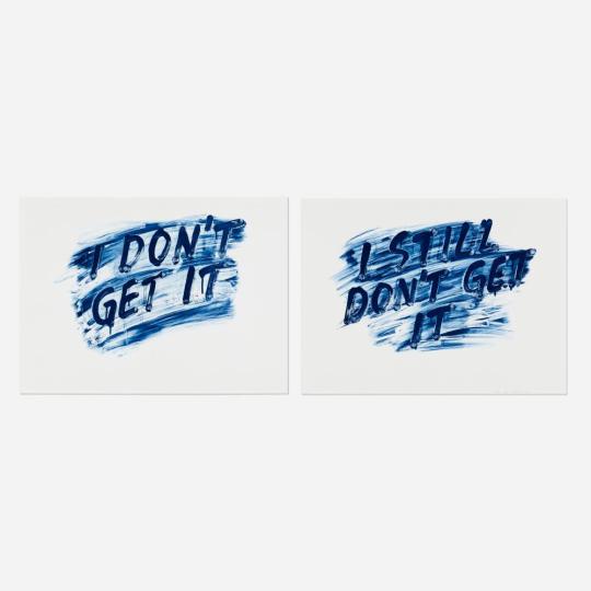
I resonated with these text within these works, I felt these were relevant to my concept - what we commonly hear as neurodivergent people as to ableism but also thoughts we have in terms of not understanding and feeling life won’t get better than this, we will always struggle.
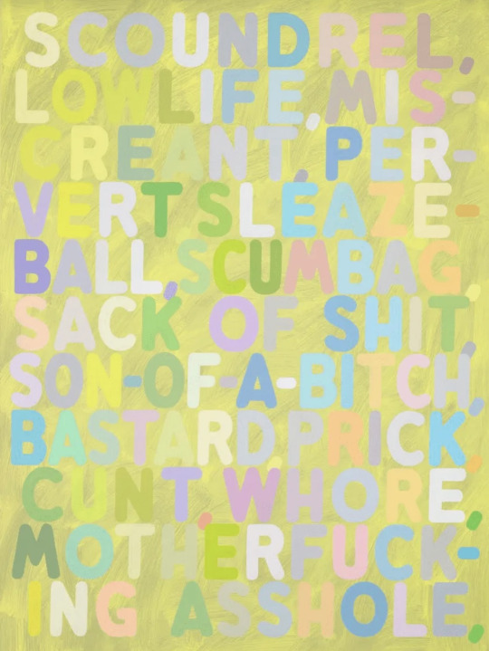
This work using vulgar words also inspired me to look at specific ableist words used towards neurodivergent people and create my own version of this work using those words. I especially like how the bright and colourfulness of the text contrasts with what’s being said, it makes me think about how even the nicest of people can be hateful.
More artworks I have saved from Mel Bochner as inspiration:

I especially liked how the letters stand out in this work and almost look 3D. After my research I began experimenting digitally with some text as i thought this would be a helpful way to experiment with the layout of text, fonts and colours schemes before beginning physical work.
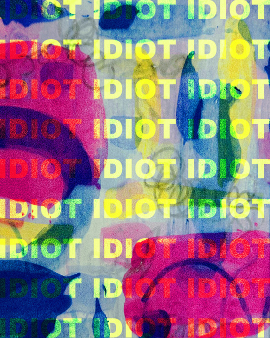
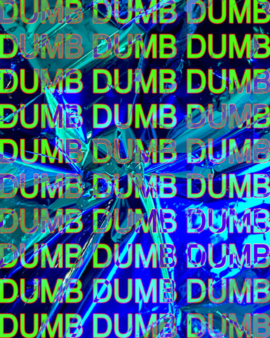
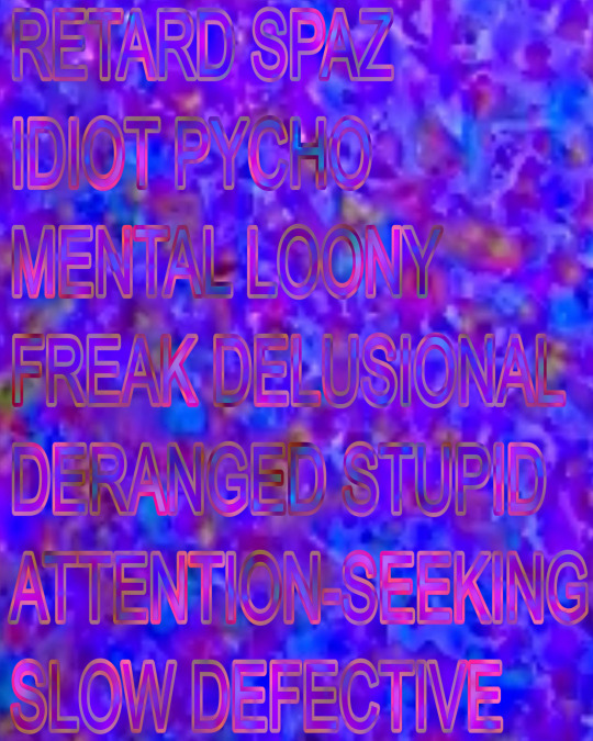

For these experiments I used bright photographs I had from my previous projects as I just wanted to see how the text would look against a busy background. I used words commonly said to neurodivergent people, my favourite was the ‘idiot’ work as I liked the painted background and bright text but also because the word idiot looked like it was spelt wrong even though it’s correct, it made me think of my dyslexia and how certain fonts make it difficult for us to read.
considering using the last image for my final folio 10 images as I liked how the background resembled broken glass and the dumb text repeated over it, reminded me of when people have said to my that I’m dumb and never do anything right, thought this connected well to the background looking like it is broken.
deciding I really liked the painted background I decide to begin experimenting with different techniques and colours palettes in my sketchbook. I looked a lot at Mel Bochners work and the different ways he paints his backgrounds and so I decided I wanted to try my own various techniques.
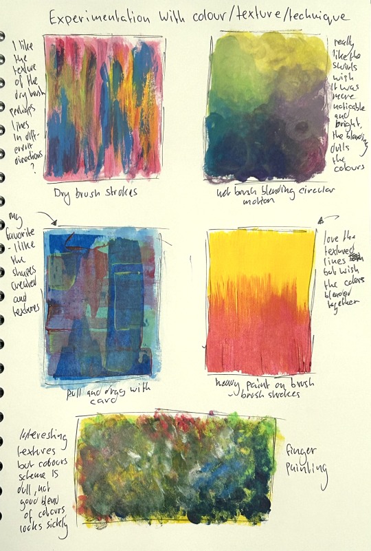
My favourite was the pull and drag technique, I felt as though it was more transparent than I wanted so when I do this next I will use more paint to ensure the different colours can be seen and saturated too.
whilst having my paints out I took this as an opportunity to make a small experiment with paint and text and so I took a recycled piece of card from a box, cut it down to A5 and began painting the background by first doing a first layer and then beginning the pull and drag technique using scrap bits of card.
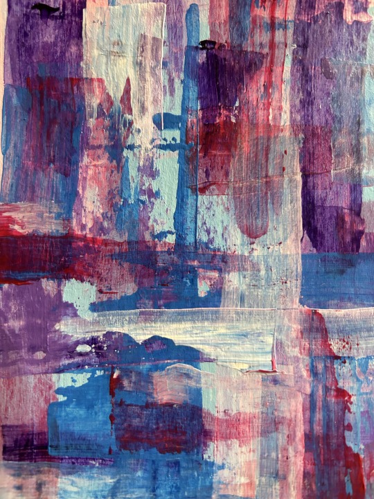
I found the layering to be really interesting, I especially liked how some of the colours blend together and the texture created. It also very bright which is what I was hoping for, I also feel the colours compliment one another very well.
I then decided to add text, I decided I wanted to use a contrasting colour scheme with the background and so I thought about using greys, blacks and white. I thought this could be a good idea to use a darkened colour scheme against the bright colours to show that these words dim our spirit. I did this very spontaneously and without much thought as this was just a quick experiment, I did a quick measurement of the text to insure the letters weren’t too big and that I could fit everything in I then went in directly with a paint brush and did a few layers of each other. I then allowed for some of the paint to drip as I thought this could look interesting, it didn’t really turn out how I hoped and the text just didn’t stand out like I wanted it to.
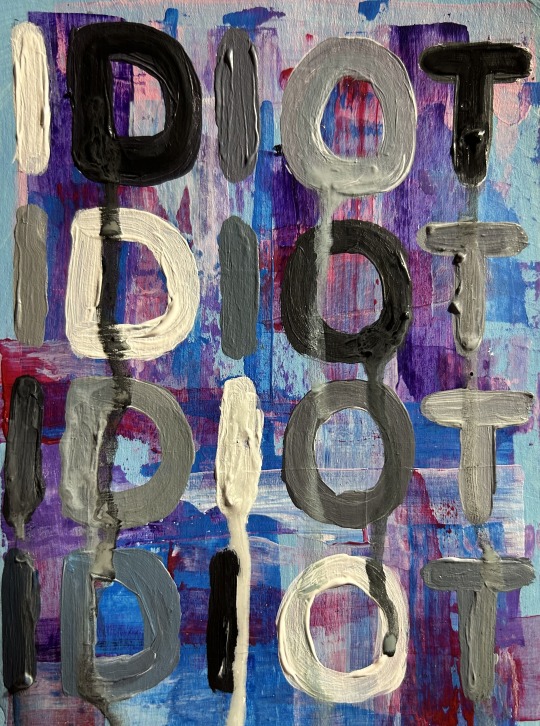
After completing this I realised the grey scaled letters didn’t look good against the bright colours, the letters also felt like they just didn’t stand out as much as I wanted it to, it looks too flat compared to the busy background. One thing I liked about Bochner’s work as no matter how busy the background was with colour and texture, this words always stood out with think thickness of paint/ink. I also didn’t like how the font looked and how each letter looked inconsistent and different from the other. Not liking how this turned out, I began thinking about how I could make the text stand out more against the background.
My idea is to print out the text I want for the artwork and carefully use a scape to cut this out and then using the print out as a guideline to cut the shape onto cardboard which I can then either decide to use it to trace round, use as stamps (dipping them into paint and applying to the work) or paint the cardboard and glue directly onto the piece to ensure it physically stands out but also visually. I am thinking painting it gluing it on to the canvas may be interesting as it will stand out completely but I will have to experiment this and I would also like to try the other options I listed. I also thought about buying letter stencils but I think this will be a great cheaper alternative and a good way of recycling scrap cardboard and greyboard I have kept from previous projects.
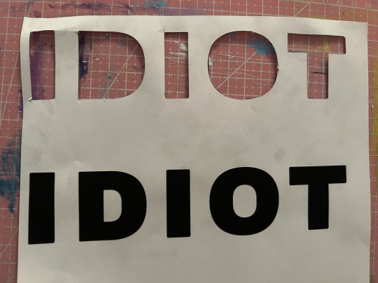
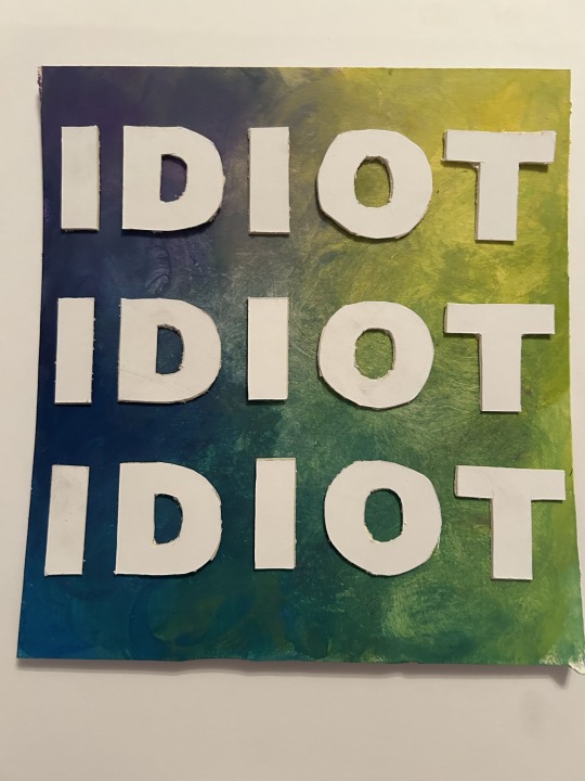
Printed out the text and cut these out, I then used them as a stencil to trace and cut round on think white board. I struggled slightly with this process as it was difficult to use a scalpel on the white board more specific when doing round shapes and so some of the shapes are imperfect but I am much happier with how they look against the painting and fully stand out.
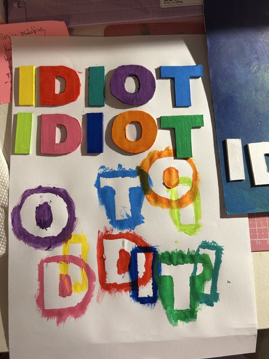
started painting the letters in random order, I just chose colours that felt right and different from the previous colour and ensuring to split up similar colours. I used a scrap piece of paper to paint these on as I had to ensure to paint around the edges of the letters, to my surprise I liked how the excess paint of the letters looked and how they overlapped one another I think this could be something interesting to look into further.
I then finished painting all of the letters, I really liked the colours chosen and how bright and how much they stand out against the painting.
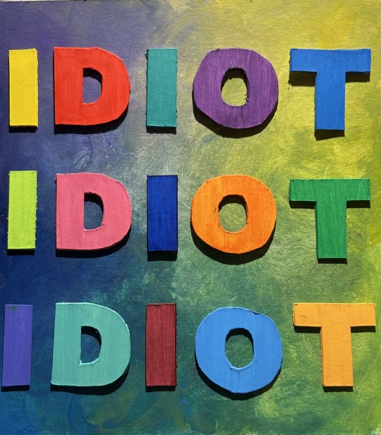
However I felt they lacked something and needed something extra as they were to plain and simple looking and so I began adding extra paint to the letters and creating some texture with the paint brush.
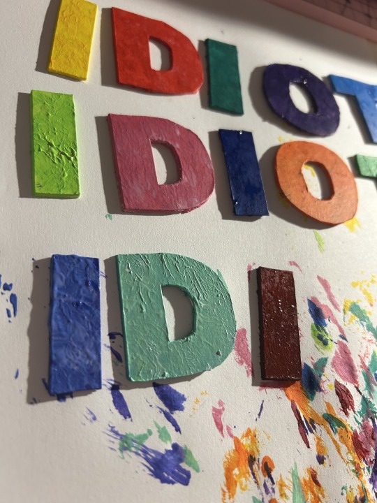
More experimenting:
I had the idea to try use the cut out shapes as stamps and see how this turned out.
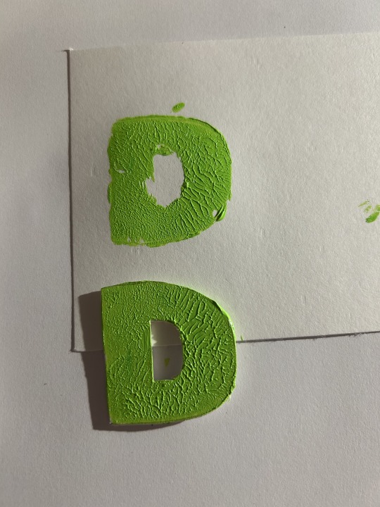
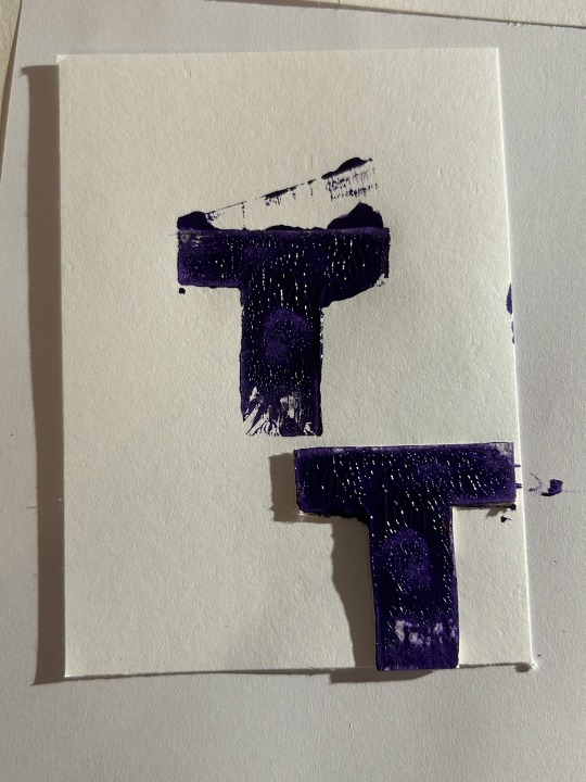
I applied a thick layer of paint with a brush and then pushed it into the paper, this did not work successfully as the full shape of the letter wasn’t stamped and some extra areas were stamped instead. I then tried it again but the same issue happened, however I liked the texture crated and so this inspired me to add texture to the letters.
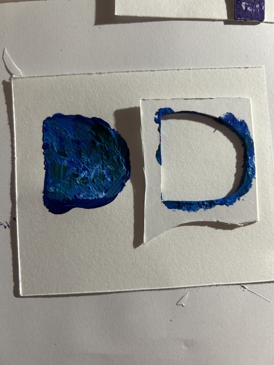
I also tried to use the card as a stencil but this didn’t work, the paint just bled through around the letter and just looked like a blob.
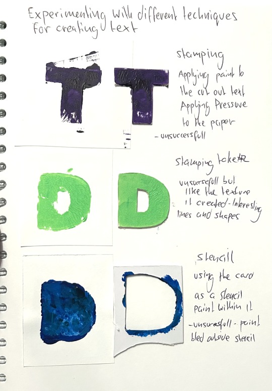
since I liked how the texture looked on the letters I used to stamp, I tried continuing this onto the other letters I had painted already. I liked how this looked although I felt I could’ve used more paint so they textures are thicker and perhaps a different shade of the base colour so that it’s more noticeable.
I liked how the letters looked and how they stood out, I just didn’t like the combination with the background and the large spaces between the text. I felt it the text were larger to fill the spaces and the background was more busy, it might look more visually stimulating and overwhelming like I wanted it to.
Through the techniques I tried for the text stamping, using stencils, painting directly onto the painting, cutting out the the letters and gluing them on - I think cutting out the letters and gluing them on is the technique that works best.
I now plan to experiment further, perhaps on a larger scale and working towards different texts, using multiple words on the painting instead of just one. After experimenting further, I would like to make an a3 or a2 development and begin working on my other ideas so that towards the end of my project, I can decide if this development is something I want to develop even further as one of my final pieces or select as a final piece if I am happy with how the development turns out.
I decided to plan what text I wanted to use for this next work and so I experimented with digital software, experimenting with different words, sizes and layouts.
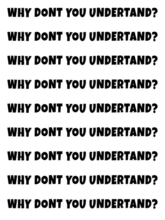
I wondered how longer text would look and I liked the idea of Why don't you understand? something that has been said frequently, especially as a child undiagnosed with dyslexia and autism. However, I felt the text just didn't look right, the spaces between each row as too large but if I made this smaller, then it would require even more words - had to think about that this would be time-consuming to do as I have to cut out each individual letter - perhaps this type of longer text could be used for digital works that require less time.
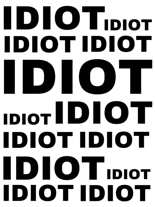
Repetition of the word idiot, I liked how this looked, and It looked visually interesting and overwhelming when in various scales. Although I didn't want to keep reusing the same text and wanted to used various types of words and more shocking ones in my next work and so I decided to do this;

I also thought about using various different ableist words rather than one being repeated over and over again. This involved a lot of reflecting and researching as I had to think about words that have been used towards me - it was quite a difficult process for me to have to think about this but it made me realise how harmful these words were to my confidence and self-esteem growing up. Considering how these words made me feel and how shocking it felt to see them laid out in front of of me - I felt it was clear to me that I should use this text for my next work. I also really liked the style of layout I chose, how some words are larger and smaller and inconsistent - this will allow the viewer's eyes to travel through each word, ensuring each one is read. I also hope this style will be easier for viewers with neurodiversity and learning difficulties to read the words as the words are separated by height.
For using this type of text, especially using slurs, I had to consider if this work is appropriate for college and studio work but through discussion with my lecturer I realised I shouldn’t have to filter or hide these words as these words come from my experience and my reality. It would feel wrong to filter them or “water them down” make it seem less of an issue than it is by using less extreme words because this is just taking away the difficulties and torment neurodivergent people have had to endure.
My intention for this text work is for the viewer to experience a feeling of shock when they view the text bolded and in large scale for everyone to see, I feel these words are something people try to hide in the sense that people will use these words in secret (behind someone’s back) or in conversations/situations where they can’t be held accountable and caught out for their ableist language and so I feel with this work people are forced to see these words for what they are which is ableist and almost take a moment to register if they also use this language, perhaps bring awareness to stop using these words? I also intend for the horrible negative words combined with the bright colourful text to make the viewer confused, question why these words are with happy upbeat colours when they’re awful - it’s my way of giving the viewer the opportunity to realise how awful these words are.
More thoughts:
Thinking about other ways I could create text works rather than looking at repetition of words. Words and phrases I could use: Why don’t you get it? Are you stupid? How many times do I need to explain it?
I also thought about how people will commonly think “oh but these are just words” and believe we should just think in this mindset in order for us not to be impacted by these harmful words but sadly that is just not true and so this gave me the idea to possible use the text “words are not just words”
1 note
·
View note
Text
ARTIST RESEARCH
Within my work I plan to use text, exploring the misconceptions and ableist terms used against neurodivergent people and so I plan to research a variety of artists that use text.
I also plan to make art that is interactive and immersive for the viewer and so I plan to research immersive artworks and the different ways works can be interactive for the viewer.
I would also like to research neurodivergent and disabled artists that explore their disability and experiences within their artwork.
Mel Bochner

I particularly liked Bochner’s work where he used vulgar words, I liked how they contrasted with the colour pallets he used. He has inspired me to explore words relevant to my concept that I could work with in a similar way, perhaps repeating ableist words over and over again showing the frequency that we hear these words.
Simone Wojciechowski

Bel Pye


Kyla Yager

Mahlia Amatina

CONTEXTUAL RESEARCH
What is neurodiversity/neurodivergent?
As an autistic person with dyslexia, I have a good amount of knowledge of what neurodiversity is, although I felt it was important for me as an artist who wishes to explore this, to research into it further and fully understand what neurodiversity is. I was also curious as to what my findings would be, if I would discover any new information I hadn’t already known.
According to the BBC neurodiversity is a word used to describe the different thinking tstoles that affect how people communicate with the world around them. It is an umbrella term that sums up many things, it included autism, ADHD, dyslexia, dyspraxia, dyscalulia and tourists.
Neurodivergent - the word comes from two parts neurological and divergent. It is a term for things to do with our brain and divergent is about moving away from a set path, it is used to describe people who have a different thinking or communicating styles.
We also often describe the ‘average’ person as neurotypical as this is a term to describe a person with the typical way of thinking, processing and communicating.
neurodiverse is an other common word used, these words neurodiverse and neurodivergent were introduced in the 90s by autistic sociologist Just Singer as an alternative to defect-based language such as ‘disorder’. (Defect based language is avoided as it is harmful to those who don’t have the ‘typical’ brain, defect based language leads us to believe there is something ‘wrong’ with the person or that they need to be ‘fixed’. Neurodivergent is a much better term as this word shows we are different and not ‘wrong’).
Ableist comments/slurs
Within my project I want to explore using text, specifically looking at slurs and ableist comments used against neurodivergent people. Misconceptions and other statements we constantly hear and so I decided to begin researching into these types of words and comments, as much as I already know some and have a good idea of what these comments are, I wanted to do further research into this, exploring the experience of other neurodivergent people.
I first questioned what actually is ableism, according to disability awareness, ableism is any prejudice, bias or discrimination directed towards people living with disabilities. This can be as simple as phrases such as “but you don’t look autistic, you look normal”
internalised ableism is also possible any many disabled people, by definition it is when a disabled person absorbs the opinions and viewpoints of the ableist society. This can be by comparing to neurotypical and placing unrealistic exceptions on one’s self.
other examples of ableism, belittling the need for mobility devices, accessible parking, assistive technology, support workers, the need to take medication. Other examples consist of signalling to a neurodivergent individual they’re not understanding because they’re not thinking in neurotypical ways - comments like “why don’t you understand?”, making casual embarks that rivalries disability like “I’m so OCD about my desk””I’m so autistic today” “I can’t read I’m so dyslexic”, highlighting and making light of neurodivergent behaviour “they’re definitely on the spectrum””they must be autistic”. Many of these statements I have heard everyday in my life, from my experiences these types of comments make me feel my disability is insignificant, minimises my disability and experiences, make me feel misunderstood and often uncomfortable around these types of people. It also often makes me feels like all my efforts to get to where I am are not good enough and in the neurotypical view I will never be deemed good enough or trying hard enough, I will always be less than.
Other ableist words I came across in my research were words such as: stupid, insane, crazy, dumb, slow, r*tard (a slur as another term for stupid, historically used as a clinical term but formed into a derogatory one), Moron (once used to describe people with mild intellectual disabilities), spastic (used when someone is behaving chaotic or erratic), crippled, psycho, crazy, lazy, obsessed, mongo (stupid).
The puzzle sign
I decided I wanted to do research into the puzzle sign which is the ableist symbol for autism, i plan to involve the puzzle sign, puzzle imagery and it's ableism into my work and so I wanted to dive deeper into the history behind it and the ableist group 'autism speaks".
intheloopaboutneurodiversity.wordpress.com
This site explains that a lot of neurotypicals believe the puzzle piece is a positive symbol for autism and use this to show their support for their friends and family however a large majority of autistic people do not identify with this symbol.
autismspeaks.org
https://www.autismspeaks.org/autism-symbol
From my research into autism speaks, the puzzle piece originated as an autism symbol in 1963 when it was developed to raise awareness for autism which was long before autism speaks was founded in 2005.
The symbol has been selected by autism speaks as its current logo which is presented with a spectrum of colours which is meant to represent "the spectrum of perspectives and experiences autistic people may have On their site they say that they believe the updated and more colourful puzzle piece represents inclusivity and optimism as they "look towards a future of progress for those on the autism spectrum"

- i found it humorous that they say it represents the perspectives and experiences of autistic people but they are commonly known for disregarding autistic individuals struggles and instead focusing on the research and bringing stereotyped awareness focused towards families and neurotypicals.
The autism speaks group is described as a hate group that seeks to find a cure for autism, that specific word was only removed from its website in 2016 for backlash and has now described themselves as
"committed to personalised healthcare, interventions and supports.
The puzzle piece

it was originally designed by Gerald Gaston in 1963, a parent and board member of the national autistic society in London. The puzzle piece was used as it symbolises how some people thought autism was a 'puzzling' condition. The original design featured a child crying inside the puzzle piece which was to present the sadness from the burden that autism was considered to put on a child's life - which is quite controversial and stereotyped to assume an autistic child is burdened when in reality many autistic children live a very happy life (it's the lack of support and understanding that burdens them!)
However its meaning was then changed and people assumed it meant that autistic individuals had a piece missing.
the puzzle piece is deemed inappropriate as it was created without input or feedback from actual autistic individuals, conveniently designed by neurotypicals. The missing piece idea is very problematic and implies that an autistic person is incomplete and need fixing which of course is not true.
although despite the negative connotations and ableist history, some people have claimed that their autism diagnosis has completed their puzzle - which o feel is a beautiful way to look at it.
The correct symbol to use - created by neurodivergent people

The infinity symbol is the most popular used by the community.
There are two symbols - the rainbow one often represents neurodiversity as a whole, whilst the gold one represented autistic people specifically.
This symbol was created by neurodiversity advocates who wanted the symbol to feel inclusive and the idea behind the infinity sign is that the autism spectrum is linear. It also represents that autism is not a disease that can be cured - it is a disability and the infinity symbol stands for acceptance in that.
This site was very helpful in my research as I learned some things I didn't know already:
https://www.cloudberries.co.uk/news/the-puzzle-piece-symbol-and-autism-why-its-controversial/?
(Some of the links from my research aren’t uploading to tumblr sorry!)
Researching the term “wired” differently
I was initially interested in the term wired differently, as this is a common term I have heard being used around neurodivergence and I began wondering where this term came from and if there was any history behind the term.
From my research from various different cites, the word wired/wiring links to brain cells that are connected to each other and sending electrical sing in all via nerve fibres, these signals send information just like a wired computer and so the metaphor wires are used to describe this carry of information similar to how information and electricity travels through actual wires.
“Wired differently” is a figurative speech and refers to the different ways of thinking and the ways that our brains processes and signals information differently. Depending on the context this term can be derogatory.
Some understand the term wired differently by linking it to this context: electrical equipment must be wired currently so that they can work correctly (behave normally), or they will malfunction and behave in a non-planned way. And so if you are weirded differently, then you don’t behave like other people.
As mentioned before, depending on the context the term can be derogatory. Some neurodivergent people find the term hurtful as it makes them feel they aren’t ‘made correctly’ or that they are ‘faulty’ similar to how a literal item wired differently would be deemed. When we think about something being wired differently we think of it as broken, wrong and not as it should be and therefore undesired and so depending on how individuals view this term it could be deemed harmful or positive.
https://www.baen.com/wireddifferently#:~:text=It's%20a%20common%20attitude%20in,abilities%2C%20and%20even%20neurological%20disorders.
https://ell.stackexchange.com/questions/67639/whats-the-meaning-of-wired
Sensory seeking, hyper sensitivity and colour perception
Considering I am interested in exploring sensory works, works that are of particular interest to neurodivergent individuals as to textures, colours and sound - I thought it would be beneficial to research sensory seeking behaviour, what this consists of, why certain colours textures, lights etc are stimulating for neurodivergent brains.
I first looked at how does colour help individuals with dyslexia to read better:
there are many different types of coloured filter that can aid reading for people with dyslexia but how do they work? They work by making text stand out - giving the illusion that the text is on a coloured background. Both coloured reading aids and coloured background help by altering the wavelength of each colour, recalibrating the speed that signals are passed from the eye to the brain, according to exceptional individual’s dyslexia coloured overlays article 2021. Although one colour combination may be more effective than the other depending on the individual. The reason that it’s often difficult for dyslexics to read black text against white paper is because their visual context is oversensitive to certain wavelengths. Overlays or tinted glasses can not only make text easier to read but also clears headaches and migraines.
exceptionalindividuals.com/about-us/blog/dyslexia-glasses-coloured-overlays-how-do-they-work-exceptional-individuals
I then researched the science of colour perception in autism, specifically how people with autism perceive colours differently:
The sensory processing differences for autistic individuals can make certain colours appear more intense or overwhelming such as the colour yellow can be joyful but could be uncomfortable for a person with autism. Research has shown that specifically children with autism often prefer certain colour hues (although I feel this should be inclusive for adults with autism too) that colours that are softer and less intense with duller tones, pastels and muted shade are generally more comforting and have a calming affect, helping reduce feelings of anxiety or overstimulation. Bright and intense colours such as vivid reds or neon on shades are typically less favoured and viewed as too stimulating and may lead to sensory overload. Although it’s important to note that this may be different to any individual.
Notes: specific colours like green and blue are often cited as colours that can help and relax individuals with autism as these colours remind us of nature and can help create a peaceful environment.
light sensitivity is also something to consider - those with asd often have sensitivities to bright or flickering lights and preferences for natural light are common.
www.mywellnesshub.in/blog/color-preferences-in-children-with-autism/
0 notes