
crissyraccoon-blog
Art 2313 - Drawing
Crystal Kunze
17 posts
Don't wanna be here? Send us removal request.
Last Seen Blogs

deboralvesoficial
O seu lugar pra ficar🖤

anonymous333sthings
Untitled

firebender-hands
***INACTIVE*** on: s1 ep10

clubscreens
clubscreens
escaked
time to pass away in my sea of fandoms
Link
There were too many pictures for Tumblr, so here is the link to a blog post for the project that I made on my design website for my final project!!
0 notes
Photo
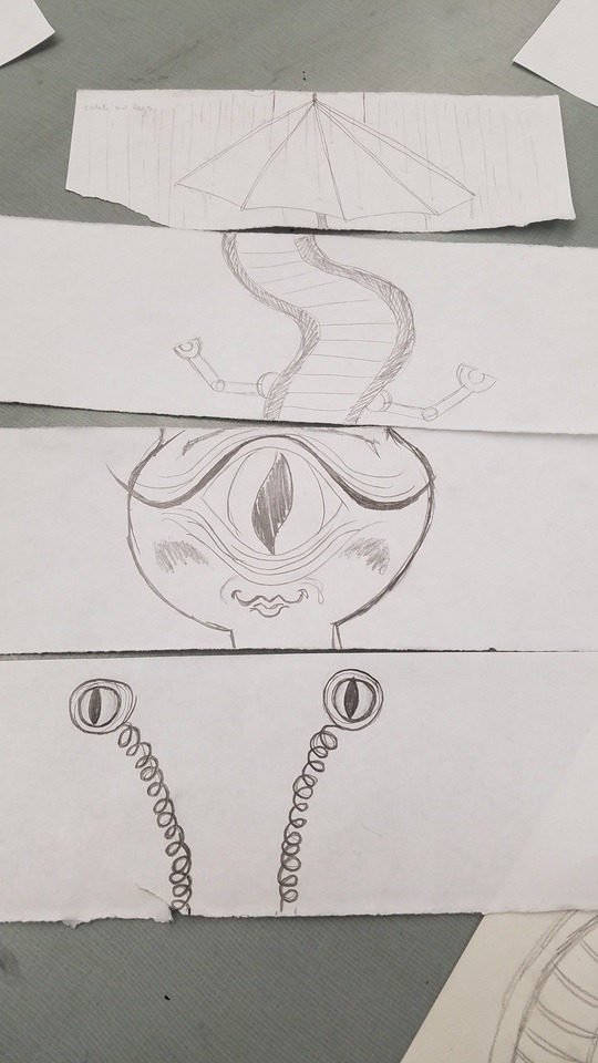
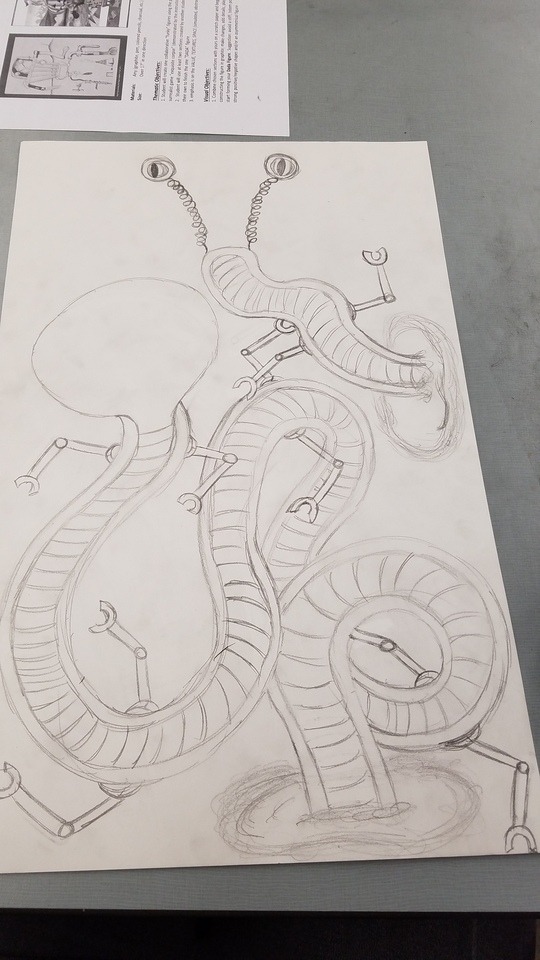
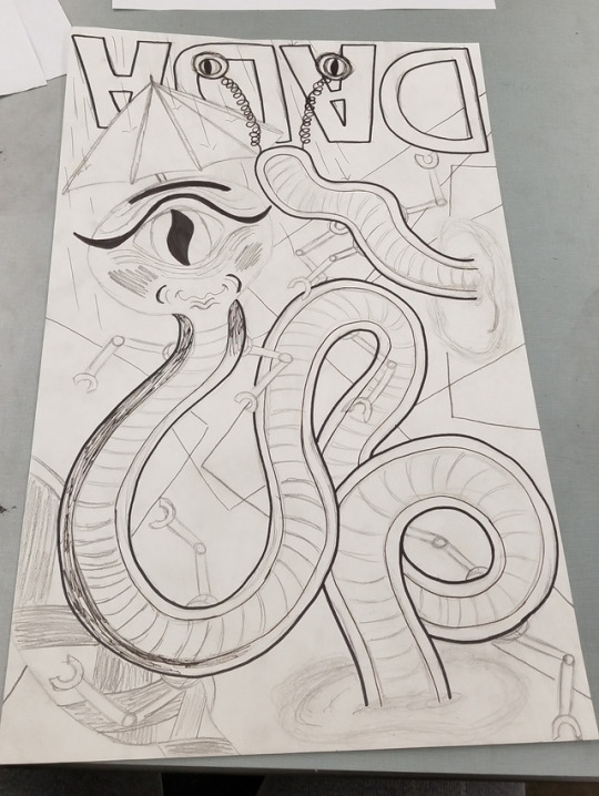
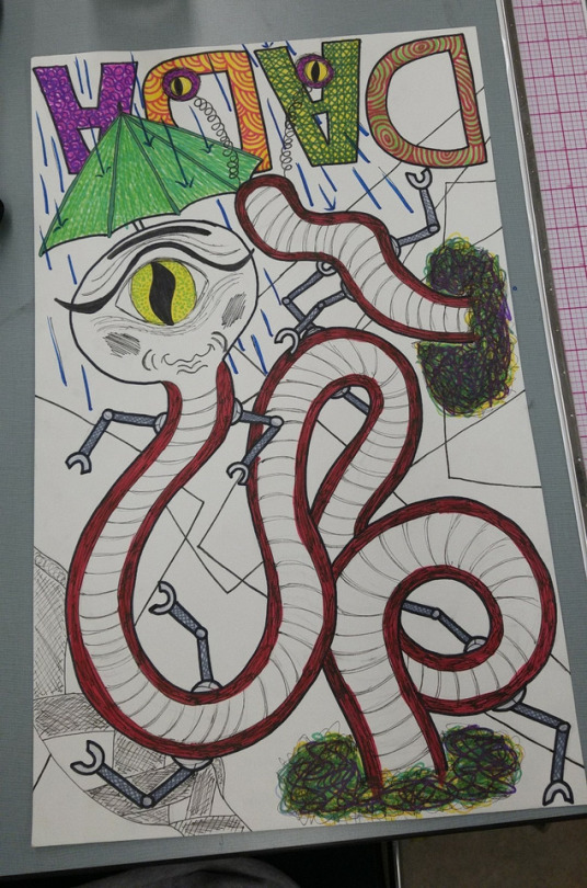
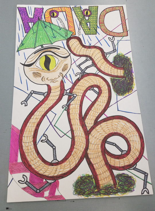
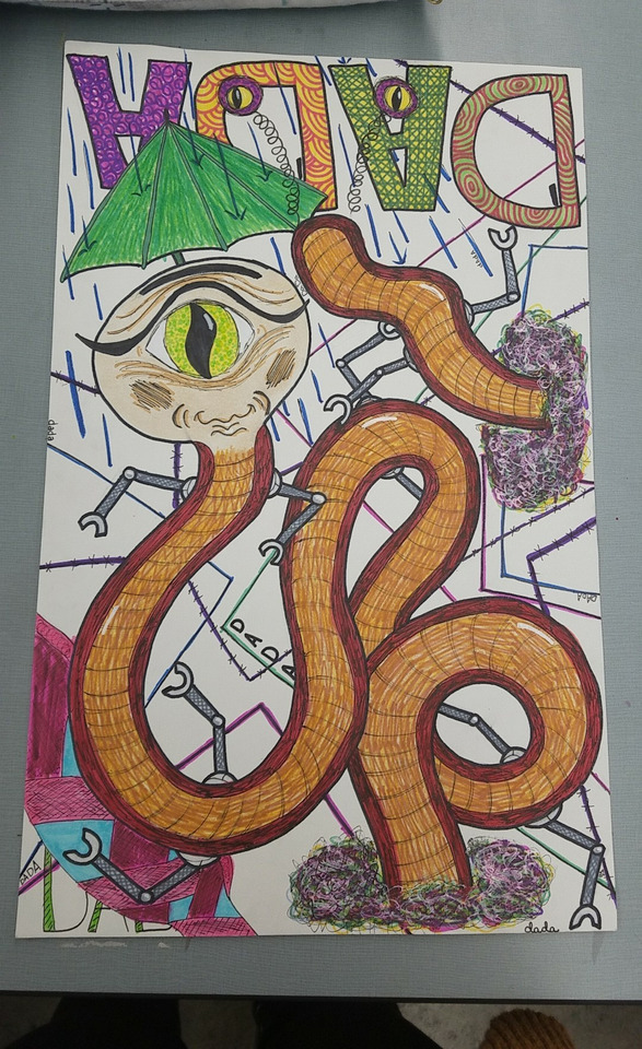
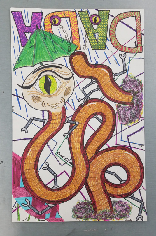
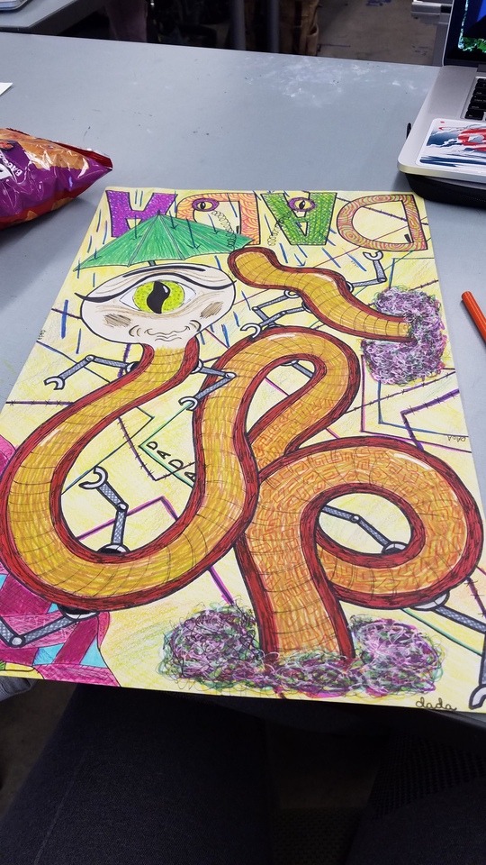
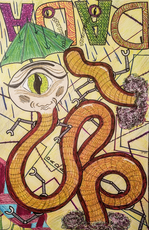
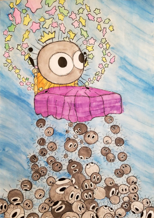
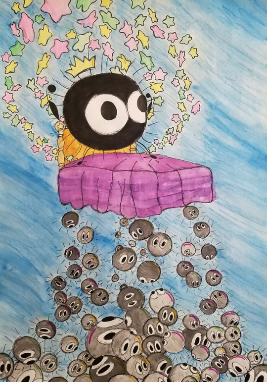
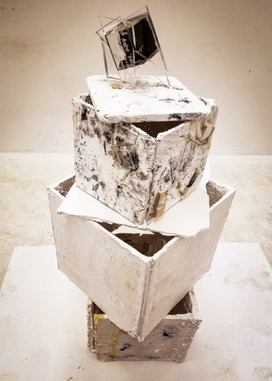
DADA Figure - Mr. Smarm
Mr. Smarm was created from separate body parts that I drew from a small container after we all drew 2 different creatures and then tore it apart and threw it into said container. He enjoys swimming through portals and failing to protect his robotic arms from rust because only his head is really covered by his umbrella. He has an extra set of eyes on his buttocks which keeps a lookout for food in case he needs to return from within a portal quickly and efficiently. He is a very friendly superior alien being.
0 notes
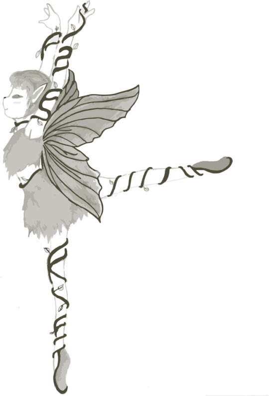
Photo
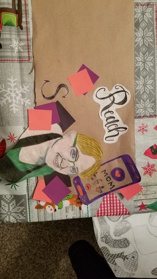
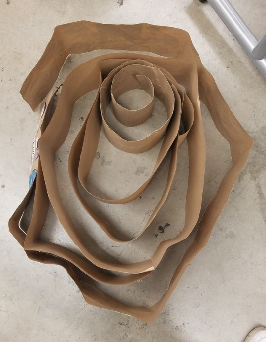
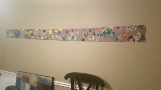

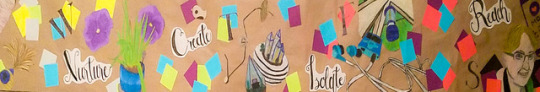
Time Sequence Narrative - Coping Mechanisms 6′ x 1′
I wanted to create a cyclical sequence that wasn’t completely understandable at a glance for this project; because of this, I chose to create a timeline of my usual coping mechanisms when I am having a particularly rough week or am spiraling when my anxiety is getting particularly nasty, and prioritized each coping mechanism from beginning to end. It came out alot bigger than I intended it to be, and would not sit in a perfect circle the way I wanted it to, so I decided to situate it in a fingerprint sort of formation facing outward. This form was much more pleasing to me, and made more sense as it was a more personal aspect of myself that I was sharing, and I was overall more pleased with the end result.
0 notes
Photo
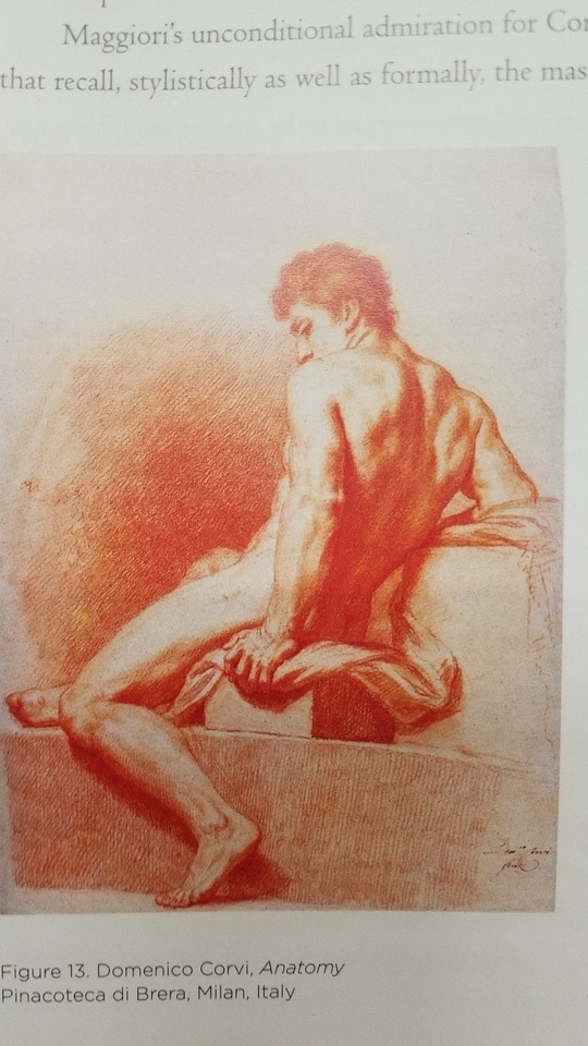
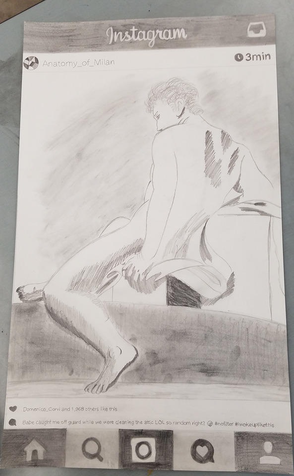

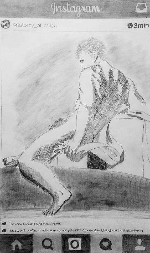
Historical Classical Figure - Domenico Corvi’s Anatomy
Every drawing class needs a figure drawing assignment to make you feel terrible about the fact that you can’t draw people, and this drawing was it. The point of the project was to find a sketch of a classically beautiful body and recreate it with a modern twist. Because I am inexperienced with the figure and wanted to focus more on trying to figure out the shading and simply try to get the proportions of the body correct, I chose to add an Instagram layout around the figure rather than add onto the background and add anything to him.
0 notes
Photo
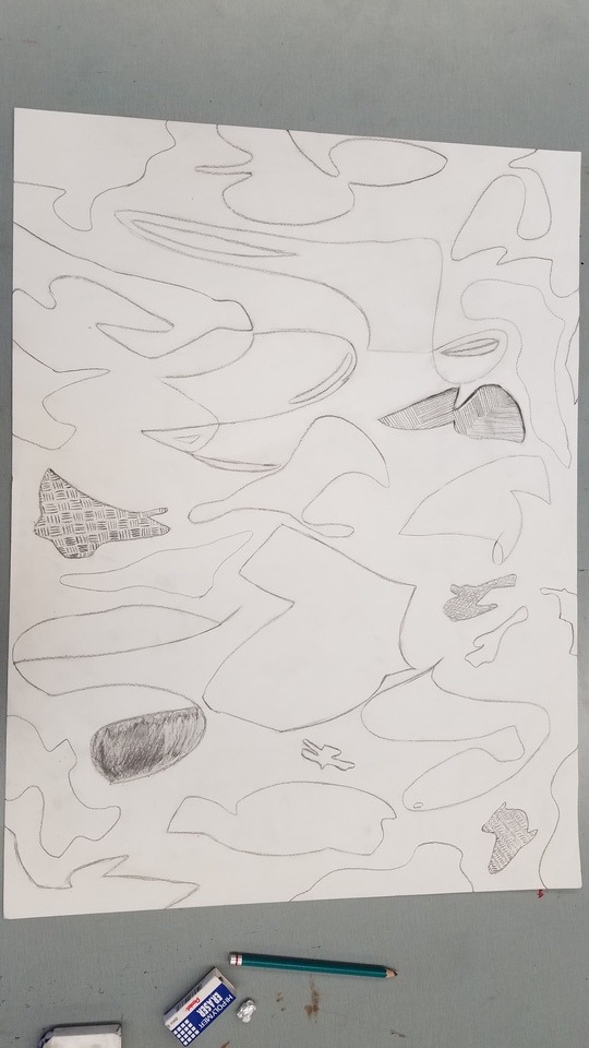

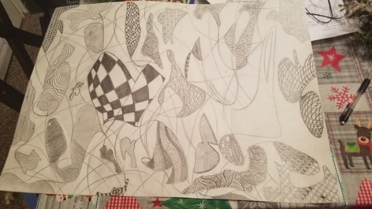
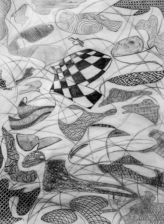
Scribblism Drawing - Texture Study, 18 x 24″
The main idea for this project was to create by destroying and erasing. We first began by drawing a bunch of lines and then erasing those lines to create abstract shapes. After making the shapes, we could choose whether or not to focus on 2D or 3D objects and objective or non objective objects and attempt to create space and work with depth. I chose to make mine a texture study and try to create depth with different textures, then link them all together with smeared graphite powder in the background and added lines connected the shapes together, as if there are textures on top of textures on top of textures, like some weird repeating metaphor.
0 notes
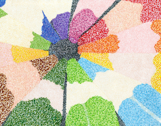
Photo
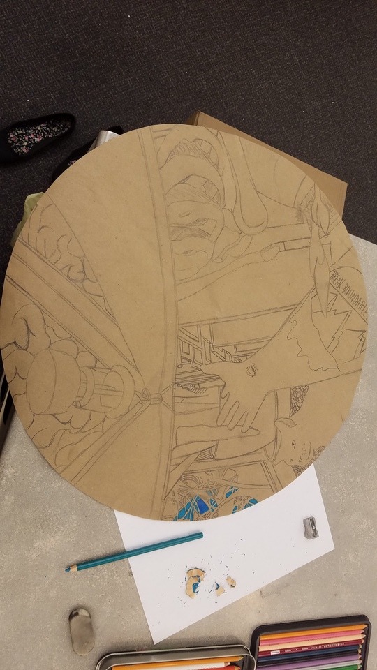
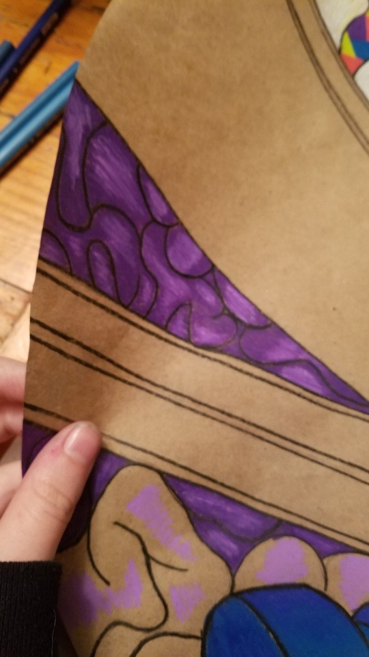
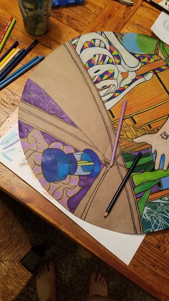
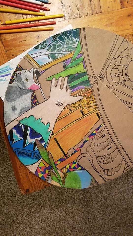

Mixing Interior/Exterior - Self Portrait, 22″ diameter
For this project, we had to create a drawing that could be viewed from ideally at least 3 different angles which showed both the interior and exterior of an object, situation, narrative, etc. I chose to do an abstract self portrait of myself,mixing together body parts, objects and memories that make up who I am, and the chemical make-up of the medicine I am required to take daily in order to fulfill the project’s requirements. We were also encouraged to look past the normal rectangle shape for drawing. I chose to go with a circle; it seemed more fun and could be viewed from literally any angle.
0 notes
Text
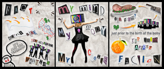
ARTISTIC THEMES POST
Social Commentary - I believe I already use social commentary in much of my design work, but I could definitely utilize it in different ways. I greatly admire the work of Barbara Kruger and Emory Douglas and the unapologetic manner of their design. The majority of my work that is political is fairly straightforward and in the form of infographics, and pertains to issues that could potentially affect me, such as mental health and women’s rights. While these issues do need to be spoken about in a rather harsh or overt manner in order for other people to possibly understand the situation, there are people who could get angry and run from an idea simply because it was forced onto them. I admire artists like Emmett McBain who are able to put social commentary into their work that is not overtly political but is political nonetheless. Where I am more straightforward and graphic in detail in my design, I would like to channel my energy into trying to soften this approach, as it could scare future clients away. The sophistication of a political message hidden within the lines of a beautiful, romantic soliloquy is enticing. I’m always willing to try new things, and challenging myself to tone a loud message down or maybe take a step back and examine what or why something needs to be less overt is just incredibly interesting to me, and could possibly lead me to evolve my work in a way I had never thought possible before.
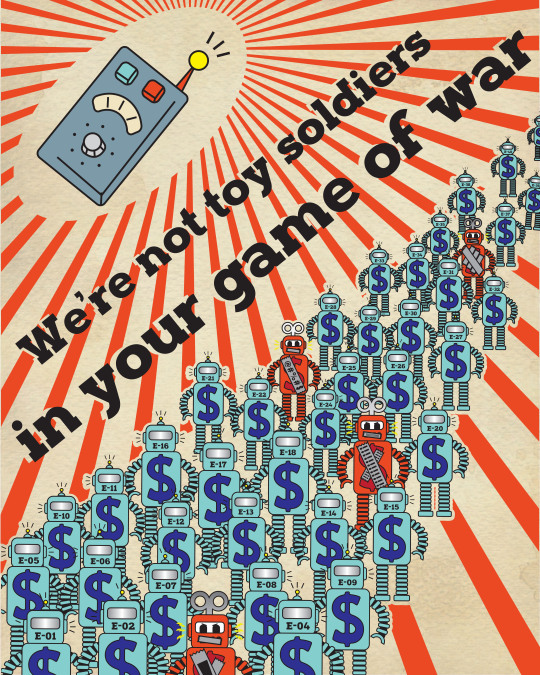
Allegory - The only piece I have ever really done that could be considered allegorical was probably a poster I used that contained small toy robots which I used to make a statement concerning government control. I would love to explore allegorical context more in my work, as I feel it could elevate my design, because the symbology that goes into design in branding and logos are so important, especially if it concerns a company whose business is deeply involved in its own cultural history or moral values. I also just enjoy narratives and storytelling, and allegories in particular are my favorite. The book Animal Farm was fascinating to me, and the research that can be found on the characters and the political figure they are associated with is astounding. While Animal Farm is mainly about the Stalinist Era of the Soviet Union, I feel allegory can be applied to anything nowadays, especially with the turbulent political climate we currently live in. A picture or novel could be just a beautiful picture or story, but have so many layers and hidden meanings it could take years to uncover its secrets. These pictures could also uncover the morals and values of a culture as a whole through a story, which is what many African and European cultures did to portray their spirituality by making each character either a certain value or symbol of religion in general. The possibilities for allegory in art history as well as contemporary art are endless, and I would love to experiment with my style to try to include it in my work.
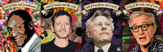
Metaphor - My most recent project in design was to compare celebrities, filmmakers, and producers who have committed heinous sex crimes against women and children and will most likely get away with or have gotten away with it to the Greek gods in mythology. The gods were portrayed as sexually promiscuous and humanly imperfect, and I felt this would be perfect to get my message across. I use metaphor possibly the most out of anything else in my work, and feel it is the device most people can relate to and identify, whether it is in drawing, design, or simply in literature. Archie Boston used his own twisted, tongue in cheek version of metaphor to advertise for his design firm, and looking at his work has inspired me to try to expand my portfolio and try to push the limits of exactly what is acceptable in today’s society. Visual linguistics are imperative to design and drawing as well, as the artist or designer would like the viewer to be able to identify what the comparison or explanation is right off the bat. I want to look at different ways of incorporating metaphor into my work, as metaphor is one of the most common uses of visual linguistics in advertising today because of its complex simplicity. I truly think combining these linguistics with design and other artistic techniques is a beautiful symbiosis of the arts and a deeper, stricter manner of thought.
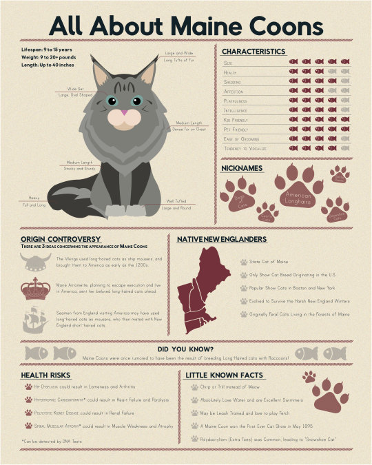
Personal Themes - I am not entirely comfortable with delving into my personal life or psyche or anything of the sort when it comes to my art. The deepest I will go is “I like cats, let me research them and then make an infographic that has to do with my favorite breed of cat,” or “I like space, I’m gonna make a sculpture of a spaceship because aliens and space are rad.” Artists who are able to delve into their personal experiences or cultural heritage like Kara Walker, who creates scenes pertaining to her cultural heritage out of black silhouetted pieces of paper, or Manele Zuholi, who explores her personal identity as a South African lesbian, are just as awe inspiring to me as they are confounding. I would like to be as personal with my work and self reflective as they are, but I simply cannot bring myself to be. I feel as if I am already too overtly physical and involuntarily open when it comes to my anxiety and panic disorders, and this is a relatively new development as I have become more comfortable with myself and my mental health, but the work I have done pertaining to mental health is purely academic and could only be taken as such. I would love to be able to overcome the hurdles that are my personal boundaries and do what my idols do and plaster the walls with my story, but I simply feel as if that could be impossible. Simple academic research does not seem to be a viable option in this situation. Self reflection could be the only way to reach an artist’s personal psyche and add that life that elevates their work above a picture that was simply made to look like a pretty picture.
0 notes
Photo
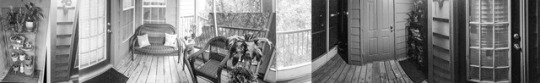

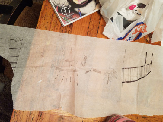
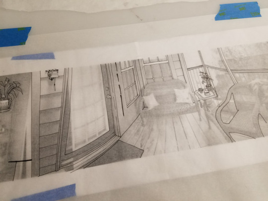


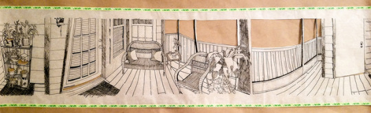

Fractured Panorama - 537′s Patio Throughout the Day
Pen and Ink, 6″ x 29.5″
Drawing with tracing paper is difficult because it’s so difficult to keep straight, keep flat on a surface, and there is little to no allowance for mistakes, so I was not able to draw an outline in pencil and then redraw over it in pen. I wanted to experiment with flat vs. three dimension in this piece, and thought it would be interesting to cut out the spaces that made up the windows on our balcony. At first I wasn’t sure what would be too much to cut out or what would come off as the sky, but I tried to play with what negative space I could and try to keep it fairly consistent throughout the piece.
0 notes
Photo
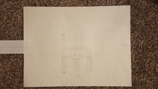
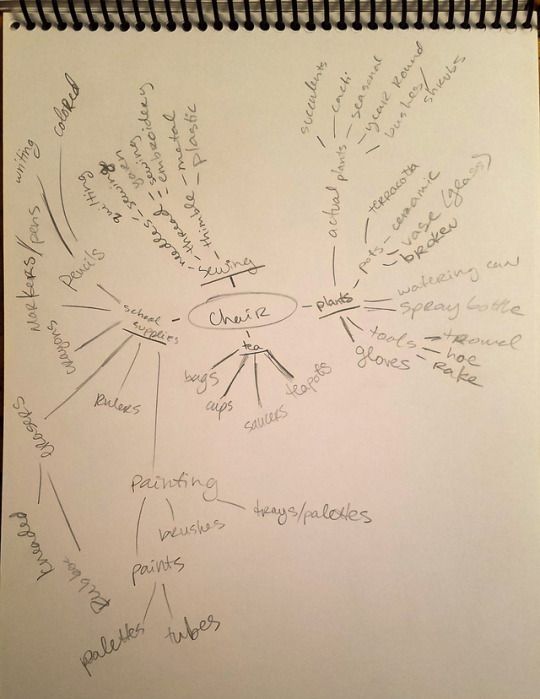
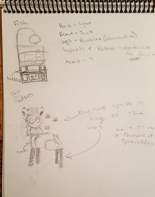
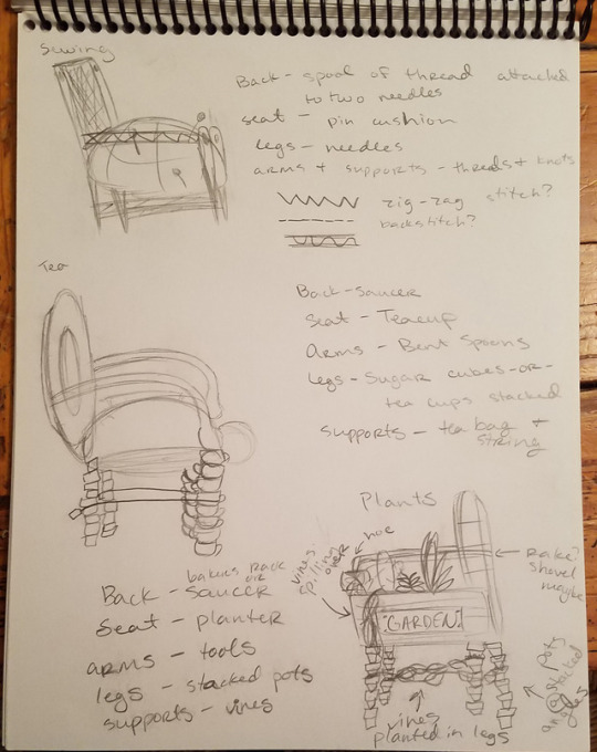
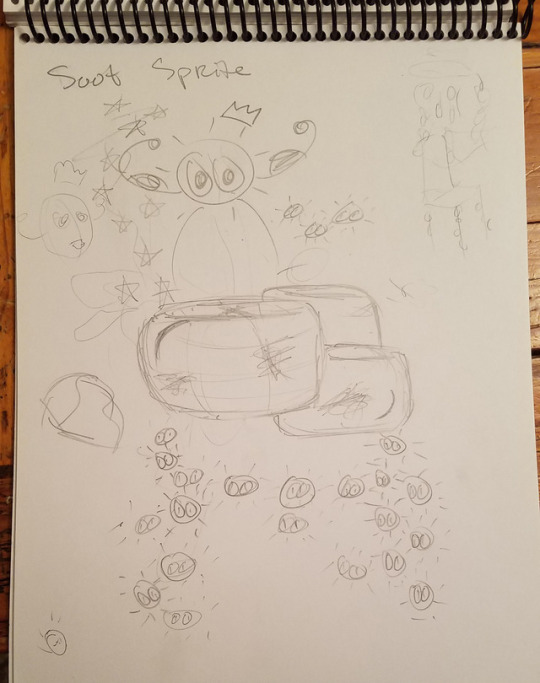

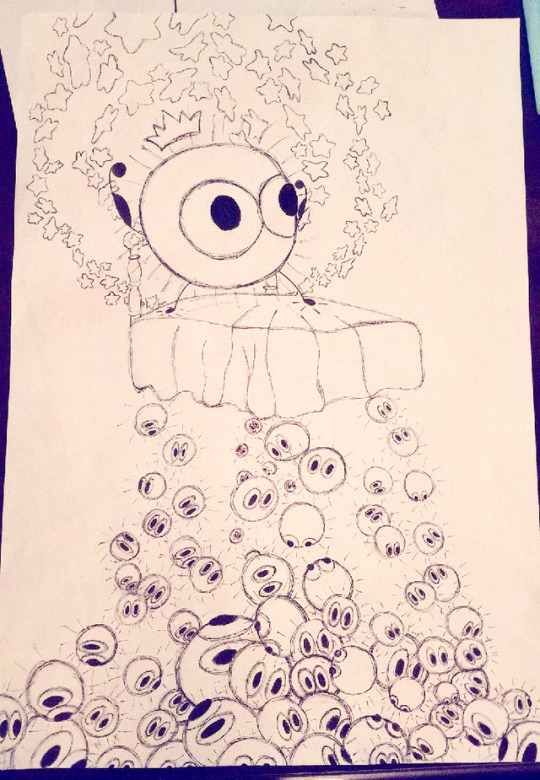
2-3 Point Perspective Chair - Soot Sprite Dream
Pen and Ink, Watercolor, Marker, 12.5″ x 18″
For this drawing, we were supposed to begin with a simple two point perspective drawing of a chair. Afterwards, we had to come up with at least 5 ideas for a new chair that broke the boundaries of the chair design, but stayed in perspective. I’m not the best with perspective and don’t do much conceptual work, so this was a fun exercise to get to brainstorm and see all of the ideas I came up with, as I can relate the process of brainstorming to graphic design and generating ideas for future clients.
0 notes
Photo
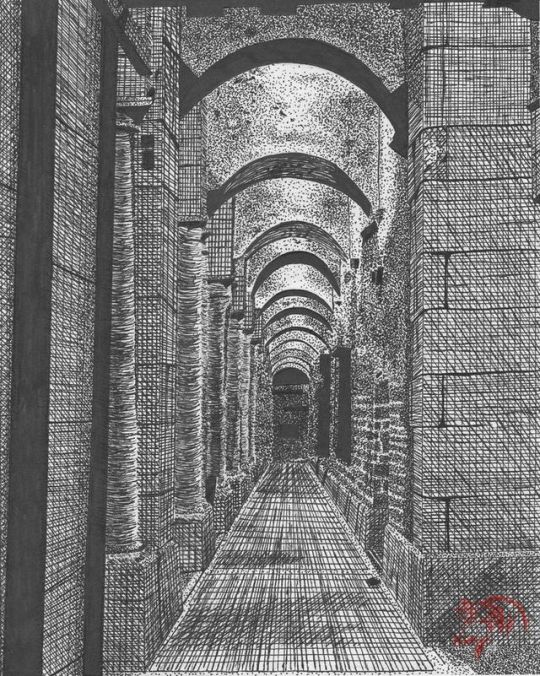
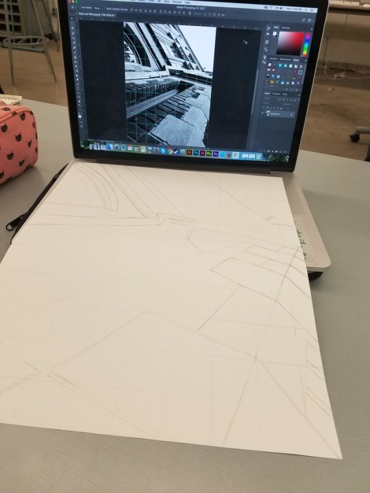
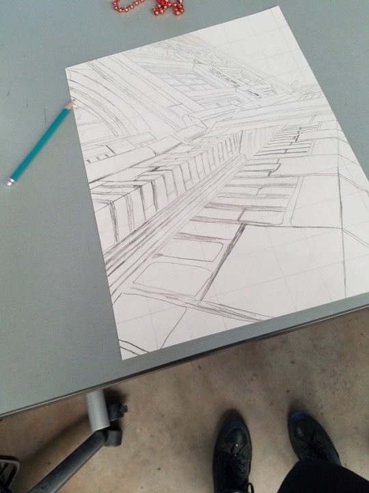
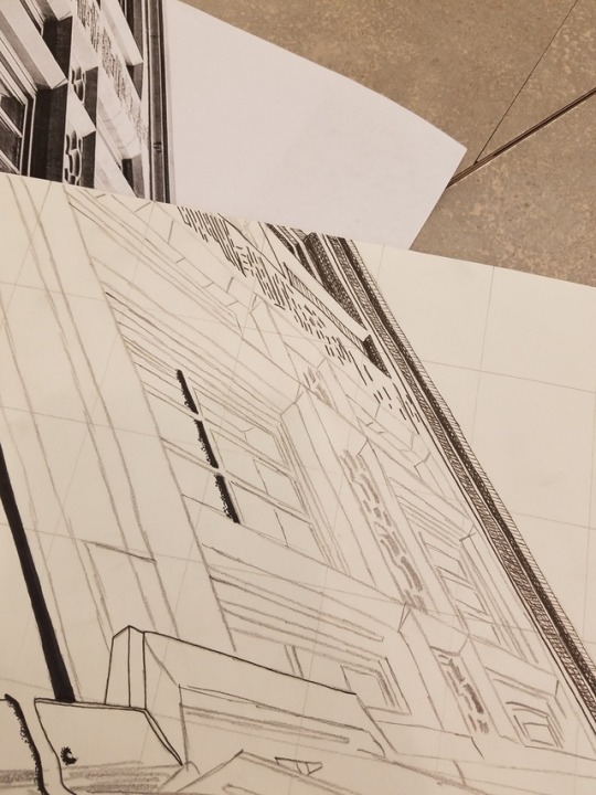
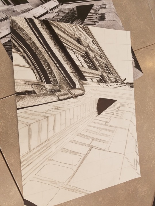
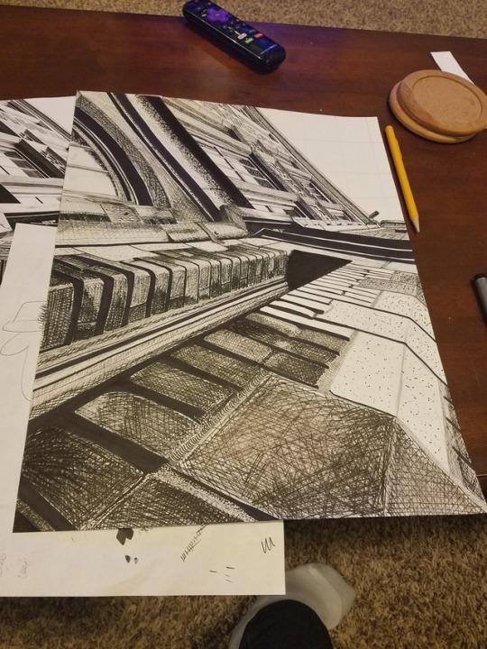
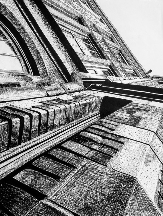
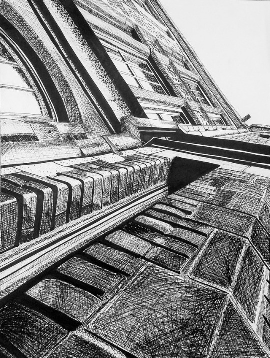
Space Drawing - OU Buildings
Pen and Ink, 12.75″ x 17″
For this drawing, we were required to take a picture of at least two types of perspective of a space that was at least 15 feet across. I wanted to combine stippling and crosshatching in this drawing and test different weights of pens in this drawing. I have never done a hugely architectural piece like this one, and found it challenging but fun to try to get the lines as proportional and straight as humanly possible. I had similar issues with getting darker values before the critique as my pens began to run dry, but after giving the drawing some “space,” I was able to darken the right side.
0 notes
Photo

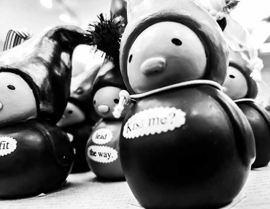
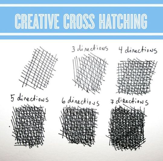
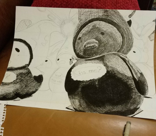
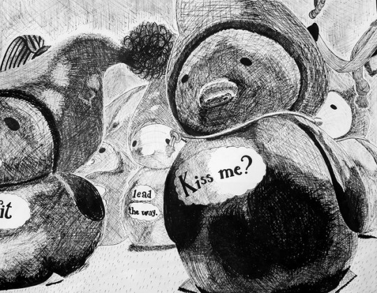
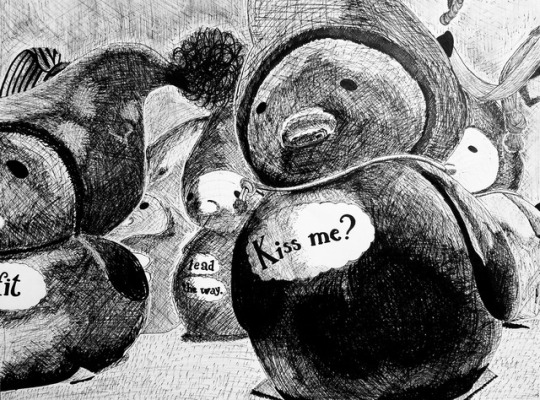
Observation Drawing in Pen and Ink - Gnomes at Hallmark
Pen and Ink, 12.75″ x 17″
Before the critique, I was not able to get as many dark values as I wanted to, but after the critique I was able to figure out how to darken certain spots, get rid of halo areas between the background and the gnomes, and separate the two gnomes in the background to show greater depth. This was the first pen and ink drawing I’ve ever done, and I ended up doing research on different methods of cross hatching and how to follow the contours of the figures in the drawings to create dimension.
0 notes
Photo


Shown in this post are 5 traditional pieces of art I have done in the past. The first was created with melted crayons on a canvas, the second was drawn in graphite, the third was made with marker, the fourth was a watercolor piece and had white colored pencil drawn over it, and the final piece was made from colored pencil.
0 notes
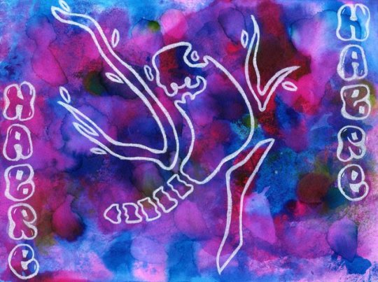
Video
youtube
“The Price of Silence” Pre-Critique
After Effects Assignment
Core III - Time/Motion
0 notes
Video
youtube
“The Price of Silence” Post-Critique
After Effects Video Assignment Critique Responses
Concepts - My audio initially began as a narrative of an anxiety attack, and eventually turned into more of a battle between a person and their own mental illness, whether it was anxiety, schizophrenia, multiple personality disorder, or any other disorder in which their mind is constantly “running” or “screaming,” and they are not able to catch a break. I felt adding the video strengthened both my narrative and the underlying meaning of my remix as a whole because it is incredibly hard to describe mental illness to someone who does not have to deal with these issues on a daily basis.
Structure - I tried to time the elements of my video with the sounds and basic beat of my remix so the video flowed with it, but also tried to have enough of a disconnect that it still seemed like a sort of organized chaos. I wanted the loud, fast parts to be loud and angry and have tons of color correcting and weird effects, and the softer or barely audible parts to have either no effects or a simple black and white filter and fade in/out. I also broke my remix into obvious sections with clear breaks that are simple, black screens to give the viewer a little bit of a rest after the “eye assault.”
Timing Strategies - I had my Garageband file open the entire time and cut my video as closely as possible to fit with the audio. On almost every clip, I use the Time Layer > Time Stretch, and set it anywhere between 5 and 15, and if the clip was too short after this, I would create a composition of the video on a loop until it fit the desired amount of time. To save time after I finished the first set of bass drops and beats, I copy and pasted the clips from videos that were originally 15-20 minutes long and simply moved the selection bar to a different part of the desired clip so I had a seemingly new clip to use and no extra editing.
Color Corrections - I used color corrections for almost the entire video because I wanted to get the point across that the entire experience a person has with mental illness is not to be taken lightly, and can, in fact, be frightening and disorienting. The most used color corrections tools I used were Curves and Exposure. Every single video clip that was put into the video except for the last three at the end had Curves applied, and in order to cut time on this process, I made an initial Curves edit, then saved it to my computer, and anytime I had to add the effect in, just had to open the file and then change a couple of small areas that took less than a minute to do. For a clip from the Babadook, when the audio screams, “Why can’t you just be normal,” I used Exposure and timed it to help change the colors and make it seem like the mother’s face was morphing to and from some weird monster. Another part where I used Exposure heavily was the area right after “Why can’t you just be normal,” when images such as “Help,” a hand next to a pill bottle, and a girl holding her knees to her chest. The Exposure effect helped make these images more visible, when the blending mode options would either make the images disappear or distort them too heavily to be recognizable. Hue/Saturation was also used for the door slamming effects just so I could add a little extra “oomph” to the video.
Effects - I mostly used the Split and Mirror effects for my video to help add not only to the disorienting effect of what I thought was the metaphorical battle with illness, but also because effects that either double or reflect a certain image are tropes used when describing mental illness or a “breakdown” of emotion in a few popular ego music videos I’ve seen. The majority of these effects were added to the beginning half of the video before the large break, simply because I wanted to keep the viewer from gaining somewhat of a visual foothold and create a disorienting, uncomfortable space.
What Worked - I think the use of color corrections paired with certain effects was incredibly effective in my video. I also thought that my use of different timing, jump cuts, and overall any timing edits were on point. My goal was to create a disorienting, uncomfortable, terrifying space, that people might think can’t get much worse father the first break, but it definitely can, and I feel like I accomplished that. Overall, I am pleased with the end result.
What Can Be Fixed - I think the ending could definitely better, but I couldn’t decide between a super literal ending or an abstract ending like the rest of the video, I just know it doesn’t sit completely right with me. I also wanted to find some better footage for the ending, but whatever I looked up either didn’t feel right or the search result wasn’t what I was looking for and some of the footage ended up being more of a compromise than anything.
Post-Critique - After the critique, I tried to make the images that appear in the final sequence more noticeable, as a couple of them (i.e., both gun pictures and the pill bottle) did not seem to show up as well as I had hoped. I changed some of the timing that I noticed had been a tiny bit off before, but I don’t know if it’s just my eyes having trouble keeping up with anything or what but it doesn’t look like I changed anything at all. I also changed the last two ending clips, and am much happier with the way it came out. There were also very, very minor tweaks to color corrections that aren’t noticeable to most people but really bugged me.
0 notes
Audio
Garageband Audio Assignment Critique Responses
“The Price of Silence” began as “I Should Be Sleeping,” and was originally meant to be a short narrative detailing an anxiety attack’s natural progressions. Pre-critique, the remix ended after the person suffering from the attack began to calm down. Post-critique, when the remix became “The Price of Silence,” it became a narrative about a person who had consistently struggled with anxiety and depression who just wanted everything around them to stop and be silent. The person chooses what they feel is the most viable option in this scenario and ends up killing themselves, earning the silence they felt they deserved.
Software Instrument - I utilized 2 software instruments, a keyboard and drum kit, in my remix, both in order to quicken the pace of a certain section of the song and help supply a subtle beat to these certain sections. Though they are less detectable than most of the other sounds in the remix, they were important when I was deciding on tempos and keeping a steady beat.
Self-recorded Audio - I had videos of my downstairs neighbor harassing us that I downloaded the audio from and put into the remix in order to add a slightly personal touch to the remix. This was before it became about a battle with mental illness in general, but was still meant to personalize the experience because everyone’s situations differ from person to person.
I mostly used distortion plug ins and played with the pitch and vocals. I used metal distortion and tinnier sounding plug ins in oder to make the entire remix come across as warped and garbled. For many of the loops I used, I increased the speed and shortened them, or cut them apart and copied and pasted them together in order to create a new sound that still flowed with what had previously played.
I wanted to create the “timeline” for an anxiety attack, slowly building up into the cacophony of noise that would eventually explode and lead into a soft, quiet end. I mostly listen to music with buildups like these, where the music starts off rather strong, then builds until it is almost deafening, and then tapers off into nothing, and wanted to try to replicate that in my remix.
I used pan for different voice layers and the thunder ambience in order to make it seem like it was all encompassing, but mainly wanted to make sure the person listening would not be able to concentrate on just one single sound or voice, and used echo on most of the instruments and loops and reverb on the audible sounds such as the door slamming and the glass breaking.
High End - Most of the high end audio clips were high-pitched screeching noises such as nails scratching on a chalkboard or the dialup noise that were meant to be grating on the nerves and further agitate the listener. These noises were used leading up to the climax of the remix.
Mid Range - The majority of the remix was in the mid range, the only thing that really changed was the volume and speed in order to change the tone of the song
Low End/Bass - I used a bass loop in the climax of the remix in order to add to the intensity of the moment
Textures - The climax of the remix was more dense and used a much more garbled and harsher tone and combined the higher tones and bass in order to demonstrate the urgency of the piece, whereas the previous sounds and voices used leading up to the climax were less dense and utilized mostly mid range sounds
My transitions seem to be working just fine, and I definitely like the buildup leading up to the climax of the song. The voices were kept to a minimum and were integrated more as an addition to the garbled sounds, and I think it really helped with my initial idea.
I don’t like the ending at all and want to change it, and will probably follow my first gut instinct. I will also be messing around more with the volume levels, and I also noticed that a few of the sounds I initially added had been deleted when I edited different parts of the song without noticing it.
The most significant change I made was to the ending. I completely changed it. I also added in a thunder ambience to add an additional bass tone that would play consistently throughout the song, and just added additional effects and played with the panning and volume settings, adding more of a variation and fluctuation to try to add more chaos.
0 notes
Photo


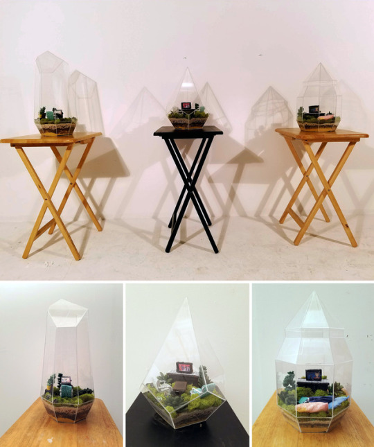
The pieces in this post are five of my favorite pieces that illustrate a variety of the work I have created in the past couple of years. My personal favorite is the “Toy Soldiers” poster, which is a 16 in. x 20 in. poster created as a song interpretation of the song “Toy Soldiers” by the band The Animal in Me.
0 notes