
Don't wanna be here? Send us removal request.
Statistics
We looked inside some of the posts by crossgrossgrass and here's what we found interesting.
Average Info
Notes Per Post
1
Likes Per Post
1
Reblog Per Post
0
Reply Per Post
0
Time Between Posts
4 days
Number of Posts By Type
Text
4
Last Seen Tumblr Blogs


Fun Fact
Tumblr was attacked by a cross-site scripting worm deployed by the Internet troll group GNAA on Dec 3, 2012.
Text
Week 5
Virtual reality is a computing technology that generates an immersive experience leading through media - it could be animated 3d environments, 360° movies, or training simulations. Everything there works accordingly to the laws of physics to make us feel a state close to natural. However, VR expands the limits of possible by giving us a chance to fly, interact with any objects and creatures, travel along imaginary routes.
As a relatively new medium, VR does not have much of a heritage and is still being at an experimental stage. Thus artists and designers who enter this industry might question if already established principles of 2d-design we have been using for ages still work in VR.
Principles of 2D design:
Balance – can be Symmetrical or Asymmetrical.
Symmetrical = dividing a composition into two halves with seemingly identical elements on each side.
Asymmetrical = balance based upon a visual sense of equilibrium that can be felt more than it can be measured. There are no specific rules for asymmetrical balance except that of diversity.
2. Repetition/Rhythm – a repeating visual element (line, shape, pattern, texture, movement); a flowing and regular occurrence. A subcategory of repetition is a pattern.
Pattern – any compositionally repeated element or regular repetition of a design or single shape; pattern drawing sin commercial art may serve as models for commercial imitation.
3.Focus/Emphasis/Dominance – the prime center of visual importance within a composition to which all other visual elements yield; it holds the viewer's attention because of its attractive and dominant influence on its surroundings.
Rule of Thirds – a compositional tool that makes use of the notion that the most interesting compositions are those in which the primary element is off the center. Basically, take any frame of reference and divide it into thirds, placing the elements of the composition on the lines in between.
Visual Center – The visual center of any page is just slightly above and to the right of the actual (mathematical) center. This tends to be the natural placement of visual focus and is also sometimes referred to as museum height.
Golden Rectangle – Another method of arranging a composition.
4.Unity/Harmony
5.Scale – The overall size of an object
6.Proportion – The relative size of different elements of an artwork. An example is the exaggerated proportions in caricatures.
7.Contrast – When one extreme is pitted against another. Bright vs. Dark. Heavy vs. Light, Rough vs. Soft, etc.
8.Movement – How the artist leads the viewer's eye around the page
9. Depth – overlapping forms suggest depth; changes in scale can suggest depth; illusionistic perspective can suggest depth, atmospheric perspective can suggest depth.
The short answer is, "yes, they do."
In fact, there is no such thing as principles for 2d design. What we have is a set of rules extracted from the exploration of human perception, which can be applied to any medium.
Besides, we didn't come to VR in an instant; there were photography and cinema which work within time and space. The essential thing here is that VR was not a shift from a 2d world; it was a shift from a flat rectangular frame that locks art inside of itself.
"Rectangular thinking, however, is counter-intuitive. Unlike spheres, the rectangle is rare in nature. It appears natural because we were taught to think inside a 2D square — but it's completely artificial."
So, what is implied in this shift?
1. The role of the viewer (or rather an experiencer) is not passive anymore. One could look in any direction; thus, the way we observe artwork is not dictated by its creator anymore. Instead, VR creator uses visual cues to draw our attention to something.
Flat-screen is not only a bridge between the work and viewer but also a barrier (in terms of emotional engagement). The happening on the screen does not feel realistic enough, so cannot be taken towards ourselves ----> Suspension of Disbelief
2. Perceptual realism wins over the visual. ----> VR is a comprehensive experience, a combination of multiple mediums.
The main goal of VR creator is first and foremost to provide an immersive experience. In other words, she/he needs to create a convincing illusion that we look at the real environment. And there are two ways to achieve realism:
One of them is having photorealistic visuals where all the objects presented in a high resolution with enough details. This task is completely fulfilled by 360° videos using a new capturing technique - the camera that has spherical lenses placed along the different axes of its corpus. Add there spatial sound and voila.
In this sense, 3d animated environment is inferior to VR movies as computers don't have enough processing power yet. But why do we still feel immersed while experiencing these cartoonish 3d worlds?
In a 3d environment, priority is given to interactivity. Meanwhile, t 360 video is always taken from a single point of view. The user in the headset has to see happening from the perspective of a camera; they cannot independently walk through the environment themselves.
0 notes
Text
Week 4
Is it possible to apply the already established principles of 2d-design to the technology of virtual reality?
"VR is not so much a medium in itself, as a technology for the synthesis of all media towards a total experience."
The core components of VR:
1. Immersion
2. Interaction
The design principles for VR (Gestalt principles conventional for the visual design, in general, do not fully cover the needs of VR experience. Everything we need to know surrounds us in the real world):
Role of the ground - the user has to see a horizon line for preventing motion sickness.
Use of depth - the further an object from the user, the blurrier it is.
Motion flow and visual cues - The camera in VR is always mapped to the player’s head. It should always stay there. Light and movement are the most potent means for guidance.
Anchor Objects - provide a better immersion and nausea-free experience. (https://www.wired.com/2015/04/reduce-vr-sickness-just-add-virtual-nose/)
Holophonic sound - "If the sound is consistent with geometry, you'll know automatically where things are even if they're not in your view field."
0 notes
Text
Week 3 - FAD Topics/ Questions
Topics:
Abstract Art
Perception
Art Fundamentals
Questions:
How does human perception work?
What is composition?
Abstract art - why do we like it?
Is perception entirely intuitive or there is a mechanism/algorithm behind?
Is it possible to create good artwork strictly following already existing art rules?
Why artists deliberately break them?
How do these rules work in new forms of media? Are they still relevant?
Is there something that goes beyond perceptual limits?
We will be able to answer some of these questions by turning to Neuroaesthetics - a scientific discipline situated at the junction of neurobiology, art, and psychology. The study of beauty perception began in the 90s, the largest contribution to which belongs to one of the main proponents of the mirror neurons theory Vilayanur Ramachandran.
In his opinion, the work of mirror neurons is directly related to art. By themselves, they represent a special class of nerve cells that connect the obtaining visual information with a motor reaction. Surprisingly, mirror neurons are activated not only when an action is performed by their host, but also when it is performed by other individuals. This sort of brain imitation is the key to empathy (as well as learning).
So this works when we observe paintings or watch films. For example, the cruel narrative depicted by Caravaggio causes anxiety and horror, not only because of the visual or conceptual content but because the viewer puts himself in the place of the characters.

Judith Beheading Holofernes (1598-1599) – Caravaggio
However, what happens when an art piece does not include an object to empathize with? What happens when the viewer is faced with abstract work? In the first case, perception is touched on an emotional level, but it is unlikely that a composition compiled of colored figures will make us cry or laugh. Here, it’s rather about the inner “like-dislike”, “pleasant or not really”. So what influences our sense of aesthetic?
In his book “The Tell-Tale Brain”(2010), Ramachandran articulated nine neuroaesthetic principles:
1) Peak shift principle; 2) Grouping; 3) Contrast; 4) Isolation; 5) Perceptual problem solving; 6) Symmetry; 7) The generic viewpoint; 8) Order; 9) Visual metaphors.
Peak shift principle
According to the professor, art always implies some exaggeration of reality. The principle of peak shift means that our brain is pleased when the pivotal image properties are expressed vividly. The most striking example of how this is used in art is caricature.
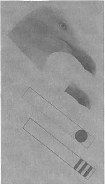
The key to understanding why we react so violently to exaggerated stimuli can be found in animal behavior. Silver gull chicks which are grown in captivity, without the participation of their parents, willingly associate the latter with yellow tweezers with a red speck, similar to a beak. And even more: if we replace these tweezers by a yellow stick with three red stripes, the chicks start to reacting even more actively, although such a tool does not resemble the beak of a silver gull at all. The fact is that every chick is evolutionarily prepared for a reaction to a beak with a red spot, and the stronger its features are, the more enthusiasm it causes. According to the researcher, the receptive fields of neurons apparently adhere to the following rule: the “beakier” the beak (the longer the shape, the redder the red), the better.
So we can assume that such artists as Picasso or Kandinsky found something that equal to these three red stripes for seagulls: “They are tapping into the figural primitives of our perceptual grammar and creating ultranormal stimuli that more powerfully excite certain visual neurons in our brains as opposed to realistic-looking images. This is the essence of abstract art.”
Grouping
When our brain manages to highlight a clear figure or object from a complex background, it brings us some aesthetic pleasure. The brain likes to solve puzzles and that becomes a core basis of visual arts. An example of this may be such a technique as pointillism and George Seurat's "A Sunday on La Grande Jatte" in particular. The painting itself is quite large (2 x 3m), so from a close distance, we see nothing but a myriad of unrelated spots. But as soon as we move away from the painting, the brain begins to extract the meaning from this chaos; and gradually all the fragments are getting grouped in the correct order, forming a unified image.

Isolation
Why do primeval drawings of buffaloes look much more expressive and give even more ideas about the animal than a realistic shoot from National Geographic? Why Egon Schiele's sketch of a nude body impress us much more than a photograph of woman?

The answer lies in that we have a limited amount of attention. In photographs, attention is distributed between the texture of the skin, shades of grass, glares, and so on and so forth. Insignificant information overloads the picture and distracts attention from the essence. At the same time, the artist selects one parameter, one idea, and focuses on it, removing all unnecessary additional details.
0 notes
Text
Week 2 - Analysis of 3 Artworks

Age of Reason (2018) - Oil and acrylics on canvas
Over the past few years, Loribelle Spirovski got the name of one of the most talented painters on the contemporary art scene. In 2018, she presented a series of paintings entitled “Be Still” and today we are going to examine one of them.
The human form is a central theme for many Spirovski’s pieces and “Age of Reason” is not an exclusion. In the picture, we see a two-headed male figure. Stylistically, the composition is divided into two parts: a half-empty body and a highly detailed facial part. The body is defined only by thin delicate brushstrokes and practically becomes part of a strict background - a narrowing room, made in the manner of Francis Bacon. The heads are shown not entirely and are enclosed in simple geometric shapes. The general color palette consists of muted tones; the most striking detail is the blue line forming the torso.
Apparently, the depicted figure is not a reflection of a real person, but rather of an internal state. This may be evidenced by the fact, that Spirovski started her artistic path as a hyper-realist painter, but eventually, her curiosity led to exploring the ability of paint to capture not only the physical appearance of objects but also what could be hidden underneath. This portrait differs from most that were created by Spirovski: there is no eye contact with the character and therefore direct dialogue. Nevertheless, the effect the painting creates is no less powerful.
The name of the painting may help us to unravel the idea behind this work. It is unlikely that the artist referred to the philosophical movement; rather, she implies a period of consciousness in an individual's life. This term is often associated with children who are just entering this period, but here we see an adult person at the peak of his abilities. Hence we face a paradox: why does the inner world of a mature formed person look more like a Rubik's cube? However, this is the whole point: Spirovsky is trying to convey that it is normal sometimes to feel incomplete and full of doubts. Human nature is multifaceted and paradoxical, it is difficult to predict and even more difficult to program. Nevertheless, there is something that is familiar to everyone: sometimes all we need is to withdraw into ourselves and stay in silence.
_________________________________________________
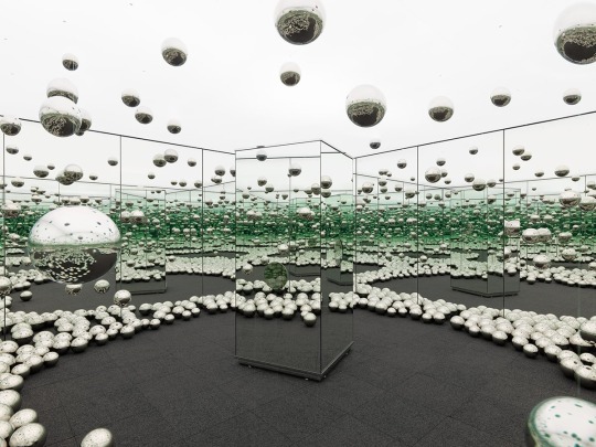
Let’s Survive Forever (2017) - Physical installation
“Let’s Survive Forever” is one of the famous Yayoi Kusama’s Infinity Mirror Rooms, first exhibited at New York's David Zwirner Gallery in 2017. The installation is a brightly lit room, the walls of which are covered with mirrors. This time, the conventional for Kusama polka dot motifs acquire volume and adorn the ceiling and floor in the form of polished metal spheres. Thanks to this solution, Kusama surpassed herself, being able to really bring the number of reflections to infinity. An additional effect of displacement and refraction creates a mirrored column in the center of the chamber

The central object of the exposition is the viewer himself, immersed and gradually dissolving into an endless illusion. The spheres are like hundreds, thousands of eyes fixed in his direction, reducing and distorting his figure.

The origins of Kusama's obsession with repetition and multiplying of forms originate in her attempts to combat obsessive images and fears. However, in the modern context, we can interpret the work as a commentary on mass selfie-hysteria and life online, where personality is lost among a myriad of digital copies.
One must appreciate the genius of Kusama: she proved that even using the simplest visual means, incredible results can be achieved.
_________________________________________________
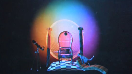
Multi-Love (2017) - Music Video/ Video Game
In 2015, a psychedelic rock band Unknown Mortal Orchestra released their third album “Multi-Love” the brightest work in which became the same name song. Later on, UMO presented a colorful surreal music video directed by multimedia artist and musician Lionel Williams. It also was uploaded as an interactive video game letting everyone explore this peculiar 3d-world.
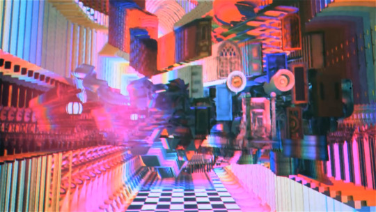
Indeed, this work barely reminds us of the common virtual environments: instead of the habitual indoor/outdoor space, we see a set of collage-like textures multiplying and overlapping each other. It's hard to determine the borders and size of it and all experience looks rather like a hallucination. At first glance, one could have the impression that this bizarre computer-generated effect doesn’t have a certain logic behind it. However, later we can notice that these multiplying images rigorously follow the movement of a camera. Thus, almost all objects in the scene play the role of brushes, manipulating which the user has a chance to create an infinite number of compositional patterns.
The video itself doesn’t bear a certain narrative that would follow or complement the song's lyrics. Williams, a musician himself, is rather interested in visualizing sound providing the user with a sort of synesthetic experience. Captured by an idea of mystical sensationalism, his main endeavor is to portray a multidimensional reality.
1 note
·
View note