
Don't wanna be here? Send us removal request.
Statistics
We looked inside some of the posts by cs-year2-fmp and here's what we found interesting.
Average Info
Notes Per Post
0
Likes Per Post
0
Reblog Per Post
0
Reply Per Post
0
Time Between Posts
15 hours
Number of Posts By Type
Text
17
Last Seen Tumblr Blogs


Fun Fact
Tumblr is used by 21% of adults online aged 18-29 years.
Text
Loading Screens
Find 5 different examples of loading screens from different games
Highlight - what do they all have?
What makes each one stand out - what caught your eye.
0 notes
Text
Game Name
Record the process of you coming up with a bike gang game name.
if you use AI record the process and the prompt
0 notes
Text
Mood board for background
Create a mood board for your background.
What will be behind the bike?
Talk about colours.
0 notes
Text
Composition in Art
Key Highlights from the Article:
Golden Ratio: A central focus is the Golden Ratio (1:1.618), a mathematical principle used to achieve balance and harmony in art. Leonardo da Vinci's "Vitruvian Man" exemplifies this ratio, illustrating ideal human proportions and its application in art .
Focal Points: The article emphasizes the importance of establishing a strong focal point to guide the viewer's eye and create visual interest.
Compositional Maps: It introduces tools like the Rule of Thirds and the Golden Rectangle to help artists plan their compositions effectively.
Positive and Negative Space: Understanding the interplay between filled (positive) and empty (negative) spaces is highlighted as crucial for creating dynamic compositions.
Color and Perspective: The guide discusses how color choices and perspective techniques can influence the mood and depth of an artwork.
0 notes
Text
Layout Ideas
Sketch out 4 different layout ideas for your loading screen.
Provide examples (research images) that inspired you.
0 notes
Text
Vector Artist 3
What do you like about their work? Is there anything you don't like? Are there any techniques or processes you want to include in your own work? (Use of line, textures, effects, colours, specific imagery - skulls, bikes demons).
0 notes
Text
Vector Artist 2
What do you like about their work? Is there anything you don't like? Are there any techniques or processes you want to include in your own work? (Use of line, textures, effects, colours, specific imagery - skulls, bikes demons).
0 notes
Text
Vector Artist 1
What do you like about their work? Is there anything you don't like? Are there any techniques or processes you want to include in your own work? (Use of line, textures, effects, colours, specific imagery - skulls, bikes demons).
0 notes
Text
AI and Tutorial - GTA loading screen
youtube
I found this but its not what I want to do.
youtube
This is using software I have not used before - Will not be doing this one.
0 notes
Text
GTA V Loading Screen
An entry screen (also known as a loading screen) is a sequence of images that loop while a GTA game loads up. Entry screens always consist of official illustrated Rockstar artwork, usually depicting major characters and/or locations in the game.
youtube
This link has lots of details about each games loading screens.
GTA 3 has a really good art style. This reminds me of illustrator and vector images.

The Vice City ones use more colour and have gradients to represent the 80's and the Miami setting.

San Andreas is more simple with the characters but also has some vehicles. I want to add a bike to mine.

This is not a motor bike - but it was the only one I could find for this game.
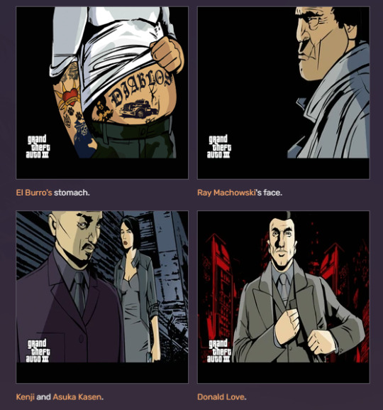
Grand Theft Auto: Liberty City Stories


These are the only motor biker ones in the franchise.
0 notes
Text
Game UI Database
This website has lots of examples of game title screens and loading screens
0 notes
Text
Project Planning
I have explored illustrator and designed logos and also looked at some open sequences.
I think I want to push more towards creating a mixture of all of these elements.
Idea 1 - Game Case
Idea 2 - Loading screen
After having discussions I think I want to focus more on the loading screen and if i have time make a game cover.
Loading screens I think will be good because I can use some of the illustrator work I have ben practicing on for the main part of it, as well as use the logo for the game name.
0 notes
Text
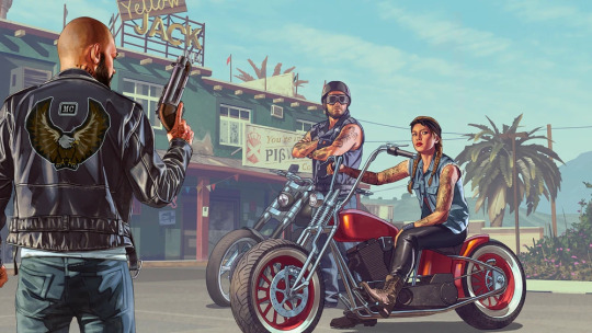
Retro T shirts / Bike T Shirts
I love the design of this T-Shirt because it's essentially Ghost Rider and the vibrant fire stands out against the black.
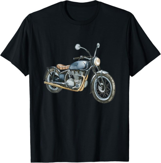
I love this one because of the simplicity of it just being a motorcycle, no flashy visuals to mask it.
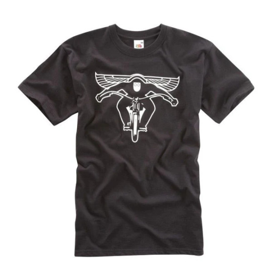
I like this one because it has given the rider some wings to signify that he is free, he is not restricted by anything.
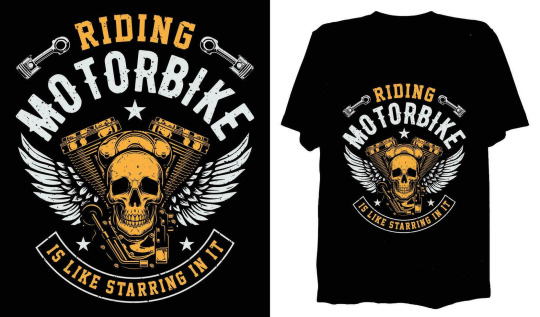
I love the merging of an engine block with a skull on this one, it's such a cool design.
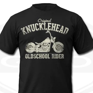
I like this one because the Knucklehead is my favorite Harley Davidson model and the lettering is faded and rundown.
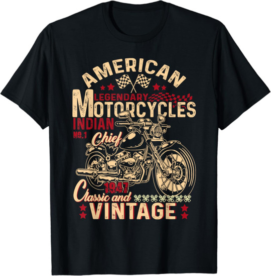
I like this one because it's old and vintage.

I like this one because it's simple and things I like.

I like the way they've done the mountain and trees behind the motorcycle and the text describes exactly what I want to do.
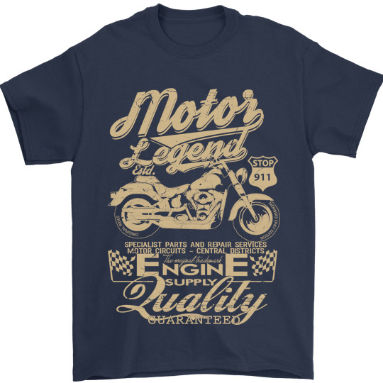
I like this one because it is an old and vintage design that you don't see anymore with modern T-Shirt designs.

I love this one because it merges two things I love together, motorcycles and Vikings, the greyscale design makes it stand out more as well and is overall an awesome design.
0 notes
Text
Half Tone
youtube
What is half tone?
Show your attempt at the tutorial
0 notes
Text
Vintage AI effects
youtube
Below please add your test and attempt at this tutorial
0 notes


Text
Art of the Title - Title screens
GTA 3
The music used gives off 1920s-1960s America, the way the sections come together to make one image and then pans through an entire scene is really cool.
- how? the Mafia-type theme gives off the feeling that something at some point is going to go horribly wrong and an all-out war will ensue.
Full Throttle (1995)
the 8-bit style and the way the camera pans to each shot rather than just using a simple cut.
the open road, the rock music and formation of the riders all give off biker/Motorcycle Club vibes.
Grease
Focus on the logo design


The simplicity, and the way the lines bend and contort to the desired shape.
I like the logo because it's simple but effective and sometimes that's all you need.
It depicts 1950s America quite well with the town, the vehicles, the different stereotypical groups and the aesthetic as a whole.
I prefer the one in the second panel because it stands out a bit more with the bold edges, the one they used was simple but it still works, the other one would've been a better fit though because it stands out more and would've been a little more effective.
0 notes