Don't wanna be here? Send us removal request.
Statistics
We looked inside some of the posts by csprofstudy and here's what we found interesting.
Average Info
Notes Per Post
0
Likes Per Post
0
Reblog Per Post
0
Reply Per Post
0
Time Between Posts
7 days
Number of Posts By Type
Text
16
Photo
1
Last Seen Tumblr Blogs


Fun Fact
28.6 is the average number of monthly visits per US mobile user.
Text
Professional Practice Blog Week 22
MEETING WITH PROFESSOR PHIL CLEAVER
This was nerve-racking, but so exciting…..However, there was no need to worry. Professor Cleaver was really approachable and immediately put me at ease. Louise was there too, which was helpful and reassuring.
Firstly, he liked the hand-made envelope with my name and flying fish images on! I had remembered what Louise and Nancy have said in the past about impact and it paid off.
Louise liked the texture of the holder and said it was ‘Fantastic’ and Professor Cleaver described it as ’Real fun’.
His main criticism was that too much had perhaps been included ‘Too many goodies in one bag’ as he put it. He suggested including maybe 6 cards and then continuing to send cards every 6 months. Very useful advice, which I have taken on board.
He also said the wrapper could be drawn by hand too – or inked and printed – as this gives a different energy to digital work and leaves a strong impression. I will remember this for the future.
In summary he said ‘I would ‘love to get that through the post!’ WOW! He also said it would ‘get kept’. High praise and a huge boost for me.I
This was a great end to the PP course. I feel so much has been covered, by Louise especially (Thank you, Louise!) to give an insight into the professional world of illustration and I have learnt lots along the way that I never would have thought about before e.g. payment of taxes, how to write emails exploring work possibilities, the importance of considering client needs and how to present yourself and your art etc. At times, I have had to leave my comfort zone, but this is becoming easier with practice. The self-promotion piece was the end product, incorporating lots of the things we have learnt and I definitely could not have produced something like this at the start of the course; it was a high point for me and has really helped my self-belief.
0 notes
Text
Professional Practice Blog Week 21
REVIEWING SELF-PROMOTIONAL PIECES FOR PHIL CLEAVER, TUMBLRS, WEBSITE
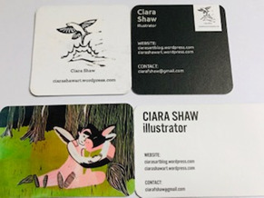
It was so exciting when my Moo package arrived. I was really pleased with the quality of the cards; they looked so professional!
If I was doing it again, I might have made the Lear linos into postcards as the level of detail worked really well, but anyway – I liked the results although the photos don’t quite accurately portray the sharpness of the images.
It was slightly odd to see my name in print, as below…but I felt very proud!
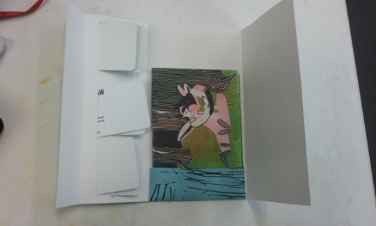
The transfer into the holders was smooth and everything fitted well! It has been a great exercise in terms of creative, practical and personal progress and I am happy with the outcome. Let’s hope Professor Cleaver is too!
0 notes
Text
Professional Practice Blog Week 20
REVIEWING SELF-PROMOTIONAL PIECES FOR PHIL CLEAVER, TUMBLRS, WEBSITE
I finished selecting the images for the business cards and postcards and sent everything off off to Moo. I thought about Louise’s advice re. quality and uniqueness and so ordered the thicker card versions - and to make them stand out – rounded corners where possible. As I was ordering a lot of products, the delivery time was delayed slightly. I had left it later than intended, so I had to pay for express delivery as I was worried the card might not arrive in time for me to assemble the package, send off to uni and pack up a spare for Professor Cleaver. Hmmm. Lesson learned from that about organising WELL ahead….
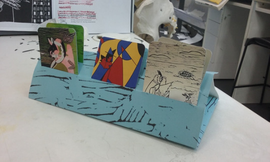
As I wasn’t going to fall into the same trap twice, I decided to make my folders to contain the cards - ASAP. I copied the sample template, tracing over it with a pencil onto paper. I then used a scalpel and a ruler, following the pencil line, to cut out the right shape, folding the paper over to make a packet. I made a number of dummies and when I felt I had the best one, I scanned it onto my USB so I could work with it more easily.
To make a patterned cover for the card holder, I selected one of my lino prints and edited it until just the lines were standing out so that it gave the illusion of texture. I sent it to reprographics and when it came back, I used the card holder template I had scanned as a base from which to cut out the final piece. So I ended up with a patterned card holder made to the measurements I wanted, containing carefully cut sections to hold and store the cards. I chose blue as my base colour as I wanted a cool, serene vibe.
I was pleased with the final product – now I hope it all comes together well when the cards arrive!
0 notes
Text
Professional Practice Blog Week 19
WHAT DO CLIENTS WANT?
(And what do we need?).
This lecture took a look at the basic conduct codes for creative business so we can understand how to present ourselves and our work to maximum effect in the outside world. Although this is in some ways quite daunting, it is raising our awareness and making us begin to take a leap and think like professionals, not students! Louise explained that the relationship between illustrator and client is a bit transient, often intense and brief, but there are sets of expectations from clients, which are constant. We were given lots of advice about the things a client will assume that we can and will do. I have made a comprehensive list of points as I know I will find this useful later. We should be able to:
Read and process a brief.
Offer a selection of thumbnails and ideas with more than one rough, maybe 3 or 4. Adapt to any request for a mix and match of images.
Supply a ‘polished’ rough if appropriate.
Take on feedback and address points.
Observe deadlines meticulously as there are knock-on effects for a whole range of people otherwise.
Produce work that is consistent with work in our portfolio.
Ask where work has been seen and which pieces to give a steer about client requirements.
Adopt a friendly but professional tone. Confident, but not too informal and avoiding too many irrelevant personal details. Similarly, social media presence should be professional and respectful.
Accept and understand that the working week is not a regular one.
Louise also explained to us that we should equally have a clear expectations from a client and gave advice to help us to understand what we should be looking for and how we should handle ourselves.
A clear and specific brief should be given to ensure the end product is the right one.
A contract is always necessary and should list: image dimensions, areas where text should go, fee, usage, roughs, deadline. Contract can be obtained from AOI (MUST JOIN!!).
Chain of command can be complex and not always arty, so ensure all people on the client team are involved and have seen and approved the art work.
Be ready to adapt to changes requested, even if not paid an additional sum
Remember that the client is always right!
Clients only purchase license to reproduce work – not original art work. Agreement is always needed to use work outside contract term
Fees, copyright, usage - may need to help client understanding of this (look at podcast)
Pricing should reflect experience and expertise – not less than minimum wage. Look at the ‘Profit beyond the billable hour’ - BLAIR ENNS.
Communication is important. You need copies of printed work back can use for website and portfolio
Credit for material is important
Workshop task:
Discuss in gps of 3 for 15 mins. Consider: language, content, tone, self-representation
1. To write an Introductory email for bikini lists, or similar organisation. This will accompany 3 images which will be sent out in an email by the company by to 1k editorial/advertising/design.
Consider: Which images and why? How would you put the text together? What would you write about yourself?
2. Email responding to interest shown from client asking to see more work with a view to possible commission
Key considerations that were discussed and agreed upon in our group:
Keep the email clear and make the purpose obvious in the subject line.
Keep it brief. Who (are you)? Why (are you writing)? What (can you offer)?
Make sure your language and tone is professional and doesn’t overstep boundaries and irritate the client.
Choose a sensible font and avoid emojis
Include all relevant contact details.
We then made individual drafts. I felt too shy to read mine out to the group and I found listening to others who were braver than me quite reassuring as I had included similar details. I think I managed to create a good tone – friendly but polite and suitably pointed.
Example 1. Draft email to be sent to a range of potential clients.
Subject line: Versatile Illustrator seeks work opportunities.
Hello.
My name is Ciara Shaw. I am a London based illustrator who has recently graduated from university and I am now keen to work in a professional setting.
Consequently, I have included a link to three images from my portfolio, which I feel reflect my skills, originality and versatility as an illustrator: ADD LINK.
I am enthusiastic, responsive to instruction and have a meticulous eye for small detail, so I feel I could contribute very positively to any brief issued. If you have any questions, please contact me at the email address below.
Many thanks for your time and attention.
Best wishes,
Ciara Shaw
ciarashawart.wordpress.com/
Looking over this, I could alter the first paragraph to omit the ‘recently graduated etc’ and just put:
My name is Ciara Shaw and I am a London based illustrator who is available for work. Etc etc (The rest of the email would stay the same).
I prefer the honesty of the first email - we all have to start somewhere! Maybe someone might like to give a new talent a chance! And it does explain why I don’t have reams of work experience and competition successes to quote.
Alternatively, it could work against me as people might think inexperience is a nuisance and that using someone untried is a bit of a risk. It could possibly mean that someone unscrupulous might be exploitative, but Louise has us well trained on how to manage this, so I don’t think I would be phased by it…..
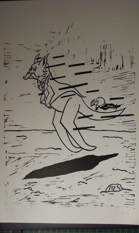
The images I would probably choose are one from my ‘Inspector Calls’ book cover project as these are quite bold, bright and original, a ‘Midsummer Night’s Dream’ lino print which shows specialist skills, good use of colour and humorous interpretation and finally one from my Lear project, demonstrating good use of fine artistic detail. I was originally going to attach these but having read the material from the links supplied by Louise,
(https://talentegg.ca/incubator/2015/07/10/formal-casual-emails-professionalism-correspondences/ https://folioart.co.uk/illustration-agency-submissions/)
it appears that this is not always a popular approach with companies, so I have included a link instead.
The websites contained useful tips about tone and language, which I have tried to take on board in my email tasks. I also removed the direct suggestion that a potential client might like to view my website, having read advice from: https://doubleyourfreelancing.com/guide-to-writing-client-emails/
Instead I have included a much more selective link in the hope they might be more inclined to click on it, with the website included at the end, carrying an implicit message: please view me!!
I found the second task much harder as we had not discussed it in detail and also – when you don’t know the client to whom you are writing, it means that you are unable to offer tailored comments to fit the company/agency, or show appreciation of what they have/are achieving. But I did my best to adopt the general guidelines we have been given re. self-presentation.
Example 2. Response to enquiry to view more work with a view to possible commission.
Dear X, [Name would be included now as now the email would be more personalised],
Thank you for your response to my previous email. I am delighted to receive your request to view further samples of my work. I admire the way in which your company supports the environment (SUBSTITUTE AS APPROPRIATE DEPENDING ON THE COMPANY) and I was impressed by your recent (ADD RELEVANT POINT).
I specialise in lino-printing, digital art and traditional illustration, and have selected a number of pieces from my portfolio which can be accessed via this link: (ETC ETC ETC). However, I would welcome an opportunity to learn more about your specific requirements and how I might be able to help.
Are you therefore available for a 15-minute chat next Tuesday at 1:30pm?
Kind regards,
Ciara Shaw
I have agonised over this email and read lots of articles on advice to Freelancers on: https://doubleyourfreelancing.com/guide-to-writing-client-emails/
Quite honestly a lot of the advice was completely scary and seemed horribly pushy….
The bits of advice which I have tried to incorporate are:
Still keep it short. People are busy and don’t want to know your life story.
Show admiration for the client/company and what they stand for.
Select pieces from your portfolio which fit with their ‘feel’.
Show that you are productive and proactive – wanting to ‘help’.
Be brave and suggest a time for a call or meeting to take the onus off the client and show self-confidence.
0 notes
Text
Professional Practice Blog Week 18
REVIEW OF SELF-PROMOTION
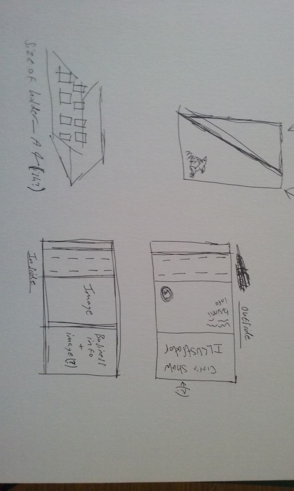
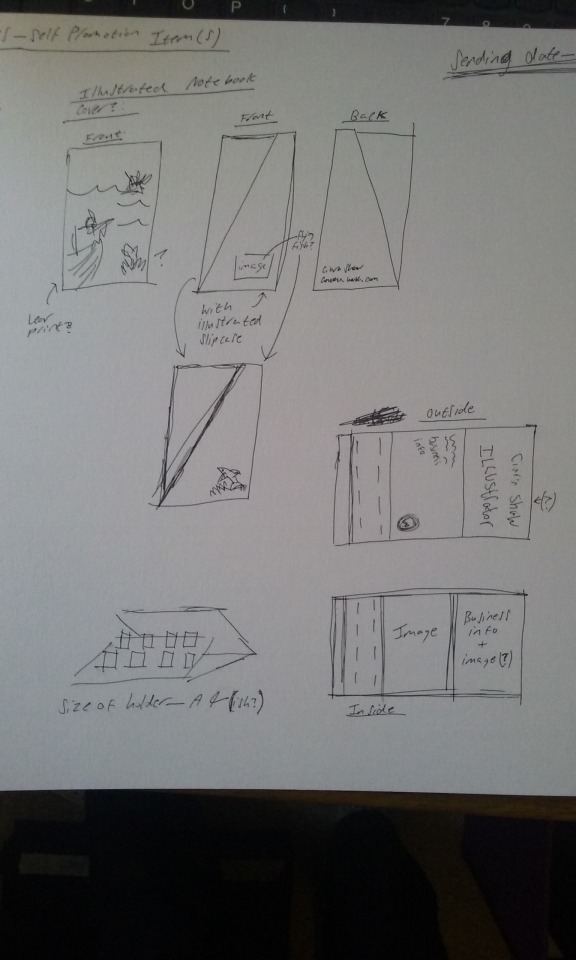
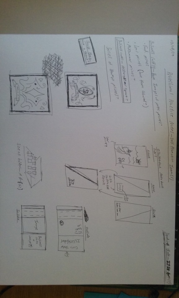
I showed Louise the folder of dummy cards that I sent off for, and which I am hoping to use as a template for submitting my own designs to Professor Cleaver for my self-promotion piece. The aim is to reproduce some of my best pieces on different sized business cards.
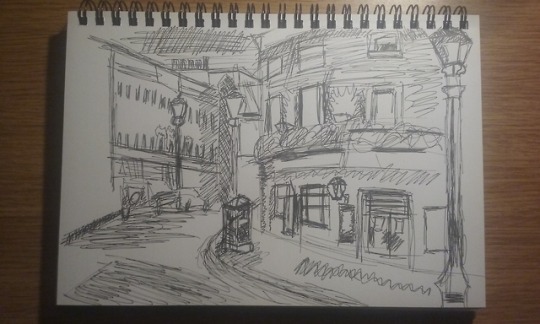
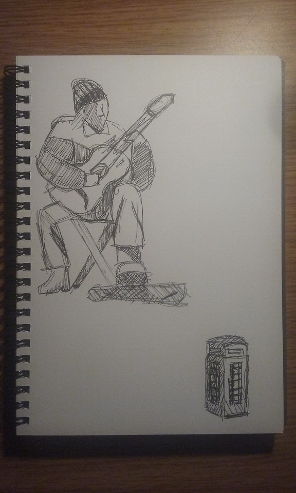
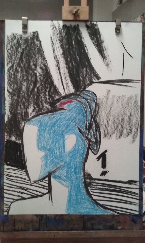
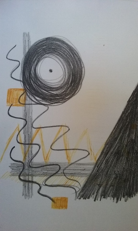
Louise liked the general idea and the folder, and suggested that I might design and make something similar myself using the laser cutter. I could then mould the design to fit my exact requirements and really show my work off. Perhaps screen -printing something onto the cards? Nancy also thought I could get advice from the 3D room to help me with the design. I definitely agree that this would be a great way forward and it was helpful to be able to talk things through and Louise’s questions made think more critically about what I am doing. I showed them both the rough sketches (photographed at the end of this post) which they thought would work effectively. This was a relief as it is a new departure for me to consider presentation in so much depth; a bit of a learning curve.
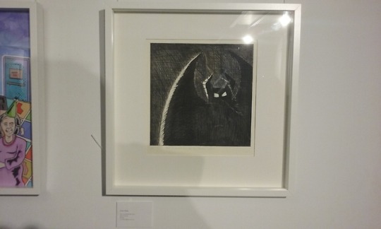
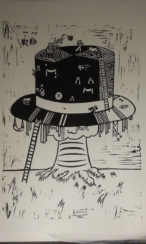
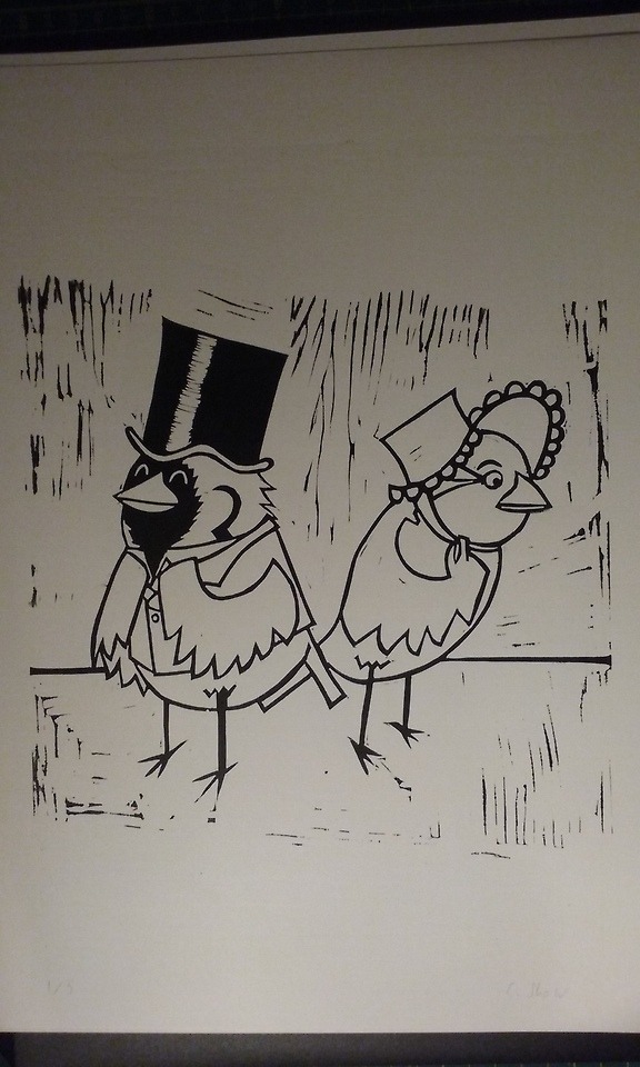
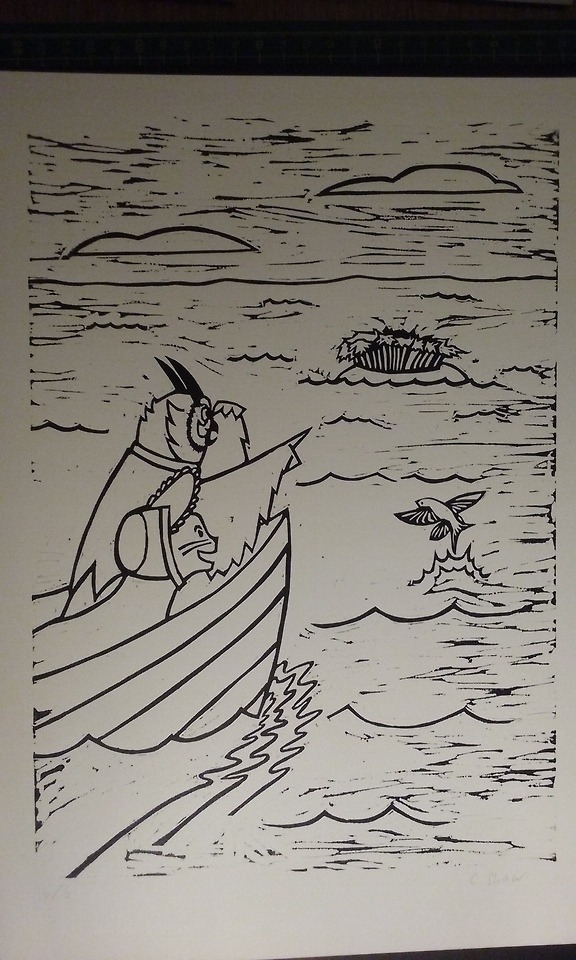
Louise and I looked at some of my art work with a view to selecting pieces for the promotion. I couldn’t find my Lear linos initially – a lesson to me to organise my work more efficiently - but eventually we found them on my website. Luckily, she liked them, so I am on the right track! We discussed the metaphorical aspect of my owl, which could be seen as a ‘journeying’ print and how it could be used to strengthen my submission and make it stand out. Louise felt it was strong enough to form an outside cover to the folder and we looked at how this might work in practice, i.e. where we might fold it and which space to use for Professor Cleaver’s address etc.
Then we looked at the flying bird icon and how we could isolate and integrate this into the final promotion as a container for my name, website and email. Finding the right font and size was a bit of a tricky process, but after some fiddling we got a final logo in place, which I can use to create a kind of identity. It was exciting to watch this come to life and watching Louise tinker with the basic images to make them ‘work’ was valuable and informative.
It made me think of how I can use individual characters and images, like the ladder, to deliver a message, and use the computer to my advantage. I enjoy working digitally, however, it is a technique that is still quite new to me, so I must try not to be deterred by that.
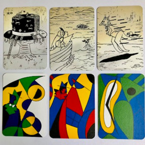
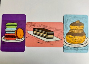
We saved the pieces under ‘Logo’ and then looked at the Midsummer Night’s Dream linos. Images to be used for the business card front. Louis enjoyed the humour of the pieces. I need to get digital files sorted though for easy access. We also looked at the cake pieces which she thought would make a good contrast.
On the practical side, Louise explained that costs of printing really vary depending on timing and that good organisation saves money…. Costs also depend on the product chosen, so e.g. with Moo, the site I am using, quality of paper effects price and rounded corners are more expensive. All these things have to be weighed up. I have 3 weeks to get sorted! It doesn’t seem long.
0 notes
Text
Professional Practice Blog Week 17
REVIEW OF TUMBLR AND SELF-PROMOTION
I have now turned the privacy setting off so all my posts can be accessed. There seems to have been some confusion with codes and my pieces for the two blogs keep appearing on the same strand, even though I am following Alex’s instructions for separate hashtags when loading. Louise was patient and says she will doublecheck the details with Alex.
I thought I was a bit behind but Louise says all is ok. She gave me advice about taking proper breaks to keep fresh and I will follow this as I have been feeling tired. I need to email Shazleen for web-site help. I also need to focus on the self-promotion piece for the next session. So much to do!!
0 notes
Text
Professional Practice Blog Week 16
MAs
Martin gave us a talk today about MAs, which I was really looking forward to. I know I have come a long way since IFad, but I still have a lot to learn and I have been thinking about this option for a while.
I feel very happy and comfortable at Middlesex, I don’t have to worry about food and accommodation like some of my friends do, the tutors are really helpful and the facilities are great, so it would be the obvious choice if I qualify. I am working hard to get a 2:1 and I feel like I am becoming much more professional in the way I approach briefs.
There are lots of different options on offer, Children Book Illustration and Graphic Novels (Martin’s area)/Print Making/Animation/Graphic Design and Martin suggested we should look carefully at them all. How to choose? I know I will really need advice on this nearer the time. I do really like the sound of the part-time option though over two years as I think this would be less pressured and give me a chance to develop my website, as well as my skills and confidence.
During the talk, Martin, with the help of Freddie, Alex and Louise, outlined all the advantages of studying for an MA, such as good industry links and excellent contributions from well-known professionals, giving us more time to work with specialist people who you wouldn’t normally meet on a degree course, good for the CV and development as a practitioner….as well as a 20% discount for Middlesex students! All sounds very good!
Louise advised us that we would need self-belief, energy, enthusiasm and focus to get the most out of an MA and I think I have all of these. Well the self-belief bit is growing and I would definitely gain a lot from continued support, practically and personally….
Louise is going to put up a list of dos and don’ts with links, which I will look up when it is up.
Overall, I am excited by the thought of a part-time MA and later next term I’ll arrange a meeting to talk it through further with Martin or Nancy.
0 notes
Text
Professional Practice Blog Week 15
EXPLORING AND REVIEWING TUMBLR POSTS AND SELF-PROMOTION
Initially I had some problems accessing my Tumblr posts because of the settings I had used; but I managed to get there in the end. Louise was pleased with the result and the extra research I had done in some areas, such as use of classic art in the Media for advertising purposes and the implications of this. It was a task which I really enjoyed and I was surprised just how grumpy a disrespectful use of brilliant art made me feel (Pizza Hut....)..
One gap she identified was lack of entry for the film session: ‘How to Get Ahead in Advertising’. I took quite a few notes when watching the film, so will go back to these, expand them and then post! I’ll have to investigate how to post this so that it follows Week Order to avoid confusion…..
We had a brief chat about Self-promotion; I’m not sure yet how I am going to approach this, or which work to use. I’ll start with Louise’s suggestion to play to my strengths and choose the more original pieces that might make me stand out a bit. Maybe using small taster cards in some way.
0 notes
Text
Professional Practice Blog Week 14
LIFE AFTER MIDDLESEX
We had a talk today from Alex who graduated in 2013. Nancy told us in her introduction that he has been really successful because he has always been so proactive – taking all opportunities open to him (as well as being talented!). That is a message that comes across a lot in this module! Being a good illustrator just isn’t enough on its own….
So how did he get jobs? Key question! He talked about the importance of:
Entering competitions and how success in these can lead on to other things. (How do you find them though? I didn’t like to ask….).
Keeping a blog - it can lead to personal commissions. (I don’t mind writing so that is ok!)
Being aware of portfolio websites – like Squarespace/Wix (quite easy to use) and online shops, such as Etsy and Not on the High Street (although you have to apply and be accepted for that). Watch out for fees…(I need to look at this over the Easter holidays and have already investigated some possibilities).
Joining Facebook groups – like Etsy Groups or Indie retail. Keeps you up-to-date. (I’ve already made a start on this in a small way, posting some of my work on Facebook).
Considering Agents (Travis Foster/Chgampion). Can be useful in providing work, although not always reliable. Will take 20-30% (plus VAT), can vary. Seems a lot but Nancy pointed out that they can get you great jobs and lots more of them than you could get on your own. (And for someone like me, it is very attractive as I would find it hard to pitch and negotiate).
Word of Mouth. Look after your contacts as people move around….and be polite and reliable, or it can work against you.
Being selective with job sites. Avoid unless big budgets and big businesses. Working Not Working is a good one – Freelance.com is not. Take note when you find good ones.
General advice from questions and answer.
Take care with contracts - for example, add a note about revisions allowed so that you are protected from having to make endless changes.
Make sure pricing reflects distribution. Look at usage terms. Where? Cost? Rejection fee should be built in.
Be clear about copyright. Graphic Artists Guild Handbook of Pricing and Ethical Guidelines is a useful book.
Try to work within day time hours and don’t say yes to everything though money isn’t the only important factor! Personal satisfaction and getting your work out there is also important. (Have sold some cards and pictures already and I know that is a great feeling).
Hard work is the most important factor. (I’m not scared of hard work!).
Be diverse! (This is a tough one, but I am trying to experiment at the moment whilst playing to my strengths).
0 notes
Text
Professional Practice Blog Week 13
SELF-PROMOTION.
What is special about me??? How do I present myself as being different to others?
These are the questions Louise was asking us to consider in this week’s blog. Looks easy, but I think it’s hard to do an exercise like this if you are very reserved by nature. I’m not good at praising myself, so I tend to go blank when I’m asked to comment on my strengths. I am getting better at it though! And I can see Louise’s point – until you can see yourself and what is unique about you/your work, you can’t really translate that to someone else.
Self-promotion is a much easier process now with Internet. Email/Instagram/Facebook allow you to be tracked by Art Directors – kept ‘warm’.
Louise also talked about the importance of having a website and suggested some sites with simple steps to building one. This is an area I definitely need to develop. After the lecture I looked at some possibilities and found the following:
BEHANCE. https://www.behance.net portfolio site for artists and designers. Here you can upload projects and get noticed! However, I found the site a bit intimidating and confusing.
WIX. https://www.wix.com Hundreds of templates and easy drag and drop. Free! Looks like a good place to start to build a basic website.
Pixpa. https://www.pixpa.com Advertises itself as an online portfolio website for creatives. It has a special section for students, with advice, so obviously open to emerging artists not just established ones, which is encouraging. 50% discount for students. Might take another look at this one….
Moonfruit. https://www.moonfruit.com Recommended by Telegraph and Guardian and looks accessible, but not as attractive as sites which are especially geared up to support artists’ work…
Squarespace. https://www.squarespace.com Looks a bit too sophisticated. Bit scary!
ARTWEB. https://www.artweb.com/ You can set up a website here and you can showcase your work on ArtWeb.com. 15 images free and then up to 8.13 per month for a gallery of 500 images. You can sell work online. It looks very professional and there are over 160 artists featured. Some of the work looks amazing. Not sure how appropriate for young illustrators starting out? A bit expensive too?
I also found a useful article on how to make an artist’s website and why you need one! https://www.studentartguide.com/articles/how-to-make-an-artist-website It has a step-by-step tutorial, showing the process used to set up a successful website so hopefully this could be a real help! On this site, it is advised that the best option is known as a self-hosted WordPress site. Sounds very complicated! Apparently this gives more flexibility than packages offered by Squarespace or Wix. Something to explore over Easter, or sooner?
Louise also gave us some useful tips about how to make our communications to Art Directors memorable!
Advice:
Pay attention to Packaging and Promotion.
Make sure it reflects your personal style, character and ID.
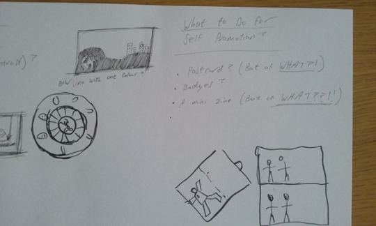
Consider unusual packaging – maybe include fun items. Louise told us about the ‘Monster’ goody bags containing sweets and other items, and told us about an artist who created a screen print on MDF, then a laser cut out. Look in Museum and Gallery shops/etsy etc for inspiration. Basically – we should aim to offer something someone might want to keep and avoid a stereotypical approach if possible. e.g. postcards!
The advice – to think of our submission ‘like a present’ to be opened - made it easier to visualise.
So things we might not usually think about like the envelope, font, stamp positioning, sellotape, string colour – can all have an impact and so we ought to think of these as part of our art work.
Although email is handy, physical pieces are less likely to be trashed! Art directors get lots of emails, which are easier just to scoop up and bin….
Research your markets…… (go back to Week 9 to look)
Choose your best stuff.
Packaging should suggest QUALITY! TRUST! The tea bag packaging was an amusing illustration here, making us think a bit about why we might be tempted to try a certain product and ignore another!
I might look at the moo.com website to see how I might translate some of my interesting images onto business or mini cards.
Today’s task: we had to…..
Consider what makes our work special?
Look at themes in our portfolio.
Play with some ideas for self-promotion – choose something you enjoy as your base
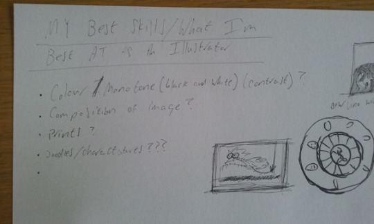
I worked with Joe on this and we drew up a list – see below. I find it hard to prioritise areas of strength/success, but more and more I find myself drawn to:
Areas of print making. I have had some success with this, especially with lino printing and silk screen printing. I enjoy the physicality of it and the thrill of the final reveal – like a magic trick!
Use of monochrome with colour pops for contrast.
Cartoon/caricature with a view to graphic novels.
Learning more about animation, after my recent project.
I now need to focus on the Outcome:
To Phil Cleaver through post.
Impressive, but not necessarily in size.
Post-friendly!
0 notes
Text
Professional Practice Blog Week 10
For a break, but at the same time connecting with the whole idea of professional practice, we watched the satirical ‘How to Get Ahead in Advertising’, which takes a brutal (and sometimes quite funny in a black way!) look at the advertising industry in the 80s.
The basic plot centres on an advertising exec who has a complete breakdown after years of stress caused by having to juggle lots of projects. Things reach a critical point when his obsession with finding the right slogan for a new boil cream takes over his life. As a result of this, he begins to develop a split personality and questions his role, behaving badly at a dinner party. The stress leads to a boil on his shoulder which bizarrely grows eyes and a mouth and ends up replacing his real head when he is in hospital. So, we see one side of him, which is the exec in action, mean, hard and fast-talking with all the ‘chat’ and another side which is the gentler version lying beneath. Unfortunately, the good side takes the place of the boil on the shoulder and the cynical side dominates. Although the good side does not ‘die’ it is no longer powerful and the ending is not a happy one as the ‘baddie’ is king.
Richard E. Grant is brilliant and really portrays the madness of the industry that the film is criticising; I really enjoyed the film and as well as being fun to watch, I think there was also some helpful advice to be gained.
Most notably:
Watch out for deadlines.
Keep a cool head when trying to think of ideas for project(s).
Try not to let projects get on top of you. If you don’t, it may result in stress, emotional and/or physical fatigue.
It’s good to have a break from things and to ‘refresh’ once in a while.
Over stress and lack of rest may have negative psychological results and bring out the worst in people.
Value your relationships and don’t let your job take over.
Don’t neglect your ethical beliefs for a better material outcome….
Plenty of food for thought….
0 notes
Text
Professional Practice Blog Week 9
MARKETING AND PROMOTION
Key points picked up from this talk:
Marketing and promotion prepares you for the future.
Visibility is essential unless you have contacts.... it is a continuous process. If you don’t send (appropriate) work to clients – it is hard to be seen!
Can target by email but can be passed over or lost, so hard copies can often gain better response. Presentation is very important and can say a lot about you before your work is even considered.
Be clear about who you are (BE SELF-CRITICAL and REGULARLY SO) and who you are selling to.
Use your community and friends to canvas opinions.
Have a second string to your bow – part time work can help your artistic practice.
I found the practical advice really useful in thinking about my own path forward as I am not naturally great at self-promotion. It is almost like having a checklist and we can benefit from the experience of those who have been there, done it and learnt from their experiences. Without the PP lectures it would be hard to know where to start....
To build on what we have been learning, we will be involved in Self-promotion project work to follow next term, for Professor Phil Cleaver. This is an amazing opportunity, so a bit pressurising too.
Task
In preparation for the self-promotion piece, in pairs or small groups we had to consider:
What is special about our work?
How can we best showcase and promote it?
This was the trickiest task so far. It made us realize that we don’t always look carefully enough at the work of others and that we miss a trick by not doing this as it is a learning tool. We had some ideas, but had to prompt each other about our favourite ways of working and then we discussed how best to showcase. Photograph of discussion and more detail to follow!!
0 notes
Text
Professional Practice Blog Week 8
COLLECTIVES
Today, Alex talked about her collective ‘Drawn Chorus’: they have a website with members’ (self) portraits and a record of their involvement in events/projects with a shop and platform to advertise other crafts. She told us that it works well as it is both motivating/supportive/sociable and good to share skill and costs (e.g. gallery costs).
They started because of their uncertainty about what was happening at the end of their final year. Decided to organise an exhibition after graduation – ‘Curiouser and Curiouser’ based on Lewis Carroll’s work - found gallery near Old Street. Then decided to formalise it as a collective. Circus/nautical themes – book launches, conventions, fairs. Used Espacio Gallery Brick Lane. ‘Thought Bubble’. Contacts. Some personality problems to get over. Postcard, badges, stickers popular and prints in easy easy frame sizes – A4.
Alex explained the way the group worked in practical terms. Percentage of costs paid for venues etc depends on sales made by individuals; fair. She suggested business cards/postcards are a handy way to self-promote. It all sounded very democratic with voting carried out on projects, plenty of face to face meetings and careful task divisions. She did stress how you need need one or two people to really push things forward and this made me think back to the Xmas pop-up which never took off because we didn’t organise this…..I think we would definitely go about it differently now after these session which have been a great learning tool.
Exercise: Collective and mini-manifesto; aims and goals for the future – events and publications.
We enjoyed this, although we struggled with our name. Here are our group notes below.
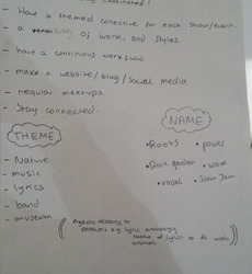
Name: Rock Garden.
Manifesto:
Make art, make fun.
Continuous work flow.
Promote a variety of styles.
Make a website.
Create and complete a project - book/show - once every 6 months.
Regular meet-ups drinks, for feedback, planning and support. Stay connected.
Work:
Group interested in stories – graphic novel…..
Theme: nature and music.. Different approaches, but cohesive. T-shirt for bands?
Having chosen our theme of nature and music we were able to move forward after a slow start ad we really felt we managed to achieve something interesting and workable. There were some original ideas from other groups e.g. Happy Hour Collective – bridging the gap between art and drinking! Generally, I think everyone was keen to explore the idea of collectives for fun and for security, so the task went down very well.
Other established collectives online:
I had a quick look at some other collectives online and will go back to these to explore further.
Jaguar Shoes Collective - which seems more like a very trendy lifestyle collective!
The Independent Group – very experimental.
Frieze – urban concerns.
0 notes
Text
Professional Practice Blog Week 7
PLAGIARISM, PASTICHE AND PARODY (and copyright)
Today’s topic revolved around the whole issue of copying: how conflict is set up between an artist’s desire to be original and the impossibility of this as we are always going to be influenced by others. Louise explained to us that there are certain boundaries that cannot be crossed and that if these are crossed, it becomes theft of an image. She used the example of Picasso ‘good artists copy great artist steal’ – and the way in which his work was heavily influenced by African art and culture.
We were warned: don’t use images unless they are copyright free. Internet has made it easier to surf but it can be dangerous and people make the mistake of thinking just because an image is on there, it is a ‘free for all’. The bottom line is that as artists, we need to have creative integrity. Just referencing doesn’t make taking someone else’s image ok either….Legal issues can arise. Basically, using your own images means you avoid any potential hassle and the social media minefield.
Pastiche.
Can be a lazy way of approaching a brief – but also can identify social issues and questions.
Copyright
All illustrators need to understand the issue of licensing and restrictions. You own your own image – to keep or sell. If you are employed by a company – they own the image. Put copyright notice on website. Name and year of work.
Task
Take a famous image from historical art and research how contemporary illustrators have used it in their commercial art. How does it affect our view and appreciation of the original image?
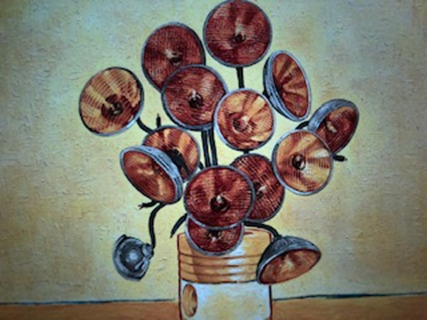
‘Every piece is a masterpiece’. (Lexus Ad)
I think this is very clever. The sunflowers have been replaced by Lexus headlights angled in recognisable fashion to mirror the ‘Sunflowers’. It is tastefully done, left minimalist and with rich golden colour, which echoes the flowers in the original. The strap line draws attention to the excellent qualities of the Lexus, but at the same time is praising the genius of Van Gogh. Generally it is respectful and I feel quite witty, original and amusing. It has kept the spirit of the original and so is ‘acceptable’.
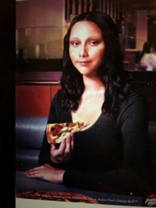
In contrast, the pizza eating Mona Lisa look-alike eating a ‘classic Italian’ pizza from Pizza Hut is horrible. It just seems to cheapen the image. I have seen the original in Paris and it has such dignity, it is a terrible insult to reduce it to selling a large pepperoni.
https://www.artsy.net/article/artsy-editorial-mona-lisa-selling..
The Mona Lisa has been used in numerous advertisements and Isaac Kaplan makes some interesting points about this and the use of other famous artists in his ‘Visual Culture’ article: ‘Why is the Mona Lisa selling shoe polish’? He quotes John Berger (‘Ways of Seeing’) who explains that art brings ‘cultural authority’ to the product advertised, it provides ‘a from of dignity, even of wisdom, which is superior to any vulgar material interest’.
I guess the bottom line is that Art is being used to persuade people to buy, as if they will somehow be culturally more rich if they do. Does it ruin the artists’ reputation and manipulate people through art, or bring art to the masses? There is no simple answer to that.
0 notes
Text
Professional Practice Blog Week 6
TECHNOLOGY AND THE FUTURE OF ILLUSTRATION
The main theme of today’s lecture was the future of illustration. Where will things be in 5 years’ time? We haven’t got a crystal ball, but what is certain is that changes will happen whether we want them to or not. So as artist, we need to try to keep on top of social/political/cultural changes/market trends, which might inform our work.
Louise talked about how Sci-fi writers often anticipate changes. I love Sci-fi ideas and have enjoyed both Orwell’s vision of the future in ‘1984’ with the sinister Big Brother and Forster’s in ‘The Machine Stops’ where man lives in luxury underground cells. It is a frightening thought.
So – where will we be? Louise advised us that whilst traditional media is important, we need to be tech aware too as it is expected. (Some practical advice – get an excellent scanner). Aim: to stand out. She encouraged us to consider how we can avoid stereotyping ourselves and how we can practice maybe through Pop up shops – with mugs/mats – get work printed on fabric. Important to create outside commissions where possible and build the portfolio.
How to stand out.
Companies use illustrators because they want to seem different (superior maybe?) and break the corporate mould. Animation is popular. Nostalgia a key area in creating desire. Craft is seen attractive. New way of working. Installation in Connaught by Christina Williams – also used on letter heads. Similarly, Beth Kerridge supplied installations for the new Corinthia restaurant.
Where do I fit in? This is a key question!
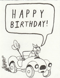
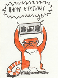
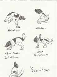
To date, outside uni, I have been employing my drawing skills by offering a bespoke card service for friends and family so they can get something personal that they might not be able to get in a shop. Some examples below.
The first involves a Shelby Cobra for a Classic Car enthusiast, the second for a cat-mad rock chic and the third for someone who owns an unusual dog called a Stabyhoun. I have also completed a number of other cards for special days such as Father’s Day. My style is simple and effective, almost deliberately naïve. I think I am beginning to develop a particular ‘look’, which is appealing.
I sold canvasses at Sidmouth folk festival last year which was also a good experience (although I was terrified). My target audience was tourists wanting souvenirs, so I made my images commercial, taking atmospheric photographs and then transferring these onto canvas.
People were excited and made encouraging comments, but were put off by the price, which I had made too high initially at £25. Eventually I sold some at £20 and some at £15, going lower as the week went on! Eventually after costs, I made about £120!

Sea Front
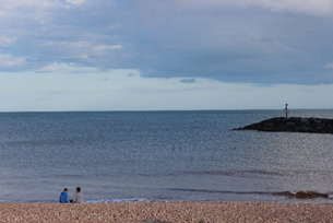
Meditation
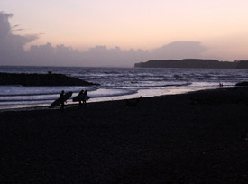
Surfers
Louise told us to take risks and not to be scared of adventures; this was a huge adventure for me as I had to interact with the public and run my small stall.
Task: group.
In groups we had to consider how we see the industry developing? As a base for our discussion, we had to explore the pros and cons of the following pairs of contrasting words: Digital and Craft. Global and Local. Bespoke and Generic.
Our notes are below.
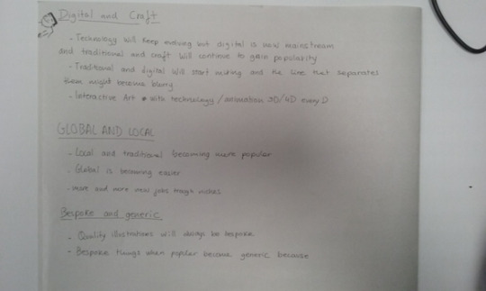
We had some lively discussion, mainly on the first pairing. Some of us are more tech literate than others and this probably affected our views. However, we all agreed that there should be a balance between digital and craft and that in some ways craft has become even more important as a medium to ground us and keep skills alive in a digital world.
Definitely it has become easier to market ourselves in a global world, but local keeps us more in touch with our community and is popular.
Finally, we felt bespoke is always going to lead to better quality and avoid pieces, which are generic and corporate where,because of its audience and production, pieces might lack originality. However, we also accepted that for practical reasons there should be a balance between the two aspects.
0 notes
Text
Professional Practice Blog Week 5
BLOGS AND VLOGS
This week’s topic is self-reflection – as Louise pointed out some are comfortable with this and, some not. I have never kept a diary and tend to express myself through art, music or creative writing, however, I think I have improved in terms of self-appraisal during my time at Middlesex and I am now more able to self-criticise and take on board criticism.
Louise explained that we would be writing a blog to cover the Professional Practice sessions and tasks, and that the first four weeks would be retrospective.
Why do we blog? Louise explained that sometimes you can be asked for a visual and verbal record. Blogging is more flexible than Instagram and a better diary-type record of progress. Can help you to move forward. At the same time, there was a warning note about how blogging can leave you vulnerable and let too many others into your life. It is easy to become dependent on what others think. I find this aspect a bit scary. I prefer my art to speak for itself and don’t really want to let others into my private life and thoughts….
We listened to a clip which satirised You-Tubers/Vloggers ‘Journey to becoming a You-Tuber’; a fake channel. One of a number of episodes on BBC 3. Very funny, exposing the superficial nature of vlogging and the pretence at the centre of it.
We then went up to the studio to set up the blog and hashtag etc (reported earlier in the blog retrospectively) which was fiddly, but rewarding and a new area for me. Looking at Holly Exley’ s ‘real’ blog was interesting. Her work is just beautiful – delicate, detailed and beautifully coloured. Really inspirational. I was struck by how visual her blog is and I think I need to add more visuals to mine, time allowing. She has also included videos and philosophical reflections! I don’t think I could manage that!
Although a professional blog looks different to a student effort like mine, it has given me ideas. Also having to write a blog for professional practice and for my context study (although this has stalled a bit in recent weeks!) has given me more experience and confidence a new area for me, as well as generally broadening my outlook.
0 notes