
Don't wanna be here? Send us removal request.
Statistics
We looked inside some of the posts by cubby6976 and here's what we found interesting.
Average Info
Notes Per Post
1
Likes Per Post
1
Reblog Per Post
0
Reply Per Post
0
Time Between Posts
7 days
Number of Posts By Type
Text
5
Last Seen Tumblr Blogs


Fun Fact
Tumblr was created by web developers David Karp and Marco Arment.
Text
Final Project
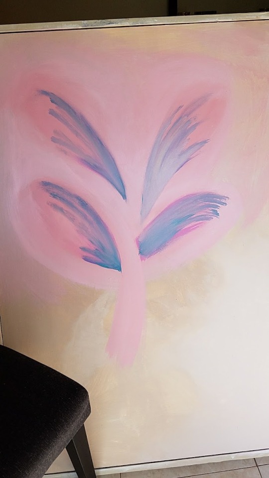
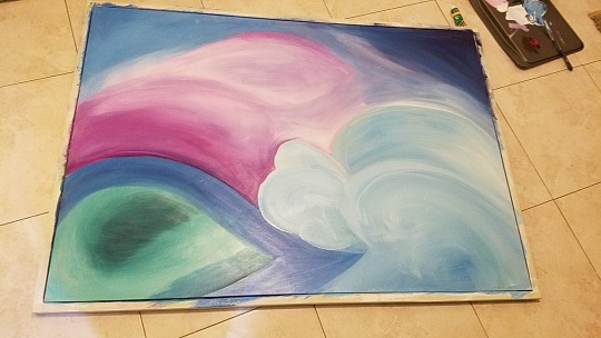
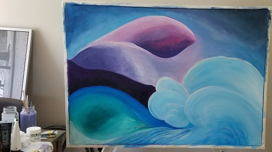
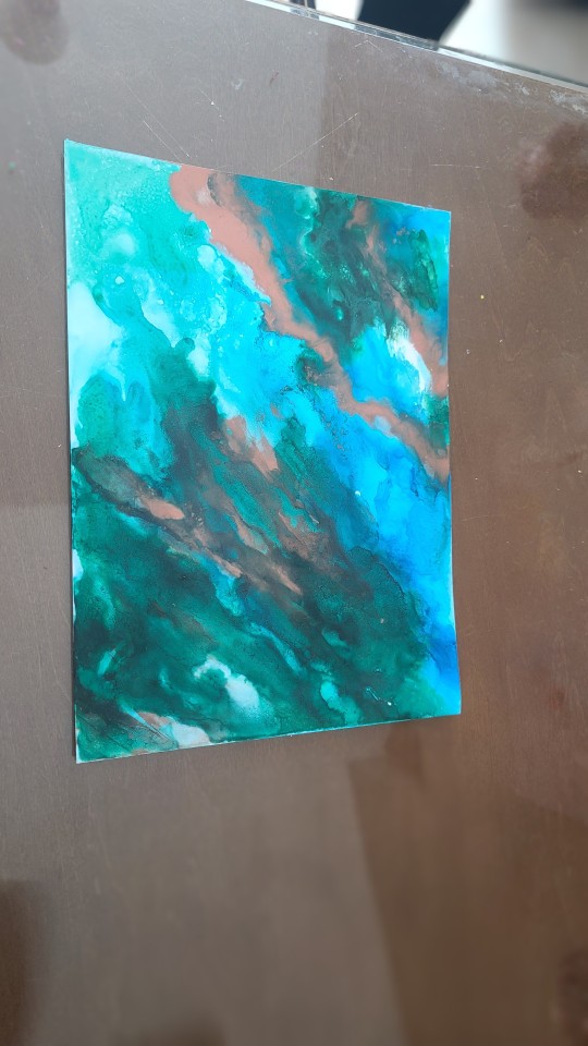
I originally wanted to do a large singular flower painting similar to Georgia O'Keefe, so I started with that on the canvas. I reused an old photography canvas I wasn't using anymore. I painted a neutral background to make the flower pop and wanted to keep it bold. (Photo 1) But as I was painting it, I had a hard time visualizing the final piece, and what it would look like, so I switched direction and decided to paint more of an abstract painting depicting how I saw the mountains go into the ocean, with colors that complimented but showed contrast. I started painting the mountains in a more pink tone (photo 2) with the ocean and was trying to show the flow of the water to crashing waves. But the heavy pink didn't work for me, so I transitioned to purple and tried to show the colors of the hills and mist as they came down the mountain with the stark contrast of the deep purple and muted blending of the pinks and blues. The left shows the lower hills to the shoreline with the transition to the ocean. I added heavier paint strokes to create texture where you would see more of the 'frothiness' of the ocean to create a flow. (photo 3) I tried to keep a structure that allowed for a central focal point with an A-Frame point of view.
0 notes
Text
Virtual Sketchbook 4
Jackson Pollock's large work is similar to what his mentor, Thomas Hart Benton, created. This inspired the largeness of his work as he moved from a "structured" abstract to a more free-flowing abstract view. As someone coming from the era of WW2 and the subsequent high of life after the war, Pollok embraced the randomness of life. His work broke away from the structure and became more subject to fate. Artists are used to putting to canvas their vision as they see it. While Pollok had purpose to how he painted, some elements were subject to fate. He would step back from his paintings and surmise what he did before starting again, ensuring the pieces' balance and composition. Although it may look like his paintings are simply paint spattering, the way Pollok layered the different mediums he used to create different effects showed they were very intentional. Although every stroke is not as intentional as it would be in a realistic painting or even cubism, there is a certain freedom in this artwork that many artists don't give in to, and Pollok was able to walk the line of purpose and fate, delivering masterpieces that permitted free experimentation.
0 notes
Text
Virtual Sketchbook 3
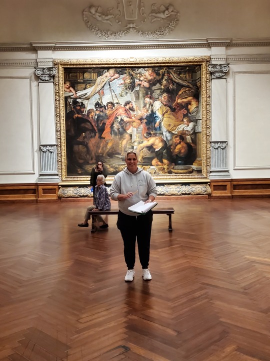
I chose “The Meeting of Abraham and Melchizedek” an oil on Canvas by Peter Paul Rubens, a Flemish painter who finished it in 1625. It is 175 ¼ x 224 3/4in. This is a realistic piece done in the Baroque fashion. You have the image painted on a tapestry, but it is really just an impression that is given, with baby angels holding up the “tapestry and columns of a room behind it. The work is balanced in color and composition, with Abraham and Melchizedek at the center and their army and serving boys surrounding them. The angels look down on them holding the “tapestry” up, returning focus to the center of the piece. The brightest colors are at the center of the piece, with darker and lighter tones spreading outwards to provide that contrast. The colors all work in harmony having a similar tonal value. The background’s blurred tones contrast the crispness of Abraham’s armor and the luxury of Melchizedek’s robes.
The work leaves me in awe of the skills and the execution of the piece. The work makes me feel hope, and joy, as it shows Abraham returning with victory and the compassion of Melchizedek giving them bread. The faith in their eyes shows great caring and hope. However, the angry man at the bottom that appears to follow you as you walk around or away from the piece, which is very unsettling.
The baroque era piece was commissioned by the Infanta Isabel Clara Eugenia, the Governess of the Southern Netherlands. They commissioned a tapestry series for the Poor Clares covenant in Madrid. The series of works was a glorification of the Roman Catholic Church.
The subject of the work is from Genesis 14:17-20, recalling the story that shares when Abraham received gifts of bread and wine. Abraham and his army received this upon his return from a battle. Theologians see this representation as a foreshadowing of the catholic ritual of receiving the blood and body of Christ. This is communicated in the way Abraham and Melchizedek look at each other, while everyone else around them is oblivious to the significance.
The works were made by Peter Paul Rubens, a Flemish painter who has been considered one of the top Baroque painters of his time. Rubens was an artist who combined Flemish traditional paintings with the styles of the Italian Renaissance. His art was full of life and energy, representing the full vitality of the Baroque period of the 17th century. In his paintings, he portrays big, bold figures that seem to be moving. You can see this especially shown in this work and also the complementary works within “The Triumph of the Eucharist”.
0 notes
Text
Virtual Sketchbook 2
JOURNALING
Unity is about the painting or piece working together, though elements may be different. Variety is about having different things within the composition that add interest to the piece.
This is shown in nature, things that grow. The leaves are different than the stem or flower but it all works together.
Balance is how the weight of the piece is distributed. All the elements working together to create that balance making the design feel stable.
A great example is a car, where the weight generally balanced. This is essential for the car not to be hazardous.
Emphasis directs the viewer to where the artist wants them to look and focus. Subordination is removing that emphasis from an area. They work together to create the focal piece of the art.
1.Leonardo Da Vinci use of light and dark spaces guides the person to where he wants them to look.

4.Directional forces is the flow of the piece and guides the viewer’s eye throughout the composition.
This is used in articles where the copy, imagery and whitespace will guide the reader through the document
5.Repetition uses something similar throughout the composition and rhythm, using the spaces within the piece to create that repetition.

Circular flow through Starry Night – Van Gough
6.Scale compares an object to a size that is known, and proportion compares an object when the scale is unknown.
Proportion is shown in everyday life as we look at other people at a distance to see their height.
Scale is sometimes used in selling when you put a dime or a quarter next to a sticker for size.
WRITING AND LOOKING –
The Birth of Venus
Fig 17.4
Sandro Bottecelli
Page 282
Bottticelli uses muted colors in the background to bring focus to the foreground. He uses two angels and the woman holding the banket to focus on Venus. The lines give balance to the painting, having 3 equal sections of weight. The dark wings and dark grass, and tree in the background also give depth while keeping focus on the four subjects. The angel blowing directs your eye toward Venus, but down and curve of the blanket directs your eye to Venus’ face.
CONNECTING ART TO YOUR WORLD –
I have an odd relationship with the color green. It is one of my least favorite, but I love nature and the outdoors, and that is so FULL of green. It’s everywhere, and I find it so calming. The shades of green and vibrancy of it all work together in harmony. But when the color is artificial, not something living and breathing, I find it completely flat and devoid of the richness of hues found in nature. Even if it is a painting of nature, there is something that is lacking. My color scheme is always changing. For a long time, it was red, but right now I think it's purple.
ART PROJECT – ARTIST’S CHOICE –

0 notes
Text
Hello, my name is Angie and I am a older student finishing my criminal Justice degree here at SCF and should be done in Dec
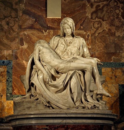
The art work assigned to me was #6 - Michelangelo 1499 Pieta. Marble; 68.5” × 76.8”.
This sculpture is the only work of art that Michalenglo signed.
It balances classical beauty and naturalism
The monument was created for a cardinal of France funeral
Michelangelo is a Florentine artist
After being vandalism in 1974 it took 10 months for restoration
3. Did the way you think about the art change from the first time you looked at it? Do you see anything different in the art now?
The Michelangelo 1499 Pieta at first glance I found the work to be intriguing and wanted to look at it further. It's one of those types of things that you glance at and think about what is happening here. Is it a Jesus and Mary, is it just a sculpture from the renaissance era. Now that I have had some time to thoroughly go over the photo of the sculpture, I find that everytime I look at it there is a different detail that I had not seen before. There is more emotion to be seen now as opposed to first glance.
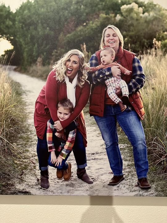
2.This is a family portrait of us from 2020. It is a canvas style picture which is usually made from cotton or polyester. This captures a moment in time when life was altered. Personally, this photo is beautiful to me. It is a clear depiction of what our life was like during quarantine.
3.How old are you? I am 47 years old. What is the gender you primarily align with? I am a female. Where are you from? I am from New Jersey. What is your ethnicity? Caucasian. What do you do for fun? I work out. everyday and chase my children around most of the time. Are you a member of any organized group? No. Where do you work? I am a stay at home mom. What makes you uniquely you? I see things very black and white with concrete perspective.
4. What are you fascinated by in your daily life? My children fascinate me more than anything else daily. How fast the world goes by and time marches on. The days are really long and the years are short. We get such a short amount of time with our children that when you are in the trenches with them you don't get to see all the small moments. They make life perfect even when life throws us curve balls.
1 note
·
View note