Don't wanna be here? Send us removal request.
Statistics
We looked inside some of the posts by cychen-blog and here's what we found interesting.
Average Info
Notes Per Post
1M
Likes Per Post
363K
Reblog Per Post
873K
Reply Per Post
18
Time Between Posts
29 days
Number of Posts By Type
Photo
13
Text
3
Video
1
Last Seen Tumblr Blogs


Fun Fact
Forty percent of Tumblr users are between the ages of 18 to 25.
Photo

So pretty! #barrigoticbarcelona #church #sonya6000 #sonyalpha (at Santa Maria del Mar, Barcelona)
0 notes
Photo


Typography from Rylsee
Follow betype on instagram: @betype.co
2K notes
·
View notes


Photo
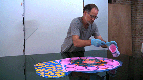
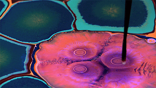


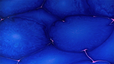
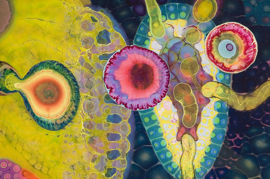

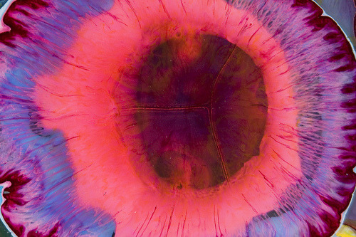
ART: Psychedelic Paint and Poured Resin Artworks by Bruce Riley
Bruce Riley is a Chicago based artist who drips paint into paint in an endlessly layered arrangement resulting in paintings that look like underwater scenes, psychedelic visions and abstract dreamscapes.
Read More
224K notes
·
View notes


Text
Design Progress!
I've been so busy these past couple weeks I haven't had time to post some projects I've been working on in class. Here's a recap of the past couple weeks:
We did more type work on a brief where we had to design a poster for a movie for the Tribeca Film Festival. This was probably one of my favorite briefs, it involved a lot of concept design. Using only type and black and white we had to create a poster that somehow reflected the plot of the movie. I picked Side Effects, which is a psychological thriller directed by Steven Soderbergh. I have never seen the film but I read on wiki about the twist in the movie that I wanted to incorporate in my design. Below is what I came up with:

Come portfolio time, I'll probably have more knowledge on how to make this perfect, but I'm pretty happy with the outcome so far!
We also started color! Damn color, it's so hard to grasp. This week we designed a brochure for the New York Public Library in a cool, modern way. The goal was the challenge a younger population to rethink the idea that libraries are old, boring, and dusty. So color choice (max of 2 colors) and type choice was crucial. Still a work in progress but this is what I have so far:
Front:

Back:

1 note
·
View note

Photo

Pentti Monkkonen at Hacienda
March 16 – April 5, 2014
(from the archives)
71 notes
·
View notes


Text
Week 5: TYPOGRAPHY!
Finally!! I was looking forward to learning typography, it’s probably my favorite part of graphic design. We did a bunch of exercises, including one that was inspired by Word as Image by Ji Lee.
The brief this week was to design an ad for Taste Talk, a food conference/festival in Brooklyn using 90% type and black and white colors. We were given a block of text to use and had to choose which fonts to use to effectively communicate the message. I figured since this festival is in Brooklyn, it’d only make sense to make the design sort of hipster. Some drafts below:


0 notes


Photo

Rain Dance by Thepapercrane
Find/contact me via Threadless | Redbubble
232 notes
·
View notes
Text
Week 4: Grids
Learned about grids this week and how to use them in print design. We were given a brief to practice using grids. I didn't get to finish but some progress below:
Grid Practice:

Magazine spread design:


It's still kind of rough, I'm hoping to continue working on it over the weekend.
0 notes
Photo

Check out the rest of their work at
http://vikautofocus.tumblr.com/
6K notes
·
View notes