
Don't wanna be here? Send us removal request.
Statistics
We looked inside some of the posts by damianacottstudio3 and here's what we found interesting.
Average Info
Notes Per Post
0
Likes Per Post
0
Reblog Per Post
0
Reply Per Post
0
Time Between Posts
2 days
Number of Posts By Type
Text
17
Last Seen Tumblr Blogs


Fun Fact
Tumblr has a 66 index score for customer satisfaction in the US.
Text
Experiment

after first experimenting with the larger repurposed work i thouhgt i better transfer the idea onto a new canvas
i stretched the bag seen on the left really tightly, so that the paint could seep through the little openings

after removing the bilum this was what i was left with
detailed pattern that kind of reminds me of fish scales
i liked the process it was fun experimenting with this some what new form of creation. i mean i have used a stencil before but not of a bilum
i like the pattern it creates. i still might do another layer of the pattern in the same colour maybe different orientation to see the effects
i don't know if i will add text to this i kind of like the way it looks
i mean when i look at it i kind of see it as this marking of the past. especially from a traditional standpoint
looking back on it maybe i should've added text first then layer the pattern over it, like wrapping the text sort of
i dont know at this point when i look it i don't really get good enough ideas for incorporating text
i keep getting this thought of "washing of the sins or rather past " when viewing
also this was the idea i had from merging aspects of Hugo Kaagman and Lady Aiko

i then decided to add this sort of form created from the curved part of the bag( the opening)
i don't know i guess i kind of wanted to see what else i could do with this stencil
i wanted to create this effect where the top half is sort of coming out of the bag or is left hanging out while the other is still inside
you can see the curved lip of the bag in the composition
im still unsure on what text to add or even if i will add text

i then took the image to photoshop
i wrote text saying forget - then warped and skewed to make this pattern
i don't know if it works though, is there too much pattern? text readability?
i like it i guess, well more so the forms of the text - this wave like pattern
i think it ties in well ( the text) with the background, kind of sticking away to the title of the work its made from (W.M.P.A) like an ocean theme kind of
i mean with the text i kind of just wrote the first thing to mind, actually no i trialled first with the text the 5 W's all written out then i just choose this
like a washing of the past
0 notes
Text
Experiment


i wanted to repurpose another work so i opted for this one
the underlying text is a poem with like a floral theme
i actually had this idea of stretching a traditional woven bag called a Bilum and using it as a stencil
the idea came from merging aspects of Lady Aiko and Hugo Kraagman
i thought that the paint produced after spraying would create this abundant pattern leading from different directions
i found that the woven material was quite compact so i had to tape and stretch the wool to i guess bring out the pattern or stencil


on the left is the first experiment and the right is when i used a larger piece of the bilum (the rest of the bag apart from the handle)
i like the first one better the pattern creates this 3 dimensional form kind of like a double helix its kind of trippy
on the left i used the rest of the bag to create the larger specs of paint
and still the left still gives of this 3 dimensional feel like a altering of the perspective
i kind of like this warping of perspective look it kind of reminds me of my interest in space and sci-fi stuff
also you can see this crosshatching emerging through the opposing stitching or sides of the bag
look i don't think its the best but i do think it was a good experiment as it led me to another work
0 notes
Text
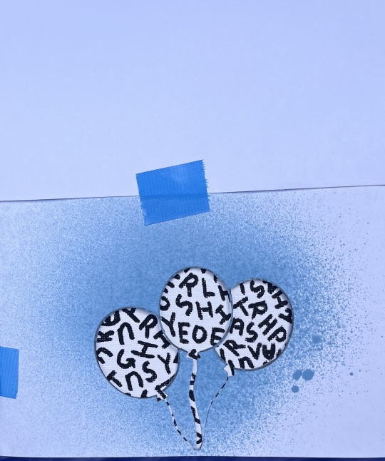
Experiment / Iteration

i made a mock-up in photoshop just to get a visual gauge on positioning, scale, colour
i knew i wanted to add an image i just wasn't sure what so i stuck to the lines of my previous work Untitled Bear to see how things could look if i were to add it
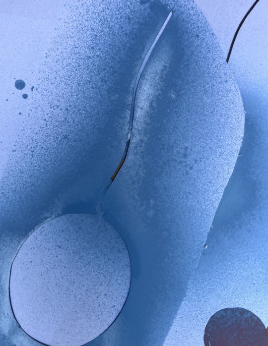
i then decided that if i just had balloons spray-painted on by stencil would go well. (with no additional imagery but the balloons.
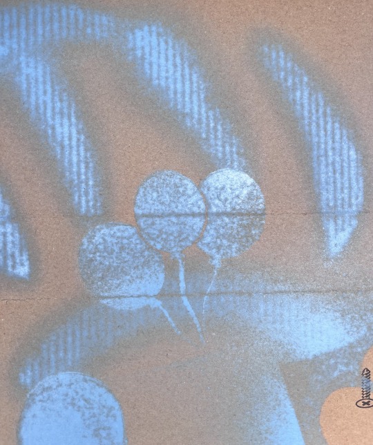
trialling the stencil on cardboard to see the outcome of using this particular stencil
i knew the stencil might be an issue, particularly the bottom end of the paper.
the cuts were to skinny which led to the paper flying around whilst spraying
i also knew that over spray would be somewhat of an issue, particularly when i applied it as the stencil was not glued down to the canvas, it was just hovering leaving open gaps for paint to travel through
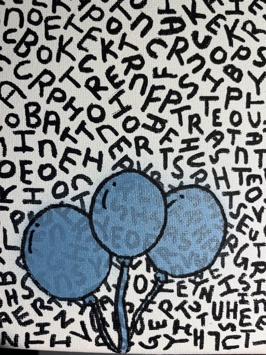
i wasn't to happy with the strings of the balloon being so skinny and also that they held no weight colour wise
i also knew that i had to outline the balloons, because if i left them untouched there wasn't enough separation between the balloons for them to be distinguishable, alongside this i realised that the balloons had to have some form of shape to them and not be this plastered on image hence the added detail lines
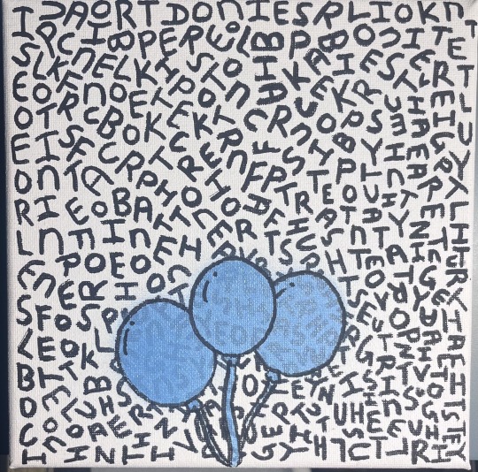
i do feel like i minimised overspray through the use of taping down the sides of the stencil as well as adding paper to cover the background from the overspray
i actually like this work and the process it took to create
there was a lot of trial and error with the stencils, especially to figure out if i should use negative or positive space, alignment
i chose to stick with just a bunch of balloons and no other imagery for the sole purpose of sticking to the theme of the text
i felt that the text provided or alluded to this space in which one is free and floating high above not bound or held down by anything
i don't know, to me it's sort of like this visual symbolism of escaping or being free, like this balloon is pulling you out of the 'normal'
i mean the text says " in space lookin for better " and " intrusive thoughts they paralyze" so i felt that the balloon would be the best or most appropriate symbol i guess, to push across this notion of being free or unbound by all the problems, issues etc.
i was going to add hands just around the strings of the balloons but i opted not to as i felt that the hands would be to clear or rather to simple if that makes sense
i like that the effect of having no hands alludes to this open interpretation, you know like theres no specific being holding on to them.
i don't know, its sort of freeing i guess, you can see the close compacted nature of the text that kind of gives of this claustrophobic feel however is juxtaposed by this balloon
reminds me of Charlie brown
also i am i guess furthering my knowledge in the applications of spray-paint
0 notes
Text
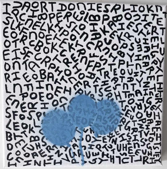
Experiment


i wanted to put the experiment onto canvas
i knew i didnt want to add any colour to the background but leave it black so it could give the same contrast as it did for the paper experiment
i didnt actually know what to text to use so i opted to use lyrics from songs that i find relatable or if i find that the text could be suitable for a work i have in mind. like this one


text reads in space looking for better
i was going to use the same style of font i did in the paper experiment however i thought that i better just keep it symbol if i were to add a figure on top of the writing

the rest of the text reads intrusive thoughts they paralyze
i am thinking of adding a figure onto the canvas just not sure what exactly maybe an infinity symbol, a character or something else
maybe i might add some brutalist \structures however i feel that it might be too much for such a small canvas. and if i were to add these structures what colour would they be
i think ill revisit this in a day or two
0 notes
Text
Research/Readings

Olender, J. (2015). Art and cultural institutions as social extensions of personal self-identity. Avant, 65-68.
i liked this article particularly this sentence " Intentionality is realized when the object is grasped with all its aspects and the viewer makes personal sense of it"
another bit i found interesting was "Our self-identity, which is based on perceptual experiences but immersed in cultural entanglements, relates to artworks that have the same basic phenomenological structure: a physical appearance bearing a multitude of cultural meanings and dependencies."
essentially what i understood from all this was that the statement suggests our self-identity and the way we perceive and interpret artworks are fundamentally similar
they both are shaped by our sensory experiences
This relationship highlights the connection of personal perception and cultural context in art
im not too sure on this but what if i were to experiment with this like further on or next semester

Thor, M. C. (2017, November). The reciprocal city: Performing solidarity—Mediating space through street art and graffiti. International Communication Gazette.
what i found interesting about this article was the debate about the similarity and differences between Graffiti art and Street art
i liked this statement about a potential difference between the two "It is understandable by passers-by and often communicates explicit messages, sometimes with an explicit political character. It informs the viewer of the intended meaning using explicit visual cues, and occasionally with text. "
i like that it kind of gives a distinction between the two. it portrays graffiti art as a sort of club, where you can only appreciate it when you understand what it seen from the tag where as street art gives a more "easy" way of interpreting
"Writing a tag on a wall is a spatial and aesthetic intervention but decoding it as something other than vandalism is equally political." i like this statement, it kind of opens my mind into the graffiti art and street art realm i guess. it kind of shows me that there kind of is a clear distinction between the two but also doesn't i guess ignore or put down graffiti art (tags).
Marcin Rogal (MrArtPride)

he makes these pop art style paintings
i kind of want to make stuff like this maybe
i found him on instagram and thought that his works were pretty good, and visually enticing
i like that he merges these different figures and themes to create a cohesive piece
i think with this artist specifically, i just like his art like what he makes
its like placing things in places that they do not belong i guess, i kind of like that you know like imagine placing a kaws character on the Mona Lisa like the two don't match but it might look good or work even
i think maybe i like it because it has some relation to my personal beliefs or something along those lines( like being out of place) but also i like that he comments on capitalism and like a consumer driven society
Will Blood:

i like that he uses cartoon characters and gives them this human aspect to it(skeleton)
His art is characterized by meticulous attention to detail, streamlined minimalism, and a distinctive approach that combines fantasy with a hint of the grotesque
its like a aesthetic and charming piece but the skeleton sort of gives it this uneasy feeling
i don't know it kind of reminds me of puppets and their puppet masters
id like to explore this, but do it in a way where its different. maybe i can take aspects from his process and try and develop or adopt them into my own practice
i mean i like the cartoon figures but im not sure if id recreate them in my own practice
im still not sure

Sarah H. Awad, B. W. (2017). Street Art of Resistance. Aalborg University Aalborg, Denmark: Springer International Publishing.
i liked this book chapter about "Art and Social Change: The Role of Creativity and Wonder"
i know its speaks about the activism side more but it mentions street art as one of the "activist art"(like activism form of creative expression) , it says that street art is directly linked to change within society and community
"It is a space where reality becomes multiple and malleable, at least as experienced in art."
this was a sentence from the chapter it i don't know to me it kinda means like it creates this other universe where they morph reality within their art
i know i don't really explore the activism side, unless my works have underlying political themes which i think they don't i would like to explore this morphed universe, well i think i do a bit ?
i don't know it was a good read
definitely open a new avenue i could explore however i am not sure if i would go a more activist route maybe i do already? not too sure on that though
0 notes
Text
Experiment


i wanted to paint the flower pot to kind of match my living room
this was really just a side project


i actually didn't know what i should do with the pot
i knew i wanted to add circles and no actual figures or anything that makes it not a flower pot
so i decided to just do some designs
colour palette was derived from my living room, finding what colours would go well and liven up the place
i did enjoy the process though
the process was actually long as well. I found myself constantly changing the design as time went along. although the design was not set in stone i often questioned what i did before moving onto another aspect of the work.
for instance i was going to incorporate just lines rather than coloured in shapes, however during the process of painting these lines i thought that it would be better if i coloured in large sums of space and letting the flower pot's natural colour contrast against my added brushwork.
although i would've probably like the lines and shapes to be more sharp edged however i do like the human quality it gives off. like its not perfect but it still works ?
0 notes
Text
Experiment

i made this in photoshop
after using the original painting i altered the hue/saturation for each image
starting at -180 i went down by -10 each image
i actually kind of made this with a slight reference to Andy Warhol. like i had this reference image from memory and then decided to make this
in regards to text and adding text onto it i actually am not sure. i dont know what text would fit.
i think id rather tie in the overall feel of the work to the theme of the text
the process of creation was fun but was also long
i think it actually turned out better than i expected
it actually reminds me of those colour wheels or the paint sample cards
when i look at it i like that my eyes aren't glued on the overlapping or straight edges. they sort of just wander throughout the composition getting lost amongst the colours
i like that there is an abundance of colour yet it doesn't feel like theres too much colour
0 notes
Text
Experiment

Repurposing a work I made last year
I wasn’t happy with how it looks so I thought I could change it up a bit
text reads noken tin tin(squared) planti which means dont think to much or alot
i actually finger painted the text on
looking at the work again, i actually feel that it reminds me of those decor or sayings that people say as a way of trying to find common ground or an easy solution to a hard problem


Adding these objects reminiscent of a flower or plant
i initially was going to make something different this being a face silhouette derived from these forms
after the first one i took a step back and liked how these forms looked
i knew i didn't want to add something so defined as i felt it would devalue the text or make it seem out of place
colour wise i also did not want to add bright colours i just wanted to play around with the same colours already used
all these were done freehand

i like to think of these forms as the basis of a thought/idea beginning from a single form that breaks of into these other ideas/thoughts essentially infecting other thoughts/ideas as they branch off
like a cell being infected and spreading the disease
which in turn defeats the purpose of the underlying text as the text 's meaning/instruction is not as easy to follow

another iteration
i wanted to see what it could look like in a different colour
following on from the above post i wanted to create this multi layered image that only displays the one copy.
i dont really like the outcome however it was a good iteration i feel
0 notes
Text
Experiment


I wanted to try and make a work by painting
i only used the colours that i had


The idea of the circles was to replicate a Venn diagram
the two moon shapes were added because I wanted to explore this day and night concept
at this stage i actually dont know if i will be adding text
if i do add text im not sure what i would add or even what colour and where i will place it
i mean i did think about adding text reminiscent of those cheap, mass produced motivational decor however i dont think it would actually fit
i have had some thoughts about adding a sort of conversation between questioner and answerer
if not i could maybe add text where the two larger circles overlap
like one’s darker than the other
i initially was going to stick to the middle right image. Leaving the part that flows into the other circle unbound or not attached to the other however opted out of this


i couldn't decide wether or not to paint the text on so i decided to trial it out on photo shop
i knew i wanted to have this sort of conversation so i began to trial different questions and answers
i kind of feel like i haven't stuck to the venn diagram aspect of the work. for instance i could do something that shows both sides of my culture ? i'm not to convinced on that idea though
i think out of the two i like the one on the left more
i feel like the work on the left is better suited to what i envisioned
i like that the answerer's answer is undefined. it leaves it open for interpretation
i think this work is a more personal exploration.
i did play around with the font, orientation, colour and size but i found this the best
i don't know, looking back at the work it kinda reminds me of the ying and yang, like positive and negative. theres always a response or an opposition to an idea, theme or so forth
0 notes
Text
Research
Sam Jablon:
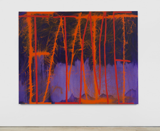
his style is influenced from his background in poetry
often experiments with layering and erasing
creates a duality in the implementation of text, the text can be legible and abstract
challenges the viewers perception
exploring image and language creating a unique and engaging viewing experience
often because of his poetry background the letters in his works become the foundation on which the rest is built
the use of colour also alters the way in which the work is received
i also like the movement of the colour like within the letters its like this flossy string of paint
Alvaro Barrington:

combines painting, sculptures, textiles and found objects
utilises vibrant colours, layered textures and references to high art and pop culture
he aims for authenticity and self awareness
Alvaro Barrington's work is celebrated for its depth, cultural resonance, and innovative use of materials
his multi-cultural upbringing heavily influences his art
exploring themes of Caribbean diaspora, Black culture, and personal history
Steven Harrington:
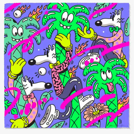
vibrant and playful aesthetic rooted in the Californian lifestyle and pop culture
incorporates elements of skate culture, music, and nature
it spits out this undeniable laid back feel
explores the symbol of the palm tree as a reference to the environment
large scale paintings, digital art, prints and sculpture
Iconography
his work is a form of personal poetry, expressing his thoughts and feelings
is a vibrant blend of personal expression and cultural reflection
to me its like child-like but yet its not, i guess because of the amount of detail and quality of the work but still it has the child-like/comedic feel to it
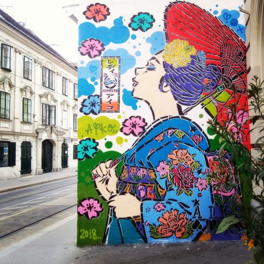
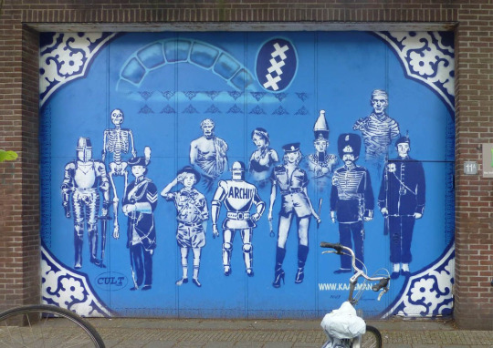
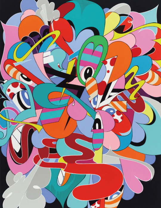
Reference Images / things i'd like to explore- INSPO:


all the images seen above have had an influence in my practice this semester
although there may not be a direct link between them and my work, i often find myself just looking at them to spark up some ideas they were inspiration
0 notes
Text
Experiment


created a stencil
i wanted to create a stencil of a pill then spray paint onto the canvas
initially i wasn't to sure about what colours i could use
i only knew that i wanted the colours to be bright and contrasting
i also did play around with the technical side of spray-paint specifically the application. i trialled different methods of application like minimising the distance from can to canvas or the length of the spray stroke, pressure applied to nozzle


red pill vs blue pill
layered and spaced out
the stencil did come out clear and what i wanted it to be
i did notice the overspray could effect the work in a way where the background (white) would not be able to contrast the colours enough or as harsh as i would want it to be
i did like using a stencil although you can see that the edges of each pill flutters. Its not as straight edged as i thought it would be


Text reads MI NO SAVE
during the process of inserting the text i did not know what colour to use so i opted to use black
spray painted the text on by using fast paced strokes
im not sure if i like the text just plastered on i do feel like it kind of devalues the background
like the background was the detailed piece but the text diminishes that
also i did not know what text i should use, so i opted to go use a phrase in language that is used in everyday conversation
the text also just is reflective of my thoughts in implementing text
i do realise that for others viewing the work who don't know the language will struggle to piece together this phrase
for instance in english you would just read it as Me No Save which does not make any sense however translated it means i dont know or im not sure
i feel like the text layered on top of the stencils kind of dilutes but exemplifies the image. its like you give someone medication or these pills but they are unsure if they should take them. i feel like this is very literal though
on the other hand its like this red pill blue pill situation, break away from the "normal" or take on the new path. like a cross roads where your decision leads to what is to come further down the line. like a constant scene of morpheus presenting you with these pills at each situation asking you to chose what road you want to take
0 notes
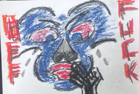
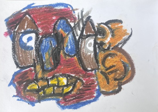
Text
Experiment
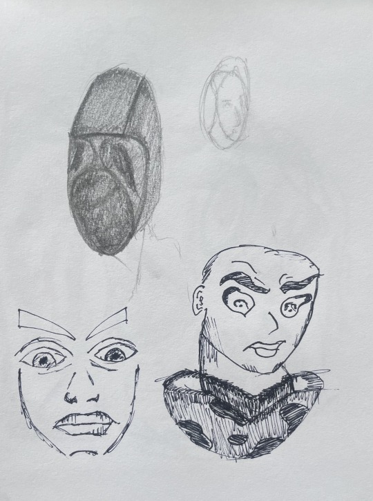
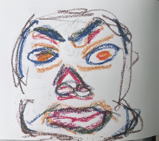
just doing random drawings with fine line and oil pastel
i actually didnt mind using the material ( oil pastel)
i found it informing yet fun
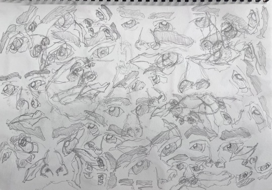
trialled this experiment where i draw faces by only holding the pencil from the end and not with a tight grip just loosely
i did find it enjoyable
Im not sure if i would take this further
the oil pastel works were just in the moment pieces
i wanted to create these abstract characters either disjointed or unfamiliar
i feel like i've been particularly focused on faces either directly or indirectly
out of all the pieces here my favourites would be the pencil drawing of the faces and the oil pastel (with yellow teeth)
if im being honest the pencil drawing of the multiple faces kind of reminded me of something out of a movie like the person who made this was overwhelmed by faces, constantly seeing them
it kind of gives this sense of uncertain, not feeling right yet it works
i like that it varies in positioning like in one corner or spot of the piece the character is facing you eyes on but you move your eyes and another glances at you from the side or rather side on
i actually found that when i was making the oil pastel work with yellow teeth i kind of followed Basquiat, like by making these character really abstracted, having overly proportioned characteristics, however i found that the process was more so done in an angry or frustrated tone which is carried out through the pressing/pressure of the material on paper
0 notes
Text
Experiment


this was merely an exercise pre painting the canvas
i wanted to visualise my idea before starting my canvas
trialling the orientation, readability etc. of the text

in the heat of the moment i got this sudden urge to just spray paint this face on so i did
this was purely experimental though
0 notes
Text
Research/Readings/Artists
Lady Aiko
i like the artists style and use of colour
Japanese street artist
i like that she incorporates her culture in this new modern contemporary style
it kind of makes it look like its its own being like a character being created that embodies the very traditions and cultures of the artist
her works also explore the whimsical and fantasy
techniques used: Stencil/handcut stencil, influence of traditional Japanese Art
Hugo Kaagman
Dutch Stencil Artist
i like the outcome of using a stencil
i like the finished products of him using these stencils but also adding these detailed design similar to these mosaic plates
i also like that all the figures he has used don't stick to a certain pattern or style they all vary in different representations of characters to characters or rather imaginary characters
he uses old Dutch blue Delftware paired with contemporary symbols as a means of communicating his perspective on current society
techniques used: Pattern/repetition, stencil, Mixed media
Eric Inkala
i like his use of bold and vibrant colours, playful shapes
i don't know its like this blend between abstract, graffiti and street art
his art is a personal expression of emotions, experiences and thoughts
i like how the shapes he created directs your eyes, like you can see the movement within this whimsical piece
i like it, although there is an abundance of forms, colours and so on it still works
it does feel crammed and claustrophobic but for me its like the forms and colours mask this
i have done something similar on A5 with oil pastel but not this scale
i have noticed so far that the artists that interest me have alot of detail however im not sure if i am wanting to achieve this. maybe i am but its subconscious or something?
ALSO:
i actually have an idea for these two artists. well not for them rather for me but the idea incorporates aspects from these two artists. more specifically the stencil and aspects of my own culture.

Galenson, D. W. (2018, March 1). Pricing revolution: From abstract expressionism to pop art. Research in Economics.
"The innovations of the Abstract Expressionists were based on extended experimentation, as they searched for novel visual images; Pop artists rejected this open-ended search for personal forms, and instead treated painting as the impersonal transcription of preconceived ideas."
"Accumulation of experience was critical for the Abstract Expressionists, who produced their most valuable art late in their lives, whereas lack of experience allowed the next generation the freedom to imagine radically new approaches, and they produced their most valuable art early in their careers."
i liked this article as it reminded me of my own practice, at times i find myself shutting of my mind (in terms of planning or thinking about creating) and just creating
although i do find myself doing both, i do at times plan or take an image and recreate it to form something new but at times i only use this as a starting point in my process
i start with a pre conceived idea, only to then begin this phase in which i limit my thoughts and just create
i mean reading this makes me question if i can merge aspects of the two to create this new form of creative expression
what if i create by being oblivious to elements and principles of design? is it possible? am i capable of doing it ?
0 notes
Text
Experiment


process of creation
i wanted to play around with spray paint as an iteration of my blue and orange spray paint piece
i opted to insert text that references songs
white text reads Trapped in my conscious
red text reads ooh and ahh
i still have'nt quite figured out the technical side of applying spray paint ( overspray, drip)


Character i been working on
i created this character a few weeks ago
during the process of creating this piece i decided that i should add this character
although i do feel like the work maybe could've been better if i weren't to shade in the body and just leave it as an stencil
i did get a lot of comments saying it was reminiscent of an five nights freddy, kaws, zombie cartoon.
i did consider creating the character in a more controlled way
like to remove the man made errors or lines
however i feel like it gives it a more raw feeling
i feel like the overspray of the work is good however im not sure if i like it

i did enjoy this process
i was going to add maybe two characters beside the centre figure however opted out
in another work id like to trial the effects of placing readable text
i think this work is more a personal exploration of my subconscious or rather myself as a whole (individual)
the text is from song lyrics that i find relatable, enticing, fun, playful, contradicting or outlandish and the layering of these lyrics kind of create the tone or theme of the work
im not sure why but when i view this work i cant seem to find a meaning other than just personal exploration of my interests
i dont know maybe this character is trapped you know, trapped in this world where his eyes are oblivious or have been blinded by his surroundings. his teeth missing from poor treatment, physical scarring of a traumatic event or accident
like if i had another character on it instead of the bear i feel like it wouldn't fit
even the text says trapped so maybe the character is trapped, trapped behind this clear frame no one can see. you can only see what the figure shows you ? does that make sense? not sure
i do like the point where its trapped behind a clear frame or glass, like a two way mirror in a prison walk through thing idk
0 notes
Text
Experiment


other drawings/experiments
these were merely excercises in trialling out different figurees and text
altering their readability, orientation and colour
i would like to explore the top left image more
i mean the rest of the pieces above were just experiments you know. trialling different materials and layering them on top or beneath other materials
0 notes
Text
Experiment


text reads Inap
trialling out spray paint
i opted to try and create a work that is barely readable
the work just reads inap over and over again
i found this process very informative
i learnt about the applications of spray paint and how to overcome certain challenges
i do like using spray paint
i feel like this was more of an introduction/refresher in the applications of spraypaint
i played around with the application of paint the most
i applied paint closer to the board then moved the can back and applied more paint
more of a repetitious work
0 notes