
Don't wanna be here? Send us removal request.
Statistics
We looked inside some of the posts by daniellewellerfmp and here's what we found interesting.
Average Info
Notes Per Post
17
Likes Per Post
0
Reblog Per Post
17
Reply Per Post
0
Time Between Posts
14 seconds
Number of Posts By Type
Text
1
Link
10
Photo
6
Last Seen Tumblr Blogs


Fun Fact
BuzzFeed published a report claiming that Tumblr was utilized as a distribution channel for Russian agents to influence American voting habits during the 2016 presidential election in Feb 2018.
Text
Design Report
The theme of my animated project was Do Doodling, replicating the way students start off doodling when they are bored. Its purpose is to encourage students to doodle more as it is a fantastic way for boosting creativity and individuality. For me, it’s an opportunity for self-exploration, reducing anxiety and increasing memory by connecting the event to the drawing.
I want to go into the pre-production aspect first to understand why some of the blunders in the animation occurred, resulting in the quality it was, which is not to say I am not proud of the result, but in many areas it could have been better. The first issue that comes up is the planning and production. Compared to the previous semesters, this had the least consideration due to me being quite scared of the project because I was losing confidence in my abilities due to my becoming stagnant by being afraid of failing. Student lesson 01: Don’t do that. But also I would come with ideas that were either more than I could handle or which would stray away far from the theme doodling, which I was strongly encouraged to do. My storyboarding would go through several iterations due to the work lacking a solid story or it would be too ambitious for someone in my field, such as recording live footage and planning to involve animation on top of it. These distractions would leave me with little time to create a fully fleshed out storyboard and animatic, during what should have been spent on the production of the animation. So the project became quite improvised at times where I would be working on the animation whilst planning the rest of the story and shots whilst creating the introduction sequence. I was strongly advised to not improvise so much with sequences involving the doodles, against what seemed natural to me. However, I managed to blur improvising with professional processes. Such as the sequence within the sketchbook which I treated as if I was key framing the animation rather than creating the animatic, instead of creating it through a storyboard which could have sabotaged the spontaneity of the sequence, which was a good choice on my part. With that out of the way, let’s get into the reflection of the end product.
The background art has a realistic quality to it rather than a cartoonish or stylized one because I wanted it to portray the world as mundane in contrast to the doodles that come to life. It sold the idea just as planned, however there were down falls with this choice, accompanied with the little time my production-errors had left me. The sharp, lineless characters would not contrast well with the background, which made them feel slapped on as an afterthought. This could have been avoided if the backgrounds were less realistic, which would have also compromised the dull atmosphere which was important to in relation to the buzzing life inside the protagonists sketchbook. A way to make it feel like the characters inhabit the world more would have been to shade them and possibly overlay textures so they feel less like vectors and cartoony. However, due to time constraints I was not able to add this polish which would have sold the immersion.
During the introduction there is a scene where the teacher is writing on the blackboard, in which the arm moves quite fluidly, enough to convey motion and life but the expression and his body doesn’t change much except for some eye movement. It’s not so noticeable during the first viewing that it creates an uncanny feeling but if you were to watch the scene repeatedly, it would quickly become quite cheap looking. Some movements to the head such as turning or some mouth moments would have made the character feel more like a real person rather than just a drawing. However, in other scenes including the ending, the character actually felt believable due to his subtle movements and abundance of sighing.
In another scene where the protagonist is reacting to the tentacle grabbing him, his head becomes quite jagged when tilting his head up slowly. This is not at all the biggest deal breaker here. The real issue is that this where it becomes clear that the character does not remain consistent at all. In the scene prior to this where he’s chewing the pencil, he’s noticeably bulkier because he had more realistic proportions. This is because this was the first scene I had worked on. I had spent a longer amount of time in drawing the specific character as well because of the lack of animation until the end. But then throughout the other scenes of the animation he is noticeably cartoony with his big eyes and skinny psyche which also made him seem a bit too young to be a university or college student. Whilst it doesn’t break the atmosphere I was trying to create through realistic grounded characters, it is a bit distracting. However, the majority of viewers don’t really notice this, possibly because the perspective implies that he would look bulkier from that angle. If I could go back I would probably resize his head and body, remove some of the detail in the outfit and get rid of the lips that I originally intended for the character.
The doodle sequence came out exactly how I wanted it. The animation was very smooth and alive. It shows clearly that I had the most fun and energy than any other part of the animation. The only aspects I’d change was where the skeleton emerges from the water as it almost feels like it was freezing. It if had a few more frames, it would have looked far smoother. Another aspect is where the snail-like creature emerges. The animation in itself is fine but I wish I’d kept the camera on him longer. With it cutting so fast it feels too energetic. It fits with the rhythm of the rest of the animation, but at the expense of the disturbing atmosphere that was crafted in the animatic. It would have been nice to let the design just sink in, and with the sound effect added later of a dark ambient noise it would have been perfect.
The ending sequence had far more animation than the beginning, and because of that it had both fantastic and weak animation. The scenes before the protagonist is leaving the classroom are all fluid with little I want to change. But the best portion of the ending animation was when he pulls himself onto the chair. I loved working on this scene as I felt passionate and ambitious about the animation quality being on par with the doodle sequence. I was so happy with the professionalism of that scene that I would love to have it on my show reel. However it took longer than I thought it would. With only a week to create the ending sequence, spending two whole days on one scene seemed like a deadly thing at the time. Looking back I wish I paced myself more. So the last two sequences looked more like a tweened animation, despite the fact I hadn’t once tweened it. This is because I reused the same shapes, like the head, so much that it was indisguisable from tweened animations. They’re not inherently a bad thing but when paired up with frame by frame animation, it looks rushed. There’s also one too many smear frames in the scene where he’s leaving the classroom. The first one works perfectly to convey the speed and energy of him leaving the class, which was the intention. However, the second smear where he stands up was created for the purpose of not conveying speed but for getting the animation done faster under the time crunch and did not work. Not only that, the animation of him running out also looked quite awkward and clumsy because of the overuse of the drawings. Also, the animation of him nodding, turning his head to look at the bag, which was used for creating anticipation and timing, looked quite awkward. It started off far too bouncy and unnatural, and with the little time I had left, I tried to reduce the bounciness. It didn’t look as strange but it still came off as quite unpleasant. If I could go back I would redraw the entire head turn scene and also add more frames towards the end. The last sequence came off even more tweened, though not as surreal. The only parts where the drawings were not reused was his arm swinging and his hair, which I had to animate to get away with the reuse of drawings. However, the sequence did end with a solid piece of animation of the doodle running up to the screen, which I wouldn’t want to change.
To start with, I disliked this project. I didn’t know where it was going and I was terrified of failure. It was to be the most ambitious project I’ve ever done; everything I’ve done in the past has not surpassed more than 20 seconds, mainly because I never had to. Through this experience I learnt to just get in there and keep calm. So in a way I am glad it went the way it did, because it taught me a hard lesson on what I should not do. This project became a fantastic chance to prove to myself that I can handle bigger projects and animate efficiently. I learnt how to utilize pacing, and ways to convey motion to a certain feeling. The animation will not stay in a state of limbo. After my time at university is finished, I want to include shading to fuse the characters with the world, give more life to certain scenes as well as elongate certain scenes to convey the original intention, and fix up the mistakes of the repetitive reuse of frames towards the end. I want to submit something I can be proud of for student animation festivals. With a little more work, I feel like I could.
1 note
·
View note
Link
The final result of the animation
1 note
·
View note
Photo


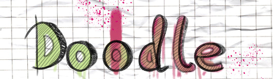


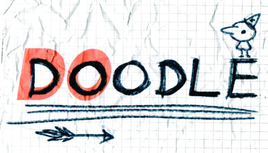
Development of the doodle banner/title.
1 note
·
View note
Photo


Here I removed the camera panning and kept it mostly flat, except for a gradual camera move upwards when the doodles appears on screen. The pink makes it distinct enough to be spotted on its own. And when I made it engulf the screen, I animated the opacity of a black box over the camera to ease it into the credits.
I also swapped the background for a different one because the other one was poorly drawn in comparison to the original the filter made it look too pix-elated.
1 note
·
View note
Photo


The camera originally panned, following Haiden across the screen. However it was disorientating and unnecessary. To overdo things I also zoomed in on the doodle, thinking we might not notice him otherwise, and followed him with the character. After roaring/glitching he would disappear downward off screen. Whic was a missed opportunity to transition into the ending credits by making him assault the camera and cover the scene in scribbles.
1 note
·
View note
Photo


Another issue were the smears. The first smear was a good choice in my opinion. It gave the scene the energy and speed it needed, conveying how much of a hurry he was in to get out. However the second smear was a product of laziness. Or at least me trying to wrap up the animation before the deadline. And you can feel it. If I had spent a little more time on it, I probably could have animated him gradually getting up instead and it would look a whole lot more natural. Another issue is where he’s running out the room. It could be just me but it feels so clunky and motionless due to me practically dragging the same template across the scene. I did try to rotate some of the assets to make it less tweeny and it did work, but it still has a lifeless awkwardness to it. Fortunately he leaves the screen too fast to take anybody out of the experience.
1 note
·
View note
Photo
And here we see some of the worst parts of the original animation. Orginally I made the face way too unnaturally bouncy. I was trying to create a scene similar to the ending of the previous Haiden scene where he bobs his head. However I overcompensated by dragging and lagging the face behind too much than a normal face would. It made it feel tweened and lazy. I changed it later on so it was much more natural, but the hair animation lacks in the same flow as the previous scene with too much copy and paste.
1 note
·
View note
Photo


This scene only needed minor adjustments. Such as Xavier, the teacher, who’s coloures were too bright for someone so far in the background, and too sharp. So I blurred him to a similar intensity as the writing on the board, and toned down his colours. Chris, the one in the foreground, also needed some adjustments to the eyes as instead of staring at the ceiling, it looked like he was looking at Haiden. Which we want to avoid unless I wanted to convey the message he somehow noticed Haiden’s wonderland experience.
1 note
·
View note