
Don't wanna be here? Send us removal request.
Statistics
We looked inside some of the posts by darianewing and here's what we found interesting.
Average Info
Notes Per Post
0
Likes Per Post
0
Reblog Per Post
0
Reply Per Post
0
Time Between Posts
15 days
Number of Posts By Type
Text
7
Last Seen Tumblr Blogs


Fun Fact
The Tumblr app for Google Glass was released on May 16, 2013.
Text
This is me making the roses in a time lapse for my "Basket of Roses" final.
0 notes
Text
"Basket of Roses"- Art Final
Darian Ewing
12/04/2023
Prof. Bzura
I chose to do a basket of roses for my final because my nana has always loved to sculpt, make award winning dolls, and roses are something that her mother taught her and she has taught me. These roses are art passed down through the generations and it shows the time and dedication that it takes to make something beautiful.


0 notes
Text
Sketchbook 4
Jackson Pollock started out like a normal artist trying to find his own style and toying with the different versions of art. He studied with Thomas Hart using abstract imagery but with time eventually succumbed to his inner feelings and put it on a canvas. Pollock had a bad history with excessive drinking but in his moment of cleanliness and clarity started producing art that was messy, dark, chaotic, it had no figure. I believe this version of his art was his true self; the dark and contrasting colors represented his mindset and how the world would have seemed to him, monotone and dark with hints of joy and color overlapping each other just like how it was on the painting. The messiness and chaos in the painting was a representation of his mind, it was all over the place, fighting off depression, anger, addiction, and dealing with everyday life on top of that as an artist. At face value Pollock’s artwork is hard to understand and can seem like there is no meaning and just a bunch of paint splashes on a canvas, but each spot on the painting is unique and the entirety of it cannot be recreated. I think the beauty in his art is the raw emotion and how he cast aside his teachings to display his own emotions, and that is art.
ABSTRACT PAINTING

0 notes
Text
Sketchbook 3
Darian Ewing
Professor, Bzura
ARH
October, 19th, 2023
Sketchbook 3


Salome Receiving the Head of John the Baptist
by the workshop of Guido Reni. (1575-1642)
The artwork of Salome Receiving the Head of John the Baptist is an oil on canvas piece that is 47 ¼ inches by 67 ½ inches. The art uses a bold red dress and gold draping skirt to accentuate Salome and show her position of hierarchy in this picture as the head of John the Baptist is offered to her on a golden platter. Salome looks satisfied taking the head of whom she desired but remorseful at the same time by having a dull look in her eyes as if she's hiding her true feeling behind her light smile. I think the artist of this painting was trying to pay homage to the great tragedy of this historic event while simultaneously capturing Salome’s emotions and drawing in the audience to learn more.
Achieving such things is a great feat and tells alot about the artist at hand, not only his skill level, but what he sees as a person, giving us a deeper look into Reni. This Renaissance movement oil on canvas is a popular adaptation of Reni’s original, according to the description of the piece, “reversing the composition, removing several background figures, changing the palette to saturated primary colors, and adding dramatic contrasts of light and shadow.” (Ringling Art Museum) Guido Reni studied under Denys Calvaert (1602-1613) and was mainly stationed in Rome where most of his popular paintings originate, although this particular piece is a popular Italian painting. Reni and the artist’s adaptation of the painting, (speculated to be one of Reni's pupils, Giovanni Sirani) told the story of this sinful randevu through popping colors, contrast of light and dark shadows, and through scale and proportion. The work balances the colors by adding the same but muted tones to the background, doubling as the work’s shadows draw attention to the highlighted platter with John’s small head. Next to it, standing tall, Salome, makes a contrast physically and emotionally.
This artwork has made me experience mixed feelings about Salome and in trying to understand her actions I cannot help but feel frustration towards her. Knowing the story of John the Baptist and Salome I find pity for her having to perform inappropriate deeds to entertain her stepfather’s wishes but sorrow for the Baptist because of his threat on Salome’s mother for yearning for her husband’s brother. Salome, in order to protect her mother, wished in return for entertaining Herod was John’s head. This artwork is revealing the greediness and sinfulness of society. I believe it is important for one to know to story of this piece of art and try to decipher their own feelings on both twisted sides of this story. I picked this painting because I originally did not know the origin of a story so popular, the beauty and ominous tone I saw in the picture is what kept me hooked. I think Guido Reni made this piece of art something to remember and pass down as a lesson. By drawing people into his art he has made countless people remember the story and depth of human emotion that was all encapsulated into one picture.
Works Cited
Reni, G. (n.d.). Salome with the head of Saint John the Baptist. The Art Institute of Chicago. https://www.artic.edu/artworks/11434/salome-with-the-head-of-saint-john-the-baptist
The National Gallery, L. (n.d.). Guido Reni. Guido Reni (1575 - 1642) | National Gallery, London. https://www.nationalgallery.org.uk/artists/guido-reni
Princess Salome Dances, John the Baptist dies. Women In The Bible. (2022, October 25). https://womeninthebible.net/women-bible-old-new-testaments/salome/
0 notes
Text
Sketchbook 2
JOURNALING-
Unity and Variety: Unity and Variety are like the yin and yang of art. Unity encompasses something that is all the same without variation. Variety is on the other end of the spectrum conflicting with everything and each individual part is different. An example of unity in everyday life could be a wall with a single color lacking texture. An example of variety is a landscape of trees, clouds, the sky, buildings, animals, ect.


Balance: Balance in art is what makes the artwork even, whether it be symmetrical or asymmetrical with perfectly contrasting colors that make whatever in the painting not seem too much or too little and it all seems in place. Some balance one might find in everyday life is the wings of a butterfly and how the wings are perfectly symmetrical on each side balancing the whole image.

Emphasis and Subordination: Emphasis and subordination go hand in hand with each other to make the whole of the art piece work together. Emphasis uses dark/contrasting colors or makes whatever is the emphasis larger in the picture. Subordination is to make wherever is being emphasized look better and draw more attention to it. An example of emphasis and subordination in everyday life is a night sky with a brightly lit moon. The stars and the black sky add to the ambiance and are the subordination of the sky but the moon is larger and brighter in comparison being the emphasis.

Directional Forces: Directional forces are the imaginary or physical pathways that our eyes follow that impact the look of the artwork. Directional forces in everyday life can be a sailboat in the water. The horizontal flat water makes the eye wander to the triangular shape of the sail on the boat making us focus more on the boat.

Repetition and Rhythm: Rhythm and repetition both work in similar ways, to achieve repetition there has to be a recurring object in an art piece and in turn this produces rhythm which is the continuous repetition. An example of repetition and rhythm in everyday life is a sidewalk. The long rectangular or squares are continuously repeated along the road creating a regular rhythm.

Scale and Proportion: Scale is the size of something when compared to another and proportion is the sizes of different things that make up something. An example of scale is a bunny compared to a tiger and proportion is the size of the bunny’s ears compared to the rest of the body.

WRITING AND LOOKING-
POSTERITY - THE HOLY PLACE by Damein Hirst, figure 4.7 chapter 4, “symmetrical balance”, is a symmetrical piece made up of contrasting colors opposite on the color wheel to get a balanced feel on all fronts. The patterns used to create this look are butterflies which are symmetrical and balanced already which really adds to the creativeness of this work. Repetition in this piece with the same butterflies occurring every so often in the same configuration makes the rhythm soothing and draws attention to the whole of the piece by using implied lines and contrasting color around the lilypad shape in the center.

CONNECTING ART TO YOUR WORLD-
Color has affected me in a great way because it brings vibrance and life to each thing. Without color my everyday living would not be as enjoyable because sunsets would now have no meaning and important moments in life that stick with you forever would seem more dull. A moment where color impacted me was when after a close family member of mine had passed away I caught myself staring at the sky more than usual and the sky seemed to be more vibrant. The saturation of the colors were beautiful shades of pink and orange. The opacity of the clouds perfectly highlighted the yellow hue in the sky. Due to this moment color has been more important to me than it ever has and I appreciate whenever there is beauty in something so simple due to the amazing color, and that would be my color scheme.
ART PROJECT/ ARTISTS CHOICE-

This painting of a lily is used with watercolor paint. This painting has a few meanings for me; I am passionate about the environment and the health of our earth. The other meaning of this lily is in memorial to my step mother who passed away and the lily was her favorite flower.
PHOTO/DESIGN-
GROUP 2
A good layout design vs. a bad layout design is something that publishers have been stressing over since print was available. A good layout design should have a clear message that is understandable, simple, eye-catching, and easy to read. A bad layout design will lack most or all of these qualities making it difficult or confusing for the audience to interpret the message.

This first example is of a good layout design. Just by glancing over the magazine, you can tell what it's going to be about from the headline and pictures. The picture is simple and easy to read. This magazine fulfills its purpose of getting readers interested in a new style by hooking them with a line that says they can find their own look in this clothing.

This second example is of a bad design because without reading the cover thoroughly one would have no idea what the magazine is about. The message is unclear and it is messy and difficult to read. The magazine does not fulfill its purpose because the message is unclear. There are multiple headings on the cover that are not related to one another for example, one about denim and another about being your own superhero right next to it. The purpose of the magazine is unclear, therefore it is not fulfilled.
0 notes
Text
Group 2
GROUP 2
A good layout design vs. a bad layout design is something that publishers have been stressing over since print was available. A good layout design should have a clear message that is understandable, simple, eye-catching, and easy to read. A bad layout design will lack most or all of these qualities making it difficult or confusing for the audience to interpret the message.

This first example is of a good layout design. Just by glancing over the magazine, you can tell what it's going to be about from the headline and pictures. The picture is simple and easy to read. This magazine fulfills its purpose of getting readers interested in a new style by hooking them with a line that says they can find their own look in this clothing.

This second example is of a bad design because without reading the cover thoroughly one would have no idea what the magazine is about. The message is unclear and it is messy and difficult to read. The magazine does not fulfill its purpose because the message is unclear. There are multiple headings on the cover that are not related to one another for example, one about denim and another about being your own superhero right next to it. The purpose of the magazine is unclear, therefore it is not fulfilled.
0 notes
Text
ARH Sketchbook
Darian Ewing
Professor, Buzra
ARH 11024
August 23, 2023
Sketchbook 1
PART 1-
I am Darian Ewing and a little-known fact about me is that I have been playing soccer and lacrosse for 7+ years.

My first thoughts about this art piece were that it was plain, but after looking longer and more into it, I found the artwork interesting as it seems like an amalgamation of different parts of housing and history. I then felt, inspired and remorseful.
The five facts about "Kippe" by Ai Weiwei.
1. "Kippe" is made up of old wood and iron bars from the temples of the Qing Dynasty
2. Ai Weiwei is a conceptual artist who challenges authority and dabbles in the world of the contemporary world and traditional Chinese culture, with which the Chinese government disagrees and earned him 81 days in jail.
3. Ai Weiwei dropped the Han Dynasty Urn (1995), destroying the cultural artifact.
4. Ai also was an artistic consultant for the Bird's Nest stadium design in the 2008 Olympics.
5. The name of the piece, "Kippe" is a German word that means the act of mounting parallel bars.
The way I first looked at the sculpture changed from a boring block to a masterpiece that encompasses the past and present. The artwork shows how many years of turmoil and history can fit into one block. In hindsight, it is an impressive sculpture that has a larger meaning than meets the eye. It shows the artist and his beliefs and how he tries to present them to his audience and peers. It was fascinating to learn about this mischievous artist and how he continues to voice his opinion through his work
PART 2-ART AND WRITING
This artwork is a picture of Kurt Cobain, the lead singer of the grunge rock band, Nirvana. This photograph hangs above my bed and I look at it everyday and remember what his morals were and what contribution he made in the music industry and the impact he had on society. He wasn't afraid to share his opinion and voice his struggles through his music. This photograph serves to me as a reminder that even a famous rockstar like him had his own struggles but tried to make the best of it. I think that this image doesn't strike me as beautiful but inspiring and yet sad that his legacy couldn't be continued.

PART 3- WRITING AND SELF PORTRAIT
When someone looks at art each has their own interpretation based on their own experiences. When I look at art it is through the eyes of a 17-year-old girl from Bradenton, Florida. I am mainly white and European but I do have some Native American in me from the Cherokee tribe. I like to play sports like lacrosse and soccer, I also have fun drawing and cooking. I work at Popis Place on Manatee as a waitress although I am also looking for another job. What makes me uniquely me is that I am determined to make my own way in life enjoyable and I can always find the silver lining in unfortunate situations. I enjoy looking at artworks and reading poems that have a melancholy deeper meaning to be uncovered.
PART 4- PORTRAIT
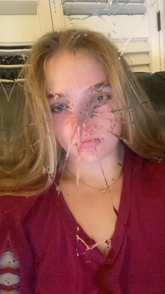
In my daily life, I am fascinated by many things, I am intrigued by how the colors in the sky interact with each other to form a beautiful sunset. Although the sky continues to impress me, what really catches my eye is how green the leaves look after it rains while the sky is overcast with a slightly yellow atmosphere. My self-portrait is me looking into a broken mirror that has shattered because in my self-image I don't see myself and I feel as though one can never really see their true image and only through the lens of others, therefore, the image is broken.
0 notes