
Statistics
We looked inside some of the posts by data-analytical and here's what we found interesting.
Average Info
Notes Per Post
0
Likes Per Post
0
Reblog Per Post
0
Reply Per Post
0
Time Between Posts
7 days
Number of Posts By Type
Text
17
Last Seen Tumblr Blogs


Fun Fact
China blocked Tumblr because of pornography and censorship problems in 2013.
Text
Practice Peer-graded Assignment: Milestone Assignment 3: Preliminary Results
I don't know about you, but I'm pretty much ready for this to be over...
I'm going to post screen shots of my current results here, so you can see I've been working. In the final report, I'll be improving upon the presentation, making sure the layout, wording and all the rest is in good shape. The numbers are all there though, so enjoy...


0 notes
Text
Capstone Milestone Assignment2: Methods
Please note:
After wasting days, ‘massaging’ data and yet more days, trying to get any sort of value out of my National Weather Service (NWS) dataset, I reluctantly decided to abandon it, in favor of my own data. I’ve worked with data for a good 30 years. So far, I’ve been far from impressed with either dataset I’ve used on this course. Either there is not enough data, lengthwise for real comparison, or the data is more a collection of partial, un-related pieces of information. I found the latter to be the case with NWS. It was just a tumbleweed of data. A whole collection of somewhat inconsistent data (with crazy outliers), that adhered to the dataset, as it tumbled around. Perhaps with hindsight, I would have approached the dataset differently. However, having coded an entire solution (that pretty much showed nothing useful), I decided to use some data that I’m more familiar with.
Test Scores
I apologize for being somewhat vague about my dataset. It is real data and has not been modified in any way. Because it is real and part of a somewhat sensitive nature, I have decided to keep the description as simple as possible. There is nothing personally identifiable in it, but out of respect to the provider, I am going to not go into specifics.
Sample
My data is based Test Scores (n=4907) for an exam. It consists of results acquired over a period of 3 years (2019-2021).
Measures
I am interested in what may have influenced test scores. I have decided to consider if any of the following factors could influence them:
Gender (1)– whether the person taking the test was Male or Female.
The takers Standing (2), professionally – i.e. is there anything about them that might have damaged their professional reputation (perhaps they have been in legal trouble, for example).
How many other Different Types of Exam (3), the taker of this exam has undertaken. Some people will be multi-disciplinary and take more than one type of exam.
Whether the person tested was Educated in the US (4), or overseas.
The Day (5) the person tested took the exam. Note, a test is administered multiple times, over several days. Day 3, for example, would be the 3rd day in a testing cycle that the test was administered. It could be a Wednesday, if the exam cycle started on a Monday. If the exam cycle started on a Wednesday, Day 3 would be a Friday. I would like to know if an exam possibly gets easier or harder, the more times it is administered.
The Total Score (6) given to the person tested for their exam.
The Age (7) of the person being tested, at the time of the exam.
The Number of Times (8)the person has taken this test. Note, 1 attempt means the person took the test and either passed (and will never re-take) or failed (and will have to repeat the test).
Analyses
In order to understand the predictors of the Exam Scores response variable, distribution of the explanatory variables were determined by calculating the frequency of categorial variable and mean, standard deviation, minimum and maximum values for the quantitative variables.
Scatter and box plots were created to assist with the analysis.
In order to check the bivariate associations between the explanatory variables and the Scores response variable, Pearson and Analysis of Variance (ANOVA) calculations were also performed upon the Quantitative and Categorical Explanatory variables, respectively.
Predicting the best subset of variables that may predict exam scores was performed by using Lasso regression analysis. A random sample training dataset was employed, consisting of 65% of the overall sample (N=3190), along with the corresponding random sample test dataset (N=1717). Explanatory variables were standardized (with a mean set to 0 and 1 for standard deviation). Finally, K-fold analysis was used to perform cross-validation, with 9 folds specified. Finally, the cross validation mean-squared error deviation identified the best choice of predictor variables. Predictive accuracy was assessed from analyzing the mean-squared error rate from the training prediction results, after applied to the test dataset observations.
0 notes
Text
Milestone Assignment 1: Title and Introduction to the Research Question
I've got to say, I'm struggling these days. I've potentially lost my job, so life is somewhat distracting. It is almost impossible to think about data analysis, when the sky is falling in. It would be easy to just give up and walk away. Can't do it, just yet.
Coming up with questions has been surprising hard for me. There's a million out there, but nothing is clicking, these days. Going to give things a go, however...
Project title: The Associations between Financial Cost and Significant Weather Events in Regional United States
I want to use this study to look for possible factors that influence the financial cost of a weather event, such as a thunderstorm or snowstorm, their duration, etc. This is based on the National Weather Service Storm Event Dataset.
I think it would be interesting to know what are the most significant elements that impact cost. For example, do snowstorms typically cost more than floods? Does a slow-moving event, typically do more damage, financially than a fast-moving one?
I plan on using combined Property/Crop Cost data for my Response variable and will evaluate several others for my predictors, including:
Region
Weather Event Type
Duration of Weather Event
Number of Injuries for an event
Number of Deaths for an event
Knowing the (financial) 'cost' of weather could be very useful to any region that experiences significant weather events, because it may indicate issues with their current weather response procedures, for example. If a hot region suffers from increased amounts of expensive, 'unusual' snowstorms, they may see the need to make greater provision for them, perhaps by purchasing more road salting equipment. This may allow the infrastructure not to collapse and prevent accidents (which increase cost).
Because regions often have different weather systems, they are usually better prepared to deal with their 'own' events. Perhaps a small snowstorm in Florida will be far more expensive financially than a heatwave there. Consequently, I want to categorize states by region, so events and their cost are more normalized.
Of course, the most important cost in any event is the human cost. However, for this study, I remain focused, primarily on dollar amounts, not numbers of people.
0 notes
Text
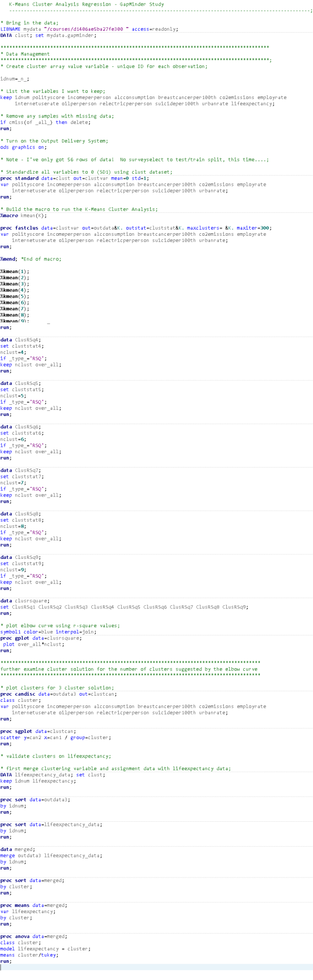
K-Means Cluster Analysis
I really didn't enjoy this assignment. It is so involved and there's so little data in my dataset, it is not a terribly good example of the method in action. Also, the sample script doesn't work out of the box, so it was hard initially, to run and compare. Here goes...
I ran a K-Means Cluster Analysis to look at underlying sub-groups of countries based on their similar responses through the following variables:
polityscore
incomeperperson
alcconsumption
breastcancerper100th
co2emissions
employrate
internetuserate
oilperperson
relectricperperson
suicideper100th
urbanrate
All clustering variables were standardized to have a mean of 0 and a standard deviation of 1.
I did NOT use the SurveySelect Procedure, to split out test/training data, because my initial dataset is only 56 rows (after missing data deletion).
A series of k-means cluster analyses were conducted on the training data specifying k=1-9 clusters, using Euclidean distance. The variance in the clustering variables that was accounted for by the clusters (r-square) was plotted for each of the nine cluster solutions in an elbow curve to provide guidance for choosing the number of clusters to interpret.
Figure 1. Elbow curve of r-square values for the nine cluster solutions.

The elbow curve was very inconclusive, suggesting that the 2, 3, 5 and 6-cluster solutions might be interpreted. Keeping in mind that I have very little data to cluster (so I cannot be certain about anything), I opted to investigate the 3-cluster solution.
I ran Canonical Discriminant Analysis reducing my 11 variables to a more manageable number.
Figure 2. Plot of the first two canonical variables for the clustering variables by cluster. Means procedure.

The lack of data reveals itself in the chart. Cluster 2 only appears to have contained only 2 data points! However, clusters 1 and 3 did show a degree of clustering. Cluster 1 was more densely packed than 3, but clearly, both displayed variance within themselves. Both clusters appeared to be distinct. That said, results could be very different, if I had more data to work with!
Because low amount of observations, I feel that a two cluster analysis would be the most effective in this case. However, because cluster 2 has almost no data within it, I am forced to use 3.
The Clustering Means Analysis on the 3 cluster solution shows the following highlights:
Cluster1
Very low (negative) levels of income, alcoholconsumptionm breastcancer, internetusage, oilperperson, retailelectricperperson and urbanization.
Very high levels of employment.
Cluster2
Omitted - because of the low amount of data in the cluster
Cluster3
Very low (negative) levels of income, alcoholconsumptionm breastcancer, internetusage, oilperperson, retailelectricperperson and urbanization.
Very high levels of incomepeperson, breastcancerper100th, co2 emission, electricity.
Moderate to low levels of political score, alcoholconsumption and suicide.
Figure 3. Means Chart.

Whilst, once again it would be dangerous to draw too many conclusions from such a low dataset, Cluster 3 seems to be a little more comparable to a developed country, perhaps with better medical care (or access to it), which might extend the average persons life.
In order to externally validate the clusters, an Analysis of Variance (ANOVA) was conducting to test for significant differences between the clusters on lifeexpectancy.
Figure 4. ANOVA Chart and tables.
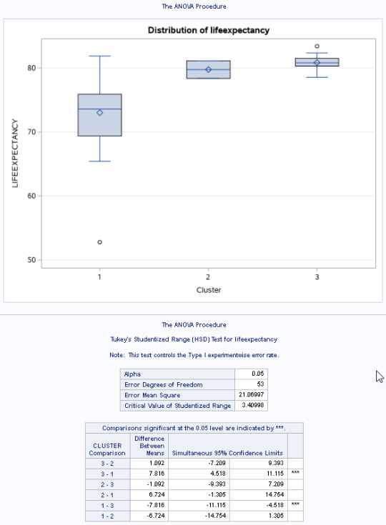
I used a tukey test used for post hoc comparisons between the clusters. Results indicated significant differences between the clusters on lifeexpectancy (F(2, 53)=17.21, p<.0001).
Countries in cluster 3 had the highest lifeexpectancy (mean=2.36, sd=0.78), and cluster 1 had the lowest (mean=2.67, sd=0.76).
Here is the code that I used to produce this analysis...
If I had more data, I could probably use this model with more confidence. Because the model tends to expect uniform and more sizable clusters of data (and my data clearly was not), I would be unhappy making any major decisions, based upon this analysis.
0 notes
Text
Lasso Regression
This was an interesting and short week. Aside from showing a handy technique, it was also a very good example of bad data in, bad data out. Here goes...
I'm going to once again look at Democracy. This is a categorical response variable, generated from the GapMinder dataset. Any value from 0 and up is considered Democratic (1). Any value below 0 is considered Non-Democratic (2). I will use Lasso Regression Analysis, to evaluate the following variables and look for the most suitable ones:
incomeperperson (range 103.77-105147.44, -M. 8740.97, SD=14262.81)
alcconsumption (range 0.05-23.01, -M 6.81, SD =5.11)
armedforcesrate (range 0-9.82, -M 1.38, SD =1.54)
breastcancerper100th (range 3.9-101.1, -M 36.63, SD= 22.78)
co2emissions (range 850666.67-3.34221E+11, -M 6557662166, SD =29477000961)
employrate (range 34.90-83.20, -M 59.21, SD =10.36)
femaleemployrate (range 12.40-83.30, -M 48.07, SD =14.83)
hivrate (range 0.06-25.9, -M 2.00, SD =4.52)
internetuserate (range 0.21-93.28, -M 32.68, SD =27.55)
lifeexpectancy (range 47.79-83.39, -M 68.80, SD =9.97)
oilperperson (range 0.03-12.23, -M 1.38, SD =1.75)
relectricperperson (range 0-11154.76, -M 1111.82, SD =1605.04)
suicideper100th (range 0.20-35.75, -M 10.02, SD =6.34)
urbanrate (range 10.4-100, -M 55.11, SD =22.41)
Partitioning
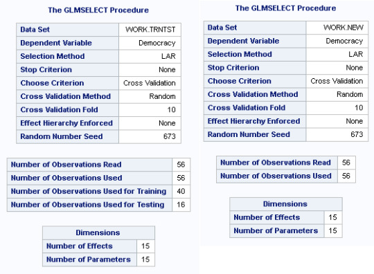
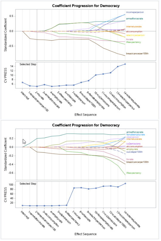
I've not been a fan of the GapMinder dataset. Aside from it being not terribly well-related, it also lacks sample data. There's only so many countries in the world. Once you exclude those that are missing data, you have have a very small sample set. Clearly, this is extremely limiting. I wrote code (see below) to run, both with and without Train/Test partitioning. In theory, if both samples are a good mix of data, all results should be roughly the same. That was not quite the case.
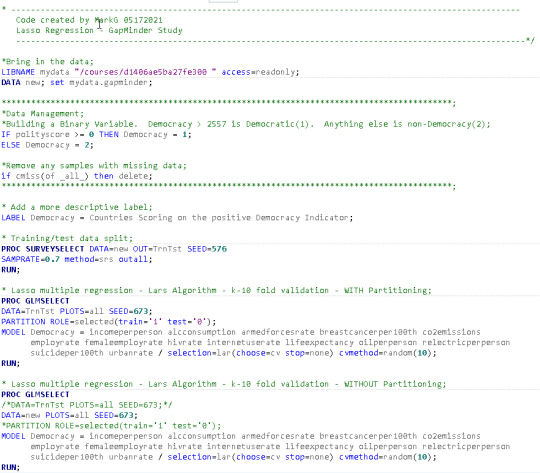
The code above shows both versions of the GLMSELECT model being executed, both with and without partitioning (Note all charts below will show partitioning examples first, or to the left of any chart where no partitioning was used).
Straight off the bat, we can see that partitioning limits us to only 40 records training/16 testing. Non-partitioning will work with the entire 56 sample. Either way, the numbers are pretty limiting and potentially biased.
The Lar Selection Summary is interesting because we get different results, depending upon, whether we partition or not. Partitioned, hivrate is the optimal Criterion variable. Non-partitioned, we see breastcancerper100th is optimal (and hivrate, falls to number 7 in popularity). This suggests that when you work with very limited sized datasets, a few extra rows can quickly change model results. This also means, it is very easy to over-fit a model, too.

The Coefficient Progression for Democracy charts and CV Press charts, again, show a difference. Clearly breastcancer has a negative influence upon Democracy (perhaps suggesting democratic countries tend to have better healthcare), but add in a little more data (the non-partitioned chart, below the first two charts), and life expectancy becomes far more pronounced an influencer? Is this true or is it simply that non-democratic countries are less willing to publish personal wealth data, so they are barely even included in the modal at all?
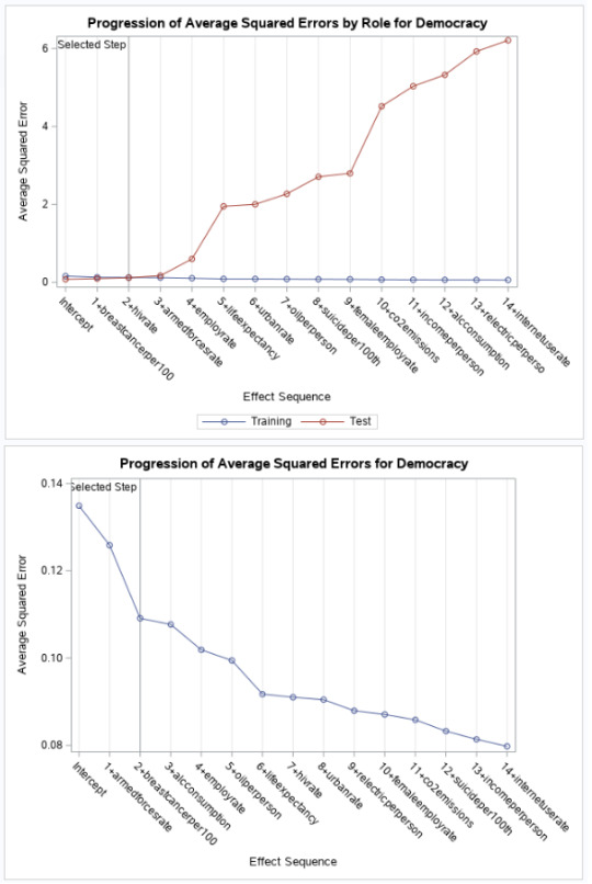
You might be forgiven that thinking the following ASE charts could be showing results for completely different sets of variables and data - they are so different, for partitioned/non-partitioned models. Test data increases to a squared error (starting at c.0 and increasing to a max of c.6), the more variables that a added to the model. In contrast, with a full sample, the ASE drops (starts at c.14 and drops to c.0.8). Very confusing - if you didn't know, you were working with such limited data.
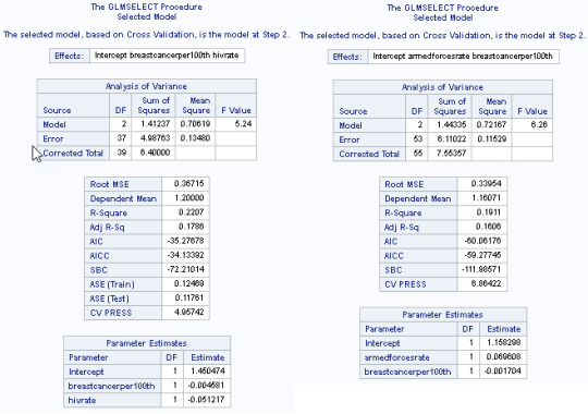
Finally, we get to look at the regression coefficients for the two different modals. With partitioning, breastcancerper100th (-.004) and hivrate (-.05) are the key indicating variables for Democracy. Without Democracy, armedforcesrate (0.69) and then breastcancerper100th (-0.001) rise to the top. I'm surprised to see ASE(Train) - 012 and ASE (Test) - 0.11 be quite as close to each other (seeing as the data as a whole generates different results).
Summary
This exercise has served as a warning for any statistical modelling approach. Bad decisions are often made, based on bad information. Results have differed here, based upon the presence of only a small amount of additional sample data. Surely, a statistic such as how long a leader has governed a country is a far more suitable variable than if a country has an army or does NOT have breast cancer. I hope that is the case, at least.
0 notes
Text
Run a Random Forest.
This was one of the easier assignments. I guess the previous assignment laid down all of the concepts. This was really just an extension of it all in many regards. Here goes...
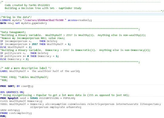
I'm going to look at Democratic countries - that is, countries that have a positive value on the democracy scale. I have turned this into a two-level quantitative variable (Democratic = 1, otherwise 2), called Democracy. I will use pretty much every variable in the Gapminder data set and use a Random Forest, to evaluate the most important variables that help predict the binary categorical response variable.
alcconsumption (range 0.05-23.01, -M 6.81, SD =5.11)
armedforcesrate (range 0-9.82, -M 1.38, SD =1.54)
breastcancerper100th (range 3.9-101.1, -M 36.63, SD= 22.78)
co2emissions (range 850666.67-3.34221E+11, -M 6557662166, SD =29477000961)
employrate (range 34.90-83.20, -M 59.21, SD =10.36)
femaleemployrate (range 12.40-83.30, -M 48.07, SD =14.83)
hivrate (range 0.06-25.9, -M 2.00, SD =4.52)
internetuserate (range 0.21-93.28, -M 32.68, SD =27.55)
lifeexpectancy (range 47.79-83.39, -M 68.80, SD =9.97)
oilperperson (range 0.03-12.23, -M 1.38, SD =1.75)
relectricperperson (range 0-11154.76, -M 1111.82, SD =1605.04)
suicideper100th (range 0.20-35.75, -M 10.02, SD =6.34)
urbanrate (range 10.4-100, -M 55.11, SD =22.41)
Here is the code that I used for my model...
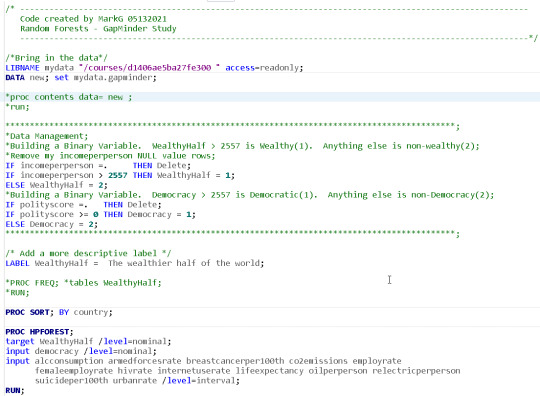
155 countries were observed, using the 60%/40% sample to bag fraction of training observations/prune split. A maximum of 100 trees were grown for the model...
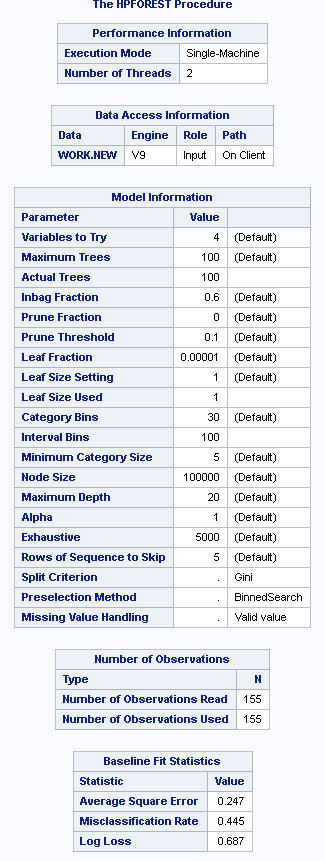
Based upon the Classification rate (100%-44.5%), the accuracy of the random forest of 55.5%, suggests that the growing of a random forest did not add to the accuracy of the overal model. This suggests that the variables are not terribly influencial upon the reponse variable and a single decision tree may well as be as effective.
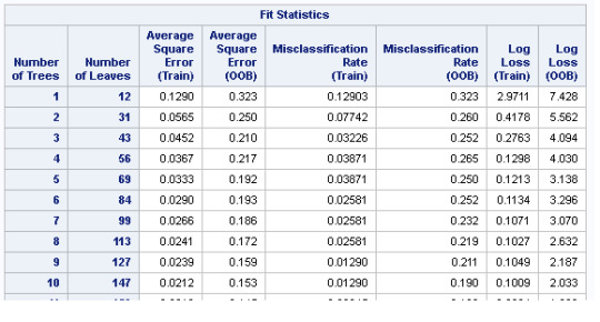
The misclassification rate (test v. training) was relatively comparible for the best fitting Statistics. However, after the 15th best comparative statistic, the training misclasffication for training dropped to 0, which Out of the Box misclassification remained at c.16%
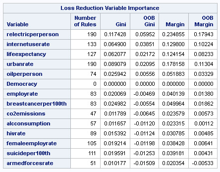
The Loss Reduction Variable Importance matrix, suggest to me that only the relecticperperson stands out as being an influence on the response variable. Its margin (test/OOB) of 23/17% is close to double the value of the variables that follow (such as internetusage rate 12/10, lifeexpectancy 12/8%).
I've repeatedly suggested that the GapMinder dataset, is more a selection of interesting data, than a collection of closely-related set of 'facts'. This model adds a little more weight behind that argument. Whilst there is some sensitivity between the variables, there is little evidence, that variable x (or several variables) can indicate wealth for a county. This could be because there is no indication of a countries size, so it's influence upon the dataset can easily skew the findings.
0 notes
Text
Running a Classification Tree
I thought I was going to like this assignment. Seemed fairly simple. I ended up wasting a ton of time playing with variables. Most of my findings seemed to result in two layer trees. After a while, I thought about the data. I was looking at many explanatory variables. I remembered that some values in each GapMinder field are incomplete. Multiply that by most of the fields I used as variables and that will mean that most countries will likely have at least one missing value...and therefore be excluded from the model! That would cause my stunted tree! I got around the issue using the ASSIGNMISSING=POPULAR parameter...
Response (target) variable = WealthyHalf - Binary categorical variable.
1 = Upper 50% of the countries with any recorded wealth.
2 = Lower 50% of the countries with any recorded wealth.
I assigned the random seed variable of 53541 and a number of other values. I did not observe any change in the results of the model.
I used a number of explanatory variables as described below:
Democracy - 2-level categorial. Positive democratical score = 1. Everything else = 2.
alcconsumption - quantitative.
co2emissions - quantitative.
relectricperperson - quantitative.
internetuserate - quantitative.
lifeexpectancy - quantitative.
oilperperson - quantitative.
employrate - quantitative.
urbanrate - quantitative.
Here is the code that I used for the model...
Because I used the the POPULAR parameter for AssignMissing, the number of observations read/used was 155/155. My tree was reduced from a maximum of 8 depth to 4 and from 21 to 7 leaves, after pruning. looking for the Model Event Level of 1 (Wealthy).
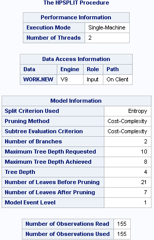
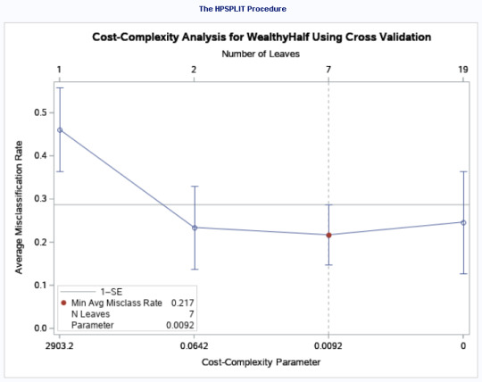
The Plot of the Cross-validated Average Standard Error (ASE) showed a minimum average Misclass rate of 0.217 and the number of leaves as 7.
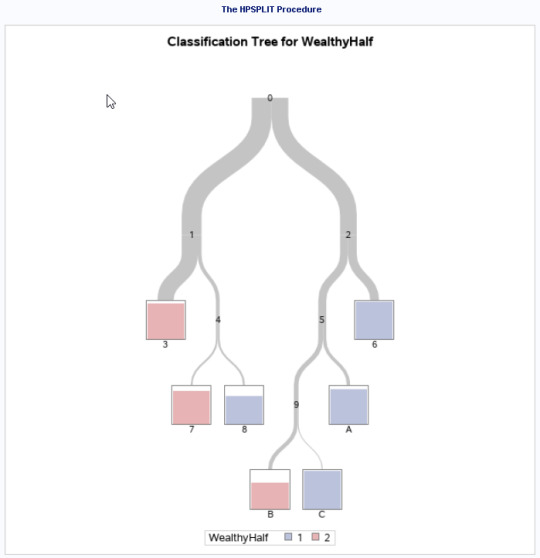
Here is the classification Tree for the model (pre-pruned)...
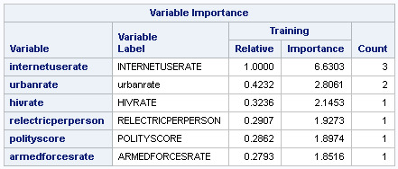
The sub-tree chart (below) shows splits on:
InternetUseRate
RetailElectricPerpPerson
InternetUseRate (used for 2 different node splits)
AlcoholConsumption
Urban Rate
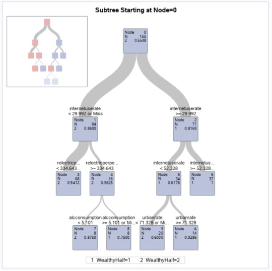
The InternetUseRate was the first variable to separate the sample into two subgroups. Countries with a usage rate greater 29.99 (range 0-93.27 -M 32.68, SD=27.55) were more likely to be 'wealthy' compared to those with a lower usage rate. Interestingly, the InternetUseRate was again used to split on values of < 52.38 and above. If below 52.38, there was a further split, based up on UrbanRate (range 10.4-100 -M 55.10, SD=22.40). You could come from a 'mid' internetusagerate, which might have suggested a poorer country, but being scoring more than 71 in urbanization would override this factor and indicate it would be a wealthier country.
The HPSPLIT procedure showed a rate of:
Value of 1 (wealthy) = 1-.14 = 86% - Those who came from a wealthy country and were correctly classified
Value of 2 (non-wealthy) = 1-.03 = 96% - Those who do NOT come from a wealthy country and were correctly classified
We are slightly better able to predict a non-wealthy country because the error rate was lower for the value 2
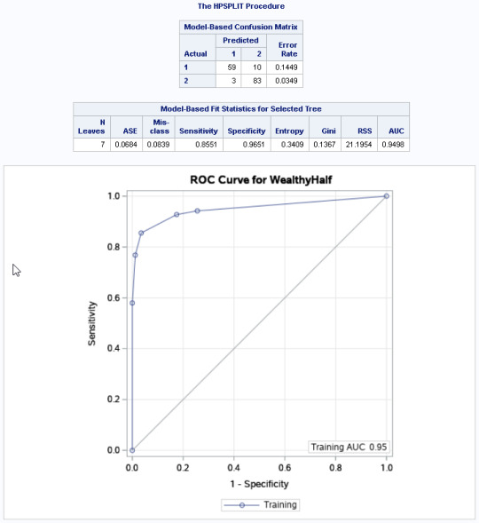
We have a Training Receiver Operator Characteristic Code of .95.
Looking at the Variable Importance Table, we can see that InternetUseRate was considered the most important variable, but all the other variables were very close to each other c. (0.24-.35 in value). All of these values were used as decision nodes however.
Once again, I suspect the results would have been a little more exciting, were the different variables in the GapMinder dataset, at little closer-related.
0 notes
Text
Test a Logistic Regression Model
This week, I'm happy. It feels like last week had a ton of concepts to take in. It over-loaded me. This week, I was able to absorb everything a lot easier. The assignment seems to be a LOT shorter than last weeks. I'm quite happy with that. Here we go...
Here is the code for this weeks assignment...

Because the GapMinder study is entirely quantitative, I've had to manage the data a little. I have decided to look at the 2009 Democracy store (polityscore) and split the data into a binary categorical (called Non-Democracy). Any values < 0 will be viewed as 'non-democratic' and get a value of '1'. Values equal to or above 0 will receive a value of '0'. The 52 countries with NULL values will be left out of the model.
Hypothesis: Non-Democratic Countries/Life Expectancy
H0 - There is no relationship between Non-Democratic Countries (binary categorical response) and Life Expectancy (quantitative explanatory)
Ha - The NULL hypothesis is disproven.
Aside from using the explanatory variable LifeExpectancy, I added several others:
armedforcesrate
relectricperperson
internetuserate
All of these are quantitative. The results from the model can be seen below...
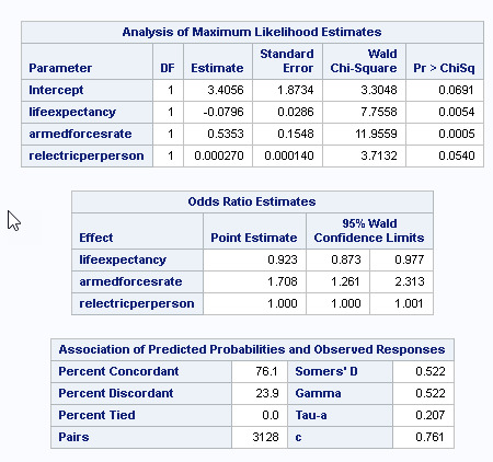
Upon adding internetuserate, I saw a change in the p-value results of the model. Please see adjusted results (below)...

The observed impact of adding the internetuserate was that Lifeexpectancy (which had a significant negative influence, with a p-value of 0.0054), changed to a statistically insignificant p-value of 0.0623. relectricperperson(which had a insignificant positive inlfluence, with a p-value of 0.054), changed to a statistically significant p-value of 0.0187 The other variables were also impacted, but remained significant. I would suggest that internetuserate is a confounding variable in this model.
After adjusting for potential confounding variables (internetuserate), the odds of being a non-democratic country were more than 1.6 times higher for countries with higher armed forces rates, than countries with lower armed force rates (OR=0.47, 95% CI = 1.176-2.21581, p=.0030).
Relectricperperson was also significantly associated with non-Democracy, with a very slim positive influence (after controlling for other variables (OR= 0.00049, 95% CI=1.0-1.01, p=.018). Internetuserate (OR= -0.035, 95% CI=0.96-0.98, p=.018) had a significant, but slight negative influence on the Non-Democracy variable, suggesting that after controlling for the other variables, an increase in internetusage, slightly reduced the odds of a country being non-democratic.
Because of the presence of the confounding internetusagerate variable, I cannot reject the null hypothesis.
0 notes
Text
Test a Multiple Regression Model
This week had a little too much information for me to fully take in. Very interesting. However, I wish I had a month to absorb it all. Once again, I think things would have been easier/more enjoyable, if the GapMinder data wasn't so poorly related, in general, Maybe I should have broken the data into smaller datasets, such as bottom 20 highest income countries, or something? Here goes though...
Hypothesis: Life Expectancy/Urban Rate
H0 - There is no relationship between Life Expectancy (quantitative response) and Urban Rate (quantitative explanatory)
Ha - The NULL hypothesis is disproven.
In addition to this, I will see if incomeperperson (quantitative explanatory), suicideper100th (quantitative explanatory), employrate (quantitative explanatory) also influence/confound LifeExpectancy.
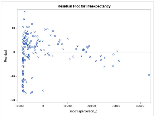
Looking at my scattergraphs, it suggests that more a curvilinear line than a straight line best fits my data. Even then, there are enough data points away from the line to suggest I there are issues with my model fit.

I centered my variables...
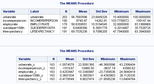
After running the GLM Model, we can see that 3 explanatory variables have statistically significant p-values lower than .05.

Two have positive estimates and one lower, suggesting that having a higher employment rate can have a negative impact upon Life Expectancy.
Having a higher income or higher incidents of higher income is associated with having a greater life expectancy. The same applies with income per person.
As often is the case with the GapMinder study, data is not terribly well-associated with each other. For example, even though there's a significant relationship between UrbanRate and LifeExpectency, there's a only a 95% chance that age will be influenced between .09 and 0.225 by the presence of Urbanization, after controlling for EmploymentRate and IncomePerPerson.
Variables were added, one by one. No variable appeared to be confounding, because I noticed no significant change in p-values, each time one was added.
R-Square was 53%, suggesting perhaps there are better variables out there that would to work with the explanatory variable better.
A Polynomial analysis didn't offer much better of a fit...

Looking at residuals, we have an intercept of c. 70. This is the rate of Lifeexpectancy at the mean of all the centered variables. I think that the urbanrate_c2 having a pvalue of .186, perhaps suggests we do not gain by using a polynomial regression model.
At this point, I decided to unpack the GLM model to look at the multiple regression output in more detail. I also ran the Reg model to see the Standardized Residual.

Most of our residuals fall within 1 Standard Deviation of the Mean.
Q-Q Plots
LifeExpectency - Suggests that the curvilinear association from our scatter plot might not be fully estimated by the quadratic urban rate term. The fit is not good, especially in the higher and lower boundaries.

Because of the low R2 value and the poor fit on the Q-Q plot, I suspect we are missing additional explanatory variables, that would better explain the curvilinear shape of this model.

There are not many extreme outliers visible from the chart. However, we do have a number of values, close to the 2.5 deviation, again, suggesting the fit of our model isn't good. There are likely variables missing that might explain the response variable better.
Residual Plots
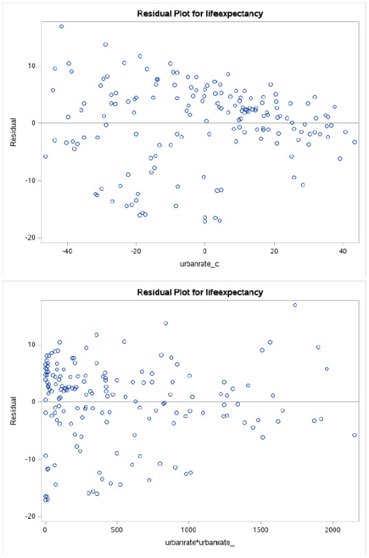
Once again, visually, all 3 charts suggest we have problems with the fit of our model. Only the Urban Rate plot tends to show some sort of fit, in the higher boundaries.
This is the code that I ran for the exercise...
Summary
I tried looking at many more variables listed here to look for good multiple regression material. I didn't find them. This is not too big a surprise, considering GapMinder seems to have data for variables that don't really look like they relate to each other, BEFORE you even start analyzing them. This is perhaps due to the extreme ranges of values in a lot of cases. I would argue the biggest problem is that the primary variable is country. A country is not like a person, in that most people have two arms and two legs and fall within a smallish range of weight/height parameters. A country could be an island of 100 people or 1 billion. That will often profoundly impact the results of the other variables.
In my case, it was pretty clear that whilst there is a significant relationship between all the explanatory variables that I selected and LifeExpectancy, the impact, positive or negative of each one, is extremely minor in influencing Life Expectancy.
0 notes
Text
Testing a Basic Linear Regression Model
Interesting week. Learning a lot. Still, not enjoying the Gapminder data, because it is a little too varied and unrelated. However, I'm ready to rock...
I decided to change my hypothesis, this week. When I looked at the scattergraph for my original data (income v. life expectancy), I could see the data was heteroscedastic, so perhaps not the best to use. As a consequence, I've switched to the following hypothesis:
Hypothesis: Alcohol Consumption/Suicide
H0 - There is no relationship between Alcohol Consumption (explanatory) /Suicide (Response).
Ha - The NULL hypothesis is disproven.
Both variables are quantitative, so I needed to find the mean of the explanatory variable and deduct it from the explanatory variable to center the values.
The mean of Alcohol Consumption was calculated to be 6.689.

Here is the code that I later ran, using the adjusted Alcohol variable.
The new mean chart shows the mean to be just about 0, showing that the explanatory variable has been removed from the regression.

The associated scattergraph and linear regression line appears to show a positive linear relationship. There are a number of outliers but most of the data is homoscedastic.

The Linear regression test shows an F value of 26.33 and a P value of <0.001, suggesting we can reject the null hypothesis - Alcohol Consumption is significantly associated with suicide.
The R-Square value is 0.12, telling us that this model accounts for about 12% of the variability that we see in our response variable.
The P-Value for alcohol consumption is <0.0001. The beta sub zero value was 9.59, with the beta sub one value of 0.45.
Just for fun, I've decided to try and calculate the value for the Suicide rate, if we an an alcohol consumption amount of 20 liters per person.
Using the following equation:
This translates to:
SuicideRate = 9.59 + (0.45 x 20) = 18.59 suicides per 100k
0 notes
Text
Regression Modeling in Practice - Week 1 Assignments
1. My Sample
My study population was centered around a Gapminder dataset, consisting of approximately 213 countries. Various data was provided for most countries for a single given year. I was particularly interested in the following areas:
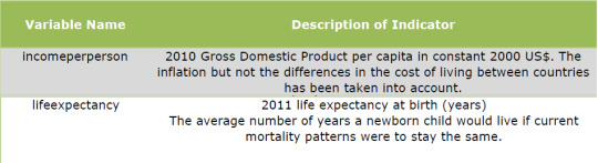
Source: GapMinder Codebook.pdf
I worked mostly, grouping the data to see if there were patterns of relationship.
The Gapminder data is free to use. It is FREE DATA FROM WORLD BANK VIA GAPMINDER.ORG, CC-BY LICENSE
- https://www.gapminder.org/
Step 2 - Sources
The incomepersperson data that I am using under the Gapminder banner, comes from the World Bank (https://databank.worldbank.org/home.aspx). Thee bank maintains a very large repository of world socio-economic statistics. These in-turn, have been sourced from numerous locations, including government agencies and various international bodies. The World Bank confirms this:
"Much of the data comes from the statistical systems of member countries, and the quality of global data depends on how well these national systems perform."
- Source: Worldbank website
The data for this variable was compiled for the year 2010.
For the lifeexpectancy data, the Gapminder codebook sites the following sources:
1. Human Mortality Database,
2. World Population Prospects:
3. Publications and files by history prof. James C Riley
4. Human Lifetable Database
The data for this variable was compiled for the year 2011
Step 3 - Variables
For most of my prior assignments, I worked around a hypothesis that there was a relationship between LifeExpectancy and IncomePerPerson. All the data was based on values provided, per country.
LifeExpectancy - 191 values ranging from c. 47-84 years of age.
IncomePerPerson - 190 values, ranging from c. $103-$106,000 per anum.
Issues with the variables:
Type - Both incomeperperson and lifeexpectancy are quantitative variables. That is great for Pearson testing. In order to work with other types of analysis, however, I regularly had to convert the data into quantitative variables. On top of that, values ranged a great deal, especially from the income perspective. To get around this, I created my own variable called IncomeRange, placing the data into 4 categories, for example.
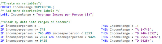
I formatted and labelled the variable, as you can see. I also used "A-B-C-D" as part of the variable value. I found that during processing, SAS would order the values alphabetically. Labelling this way displayed the data in a logical order and made the data more manageable. I had to do the same thing with life expectancy.
Missing Data - Not all of the countries listed, could provide data for my variables. One may perhaps presume this was because the country was too small to keep such data. However, if a large industrial nation did not provide data, we might make miss out on some important numbers.
In order to remove missing rows from the analysis, I set my IncomeRange variable to "." for those.
Size of a Country - It is quite likely that Country size (physical and/or population) could have a significant confounding effect on my findings. If there are 500 sovereign islands, each with 5 people on them and 10 large countries, each with 1 billion inhabitants, all my results would be seriously skewed, if each island was treated the same as a large country.
This whole exercise has shown me that you can make some very powerful conclusions with data. However, you can also get it very wrong, if you don't know and/or trust your data. Also, you need to understand that there can be seriously impactful confounding variables, out there, to make you look foolish, should you not show those the respect that they deserve.
0 notes
Text
Data Analysis - Week 4 - Statistical Interactions
This is probably the most interesting week so far. It highlights just how easy it can be to make complete conclusions based upon incomplete data. At work, last week, I was shown a chart (Developer v. tickets completed), implying how some people worked a lot harder than others. I'd just completed watching week 4 videos, so moderating variables were fresh in my mind. "Where's data for how many hours each developer actually worked? How do we know how hard each ticket was? According to the chart, our best developer did the least work. He does the hardest tickets and spends most of his days (when he is not in meetings or managing the team!), helping the other developers. A few moderating variables would likely help paint an entirely different picture...
I'm a little disappointed, doing this assignment. Over the past 8 weeks, I've become pretty familiar with the GapMinder data. It isn't bad, but there's not a lot of smoking guns in it. Most of the variables are too dissimilar to have strong relationships. A moderating variable has even less chance of showing an influence. That said, this is about the process. I'm not trying to prove anything per se, only that statistical analysis will allow me to do so.
Here goes...
I did an ANOVA analysis looking at Population Density (Low/Medium/High) compared to Life Expectancy.
Hypothesis: Population/Longevity
H0 - There is no relationship between population density and life expectancy.
Ha - The NULL hypothesis is disproven.
My explanatory variable is UrbanPercent. This is categorical. My Response variable is lifeExpectancy - also categorical.
Here is my code...

Results...

The results suggest there is a significant relationship between population density and life expectancy. With a P value of <.0001, we can reject the null hypothesis. This MIGHT suggest that the more dense the population, the longer you live. Whilst this MIGHT be true, I can think of examples where it is not the case at all. Shanty towns surrounding big cities, for example, have high crime, little to no health care and terrible sanitary conditions. I seriously doubt that people in these dwellings enjoy a particularly high life-span. Adding even more population will likely make matters worse!
A little Moderation...
I suspect that there are a number of factors that are associated with denser populations that could also influence longevity. Well-developed cities may have better medical facilities, for example. Certainly people in the city proper, will have access to better hospitals. Also, people that live in cities tend to enjoy higher incomes. Perhaps income has a moderating effect on my original hypothesis?
To make this relatively simple, I've categorized my income data into Low/Medium/High Income levels. This is probably not ideal, but it simplifies the results somewhat. Here's the code...

The code produced some potentially interesting results. Here are a the ANOVA moderating results, based upon High, Medium and Low income...

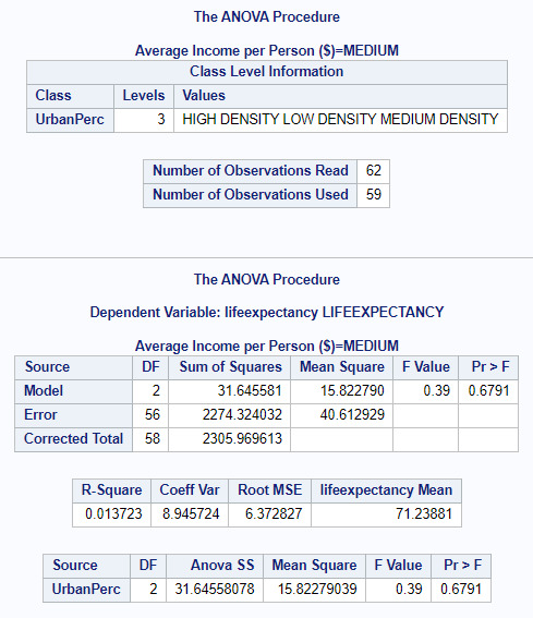
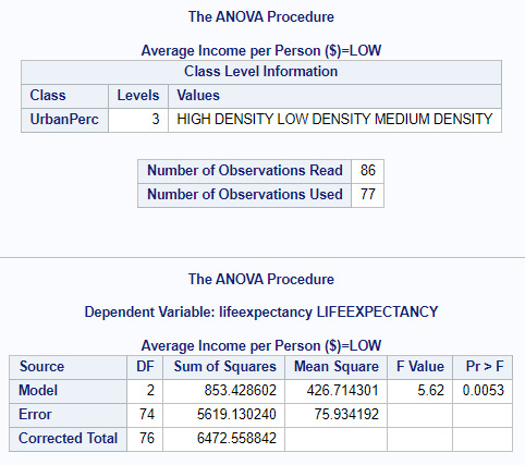
Both High and Low Incomes seem to have significant p values (<.0001, 0.0053) with Medium scoring 0.6791. I believe that this suggests that income influences the relation between Urban Population and Life Expectancy, where people tend to earn either the least amount of money or the most. If you live in a shanty town AND are poor, you certainly will suffer a shorter life expectancy, compared to someone who lives in a city and has wealth, perhaps to pay for better food and medication.
0 notes
Text
Data Analysis Tools - Week 3 - Pearson Correlation
Seems that this week allows us to take a bit of a breather!
We are going to calculate a Pearson Correlation Coefficient to perform statistical correlation analysis of two quantitative variables. Because this is a pretty simple calculation and all of my data is already quantitative, I think that I will perform two tests.
Hypothesis 1
Income/Longevity
H0 - There is no relationship between income and longevity.
Ha - The NULL hypothesis is disproven.
My explanatory variable is incomeperperson This is quantitative. My Response variable is lifeexpectancy - also quantitative.
Hypothesis 2 (Please note I expect this one to fail really. The purpose is to see some contrasting results)
InternetUsageRate/Suicideper100Thousand
H0 - There is no relationship between intenetusage and suicide.
Ha - The NULL hypothesis is disproven.
My explanatory variable is internetusagerate. This is quantitative. My Response variable is suicideper100TH - also quantitative.
Here is my code...

Hypothesis 1 - Results...

The analysis shows that there is a Pearson value (r) of 0.60152 and p value of <0.001. This indicates statistical significance and a positive relationship. Using r-squared (0.60152*0.60152=0.36182), If we know income we can predict 36% of the variability we can see in the rate of life expectancy.
The scatter chart suggests somewhat of a linear relationship between both variables. In this case, I would reject the NULL hypothesis and suggest the significant relationship between income and life expectancy is NOT a result of chance.
Hypothesis 2 - Results...

The analysis shows that there is a Pearson value (r) of 0.06872. Whilst this indicates a very slight positive relationship, the p-value of 0.3634 tells is that there is no significance. Using r-squared (0.06872*0.06872=0.005) If we know income we can predict < 1% of the variability we can see in the rate of suicide.
The scatter chart suggests that the non-significant numbers are right. Results seem to be utterly scattered with no discernable pattern of distribution. Based upon this, I would accept that NULL hypothesis.
0 notes
Text
Data Analysis Tools - Week 2 - Chi Square
Interesting Week. This has been more about understanding another mechanism for looking for variable significance, rather having to understand new concepts. Thank goodness!
I am using the GAPMINDER study. All of the data within is quantitative, which is totally the opposite from what you need with Chi-squared (categorical v. categorical). I'm going to categorize Income and Life expectancy. I reduced my number of categories slightly, just to decrease the amount of Post hoc tests needed.
My hypothesis is:
Income/Longevity
H0 - There is no relationship between income and longevity.
Ha - The NULL hypothesis is disproven.
Here is the code that I have written:
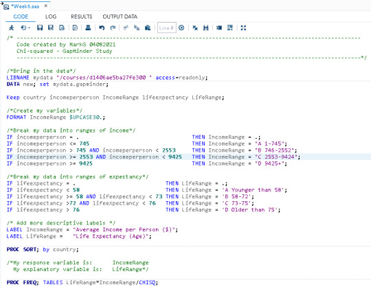
My explantory variable is IncomeRange. This is categorical, at 4 levels. My Response variable is LifeRage - also categorical, at 4 levels.
Here are the results from my code:
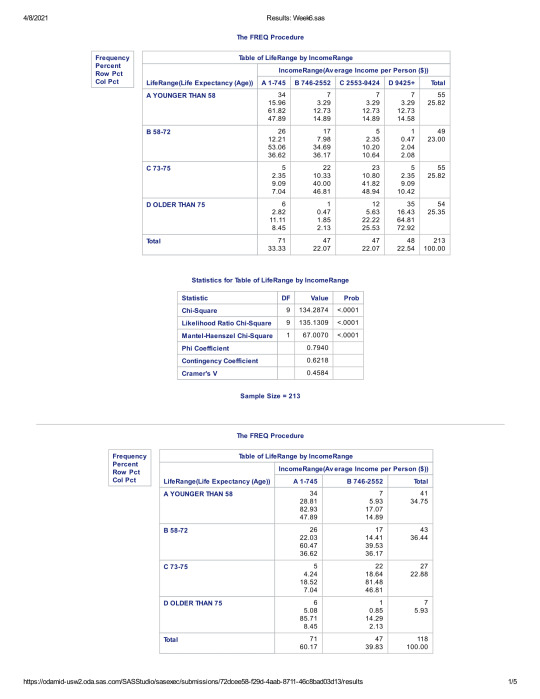
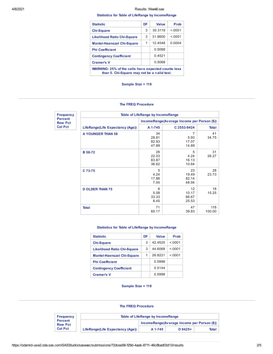
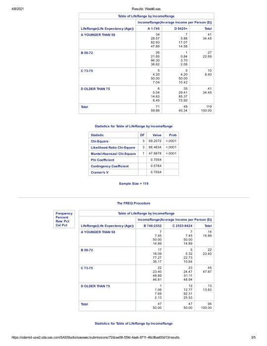

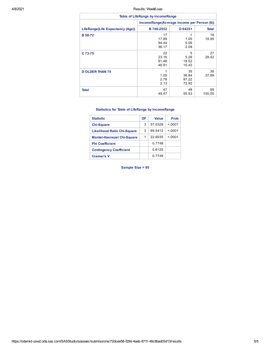
The initial chi square result had a p-value of less than .05, suggesting that there was statistical significance between Income and Life Expectancy.
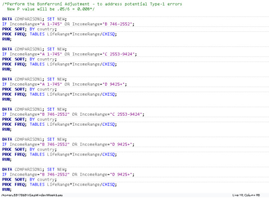
In order to reduce the risk of type-one errors, however, I also ran the Bonferroni Adjustment, to see if we had any examples of a p-score being higher than the adjusted .008 rate. Once again, all 6 cross-categorical p-scores were still below the .008 rate. This suggests that no categorical group stands out that suggests there is not a statistical relationship between Income and Life expectancy.
Based on the information presented in my findings, I suggest that we can safely reject the NULL hypothesis. There appears to be a significant relationship between Income and Life Expectancy.
0 notes
Text
Data Analysis Tools - Week 1 - ANOVA
This week hurt. I'm good at breaking down data. I'm not good with statistics! Now that we are getting into Inferential Statistics, things are getting a lot harder. I'm seeing equations and a lot of 'magic'. Just trust the program! I don't. I don't even trust the data! I guess this is all part of the process...
There is an issue with my data types. I am using the Gapminder study. This is almost entirely quantitative. As a consequence, I will be converting the income variable into 4 ranges of income Categorical data. I will use this data to see if there is a relationship between income and life expectancy. I will also attempt to see if there is a relationship between income and suicide. Because there are more than 2 categorical ranges of income, I will use the Duncan post hoc test.
My hypothesis' are as follows:
1. Income/Longevity
H0 - There is no relationship between income and longevity.
Ha - The NULL hypothesis is disproven.
2. Income/Suicide
H0 - There is no relationship between income and suicide rate.
Ha - The NULL hypothesis is disproven.
Here is the code that I am using for both:
Results from Income/Longevity:

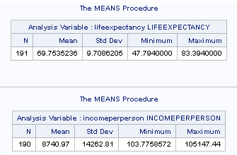
When examining the association between Life Expectancy (quantitative response) and Income (categorical explanatory), an analysis of variance (ANOVA) suggested that there is an F value of 58.56 with a P value of less than .0001. Mean life expectancy is 69.75352. Therefore, I can safely reject the NULL hypothesis and suggest that there IS a relationship between income and life expectancy.

The Duncan chart suggests that the two mid groups of my 4 categories (746-2553 and 2554-9424) are not significantly different from each other. In essence, I believe the chart indicates that the very wealthy live significantly longer than the other groups and the poorest people live significantly shorter lifespans.
Results from Income/Suicide:

When examining the association between Suicide per 100 thousand (quantitative repsonse) and Income (categorical explanatory), an analysis of variance (ANOVA) suggested that there is an F value of 0.71 with a P value of less than .5448. Therefore, I cannot reject the NULL hypothesis. Contrary to the previous hypothesis, it is quite likely that there is no relationship between suicide and income.
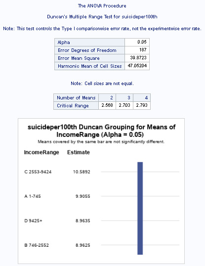
The Duncan chart appears to support the NULL hypothesis. All 4 groups are covered by the same bar, suggesting that there is no significant difference between any of the groups.
0 notes
Text
Week 4 Assignment - Graphs
I used PROC UNIVARIATE to look at the distribution of data. Most of my data was already broken into smaller groups, quite well. Regardless, I changed my IncomeRange variable to try using a 25% split.
I had issues with my IF/ELSEIF statements. I re-wrote each variable to just use IF.
My 3 main variables are based on the GAPMinder study. They are:
-incomeperperson
-lifeexpecttancy
-suicideper100th
I had issues with producing graphs. 2 problems:
- Width=30. The app said it could not handle this width. I adjusted to 15.
- Each chart would display itself twice. I used the word QUIT after the charting to prevent that.
Here's my code that I used to produce my output...
This code produced the following output:
Univariate chart of Income:
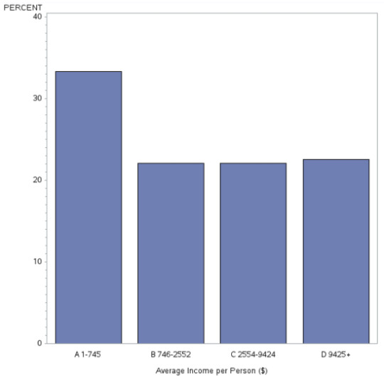
This chart is unimodal. Distribution is fairly even, except for the higher frequency in the lower 25% of income. This suggests that the more people earn the lowest amount of money than in each other quartile.
Univariate chart of Life Expectancy:

This graph is unimodal, with its highest peak at the 70-79 years of age range. It seems slightly skewed to the left as there are lower frequencies in the higher categories than the lower ones.
Univariate chart of Suicides:
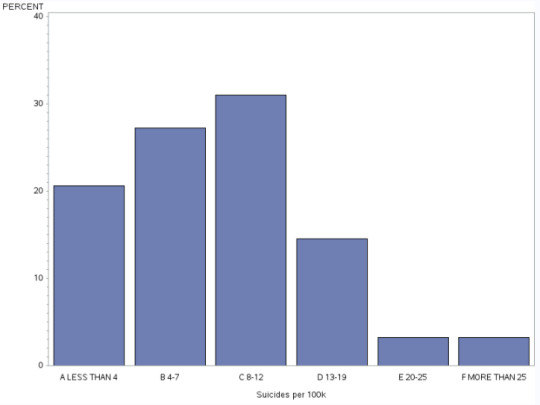
This graph is unimodal, with the highest peak at 8-12 suicides per 100k people. The data skews to the right as suicides decline to the right from the 13+ number onwards.
Bivariate chart of Suicideper100Th to Income per Person

This graph plots the relationship between Suicides and IncomePerPerson. Whilst the data is relatively concentrated, there does not seems to be a clear relationship between the two variables.
Bivariate chart of LifeExpectancy to Income Per person
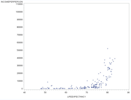
This graph plots the relationship between Income and the impact upon Life Expectancy. The graph seems to suggest that people that live beyond 72 in age, tend to have the higher incomes, perhaps suggesting they can afford a healthier lifestyle and have access to higher quality health care.
0 notes
Text
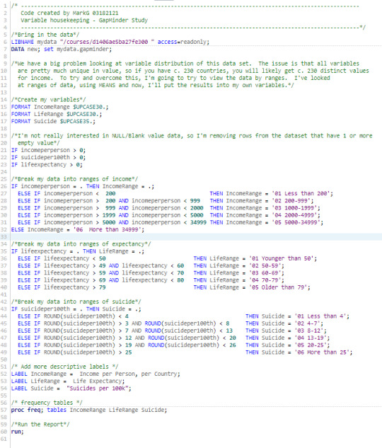
Week 3 - Data Management
This has been a weird week for me. Because of the nature of my data, it is pretty useless, without data management. I did a lot of it last week, without realizing it.
This week, I've collapsed my 3rd variable, (as well as round off the values). I also decided that any row that didn't have all 3 variable values needed to be excluded from my data set.
All of my variables are collapsed, because there are too many distinct values in each, to be meaningful. I created my own variables, named IncomeRange, LifeRange and Suicide.
Here's the code that I've written...
I printed the results of the data, using PROC PRINT; Here's a sample...

The code produces 3 sets of output - each containing the same count of 170.
Here's the data analysis...

Looking at my Results, I can derive the following conclusions:
Income per person, per Country
Using IncomeRange, I can see the majority of the data is in the 200-999 range. There are small extremes at either end of the financial spectrum, however.
Life Expectancy
Using LifeRange, it appears that more people live to between 70-79 years of age, that other categories.
Suicides
Using Suicide, it appears that the most common range of suicides, per country is around 8-12 per 1000 people.
0 notes