
Statistics
We looked inside some of the posts by davidcampiti and here's what we found interesting.
Average Info
Notes Per Post
19
Likes Per Post
12
Reblog Per Post
7
Reply Per Post
0
Time Between Posts
1 month
Number of Posts By Type
Text
17
Last Seen Tumblr Blogs


Fun Fact
Tumblr has a 66 index score for customer satisfaction in the US.
Text
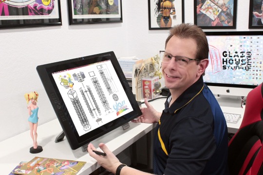
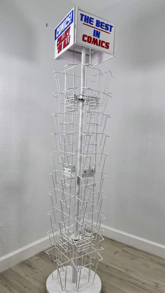
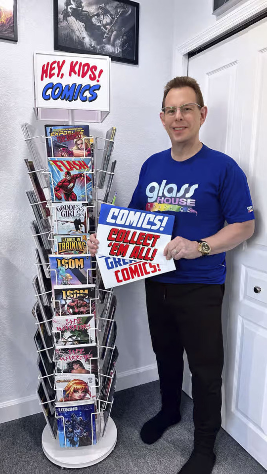
GLASS HOUSE GRAPHICS OFFERS
CLASSIC COMIC BOOK SPINNER RACKS
David Campiti of Glass House Graphics is offering a new 40-pocket comic spinner rack that disassembles and can be transported to conventions in a wheeled carrying case. The new design, currently on Kickstarter, is approximately 70" high on a 12-inch footprint. It features wide pockets over seven inches wide, which can hold bagged-and-boarded comics and graphic novels up to Golden Age size.
The comic spinner is available in white or black, with four topper graphics: two each of "COMICS! COLLECT 'EM ALL!" and "THE BEST IN COMICS."
Because the racks can be disassembled for shipping, delivery costs have been eliminated for U.S. backers, and are included in the $399 price ($379 for early bird orders). Additional options include the wheeled carrying case for an additional $40, variant toppers with "HEY, KIDS! COMICS" and "WORLD'S GREATEST COMICS" for $15, and customized topper for $25.
Discounted two-packs are available, and a publisher bundle of ten racks with a customized header featuring the publisher logo for $2,999 including U.S. freight is also offered.
Here's the direct link:
tinyurl.com/spinner-rack

0 notes
Text
SAGE ADVICE
TRUE STORY: It was wonderful to see long-time DC Comics publisher and writer Paul Levitz at NYCC 2024.
Although this was our first picture together, I realized that I'd first met Paul nearly 50 years ago -- at PittCon in the mid '70s.
In a bizarre fanboy turn of events, Scott Rockwell, Doug Asianman Rockwell, new friend David Lawrence, and I all attended an auction held by the Con. A "real" auctioneer confused fans, so Len Wein and Marv Wolfman took over. At some point one auctioned off an hour of his time, which the other bought. Somehow it got to the point where Jim Shooter's time got bought. Paul Levitz was in the mix.
Then, before we knew it, the four of us scraped together our (meager) dollars and quarters and nickels -- and we won the auction.
It resulted in an amazing situation: Jim Shooter, Paul Levitz, Roger Slifer, Len Wein, and Marv Wolfman crowded into a hotel room with us talking all about creating comics and breaking in and mistakes amateurs make submitting their work, and so on. I even recorded it all on a big, clumsy tape recorder, which I recall transcribing years later and The Buyer's Guide for Comics Fandom publishing.
Paul invited us to New York to submit work to him at DC, which I took him up on the following year. I wasn't ready, but Paul advised me what to do better so I someday would be ready.
In 1982 I broke in as a writer at Pacific Comics, and by '84 I was selling Superman stuff to DC's Julius Schwartz for Action Comics.
The decades that followed, I wrote many thousands of pages of comics, most recently this year's graphic novels WARRIOR ONE with Quantum Leap co-creator Deborah Pratt and MOON BASE ALPHA for Simon & Schuster. I became an editor, a publisher, a book packager, an agent, an animation studio head...and a dozen or so years ago I even (literally!) wrote the book on creating comics, STAN LEE'S HOW TO DRAW COMICS.
And, of course, I've taught many a Creating Comics Seminar all around the world and written hundreds of essays/blog posts about breaking into comics and the many mistakes artists make when submitting -- so that today's artists won't repeat those same mistakes.
That's all my way of paying it forward, thanks to the kindnesses shown to us that day, back in the '70s.
Thank you, Paul.

1 note
·
View note
Text
FANTASY FEMALE FAILINGS
I've been reading quite a bit of negativity about current fantasy films with female leads failing, with the prevailing belief that audiences don't want to watch female lead characters.
I'll venture the opinion, as a publisher and a content provider for other publishers, that guys do NOT hate women in leading roles. They hate 1.) poorly-written movies about 2.) women who aren't sexy. (After all, these movies are fantasies.)
Look at the comic books themselves: Sexy variant covers sell like crazy. As mainstream publishers phased out "sexy babe" comics in recent years, that audience -- a big audience, because comics are still mostly read by guys -- found their sexy babe comics on Kickstarter, where they thrive. (I've published a few there.)
I believe it's the same with movies and TV shows. Silly shows like She-Spies and Pamela Anderson's VIP thrived when playing up the sexy and nothing depressing. Think Xena, Wonder Woman, Baywatch, Charlie's Angels, Buffy the Vampire Slayer, Nikita, Alias, Charmed, and so many others.
The super heroine movies of recent years have none of the sexiness and joy that the main audience wants. Halle Berry's Catwoman was poorly written and nothing at all like the audience wanted. Black Widow and The Marvels just sat there, not even trying to be entertaining (yet not as bad as Eternals, which wasted Angelina Jolie and Gemma Chan).
She-Hulk was a slog to get through; its fourth wall-breaking was self-conscious and unfunny, the opposite of Deadpool that revelled in its silliness and irreverent, bawdy humor. She-Hulk's twerking wasn't well done and seemed forced, and the bad CG work hindered it further. Deadpool's dancing proved hilarious and consistent with the character. She-Hulk seemed to be a series that hated itself, so it's no wonder much of the audience hated it.


2 notes
·
View notes
Text
THE SCHOOL, NOT THE OLD
I had a conversation today with an editor buddy of mine who was put out to pasture long before his expiration date. And that got me wondering.
Y'see, yesterday I went into my friendly neighborhood comic book shop and thumbed through a bunch of new comics from Marvel, DC, and several other companies -- some of which I'd not even heard of before yesterday.
One thing really jumped out at me: How much some of these writers, artists, letterers, colorists, and inkers DON'T know about the comics they're producing.
The page-after-page of conversation scenes in a visual medium; some horrible balloon placements; submarine-shaped balloons that look horrendous; boneheaded spelling errors; colors that look "off" because someone probably colored in RGB then converted to CMYK, not realizing how much colors shift when printed; so much art that so obviously looks digital; truly weak storytelling with characters just standing around, never making eye contact or interacting with their environments; and on and on.
And yet so many talented comic book creators have been minimized or sidelined because their hair turned gray or were considered "old school" without being even a chance to reinvent -- focusing on the word "old" instead of "school."
In my recent dealings I've discovered so many editors who don't even know how much they don't know. Or artists/inkers whose minds turn off at the mention of Will Eisner or Wally Wood or Alex Raymond or Jack Kirby. "Oh, a dead guy, so he doesn't count," one artist said to me.
So much can be learned from talents like Tony Isabella and Alex Saviuk and so many others. The very idea exhausts me at how so much inferior work could be made so much better just by listening to the still virile, available veteran professionals who have so much to teach.
6 notes
·
View notes
Text
THE COMPULSION
TRUE STORY: What is this compulsion artists and colorists have to showcase their worst work in their portfolios?
When I've reviewed samples across the decades, I've included notes on what to revise to make the pages usable. The hope, of course, is they'd make the revisions to create a publishable page and also show how good they are at following editorial direction. Instead, the artist or colorist usually vanished or created different pages rather than fix the pages reviewed.
Of course, the artist then put the UNCORRECTED pages in their portfolio, thereby showcasing their mistakes for editors to see.
Case in point: One of my artists (Tina Francisco) drew a delightful page that the colorist obliterated with dark, murky tones. The sample was rejected by the client because it was so heavy and muddy, yet the colorist used it in his portfolio without first revising it. Of course, with a colorist putting this forward as an example of his best work, I couldn't offer him anything.

0 notes
Text
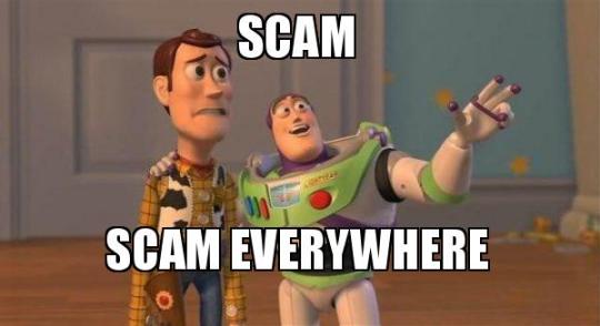
SCAMMERS EVERYWHERE
Sometimes these reminders need to be said: MUCH of social media, in particular Facebook, consists of scam ads. The too-good-to-be-true advertisements that show up in your feed usually are.
If you see a marvelous product you want with a really low price and free shipping, use your head. Use Google to search the product, and you'll usually find the real thing is much more expensive, or is something being crowdfunded at a much higher price and doesn't exist yet. I clocked about 30 of these in my feed in the past week.
But it's way more than that. Individuals selling items -- toys, puppies, phones, whatever -- that insist on unorthodox pay methods ARE SCAMMERS.
If someone asks you to prepay or make a down payment via PayPal, that's fine; pay for it as a purchase, which gives you protection so you can get a refund through PayPal if necessary. If the seller insists on PayPal's "Friends and Family" option, offer to pay the 3% PayPal processing fee. If she STILL Insists you can only pay by "Friends and Family," which offers you zero protection, it's a scam. If she insists on prepayment via CashApp or Venmo or any other option that doesn't offer you protection, it's a scam.
If the seller pivots to any variation of, "I wouldn't cheat you, I'm a Christian," it's a scam. (History has shown some of the worst crimes perpetrated on humanity have used religion as their justifications.)
Meeting up in a parking lot to trade cash for a purchase? Do it in a Police Station parking lot. (If you're in Clermont, FL, there's a big, bright parking lot at the Police Station where they encourage transactions there.)
Think. Plan. If it sounds too good to be true, it is. If it sounds "off," it is.
0 notes
Text
SCAMMERS BE SCAMMIN'
TRUE STORY: One of our artists brought us a client who wanted design work done. They asked him to start and would pre-pay. So far, so good.
Even before we received the check, the client sent me multiple emails requesting a deposit receipt to confirm we'd received/ deposited the check. While doing so, he wrote to the artist -- leaving me off the email -- saying an emergency had come up, they needed half the money returned. By wire transfer. To yet a different name and address from anything so far.
* The check came from an LLC in Massachusetts. Yet that check was shipped from another company in California. Instead of the check identifying the project being commissioned, it stated only "Payment Approved." First flag.
* Client seemed hesitant to give me his phone number, or his full name, and his generic email address gave no name from which we could perform client due diligence. Second flag.
* While he wrote to me asking for a deposit receipt, he wrote to our artist -- NOT copying me -- saying he needed half the money returned. He specifically left me out of that information loop while wanting a deposit confirmation. Third flag.
* It would have made FAR more sense for him simply to write me saying "Plans have changed, we can only pay for the 1st phase, so do not deposit that check; tear it up and we're putting a check for the revised amount in the mail to you today" rather than a far more complicated process of receiving/depositing/clearing/issuing rush refund. Fourth flag.
* He was pushing for a rush refund by methods different from the way he paid us (wire, Zelle); those methods cost a fee to send to him and offered us no protection. Fifth flag.
* The name and address for the requested wire transfer did not match any information on the check OR on the envelope's shipping address. Sixth flag.
* Even though our bank technically clears a check in a business day or two, we've had occasions from new clients where their check bounced and our account got docked for it 10 days later. We also had one instance where someone else did this exact same thing -- sent us a check, asked for a refund and, after we did so, their original check bounced. Seventh flag. But we were able to stop payment on our check and not get stiffed.
Our bank rep advised us not to issue any type or refund for "Seven to 10 business days" to make certain the LLC check clears and nobody tries to "stop payment" on it, as the only way to ensure the money is there. Once our Bank gives the all clear, I told the client I'd mail a refund by check -- the same method we were paid -- to the name and address on the original check.
As a faster alternative, because I have not yet released any money to the artist, I suggested the sender call his bank to stop payment today on the LLC check. "You could then pay us the revised amount and we could start from scratch."
Client wrote back that I'm a liar, that I was being selfish, that this delay could cost a child's life. I reiterated that his bank could stop payment on it, problem solved, and even sent him a link to the LLC's bank how to do it. In response, he continued to demand refund by wire transfer and even threatened to call the FBI. (!!!)
Of course it was a scam. Just by me holding off one day, I got to see the client's check to us BOUNCE, proving it was indeed a scam all along. Nearly thirty-one years of running Glass House Graphics gives me a pretty good spider-sense about this....
Discuss.

0 notes
Text
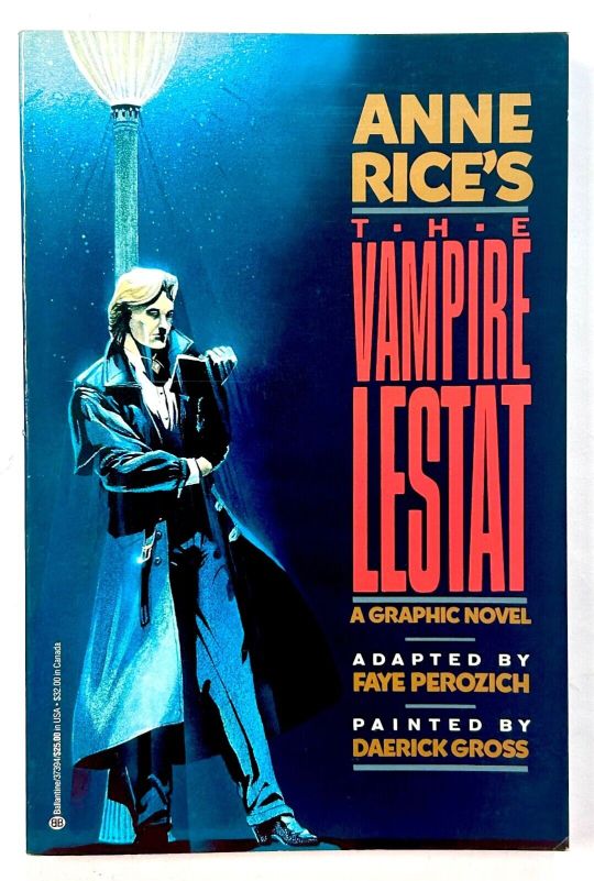
Back in late 1989 Innovation Publishing had licensed its first novel -- Anne Rice's THE VAMPIRE LESTAT. We were attempting to adapt a 400-page novel with a 400-page adaptation, 32 pages per issue, cardstock cover, every panel fully painted. Wiser heads at Marvel told me I was a fool to attempt it, there was no way it would sell.
I hired Daerick Gross to paint the 12-issue series. It was some masterful work. It was ultimately Innovation's best-selling series and became a graphic novel distributed into bookstores worldwide by Ballantine.
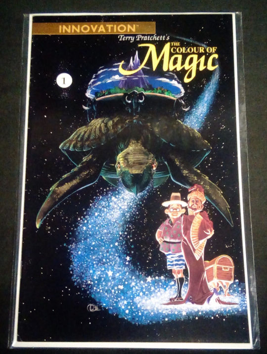
We enjoyed working with Daerick so much that we brought him back to paint the adaptation of the classic film Forbidden Planet, which I scripted. He also painted covers for The Color of Magic and other Innovation projects. He even directed other talented artists in our direction, such as Miles Teves and Dell Barras.
Meeting Daerick was a treat. He looked like King Arthur and carried himself in regal fashion. When we offered a signed edition of The Vampire Lestat hardcover, Daerick flew in for the signing. Scripter Faye Perozich, Daerick, and I sat around a table signing -- with Daerick buck naked, as was his style.
The following year, at San Diego Con, we all shared a house I'd rented for the week. I remember one evening there when an in the-buff Daerick was playing Monopoly and drinking with George Broderick, Jim Elliott, and me. Daerick out-drank everyone with no obvious effects. George didn't drink. Jim drank too much. George commented, "Daerick and I are like apples and oranges...or like bananas and...peanuts." Daerick's whole personality was as outsized as his talent.
I only saw Daerick a couple of times after that. Once I brought a guest to visit Daerick in his art studio, a short walk from Hollywood Boulevard; he met us in the buff. Another was a short greeting at a later convention. After launching Glass House Graphics, I recall at his request arranging a couple of jobs for him at Marvel, but he had another agent who muscled his way into them, so that ended our working together.
Across the decades we stayed in touch, primarily here on Facebook, yet we never managed to reconnect in person.
Yesterday I learned that Daerick Gross has passed. We'll miss both the man and his great talent.

0 notes
Text
TODAY'S ART REVIEW
<<<Thanks for showing me.
The work isn't quite at the level we need for our clients.
In terms of page details, a few quick notes:
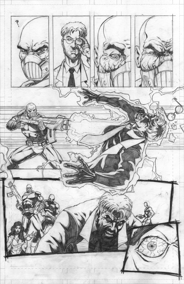
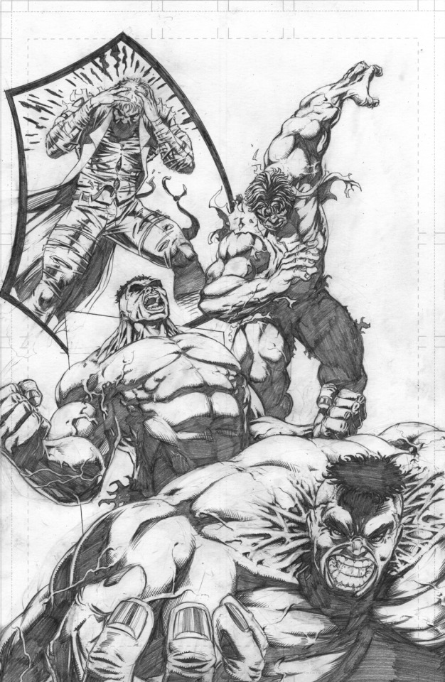
* Page 1 -- Establishing shot/setting problems. In the panel 1 establishing shot, the only things to Bruce Banner's right are double-doors, a smaller window, and the fast food service area. In panel two, the soldiers smash through from...where? It's not through the too-small window. Why would they need to shatter a door they can simply open? That means there was another display window somewhere, but you didn't establish it.
* Page 2 -- What's more, you don't EVER establish it on the pages that follow! Instead, you use out-of-place manga lines, to cover up that the soldier had to STEP BACK several feet in order to aim and shoot his oversized weapon. Given that Bruce Banner was up against a wall in his booth, the blast must have destroyed the booth and the wall behind him, in order for there to be that much space in the bottom panel.
* Page 3 -- I honestly lost all understanding of WHERE this is taking place. No backgrounds, no context. Are they outside now? Still inside?>>>

0 notes
Text
SEEKING ADVICE
Today I received this email: "I'm looking for some advice. I'm an aspiring comic artist, I'm still learning by attending the last year of comic school. I'd like to know what a professional penciler or colorist portfolio should look like for you."
Here was my answer:
Before submitting your portfolio, take the time to check out what the publisher is publishing. Check out their website. Look at their books. If your stuff doesn't "fit" what they're doing, it may not be the best place to seek a job.
Be smart with preparing your portfolio. If you're preparing a .PDF of your work, create a cover page with some great art, your name and full contact information and credits (if any). Make sure your name is in the file name of your .PDF, so there's no guesswork who sent it.
See if the potential employers have specific requirements for your submission. If they want a single .PDF of your work, don't submit .jpgs. If they want a download link to your work, send tht link, not an email stuffed with a large file. Don't send them to an ArtStation or DeviantArt account that's packed with old stuff or art unrelated to the job you want.
A professional portfolio should be clear about what kind of assignment or job you are applying for. More important, it should look as though you've already been doing it for years.
For a professional editor or agent, it's disheartening to see a portfolio that LOOKS like an "art school portfolio" stuffed with unrelated assignments and sketches.
If you want to be a graphic designer, show your finished graphic designs that look like read book pages, ads, brochures, or whatever you're showing. If you want to be a cover artist, show me some covers. If you want to draw licensing art (Disney, Dreamworks, whatever), you have to prove you can draw on-model without copying/tracing drawings you've already seen.
If you want to draw comics, then DRAW COMICS. Showing sketches of characters with balled-up fists and gritting their teeth are useless to me. Comics are sequential storytelling where characters live and breathe on the page in consistent environments convincing in the style you use. Body language, gesture, expression, are all critical. Do characters interact with their environments? Do they make eye contact? Are they believable?
Also remember that experienced editors and agents already know all the tricks. If your work looks digital to them, they'll wonder why you didn't do enough to make it look better. If you swipe, they'll usually catch the swipes.
And if you use AI (plagiarism software), you've already lost the job.
2 notes
·
View notes
Text
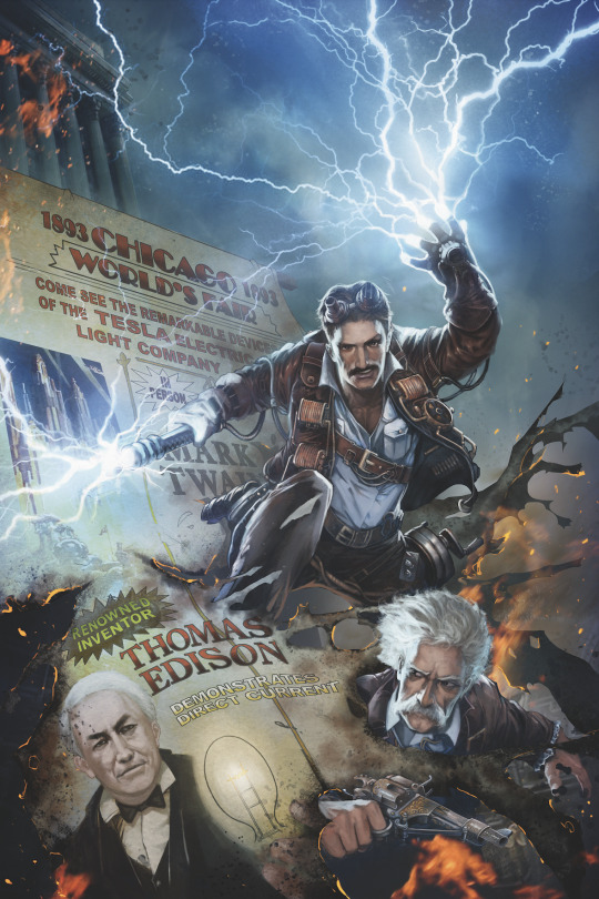
THE ELECTRIFYING TALE OF TESLA
True story: Two writers with whom I work dreamed up a TESLA comic book that teamed the real-life genius inventor Nikola Tesla with his real-life author friend Mark Twain for a buddy-action-movie-style series of adventures. At once clever and exciting and (overall) historically accurate, the scripts were illustrated by Filipino artist Bong Dazo, best known for Marvel's DEADPOOL and THUNDERBOLTS, and for STAR WARS at Dark Horse. Bong did a masterful job designing and illustrating the project.
TESLA caught the interest of a client aspiring to publish projects that would capture Hollywood's attention. On that publisher's board of directors was a movie producer who claimed TESLA was ideal for Hollywood, and they would push the project aggressively if the company co-owned it. Contracts were signed for TESLA to appear in a serialized anthology. Four installments were completed. Three were published. Glass House provided all of Bong's concept art, and they told us the Hollywood push began.
First came a curious lack of feedback/updates regarding the Hollywood situation. Then came bigger concerns: Among them was the contractual guarantee that if the material got used in a certain promotional book, the creators would receive $10,000. The book was published; the payment never came.
The actual breaking point occured when the publisher, looking at the eight series he was releasing, decided to do a crossover mini-series. His new (licensed) character would, in each issue, enter and interact in the "world" of each otherwise-unrelated series, theoretically throwing more attention on his line of books.
At first it sounded interesting, and per contract the authors had the first opportunity to write any tie-ins/spin-offs. The problem was that the publisher assigned HIMSELF the writing job for the new-mini-series. His excuse was that the company needed to save money and, as publisher, he would write it all for free; we soon learned that he paid himself the company's top writing rate for the crossover stories.
The authors blocked the crossover, cited breach of contract, and demanded the property revert back to them. Two years of fighting over ownership and payments ensued, with the publisher demanding reimbursement of art costs on the unpublished issue and the authors simply saying "deduct those art costs from the 10 grand you owe us, and pay us the balance." Finally, those contracts simply expired with the publisher never paying that balance, and Bong died waiting for the situation to be resolved.
Before long, a TESLA feature film hit theaters; publicity said the film was based on an earlier script the director had written but had never been made. And yet that SAME PRODUCER who told us he was shopping TESLA for us was credited as producing this film. It was certainly a far different -- and way less fun -- story. But given the lack of transparency in the whole situation, one wonders how much, if any, of our TESLA material was used in pitch decks and presentations and such to shop and develop the film that finally got made.
At the very least, if the producer's interest had shifted from our TESLA to this other TESLA at some defining point, you'd think we'd at least rated the professional courtesy of advising us as much.
0 notes
Text
UNREALITY CHECK
True story: A publisher planned to make a big splash at Comic-Con. He had an impressive 20' x 20' booth space in a desirable location and wanted to make the most of it. He'd ordered a massive metal booth from China that got shipped in directly to the Con.
It all sounded great. The booth looked impressive. The night before set-up, he rounded up everyone including his wife, handed out booth assembly instructions, and explained his set-up plan: The booth was already at the Con. He would drive everyone over in a van early in the morning, and his team would have all day to set up the booth.
As he spoke, I thumbed through the assembly instructions with dread. Then I pulled out the convention's exhibitor paperwork and read the set-up rules. Basically, if a booth took more than half an hour for two people to assemble, the exhibitor had to pay for the con's Union workers to assemble it. I held up the paperwork and asked the publisher about it.
"Don't worry about that," he told me. "I have a plan to get around it." Ahh. Tomorrow was going to be one of those days. I shook my head in disbelief.
The next morning, we entered the Con to start set-up. When we arrived, the booth containers were on the convention floor at the location. I took one look and realized the misgivings I'd had last night were spot on; this booth couldn't possibly be assembled without a crane. Lou Ferrigno standing on Arnold's shoulders couldn't have assembled this thing. Besides, it was incredibly obvious this would take the Union team hours, even with a crane.
I waited for the train wreck to begin via the publisher's grand plan to circumvent the Union workers. Here it came. The publisher said, "I have to leave to run errands. There's the booth, the assembly tools were shipped with it. If the Union reps come over, tell them you've got it covered, you don't need their help." Then he left. Yes, that was his grand plan, to leave and let his wife and his team fend for themselves.
As the team stood around confused and stunned that they'd been left to fend for themselves, a Union rep came over with his clipboard and a contract for services. The publisher's wife bravely tried to say what he'd told her to. The Union rep looked at the booth containers, half-smiled, and basically said, "Uh-huh. Right."
Then he pulled over a folding chair, sat down in the booth space, crossed his arms, and waited.
"That went pretty much like I expected," I said aloud. "I'm taking my wife and daughter to the zoo." And I did.
End of the day, I returned to the convention center to see what was happening. Nothing was done, because the publisher didn't authorize the Union to begin assembly. As I turned to leave, the publisher arrived, upset that the booth wasn't up. He argued with the Union rep, oblivious to the fact that a crane was needed to assemble the booth.
In the end, the publisher had to pay TIME AND A HALF for the full assembly because the Union workers had to stay late to work on it. And, of course, full Union fees for the teardown, as well.


0 notes
Text
POSTER CHILD
True story: A publisher made a deal to produce comics and posters featuring a popular YouTube celebrity. Glass House Graphics created 10 painted covers for the project. Because the celeb agreed to attend Comic-Con and spend the whole time signing at the booth, the publisher decided to release all the images as retail posters.
"We'll make a million dollars at the Con!" the publisher told me during an in-person meeting.
I couldn't find words at that moment. Seeing the look of confusion on my face, he explained further. "I'll print them in China, air freight them in directly to the Con. I'll even create a massive new booth with the celeb's face gigantic on it. Ten posters, we'll print 10,000 of each."
"Jesus, that's a lot of expense," I said, running likely numbers in my head. "A new booth, airfreight shipping, the event's Union costs to set it up, the drayage charges to store and forklift out that many posters...."
The publisher wasn't hearing me. He was on a roll. "It'll be $20 for one signed poster, a sliding scale, if they buy all 10 it'll be $10 each, $100 for the set. We'll move 100,000 posters at the show and make at least a million bucks."
I shook my head in disbelief. "Nope. I'd suggest printing 500 of each, maybe you'll sell 5,000 total if you're lucky," I told him. "If he has time to sign any leftovers, you can sell them online later. Your math doesn't match reality."
"You're an idiot," he argued. "Of course it does."
"The arithmetic...doesn't...work," I said, with deliberate emphasis. "The Convention is 10 hours a day, maybe four hours on Preview night. That's 44 hours MAX. You're expecting a lot for a celeb to be there every minute. Even if he intends to, he'll have to break for lunch, to stretch his legs, bathroom breaks, probably have a meeting or two, some buddy will come by who he'll need to chat with. It will all take away from his signing time."
"I'm allowing for that. We'll have hired staff to corral people through the line fast."
"All right," I said. "So someone goes through the line, selects a poster or two, pays for them, talks to the celeb, maybe hands him a gift, they chat for a few seconds, he makes a joke, they take a picture together, shake hands, then on to the next person. Their special moment, that's maybe one minute." I pulled out my phone and ran the calculator. "Sixty people an hour. In an ideal world, 44 hours x 60 people an hour is 2,650 people. If each buys a poster or two, you'll MAYBE sell 5,000 posters at the outside."
"You're wrong," he told me. "We'll sell multiples."
Of course, the publisher proceeded to do as he pleased: Pricey new booth, 100,000 posters air-freighted in at considerable expense, con staff expenses, celebrity costs, all of it.
After Comic-Con was over, I heard that roughly 4,800 posters got sold. While some of the 95,000+ leftover posters shipped to a warehouse, many were left on the convention floor to be trashed. The company imploded shortly thereafter.
And as you might suspect, the artists who painted those posters never received their comp copies OR a dime of their contracted royalties for the ones that did sell.

0 notes
Text
THE IMPORTANCE OF HONEST COMMUNICATION
Decades ago, DC Licensing contacted us for Mike Deodato to draw a superhero lithograph to be sold exclusively through the Warner Bros. Studio Store. At the time he spoke no English, so I worked with a coordinator in Brazil to handle the jobs. Deodato gladly accepted the assignment.
DC Licensing was clear about the SIZE. They didn't want the standard 11" x 17" original art proportions. They wanted two 11" x 17" sheets taped together for a more squarish 17" x 22" proportion and more room for detail. My coordinators in Brazil, translating and handling the job, said it wasn't a problem.
When the finished line art file reached the client, they contacted me. "We need Deodato to scan the rest of it. We're missing both sides of the artwork." For close to a week I kept bugging my coordinators to rescan it, and each time they assured me the art was two 11" x 17" pages taped together, and they were scanning both pieces in their entirety.
In the end, DC Licensing never received the image in the proportions they wanted. They ran out of time, and used the art as-is. They published it but weren't happy that it wasn't the format they'd planned. That meant we never got another assignment for Deodato from them; they never even sent us one of the lithographs, so to this date I've not seen the printed product in person.
Years later, after I no longer worked with the coordinators, I visited Deodato at his home. I learned that a.) Deodato had never been told to draw the poster in any size other than standard 11" x 17"; b.) the coordinators never contacted him to draw additional imagery to fill out the size Warner Bros. required; c.) Deodato never even heard about the proportions struggle until we sat together in person to talk about it.
Sure enough, he pulled out the original art to show me -- 11" x 17", the size which they'd repeatedly assured me it was NOT.
1 note
·
View note
Text
Sigh*....FLASH?
SPOILERS! I waited this long to post my thoughts on THE FLASH movie, so most folks who wanted to had a chance to see it. This is NOT about Ezra Miller's dumpster-fire real life; it is about the movie.
I didn't mind it while watching it, but the further into the movie we got, the more it unraveled -- the story and the CG. Producers delivering bad SFX and backpedaling to call it "intentional" seemed desperate to me. Iris West had ZERO chemistry with Barry Allen. The falling babies sequence hurt my head, starting with WHERE in the hospital the nursery was located. WHY did they have to use ZOD again? Doesn't THE FLASH in the comic books have a wild rogues gallery of villains to choose from? If they HAD to use Zod, why not be SMART about it?
That's the key to the movie -- NOT being smart.
I have EXACTLY the same problem with THE FLASH that I had with SPIDER-MAN: NO WAY HOME: The adult in the room has to behave like a fucking idiot or the story doesn't function.
In SPIDER-MAN, Peter Parker went for help to Doctor Strange, the adult who most helped save the cosmos outside his mentor Tony Stark All Stephen Strange had to do was ask a few adult questions: "What problems are you trying to solve? Have you tried writing your intended college asking them to reconsider? Should I reach out to them? Or perhaps Pepper Stark, head of Stark Industries, could speak on your behalf? Are you sure you want EVERYone to forget you? Me? The Avengers? Trusted family or friends?" A three-minute grown-up conversation from the adult in the room would've prevented a catastrophe. Instead, Doctor Strange had to be a fucking idiot.
Similarly, THE FLASH expected us to believe that BATMAN, the world's greatest detective, was too stupid or clueless to ask some basic questions of the FLASHes, one of whom was still a kid and the other an awkward adult who clearly depended upon the guidance of "his" Batman, How about: "How precisely did the Superman of your world defeat Zod? Did your Batman, knowing of such super-powered aliens, just let them do their own thing, or did he figure out a weakness? What's this Kryptonite you mentioned? Can we track its radiation signature? Let's hunt down some kryptonite." He'd be the adult and strategize. But instead of being the world's greatest detective, he too behaved like a fucking idiot. The so-called greatest detective is more to blame for the failure than the Barry Allens.
I had zero use for the Aquaman tag, and the George Clooney Bruce Wayne ending, played for laughs, only confused things. I think they could have used ALL THREE of the endings they filmed, scattered across the end credits, which would've been more interesting than the confusing Clooney-as-Batman tag. .
Sure, I loved seeing Keaton back as Batman and wished he'd used the Batmobile at some point. Instead of hermit Bruce living alone, though, I'd have far more enjoyed Flash dropping in on Keaton and Michelle Pfeiffer enjoying a night away from their usual socializing.
Sure, the poorly CG'd cameos from Christopher Reeve, Adam West, and so on were sweet, building on what Berlanti's similarly-themed Crisis on Infinite Earths attempted to do, none of it contributed to the story. and characters just stood around and posed. It delivered nothing beyond the most basic fan service.
I hoped finally for something amazing from the DC films. This wasn't it.
1 note
·
View note
Text
MISSING IN ACTION
True story: A very slow-but-excellent artist had been abusing playing the "I need an advance on the pages to pay bills" card. Still, he was so good we were planning his next project, and I traveled a significant distance to meet with him to discuss the details, a lunch we'd planned a week ahead. He was bringing with him pages of art we'd sold to a client, that I would ship for him.
He didn't show, didn't text, didn't call. I texted him multiple times. "I'm already seated, our table is in the back." "Are you here?" "Are you on your way?" No answer. I ate lunch and left.
More than a week later, he sent one page of art and, of course, asked for an advance on the next pages as he fell further behind.
What was his explanation for not showing up, not warning me ahead of time he wasn't coming? "Dave I'm sorry if I didn't make it to the meeting for some reasons."
That's right, he emailed me a placeholder and didn't even put in the excuse.
So my reply, when he asked for another advance? "I'm sorry, I can't do that anymore for some reasons."
Was I wrong?
0 notes
Text
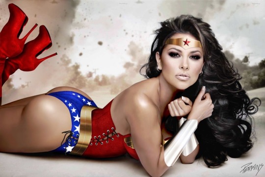
THE TALE OF JASON PERKINS, MY REAL-LIFE AI
JASON PERKINS is a name every Glass House artist, and many of our clients, will recognize. Not only has Jason long been my company's webmaster and top website designer, he's been an A-level video editor, graphic designer, photo retoucher, and much more.
The Wonder Woman I'm posting here on my blog is his work. He received a high-res photo of Telemundo actress Gaby Ramirez from Playboy Mexico and created the costume, changed the makeup and muscle tone, even added volumes of hair with completely new lighting, and made it look terrific.
Ours has been a 15-year working relationship that's bizarre to think about. We've never met. We've never video chatted. We've never even spoken on the phone. 100% of our communication across all this time has been emails or, rarely, text messages.
I've long called him my Guardian Angel -- saving the day for me again and again, always there, always dependable. It's as if he's always existed there, helping me as this disembodied existence in the ether, my ultimate AI, where I only had to type what I needed...and suddenly it was done, always great and without hassle.
We've accomplished so much great stuff creatively and have been working toward a new animated feature film. And we'd spend so much time typing back and forth about creative things, personal things, hopes and dreams and plans a'plenty.
On January 31, 2023, I received a call from his wife Suzanne. She is now his widow. Jason Perkins has died of a massive stroke at only 56 years old.
His family is in shock.
We've lost a massive talent.
I've lost a unique friend and confidant.
I am devastated.
6 notes
·
View notes