i realized i haven't actually updated this description in a while, but essentially i realized a while ago posting art just wasn't something i have motivation for it that makes sense. i still like to draw when i have time, just not for here. essentially im only just keeping this blog up to collect references and stuff. minimal organization, if any.
Don't wanna be here? Send us removal request.
Statistics
We looked inside some of the posts by daydreaming-stardust and here's what we found interesting.
Average Info
Notes Per Post
815K
Likes Per Post
515K
Reblog Per Post
300K
Reply Per Post
593
Time Between Posts
2 months
Number of Posts By Type
Text
14
Note
1
Photo
2
Last Seen Tumblr Blogs


Fun Fact
Users from the US are the majority of Tumblr visitors.
Text
i hate when you google a word and some fucking company comes up instead. Do you think you are more important than the english dictionary you piece of shit corporation
127K notes
·
View notes
Text

Everyone look at the cat blanket I made like .. 3 years ago
41K notes
·
View notes
Text


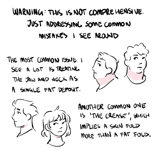
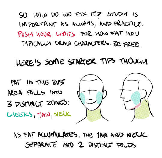
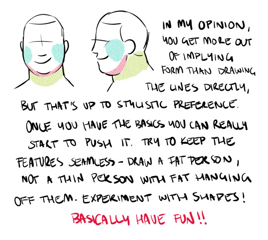
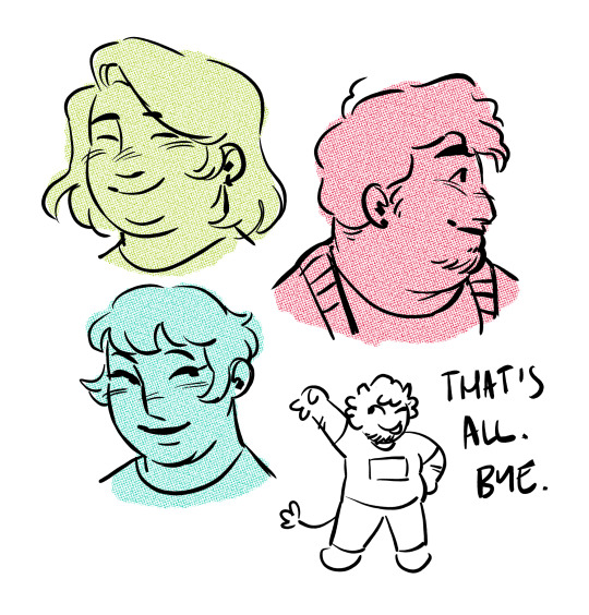
Compiled some basic information I know about drawing fat characters for beginners since I've been seeing more talk about absence of really basic traits in a lot of art lately.
Morpho Fat and Skin Folds on Archive.org (for free!)
124K notes
·
View notes
Text


Overview of some topics when it comes to drawing characters who are burn survivors.
DISCLAIMER. Please keep in mind that this is an introductory overview for drawing some burn scars and has a lot of generalizations in it, so not every “X is Z” statement will be true for Actual People. I'm calling this introductory because I hope to get people to actually do their own research before drawing disabled & visibly different characters rather than just making stuff up. Think of it as a starting point and take it with a grain of salt (especially if you have a very different art style from mine).
Talking about research and learning... don't make your burn survivor characters evil. Burn survivors are normal people and don't deserve to be constantly portrayed in such a way.
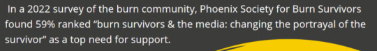
edit: apparently tum "queerest place on the internet" blr hates disabled people so much that this post got automatically filtered. cool!
46K notes
·
View notes
Note
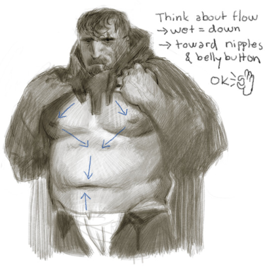
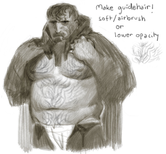
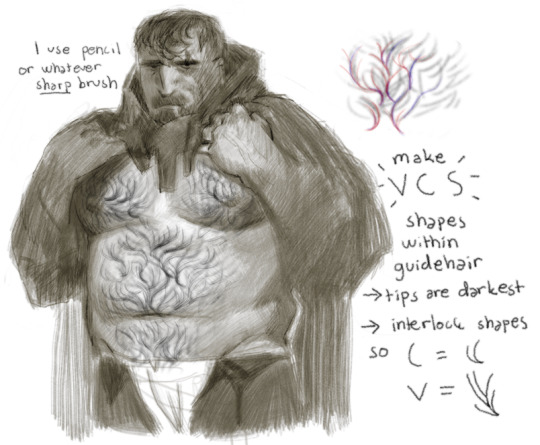
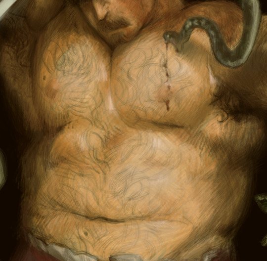
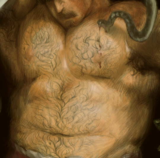
can you do a tutorial on how you draw body hair ,,, im just getting into it but i loveee how you do the wet/sweaty curls ohh fmy god
Tried my best to explain plainly how I do it, enjoy! (+cursed hairless Wreg)
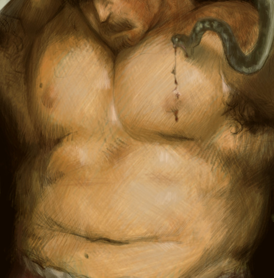
What does this look like in actual work? Something like this (+another cursed hairless Wreg)
5K notes
·
View notes
Text
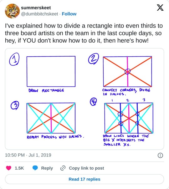
really helpful technique ^ once you know how to divide by halves and thirds it makes drawing evenly spaced things in perspective waaay easier:


134K notes
·
View notes
Text


tutorial for drawing characters with Down syndrome!
DISCLAIMER... please keep in mind that this is an introductory drawing tutorial and has some generalizations in it, so not every “X is Z” statement will be true for Actual People. it's more of an overview of features that are common in people with Down syndrome, not meaning to imply that every person with DS has all of them 👍👍 thanks
if you draw any characters using this feel free to tag me!!
35K notes
·
View notes
Photo
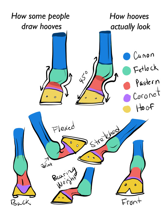
for all of you who struggle to draw horse feet. :) You’ve gotta have those pasterns in there, as they are the horse’s main shock absorbers, as seen in the “bearing weight” example.
If you can handle an animal autopsy, here’s an interesting vid on how the muscles and joints work in the lower leg of the horse.
24K notes
·
View notes
Photo
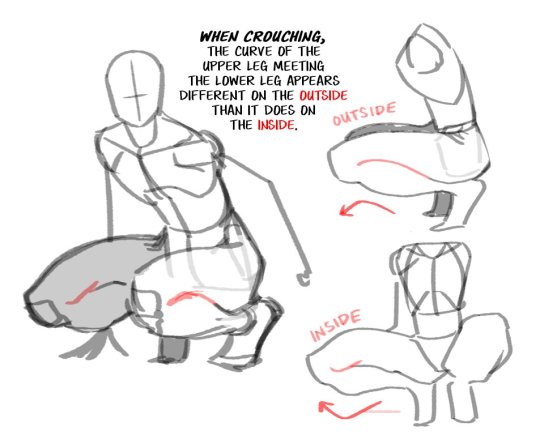
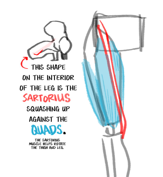
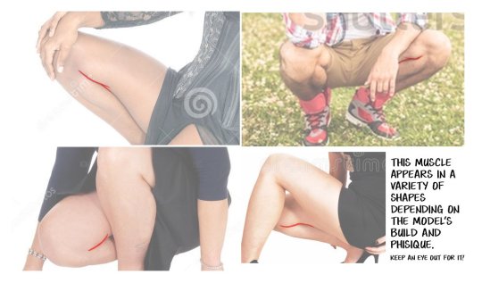
Here’s a little Art Tip about a very specific part of the body. Pop a squat and see how it looks on you.
38K notes
·
View notes
Text
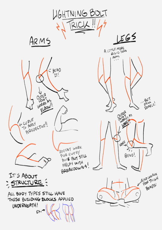
this showed up in my FB memories, the lightning bolt trick! I don't sketch out the lightning bolt much nowadays but it's still super helpful when I need to lay out tricky arms and leg poses. And I still apply the logic of it, especially with how I draw arms :' ) Biggest thing it helps with is shape breakdown and visualization, we gotta use whatever works to break down shapes into simpler concepts for our brains 👏💓
14K notes
·
View notes
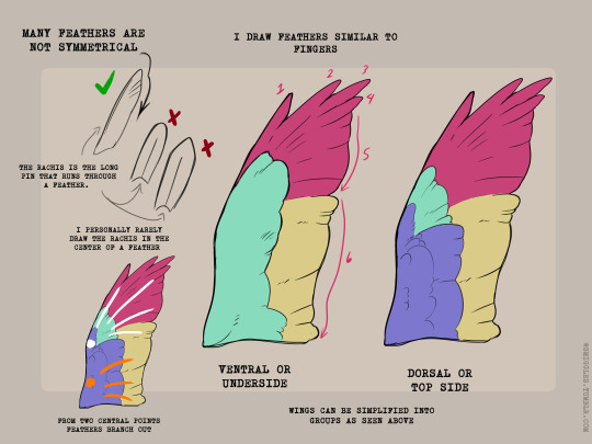
Text
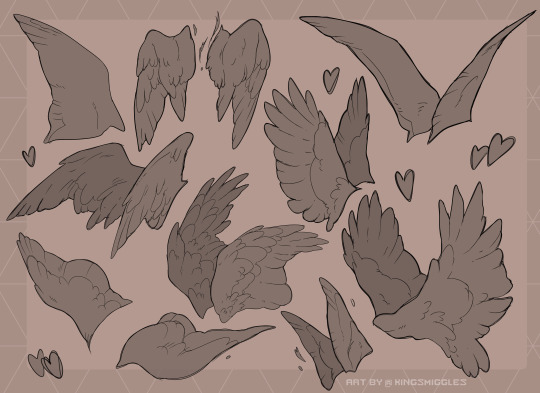
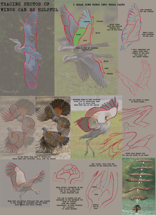
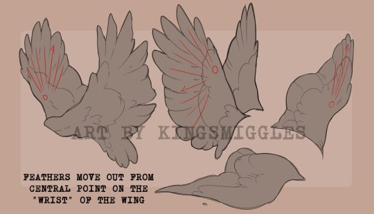
I made an art/anatomy tutorial about birds! I hope people will find it helpful!


52K notes
·
View notes
Text


draw more fat characters ok. i love you
36K notes
·
View notes
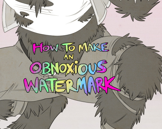
Text
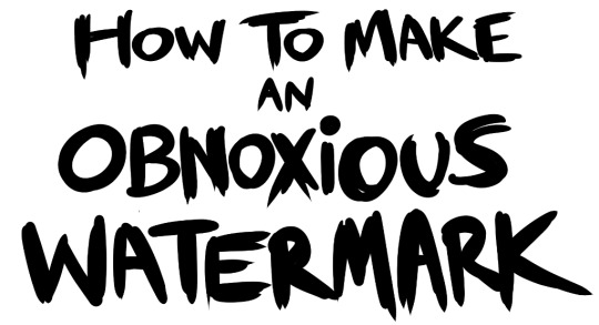
...that your audience won't hate.
This is a method I started using when NFTs were on the rise - thieves would have to put actual work into getting rid of the mark - and one that I am now grateful for with the arrival of AI. Why? Because anyone who tries to train an AI on my work will end up with random, disruptive color blobs.
I can't say for sure it'll stop theft entirely, but it WILL make your images annoying for databases to incorporate, and add an extra layer of inconvenience for thieves. So as far as I'm concerned, that's a win/win.
I'll be showing the steps in CSP, but it should all be pretty easy to replicate in Photoshop.
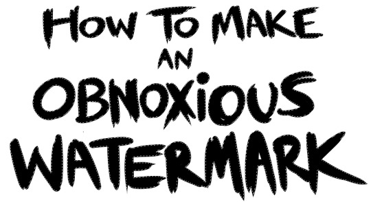
Now: let's use the above image as our new signature file. I set mine to be 2500 x 1000 pixels when I'm just starting out.
Note that your text should not have a lot of anti-aliasing, so using a paint brush to start isn't going to work well with this method. Just use the standard G-Pen if you're doing this by hand, or, just use the text tool and whichever font you prefer.
Once that's done, take your magic wand tool, and select all the black. Here are the magic wand settings I'm using to make the selections:

All selected?
Good.
Now, find a brush with a scattering/tone scraping effect. I use one like this.
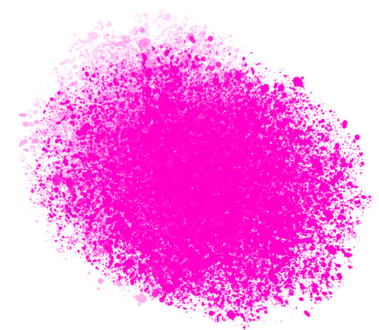
You can theoretically use any colors you want for this next part, but I'd recommend pastels as they tend to blend better.
Either way, let's add some color to the text.
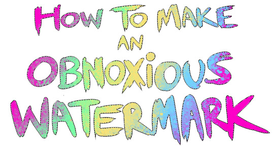
Once that's finished,
You're going to want to go to Layer Property, and Border Effect

You'll be given an option of choosing color and thickness. Choose black, and go for at least a 5 in thickness. Adjust per your own preferences.
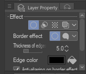
Now create a layer beneath your sig layer, and merge the sig down onto the blank layer.
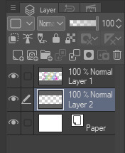
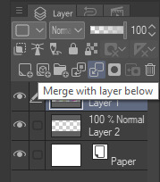
This effectively 'locks in' the border effect, which is exactly what we want.
Hooray, you've finished your watermark!
Now let's place that bad boy into your finished piece.
You'll get the best mileage out of a mark if you can place it over a spot that isn't black of white, since you'll get better blending options that way. My preference is for Overlay.
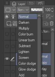

From here, I'll adjust the opacity to around 20-25, depending on the image.
If you don't have a spot to use overlay, however, there's a couple other options. For white, there's Linear Burn, which imho doesn't look as good, but it still works in a pinch.
And for lots of black, you have Linear Light
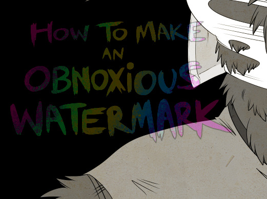
Either way, you're in business!
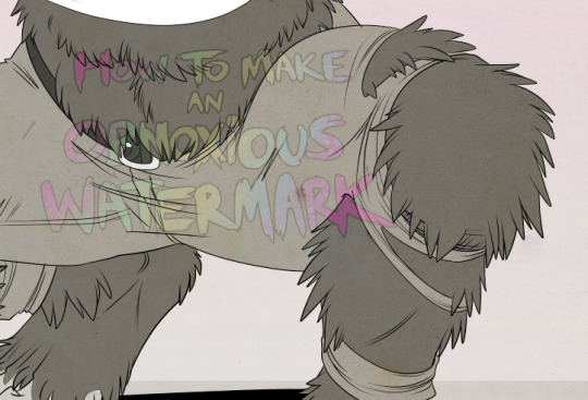
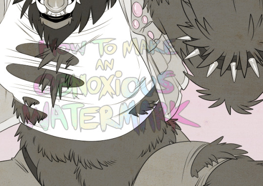
EDIT since this has escaped my usual circles, and folks aren't as familiar with my personal usage:
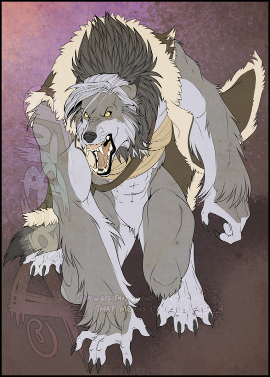
An example of one of my own finished pieces, with watermark, so you can see what I mean about 'relatively unobtrusive'-- I try to at least use them as framing devices, or let them work with the image somehow (or, at the very least, not actively against it).
I know it's a bummer for some people to "ruin" their work with watermarks, which is part of the reason I developed this mark in particular. Its disruption is about as minimal as I can make it while still letting it serve its intended purpose.
There's other methods, too, of course! But this is the one I use, and the one I can speak on. Hope it helps some of you!
52K notes
·
View notes
Text
fat bodies, fat anatomy, and how body fat tends to work should be taught as standardly as skinny anatomy and how muscles work in art courses. fat bodies are not an outlier. fat bodies are not a minority and theyre not abnormal or wrong. fat bodies are normal and they belong in art teaching spaces as commonly as other anatomy, because fat bodies ARE normal anatomy. people have diverse bodies and there will never be a single body type that encompasses the “normal body type”
tldr; fat anatomy should be taught as a staple in art courses just like any other anatomy. this is fact <3
45K notes
·
View notes
Text
i don’t really post my work anymore but this sketchbook ender photographed so well i just had to.
0 notes