
Don't wanna be here? Send us removal request.
Statistics
We looked inside some of the posts by designbygrace2019 and here's what we found interesting.
Average Info
Notes Per Post
24
Likes Per Post
0
Reblog Per Post
24
Reply Per Post
0
Time Between Posts
44 minutes
Number of Posts By Type
Video
6
Text
11
Last Seen Tumblr Blogs


Fun Fact
There were a total of 171.5 billion posts on Tumblr in 2019.
Text
Creating Video

I used After Effects to create individual animations and the entire pitch video for Green Points.
1 note
·
View note
Text
Video pitch script


I didn’t create a storyboard, I did however edit a script so I knew what order to put things in. I also planned out visuals to go along with the script but instead of drawing them out I wrote them down. My general idea for the video, was to briefly explain the problem of sustainability, hone in on the area of motivating sustainability in everyday life as my problem area. Show a prototype of green points that illustrates the feature and benefits and how it responds to my problem area. I didn’t include all of the screens from my prototype because the on-boarding screens explained how the app worked and it seemed silly to repeat that twice.
I then talk about how nz’ers are becoming more concerned with environmental issues etc. and the problems and barriers everyday people face in trying to become more sustainable, I then reiterate how green points helps people to overcome those barriers. I finish on a call to action (download green points)
1 note
·
View note
Text
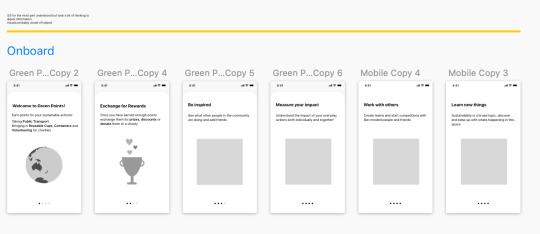
Developing Onboard Animation
I used both after effects and principle to develop my onboard animation. the general flow and copy I developed throughout user testing. The illustrative elements I initially created in sketch, I then recreated these in illustrator and animated them in after effects. I then imported these animations into principle and placed them on the screen designs. The transitions between screens as well as the type animations and the movement of the iPhone mockup were all done in principle. It was a challenging and time consuming process but I definitely improved my animation skills and I am fairly happy with the result.
1 note
·
View note
Text
Branding: Colour, Logo, Icons
Logo: I considered several other options including a logo from last semester. I considered the idea of using a circle to represent the earth and hands to represent care. I also looked at this hand tone text below with curved edges inspired by the edges of a leaf.


Colour: I also found some images online and gradually developed the colour palette. Colour was very important and tricky, because the name of my product is Green points, I couldn’t really not have green be the main colour. However green is not a very accessible colour whenever I did testing on the brighter greens the contrast between either black or white is not enough to be readable. Additionally green is generally reserved to indicate successful completion of an action, so it can be confusing when used as a branding colour as well. I experimented with blue and then with teal/turquoise shades until I eventually settled on my final colour palette.

Final colours:

Final logo
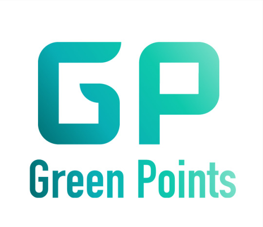


Other applications of the brand:
Icons:


Illustrations:

1 note
·
View note
Text
Iteration 4: Improvements and Branding
In this iteration I created the brand and also made a few changes based off of the last user test.
These changes included changing the placement of the tool tip to be closer to what the tool tip is actually for. I also made changes to the onboard which I will cover in another post.

1 note
·
View note
Text
Iteration 3 Testing
In this version I altered the copy and the design slightly of the tool tip as well as reconfigured the features included in the navigation bar. Profile is now its own feature and includes metrics and stats from the person actions (an element of the impact feature). Four features seemed like a good compromise between making them more understandable and not having too many features and overloading the user. Again, when I tested with users there was confusion around the points feature, specifically the placement of the tool tip. my users felt that the tool tip should be placed next to the feature it was specifically referring to, which made sense. They were also confused about the other actions and whether the Qr scanner was for everything or just public transport and reusable items. My participants also felt my on-boarding was too long and unnecessary.

1 note
·
View note
Text
Iteration 2: Testing
This round of testing I found that a few of my users were still confused about what the Qr code scanner was for and some didn’t read the tool tip properly or didn’t realise that their were two tool tips, one after the other and just got stuck on one. Which lead to confusion about how the Qr code scanner worked and how to use it.
Other little confusions in copy such as in the onboard, one user suggested a prompt to tap on the pictures as this wasn’t so clear.
I also found that people were confused about the profile feature (also under points) and suggested that it become its own feature. Overall users liked the idea and found it fairly simple to understand.


4 notes
·
View notes
Text
Round 1 Testing: Improvements
This is the new version I have created based off of feedback from the first user test session.
Summary:
The main improvements include:
Re-writing the onboard screens to include the other features, as well as condensing some of the original screens.
One of my main pieces of feedback was that actions and impact features were too confusing and that there were too many features in the navbar. So I have combined both action and impact into one feature - still called impact. This feature now shows specific impact stats for a particular action this can include the environmental benefits such as how much water was saved etc.
I also included impact stats under profile which is now also included in the action feature. This information is specific to the user, the actions they have taken and the environmental benefits of that action.
Users were a little bit confused in the on board stages what the grid or the grey boxes were for. Basically this feature is similar to pinterest where you can choose what actions you are currently taking and what actions you would like to be taking. Because there were no images in the grid it was a bit more difficult for participants to understand what this was for and what they were supposed to do. So I have included stock footage this time around.
in the onboard stage one of my participants misinterpreted the image with coffee cups connected to the phone, and assumed the cafe would have the qr code rather than the user. This sparked a new idea for me to make it so that the cafes had the unique Qr code rather than the customer. As this would be a much more cost effective way of implementing the system. Rather than developing a seperate product for the cafe’s to use to scan customers Qr code.

7 notes
·
View notes
Text
WK 7: Round 1 testing
after thinking about the advice from my tutor I really tried to simplify my screens so they were less overwhelming to look at. I also decided I may as well start using patterns from human interface design system - developed by apple. As these components are well designed and people-especially those with apple devices are familiar with them. For the initial test prototype I haven’t included any stylistic elements or branding as I just want to test the functionality and the flow of the app. Once I have validated this then I can consider what the brand should look like and how to apply it to the design.
I believe that agile processes such as going through multiple testing and prototyping sessions as part of a design sprint is incredibly important to developing an understandable and useful product.
Test Script
In the past when I have prepared test scripts I have written a script including an introduction and a series of tasks and questions for the test participant to complete and answer. This time around however I decided to create an excel spreadsheet with tasks and questions broken down into sections. This allowed me to easily type notes and compare answers later on.

Test for a treat event
I participated in test for a treat, for this round of user tests. Which was perfect because I was able to test on people I didn’t know and had never heard of my idea. This event was organised by AUTSA and had other communication design students as well as creative technology students.
Pre interview
Because I was with people I had never met it was a great opportunity to do a pre interview and gain more insights into attitudes towards sustainability and motivations behind sustainable actions. Some interesting responses included the fact that the people who made household decisions have a lot of power over how sustainable their lifestyle was. One participant mentioned if she was flatting she would be able to be more sustainable as she’s be able to make more decisions for herself. Another mentioned how their sister was the driving force behind her families changing lifestyle.
Mapping Pain Points and successes:
Below shows how I have mapped the pain points from my user test, as well as validated features.


Summary:
Action feature was confusing - participants especially confused action and impact.
Confusion on how the Qr scanner and tab works.
Overall simple to understand app.
Could have a bit more personality.
1 note
·
View note
Text
Break/WK 8: Initial Wireframe

These are my first attempt at creating designs for the app. I have wire-framed these and focused on how the app is structured - including the 5 main features that I decided upon in the user flow.
Actions and challenges was by far the most difficult to design as I tried to make the screens as simple as possible. Actions include 8 different initiatives for users to earn points including:
Public Transport
Reusable cups
Reusable containers
Volunteering
Learning
Refilleries
Water usage
Electricity usage
Challenges additionally comprises several actions that users must undertake several times to gain more points and awards. All of these functionalities sit under one feature currently.
Initial Feedback:
Before testing I walked through these wireframes to get initial high level feedback. This helped me to refine my designs further, or bring up problems or pain points that may be glaringly obvious to people with fresh eyes.
“i like the idea”
“theirs a lot going on”
“maybe actions screens needs to be changed, I’m a bit by confused as to what it’s for?”
“could it be like pinterest where you say what things you’re interested in and those suggestions come up in the home screen?”
James also gave me feedback;
could you make it a calmer more meditative experience?
this is very quantified based - could this be dis-heartening for people?
could you incorporate more quantified gamification, mana for example?
1 note
·
View note
Text
Break: Competitor Analysis
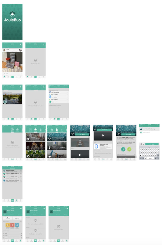
In semester one I found a similar app to green points called pips rewards which I did a competitor analysis for. This semester I have come across another one called Joulebug.
Users can complete actions, join challenges, get live updates of actions of others and collect badges and trophies. It doesn’t have a rewards or discount function like pips rewards however.
I think the profile feature and activity feature where you can view stats around your impact and see what others are doing (similar to newsfeed) are interesting ways to motivate people and what I am considering to replicate in my own app design. This app also includes leaderboards which encourages competitiveness also encouraging people to be more sustainable.
However the ui for Joulebug is dated and a cluttered, it is an easy app to navigate and it is also very understandable from my own experience of using it.
1 note
·
View note